7,309 search results
(0.014 seconds)
- Jacob Graffiti by Quatype,
$15.00 Jacob Graffiti is a font inspired by graffiti. In order to reflect the feeling of spray paint, the beginning or the end of the characters show a sense of stroke. When designing this font, to add some fun, a pictorial ligature was specially designed: jacob. And it's on the smile face Unicode block too.
 - Storytail by Balpirick,
$15.00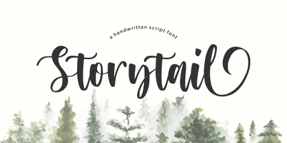 Storytail is a Handwritten Script Font. Storytail is a stylish and delicate script font. This font is PUA encoded which means you can access all of the glyphs and swashes with ease! - also multilingual support - Lowercase Ending Swash Enjoy the font, feel free to comment or feedback, send me PM or email. Thank you!
 - CompassOne by Ingrimayne Type,
$9.00 CompassOne was a design I began in 1990 or so, but did not bother to finish until five years later. Its name comes from the fact that all the letters could have been drawn with a compass (which draws circles) and a straight edge. The typeface Demotte was a further development of this design idea.
 - Masculina by Brave Lion Fonts,
$8.00 Masculina is a strong font with sharp ends. It is a majuscule font and supports many languages. If you love capital letters, Masculina is a must-have. It is recommended for signs and headlines but there are many more ways to use it. Masculina is ready for you. Make the maximum out of it.
 - Bestaline by Typebae,
$15.00 Introducing Bestaline Font Pack Bestaline is a versatile font pack. It has 5 styles of fonts and ornaments, can be used and combined for various projects. To use the beginning and ending swashes, you don't need to use software that supports opentype, because we have made it separately so it's very easy to use.
 - Wolfram by Scriptorium,
$18.00Wolfram is a bold display font based on an Art Nouveau type design from Germany. It features very thick letter forms with gnarled edges simulating antique printing, though the letter forms are stylish and rather modern looking. It's a striking font - excellent for buttons and other places you want to provide some strong emphasis. - La Mango by Sans And Sons,
$19.00 Le Mango, a Modern Ligature Serif with Elegant Style. Le Mango is a high contrast typeface so delicate, legible and lend themselves to high end branding, logo designs, product packaging, invitation & masterhead designs. Language Support: All fonts support English, French, Italian, Spanish, Portuguese, German, Swedish, Norwegian, Danish, Dutch, Finnish, Indonesian, Malay, Hungarian, Polish, Turkish, Slovenian.
 - Sinister Undertones JNL by Jeff Levine,
$29.00 Hand lettering from the 1958 movie poster for “Vertigo” (designed by Saul Bass) was the inspiration for the digital font Sinister Undertones JNL, which is available in both regular and oblique versions. The quirkiness of this irregular, squared-edge sans – despite its simplicity – perfectly captured the mood and drama of Alfred Hitchcock’s film production.
 - Kopa by The Hiscott Foundry,
$30.00This font is good clean fun. "Kopa" is a word that means "soap" in the Hawaiian native language. The thickness and rounded edges mimic the form of solid soap. Some additional design involving the base of the glyphs brings out the style just a bit more. This font works especially well with colorful designs. - Maltiner Display by Arterfak Project,
$28.00 Introducing Maltiner Display: A versatile, elegant, and sophisticated condensed serif font inspired by classic typography and newspaper headlines. Designed to excel in display settings, Maltiner Display prioritizes typographic excellence, offering a bold yet refined aesthetic. With unique letterforms and sharp edges, Maltiner Display provides ligatures and special characters, the perfect choice for luxury projects.
 - Atyp Kido by Suitcase Type Foundry,
$80.99 Atyp Kido with softened stem ends is a great alternative if you are creating branding or logotype with a feeling of warmth, love and playfulness. Atyp Kido comes in six weights with a rich language palette of expanded Latin, Cyrillic and Greek. The available variable format is a clear benefit for creating quality responsive design.
 - Jamarius Script Font Trio by Zane Studio,
$15.00 Jamarius Script - This handwritten font is a new modern script with an irregular base line. Trendy and feminine. Jamarius Script looks beautiful in wedding invitations, thank you cards, quotes, greeting cards, logos, business cards, and more. Perfect for use in ink or watercolors. Including beginning and end letters, alternatives and support for many languages.
 - Smithrose by Sibelumpagi,
$19.00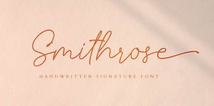 Smithrose is inspired by monoline signature letters and is a natural & modern handwritten signature font. Smithrose comes with 85 ligatures and ending swashes. Smithrose is perfect for many different projects such as logos and branding, invitation, stationery, wedding designs, social media posts, advertisements, product packaging, product designs, label, photography, watermark, special events and more.
 - Lilycat by Letters&Numbers,
$26.00 Lilycat is based on paper cut-outs of circles and rectangles. Letter shapes share characteristics of early modern fonts such as Futura. Uneven edges give the typeface a hand-made, playful, authentic feel. The font is suitable for use in short paragraphs, headings and captions, logo types or whatever use you see fit. Enjoy!
 - Armeria by Tanincreate,
$17.00 Armeria is a modern serif font with modern look and elegant minimalistic style. Armeria aims to be a universal, it works great in headlines, high-end branding, logo designs, magazines, product packaging & invitations. It comes in 1 style - regular and is equipped with an advanced character set, supporting Central European languages. Armeria Regular Armeria Italic
 - Buttoneer by DonkeyWorx,
$20.00Buttoneer is a specialist symbol font for representing media controls such as play, stop, fast forward, and so on as well as other icons useful in developing multimedia or interactive applications. Also useful in printed materials for representing these items - for example software or hardware manuals. Layout optimised for use with codepage utilities e.g: CharMap. - Karara Shadow by Kufic Studio,
$20.00 Karara Shadow, a complete font set and additional font style of Karara. The word Karara means patience & steady. The style is achieved by practicing and studying the modern techniques to deliver high-end professional font. This specific font had a tint of wall chalking & texture. Carefully engraved and stenciled to delivery clean cuts and design.
 - Artonic by Seventh Imperium,
$37.00 Artonic is a tattoo script typeface inspired by elegant script and sharp look typeface. The characteristic of artonic is flowing edge, elegant,sharp and black. These typefaces are made out of pride and passion for urban tattoo design. Of course Artonic comes with a variety of ligatures and alternative forms, available through OpenType features.
 - Agane by Trim Studio,
$20.00 Agane is a Basic modern Sans Serif font. Design with oval as main shape, It's combine the basic sans type with smooth curve in the end, perfectly suited for graphic artists to complete their design such as web design, advertisements, posters, logos, product signs, and many more. Agane contains all standard glyphs and punctuations.
 - Space Quest by Lone Army,
$10.00 This font is inspired by aerospace. I use the negative spaces of each font to form planets or rockets. every glyph has its power. can be used as initials or as a word nicely. and also supports multilingual. the space design side is also found in punctuation to! thanks and enjoy the design! cherrs
 - Anttalla by Attype Studio,
$15.00 Anttalla is modern script calligraphy font, include front swash and ending swash for lowercase glyph, combine it to make the best word for your design. Anttalla font perfectly match for design like banner, book cover, t-shirt, branding, promotion, social media post, quotes, wedding, photography and more. Hope you enjoy with our font! Attype Studio
 - Amelia Harper by Letterhend,
$14.00 Amelia Harper , a new font duo where the elegance of a serif font intertwines flawlessly with the beauty of a handwritten script. This font duo is carefully crafted to bring together the classic charm of serifs with the contemporary edge of modern scripts. Features : Uppercase & lowercase Numbers and punctuation Alternates & Ligatures Multilingual PUA encoded
 - Bible Script by ITC,
$29.00Bible Script font is the work of designer Richard Bradley. A textured edge, swash alternate characters and additional flourishes enhance this traditional, calligraphic font. Word settings look as though they were written by hand. Bible Script font is perfect for certificates, diplomas, citations, greeting cards, or anything that should have a personal, elegant touch. - Homestone by Typebae,
$17.00 Homestone is an exquisite handwritten font, masterfully designed to become a true favorite. It maintains its classy calligraphic influences while feeling contemporary and fresh. To use alternates, heart connector, beginning and ending swashes, you don't need to use software that supports opentype, because we have made it separately so it's very easy to use.
 - Quickstep Sans by Holland Fonts,
$30.00A 'quick' font, originally made for the 25th anniversary of SSP Printing Co. in Amsterdam. First used for an intro spread in Wired Magazine (#3.05, May 1995): "The problem with computers is that they don't have enough Africa in them. What's pissing me off is that they use so little of my body" (Brian Eno). - Dupliciter by JAF 34,
$9.90 DUPLICITER is an experimental display sans serif font which has two typefaces for comfortable and experimental use. DUPLICITER is a (latest) part of new school in type design that could be called like mind-free and geometric direction in the world. Sans serif, condensed, sharp edges, geometric, experimental, these are the main attributes of DUPLICITER.
 - KG Defying Gravity by Kimberly Geswein,
$5.00 Use the [ and ] key to create a unique flag ending on your words. Use alternating lowercase and uppercase with the Bounce version to create a bouncy look. To create a solid space instead of an empty space, use the bar key | which shares a key with the \ backslash on my keyboard. Your keyboard may vary.
 - Better Summer by Din Studio,
$29.00 "Summer is Never Ending :D" Introducing a Better Summer Script. Made from a chic brush, it will make your design more beautiful. Includes: Better Summer (OTF) Features: Character Set A-z Numerals and Punctuation (OpenType Standard) Accents (Multilingual characters) PUA Encoded Beautiful ligatures I hope you can enjoy the font as you enjoy the summer :)
 - Hawkes by Kimmy Design,
$15.00 Hawkes is an extensive handmade typeface family that comes with a bundle of weights, widths and styles, all designed to work cohesively. Here is a breakdown of the Hawkes family. Hawkes Sans: The primary subfamily is a sans-serif typeface that includes nine fonts: three weights (light, medium and bold) and three widths (narrow, regular and wide). Within this set are an array of stylistic features; including small capitals, character style alternatives, discretionary ligatures and contextual alternatives. See details below for more information on OpenType Features. Hawkes Variable Width Sans: The secondary subfamily is the same base sans-serif fonts but combined in variating widths. Essentially, it takes all three widths of each weight and randomly mixes them together. This creates a funky and creative alternative to the more traditional sans-serif set. The variations are for the uppercase, lowercase, small capitals, ligatures and numbers. Hawkes Script: The last subfamily is the script typeface. It’s a quirky script with variations of its own, including ligatures, swashes and contextual alternatives (again, see below for further details.) The script font works great as a complimentary style to the sans-serif, or on it’s own. FEATURES Alright, let’s get into all the extra goodies this typeface has to offer. Small Capitals: Small caps are short capital letters designed to blend with lowercase text. These aren’t just capital letters just scaled down but designed to fit with the weight of both the lowercase and capitals. With Hawkes, small caps can either sit on the baseline (in line with the base of the capital and lowercase) or to be lifted to match the height of the capital letters by applying the discretionary ligature setting in the OpenType panel. These small capitals have a dot underlining them that sit along the baseline. The feature offers a unique display affect that is great for logos, titles and other headline needs. Discretionary Ligatures: A discretionary ligature is more decorative and unique combination than a standard ligature and can be applied at the users discretion (as the name indicates.) The specific styling for these ligatures varies for different fonts. With Hawkes, they are used as an all capital styling feature, or to lift the small capitals to align with the height of the capitals. In the former setting, both lowercase and uppercase letters are first changed to all capitals, then a specialized set of letter combinations are transitioned so small characters are positioned within a main capital letter. These combinations only happen with main characters that include an applicable stem, such as C F K L R T Y. Some of these combinations include two or three characters. When Small Caps is turned ‘on’, this feature will lift the small caps to the height of the capital letter. For more information, please check out the user guide! Stylistic Alternatives: Stylistic alternates are a secondary form of a character, often used to enhance the look or style of a font. For Hawkes, these alternatives provide a slightly more handmade feel. A - the capital and small capital A will lose its pointed apex and become rounded. Think of it more as an upside-down U than an up-side-down V ;-) Oo, G, Ss, Cc- these characters’ topmost terminal becomes a loop. The O is applied automatically, the G S and C need to be turn on individually. Titling Alternatives: This feature does sort of the opposite of what it intends. Instead of being used for titling purposes, this feature makes the text look better in paragraph text settings. Kk Rr h n m - curved terminals on the are straightened e - the counter stroke also gets straightened from a more looping motion y - the shape of y is changed from a rounded character to a sharper apex (think more like a ‘v’ than ‘u’) Contextual Alternatives: Contextual alternates are glyphs designed to work within context of other adjacent glyphs. With Hawkes Sans, there are three slightly different variations per character. The feature rotates the application of each variation. This helps with organic authenticity, so if you have two e’s next to each other, they won’t look identical (reflecting the natural variations in handwriting and lettering.) With Hawkes Variable width fonts, I have created a contextual pattern that randomizes the widths of each character. So, when the feature is turned ‘on’ in the OpenType panel, the widths would alternate in a pattern such as: Narrow, Wide, Regular, Narrow, Regular Wide, Narrow, etc. It happens automatically so the user doesn’t have to think or worry about getting a random seed. With Hawkes Script, contextual alternates allow strokes to connect properly from one character to the next while maintaining a believable, natural flow. Connecting strokes are present for two letters next to each other but are replaced by a shorter stroke when located at the end of a word or sentence. Some characters have in-strokes when located at the start of a word. When a character is preceded by a capital letter that doesn’t connect, it too needs an in-stroke or altered spacing. This feature is complicated and messy, but luckily you don’t really have to think about it! I’ve done all the coding so all you have to do is turn ‘on’ the feature in the OpenType panel and you are off to the races! I’m just letting you know what’s happening behind the scenes. Swashes: These are just for Hawkes Script and provide tail swashes to the start and ends of letters. There are three different options. You can pick the basic option by turning ‘on’ the swash feature in the OpenType panel, or you can pick using the Glyph panel. Stylistic Sets: This feature work in new versions of Illustrator CC and InDesign CC. You can pick specific styling sets instead of turning on an entire feature. For example, let’s say you want to have a loopy S, but not a loopy C or O, you can just turn on the S in the Style Set. It also helps create the little drop box that pops up when you hover over a character, showing you the alternates associated with that character. This makes it easy to pick and choose specific styles you want in a word or headline. ---------- And there it is folks! That’s all the basic info on Hawkes, I know it’s been a lot and I appreciate you hanging on. If you are like me and need more of a visual reference to accessing all these goodies, I’ve made a user guide to help navigate Hawkes and everything it has to offer. Altogether this extensive family boasts 14 total fonts in a wide array of styles, weights and widths, making it a great addition to any handmade type collection. Enjoy!
 - Feldicouth Italic, a creation from the design studio of Three Mile Island, stands as a captivating embodiment of elegance and fluidity in the realm of italic typefaces. It is a font that seamlessly b...
- Civane by insigne,
$- High atop the mountain of fonts, a new structure has been raised--one solid and strong against the challenges of time. Civane is a victorious conqueror among fonts, standing above the clutter and the mundane. Its firm structure joins effortlessly with graceful calligraphy in a new flowing, inscriptional typeface. Civane is inspired by monuments of great civilizations, whose lofty inscriptions remain chiseled into the very stones and columns of their structures. The font’s medium contrast with its flared stroke ends lead the reader to feel the solemn presence found in these great obelisks and shrines. Even Civane’s thinnest weight holds a quiet power over its audience. Still, its classic lines provide a beautiful flow between the strong letters, allowing the reader’s eye to move easily across the page. Civane supports OpenType features and comes with upright italics, alternates, ligatures, old-fashioned figures, titling and small caps. Preview all these features in the interactive PDF manual. The font family has 48 fonts, with three widths and eight weights. The font family also includes glyphs for 72 languages; over 550 glyphs per font stand ready for you to command throughout your design. Civane is built for advertising and display typesetting as well as title and small text, making it an excellent choice for websites as well as flyers and packaging. Use it for defining your brand or for creating designs that evoke academia, militaria, monuments, automobiles, signs, and so on. Its 48 well-designed fonts are well-equipped to help you leave your mark on history. Production assistance from Lucas Azevedo and ikern.
 - Castile by Eyad Al-Samman,
$3.00 Castile is a central region of Spain that formed the core of the Kingdom of Castile, under which Spain was united in the 15th and 16th centuries. "Castile" is a Kufic modern Arabic typeface. It is suitable for books' covers, advertisement light boards, and titles in magazines and newspapers. It is very distinctive when used in black and white printout. It decorates colored pages and makes artworks more attractive. This font comes in three different weights. I adore Spain and the historical achievements of the Islamic civilization existed there in the past. By designing "Castile" Typeface, I wanted to refer to the Islamic civilization that Muslims had in Spain and especially in Andalusia. Today the name of Castile survives in two autonomous regions of Spain: Castile-La Mancha (capital city is Toledo) and Castile-Leon (capital city is Valladolid). The main characteristic of "Castile" Typeface is in its modern open-end style for some of its Arabic characters such as "Sad", "Dad", "Seen", "Sheen", "Qaf", "Faa", "Yaa" and others. The shape of the characters' "dot", "dots", and "point" is innovative; a triangle with a semi-circle shape. "Castile" Typeface is suitable for books' covers, advertisement light boards, and titles in magazines and newspapers. Its charactersí modern Kufic styles give the typeface more distinction when it is used also in posters, greeting cards, covers, exhibitionsí signboards and external or internal walls of malls or metroís exits and entrances. It can also be used in titles for Arabic news and advertisements appeared in different Arabic and foreign satellite channels.
 - Frutiger Stones by Linotype,
$29.00In Adrian Frutiger, the discipline of a mathematically exact mind is joined with an unmistakable artistic sense. His independent work possesses the controllable language of letterforms. Personal and intensive, this work is the manifestation of his expressive will. Frutiger's precise sense of outline reveals itself two- or three-dimensionally in wood, stone, or bronze, on printing plates and in the form of reliefs. However, even his independent work can be understood as objectivized signs; in their symbolism, they are embedded in the fundamental questions of human existance. They might have developed in the spirit of playfulness, but their nature is always conceptual, directed towards a complex, yet harmonic, whole. Following function, form also necessarily follows the content of the language. The entire spiritual world becomes readable through letters. Essentially, Adrian Frutiger attempts to fathom the basic, central truth which defines our lives: change, growth, division - beginning and end. In a virtual synthesis, he seems to close the circle in which the world reflects itself in symbolic forms. Frutiger Stones is for Adrian Frutiger the example of his formal artistic sensibility par excellence. Searching for the fundamental elements in nature, he has discovered the pebble, rounded and polished over innumerable years by gently flowing water. And out of this, he has created his complete system, a ruralistic typeface of letters and symbols. It depicts animals and plants, as well as astrological and mythical signs. Because of its unique aura, Frutiger Stones is particularly well-suited to different purposes - in headlines and prominent pictograms, as symbol faces, illustrations, and more. - Burford Rustic by Kimmy Design,
$10.00 Burford Rustic is the weathered and textured alternative to the Burford Family. It works the same way as Burford as a layer-based font family, but with some style variations and new layering options. It includes 20 font files, starting with four texture variations from Black, Bold, Light to Ultralight. It also includes and Outline and two Inline Weights. Additionally it offers three line weights (light, medium and bold) for top layering options. There are two extruded fonts and two drop shadow fonts, all either in a solo version and set with Burford Rustic Black for users not using Opentype programs. For users that have Opentype programs, such as Adobe Illustrator, Photoshop, InDesign, Microsoft Publisher and Quark, each font also comes with a set of Stylistic Alternatives for letters A C E F G H P Q R. There are two versions of each letter, and by using contextual alternatives, no two letters next to each other will be the same. Burford Rustic Basic package is created for users who don’t have access to programs with Opentype capabilities and are unable to use the layering effect. Burford Rustic can still be a powerful tool as each font can also be used on it’s own. It includes every font file not needed for the layering effect. The Burford Rustic Ornaments uses all basic keyboard characters - around 100 total elements per set. They are designed to go specifically with Burford Rustic and use the same textured edge. The set includes: banners, borders, corners, arrows, line breaks, catchwords, anchors and many more!
 - Transport New by K-Type,
$20.00 Transport New is a redrawing of the typeface designed for British road signs. In addition to the familiar Heavy and Medium weights, Transport New extrapolates and adds a previously unreleased Light weight font originally planned for back-lit signage but never actually applied. Version 3.0 of Transport New features significant improvements including numerous outline and spacing refinements, and a full complement of Latin Extended-A characters. Also, to align Transport New with the 2015 release of Motorway, the other typeface used for UK road signage, Italic fonts for all three weights have been added. Originally designed by Jock Kinneir and Margaret Calvert beginning in 1957 and first published on the Preston bypass in 1958, the original Transport font has subtle eccentricities which add to its distinctiveness, and drawing the New version involved walking a tightrope between impertinently eliminating awkwardness and maintaining idiosyncrasy. The Grotesk roots of the glyphs were investigated and cheekily fine-tuned – uncomfortably close terminals of characters such as 5, 6, C, G, and e were shortened, the S and s were given a more upright aspect and their protruding lower terminals tucked in, overly wide glyphs like the number 4 were narrowed, and some claustrophobic counters were slightly opened up. The question mark was redesigned and parentheses given some stroke contrast. The x height was edged fractionally even taller. The Heavy font is actually more of a Bold, and the Light is pretty much a regular weight, but the original nomenclature has been retained for old times’ sake.
 - Aviano Royale by insigne,
$34.99 Aviano returns to lend its classic line to its newest variation, Aviano Royale--named so because of the rich flow the calligraphic capitals give the established font. The extended lowercase characters give an air of formality to the face as well and bestow on the family a deeper sense of wealth and power. This recent development of a timeless font, part of insigne’s annual tradition of adding to the Aviano family, was elected the clear winner in a poll of insigne design’s social media followers. And is it any wonder why? The long-handed elegance of Royale features graceful script capitals as well as widely tracked and smaller titling capitals, all which make Royale ideal in high-end applications and branding where titling with a taste of gentility is required. Royale’s suite boasts a number of OpenType alternates, most importantly of which are the alternate forms for the capitals. Whereas the default forms of the face are regal, it’s flourishes must be activated through the swash set. For a look more restrained, activate the stylistic alternates. It’s like having three different fonts in one! Additionally, there are baseline lowercase forms. The lowercase forms are 20% smaller in height than Aviano’s lowercase forms, so the families are not interchangeable. However, they can still be used well together. The script capitals could also be used separately as drop capitals and nicely complement any of the other 12 Aviano families. It’s time to look beyond common. For the look of refinement you desire, design with Aviano Royale.
 - Tattoo - Unknown license

- Mousie - Unknown license

- Tape Font by Vladimir & vladimir,
$- Although this condensed type is ideal for titles and headlines, it has small caps and letters with diacritical marks included as well. It keeps readability at mind, while trying to be as much "done-by-hand" as it can. It has unique tears on each edge of each letter and tilting on certain "slices of tape".
 - Gilmer by Piotr Łapa,
$30.00 Gilmer is a fresh, geometric, sans-serif font family inspired by iconic typefaces like Futura and Avant Garde. Gilmer has a big x-height value, geometrical letterforms, sharp edges, and very small stroke contrast as the neo-grotesk fonts from the 20th century. The typeface is versatile and can be successfully used in magazines, posters, branding, websites, etc.

