7,599 search results
(0.013 seconds)
- Matchbox by K-Type,
$20.00 Display font for pixel lovers - mad for right angles and hard edges? Constructivists ate my bitmaps.
 - Vandal Blow Graffiti Regular by Sipanji21,
$15.00 "Vandal Blow" is a 3D layered graffiti font that includes solid, shadow, and inner shadow styles, providing the tools to create a three-dimensional appearance in your text. Fonts with layered styles like this are commonly employed in graffiti art, street art, posters, and other designs where a dynamic and eye-catching 3D effect is desired. By utilizing the solid, shadow, and inner shadow layers in "Vandal Blow," you can enhance the visual impact of your text, creating a sense of depth and dimension. This font is particularly suitable for projects where you want to infuse a graffiti-style aesthetic with a three-dimensional twist, making your text stand out and grab attention.
 - Sonneta by District 62 Studio,
$39.00 Introducing Sonneta, a free flowing, modern hand drawn script. With a spontaneous feel and lots of alternates, it's a perfect typeface for your branding projects or anywhere you need a fresh hand drawn look. Sonneta has three complete character sets plus alternates, swashes and ligatures making it look authentically handwritten - no duplication of characters here. Note the three distinct styles of capitals, making it a truly versatile font. We particularly like using the large, extravagant caps for monograms. There are also eleven swashes to provide a nice finishing touch to your design. Sonneta pairs beautifully with both sans and serif styles. We think it's particularly successful when paired with ultra thin sans. Check out the previews to see more.
 - ITC Hornpype by ITC,
$29.99ITC Hornpype is the work of California freelance designer Mott Jordan, a cheerful display face inspired in part by the cartoons of the 1920s and 30s. According to Jordan, the typeface's name and three-dimensional quality can be traced to an early cartoon in which a cat blows on a horn with such force that the instrument bulges out. For the three-dimensional look, Jordan added highlights to the thicker strokes to create letters that look as though they were, in his words, squeezed from a toothpaste tube". Jordan suggests his eye-catching font for shorter words in larger point sizes. ITC Hornpype is a lively font perfect for anything needing a "fun, goofy" look." - MFC Carson Monogram by Monogram Fonts Co.,
$24.95 The source of inspiration for Carson Monogram is a letter set from the book, Art Monogram and Lettering by J.M. Bergling, Vol. 1, Fifth Edition published in 1912. This elegant historical style was simply labeled, "New Antique 53". Carson Monogram can create one, two, or three letter monograms as well as basic headline and titling settings. By default, Carson Monogram types in a horizontal format, but by utilizing OpenType Contextual Alternates, you can typeset in a three smallcap diagonal format as well! It is a refined look that is perfect for a wide array of classic personalization settings. Download and view the MFC Carson Monogram Guidebook if you would like to learn a little more.
 - Armavir by FontaZY,
$19.00 Armavir by Fontazy is an uppercase type-family consisting of three gradually distressed sub-families Armavir 01, Armavir 02 and Armavir 03 (each in Regular and Bold weights) and Shadow (also in Regular and Bold). Armavir is a sans serif font with a slight touch of handmade. Each typeface contains stylistic alternate version of vowels -A, -a, -E and -e, that converting uppercase font in unicase(-ish). The Shadow style is suitable for each of three text styles. Being a duplicate of the text layer, it gives an additional decorative appearance to the text. All fonts in the family has Latin (West, Central and Baltic) and Cyrillic encoding. Armavir is perfect for logo making, print design, advertising, branding etc.
 - The Giant Monster by Sipanji21,
$20.00 "The Giant Monster" is a bold 3D display font featuring solid, inner, and shadow characters. Fonts like this offer various styles within the same typeface, providing depth and dimension to the text. The solid characters provide a bold and straightforward appearance, while the inner characters offer depth and a three-dimensional effect within the letterforms. The shadow characters contribute to the font's depth by adding shadowing or highlighting behind each character. With its multi-layered design, "The Giant Monster" allows you to create text that appears voluminous and impactful. This font is suitable for projects such as posters, titles, or any design endeavor that requires a bold and dynamic typographic style with a three-dimensional effect.
 - Delauney by Arterfak Project,
$17.00 Delauney is a display font, inspired by the Art Deco style from the 1920s. Delauney visualizes luxurious looks, elegance, and wealth. This font is an all-caps font designed with geometric shapes and firm strokes that gives a clear look and minimalist. Delauney also has some OpenType features and accented characters to give you many alternatives in your creative process. A great choice for your headline, title, label, editorial, logotype, quotes, typography, and more! Delauney provides three styles : Regular: The main style for display or headline Shadow: Secondary style that you can use to beautify the Regular one. Catchwords: Available in three languages; English, Spain & Bahasa. Complete your words to look more decorative. Thank you for visiting Happy designing!
 - Gestura by NamelaType,
$17.00 Gestura is a Connecting script font that has an angled terminal upturned tail at the end of the ascender, and a flat terminal at the end of each letter, giving a bold impression in a script font. Gestura consists of 14 styles from Light to Black with each matching italics, 2 Variable Font; Upright and Oblique.
 - Hlad by Tour De Force,
$25.00 Hlad is incised sans serif family inspired by carved Roman letters. Hlad comes in 5 weights – Thin, Light, Regular, Semi Bold and Bold. It is a low contrast typeface, with asymmetric flare serifs and sharp bowl and shoulder endings. Hlad combines elegance of calligraphic endings with stable, solid constructional stems from sans serif group of typefaces.
 - Viking Initials by Wiescher Design,
$19.50 Viking Initials are pure brute-force blackletter initials of the time just before the Nazis started to rule, somehow these initials are typical for that period. I made one alphabeth-set with rough edges on the uppercase keys and a second set with sharp edges on the lowercase keys. For you to choose. Your historical designer Gert Wiescher
 - Diolitha by Attype Studio,
$16.00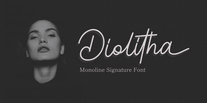 Diolitha is monoline signature font with ending swash. Fall in love with its incredibly versatile style and use it to create spectacular designs! Diolitha is perfect for branding, logo, invitation, stationery, social media post, product packaging, merchandise, blog design, game titles, cute style design, Book/Cover Title and more. What's Included : - Ending Swash - Ligatures - Multilingual Support
 - Fd Vienna by Fortunes Co,
$9.00 Vienna is Modern Serif is a font style that blends traditional and modern design elements to create a distinct, stylish look. This typeface is characterized by serifs, or small lines added to the end of a stroke, that give it a classic and sophisticated feel. The font is often used in high-end fashion magazines and advertisements to evoke a sense of luxury and elegance. Fashion serif typeface is versatile and can be used for various purposes, from headings and titles to body text. Overall, this typeface is a perfect choice for designers looking to create a high-end, fashionable aesthetic.
 - Fansthome by Qaratype,
$18.00 Fansthome is a modern Calligraphy font with magical Signature effect. it is perfect for creating signature logos and watermarks for photography studio or wedding invitation, best for initial or branding logo signature . Fansthome includes full set of beautiful hand lettered uppercase and lowercase letters, numerals, a large range of punctuation and ligatures. All lowercase letters include beginning and ending swashes, giving realistic hand-lettered style. lowercase beginning swashes: (-a) lowercase connecting & ending heart swashes: (b&a) or (a&) lowercase ending swashes: (k-) Main Features: Uppercase & Lowercase letters Punctuation and special characters Multilingual support Ligatures & Alternate glyphs
 - Barrington by Letteralle,
$18.00 Say hello to Barrington! A font with relaxed style and carries the impression of luxury. Barrington comes with 64 ligatures to give a natural impression, Uppercase Alternates to give different styles, and also ending swash. To access ending swash you only need to add the number "1" at the and of the word. for example if you want to write "Barrington" with the swash ending, you just have to write "Barrington1", and that's it. Very simple. Barrington is perfect for branding & logo projects, also suitable for Product Packaging, Titles on articles or book covers, Stationary, and much more. Thank You!
 - H.I.B. Cell - Unknown license

- Diablito One by RodrigoTypo,
$25.00 is an entertaining font with pointed endings, contains inline and many dingbats, besides having a free version!
 - Crazymond by Tour De Force,
$25.00 Catchy, clumsy and charming – that’s Crazymond. Contains 38 ligatures, 12 ending characters and collection of 42 dingbats.
 - Boule Plus by Ingo,
$33.00 CAPITALIZED, geometric, bold and round. If the typographer sees a font like that, it's enough to make his toes curl. But sometimes it just has to be that way. Geometrically constructed fonts do not necessarily have to be pointed and angular; It also works consistently around. And if I say it consistently, then in this case, that's done consistently. The basis for the BOULE is the circle. The letters are drawn with constant line width, the “corners“ and endings all have the same radius, the lines are all the same thickness. The BOULE consists only of capitals. There is only one difference in the use of uppercase and lowercase letters: in the uppercase letters, the round letters are circular, while the lowercase letters are narrow. The character set of the Boule contains all letters and accents to support the Western, Northern, Central and Eastern European languages with Latin alphabet. The BOULE is not only very fat, it also runs very tight; that is, the glyphs are very close to each other. To avoid "holes" due to unfortunate letter combinations, the BOULE contains ligatures for FT, ST, TT and TZ. There are also other versions of the font: BOULE Brillant on the one hand. In this version, simple highlights simulate a light incidence from the top right. These light edges give the font a decorative effect that makes it easy to think of wet sausages or balloons in some shapes. And finally the BOULE Contour. As the name implies, it is the outer contour of the letters, combined with a shadow at the bottom left. The name BOULE (French for ball) says it already: this font is globated. Therefore, it is also very suitable for all three-dimensional alienation effects. With simple light and shadow you can achieve a very convincing 3D effect with little effort.
 - Gambler by Fenotype,
$25.00 Gambler is a characteristic display type collection of 7 font styles with both clean and textured -making it total 14 fonts designed to play together. Gambler strikes with witty and elegant appeal combining vintage and modern elements. Gambler is an effective set for creating identities for branding, posters, book covers, headlines, logotypes, prints on garments, restaurant menus, beer labels and so on, both offline and online. Gambler Script is a smooth contrasted script that comes in two weights and it is packed with plenty of OpenType features: Standard Ligatures and Contextual Alternates are automatically on and they help to keep the flow and connections smooth. From Stylistic Alternates you’ll find characters with pointed endings and some other small variations. For extra flair try Swash or Titling Alternates. Gambler Script is PUA encoded so you can access the extra characters in most graphic design softwares. Gambler Brush is a soft brush script with low contrast and large x-height. Gambler Brush comes with following OpenType features: Standard Ligatures and Contextual Alternates that are automatically on and that keep the connections smooth. For less uneven word picture try Stylistic or Swash Alternates. Gambler Brush is PUA encoded so you can access the extra characters in most graphic design softwares. Gambler Flare is a flared serif with sharp edges and wide characters Gambler Flare comes in two weights. Gambler Gothic is a rigid condensed sans serif that comes in two styles: Regular and Shadow. Gambler Gothic Shadow has a narrow lining giving a three dimensional expression to the font. Gambler fonts are designed to play together, in pairs, or all together but they also work great as themselves or combined with other Fenotype Fonts.
 - Ed's Market by Laura Worthington,
$29.00 It’s like hiring your own professional sign painter with a solid repertoire of styles; each one is distinctive, yet clearly by the same hand. No variants were created on the computer – each weight and version was individually hand-lettered. Ed’s Market lets you evoke the warm, inviting vibe of classic 20th-century grocery posters and showcard lettering right from your type menu. Smart programming ensures that digital perfection doesn't trump human charm: each display face features three variations of each letter, to ensure a natural hand-painted look when characters repeat. Ed’s Market includes three script styles, each with more than 100 alternate characters and swash forms. Seven display faces feature three variations of each letter, to ensure a natural hand-painted look when characters repeat. Design Elements offer expandable arrows, rules and ribbons; along with badges, swashes, scribbles, clouds and snipes. See what’s included! http://bit.ly/1Mzurs3 *NOTE* Basic versions DO NOT include swashes, alternates or ornaments These fonts have been specially coded for access of all the swashes, alternates and ornaments without the need for professional design software! Info and instructions here: http://lauraworthingtontype.com/faqs/
 - Refresh by Scholtz Fonts,
$12.00 Refresh was inspired and partly based on handwritten text from advertisements for a popular cola-based soft drink from the 1950s. I designed the missing characters in the handwriting style of the original. The Refresh family comes in three styles: - Lite- possibly the most elegant of the three styles -- use at larger sizes for greater legibility; - Med -of intermediate weight - more legible than Lite; - Blak - for bolder statements and best readabilty. Refresh, with its three styles, is ideal for any display work needing a feminine, handwritten effect. Use it for product branding, book covers, invitations, greeting cards where you're looking for charm and movement. Refresh has not been designed to be used with capital letters placed next to one another: it is not advisable to use text in "ALL CAPS". The best effects for headings and subheads are obtained with an initial upper case letter followed by lower case characters. If you are using upper and lower case then it is not necessary to use kerning. Refresh contains over 250 characters - (upper and lower case characters, punctuation, numerals, symbols and accented characters are present). It has all the accented characters used in the major European languages.
 - Starx by Koray Özbey,
$11.00 Starx is a variable display typeface with angular lines, offering a futuristic and dynamic aesthetic. It consists of three axes: angular, rounded, and slanted. The bold version embodies a strong and high-tech expression, while the italic and rounded versions convey a dynamic, sporty, and futuristic impact.
 - Quality Capcay Black Light by Sulthan Studio,
$6.00 Quality Capcay Black is a handwritten that comes with three fonts. This font is fresh and cute and it will be fun for you when use it. File include - Quality Capcay Black(line). otf/ttf - Quality Capcay Black(light). otf/ttf - Quality Capcay Black. otf/ttf
 - Quijibo by Matt Frost,
$20.00 Hand-made slab serif. It’s cute, it’s versatile. It has a decorated version called Quijiboquail and a non-decorated version just called Quijibo. Each comes in three weights, plus italic. Each has 3,000+ kerning pairs. Go to http://facebook.com/frostfoundry to share this and see more!
 - Digdope by Holis.Mjd,
$10.00 Digdope is a fun and natural font like a handwritten sans font, so you will get a more realistic feel. Digdope is a layered font available in three styles, REGULAR/NORMAL, OUTLINE &, SHADOW. Perfect for branding, logos, posters, quotes, headlines, movie titles, book titles, and other designs.
 - Tape Back by Adam Ladd,
$5.00 The Tape Back family comes in three weights. Each are monoline in weight and have a modern yet slightly quirky appearance. It is informal but has some stability with its linear forms. The slant backwards makes it unique, and it displays well even for body text.
 - Scaramouche by Fenotype,
$25.00 Scaramouche is a decorative and playful connected script. Scaramouche family has three weights and matching ornament sets. For the best price, purchase the whole family. Scaramouche has plenty of alternate characters; click on Swash, Contextual or Stylistic alternates in any OpenType savvy program for decorative alternates.
 - Shocker by Vozzy,
$10.00 Introducing original label font named Shocker. This font has a multilungual characters support (check out all available characters on previews). The font family has three styles: Regular, Rough and Lightning. This font will look good on any designs like a poster, T-shirt, label, logo, etc.
 - King Slayer by OzType.,
$7.50 King Slayer is a strong versatile serif font, the design details have been fine tuned to offer excellent readability on any screen size. King Slayer comes in three weights from regular to bold, with matching true italics, for a full range of editorial and advertising uses.
 - Panther Black by Device,
$39.00 Developed from Rian Hughes’ Black Panther logo for Marvel, Panther Black is a sharp and stylish three-weight headline sans. Built from sweeping curves and tapered crossbars, its bold, dynamic design is seen to best effect in shorter settings. Available in condensed, normal and extended variants.
 - Craggy by Ingrimayne Type,
$7.95 Craggy has a narrow, spidery, irregular set of letters. Its creepy, Halloween spirit makes it ideal for scary stories and similar uses. The family has three base styles: condensed, regular, and bold. Each comes with an oblique and backslanted version yielding a complete family of nine members.
 - Poppy JT by JAM Type Design,
$15.00 Poppy JT is a brush script typeface that contains three exciting weights which simulate the shapes created by a brush pen. Boasting over 800 glyphs, with its multiple ligature sets and alternatives, this is a wonderful typeface to use in packaging, magazines and on promotional messages!
 - Zimric by Ingrimayne Type,
$5.00 Zimric is a family with 28 styles. It has the look of neat hand printing. It is monoline and sans-serif, friendly and legible. The Zimric family has three widths, each width has four or five weights, and each weight comes in both upright and italic styles.
 - MuX1ne by Machine Cult,
$14.00 A geometric-ish font family that's a bit off-kilter, offering three families: Regular, Rounded and Hatch as well as the bonus Noise, catchwords and dingbats for some occasions. Each font comes in Light, Regular and Bold styles. Complete latin character set with a range of ligatures.
 - Shabon Dama by Abdulrhman Saeed,
$19.99 Shabon Dama is a cheerful fun Arabic typeface, it bridges the gap between formal and fun, thus keeping it readable. It fits well with video games rated for everyone, kids comics and books, and cheerful marketing. Featuring three weights: Light, Regular, and Bold. ARABIC CHARACTERS ONLY.
 - FS Brabo Paneuropean by Fontsmith,
$90.00Worldly Even though it’s a new arrival, FS Brabo has seen the world. Designed by a Brazilian working in London and studying in Belgium under a Dutchman, it’s certainly well-travelled. And it was inspired by the extraordinary archive of early book typefaces at the world-renowned Plantin-Moretus Museum in Antwerp, while Fernando Mello was attending Frank Blokland’s Expert class Type Design course at the Plantin Institute of Typography. It was there that Fernando became engrossed in the collection of early metal type, matrices, punches and type samples by figures such as Garamond and Granjon. So much so that he took on the mighty task of developing ‘a beautiful, functional, serifed text font’ of his own. Heroic FS Brabo’s journey from sketch to font family took an epic three years, starting in Antwerp, continuing at Fontsmith in London, and reaching its conclusion back in Fernando’s home city of São Paulo. No wonder Fernando was reminded of another titanic face-off: that of Antwerp’s Roman hero of legend, Silvius Brabo, and the evil ogre, Antigoon. Brabo came to the town’s rescue after the tyrannical giant had been charging ships’ captains extortionate taxes and chopping off the hands of those who refused to pay up. Having finally downed Antigoon after a long and terrible duel, Brabo cut off the giant’s own hand and threw it into the river Scheldt, unwittingly giving the town its name: the Dutch for ‘hand-throw’ is hand werpen. What better way for Fernando to name his literary typeface than after the hero of Antwerp’s oldest tale? The garalde factor FS Brabo is not a revival, but a very much a contemporary, personal interpretation of a garalde – a class of typeface originating in the 16th century that includes Bembo, Garamond and Plantin, with characteristically rounded serifs and moderate contrast between strokes. Brabo’s ‘ct’ and ‘st’ ligatures, upper-case italic swashes and contextual ending ligatures – ‘as’, ‘is’, ‘us’ – all preserve the beauty and character of traditional typefaces, but its serifs are chunkier than a garalde. Their sharp cuts and squared edges give them a crispness at text sizes, helping to bring a beautifully bookish personality to hardworking modern applications. A workhorse with pedigree It may give the appearance of a simple, four-weight typeface, but FS Brabo has hidden depths beneath its simplicity and beauty. OpenType features such as cap italic swashes, contextual ending swashes – programmed only to appear at the end of words – and stylistic alternatives make this a complete and well-equipped typeface. Comprehensive testing was carried out at text and display sizes, too, to prevent counters from filling in. All of which makes FS Brabo a very modern take on a traditional workhorse serif typeface: colourful and versatile enough to adorn not just editorial projects but also signage, advertising and logotypes. - FS Brabo by Fontsmith,
$80.00 Worldly Even though it’s a new arrival, FS Brabo has seen the world. Designed by a Brazilian working in London and studying in Belgium under a Dutchman, it’s certainly well-travelled. And it was inspired by the extraordinary archive of early book typefaces at the world-renowned Plantin-Moretus Museum in Antwerp, while Fernando Mello was attending Frank Blokland’s Expert class Type Design course at the Plantin Institute of Typography. It was there that Fernando became engrossed in the collection of early metal type, matrices, punches and type samples by figures such as Garamond and Granjon. So much so that he took on the mighty task of developing ‘a beautiful, functional, serifed text font’ of his own. Heroic FS Brabo’s journey from sketch to font family took an epic three years, starting in Antwerp, continuing at Fontsmith in London, and reaching its conclusion back in Fernando’s home city of São Paulo. No wonder Fernando was reminded of another titanic face-off: that of Antwerp’s Roman hero of legend, Silvius Brabo, and the evil ogre, Antigoon. Brabo came to the town’s rescue after the tyrannical giant had been charging ships’ captains extortionate taxes and chopping off the hands of those who refused to pay up. Having finally downed Antigoon after a long and terrible duel, Brabo cut off the giant’s own hand and threw it into the river Scheldt, unwittingly giving the town its name: the Dutch for ‘hand-throw’ is hand werpen. What better way for Fernando to name his literary typeface than after the hero of Antwerp’s oldest tale? The garalde factor FS Brabo is not a revival, but a very much a contemporary, personal interpretation of a garalde – a class of typeface originating in the 16th century that includes Bembo, Garamond and Plantin, with characteristically rounded serifs and moderate contrast between strokes. Brabo’s ‘ct’ and ‘st’ ligatures, upper-case italic swashes and contextual ending ligatures – ‘as’, ‘is’, ‘us’ – all preserve the beauty and character of traditional typefaces, but its serifs are chunkier than a garalde. Their sharp cuts and squared edges give them a crispness at text sizes, helping to bring a beautifully bookish personality to hardworking modern applications. A workhorse with pedigree It may give the appearance of a simple, four-weight typeface, but FS Brabo has hidden depths beneath its simplicity and beauty. OpenType features such as cap italic swashes, contextual ending swashes – programmed only to appear at the end of words – and stylistic alternatives make this a complete and well-equipped typeface. Comprehensive testing was carried out at text and display sizes, too, to prevent counters from filling in. All of which makes FS Brabo a very modern take on a traditional workhorse serif typeface: colourful and versatile enough to adorn not just editorial projects but also signage, advertising and logotypes.
 - Spiral Ornaments by Gerald Gallo,
$20.00 Spiral Ornaments are of varying complexity with positive and negative variations. There are a total of 48 ornaments.
 - GothBlocks by Dingbatcave,
$10.00Great for making all sorts of tiling backgrounds, borders and edging, the numbers of different possibilities are limitless.
