7,441 search results
(0.027 seconds)
- Prillwitz Pro by preussTYPE,
$49.00 Johann Carl Ludwig Prillwitz, the German punch cutter and type founder, cut the first classic Didot letters even earlier than Walbaum. The earliest proof of so-called Prillwitz letters is dated 12 April 1790. Inspired by the big discoveries of archaeology and through the translations of classical authors, the bourgeoisie was enthused about the Greek and Roman ideal of aesthetics. The enthusiasm for the Greek and Roman experienced a revival and was also shared by Goethe and contemporaries. »Seeking the country of Greece with one’s soul«. All Literates who are considered nowadays as German Classics of that time kept coming back to the Greek topics, thinking of Schiller and Wieland. The works of Wieland were published in Leipzig by Göschen. Göschen used typefaces which had been produced by until then unknown punch cutter. This punch cutter from Jena created with these typefaces master works of classicist German typography. They can stand without any exaggeration on the same level as that of Didot and Bodoni. This unknown gentleman was known as Johann Carl Ludwig Prillwitz. Prillwitz published his typefaces on 12th April 1790 for the first time. This date is significant because this happened ten years before Walbaum. Prillwitz was an owner of a very successful foundry. When the last of his 7 children died shortly before reaching adulthood his hope of his works was destroyed, Prillwitz lost his will to live. He died six months later. His wife followed him shortly after. The typeface Prillwitz as a digital font was created in three optical styles (Normal, Book and Display). The typeface Prillwitz Press was created especially for a printing in small sizes for newspapers. »Prillwitz Press« combines aesthetic and functional attributes which make written text highly readable. It was originally designed for a newspaper with medium contrast to withstand harsh printing conditions. Its structure is quite narrow which makes this typeface ideal for body text and headlines where space is at premium. For the Normal – even more for the Book – a soft and reader-friendly outline was created through a so-called »Schmitz« and optimized in numerous test prints. The arris character and the common maximal stroke width contrast of the known classicist typefaces (Didot/Bodoni) were edited by the study of the original prints. This was also done in order to reach a very good readability in small type sizes. This typeface is perfectly suited to scientific and belletristic works. Accordingly it has three styles: Regular, Bold and Italic as Highlighting (1). The typeface Prillwitz is a complete new interpretation and continuing development of the conservated originals from 1790. They have been kept in the German Library in Leipzig. It was always given the priority to keep the strong roughness and at the same time optimizing the readability of this striking font. The type family has all important characters for an efficient and typographic high quality work. ----------- (1) Accentuation of particular words or word orders (e.g. proper names, terms etc.). Typographic means for Highlighting could be Italic, SmallCaps or semi-bold.
 - Technical Signature by MMC-TypEngine,
$42.00 ‘Technical Signature’ 2015-2021. A Pixel labyrinthine Display Type System! Plus, Digital “Layer Game”, Futuristic & Sci-Fi Optical Texting for interfaces evolution Landmarks! Now with 3D Styles! 18 Styles total! Revised, Verified & Updated New Edition ! It was inspired also by antique juxtaposed zig-zag Greek mosaics ornaments “ancient times computer” which defined it into a Small Caps Font, while another pair font with same metrics was made to reminisce the manuscript look as a “sister” and Cursive symbiont. Searching for a technical language and perpetration, resulted in many combined styles by matching the primary ones so there’s plenty variations for multi-purpose texting like layered typesetting or simply monochromatic designs… Plus got accurate streaming resolution, therefore some sub-families like Stamp and Texture implicates greater points for minimum size as Regular and Light is appropriated to Small Optical Text reductions. *The New 3’s Upgraded Edition Improvements consisted of Correct ‘Font Info’ (verified data-debugging) rescaled glyphs, quick design review, better correspondent renamed fonts & style linking, addition of responsive OT features encoding and 3D Styles. Multilanguage Support: Western & Eastern European, Baltic, Turkish, Greek, and Cyrillic. This Type is ideal to Technician Designs, things like Footer Signage, Engineering & Crafts Logos, Op-Art Posters, Stamps, Labels, Printed & Digital Certificates, Plus Movies interfaces, Internet Headings and Text and of course Video Games!
 - VLNL Gindicate by VetteLetters,
$30.00 The alcoholic beverage Gin is drunk around the world, as far back as the 13th century. Originally distilled as a medicine, it draws its main flavour from juniper berries. Gin is colourless itself but – due to its smooth taste – a major ingredient in a long list of famous colourful cocktails. Gimlet, Singapore Sling, Negroni, Charlie Chaplin, French 75, Vesper, Tom Collins, White Lady, Aviation, Monkey Gland, Southside, Gin Gin Mule and New Orleans Fizz are but a few of them. That made us decide it simply cannot be missing from the Vette Letters font collection. Vette Letters designer Henning Brehm originally designed VLNL Gindicate for the 2015 action movie Hitman: Agent 47. It was specifically used for the logo and signage of the maverick ‘Syndicate International’ organisation in the film. It lay dormant in a folder for a while, when it was reworked into this flashy 5 weight family. VLNL Gindicate is a rounded modern sans serif family, suitable for a multitide of applications, corporate or otherwise. It has somewhat of a warm sci-fy feel, without being overtly techno-ish. In the family are 3 regular weights (Light - Regular - Bold), but also an Inline and Multiline weight for extra design possibilities. Company logos, brand identities, music flyers or posters, you name it. VLNL Gindicate will spice up any design. Bottom’s up!
 - Lady Dodo by Sudtipos,
$49.00 And the day in which I introduce my second typographic family has arrived. In order to do this, I borrowed several passages from this beautiful book by Maurice Maeterlinck, “Life and Flowers”. His poetic observation of Nature made me reflect about the small discoveries behind the flow of my pen on paper. About that quick, spontaneous, overwhelmed stroke, with some awkwardness as well as certainty in it. About the writing that looms line after line. About the mischievous stains of ink flooding my writing tool. Lady Dodó was born as a product of these drawings, pieces of writing and reflections. Following the steps of its ancestor and friend, Lady René, it takes advantage of the goodness of the Open Type technology to propose a systematized as well as a personalized writing font. Both friendly and challenging. Due to the large number of alternate characters (both for lower and upper case as well as for numbers) and to its precise programming, it proposes to design diverse and rich typographical sets with multiple strokes in a simple way. However, Lady Dodó is not just made of typographical signs; it also proposes a set of modules to make patterns and another one to design frames. From the combination of these modular signs, an infinite universe of possibilities for decoration arises. Here is Lady Dodó, ready to get started and write its destiny. July 2015.
 - Damask Dings1 - Personal use only

- Linotype BlackWhite by Linotype,
$29.99BlackWhite is a titling typeface created by Ferdinay Duman in 1989 styled after the designs of the late 1980s. Like the name says, the figures emphasizes the play between dark and light. To this end, most inner spaces have been deleted. The constructed outlines of the robust figures draw the attention. In some weights, Duman split the figures horizontally, giving them a unique look. The technical and mechanical BlackWhite is perfect for generous headlines on fliers or in trendy magazines. - Lina Serif by Caroline Herr,
$18.00 Lina Serif is an antiqua balanced between classic and modern. The design focused on the combination of flowing shapes and partially edged transitions, that give Lina her character. The font plays with a high line contrast in combination with dynamic shapes. This makes Lina a casually elegant display font. The terminals remind on floral shapes. Lina gives your design a human, natural touch. Lina Serif is available in 4 weights or as variable font with infinitely variable interpolation of weight.
 - Jean Paul Fraktur by RMU,
$25.00A typographic treasure, originated at the end of the 18th and the beginning of the 19th century, had been brought back to life. With its charming touch it makes a wonderful font for poems, bookcovers, reprints and other historically relevant projects. To get access to all ligatures, it is recommended to activate both Standard and Discretionary Ligatures; the round s you find on the # key, and typing the combination N-o-period and activating the OT feature Ordinals gets you the numero sign. - Amberday by Richarts,
$4.99 Amberday is a modern display serif typeface to be used more than just as a header font. When I was creating this typeface my first though was to create a light font but strong enough to stand as a header font. Amberday is a perfect typeface to use for logo design, webdesign, header design, typedesign, posters and many more. Amberday family includes eight weight starting with Thin and ending with a Heavy style. Each style includes kerning, ligatures and alternates.
 - Dry Brush Serif by Kaer,
$28.00 I'm happy to present you my new classic style font. It's a vintage serif font with my brush touches. I used dry strokes with rough edges decoration elements. Perfect if you want to add slight retro style to your project. I designed it for fashion labels, classic headlines, glamour posters, luxury identity, wedding invitations. You will get: * Uppercase glyphs * Numbers and symbols * Multilingual support * Free future updates Please feel free to request to add characters you need: kaer.pro@gmail.com Thank you!
 - Half Blvd by Maulana Creative,
$15.00 Half Blvd is an industrial genre display sans serif font. With bold soft round edge stroke, fun character with a bit of ligatures. To give you an extra creative work. Half Blvd font support multilingual more than 100+ language. This font is good for logo design, Social media, Movie Titles, Books Titles, a short text even a long text letter and good for your secondary text font with sans or serif. Make a stunning work with Half Blvd font. Cheers, Maulana Creative
 - Kahlo Rounded by Latinotype,
$25.00 Kahlo Rounded is a new version that plays hipster style with a Latin flavor. It was inspired by the strong influence of Mexican decorative elements as you can see in the set of ornaments and patterns. Kahlo Rounded has four weights and italics, initial capital letters, some alternate characters and ending. It works well for magazine headlines, posters, logos, cosmetics packaging, advertising etc. Salud! Languages include: Basic Latin, Western European, Euro, Catalan, Baltic, Turkish, Central European, Romanian and Pan Africa Latin.
 - Margit by Schriftlabor,
$44.00 Margit is a condensed display typeface that includes Latin and Cyrillic scripts, supporting over 200 languages. Margit's letterforms have a contemporary style with pointy edges and friendly curves inspired by old wood-type specimens. Its bold and unapologetic design will be great to use in poster design, giving the content a stronger voice. This font family can bring a unique look to your packaging projects and modern branding solutions. Explore the extensive range of styles and weights that make this typeface ultra-versatile.
 - ITC Belter by ITC,
$29.99ITC Belter was designed by Andreu Balius in 1996. Out of a purposely limited form repertoire Balius created a constructed typeface with a cool and technical character. A distinguishing characteristic of this font is the cross at the ends of many strokes. The figures seem to be products of mass production, which heightens the mechanical feel of the font. Belter is meant for point sizes of 10 and larger in headlines and shorter texts and must be set with generous spacing. - ITC Tapioca by ITC,
$40.99ITC Tapioca was designed by Eric Stevens. He developed the typeface for a nightclub, yet its simple forms are reminiscent of childhood writing exercises. This effect is enhanced by rough edges, which in large sizes make the characters look as though they were composed of strings of dots...or tapioca. The basic style is printed handwriting, although some forms take cursive handwritten forms. The varying slants and irregular forms of the characters give ITC Tapioca a sense of energy and playfulness. - Crimstone by Locomotype,
$14.00 Crimstone is a bold and strong geometric typeface. Rectangular shape with rigid and sharp edges is the first impression that makes this font look powerful and hit. Its continued development created other variations including rounded styles, inline and handmade styles. Not only the clean version, Crimstone is also available in a printed version with a rough and textured appearance. Each has an upright and slanted version. Available in 16 fonts, the Crimstone family is perfect for poster designs, movie titles, logotypes, packaging etc.
 - Alifut MF by Masterfont,
$59.00 A practical font family with 4 weights for all your day to day design needs: headlines, body text, signage etc. High legibility at small sizes. An extended sans serif typeface with rounded endings that provides a unique softness appearance without losing legibility. The Pro version is an excellent support for Niqqud (Vowels). All marks are programmed to fit each glyph's shape and width. Best used with apps that support right to left Hebrew text, like Adobe InDesign CC or MS Word.
 - Linotype Bariton by Linotype,
$29.00Linotype Bariton is part of the Take Type Library, chosen from contestants of Linotype’s International Digital Type Design Contests of 1994 and 1997. Designer Alexej Chekoulaev designed his font in one weight to mirror the Zeitgeist of the early 1930s. The characters of this extremely bold font are based on the form of a rectangle though its rounded edges soften its look a bit. Linotype Bariton should be used only in larger point sizes in headlines which should really catch the eye. - Wood Fancy Reverse JNL by Jeff Levine,
$29.00 Amongst some pages scanned and posted online of old wood type alphabets comes this lovely, ornamental design in a reversed style of white lettering on black rectangular boxes. This classic set of wood type is now available digitally as Wood Fancy Reverse JNL. There is a narrow blank box on the “less than” key for use as an end cap, and a wider blank box on the “greater than” key to use between words as a blank space if so desired.
 - The Bolder Shadow by Sipanji21,
$15.00 The Bolder Shadows is an urban graffiti font characterized by sharp edges and a bold look. Ideal for music posters, apparel designs, shirts, and streetwear, this font brings a touch of edginess to your projects. The unique style of "The Bolder Shadows" makes it the perfect choice for street style or urban graffiti themes. Whether you want to create a strong and powerful statement or simply add a touch of attitude to your designs, "The Bolder Shadows" is the font for you.
 - Barking Frenzy by PizzaDude.dk,
$18.00 Barking Frenzy may look as if it was cut out of paper or cardboard, but it's not! It was drawn with a rugged pen, leaving rough edges here and there. It's great for children's books and toys or maybe handcraft or other handcrafted activities. I've added 5 different versions of each lowercase letter and these appear randomly as you type. That way your text looks really natural and organic, because the letters rarely repeat themselves. Also the font has multilingual support!
 - Fidusmager by PizzaDude.dk,
$17.00 This is definitely a font suitable for kids toys. The letters are legible, and at the same time totally wacky! Kinda like what a kids toy should be! Fidusmager started out as a handdrawn, slightly rugged looking fon. However I ended up manually tracing each letter in order to have those smooth lines. By the way, Fidusmager is danish and actually means someone who’ll trick you - but as a kid I didn’t know that, and found that it most likely was something positive! :)
 - Alphabet Soup Pro by Red Rooster Collection,
$60.00 Steve Jackaman. In the early 1980's, Steve worked at Typographic House in Boston, Massachusetts. At the time, 'Typo' House, as it was affectionately known, was the largest type house in New England. This font was designed and produced during his tenure. The design was so popular that it became available commercially through VGC, and was known as TH Alphabet Soup. Completely redrawn and remastered, Alphabet Soup Pro contains all the high-end features expected in a quality OpenType Pro font.
 - Meranie by Garisman Studio,
$20.00 Meranie is made a naturally modern script with the ending swashes and more than ligatures. With the unique Opentype in it and the ligature will add aesthetic value to your design product. Available in this file are Meranie Swash which you can unite into an amazing design. - Simple installation - Ligatures & OpenType included - Swashes - Work for Windows or MAC - PUA Encoded Open - Versatile for poster, logotype, labels, book cover - Supported for: Adobe Illustrator, Photoshop, Shillouette, Corel Draw, Indesign, and Procreate (updated)Signature
 - Kefago by Grontype,
$15.00 Kefago is an elegant and stylish serif typeface. It's sharp and light edges, that creates beautiful typographic adjacency. The font is perfect for text quotes and other design graphic projects such as wedding invitation card, Magazine Header and body text, flyer header and even logo text. Kefago features: Uppercase and lowercase glyph Numeral and punctuation Multilingual support Ligatures and alternates Thankyou for picking this font. if you have question, send me a message and i'am gladly to answer. regard, Grontype
 - Dom by ParaType,
$30.00 Dom was designed by Peter Dombrezian for American Type Founders in 1951–52. It is an informal unjoined script typeface that looks brushwritten. Its letters are almost monotone, freely or casually drawn. Vertical strokes of them have irregular ending at different heights, and oval axis have slightly different slopes. This typeface is to create a friendly, informal look in signs, advertising, and invitations. The Cyrillic version of the Bitstream digital font was developed by Dmitry Kirsanov for ParaType in 2008.
 - Revisthond by Namara Creative Studio,
$18.00 Introducing Revisthond Script : An authentic monoline hand-drawn script font, perfect for branding, wedding invites, cards, and/or any other suitable projects. Includes full set of gorgeous uppercase and lowercase letters, numerals, a large range of punctuation, alternates, and ligatures. All lowercase letters include beginning and ending swashes, giving realistic hand-lettered style. In order to use the beautiful swashes, you need a program that supports OpenType features such as Adobe Illustrator CS, Adobe Photoshop CC, Adobe Indesign and Corel Draw.
 - Youngblood by insigne,
$24.99 Youngblood is a non-connected formal script with tall, sweeping ascenders and two alternates. These alternate forms can be mixed and matched for a custom look, and Youngblood is stronger in weight and is better suited for display work than most script fonts. Although Youngblood looks back to traditional copperplate scripts for inspiration, there is a new and exciting spirit to the design. Youngblood includes OpenType ending swashes, ornaments, ligatures, discretionary ligatures for most common ascender pairs and old style figures.
 - Abocat by Grontype,
$14.00 Abocat is an authentic vintage san serif font. It comes with unique shapes bold to thin and rounded edges that will give remarkable touch. The font equipped with more ligature and alternates which is perfect use for Branding, Logo Design, Lettering, Logotype, Clothing, Poster, magazine, packaging, posters, shopping bags, t-shirts, book covers, photography, special events and other design project. Abocat Features: Uppercase glyphs Numeral and Punctuations Currencies Standard Ligatures Stylistic Alternates Thankyou for choosing this font, Enjoy Regard, Grontype
 - Braderia by Aldedesign,
$25.00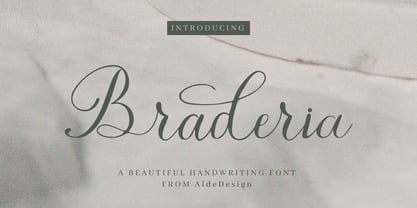 Braderia // Modern Calligraphy is a stylish script font that features a varying baseline, smooth line, modern, and depth of love. For those of you who need a touch of love and modernity for your designs or branding, it can be used for various purposes such as headings, weddings, invitations, signatures, logos, branding, t-shirt, letterhead, signage, labels, news, posters, badges, etc. Each Font Has: Stylish modern handwritten script Beautiful Swash (Ending tail) Beautiful Titling (Beginning tail) Special Ligatures Multilingual Support
 - Shaky Halloween by Putracetol,
$28.00 Shaky Halloween is a horror display font. This font is inspired by movie titles and some horror logos. The impression of horror is highly emphasized, but the alternate character of this font that curves at the beginning and end of the letter makes this font very suitable to be used as a logo and poster. Shaky Halloween would be perfect for Logo, title, logotype, cover, headline, apparel, comic, cover books, cards, posters, or anything that requires a horrror or halloween!
 - HWT Bernice by Hamilton Wood Type Collection,
$24.95 HWT Bernice is an ornament font system designed by Marian Bantjes. The basic shapes were designed by Bantjes for the Hamilton Wood Type Museum's border stamping machine as a contemporary application for this 150 year old machine, which punches shapes into end grain wood to form continuous border patterns. The digital version expands a bit beyond the punch machine and allows designers to assemble a multitude of options using flipped and rotated variations of these 6 basic shape sets using simple keystrokes.
 - Hardcore Hipsta by Arterfak Project,
$18.00 Hardcore Hipsta is a vintage display font. Comes in regular and rough styles which are perfect for your next project. It's strong, bold, tough, and has confident looks. Designed with block-based, curveless, and sharp edges that give a brave approach. A great choice to apply to many purposes such as sports, posters, jerseys, labels, storefronts, coffee, sticker, logos, badges, headlines, and many more! Hardcore Hipsta is an all-caps font that consists of uppercase, extra alternate characters, and multilingual support.
 - Matura by Monotype,
$29.99 Matura font was designed by the Hungarian wood engraver and type designer Imre Reiner in 1938 and released by the Monotype Corporation. Matura font is a bold upright script that looks as if it were written with a broad-edged pen. A set of vibrant near-flourished capitals, called scriptorial capitals, broadens the usual range of script faces. Matura's distinctive lines make it appropriate for advertising uses as well as text headings, and for informal work like cards, invitations, and announcements.
 - Kalisha script by Akrtype Studio,
$19.00 Kalisha Script was built 570+ glyphs, with OpenType features and includes many beginning and ending swashes, numbers, punctuation, and it also supports other languages. You can toggle between both the regular and swashes font to get a handwritten, professional look. To enable the OpenType Stylistic alternates, you need a program that supports OpenType features such as Adobe Illustrator CC, Adobe Indesign & CorelDraw , Microsoft Word 2010 or later versions. Don't hesitate to drop me a message if you have any issues or queries
 - Escrow RE by Font Bureau,
$40.00 The Wall Street Journal commissioned the original version of Escrow. Cyrus Highsmith designed forty-four styles in this new Scotch series, which sets the tone of the front page of the Journal, envy of the newspaper industry. This version of the family is part of the Reading Edge series of fonts specifically designed for small text onscreen, having been adjusted to provide more generous proportions and roomier spacing, and having been hinted in TrueType for optimal rendering in low resolution environments.
 - Sholaria by Subqi Studio,
$29.99 Sholaria designed to be a clean and luxurious display script font. Inspired by vintage copperplate style. Carefully made for the best 'flow' result. Came with seamless connection each others . Ton of 'necessary' swash alternates to playing with, around 400 glyphs total. This font will suitable for your any project. Branding, quotes, headlines, romantic letters and many more. Little note, you could access the end swash by check the number 1 and 2 alternate or just find it via glyph table.
 - Manor Smiths by Maulana Creative,
$14.00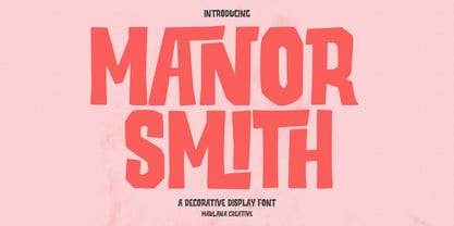 Manor Smiths is a decorative display font. With bold sharp edges stroke, fun character with a bit of ligatures and alternates. To give you an extra creative work. Manor Smiths font support multilingual more than 100+ language. This font is good for logo design, Social media, Movie Titles, Books Titles, a short text even a long text letter and good for your secondary text font with sans or serif. Make a stunning work with Manor Smiths display font. Cheers, Maulana Creative
 - Bagefi by Maulana Creative,
$22.00 Bagefi is a modern sans serif display font. With semi rectangle shape edge and bold stroke, fun character with a bit of ligatures. To give you an extra creative work. Bagefi font support multilingual more than 100+ language. This font is good for logo design, Social media, Movie Titles, Books Titles, a short text even a long text letter and good for your secondary text font with script or serif. Make a stunning work with Bagefi font. Cheers, Maulana Creative
 - Brick Lane by kapitza,
$99.00 Brick Lane is an picture font consisting of 52 detailed, hand drawn illustrations of people seen on Brick Lane, a street in the heart of the Bangladeshi community in the East End of London. It has over the last few years become the home of parts of the creative industries in London, mainly media, fashion and graphics. All illustrations are based on photographs taken on location over a period of time. The photographs are then hand traced to create high quality, detailed silhouettes.
