10,000 search results
(0.022 seconds)
- Heller Sans JNL by Jeff Levine,
$29.00 Heller Sans JNL is based on the main letterforms of an experimental alphabet designed by Steven Heller; noted author of over 170 books on design and visual culture. Some modifications were made in turning his design into a digital font. In his own words, here is the background to this typeface: “I recently recovered this from the junk heap. It is a yellowing photostat of my first and only typeface design (1969-70). Total folly! At the time I was smitten by Art Moderne lettering. I called it “Klaus Boobala Bold” because I liked the K and B. I’ve lost the letters S through Z, which were made. The letters were drawn with compass, Techno pen (that frequently clogged). as well as a triangle and T-square. The inline and outline made no real logical sense. I based the design, in part, on Kabel, Avant Garde and it was a product of whatever I could accomplish with those tools. The caps-only alphabet was photographed and produced as a film negative that was cut in foot-long strips and spliced to fit on a Typositor reel. Sadly, the negatives made for the font were too brittle and the splice snapped apart in the Typositor. I worked on it for well over a month and used the face only once. I realized with this attempt, like so many other times I attempted different challenges, that type design — indeed mechanical drawing — was not my strong suit.” Heller Sans JNL is available in both regular and oblique versions.
 - Amerika Pro by CheapProFonts,
$- This is the 200th font released by CheapProFonts, and again I wanted to make something special - so I have chosen to upgrade another well-known font by the infamous Fredrick "Apostrophe" Nader: Amerika! The whole character set for this stylish font has been polished for consistent baseline placement and serif thickness, and proper overshoots has been implemented. All the alternate letterforms (and some new ones) have been included as OpenType alternates AND they have now been made available with accents, too! The Greek and Cyrillic letterforms are properly encoded and kerned. I hope many will enjoy the improvements - and naturally: it is still free! ALL fonts from CheapProFonts have very extensive language support: They contain some unusual diacritic letters (some of which are contained in the Latin Extended-B Unicode block) supporting: Cornish, Filipino (Tagalog), Guarani, Luxembourgian, Malagasy, Romanian, Ulithian and Welsh. They also contain all glyphs in the Latin Extended-A Unicode block (which among others cover the Central European and Baltic areas) supporting: Afrikaans, Belarusian (Lacinka), Bosnian, Catalan, Chichewa, Croatian, Czech, Dutch, Esperanto, Greenlandic, Hungarian, Kashubian, Kurdish (Kurmanji), Latvian, Lithuanian, Maltese, Maori, Polish, Saami (Inari), Saami (North), Serbian (latin), Slovak(ian), Slovene, Sorbian (Lower), Sorbian (Upper), Turkish and Turkmen. And they of course contain all the usual "western" glyphs supporting: Albanian, Basque, Breton, Chamorro, Danish, Estonian, Faroese, Finnish, French, Frisian, Galican, German, Icelandic, Indonesian, Irish (Gaelic), Italian, Northern Sotho, Norwegian, Occitan, Portuguese, Rhaeto-Romance, Sami (Lule), Sami (South), Scots (Gaelic), Spanish, Swedish, Tswana, Walloon and Yapese.
 - Longhorn by Belldorado,
$20.00 I saw a cool UT-Ligature on an old (maybe 70's or 80's) Texas Longhorns fan-shirt - it was in 3D and I wanted something like that with my own initials A and B to print it on a baseball hat. I started drawing it and when I was finished, I thought it might be nice to do the same for my officemates. I needed another G, T and K. After finishing that I thought it might be cool to do this for other people as well. Since the source of all the 3D glyphs is found in the regular ones which get moved by a 45 degree angle and then connected with lines , I first draw all the uppercase regular glyphs. The thing that followed was kind of an addiction: after finishing the uppercase letters, I wanted to add lowercase letters, after finishing the 3D letters, I thought it would be nice to have a fill version to layer with the 3D letters. Having a rough, woodcut version of the regular style would be cool, too. And the font is also pretty much suited to make a stencil version. When all this was done, I was interested on how the font would look like without the serifs and curves instead of the 45 degree angles, so I did the Longhorn Sans. Good to use for all sports-related designs, especially retro-style soccer/football shirts. Uppercase characters can be combined to form ligatures or logotypes.
 - Resist Sans by Groteskly Yours,
$25.00 Resist Sans is a free-spirited neo-grotesque that embodies both the innate desire for revolt and a tendency towards uniformity. While Resist Sans preserves the neat, minimalist look which is associated with neo-grotesques, it also accentuates the tentativeness of each letter form. The name, too, hints at the rebellious character of the typeface. Resist Sans comes in 28 styles (14 uprights and matching obliques). Text vs Display Resist Sans comes in two versions: Display and Text, which serve different purposes but remain interchangeable and even complementary in some cases. Resist Text is equipped with deep ink traps and optical compensators, which really come into play at smaller sizes. The Display version is smoother and more consistent, so better for use in larger sizes and headlines. Styles/Weights Each of the two versions of Resist Sans comes in 7 weights (Thin to Black) and is equipped with matching Obliques, which brings the total number of styles to 28. Two trial styles (Text Light and Display Medium Oblique) can be downloaded free of charge. Each style contains 900+ glyphs, awesome OpenType features, and around 1500 kerning pairs. Language Support Resist Sans is truly multilingual. It supports most European and Latin-languages and features Extended Cyrillic, which gives access to such languages as Ukrainian, Bulgarian, Serbian, Russian, Macedonian and many more. Free Styles Two styles of Resist Sans can be downloaded for free on MyFonts. Type Specimen Resist Sans PDF Type Specimen can be downloaded here: Resist Sans PDF Type Specimen
 - Technical SCRIPTURE by MMC-TypEngine,
$19.00 ‘Technical Scripture’ 2015-2021 A manuscript look, Pixel labyrinthine Display Type System… Plus, an Optical “Layered Game”, Retro Futuristic Sci-Fi Digital interface evolving placeholder… Now with 3D Styles! It was designed as a pair to its brother font ‘Technical Signature’ a Small Caps Font, both inspired by antique Greek, mosaics zig-zag ornaments “ancient times computer” intentionally as a Romanic variation with same metrics... Searching for Technical Solutions, it resulted in many combined styles by matching the primary ones so there’s plenty variations for multi-purpose texting like layered typesetting or simply monochromatic designs… Plus got accurate streaming resolution, therefore some sub-families like Stamp and Texture implicates greater points for minimum size as Regular and Light is appropriated to Small Optical Text reductions. *The New 3’s Upgraded Edition Improvements consisted of Correct ‘Font Info’ (verified data-debugging) rescaled glyphs, quick design review, better style linking with correspondent renamed fonts, addition of automatic OT features encoding, 3D Styles and Italics. Ps. This actual Typeface was quickly re-edited for technical reasons and hasn’t yet reached the intended design, it will soon receive a more tangible redesign upgrade, mainly in lowercases to enhance cursive style. Due to other priorities. Tip: Give preference to THE LYSERGIC UPPERCASES! Multilanguage Support: Western & Eastern European, Baltic, Turkish, Greek, and Cyrillic. This Type is pleasant to Technician Compositions, Such as Briefs layouts manuscript, Old Engineering & Crafts Logos or Support Text, Op-Art Posters, Stamps, Labels, movies and Cartoons Ludic Scripts, sites and of course Video Games! Try ‘Technical Scripture’ & Have some Power to the Pixel! Padang!
 - Gineso by insigne,
$- Michaelangelo. da Vinci. Bellini. Rafael. Masters of Italian art whose names have dwarfed those of many other great Italian artists. Yet relics from these other artists remain, though often unnoticed because of their practical nature. These unknowns are the Italian Masters of vernacular sign painting, and insigne now gives a nod to their work with its new sans serif, Gineso. Based on its inspiration, Gineso was created for posters, headlines and logotypes. (It does well in apps, too, though the sign painters probably weren’t thinking about that at the time.) Aesthetically remedied, yet still with an uncut charm, Gineso’s condensed qualities make it especially nice for signs and titling where horizontal space is at a premium. The tight, narrow forms of its geometric design leave you with a robust flavor that will remind you of mamma’s spaghetti. But don’t worry; the font’s ample counters ensure your audience won’t be reading through a bowl of pasta. These condensed forms look great on their own or when their seven different weights and matching italics are utilized together. With the included OpenType features, fractions and superior/inferior positions are also available to broaden your palette. Even more, this font is ready for complex, professional typography with OpenType features like alternate letters and a large character set including Central and Eastern European Languages. So when you find yourself (or your project) in a tight space, stir in Gineso to get the right taste for your copy. It may just make all the difference.
 - Wonder Brush by Canada Type,
$29.95 Wonder Brush is a display typographer's guilty pleasure. It's one of very few fonts ever made that can take intense abuse and still look natural. Partly based on a 1969 Friedrich Poppl design called Poppl Stretto, but considerably fused with ideas found in interwar magazine ad lettering and signage, Wonder Brush caters to the idea that most graphic designers would rather use design elements they can enjoy. When you spend your days being "challenged" and "creatively tested" and "communicating the message," you can definitely use a little bit of playtime. And this font gives you just that, playtime on the job. Wonder Brush appears to be a straightforward narrow upright brush script. But it really is made of malleable rubber. Take it into a program like Adobe Illustrator, set something, stretch or squeeze, shear or warp, slant or transform… just play with it like they used to do in the 70s and 80s. You will soon discover that this font really is a big old top hat, and it's up to you and your mischief to pull rabbits or geese out of it. A single font that allows you to emphasize content or manage space mechanically without affecting the integrity of the type setting. And if your playtime includes fiddling with OpenType features, you're in for a bonus treat: Wonder Brush comes with over 800 characters, including a lot of alternates and extended language support. So tweak away until your eyes cry with joy. The only rules are the ones you set, and even those are meant to be broken.
 - Satero Sans by Linotype,
$29.99 Satero was designed by Prof. Werner Schneider in 2007. Never before have we had so much written material to consume; this is the age of mass-communication. Unfortunately, the decision of which typeface to use is too often made lightly. The typeface is one of the most elementary means of language, and it can play a major role in a text's legibility and the amount of time the reader needs for it. The Satero Type System offers a high degree of legibility due to its dynamic and forms. The individual characters have been based on classical concepts. They are clearly made, and leave all unnecessary elements behind. The type works to create an environment of extreme legibility. Essential parts of the a, c, e, s, and r are to be found at the x-height line, which is the most important area of a line of text in determining legibility. The Satero Type System includes two members whose basic forms are the same. The Sans Serif members are more horizontally differentiated than common grotesques, which aides their legibility. The Serif design employs asymmetrical serifs, avoiding elephant feet" altogether. Their dynamic is progressive. The condensed nature of the seriffed counterparts is optimal for newspaper and magazine applications, where space is at a premium and paper must be saved. All fonts in the Satero Type System include a number of alternate glyphs, as well as ligatures and proportional lining figures; all weights except the Heavy and Heavy Italic fonts are also equipped with small caps, small cap figures, and oldstyle figures as OpenType features. "
 - Loraine by Homelessfonts,
$49.00 Homelessfonts is an initiative by the Arrels foundation to support, raise awareness and bring some dignity to the life of homeless people in Barcelona Spain. Each of the fonts was carefully digitized from the handwriting of different homeless people who agreed to participate in this initiative. MyFonts is pleased to donate all revenue from the sales of Homelessfonts to the Arrels foundation in support of their mission to provide the homeless people in Barcelona with a path to independence with accommodations, food, social and health care. Loraine was born in London. She was an ordinary, hardworking family person, with nothing to worry about beyond paying the rent at the end of the month or keeping the fridge full. Until in 2009 she came to Barcelona on holiday. Soon after she arrived her passport was stolen from her and she had a series of problems with the British embassy. Somebody had made illegal use of her passport. So Loraine found herself in a strange place, unable to get home. She didn’t know anyone there and her circumstances meant she couldn’t ask for help from England, either. She had to sell all her possessions and, in time, learn to speak Spanish. “Living in the street is a wonderful adventure,” she says. In the street she discovered a new city, a new country and a new culture. “There are lots of people who prefer to sleep under the stars.” She also made lots of friends who helped her in a completely unfamiliar world.
 - Floral Decay by Mircea Boboc,
$22.00 This is Floral Decay, your seasonal autumn font with jaded, weathered, and earthy contours of rustic lettering. As they blend into words, the characters evoke floral arrangements of a decaying beauty. It is versatile, playful, and perfect for Graphic Design decorations! This font is unique because, in order to create it, I had to answer some tricky questions: What makes autumn… autumn? Capturing the essence of the other seasons into your letters comes easier. For instance, in order to suggest summer, you only need to draw a few flowers. How about autumn? You could garnish your letters with a few grapes, you might think, but it would only result in a grape-themed font. The notion that is more directly associated with autumn is the image of falling and withering leaves, which brought me to the second question. How exactly are you going to create something beautiful out of a somewhat morbid premise, like wilted leaves? Well, I soon realized that by creating a handwritten font and preserving the right imperfections, you can actually portray collateral beauty. In this context, asymmetry is important because it suggests decay. Further on, the design concept required the letters to come very close together, so that every typed word can be regarded as a floral arrangement. How close together, though? As much as possible without confusing one with the other, risking a lack of legibility. Therefore, in contrast with the demo version of this font, this actual version provides the ideal kerning.
 - As a creation of Tattoo Woo, the Quasari font is an exquisite display of the artistic finesse and bold creativity that defines the designer's portfolio. It is imbued with a sense of fluid motion and ...
- cipher - Unknown license

- Vaudeville JNL by Jeff Levine,
$29.00 Vaudeville JNL started out as the re-drawing of an angular Art Deco font hand-lettered on some old publications for sale online. After completing the basic alphabet, it was realized that it just didn't look good -- so a more traditional letter form was adapted to represent the style and times.
 - Meaglez by Rvandtype,
$15.00 Meaglez Display font. Its elegant and cool look makes it the perfect choice for logos, branding, invitations, stationery, wedding designs, social media posts, and so much more. Meaglez font is PUA encoded which means you can access all of the glyphs. Features: Ligature Alternate Characters Numbers and punctuation Multilingual PUA encoded
 - Shooked by Krntype Studio,
$16.00 Shoked is a Street Brush Font style. Like the unique and distinctive graffiti art that we often encounter on the street. Made with a thick brush, so that each stroke produces a strong and fierce impression. Shooked is ideal for logos, apparel, T-shirts, Hoodies, quotes, product packaging, and many more.
 - Gratezon by Rvandtype,
$15.00 Gratezon is a display font. It has a cool and playful look that can be used for logos, branding, invitations, stationery, social media posts, and so much more. Featuring the perfect amount of trendiness, this font will make your designs come to life. Features : Numbers and punctuation Multilingual Support Ligature
 - Norseman 2 by Alphabet Agency,
$21.00 Forged to be as imposing as a Norse horde ready to stampede into battle, Works great in all caps which it was initially designed to. I designed the lowercase characters to match really well with each other and the uppercase, so it works well in title case. Designed by Jon Swinn.
 - Cute Easter by Yoga Letter,
$16.00 "Cute Easter" is a unique and playful display font. The letters in this font are so cute because they have been specially designed. This font is equipped with uppercase, lowercase letters, numerals and punctuations, and multilingual support. Can be used for Easter moments, greeting cards, cartoons, comics, movie titles, and more.
 - Matteus by Epiclinez,
$18.00 Matteus is a new, fresh, and beautifully crafted signature script font. It's suitable for branding, logos, social media posts, and everywhere else you're looking for an awesome signature style. So what’s included : Basic Latin Uppercase and Lowercase Numbers, symbols, and punctuations Ligatures Multilingual Support Simple Installations Works on PC & Mac
 - Hardiness by Beary,
$14.00 Hardiness is an amazing hand lettered font. Every single letter have been carefully crafted to make your text looks beautiful. This font is suitable for invitations, branding, advertising, classic design, poster design, and more. This font is PUA encoded so you can access extras from character map in most design software.
 - Sweet Brittany Script by Letterfreshstudio,
$15.00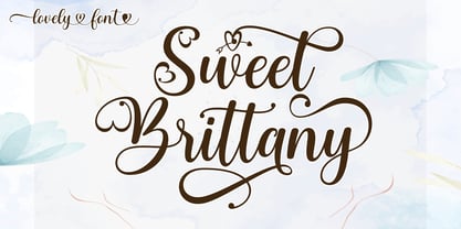 Sweet Brittany Script! Fresh modern lovely font with decorative characters and dancing baseline. So beautiful on invitations such as crafts, greeting cards, branding materials, business cards, quotes, posters and other design concepts. Features: Ligature Style set Basic Latin A-Z and a-z Number International symbols include punctuation fastener Thank you.
 - Snakehead Graffiti by Sipanji21,
$18.00 Snake head is a script font with a graffiti look. cool to be use in various types of designs, with several choices of characters and various kinds of swashes, so that your design looks powerful, this font is sutable for branding, clothing, logotype, packaging, advertising, crafting, and various other designs.
 - The Lord Of Bronze by Rockboys Studio,
$23.00 The Lord Of Bronze is a unique handwritten font. It includes elegant swashes which can be used to give a luxurious look to your designs. It can be used for various purposes such as logos, wedding invitations, headings, t-shirts, letterhead, signage, labels, news, posters, badges and so much more.
 - Sidney Bloom by Fromletterel,
$10.00 Sidney Bloom is a handmade display font, it suitable for display because it's bold and cheerful character, and because it was handmade Sidney Bloom also can be used to any project that need natural writing touch. So get creative with its playfulness, and use it to brighten up any project!
 - Bombay Blue by Hanoded,
$15.00 After having finished Pondicherry font, I stayed in the 'Indian Mood' (so to speak) and named this font after another Indian city. Bombay Blue turned out to be a handsome typeface with a flirty air, suburban chic and just enough sleaze to keep everyone happy. Comes with a diacritical pantheon.
 - Blusbow by Rvandtype,
$15.00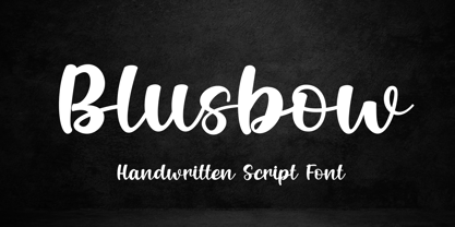 Blusbow is a handwritten Script font. It has an elegant and playful look that can be used for logos, branding, invitations, stationery, wedding designs, social media posts, and so much more. Its authentic look will add a personal and realistic feel to your designs. Thank You, i hope you enjoy it.
 - Rhinestone by Typehand Studio,
$17.00 Rhinestone is unique expressive handwritten font. This font is made with joy, made using a custom brush so that it looks natural. There are ligatures and alternates for easy use. bonus some illustrations like doodles or circles. This font can be used as a logo, notepad, or packaging design or etc.
 - To Be Continued by Comicraft,
$29.00Trapped in a world they never made, the characters in our Story So Far have been engaged in final battle with their Arch Enemies... the characters known only as ToBeContinued. Will our heroes survive? Will justice prevail? Will the forces of good defeat the forces of darkness...? To Be Continued... - Takeshi by Hanoded,
$15.00 I just finished book 8 of The Expanse (by James S.A. Corey) and the name Takeshi popped up somewhere, so I decided to use it for this font family! Takeshi is a hand made set of fonts: a fat display font, a thinner complementary font and a doodle font. Enjoy!
 - Naroid Initials JNL by Jeff Levine,
$29.00Naroid Initials JNL is one of the most ultra-compressed sets of initials available in digital type. These twenty-six initials are so narrow that a test print with all of the letters at 2-1/2 inches in height took up no more than about 5 inches in width! - Bohemaz by Malgorzata Bartosik,
$29.00 Bohemaz is a typeface inspired by the Art Deco typography from the 1930s. It contains 4 styles - Thin, Light, Regular and Bold - Latin, Greek and Cyrillic alphabet, diacritics from Western, Central and South Eastern Europe and many decorative ligatures. Bohemaz is both classic and modern, so it can be widely used.
 - Fruit Syrup by Olivetype,
$18.00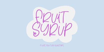 Fruit Syrup is a playful handwritten font with a dancing baseline!. This font is suitable for children craft, teaching material, or any other design that needs a splash of cuteness. So what’s included: Fruit Syrup (OTF) Basic Latin A-Z, a-z, numbers, symbols, and punctuations International Characters. Thank You
 - Dastardly Deeds SRF by Stella Roberts Fonts,
$25.00 This design from Ray Larabie (and adapted by Jeff Levine) is so unusual. The lettering lends itself to messages of sinister intent or horror movie titles. The net profits from my font sales help defer medical expenses for my siblings, who both suffer with Cystic Fibrosis and diabetes. Thank you.
 - Rossela by Letterena Studios,
$17.00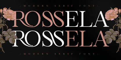 Rossela is an elegant, distinct and stylish serif font. This typeface is perfect for an elegant & luxury logo, book or movie title design, fashion brand, magazine, clothes, lettering, quotes, and so much more. It is also PUA encoded which means you can access all of the glyphs and swashes with ease.
 - Metavoria by Invasi Studio,
$17.00 Introducing Metavoria Font, a playful and quirky display typeface with a hand-drawn style. This font comes with so many ligatures and alternates, that you can use that for more fun on your projects. Metavoria font is ideal for branding projects or packaging that need a quirky and playful feel.
 - Tecna Wide by Descarflex,
$20.00 The Tecn@ Wide family was designed so that its characters are legible and easy to interpret in any writing in its headers or titles to cover more space; For example, the descriptive memory of Plans or Instructions. Tecn@ Wide complements the Tecn@ Background Light and Dark Square Triangle font family.
 - Beldon by Aqeela Studio,
$12.00 Introducing a new beautiful calligraphy font, Beldon! It is perfect for elegant logos, upscale packaging, wedding stationery, websites, and any other projects requiring a handwritten and luxurious touch. A wide range of ligature alternates are included so that you can give your logo or name a custom, hand-calligraphy look.
 - Bankai Street by Sipanji21,
$14.00 Bankai Street - Realistic Monoline Handwritten Graffiti Font This font designed so that users can use it more easily and make graffiti designs easier. Bankai Street is very suitable for use in various media such as; packaging, logos, labels, posters, shirt designs, bulletins, typography, and many other media, especially with graffiti look.
 - Yoda by MysticalType,
$10.00 Yoda is a super-compressed font family with some suitable special characters. Perfect for posters, display copies, headlines, magazine header copies. It comes in 10 weights ranging from extra light to black so it is versatile. The extra lightness can give you great height because of how narrow it is.
 - Udon Soup by Hanoded,
$15.00 Udon Soupis my all time favourite Japanese food! I like it so much that I decided to name a font after it. Udon Soup font is a handmade script font, kind of messy, kind of weird, but very legible and useful. Comes with oodles of diacritics and double letter ligatures.
