10,000 search results
(0.014 seconds)
- Flores del Sol by Roland Hüse Design,
$25.00 Flores del Sol is a cursive, calligraphic script font with swashed characters, ligatures and full latin and cyrillic support. It is elegant yet friendly and playful and is perfect for logotypes, floral and boutique themes, products T-shirts, scrapbooking postcards or even weddings and name cards. Hope you like this one, good luck with your creative projects! Any questions, feedback or customiztion request please contact me. Cheers, Roland
 - Hyang Soo by Phoenix Group,
$9.00 Hyang soo type face is a collection of fonts with the theme of love and affection, this font is made like handwriting in everyday life, which makes this font close to our lives.
 - Shredded - Unknown license

- Shred by Canada Type,
$24.95 Shred is the result of staring at so-called three-dimensional shapes for days on end, then capping the meditation by eating the white light at the end of the tunnel and sweating it out a blade a second. Bliss is overrated. Sharpness is where it's at. Get slicin'.
 - Shrek by words+pictures,
$20.00 - Sheree by Typadelic,
$14.95 Inspired by mid-century greeting card hand-lettering, Sheree is a unique serif font with some really fun qualities. While some characters are distinctly calligraphic and conformist in nature, Sheree bounces all over the baseline, displaying an unconventional attitude all her own.
 - Coo Coo by chicken,
$23.00 So I made five rather odd characters for a logo for a friend… Then I thought I'd fill a couple of spare hours expanding it to a single alphabet… And some considerable time later I ended up with a whole font with full punctuation, a bunch of alternates, pretty broad international support and some OpenType features to keep things varied… There are elements of Art Deco, Art Nouveau, Lego, circuit boards and Ceefax, Memphis lamps and lab clamps, hieroglyphs, googly eyes and who knows what else… Intricate, insane, highly irregular, but somehow it hangs together… Throw down a few letters nice and big when the fancy takes you…
 - Loo Snoo Roman NF by Nick's Fonts,
$10.00Here's a fresh version of an old favorite, Loose New Roman, from the Schaedler Studio of New York. Easy, breezy and carefree, it's a natural for happy headlines. Both versions of the font contain the complete Unicode Latin 1252 and Central European 1250 character sets. - Sol De Jalisco by Fat Hamster,
$25.00 Sol de Jalisco inspired by view of blue agave valley in Jalisco, Mexico. With Sol de Jalisco font you can give your project it's own unique and stylish feel. Sol de Jalisco typeface is perfect for your tequila and mezcal label and packaging design, social media quotes, logo and branding design, t-shirt design, whiskey, beer label and packaging design, heading, scrapbooking, calendars, book covers. Enjoy using the logos and little marks in your design projects.
 - Dev Gothic - Unknown license

- MOO! - Personal use only

- Foo - Unknown license

- MOO - Unknown license

- Soon by Fathom Collection,
$8.00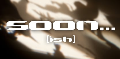
- Solo by URW Type Foundry,
$39.99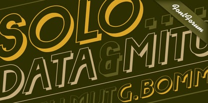
- Boos by Fontex,
$29.00 A lot of time and effort has been put into the process of creation the Boos Font. A careful analysis of the current font market and overly increasing customer needs have shaped Boos' final appearance and content. We don't have a precise target audience for Boos, since the amazing amount and structure of the chosen characters enables a very wide utilization. It will be best suited for headlines for classy magazines. It's look and feel came from a different designing approach, so that it can successfully satisfy the needs of even the neediest. Shining with calm and dignity, while in the roots being aggressive, it has successfully connected classic and modern styles - representing it's largest value. Medium, bold, black and light versions are included in the complete package, at a discounted price!
 - Soto by Thinkdust,
$10.00 A grungy, blocky, sans-serif font, Soto has one goal: get the message across. Saying it plain and simple, in a way that no-one can misunderstand, Soto’s very slight angles and thick style carry a weight and impact that make it stand out. With the textured finish it even jumps out from the backgrounds it’s placed on, so you can make use of the contrast to draw people in. Soto is best used in headlines and announcements that want to get their message across in an interesting and quick way. Stand out from the crowd and make people want to read what you’re writing by using a font like Soho to shout it out. If you like Soto but you're not feeling the grunge texture, then check out Ebisu.
 - Roos by Canada Type,
$24.95 The Roos family is a digitization and expansion of the last typeface designed by Sjoerd Hendrik De Roos, called De Roos Romein (and Cursief). It was designed and produced during the years of the second World War, and unveiled in the summer of 1947 to celebrate De Roos's 70th birthday. In 1948, the first fonts produced were used for a special edition of the Dutch Constitution on which Juliana took the oath during her inauguration as the Queen of the Netherlands. To this day this typeface is widely regarded as De Roos's best design, with one of the most beautiful italics ever drawn. In contrast with all his previous roman faces, which were based on the Jenson model, De Roos's last type recalls the letter forms of the Renaissance, specifically those of Claude Garamont from around 1530, but with a much refined and elegant treatment, with stems sloping towards the ascending, slightly cupped serifs, a tall and distinguished lowercase, and an economic width that really shines in the spectacular italic, which harmonizes extremely well with its roman partner. The Roos family contains romans, italics and small caps in regular, semibold and display weights, as well as a magnificent set of initial caps. All the fonts contain extended language support, surpassing the usual Western Latin codepages to include characters for Central and Eastern European languages, as well as Baltic, Celtic/Welsh, Esperanto, Maltese, and Turkish.
 - Sho by Linotype,
$29.99Karl Georg Hoefer’s Sho first appeared in 1992 with Linotype-Hell. The font is a part of the package Calligraphy for Print, which also contains Ruling Script and Wiesbaden Swing. Calligraphy for Print 2 completes the set. These packages offer modern calligraphy fonts particularly well-suited to use in posters, magazines and advertisements. Sho distinguishes itself in the extreme contrast between the strokes. A unique characteristic of the font is the way it uses simple round forms in some of its letters, giving it a peppy and playful feel. - Soho by Monotype,
$29.99 Soho is the latest addition to the growing range of typefaces from Sebastian Lester. This grand opus of a project resulted in a typeface that comprises nine weights and five widths of precision engineered OpenType. 40 fonts, 32,668 characters and 24 OpenType features. Hot on the heels of the popular Neo Sans and Neo Tech range, and his first typeface release Scene, Soho represents three years of work by Lester. As a type designer I'm preoccupied with finding ways in which I can address modern problems like good legibility in modern media, and create fonts that work precisely and efficiently in the most technically demanding of corporate and publishing environments." Slab serif typefaces are enjoying something of a renaissance, offering versatility whether for corporate identity, product branding, text or display use. With 40 weights to choose from Soho gives designers endless possibilities from the ultra chic lines conveyed by the lighter weights to the rock solid statement made by the heavier weights. Soho is cross-platform compatible. The Pro version provides extended language support for Central European languages. Used in conjunction with software applications that support OpenType many useful features like "stylistic sets" can be leveraged -- in which a wide variety of alternative characters can be introduced at the click of a mouse button giving one font several "tones of voice" from conservative to cutting edge. The wide range of glyphs includes ligatures and small caps."
 - Oo Boodlio Doo NF by Nick's Fonts,
$10.00Bongo drums at the ready! Freeman Craw's archetypal beatnik typeface Ad Lib provided the inspiration for this indubitably eccentric excursion in coolsville typography. Both versions of the font include complete Latin 1252, Central European 1250 and Turkish 1524 character sets, with localization for Moldovan, Romanian and Turkish. - Silly Poo-Poo - Unknown license

- Koo Koo Puff by astroluxtype,
$20.00 Does the world really need one more vernacular pop culture typeface? We here, at astroluxtype shout a resounding yes! Sure, at myfonts.com, you can find the apex of fine font design that will have your mind and eyes burst with joy at the level of sophistication and craftsmanship they exhibit- Koo Koo Puff Light Condensed and Regular Condensed are not one of those fonts. But if kooky goofy is your thing, we're selling it at the astroluxtype booth. Koo Koo Puff Regular Condensed is the companion font to Koo Koo Puff Light Condensed. Both fonts includes an upper and lowercase glyph set. Regular Condensed has a different upper and lowercase “O” from the original Koo Koo Puff Light Condensed. Spacing metrics are looser, as well. The font is not a match for Light Condensed, it is a separate font. Both are headline display faces, for optimum usage it is recommended to be set at 48 points or larger in size. Look to astroluxtype’s Sugarbang ! as the first in a series of fonts inspired by vintage product packaging, Koo Koo Puff is the second release in the Cerealboxx series. The third font is in the fridge getting cool now, watch for it in the future. Rave on you design genius.
 - Boo Boo Kitty by Lauren Ashpole,
$15.00 Boo Boo Kitty is a blocky font with a halftone style gradient texture. One of the big inspirations for this font was retro comic printing so I tried to keep the background slightly messy to capture that look. It was originally released in 1997 as an all-caps font with mixed plain and textured characters but was recently updated it to include lowercase letters and full versions of both background options.
 - Dee Dee by TipografiaRamis,
$39.00 This is a second edition of Deedee type family, originally designed in 2011. Deedee is a geometric sans serif typeface family of ten styles with extended support for most Latin languages plus Cyrillic. Revisions in this edition included minor adjustments to glyph shapes and improved kerning tables. The typeface is ideal for use in display sizes and is quite legible in the text.
 - De Roos Mediaeval NF by Nick's Fonts,
$10.00 Here’s a classic face from Dutch master type designer Sjoerd H. de Roos. Use it where timeless elegance is the goal. Both versions of this font support the Latin 1252, Central European 1250, Turkish 1254 and Baltic 1257 codepages.
 - Zeroes Three - Unknown license

- Three-Sixty - Unknown license

- Zero Threes - Unknown license

- Buzzer Three by ITC,
$29.00Buzzer Three is the work of Tony Lyons and Paul Crome. Its futuristic appearance is in the OCR style, however, it contains unique design characteristics that separate it from the more predictable geometric styles in this category. - Fleurons Three by Wiescher Design,
$39.50 Fleurons are embellishments and here is my third and so far nicest round. I found some old ones in London and made them more modern ones. These go very well with my scripts Nadine and Ellida and a lot of my other scripts!!! Yours once more in a beautiful mood, Gert Wiescher
 - Highway Shredded by Aminmario Studio,
$30.00 This is a supercharged font, with natural brush, quick strokes and sharp details. Perfect for challenging jobs, titles, movie,logos, apparel, t-shirts, hoodies, quotes, product packaging, or anything that needs a typographic turbo-boost and a typographic unique style. Thanks for checking out this font. I hope you enjoy it!
 - Three Horse by Alit Design,
$18.00 Introducing the "Three Horse" Vintage Letter Font Collection – a captivating journey into the artistry of yesteryears. This remarkable font family embodies the essence of vintage charm, offering 12 distinct font variations that encapsulate the character and nostalgia of classic letterforms. The "Three Horse" collection is your gateway to a world of timeless design, perfect for projects seeking to evoke the allure of eras gone by.
 - Schism Three by Alias,
$55.00 Schism is a modulated sans-serif, originally developed from our Alias Didot typeface, as a serif-less version of the same design. It was expanded to three sub-families, with the thin stroke getting progressively heavier from Schism One to Schism Three. The different versions explore how this change in contrast between thick and thin strokes changes the character of the letterforms. The shape is maintained, but the emphasis shifts from rounded to angular, elegant to incised. Schism One has high contrast, and the same weight of thin stroke from Light to Black. Letter endings are at horizontal or vertical, giving a pinched, constricted shape for characters such as a, c, e and s. The h, m, n and u have a sharp connection between curve and vertical, and are high shouldered, giving a slightly square shape. The r and y have a thick stress at their horizontal endings, which makes them impactful and striking at bolder weights. Though derived from an elegant, classic form, Schism feels austere rather than flowery. It doesn’t have the flourishes of other modulated sans typefaces, its aesthetic more a kind of graphic-tinged utility. While in Schism Two and Three the thin stroke gets progressively heavier, the connections between vertical and curves — in a, b, n etc — remain cut to an incised point throughout. The effect is that Schism looks chiselled and textural across all weights. Forms maintain a clear, defined shape even in Bold and Black, and don’t have the bloated, wide and heavy appearance heavy weights can have. The change in the thickness of the thin stroke in different versions of the same weight of a typeface is called grading. This is often used when the types are to used in problematic print surfaces such as newsprint, or at small sizes — where thin strokes might bleed, and counters fill in and lose clarity, or detail might be lost or be too thin to register. The different gradings are incremental and can be quite subtle. In Schism it is extreme, and used as a design device, giving three connected but separate styles, from Sans-Didot to almost-Grotesk. The name Schism suggests the differences in shape and style in Schism One, Two and Three. Three styles with distinct differences, from the same start point.
 - Eclectic Three by Altered Ego,
$45.00STF Eclectic Three contains dingbats and a special set of glyphs which make it simple and easy to create registration and fill-in forms for print materials. Create rules with hash lines, fill-in boxes and many other variations. Also includes handicapped, recycled and arrow right/left symbols. The Eclectic family is legendary, with a cult-like following among the inititated. With over 100 characters in the complete set, you'll find yourself using Eclectic Three almost daily to add spice to your otherwise san-serif typographic existence. Available in Mac and PC formats. License it today! - Antique Three by Wooden Type Fonts,
$15.00A revival of one of the popular wooden type fonts of the 19th century, suitable for text. - Three Candy by Mazkicibe,
$11.00 Three Candy Font is Sans Serif and modern font combined with a sweet touch and beautifully curved each letter. using a touch of soft curves so that it is pleasing to the eye. Three Candy Font Spirit is great for: Wedding invitations, fashion magazines, logos, signatures, and suitable for watermark photography.
 - Dew by ParaType,
$25.00 Dew is a script font with blobs on the stems that according to author’s imagination resemble dew drops on the caules. It gives an impression of fragrance and freshness and thus can be used for informal headings and short advertising texts for perfumes and cosmetics. The font was developed by Ekaterina Pulenko and released by ParaType in 2009.
 - Debs by Scholtz Fonts,
$9.95 Debs was inspired by a thank you note sent from one of my friends to another. The recipient liked the handwriting so much that he passed the note on to me after having asked permission from Debs, the writer. I enjoyed the vigor and looseness of the handwriting, as well as admiring its legibility and style. Debs has all the characteristics of modern handwriting: It appears loose, unstructured, and free, while maintaining good form and great legibility. Its baseline is varied, creating an impression of notes written by busy people, while its characters remain well formed and readable. Debs comes in five styles, regular, lite, black, wide and wide-black. Use Debs for advertising, for casual greeting cards, for a casual, handwritten look on music or fashion media. Debs has all the features usually included in a fully professional font. Language support includes all European character sets.
 - Dee by Chantra,
$18.00The Dee font family started from letter "d" and "e" followed by the rest of the letters. "Dee" is Thai word mean "Good" in English that is the source of this font name. The Dee XTS style has alternate stroke ends relative to the Dee XT style. It is included as a bonus style in the Dee Regular Set and Dee Complete packages.


Page 1 of 250Next page