10,000 search results
(0.337 seconds)
- Pen Tip DT by DTP Types,
$89.00An original design by Malcolm Wooden of DTP Types Limited. - Hoods And Capers by Dismantle Destroy,
$29.00 This font was inspired by music from the band Asteria.
 - Schneider Buch Deutsch by Intellecta Design,
$21.90a digitization of a classic blackletter by german typographer Schneidler - Monster Monster by Dismantle Destroy,
$19.00 This was created by hand, scanned and digitalized for quality.
 - Garamond 96 DT by DTP Types,
$89.00A revival design by Malcolm Wooden of DTP Types Limited. - Hagada Mesugnan MF by Masterfont,
$59.00 Custom designed letterforms for the Hagada, published by Gad Ulman.
 - Abirut MF by Masterfont,
$59.00 Inspired by horror movies, this font will deliver the trill!
 - Century PS Pro by SoftMaker,
$14.99 Century PS Pro is a serif typeface published by SoftMaker.
 - Bombastic by Michael Browers,
$25.00Bombastic is a distressed grunge font developed by Michael Browers. - Blobbing by Wooden Type Fonts,
$15.00 One of a few quirky display types by this designer.
 - Brave Mountains by Dismantle Destroy,
$9.00 This font was inspired by music from the band Silverstein.
 - Venezuela by Red Rooster Collection,
$45.00Based on the typeface Vesta by Albert Augspurg, circa 1926. - Pergamon by SoftMaker,
$9.99 Pergamon is a sans serif decorative typeface published by SoftMaker.
 - Murray Hill by Bitstream,
$29.99An original informal script designed for ATF by Emil Klump. - RMU Kontrast by RMU,
$30.00 F. H. Schneidler’s ‚Kontrast‘, released by Weber in 1930, revived.
 - Century Schoolbook Pro by SoftMaker,
$14.99 Century Schoolbook Pro is a serif typeface published by SoftMaker.
 - Broadway No2 by SoftMaker,
$9.99 Broadway No2 is a decorative 1920s font published by SoftMaker.
 - Organ Grinder by SoftMaker,
$9.99 Organ Grinder is an art deco typeface published by SoftMaker.
 - Quest by Red Rooster Collection,
$45.00Loosely based on Dorsey, an English typeface by Alan Dempsey. - Palette by Berthold,
$57.99 Palette was designed by Martin Wilke for Berthold in 1950.
 - Beale Charming by SoftMaker,
$9.99 Beale Charming is an Art Deco font published by SoftMaker.
 - Openface No2 by SoftMaker,
$9.99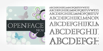 Openface No2 is a decorative serif typeface published by SoftMaker.
 - Sylar Stencil - Unknown license

- Chopped Black by Tipo Pèpel,
$24.00 This typeface was inspired by the font Pabst Heavy, designed by Chauncey Hawley Griffith in 1928 for Linotype. Because of its formal characteristics, recalls the popular Cooper Black and probably was the reaction of Linotype to counter the popularity of this font distributed by the "American Type Founders" was acquired. It's a heavy typeface, ideal for headlines or for use in creating logos, rounded shapes and gestures evoke dynamism and make it perfect to highlight specific words or phrases.
 - Graphic Stylin NF by Nick's Fonts,
$10.00The letterforms are based on Inserat Cursive, a bold script popular in the late nineteenth century; the treatment was suggested by cover artwork for Graphic Styles from Victorian to Post-Modern, written by Stephen Heller and designed by Seymour Chwast. Included in the font are several handy ink blots (section mark and superior numbers positions), a stylish tailpiece (florin position), and a couple of ink bottles patterned after those on the bookcover (bar and broken bar). - Textbook New by ParaType,
$30.00 Designed for ParaType in 2007 by Isabella Chaeva. The type is based on Bukvarnaya (TextBook) photocomposing version designed in 1987 by Emma Zakharova. The initial Bukvarnaya for metal composition was created at Polygraphmash in 1958 by Elena Tsaregorodtseva. It was developed for primers and the first level school textbooks. An early sans serif ('Grotesque') with half-closed static letterforms. For use in book and magazine typography, advertising and headlines. Also may be useful as screen font.
 - Louis by Canada Type,
$24.95 Louis is a faithful digital rendition and expansion of a design called Fanfare, originally drawn by Louis Oppenheim in 1927. Redrawn digitally by Rod MacDonald, and engineered in-house by Canada Type, Louis includes the many alternates that came with the original design, and then some. It was also expanded into three variations, including a soft-cornered style, and a rough woodcut one. And of course, the codepage support covers the majority of Latin-based languages.
 - Alonso Flair by BA Graphics,
$45.00This font, as indicated by its namesake, was designed and started by the late Bob Alonso. It represents the first of his unfinished work to be completed by friend and colleague John Bomparte, following Bob's passing in December of 2007. It is a font that speaks with a distinctively robust voice; and would be a great choice for a wide variety of uses. Central European languages are supported through OpenType, and Windows/Mac OSX TrueType versions. - Aesop by Fine Fonts,
$29.00 Aesop was developed from some book jacket lettering drawn by Michael Harvey for an edition of Aesop’s Fables by a master Japanese Artist. It is based upon a pen-drawn script, and is characterised by a lively sense of movement and grace. Aesop Plus, being an OpenType font, contains many alternative characters and additional ligatures which can be automatically substituted to enhance the liveliness of set text, where the application in which it is used, permits.
 - Brignell Big by IB TYPE Inc.,
$40.00 BRIGNELL BIG is a two font family designed by Ian Brignell. Bold and honest, it approaches like a dare: Go Big no regrets. A bold, personable sans serif headline font characterized by a stylized and geometric structure. Creatively, Brignell Big was born in 2011 and was inspired by lettering designs Ian was working on for CO Bigelow packaging that harkened back to early 20th century modern sans serifs. Recommended for headline use especially on packaging. Extended Latin set.
 - Sketch Block by artill,
$25.00 Sketch Block is a hand-sketched headline font. The family contains a light and bold weight; both complement each other perfectly. The mundane, constructed basic forms of the egyptienne typeface get their charming touch by the handmade hatching. Impressions of dominance and warmth are equally created. Created solely by me from sketch by hand and then digitized, Sketch Block makes a perfect font to create the hand-made character look, or to supplement illustrations with typography.
 - Hanse Textura by RMU,
$30.00 Inspired by a former Hermann Zapf design, Hanse Textura was completely redrawn and redesigned as an English-style blackletter font with a calligraphic touch. It comes also with the historical long s which can be reached either by typing [alt] + b or by using the OT feature historical forms. I strongly recommend to activate both OT features, standard and discretionary, to access all ligatures built in the font. The keys pi and product are occupied with beautiful border elements.
 - Deutschmeister by RMU,
$25.00 This crisp and constructed Ludwig Wagner, Leipzig, blackletter font in textura style had been originally designed by Berthold Wolpe. Freshly redrawn and redesigned, it adds now to the treasure trove of historic typefaces. This font contains a bunch of useful ligatures, and it is recommended to activate Discretionary Ligatures too. By typing 'N', 'o' and period plus activating Ordinals you get an oldstyle numbersign. As usual in my blackletter fonts, the # key is occupied by the 'round' s.
 - LTC Goudy Extras by Lanston Type Co.,
$24.95 A set of over 50 ornaments, connecting borders, flourishes and decorative motifs originally designed by Frederic Goudy throughout his career. Many of these designs were used by Goudy at his Village Press and offered by his Village Foundry in the 1920s. The styles range from complex title page illustrations to simple linking borders, but all have the unique Goudy style. This set is completely different from the Goudy Ornaments found in the P22 Goudy Aries Set.
 - ITC Black Tulip by ITC,
$29.00ITC Black Tulip was designed by Dudley Rees and inspired by the modular simplicity of the Greek fret band, an ancient repeating pattern formed by tracing a line at right angles between two horizontal rules to form an interlocking motif. Rees admired the discipline of the motif, I saw how that simple rigid rectangular network suggested an alphabet that would need little or no kerning," he says. He describes ITC Black Tulip as a "dramatic headline face"." - Quietism High by Michael Rafailyk,
$20.00 Quietism High is an experimental subfamily that received a high contrast from Quietism Display and a high x-height from Quietism Text. It's still a Display typeface, albeit more graceful, wide and open. Other subfamilies: https://www.myfonts.com/collections/quietism-font-michael-rafailyk Scripts: Latin, Greek, Cyrillic. Languages: 480+ The promo images used “Sleeping Venus” painting by Giorgione, “The Creation of Adam” painting by Michelangelo, and “The Piazza and Church of Santa Maria Maggiore” painting by Giovanni Paolo Pannini.
 - Sketch Gothic by artill,
$17.00 Sketch Gothic is a hand-sketched headline font. The family contains a light and bold weight; both complement each other perfectly. The mundane, constructed basic forms of the Franklin Gothic, get their charming touch by the handmade hatching. Impressions of dominance and warmth are equally created. Created solely by me from sketch by hand and then digitized, Sketch Gothic makes a perfect font to create the hand-made character look, or to supplement illustrations with typography.
 - Salto by Linotype,
$29.99 Salto was developed by Karlgeorg Hoefer and introduced in 1952 by the foundry Gebr. Klingspor in Offenbach. The capital letters were drawn with a brush, the lower case with a broad-tipped pen developed by Hoefer especially for the task. Salto reflects the Zeitgeist of the 1950s, appearing frequently in advertisements during the years of the Wirtschaftswunder. The font’s extravagance and dynamic quality arise from the contrast between the strong, zestful capitals and the more reserved lower case letters.
 - AJ Quadrata by Adam Jagosz,
$25.00 Once, Blackletter was a calligraphy style. Full of ligatures, with letters bumping into each other to create an unapologetic picket-fence pattern. Some even claimed that the regularity improved legibility! But then Blackletter was cast into metal, and only a handful of established ligatures survived, while most interletter connections were disentangled. Everyone since followed suit, and hundreds of years later, digital Blackletter fonts were modelled mostly on the metal fonts that prevailed rather than the original handwriting. Up until now! AJ Quadrata is an authentic revival of the textura quadrata hand, and its major inspiration is a 15th-century Latin manuscript of the Bible from Zwolle, the Netherlands. The typeface is delivered in two flavors. The default cut is a modern take on textura quadrata that can be useful for today and tomorrow. The standard ligatures feature employs nearly all letters. The tittle of i retains its original, hasty squiggle form (except for the Turkish localization). Discretionary ligatures include medieval ligatures da, de, do, pa, pe, po (and their mixed-case counterparts!). Stylistic sets allow to use historic letter variants such as long s and rotunda r, closed-counter a, and alternate capitals. AJ Quadrata Medieval is perfect for setting Latin. Default forms of capital F, H and O are swapped with the alternates. The squiggles above i only appear for disamibiguation nearby m, n or u, as in original manuscripts. Discretionary ligatures and historic variants are promoted to the standard ligatures feature to make room in the discretionary ligatures feature for a variety of scribal abbreviations. Dedicated stylistic sets include medieval punctuation and justification alternates — glyphs with elongated terminals used for lengthening lines that end up too short. The Rubrum styles can be layered and colored to create the illuminated effect on the capital letters. Besides a faithful rendition of extended Latin including Vietnamese, numerous synthetic additions are included: polytonic Greek, Armenian, and Cyrillic (with Bulgarian and Serbian/Macedonian localizations). Both flavors of the typeface can be considered a starting point that can be further customized using OpenType features, including Stylistic Sets (some features differ between AJ Quadrata and AJ Quadrata Medieval): ss01 Alt E ss02 Descending F / Roman F ss03 Uncial H / Roman H ss04 Angular O / Round O ss05 Contextual closed-counter a ss06 Diamond-dot i j / Always dotted i, j ss07 Contextual rotunda r / No r rotunda ss08 Contextual long s / No long s ss09 Dotless y ss10 Serbian Cyrillic ss11 Alt Cyrillic de ss12 Alt Cyrillic zhe ss13 Alt Cyrillic sha ss14-ss17 [reserved for future use] ss18 Scribal punctuation ss19 Alt linking hyphen ss20 Justification alternates
 - Indie by Lián Types,
$37.00 A FEW THOUGHTS Indie is a trendy script, result of the wide range of possibilities that can be achieved using a pointed brush. (1) “You Only Live Once” say The Strokes, (to me, symbols of indie music) so, what would represent that sensation of volatility better than a brush? As you may already know, this time inspiration came from hipsters and indies around us: We may sometimes criticise them, we may sometimes want to be like them, but the truth is that the universo gráfico they generated these past years is gigantic, full of colour and variations. (2) Brush lettering and Sign painting are fields I've been fond of since I started as a designer. Nowadays, these styles are getting a lot of attention and maybe it’s due to the undeniable mark of life that is materialised when using a brush. This tool is so expressive that shows the passions and fears of the artist, and materialises that idea of “living the present”, so popular in this era. When you see Indie, you think of skaters, rollers, surfers, hiphop dancers, street artists, summer, and why not? California beaches. So if you feel life is only one, it’s high time you got Indie into your fonts' collection! STYLES Indie comes in 4 styles plus another one which consists only in capitals. Indie; Indie Shade; Indie Shade Solo; Indie Inline are all open-type programmed and have exactly the same glyphs and metrics, so you can combine them without probem. (I.E. You may use Indie Inline, then write the same word using Indie Shade Solo, and finally put them together). In applications such as Adobe Illustrator, the font has nice results when fi ligatures is activated. However, if you want a more casual look, activate the contextual and the decorative ligatures. NOTES 1. After several years of practicing calligraphy I can say that to me, there’s nothing more satisfying than being able to create fonts out of your own handlettering. I owe a lot of this brush-style to Carl Rohrs. He was the very first calligrapher who taught it to me. His style is unique and what he can do with a brush is truly marvelous. I'm serious. 2. In spite of some particular cases, I can say I'm happy to live in a present in which Typography is living a kind of Renaissance along with Lettering. Like it happened with W. Morris a hundred years ago, handcrafts are being revalued/reborn, and some of this may be happening thanks to these indie designers that, trying to be unique, gave new/fresh air to different areas of graphic design.
