10,000 search results
(0.016 seconds)
- Weltschmerz by Hanoded,
$15.00 Weltschmerz, world-weariness… I love the sound of it, so I chose this name for my new font. Weltschmerz font is a hand made Jugendstil typeface which was modeled on a 1910 poster from Austria. Weltschmerz is a classy typeface, a little melancholic, but with a positive uplift in the end. Weltschmerz comes with extensive language support.
 - Golred by Canden Meutuah,
$15.00 Introducing Golred is a simple, minimalist and neat sans serif font. It can be easily adapted to a very large range of projects, such as advertising, titles, blogs, logos, branding, invitations, business cards and more! So add it to your creative ideas and watch how it makes it stand out! you will not be disappointed with the results.
 - The Boldstyle by Almeera Studio,
$15.00 Introducing The Boldstyle a retro bold script which will bring yo back to 70s feel.comes with Extrude versions. So you don't need extra effort to create extrude effects. Its features include: Stylistic Alternate, Swash, Ligatures, Stylistic set and multilingual support. You can choose alternatives for substitution with various variants Glyphs. Very suitable for logos, tshirts, posters, branding, etc.
 - Adlery Pro by Zetafonts,
$39.00 Adlery is a brush typeface designed by Cosimo Lorenzo Pancini for display use. It has a handmade feel and it’s optimized for maximum readability at medium sizes. The typeface comes in three styles: Basic, Swash and Blockletter Uppercase and has a double set of lowercase alphabets that alternate in writing, so that no double letters are the same.
 - Modal by Schriftlabor,
$42.00 Modal is a sans serif type family intended for corporate, editorial and web design. Each weight comes with around 800 glyphs and supports a large variety of features such as ligatures, small caps, figure sets, case sensitive glyphs and so on. With its two italics, Modal offers new possibilities for designers and creates an additional tool for distinct typography.
 - Qebil by Letterena Studios,
$10.00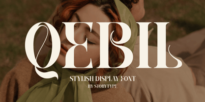 A serif modern and classic typeface that has its own unique style & modern look. This typeface is perfect for an elegant & luxury logo, book or movie title design, fashion brand, magazine, clothes, lettering, quotes, and so much more. This font is PUA encoded which means you can access all of the amazing glyphs and ligatures with ease!
 - Ghakity by Letterena Studios,
$17.00 Ghakity is a modern and classic sans serif font with a unique style and modern look. This typeface is perfect for an elegant & luxury logo, book or movie title design, fashion brand, magazine, clothes, lettering, quotes, and so much more. This font is PUA encoded, which means you can access all of the glyphs and swashes with ease!
 - Mushin by Satori TF,
$16.99 Mushin is a typeface, that comes with 14 fonts, roman and the matching italics, which draws inspiration from the grotesques of the beginning of the 20th century. However, its humanistic details and endings, remove the coldness so characteristic of this style, making Mushin a typeface of lively and dynamic curves, which can be used for various purposes.
 - Loveena by Niznaztype,
$20.00 Loveena is a script typeface with modern bouncing style. It’s contemporary font for postmodern graphic designs. Loveena is perfect for poster, book’s cover design, branding, tagline of product, advertising, short text and postmodern designs. Loveena has characteristic of feminism, love, cuteness and friendship, and so this font also suitable for designs that have love and feminism theme.
 - Bellastory by HafisHidayat,
$20.00 Bellastory is a font that is intentionally made with hand strokes using a brush pen, so that it gets a natural texture, and produces beautiful fonts for your various designs, this font is suitable for cover books, magazines, logos, invitations, business cards, screen printing, product packaging, posters, invitations, greeting cards, news, blogs, everything including personal charm.
 - Scriptissimo Forte by Wiescher Design,
$39.50 Scriptissimo-Forte is the bold version of Scriptissimo. When using the normal cut of Scriptissimo I sometimes had the feeling that I could well use a bolder cut to make a bigger impression, so I simply made that cut for myself. I think you can use it too; try it out. Yours very bold scriptissimo, Gert Wiescher
 - Kunstgewerbe NF by Nick's Fonts,
$10.00J. M. Bergling called the inspiration for this typeface “modern”—at least, it passed for modern in 1914. Its bold, sinuous forms and unusual decorative treatment suggest stained glass of a certain era, and so its name is German for “Arts and Crafts”. Both versions of the font include 1252 Latin, 1250 CE (with localization for Romanian and Moldovan). - Holiday Doodles by Outside the Line,
$19.00 Holiday Doodles includes a set of numbers plus 50 seasonal year-long holiday doodles. Great for a newsletter, monthly price list, or invitations. These illustrations have more detail, so they are great used at large point sizes as small illustrations. This font is designed to work well with the hand-lettering fonts offered by Outside the Line.
 - Printing Set JNL by Jeff Levine,
$29.00Printing Set JNL by Jeff Levine comes from a toy rubber stamp printing set imported from Japan in the 1950s and 1960s that's been revived, but is now imported from China. The font has a serif letter so typical of import toys of the day, but actually reads quite nicely in short headlines and specialty ad copy. - Groove Town Sans by Dino Feed,
$20.00 Fonts should be living, breathing organisms. Dino Feed wanted to see a font with character, so we created Groove Town Sans. This hand-drawn font has 122 glyphs and is made for Latin-based languages. Play around with the font and make it original; we like to keep everything lowercase. See more @dinofeed on Instagram or at dinofeed.com.
 - Fortela Typeface by Letterena Studios,
$17.00 Fortela Typeface is a modern and classic serif font with its own unique style and modern look. This typeface is perfect for an elegant & luxury logo, book or movie title design, fashion brand, magazine, clothes, lettering, quotes, and so much more. This font is PUA encoded, which means you can access all of the glyphs and swashes with ease!
 - Natural Handwritten by Letterara,
$14.00 Natural Handwritten feels just as charming and elegant. This stunning brush handwritten font is a stylish homage to classic handwriting. It also features many special features including glyphs and ligatures so that it displays natural and original handwriting. This font is PUA-coded which means you can access all the amazing glyphs and ligatures with ease!
 - JadeBud by Supfonts,
$14.00 JadeBud is a modern and elegant serif with incredible unusual lines that makes it far from the typical classic serif. Font is an open type with clean shapes and precise kerning. It includes ligatures encoded by the PUA. Language support: All European languages Don't forget to subscribe so you don't miss out on the new awesome fonts Dima
 - Thierry by Olivetype,
$18.00 Thierry is an elegant signature script font. This versatile script font has a wide spectrum of applications ranging from logotype, product branding to headlines. Add a romantic feel to your next project with this modern calligraphy-styled font. So what's included : Basic Latin A-Z & a-z Numbers, symbols, and punctuations Ligatures Accented Characters : ÀÁÂÃÄÅÆÇÈÉÊËÌÍÎÏÑÒÓÔÕÖØŒŠÙÚÛÜŸÝŽàáâãäåæçèéêëìíîïñòóôõöøœšùúûüýÿžß Thank you
 - Shamant by Hazztype,
$20.00 Shamant is a cursive handwriting style that gives you a modern vintage vibe. It has a hand-drawn monoline font look, an excellent choice for old-school-inspired designs and modern adaptations with a handwriting look. So for all the vintage-inspired branding, logos, wedding invites, book covers, etc., this authentically flowing font is your one-stop place.
 - Valve by Typodermic,
$11.95 Introducing Valve—the ultimate industrial typeface for the modern age. With its superelliptical letterforms and pragmatic stroke logic, Valve is the perfect choice for anyone looking to evoke the cold, hard world of plastics, pharmaceuticals, electronics, and alternative energy. But don’t be fooled by Valve’s emotionless, android-like forms. This is a typeface that packs a punch, with soft stroke ends that lend it a touch of elegance and sophistication. Whether you’re designing a cutting-edge tech brochure or a sleek new website, Valve is the perfect choice for anyone who wants to convey a sense of modernity and precision. And unlike other ultramodern typefaces that rely on tongue-in-cheek references to retro futurism, Valve is purely synthetic. Built solely from artificial elements with no specific structural source, this is a typeface that’s as forward-thinking as they come. So why settle for a typeface that’s stuck in the past when you can choose Valve and embrace the future? And with OpenType fractions, numeric ordinals, and a wide range of currency symbols included, Valve is more versatile than ever. Available in five weights—Extra-Light, Light, Regular, Bold, and Heavy—as well as a set of sleek obliques, Valve is the perfect choice for anyone looking to take their design game to the next level. So what are you waiting for? Choose Valve today and see the difference that a truly ultramodern typeface can make. Most Latin-based European writing systems are supported, including the following languages. Afaan Oromo, Afar, Afrikaans, Albanian, Alsatian, Aromanian, Aymara, Bashkir (Latin), Basque, Belarusian (Latin), Bemba, Bikol, Bosnian, Breton, Cape Verdean, Creole, Catalan, Cebuano, Chamorro, Chavacano, Chichewa, Crimean Tatar (Latin), Croatian, Czech, Danish, Dawan, Dholuo, Dutch, English, Estonian, Faroese, Fijian, Filipino, Finnish, French, Frisian, Friulian, Gagauz (Latin), Galician, Ganda, Genoese, German, Greenlandic, Guadeloupean Creole, Haitian Creole, Hawaiian, Hiligaynon, Hungarian, Icelandic, Ilocano, Indonesian, Irish, Italian, Jamaican, Kaqchikel, Karakalpak (Latin), Kashubian, Kikongo, Kinyarwanda, Kirundi, Kurdish (Latin), Latvian, Lithuanian, Lombard, Low Saxon, Luxembourgish, Maasai, Makhuwa, Malay, Maltese, Māori, Moldovan, Montenegrin, Ndebele, Neapolitan, Norwegian, Novial, Occitan, Ossetian (Latin), Papiamento, Piedmontese, Polish, Portuguese, Quechua, Rarotongan, Romanian, Romansh, Sami, Sango, Saramaccan, Sardinian, Scottish Gaelic, Serbian (Latin), Shona, Sicilian, Silesian, Slovak, Slovenian, Somali, Sorbian, Sotho, Spanish, Swahili, Swazi, Swedish, Tagalog, Tahitian, Tetum, Tongan, Tshiluba, Tsonga, Tswana, Tumbuka, Turkish, Turkmen (Latin), Tuvaluan, Uzbek (Latin), Venetian, Vepsian, Võro, Walloon, Waray-Waray, Wayuu, Welsh, Wolof, Xhosa, Yapese, Zapotec Zulu and Zuni.
 - Kenyan Coffee Stencil by Typodermic,
$11.95 Introducing Kenyan Coffee Stencil, the industrial/deco headline typeface hybrid that will elevate your graphic design game to the next level! This practical and compact alphabet has a unique stencil design that adds a touch of ruggedness and grit to your message. Crafted with utmost care and attention to detail, Kenyan Coffee Stencil is the perfect choice for designers who are looking to infuse their projects with a sense of integrity and hard-working honesty. The typeface’s compact design ensures that your message will be delivered with clarity and impact, making it ideal for headlines, logos, posters, and more. But that’s not all—Kenyan Coffee Stencil comes in five different weights, so you can choose the perfect level of toughness to suit your project. Whether you’re looking to create a bold and impactful message, or something more subtle and refined, Kenyan Coffee Stencil has got you covered. And don’t forget to check out the non-stencil version, Kenyan Coffee. This sleek and stylish typeface is perfect for body copy, and its versatility makes it a great choice for a wide range of projects. So why wait? Add Kenyan Coffee Stencil to your toolkit today, and start creating bold, impactful designs that are sure to leave a lasting impression! Most Latin-based European, Vietnamese, Greek, and most Cyrillic-based writing systems are supported, including the following languages. Afaan Oromo, Afar, Afrikaans, Albanian, Alsatian, Aromanian, Aymara, Azerbaijani, Bashkir, Bashkir (Latin), Basque, Belarusian, Belarusian (Latin), Bemba, Bikol, Bosnian, Breton, Bulgarian, Buryat, Cape Verdean, Creole, Catalan, Cebuano, Chamorro, Chavacano, Chichewa, Crimean Tatar (Latin), Croatian, Czech, Danish, Dawan, Dholuo, Dungan, Dutch, English, Estonian, Faroese, Fijian, Filipino, Finnish, French, Frisian, Friulian, Gagauz (Latin), Galician, Ganda, Genoese, German, Gikuyu, Greenlandic, Guadeloupean Creole, Haitian Creole, Hawaiian, Hiligaynon, Hungarian, Icelandic, Igbo, Ilocano, Indonesian, Irish, Italian, Jamaican, Kaingang, Khalkha, Kalmyk, Kanuri, Kaqchikel, Karakalpak (Latin), Kashubian, Kazakh, Kikongo, Kinyarwanda, Kirundi, Komi-Permyak, Kurdish, Kurdish (Latin), Kyrgyz, Latvian, Lithuanian, Lombard, Low Saxon, Luxembourgish, Maasai, Macedonian, Makhuwa, Malay, Maltese, Māori, Moldovan, Montenegrin, Nahuatl, Ndebele, Neapolitan, Norwegian, Novial, Occitan, Ossetian, Ossetian (Latin), Papiamento, Piedmontese, Polish, Portuguese, Quechua, Rarotongan, Romanian, Romansh, Russian, Rusyn, Sami, Sango, Saramaccan, Sardinian, Scottish Gaelic, Serbian, Serbian (Latin), Shona, Sicilian, Silesian, Slovak, Slovenian, Somali, Sorbian, Sotho, Spanish, Swahili, Swazi, Swedish, Tagalog, Tahitian, Tajik, Tatar, Tetum, Tongan, Tshiluba, Tsonga, Tswana, Tumbuka, Turkish, Turkmen (Latin), Tuvaluan, Ukrainian, Uzbek, Uzbek (Latin), Venda, Venetian, Vepsian, Vietnamese, Võro, Walloon, Waray-Waray, Wayuu, Welsh, Wolof, Xavante, Xhosa, Yapese, Zapotec, Zarma, Zazaki, Zulu and Zuni.
 - Carrig by Monotype,
$25.99 IMPORTANT – Please consider the superior Carrig Pro before making a purchase decision. Carrig started its life in 1998. I was working for a design agency in Cork, Ireland and was given a new brand identity project for a lakeside hotel in County Kerry. While visiting the hotel I made various sketches of the surroundings and upon returning to the studio, it was clear that my strongest ideas for the identity would be based on these freehand drawings. I wanted a classic, rough, hand-drawn typeface to complement this style but at that time, the studio didn’t have anything suitable, so I decided to draw my own. I found a Trajan-esque typeface that I really liked the look of in an old calligraphy workbook. I set about drawing my own version and then digitised it. Once the client had seen and approved my design, I began working on creating a complete all caps typeface to use for the hotel’s stationery. With ‘carrig’ being the Gaelic word for ‘rock’, my new typeface was all the more appropriate as it had the appearance of letterforms that had been carved into stone and weathered by time. With the project completed and the client happy, Carrig then sat in my unused fonts folder for several years... but there was always a nagging feeling at the back of my mind that I should do something more with it. So, in the autumn of 2014, I finally set about doing just that and created the font family you now find at MyFonts. Carrig’s form and structure was influenced by a hybrid of Classic Roman and Garalde typeface designs. The original calligraphic elements from the 1998 version of Carrig have been retained to add personality—as can be seen in the serifs, strokes, spurs, terminals and open bowls. Perhaps its most distinctive trait is a high x-height combined with relatively short ascenders. I wanted Carrig to immediately resonate with the reader and have designed it to be familiar and friendly. I imagine designers might choose Carrig as an alternative to such typefaces as Trajan, Garamond and Baskerville. I see Carrig as primarily a display typeface for titles/headlines in printed materials. I would also love to see it being used for branding, packaging and promotional material and am keen to hear from designers who use it in their own work.
 - Savigny by insigne,
$22.00 Savigny began as an offshoot of Le Havre. Le Havre met my design objective of a geometric sans serif with a strong art deco touch. Le Havre’s primary inspiration came from the art deco titling of the 1930’s, and the lower case was just icing. The art of the 1930’s is of particular interest to me, and I love the art deco era and its art, and the simplicity of geometric shapes. I am mostly interested in designing display typefaces. In many ways Le Havre was the exact opposite of another popular insigne offering, Aviano Sans. Le Havre has very high ascenders, a lower case and is very condensed. Aviano Sans has no lowercase and extremely extended capitals. With the rise of webfonts I began to see Le Havre being used frequently online. It’s short x-height and very tall ascenders made it difficult to read in on screen text settings as it was intended as display type. With this observation, I felt that there is more room for a geometric sans in the insigne catalog. So I set about to design a new geometric sans using the successful skeleton of the Le Havre family. Although I planned to extend the Le Havre line, the new family is so drastically different I decided on a new name: Savigny. The face evolved and began to take on a few humanist touches. Designed from the very beginning as a webfont, the design is open and pleasing to the eye, with a tall x-height. To optimize it for onscreen settings, the spacing is generous. In addition, it includes extended and condensed members, making it insigne’s first superfamily. The family includes over 100 OpenType alternate characters. These include several style sets. Some are stemless, others are purely geometric, and in a nod to Savigny’s origins, Art Deco titling alternates. Please see the informative .pdf brochure to see these features in action. OpenType capable applications such as Quark or the Adobe suite can take full advantage of the automatically replacing ligatures and alternates. This family also includes the glyphs to support a wide range of languages. Savigny is a great choice for a professional designer who wants a well rounded typeface family that is ready for the web.
 - Ah, the Riparo font! It's like diving into the world of quirky and eye-catching typography, a playground where creativity meets functionality. Crafted by the talented Vladimir Nikolic, Riparo doesn't...
- The Sabandija ffp font by deFharo is a typographic creature that seems to have scurried out of the imagination of a whimsical artist, finding its way onto the digital canvas. Picture this: if fonts w...
- The font named Generator REX, created by the designer known as SpideRaY, is a typeface inspired by the American animated television series "Generator Rex," which aired on Cartoon Network. The series,...
- The Eurofurence Light font is part of the Eurofurence type family, which is known for its clean lines, modern look, and versatility. As suggested by its name, Eurofurence Light presents a lighter wei...
- kitten meat - Personal use only

- Preta by Lián Types,
$39.00 Preta, portuguese for a very pure kind of black, has its name very related to its concept: I wanted to make the fattest/darkest script ever. People who follow my work may notice its forms are very related to works of my past (1) but this time the challenge was to be very cautious with the white spaces between letters. Not only I followed some rules and ductus of the copperplate style of calligraphy but also I took a lot of inspiration in posters of the early Art Nouveau (specially in Alfred Roller of the Vienna Secession) where letters forms looked like black squares if not looked from a close distance. With Preta, I wanted to achieve that same idea of “darkness” and thanks to the always welcomed question -what if?- the font grew a lot. The result is a very fat font, that looks delicious. Due to possible customer needs, I designed Preta Small, so it can be used in smaller sizes. Preta Ao Sol (which literally means under the sun!) is a style with those lovely tiny details to give the sensation of bright. Preta Ao Sol Solo was made to be used as a layered font with Preta. Finally, Preta Capitals serves as a company for Preta. Hope you enjoy the font as much as I did when designing it: The fact that it’s full of alternates, swashes, ligatures and swirls makes it really pleasurable at the moment of using it. Give it a try and dance with Preta! TIPS For better results, use Preta with the ‘standard ligatures’ feature activated. NOTES (1) Beatle in 2014. Seventies in 2015.
 - Jeles by Tour De Force,
$25.00 Inheriting the beauty and style of old type classics from this genre, Jeles is blended with very elegant modern approach featuring soft corners, round slab serifs and tasty ball terminals. Jeles is designed mostly for display use and it is highly recommended to get the whole family if you want to get the best result. It is designed in two styles Condensed and Normal. The Condensed version is developed in two weights each coming with corresponding italics. While the Normal styles are three ranging from Regular, Bold and Black. The total of 7 separate fonts inside the family are quite enough if you look for diversity and flexibility at one place. You could use the uprights for more serious and strong headlines while the Italics work perfectly for more fresh and live subheads. Of course editorial design is only one of the many directions where Jeles family could be used successfully as we all know typefaces with so visible contrast between thin and thick and combined with classic elegance, could be easily used in every design of cosmetic industry, fashion, food, jewelry, etc. Try to design a stylish boutique shop signboard and you will surely discover its beauty and potential. Easy-to-read, it is good for print design, revealing its authentic letterpress-like character as well as perfect for screen use note that the thin strokes and serifs are not that thin to vanish on a low resolution monitor. Professionally designed, they are solid enough yet very elegant and even gentle making Jeles a desired family design of attractive web banners, web sites, apps and e-books.
 - Delm by Typesketchbook,
$39.00 Delm font family is one of those large and useful families that you really can’t miss if you are looking for typeface combining originality and legibility. Delm is one of these – a sans serif with geometric modern look designed very smart with soft round look and very specific inktraps that complement its uniqueness. It is developed in 9 separate weights ranging from Hairline to Black, each coming with corresponding slanted version (called ‘Oblicua’). The light weights look more elegant, gentle and with more sensible feeling for geometry while the black versions are more soft, friendly even puffy and the geometric skeleton of the family is dominated by the overall roundness. The mid-weights are strong and prominent setting right the middle point in the contrast range of the family. Delm is a font with dedication – with so many options for different character contrast combined with slanted styles, it is perfect for editorial design where it could be easily used either for text or display font. Editorial is not of course the only application – you could successfully rely on this typeface if create brand or corporate identity, typographic posters, signboards, instruction plates, etc. Very diverse and original, this font will not leave you unsatisfied – moreover – it will surely make you try it in more and different designs be it printed or designed for screen. Web sites, banners, applications and e-books are places where Delm will show its best because of its originality, finely tuned contrast and its enhanced legibility. Fully equipped with OpenType features like ligatures and multilingual support, Fontmatters highly recommends to get the whole Delm font family for maximum results and satisfaction.
 - AS Palmer by Andrey Sharonov,
$24.00 AS Palmer Script & Sans This pair was inspired by the spirit of the past, when manual labor was common, and technology was just beginning to develop. It was crafted by hand specially for traditional typography lovers and anyone who want to add natural handmade feeling in brand identity. It comes with Regular and Aged versions that expands its posibilities in use. Opentype features Script font has 151 stylistic alternates and 3 variations of end-swashes with about 10 lengths of each style. Stylistic Alternates. The easiest way to get alternate character is to add number for example 2, 3 or 4 after any Uppercase. Each of them has from two up to five alternates. This combination works with activated Standard Ligatures option in Opentype panel (Photoshop / Illustrator). End-swashes. AS Palmer Script has 3 variants of end-swashes and about 10 lengths of each style. It works like Stylistic Alternates with activated Standard Ligatures in Opentype panel. Just add special combination at the end of the word, to get needed swash element and its length. Underscore, double underscore or slash is swash style. Number is length. For example: _3, __5, /6. Just try, it's easy. AS Palmer Sans - different Double letters. This feature work automatically with activated Contextual Alternates in Opentype panel. Note, that this features are not available in Miscrosof Word. Palmer is very good looking in logo, labels, t-shirt prints, product packaging, invitations, advertising and others. I've designed some examples, so you can see how it can be used. Multilingual support (Western European characters). English, Danish, Dutch, Estonian, Faroese, Filipino, Finnish, French, German, Hungarian, Icelandic, Irish, Italian, Norwegian, Polish, Portuguese, Spanish, Swedish, Turkish.
 - Cornhusker by Section Type,
$22.00 Standing tall as an Illinois cornfield in September, Cornhusker Regular is a strapping condensed sans designed by a champion cornhusker. Inspired by 1940s Midwestern signage, it's warm & charming characters are perfectly at home in logos, beverage bottles and food packaging, restaurant menus, travel advertisements, websites, stationery, handmade product packaging and so much more. If you're looking for a hand-crafted typeface with punch (who can fit into tight spaces!) then Cornhusker Regular is the font for you. This inspired revival excels in both retro & modern designs. Cornhusker Regular includes capital letters, small caps, and alternate cuts (with diacritics) of A, E, F, J, X, Y, ᴀ, ᴇ, ғ, ᴊ, x, ʏ, 0, 1, 2, 3, 4, 5, 7 and a sharp German double s in both cap and smallcap. This font is not affiliated with or endorsed by the University of Nebraska. WHAT'S INCLUDED Cornhusker Regular includes an installable digital Opentype Font file in a single weight. This file contains a basic Latin character set with a full set of uppercase and small caps, multilingual diacritics, numbers, international currency figures, punctuation and pagination symbols. The font also includes alternate cuts for select uppercase and smallcap letters (located in stylistic sets). It is compatible with Adobe CS and CC, Microsoft Word and other type editing apps. SUPPORTED LANGUAGES Afrikaans, Alsatian, Basque, Bislama, Breton, Catalan, Chamorro, Danish, Dutch, English, Faroese, Finnish, Flemish, Franco-Provencal, French, Frisian, Friulian, Galician, German, Greenlandic, Icelandic, Indonesian, Irish, Italian, Ladin, Latin, Luxembourgish, Malay, Manx Gaelic, Northern Sotho, Norwegian (Bokmål), Norwegian (Nynorsk), Occitan, Portuguese, Rhaeto-Romance, Romansh, Sami (Inari), Sami (Lule), Sami (Northern), Sami (Skolt), Sami (Southern), Scottish Gaelic, Spanish, Swahili, Swedish, Tagalog, Walloon and Welsh.
 - Simplo by Durotype,
$49.00 Simplo: the ‘Italian Futura’. Simplo is a geometric sans serif typeface, built in sixteen styles. It is a tribute to the 1930s typeface Semplicità, designed by Nebiolo’s Alessandro Butti. Although many details of Simplo differ from Semplicità, it preserves the spirit of the original. Simplo is ideal for use in display sizes. It is also quite legible in text, and is well suited for graphic design and corporate identity design. Simplo has sixteen styles, extensive language support, eight different kinds of figures, sophisticated OpenType features — so it’s ready for advanced typographic projects. The most notable characteristics of this typeface are the ‘t’ and the ‘f’. The ‘t’ is the culmination of simplicity: a vertical line with just a simple right-side crossbar. The ‘f’ also has just a right-side crossbar, and is really tall: it reaches both the highest and lowest vertical position of the typeface. The top of the distinctive ‘s’, is much narrower than its bottom. The ‘a’, ‘b’, ‘d’, ‘g’, ‘p’, ‘q’, and ‘u’ are spurless, and show a family resemblance with Hans Reichel’s 1990s typeface Dax. However, these letters are rounder and more geometric than Dax’s counterparts, because of Dax’s higher x-height and narrower design. In Paul Shaw’s Imprint article about typefaces that have been overlooked and/or underappreciated, “Overlooked Typefaces”, he concluded his discussion of Semplicità as follows: “These idiosyncrasies suggest that Semplicità might find a warm reception today, given the current love affair with Gotham, Neutraface and Proxima—and the resurgence of ITC Avant-Garde Gothic.” Free demo font available. For more information about Simplo, download the PDF Specimen Manual.
 - Dever by insigne,
$24.00 Dever’s brute, industrial lines are rounded up in this new typeface from Jeremy Dooley. Dever combines plenty of inspirations. It’s the flair of the Wild West melded with a shout out to the sign painters and package lettering artists of the 1800s. Dever’s big, bold, and handy frame moves through all three of the family’s strapping members. First is the sans. No doubts on what this brother’s like. Dever Sans is as straight-forward as you’ll find in this family with its four separate weights and numerous distressed options. The second of the kin’s a bit of half-breed, you might say. Pointed serifs bring a sharpness to this outfit. Rounding out the family is Dever Wedge, a bit of wild rodeo all its own. This poke’s a quick draw with any of its 107 font, and with it’s auto-replacing alternates, no two repeating characters are alike. You’re guaranteed a great show anytime Dever leaves the chute. The route to Dever was long, with many a switchback. The Wedge variant was designed first, shelved, then developed into Plathorn. But I wanted to return to those brutish forms and decided to round out the family with a sans, serif and plenty of other options. Any of the Dever family have an extended character set including Central and Eastern European languages. The strong faces have specially adapted sub-families, too, so they’re bound and determined to have an outstanding impact at whatever size you use ‘em. It’s a hard ride ahead corralling all those words. Be sure and add these able-bodied boys to your posse today!
 - Sleepy Bear by Missy Meyer,
$12.00 I've been learning to read Cyrillic and Greek letters lately, mainly because I've been playing the game GeoGuessr. (If you haven't played it, I highly recommend! It plops you down somewhere in the world in Google Street View, and you have to figure out where you are.) Cyrillic shows up in so many more places than Russia! You can see it in Bulgaria, Mongolia, Serbia, Montenegro, Kyrgyzstan, and more. Because of that, I made sure to include a fun double-uppercase version of those alphabet sets in Sleepy Bear. They're styled the same way as the Latin characters: all uppercase height, with some lowercase-styled letters thrown in at that same height for a fun look for all ages. I've also made two weights of Sleepy Bear: a plump and smooth regular weight, and a lighter weight that's built to stack on top of the regular (though you can use it on its own). Just type out a word in Sleepy Bear, copy it, and then change the copy to Sleepy Bear Light. You'll get a great outline look in seconds! All characters are extensively cleaned up, with smooth curves and rounded ends. Sleepy Bear is great for all print projects, and also cuts out of all materials like a dream. It's a cute and quirky monoline font family that's great for all of your family's designs. Each font contains over 850 glyphs, and includes: - Latin and extended Latin characters to support over 100 languages; - Cyrillic and Greek double-uppercase alphabet sets; - 18 fractions; - Punctuation galore; - 38 double-letter ligatures for variety (including international pairs like KK and II); - And a half-dozen alternates for even more variety!
 - Hermann by W Type Foundry,
$29.00 Hermann is one of our most readable typefaces so far. Since last year, the W Design team had been examining closely the possibility of developing a text font. Thus, we dug into concepts within some of our favorite novels, such as The Steppenwolf and Brave New World, written by Hermann Hesse and Aldous Huxley respectively. Ideas like duality, surrealism, and wildness mainly appeared. With these concepts in mind, we analyzed carefully the typefaces used in both Hesse’s and Huxley’s creations; Sabon and Garamond showed up catching our attention and, of course, awakening our admiration. Consequently, the challenge was to combine the key features of these fonts with the concepts already identified. At first, we made a text font which was suitable to compose long texts. However, we realized that we needed to refine some characteristics to convey all the ideas. A full set of capital discretionary ligatures was designed, which convert Hermann in a display font when is required. We also designed swashes (from A-Z) and final forms (in letters h, k, m, n, r and x in romans, and in letters a, d, e, h, i, l, m, n, r, t, u, x and z in italics), conveying more dynamism and versatility when it comes to composing visually. Hermann was designed not only to be accurate in terms of legibility but also to be wild and bold. That is why we took a big leap and designed from the beginning a font that is inspired by the world of 20th-century novels, using the name of one of its greatest exponents, Hermann Hesse.
 - The Auratype by Auratype Studio,
$9.00 Hai Folks! The Auratype is retro and classic typeface who inspired by the 60s - 80s designs with more unique explored style like swosh and alternate character. This font made from manual sketch with many many scratch then finished to font. Make your designs project with this font and extras illustration to give more superb. This font also suitable to design like logo, sticker, tees design, banner, poster, sign, display design, packaging and more superb designs! Enyoy with our product and feel free contact us for support! Features : Full set of Upper & Lowercase Character Number & Punctuation Swosh Alternate Extras Illustration Multilingual Language PUA encoded Opentype Features _________ ▼To using the feature OpenType Stylistic alternate (including swosh), you must use program that supports OpenType such as Adobe Illustrator CS, Adobe Indesign, Corel Draw X6-X7 and Microsoft Office 2010 or later versions. Additional way to access alternate/swoshes are using Character Map (Windows), Nexus Font (Windows), Font Book (Mac), or more program which has Pop Character. ▼For more information about accessing alternative, you can see on this link : http://adobe.ly/1m1fn4Y ✌ Get in touch with author https://www.instagram.com/wahyudwi.cc/ https://www.instagram.com/auratype/ https://www.behance.net/fontsfighters ❤ Thank you for purchasing our product and supporting us! We hope this font can be part of your designs project. If you have other queries, questions or issues, just feel free and have fun to contact us directly. We are glad if we can help you more! If you are happy with our product, please put your star into our design reviews, it was so fantastic moment for us. Thanks! :)
 - Kandani by Letterhend,
$17.00 Introducing, Kandani. A retro bold script which will bring you back to 60s feel. This typeface has the extrude version so you can create your retro effect font in ease. This font perfectly made to be applied especially in logo, and the other various formal forms such as invitations, labels, logos, magazines, books, greeting / wedding cards, packaging, fashion, make up, stationery, novels, labels or any type of advertising purpose. Features : uppercase & lowercase numbers and punctuation multilingual ligatures alternates swashes PUA encoded We highly recommend using a program that supports OpenType features and Glyphs panels like many of Adobe apps and Corel Draw, so you can see and access all Glyph variations. For accessing opentype feature, kindly check this link letterhend.com/tutorials/using-opentype-feature-in-any-software/ Email us to letterhend@gmail.com if you need something! Happy Designing!
