10,000 search results
(0.016 seconds)
- Algarabia by Macizo.com.mx,
$30.00 • Algarabía "Joy" is a provocative and multilingual text face designed by Leonardo Vázquez. • It was created for a mexican magazine with the same name that uses it as the body text font, and now it's released for the public. • In 1397, Frederic Goudy's was asked to draw a face for the exclusive use of the University of California Press at Berkeley. The font was called California. In 1983 a digital version of this typeface was created by Aaron Burns and it was called ITC Berkeley. • Algarabía is inspired by ITC Berkeley, it keeps the calligraphic touch and weight, but it presents certain features in its design that might result unexpected, yet at the same time they are invisible when used as body text and provides the typeface its unique own personality. • Small Caps and Small caps italic, Included in each version. • Ideal for magazines, Art books or any editorial purposes where legibility and originality are needed.
 - Marco by TypeTogether,
$49.00 Marco is a lively text face, with an informal touch, inspired by 15th century Italian letter-forms with strong calligraphic traces and intended to be used primarily in continuous and intensive reading conditions. Marco is full of features required for high-quality book typography, including: strong language-support in extended Latin, Cyrillic and polytonic Greek, a multitude of swashes in the italic styles of Latin and Cyrillic, stylistic alternates to obtain the best possible solutions and other typographic niceties. Inspiration for Marco goes back to Italian humanist typography such as those of Nicholas Jenson or Aldus Manutius, and general influences from calligraphy. As a result, Marco has matured into a personal and unique text face where its lively and somewhat informal style is an ideal counterpart to its careful and ingenious crafting. Toshi Omagari’s Marco features a huge set of over 1900 characters per style —and almost 2600 in the italics— and is available in Regular, SemiBold, Bold with matching Italics.
 - P22 Wedge by IHOF,
$24.95 Wedge’ is the outcome of a search for the essence of a formal alphabet for text — for 26 letters of the simplest form consistent with ease of reading.. Noted New Zealand architect Bruce Rotherham (1926–2004) was inspired by Herbert Bayer’s ‘universal alphabet’ created at the Bauhaus in 1927. While he admired Bayer’s pure geometry, Rotherham felt it was ‘virtually unreadable’. The Bauhaus-inspired inclination for architectural publications to use sans serif faces provoked Rotherham to consider how a readable Roman book face might be approached using some of Bayer’s same principles of simplification, but also retracing the evolution and use of the Roman form in an analytic manner. The Wedge alphabet was started in 1947 when Rotherham was an architecture student at the University of Auckland. It was worked on and refined over several decades but never commercially released, until now. Over sixty years after it was first conceived, Wedge is available from P22.
 - Armature Neue by fontBoy,
$15.00 Armature Neue is an extension and clarification of the original Armature family released in 1997. We made the distribution of weights more even, and added italics extra light and black weights. Originally consisting of four fonts, Armature Neue has twelve: six weights with accompanying italics. Although conceived as a display face, a number of alternate characters are included that can be used to regularize the type for text setting. Armature is one result of my interest in typefaces that are constructed, rather than drawn. Although it is basically a monoline design, there are subtle details throughout that compensate for a monoline’s evenness. As with all fontBoy fonts, there are dingbats hidden away in the dark recesses of the keyboard. When I first started designing this face in 1992, I called it Dino-I thought I would name all my fonts after famous pets-so the dingbats for Armature are dinosaurs. Designed by Bob Aufuldish with editing and production by Psy/Ops.
 - ITC Abaton by ITC,
$29.00 ITC Abaton, by Argentinian designer Luis Siquot, is an exercise in geometry and simplification. “It is done,” says Siquot, “with few elements, with modules of only straight lines (horizontals, verticals and diagonals of almost 45 degrees). Drawing the I and the O, I got the basic elements, and so started the fight between strict geometry and optical impression, until I obtained the rest of the characters.” The basic rectangular form is characterized by wedge-shaped serifs, almost like caps on the heads and feet of the letters. “Abaton has the 'spirit' of 19th-century faces used on money bills or postage stamps, but the realization is totally different,” Siquot explains. Abaton is a “shaded” typeface of caps and slightly smaller caps, upright and slightly condensed in form. Although the letterforms are legible at small sizes, the shading tends to clog up if it gets too small, so Abaton is happiest as a distinctive display face.
 - Squab by Tadas,
$10.00 The Squab typeface was designed to be simple, big and bubbly for projects from poster to t-shirt design or animation.
 - Bilanthy by Maulana Creative,
$13.00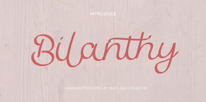 Give your designs an authentic handcrafted feel. � Bilanthy Handwritten Font� is perfectly suited to stationery, logos and much more. Many Thanks!
 - My Home by Typefactory,
$14.00 My Home is a Fun Handwritten Font, Perfectly suitable for creating quotes, kids book, t-shirts, poster, mockup, and many more.
 - Miedinger by Canada Type,
$24.95 Helvetica’s 50-year anniversary celebrations in 2007 were overwhelming and contagious. We saw the movie. Twice. We bought the shirts and the buttons. We dug out the homage books and re-read the hate articles. We mourned the fading non-color of an old black shirt proudly exclaiming that “HELVETICA IS NOT AN ADOBE FONT”. We took part in long conversations discussing the merits of the Swiss classic, that most sacred of typographic dreamboats, outlasting its builder and tenants to go on alone and saturate the world with the fundamental truth of its perfect logarithm. We swooned again over its subtleties (“Ah, that mermaid of an R!”). We rehashed decades-old debates about “Hakzidenz,” “improvement in mind” and “less is more.” We dutifully cursed every single one of Helvetica’s knockoffs. We breathed deeply and closed our eyes on perfect Shakti Gawain-style visualizations of David Carson hack'n'slashing Arial — using a Swiss Army knife, no less — with all the infernal post-brutality of his creative disturbance and disturbed creativity. We then sailed without hesitation into the absurdities of analyzing Helvetica’s role in globalization and upcoming world blandness (China beware! Helvetica will invade you as silently and transparently as a sheet of rice paper!). And at the end of a perfect celebratory day, we positively affirmed à la Shakti, and solemnly whispered the energy of our affirmation unto the universal mind: “We appreciate Helvetica for getting us this far. We are now ready for release and await the arrival of the next head snatcher.” The great hype of Swisspalooza '07 prompted a look at Max Miedinger, the designer of Neue Haas Grotesk (later renamed to Helvetica). Surprisingly, what little biographical information available about Miedinger indicates that he was a typography consultant and type sales rep for the Haas foundry until 1956, after which time he was a freelance graphic designer — rather than the full-time type designer most Helvetica enthusiasts presume him to have been. It was under that freelance capacity that he was commissioned to design the regular and bold weights of Neue Haas Grotesk typeface. His role in designing Helvetica was never really trumpeted until long after the typeface attained global popularity. And, again surprisingly, Miedinger designed two more typefaces that seem to have been lost to the dust of film type history. One is called Pro Arte (1954), a very condensed Playbill-like slab serif that is similar to many of its genre. The other, made in 1964, is much more interesting. Its original name was Horizontal. Here it is, lest it becomes a Haas-been, presented to you in digital form by Canada Type under the name of its original designer, Miedinger, the Helvetica King. The original film face was a simple set of bold, panoramically wide caps and figures that give off a first impression of being an ultra wide Gothic incarnation of Microgramma. Upon a second look, they are clearly more than that. This face is a quirky, very non-Akzidental take on the vernacular, mostly an exercise in geometric modularity, but also includes some unconventional solutions to typical problems (like thinning the midline strokes across the board to minimize clogging in three-storey forms). This digital version introduces four new weights, ranging from Thin to Medium, alongside the bold original. The Miedinger package comes in all popular font formats, and supports Western, Central and Eastern European languages, as well as Esperanto, Maltese, Turkish and Celtic/Welsh. A few counter-less alternates are included in the fonts.
 - Mr Alex by Hipopotam Studio,
$24.00 Clean and elegant display sans-serif uppercase family with three weights and rounded corners. Excellent for headers, posters, t-shirts and websites.
 - Bat Ghost by Letterafandi Studio,
$14.00 Bat Ghost is a Halloween decorative font. Add it to your Halloween crafts, horror movie posters, t-shirts and other about Halloween.
 - Reynard by Scriptorium,
$12.00Reynard is an arts and crafts period font with a bit of a Celtic inclination. Very well suited to formal, elegant titles. - Sylar by The Northern Block,
$16.70 A linear modern typeface suited for branding & advertising projects. The variations in weight give great contrast when used across body copy & headlines.
 - Little Brown Frog SG by Spiece Graphics,
$39.00 Here’s a typeface that’s both primitive and playful. It could aptly be described as having a modest bounce, unusual web feet, and a slightly grotesque croak. Joking aside, this amphibious creature-font is ideally suited for funny headlines as well as other goofy stuff. Great for party announcements, cartoon lettering, or just about anything involving kids. Or even fun-crazed adults! Little Brown Frog is also available in the OpenType Std format. Some new alternate characters have been added to this OpenType version. Advanced features currently work in Adobe Creative Suite InDesign, Creative Suite Illustrator, and Quark XPress 7. Check for OpenType advanced feature support in other applications as it gradually becomes available with upgrades.
 - Ashemore by insigne,
$34.99 Ashemore developed as a result of my visits to Barcelona, Spain and to Germany, followed soon after by a visit to Asheville, North Carolina. Blending the styles of art and architecture from these three areas may seem initially to result in an unusual formula, but the distinct and flamboyant style of Art Nouveau and the Arts and Crafts style combined with the more strict rules of a sans serif transfer well into a beautiful and very usable blend of these individually eccentric forms. The resulting font retains the Art Nouveau and Craftsman style flavors, which shine through the typeface despite its geometric base. One of the font’s defining characteristics is the unique terminators of its C, G and S. This face’s texture and rhythm also moves well in longer texts. These and other features give Ashemore a restrained bohemian vibe that seems particularly appropriate for a coffee house or an art gallery. The Ashemore family has a full range of six weights from thin to black and includes condensed and extended options for a total of 36 fonts. The typeface also includes some unique OpenType alternates that make the superfamily even more versatile. Ashemore is equipped for complex professional typography, including alternates, small caps and many alternate characters. The face also has a number of numeral sets, including tabular figures, fractions, old-style, lining figures and superiors and inferiors. OpenType-capable applications such as Quark or the Adobe Suite can take full advantage of automatic ligatures and alternates. You can find these features demonstrated in the .pdf brochure. Ashemore also includes the glyphs to support a wide range of languages, including Central, Eastern and Western European languages. In all, Ashemore supports over 40 languages that use the extended Latin script, making the new addition a great choice for multi-lingual publications and packaging. Ashemore was designed by Jeremy Dooley with production assistance from Lucas Azevedo and Marcelo Magalhaes. Kerning assistance from iKern.
 - Mauritius by Canada Type,
$29.95 Ten years or so after his unique treatment of Garalde design with Trump Mediaeval, Georg Trump took on the transitional genre with Mauritius, which was to be his last typeface. He started working on it in 1965. The Stuttgart-based Weber foundry published a pamphlet previewing it under the name Barock-Antiqua in 1967, then announced the availability of the metal types (a roman, a bold and an italic) a year later. The global printing industry was already in third gear with cold type technology, so there weren't that many takers, and Weber closed its doors after more than 140 years in business. Subsequently, Trump’s swan song was unfairly overlooked by typography historians and practitioners. It never made it to film technology or scalable fonts. Thus, one of the most original text faces ever made, done by one of the most influential German type designers of the 20th century, was buried under decades of multiple technology shifts and fading records. The metal cuts of Mauritius seem to have been rushed in Weber’s desperation to stay afloat. So the only impressions left of the metal type, the sole records remaining of this design, show substantial problems. Some can be attributed to technological limitations, but some issues in colour, precision and fitting are also quite apparent, particularly in Mauritius Kursiv, the italic metal cut. This digital version is the result of obsessing over a great designer’s final type design effort, and trying to understand the reasons behind its vanishing from typography’s collective mind. While that understanding remains for the most part elusive, the creative and technical work done on these fonts produced very concrete results. All the apparent issues in the metal types were resolved, the design was expanded into a larger family of three weights and two widths, and plenty of 21st century bells and whistles were added. For the full background story, design analysis, details, features, specimens and print tests, consult the PDF available in the Gallery section of this page.
 - FS Albert by Fontsmith,
$80.00 The x factor How do you make a font like FS Albert unique, distinctive? “When designing a font I try to question every letter,” says Jason Smith, “but all you need is a few that have an x factor. With FS Albert, they’re the lowercase ‘a’ and ‘g’ and the uppercase ‘I’ and ‘J’. “I remember a friend saying, ‘Why on earth have you designed the ‘a’ like that? Isn’t it too friendly for this kind of font?’ And, in a way, that’s what I wanted – honesty and warmth, because a lot of big brands at the time really needed to show a more human side.” Range of weights and styles FS Albert is a charismatic type: a warm, friendly sans serif face with a big personality. Open, strong and amenable, and available in a wide range of weights and styles, FS Albert suits almost every task you put it to. Fontsmith has crafted five finely-tuned upright Roman weights and four italic weights, as well as a special Narrow version to provide the best coverage and give headlines and text an easy-going character. The chunky kid “FS Albert was inspired by – and named after – my son, who was a bit of a chunky kid,” says Jason Smith. “I designed an extra bold weight because I always felt that the really big font heavy weights had the most personality. “I recently told Albert this story. He laughed, and forgave me for thinking he was a fat baby. He liked the big personality bit, though.” 1000s of glyphs Not content with a character set that covered Europe and the whole of the Western world, the studio decided to go further afield. There are now FS Albert character sets that cover western and eastern European languages, including those of Russia, as well as Cyrillic, Arabic and Greek scripts. In fact, the font now covers more than 100 languages, making it ideal for bringing a consistent typographic style to the communications of global brands.
 - FS Albert Paneuropean by Fontsmith,
$90.00The x factor How do you make a font like FS Albert unique, distinctive? “When designing a font I try to question every letter,” says Jason Smith, “but all you need is a few that have an x factor. With FS Albert, they’re the lowercase ‘a’ and ‘g’ and the uppercase ‘I’ and ‘J’. “I remember a friend saying, ‘Why on earth have you designed the ‘a’ like that? Isn’t it too friendly for this kind of font?’ And, in a way, that’s what I wanted – honesty and warmth, because a lot of big brands at the time really needed to show a more human side.” Range of weights and styles FS Albert is a charismatic type: a warm, friendly sans serif face with a big personality. Open, strong and amenable, and available in a wide range of weights and styles, FS Albert suits almost every task you put it to. Fontsmith has crafted five finely-tuned upright Roman weights and four italic weights, as well as a special Narrow version to provide the best coverage and give headlines and text an easy-going character. The chunky kid “FS Albert was inspired by – and named after – my son, who was a bit of a chunky kid,” says Jason Smith. “I designed an extra bold weight because I always felt that the really big font heavy weights had the most personality. “I recently told Albert this story. He laughed, and forgave me for thinking he was a fat baby. He liked the big personality bit, though.” 1000s of glyphs Not content with a character set that covered Europe and the whole of the Western world, the studio decided to go further afield. There are now FS Albert character sets that cover western and eastern European languages, including those of Russia, as well as Cyrillic, Arabic and Greek scripts. In fact, the font now covers more than 100 languages, making it ideal for bringing a consistent typographic style to the communications of global brands. - Marvelan by Mega Type,
$15.00 Marvelan is a display font with a touch of style that's cheerful, elegant and strong. So it is suitable for use in product design and appearance, both in modern or vintage designs. OpenType feature with several alternative characters that allow you to mix and match letter pairs to suit your design. Marvelan also includes 3 different styles, namely Regular, Outline and Extrude which are made with different styles but still have the same characters. Marvelan is included in a display font so it is very suitable for use in titles, poster products, logos, book menus, websites, books, t-shirts, posters, book covers, labels, business cards, branding, print templates and many other designs according to your needs. Marvelan includes a complete set of upper and lowercase letters, as well as multi-language support, punctuation, ligatures and alternatives. Thank you very much for looking and Enjoying it!
 - Feisty by Fauzistudio,
$20.00 Feisty (2020) is a straight script bold using magic OpenType automatically at mimic real hand lettering. Use it for magazine, fashion, invitations, greeting cards, bussines card, logo, t-shirt, web banner, book cover, campaign and watermark photography. Feature Presents an advanced OpenType to automatically choose the appropriate letter shape as you type based on whether the letter appears at the beginning, middle or end of a word. The width of the bar in the lowercase "t" can be changed as desired. Has two different styles of caps: Normal caps, which are the same style as the lowercase; and a type of Comic font, plain caps for setting acronyms, roman numerals or any other case that calls for all caps. With extended language support for most Latin-based Western and Central European languages. Automatic all fractions. *Requires an application with support for OpenType advanced typography, such as Adobe Creative Suite and QuarkXPress.
 - Frainky by Krafted,
$10.00 Looking for a perfect brush stroke that ties your design together? Introducing Frainky - A Brush Font. Trendy and artsy, Frainky makes your brand memorable. It’s an excellent choice for ads, banners, printed cards, packaging, web pages, apps, and anything else your project needs. Give it a shot and see for yourself! What you’ll get: Multilingual & Ligature Support Full sets of Punctuation and Numerals Compatible with: Adobe Suite Microsoft Office Keynote Pages Software Requirements: The fonts that you’ll receive in the pack are widely supported by most software. In order to get the full functionality of the selection of standard ligatures (custom-created letters) in the script font, any software that can read OpenType fonts will work. We hope you enjoy this font and that it makes your branding sparkle! Feel free to reach out to us if you’d like more information or if you have any concerns.
 - Barghust by Pixesia Studio,
$29.00 Introducing Barghust - Modern Decorative Blackletter Font Barghust is a modern decorative blackletter font inspired by classic aesthetics, yet infused with a contemporary twist. With featuring ligatures and stylistic alternative characters, Barghust provides endless possibilities for creating designs with a bold and unique charm. Barghust is perfectly suited for branding, logotype, social media posts, advertisement, product packaging, label, photography, watermark, t-shirt, website design, invitation, stationery and any projects seeking a touch of modern or aesthetic blackletter elegance. FEATURES - Stylistic Alternates - Ligatures - Uppercase and Lowercase letters - Numbering and Punctuations - Works on PC or Mac - Simple Installation - PUA Encoded Characters - Easily accessible without additional design software. - Support Adobe Illustrator, Adobe Photoshop, Adobe InDesign, also works on Microsoft Word - Multilingual Support including Afrikaans, Albanian, Basque, Catalan, Danish, Dutch, English, Estonian, Faroese, Filipino, Finnish, French, Galician, German, Icelandic, Indonesian, Irish, Italian, Malay, Norwegian Bokmål, Portuguese, Spanish, Swahili, Swedish, and Zulu Hope you Like it. Thanks.
 - Mogila Display by Letterfreshstudio,
$15.00 Mogila is a display font with a touch of style that's cheerful, elegant and strong. So it is suitable for use in product design and appearance, both in modern or vintage designs. OpenType feature with several alternative characters that allow you to mix and match letter pairs to suit your design. Mogila also includes 4 different styles, namely Regular,Italic, Bold and Outline which are made with different styles but still have the same characters. Mogila is included in a display font so it is very suitable for use in titles, poster products, logos, book menus, websites, books, t-shirts, posters, book covers, labels, business cards, branding, print templates and many other designs according to your needs. Mogila includes a complete set of upper and lowercase letters, as well as multi-language support, punctuation, ligatures and alternatives. Thank you very much for looking and Enjoying it!
 - Alphonse Nouveau by Jeff Levine,
$29.00 Alphonse Nouveau JNL is based on the lettering style of famed Art Nouveau illustrator Alphonse Mucha, and is available in both regular and oblique versions.
 - IC Grand Melton by Ironbird Creative,
$15.00 IC Grand Melton is a powerful display typeface inspired by vintage type with carefully crafted. This typeface is perfect for people looking for vintage aesthetics. Suitable for any graphic designs such as branding materials, shirts, print, logos, poster, t-shirt, quotes .etc We hope you enjoy the font, please feel free to comment if you have any thoughts or feedback. Thanks for purchasing and have fun! Regards, Ironbird Creative
 - Nersans by Garisman Studio,
$20.00 Nersans - Vintage Font with 3 Styles Nersans born from an inspiring vintage display with all caps glyphs. This font gives a feel of a vintage, classic, old, handmade looked like. Already PUA Encoded and I think this font is perfect for people looking for vintage aesthetic or logo-type. Suitable for any graphic designs such as branding materials, t-shirt, print, business cards, logo, poster, t-shirt, photography, quotes .etc.
 - AZ Varsity by Artist of Design,
$20.00 AZ Varsity font was inspired from a combination of typical collegiate t-shirts designs and also the current wave of Hollister t-shirt designs (rough look). This font utilizes an "old look" to the line work which is designed to have a "worn feel" to it. It is designed to compliment it's sister font, AZ Vintage Brushed. This font is designed for use as a worn and antiqued headline or subheadline.
 - Suitnice by Flawlessandco,
$9.00 Suitnice is a retro font type with a fun and bold style that is a perfect fit for your retro vintage-themed projects. Try out some alternate characters for another visual result! There's some connected letters and some alternates suitable in graphic design projects such as branding materials, t-shirt, print, business cards, logo, poster, t-shirt, photography, quotes etc. These fonts have multilingual support, and alternate characters.
 - Carols Night by Maulana Creative,
$12.00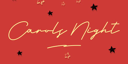 Give your designs an authentic handcrafted feel. �Carols Night Christmas Theme Font� is perfectly suited to stationery, logos and much more. Many Thanks!
 - Sunfort by Maulana Creative,
$14.00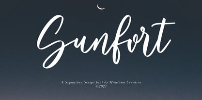 Give your designs an authentic handcrafted feel. Sunfort Signature Script Font is perfectly suited to stationery, logos and much more. Many Thanks! MaulanaCreative
 - Buttersoy by Maulana Creative,
$15.00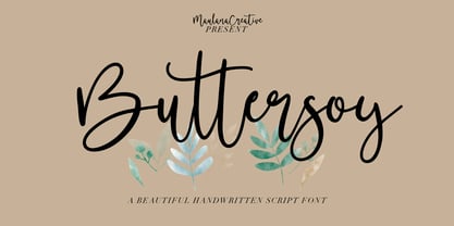 Give your designs an authentic handcrafted feel. Buttersoy Beautiful Handwritten Script Font is perfectly suited to stationery, logos and much more. Maulana Creative
 - Vako Mave by Nirmana Visual,
$24.00 Vako Mave a modern, contemporary of serif font. Ideally suited for advertising and packaging, festive occasions, editorial and publishing, creative industries and posters .
 - Diversal Brush by ijemrockart,
$10.00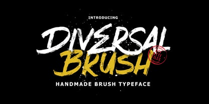 Introducing Give your designs an authentic brush handcrafted feel. “Diversal Brush Font” is perfectly suited to stationery, logos and much more. Thank you,
 - Morning Violetta by Fortunes Co,
$19.00 Morning Violetta is modern contemporary display sans, and well suited for magazines, brochures, logos, headline or quotes, stand alone display, and short paragraphs.
 - Magnold by Hikhcreative,
$19.00 Magnold is a modern bold and elegant serif font. Magnold is well-suited for advertising, branding, logotypes, packaging, titles, headlines and editorial design.
 - Thefrost by Maulana Creative,
$11.00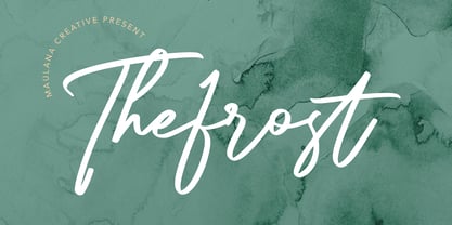 Give your designs an authentic handcrafted feel. Thefrost Modern Script Font is perfectly suited to stationery, logos and much more. Many Thanks! MaulanaCreative
 - Mad World by Maulana Creative,
$13.00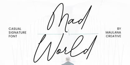 Give your designs an authentic handcrafted feel. �Mad World Casual Signature Font� is perfectly suited to stationery, logos and much more. Many Thanks!
 - Rillies by Maulana Creative,
$12.00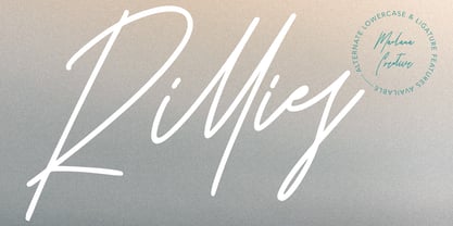 Give your designs an authentic handcrafted feel. "Rillies Modern Signature Font" is perfectly suited to stationery, logos and much more. Thanks for Watching!
 - Tamarac JNL by Jeff Levine,
$29.00Tamarac JNL offers the look of wood type with added serifs. Use Tamarac JNL when you need a change of pace from the "regular" serif fonts. - Airport Cyr - Unknown license

