7,734 search results
(0.027 seconds)
- PR Scrolls 02 by PR Fonts,
$10.00 Inspired by food labels, signs and coats of arms, PR-Scrolls is a collection of images which can be used for framing text in contexts where antiquity, craftsmanship, or traditional quality are conveyed. There are several sets of glyphs which work together to make a variety of shapes, or banners of custom length. Most of the glyphs are presented in a range of three or more widths.
 - PR Swirlies 06 by PR Fonts,
$10.60 This font is a collection of simple calligraphic ornaments suitable for invitations, gift tags, and anything that can benifit from a "spoonful of sugar" visually.
 - PR Foxtail 02 by PR Fonts,
$5.00 The bushy weed commonly known as foxtail provides the inspiration for this set of ornaments, and reveals its connection to the prairies. The appearance has an affinity to cowboy themed work.
 - PR Swirlies 02 by PR Fonts,
$10.20 This font is a collection of calligraphic ornaments suitable for invitations, gift tags,etc. These designs are assembled from hand drawn elements, and mirrored elements have been modified slightly, to increase the hand-drawn appearance. They would also be right at home framing the dialogue screens of a silent film.
 - PR Swirlies 11 by PR Fonts,
$10.00 This font is a collection of simple calligraphic ornaments suitable for invitations, gift tags, and anything that can benefit from a “spoonful of sugar” visually.
 - PR Snowflakes 01 by PR Fonts,
$12.00 These are curly designs arranged into fanciful snowflakes, evoking 1960’s psychedelia as well as Victorian romanticism. An excellent choice for any winter holiday material.
 - PR Mysticon 01 by PR Fonts,
$5.00 There has long been interest in the talismanic value of different numbers and their varied many - pointed stars or patterns. This font presents star designs with points numbering between five and twelve, in solid form, outlined, interlaced, and placed within a circle. Whether your interest is mathematical or mystical, We hope you will enjoy this collection of forms.
 - PR Pointers 01 by PR Fonts,
$5.00Perfect for anything from treasure maps to grocery flyers. This font provides directional arrows in outline, solid and highlighted forms. Each arrow is available in at least 4 directions, and many in eight directions. - PR Swirlies 01 by PR Fonts,
$10.10 This font is a collection of simple calligraphic ornaments suitable for invitations, gift tags, and anything that can benifit from a “spoonful of sugar” visually. The "Sand Drift" version combines well with: PR Bramble Wood 1, PR Bramble Wood 2, PR Hallow Doodles 01, PR Hallow Doodles 02, PR Cauldron, PR Swirlies 01], PR Swirlies 05.
 - PR Swirlies 12 by PR Fonts,
$10.00 This font is a collection of simple calligraphic ornaments suitable for invitations, gift tags, and anything that can benifit from a "spoonful of sugar" visually.
 - PR Swirlies 07 by PR Fonts,
$10.70 This font is a collection of simple calligraphic ornaments suitable for invitations, gift tags, and anything that can benifit from a "spoonful of sugar" visually. Influenced by Celtic knotwork and tattoo designs, interlacing bands are broken to emphasize the "over and under" movement.
 - PR Swirlies 03 by PR Fonts,
$10.30 This set of swirlies oraments is drawn with a pointed brush, for a higher contrast appearance than Swirlies 1 & 2.
 - PR Scrolls 05 by PR Fonts,
$10.05 Inspired by food labels, signs and coats of arms, PR Scrolls is a collection of images which can be used for framing text in contexts where antiquity, craftsmanship, or traditional quality are conveyed. Most of the glyphs are presented in a range of four or more widths.
 - PR Scrolls 03 by PR Fonts,
$10.00 Inspired by food labels, signs and coats of arms, PR-Scrolls is a collection of images which can be used for framing text in contexts where antiquity, craftsmanship, or traditional quality are conveyed. There are several sets of glyphs which work together to make a variety of shapes, or banners of custom length. Most of the glyphs are presented in a range of three or more widths. Scrolls 3 has a greater unity of detail, and a greater variety of form than our earlier designs.
 - PR Swirlies 05 by PR Fonts,
$10.50 Suitable for separating paragraphs, or framing text, this set of swirlies ornaments is drawn with a pointed brush, for a higher contrast appearance than swirlies 1 , 2, and 4. It also has a companion member, with a rough finish, called “Sand Drift”, suitable for natural, earthy subject matter. “Sand Drift” combines well with the following PR Fonts Items: Bramble Wood 2, Bramble Wood 1, Cauldron, Swirlies 1 Sand Drift, Hallow Doodles 1, Hallow Doodles 2.
 - PR Swirlies 13 by PR Fonts,
$10.00 This font is a collection of simple calligraphic ornaments suitable for invitations, gift tags, and anything that can benifit from a "spoonful of sugar" visually.
 - ZT Bros Oskon 90 s by Zelow Type,
$13.00 ZT Bros Oskon 90s is a captivating typographic creation that seamlessly blends the aesthetic charm of the 1990s retro era with a modern touch. With unmatched serif elegance and a unique 90s style, this font offers 72 variations, including sharp Condensed forms, graceful Expanded, and captivating italic styles. Every character in ZT Bros Oskon 90s is meticulously crafted, creating a vintage ambiance that is truly enchanting. Featuring 6 font weights ranging from Extra Light to Bold, this font provides you with the flexibility to create a wide range of striking and memorable designs. Features of ZT Bros Oskon 90s: 72 Unique Variations Aesthetic Retro Vibes from the 1990s Elegant Serif Style Condensed, Expanded, and Italic Forms 6 Font Weights: Extra Light, Light, Regular, Medium, Semi-Bold, Bold Exceptional Creative Versatility ZT Bros Oskon 90s is the perfect choice for graphic design projects, branding, posters, and other promotional materials that require a captivating retro touch. Unleash limitless creativity with this font and infuse a nostalgic 1990s vibe into every one of your creations. ZT Bros Oskon 90s has 6 free styles, you can get them on my GUMROAD I hope you have fun using ZT Bros Oskon 90s. Thanks for using this font ~ Zelowtype
 - Matterdi by Creativemedialab,
$20.00 Introducing Matterdi, an elegant High-Fashion serif family with tons of unique and fashionable ligatures. This versatile serif family contains 100+ unique, elegant ligatures and alternates. 9 weights available from Thin to Black which gives you many possibilities to layout your next projects. Perfect for word-marks, monograms, logos, branding projects, or to use as web font. Try Matterdi Bold for display titles or Matterdi Thin for a fashionable and elegant look. It is also perfect to pair with a hand-drawn script! How to access alternate? Adobe Photoshop go to Window - glyphs Adobe Illustrator go to Type - glyphs
 - Schuss Sans PCG by typic schuss,
$- I was working about 10 years exclusively for a type company. Based on my experiences, I built this superfamily. Schuss™ Sans PCG is a humanistic sans-serif with a little contrast. Small Caps, greek and cyrillic are included. Also tab, prop, lining, old style and small cap figures. It's a typeface with clear and open characters. All complicated shapes are cleaned and simplified with a bit elegance. Schuss™ Slab Pro is a slab serif, based on the Schuss™ Sans. Schuss™ News Pro is the modeled style between Schuss™ Slab Pro and Schuss™ Serif Pro. Schuss™ Serif Pro is the antiqua shape. Additionally all serifs are cleaned up. There is just one-side-serif in the "n" for example. Tab figures (except small caps), mathematical signs and currency symbols have a width system accross all styles and weights.
 - Metro Nova by Linotype,
$57.99 Metro Nova comprises seven weights, from ultra thin to extra black in regular proportions, and six weights as condensed designs. Each has an italic counterpart for a total of 26 fonts. The family is available as OpenType® Pro fonts, which provide for the ability to easily insert typographic features such as ligatures, fractions and alternate characters. Pro fonts also offer an extended character set to support most Central European and many Eastern European languages.
 - Peking Duck by Hanoded,
$15.00 I used to be a tour guide and I traveled to China numerous times. Usually, the itinerary mentioned going to a restaurant in Beijing and eating ‘Beijing Roast Duck’ (北京烤鸭), a famous dish that has been prepared since the Imperial era. Typically, the whole duck is sliced at your table. The skin is crisp, glazed and thin and you should eat it with thin pancakes and thinly sliced spring onion. Of course, if I had to guide several ‘China tours’ in a row, I would often eat something else (there is only so much Beijing Duck you can eat). Peking Duck is a nice, handmade, Chinese Ink font. Use it for your restaurant menu, your book covers or your posters, advertising oriental food!
 - Salminah by Letterafandi Studio,
$14.00 Salminah is a fashionable and thin lettered script font. Suitable to a wide variety of designs due to its neat and simple style, this font has the potential to become your favorite go-to font, no matter the occasion!
 - Riesling - Unknown license

- Brassiere Line - Unknown license

- Fat Albert BT by Bitstream,
$50.99 Ray Cruz releases another typeface family, this time inspired by 1970's pop culture. Fat Albert Regular, Outline and Shadow are bold poster types that evoke the fun and funk of an era gone by. Go on bro, get Fat Albert and get down.
 - Uncle Lee by Dawnland,
$13.00 Meet Uncle Lee - a hand drawn and playful serif! An upper-case-only font with upper-case-variants on the lower-case letters. With three happy versions - regular, outline & thin - you just can't go wrong! Don't forget to pay Auntie Lee a visit!
 - 1955 by Alan Smithee Studio,
$9.00 1955 Is a fresh grotesque interpretation. Any detail too historically referenced is replaced by strong geometry and idiosyncratic features. Round dots and punctuation, curved “l” foot, single storey “g” etc. all these details make 1955 a very contemporary typeface (unlike the name suggests!). With a range of weights going from Thin to Black including Italics, OpenType Features, extended character-set, tailored for print and digital, 1955 has everything to become your new go-to typeface for every project!
 - P22 Allyson by IHOF,
$39.95 P22 Allyson is based on an old metal font by Barnhart Bros. & Spindler named Hazel Script. This font is perfect for elegant invitations and certificates and has been expanded to meet the needs of today's computer user to include a full character set. Allyson Pro contains OpenType features.
 - Juicy by Positype,
$22.00 Juicy is different… in a good way. An art deco-inspired, high-contrast, upright semi-script, layered typeface best describes the playful letterforms that make up Juicy Pro (semi-connected) and Juicy Simple (unconnected). Great care has been taken to provide a wide complement of options and intelligent letter combinations thanks to OpenType. And that’s right, Juicy *is* a layered semi-script typeface. Pro and Simple variants provide a full character set (yep, lowercase). Pro variants include a wide variety of Stylistic, Swash, and Titling Alternates to really allow the expressiveness of the typeface shine… and all characters are available in the layered font counterparts… no shortcuts were taken on the delivery of this typographic chimera.
 - Auntie Lee by Dawnland,
$13.00 Meet Auntie Lee - a hand drawn and playful sans serif! An upper-case-only font with upper-case-variants on the lower-case letters. With three happy versions - regular, outline & thin - you just can't go wrong! Don't forget to pay Uncle Lee a visit!
 - Cyntho Next by Mint Type,
$35.00 Cyntho Next is a totally reworked typeface based on our previous bestseller Cyntho Pro. It also has a slab-serif counterpart - Cyntho Next Slab. Cyntho Next is a modern geometric sans based on a hybrid waterdrop-like shape with eight weights varying from Thin to Black and featuring Cyrillic.
 - Kanakira by Jetsmax Studio,
$15.00 Kanakira is a modern sans typeface that is heavy on a geometric take of the neo-grotesque model, with a special ink-trap feature. Available in 9 weights from thin to heavy, Kanakira is ready to be your “go-to” font for any kind of project.
 - Minotte by Park Street Studio,
$35.00 Originally conceived while sketching outline typefaces for a client, Minotte Pro has blossomed into a font one thousand glyphs strong and is chock full of alternates and contextual swashes! By enabling swashes, style sets, and contextual alternates in your OpenType savvy application, headlines and text set with Minotte Pro will transform into unique combinations of initial, middle and final swash forms! There’s also an alternate Cap set with a partial fill for even greater variety! Perfect for travel ad headlines, Minotte Pro adds a light, carefree touch. If your app doesn't support OpenType, then check out the split out versions, Minotte, Minotte Swash, Minotte Fil and Minotte Swash Fil. Minotte Pro Minotte Solid Pro contain these OpenType features: Contextual Swashes, Stylistic Alternates, Standard & Discretionary Ligatures, 6 Style Sets, Superiors & Inferiors, Fractions and Ornaments. The Minotte Extras Pro Pak includes three chromatic effects fonts, Minotte Center, Minotte Gradient and Minotte Shadow. These Extras fonts are intended to be used with Minotte Pro and Minotte Solid Pro, allowing colorizing and 3-D shadow effects. There are numerous combinations when using all three together! The three Extras fonts support the entire Pro character set and all OpenType features! Intended for users that do not own or use OpenType savvy apps, the four alternative fonts capture the best of the Pro version and will provide you with the glyphs needed to duplicate some of Minotte Pro’s typographic richness. Minotte and Minotte Fil are fully usable, whereas the Minotte Swash and Minotte Swash Fil are intended to work in tandem with the basic Minotte fonts. Set your headlines and text in Minotte, then switch to Minotte Swash and manually select the appropriate swash glyphs. Switch to either of the Fil fonts for full sets of Cap alternates sporting a partial fill. Minotte Pro, Minotte, Minotte Fil, Minotte Swash and Minotte Swash Fil support an extended European character set.
 - Supreme by BW90,
$19.00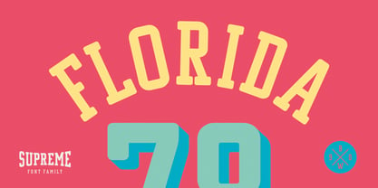 *GO TEAM GO*
 - Hero Sandwich Combos by Comicraft,
$19.00 As comic book readers know all too well, team ups are every super hero’s bread and butter... when the brave and the bold are in a pickle, and super villains are running onion rings around them, here’s how they roll: They Meat! They Team-Up with your taste buds! They Fight Hunger! Yes, some hero combos may get along better than others, but they are always more powerful together. So take a footlong bite out of crime, and make the subways safe again with our mouthwatering HERO SANDWICH! Prepared with plastic gloves on by those awfully nice chaps at the Comicraft deli. If you're an avenging hero on the go, have no fear, we've pre-assembled these eight classic Hero Sandwich Combos! Because choosing your fillings shouldn't get in the way of knocking out a supervillain’s fillings. See these families related to Hero Sandwich Combos: Hero Sandwich Ingredients Hero Sandwich Pro
 - Alio Text by R9 Type+Design,
$35.00 Alio™ Text is the workhorse of the Alio family . It works beautifully as display type, body copy and anything in between. We redesigned Alio Text with taller x-height, more pronounced accents, and wider letter spacing than its siblings, Alio Pro. We also cut down from 6 weights/12 styles to 4 weights/8 styles. All of these is to ensure the legibility and readability and to maximize the weight contrast at small sizes. Whether your designs call for all caps, title case, sentence case or all lowercase, Alio Text has got you covered with the case-sensitive punctuations. No more baseline shift all your punctuations. Alio Text supports most Latin-based languages and even the Chinese Pin-Yin. This typeface also packs with Open-Type features similar to Alio Pro. For examples, both recognize fractions vs. dates; Both features several alternate positions for the legal symbols (3 in Alio Text; 5 in Alio Pro). If you’re looking for a go-to, versatile typeface for most occasions, Alio Text is for you. (4 weights/8 font styles, 500+ glyphs each).
 - TipTop by profonts,
$41.99 TipTop Pro’s origin goes back to around 1900 when the font was released by the German foundry Julius Klinkhardt in Leipzig. Ralph M. Unger redesigned this beautiful art nouveau typeface, extended its character set and digitally remastered it. TipTop Pro fits perfectly into the series of recently released URW++ art nouveau designs (Edda, Gradl, Impression, Joga, Ornella).
 - AmpleSoftPro by Soneri Type,
$60.00AmpleSoft Pro is an extended version of AmpleSoft type family. AmpleSoft Pro Includes Extended Languages Character Set for following: Azerbaijan, Belarus, Bulgaria, Czech Republic, Kazakhstan, Latvia, Lithuania, Polish, Romania, Russia, Slovakia, Ukraine, Uzbekistan, Vietnam. AmpleSoft Pro is a display type family, optical mono linear and a bit squarish in nature. It has smooth curve instead of sharp angle formed by the junction of two strokes, which is a prominent feature of its design. It is designed to be a little eye-catching yet legible. It has clear and distinguishable letterforms, which helps to elaborate and emphasis the message. It is graphically strong and command viewer's attention. The overall appearance of type is suitable in setting it as heading, title, headline, etc. The type family consists of six weights: Thin, ExLight, Light, Regular, Medium and Bold. - Scriptina Pro by CheapProFonts is an exquisite font that has captivated the hearts of designers and typographers with its elegant and whimsical charm. A refined version of the original Scriptina font...
- Pantera by Lián Types,
$39.00 ROARRR! THE STYLES -Pantera Pro is the most complete style, and although its default look is mono-rhythmic it gets really playful and crazy like the examples of the posters by just activating the Decorative Ligatures button in the Open-type Panel of Adobe Illustrator. However, I recommend using also the Glyphs Panel because there you'll find much more variants per letter. Pantera Pro is in fact, coded in a way the combination of thicknesses will always look fantastic. -Pantera Black Left, and Pantera Black Right are actually “lite” versions of Pantera Pro: They have very little Open-Type code, so what you see here is what you get. Pantera Black Left has its left strokes thick, while Pantera Black Right has its right strokes thick. -Pantera White is a lovely member in this family that looks lighter and airy, hence its name. With the feature Standard Ligatures activated (liga) the font gets very playful. -Pantera Caps is based on sign painters lettering and since it follows the same pointed brush rules as the other styles, it matches perfectly. -Pantera Claws like its name suggests, is a set of icons that were done by our dear panther. THE STORY It is said that typography can never be as expressive as calligraphy, but sometimes it can get close enough. I tend to think that calligraphic trials, in order to work well as potential fonts, need first to go through very strict filters before going digital: While calligraphy is synonym of freedom (once its rules are mastered), type-design, in the other hand, has its battlefield a little tighter and tougher. When I practice pointed brush lettering, there are so many things happening on the paper. And most of them are delicious. The ones who know my work may see that although many of my fonts are very expressive, my handmade brush trials are much more lively than them. With that in mind, this time I tried to go further and rescue more of those things that are lost in the process of thinking type when first sketches are calligraphic. I wondered if I could create something wild, hence its name Panther, by understanding the randomness that sometimes calligraphy conveys and turning it to something systemic: With Pantera, I created an ordered disorder. Like it happens a lot in many kinds of lettering styles, in order to enrich the written word the scribe mixes the thickness of the strokes and the width of the letters. Like one of my favorite mentors say (1), they make thoughtful gestures Some lively strokes go down with a thick, while some do that with a thin. Some letters are very narrow, meaning some of them will need to be very wide to compensate. Why not?. The calligrapher is always thinking on the following letters, and he/she designs in his head the combination of thicks and thins before he/she executes them. He/she knows the playful rhythm the words will have before writing them. It takes time and skill to master this and achieve graceful results. Going back to the font, in Pantera, this combination of varying thicknesses and widths of letters were Open-Type coded so the user will see satisfactory results by just enabling or disabling some buttons on the glyphs panel. I'm very pleased with the result since it’s not very easy to find fonts which play with the words' rhythm like Pantera does, following of course, a strong calligraphic base. I believe that if you were on the prowl for innovative fonts, this is your chance to go wild and get Pantera! NOTES (1) Phrase by Yves Leterme. In fact, it’s the title of a book by him. EPILOGUE Esta fuente está dedicada a mi panterita

