10,000 search results
(0.04 seconds)
- Brackout by Runsell Type,
$16.00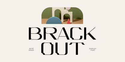 Brackout font is perfect for many of your projects like logos & branding, photography, invitations, watermarks, advertisements, product designs, stationery, wedding designs, labels, product packaging, special events and much more.
 - Anderson by Larin Type Co,
$12.00 Anderson is a stylish and unique handwritten font that is easy to remember. It’s great for branding, photo overlays, book covers, magazines, watermarks, business cards, invitations, and much more!
 - Ufaira by Edcreative,
$15.00 Ufaira is an original handwritten font that can be used in various needs of the network such as screen printing of clothes, posters, films, magazines, banners, books, and more!
 - Burithan by Runsell Type,
$16.00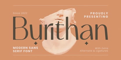 Burithan font is perfect for many of your projects like logos & branding, photography, invitations, watermarks, advertisements, product designs, stationery, wedding designs, labels, product packaging, special events and much more.
 - HV Cocktail by Harmonais Visual,
$12.00 Cocktail - elegant retro serif with an artistic touch. Specially designed for vintage, retro, elegant projects, perfectly suitable for creating simple, lifestyle designs such as logos, title, packaging, and more.
 - Ecbert by Runsell Type,
$16.00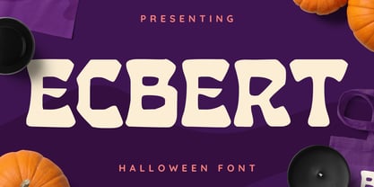 Ecbert font is perfect for many of your projects like logos & branding, photography, invitations, watermarks, advertisements, product designs, stationery, wedding designs, labels, product packaging, special events and much more.
 - Stay Kind by Sans And Sons,
$12.00 Stay Kind is Modern Retro with Fun and Groovy Style is perfect for branding, logos, shirts, invitation, stickers, master heads, Cricut projects, social media, posters, magazine, prints and more.
 - Wayxon by Runsell Type,
$16.00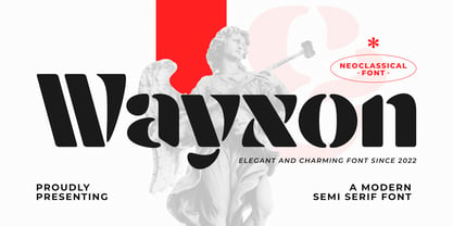 Wayxon font is perfect for many of your projects like logos & branding, photography, invitations, watermarks, advertisements, product designs, stationery, wedding designs, labels, product packaging, special events and much more.
 - Rooters by Letterafandi Studio,
$14.00 Rooters is a Handwritten font. That font is perfect for; logos, greeting cards, package design, brand identity, craft design, any DIY project, book title, packaging, another project, and more.
 - Chamfer Stencil Sans JNL by Jeff Levine,
$29.00 Based on some 1930s-era ‘block chamfer’ gummed paper lettering, Chamfer Stencil Sans JNL is a stenciled treatment of the original design; available in both regular and oblique versions.
 - German by Runsell Type,
$16.00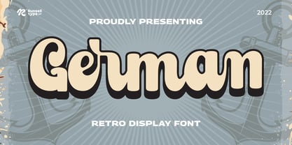 German font is perfect for many of your projects like logos & branding, photography, invitations, watermarks, advertisements, product designs, stationery, wedding designs, labels, product packaging, special events and much more.
 - Bonstar by Runsell Type,
$16.00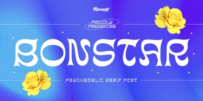 Bonstar font is perfect for many of your projects like logos & branding, photography, invitations, watermarks, advertisements, product designs, stationery, wedding designs, labels, product packaging, special events and much more.
 - Qalkage by Runsell Type,
$16.00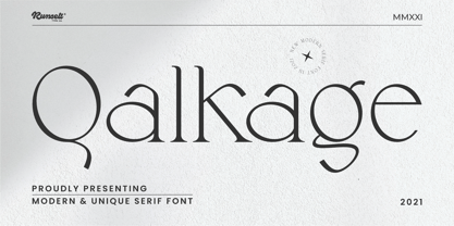 Qalkage font is perfect for many of your projects like logos & branding, photography, invitations, watermarks, advertisements, product designs, stationery, wedding designs, labels, product packaging, special events and much more.
 - Thebeats by Runsell Type,
$16.00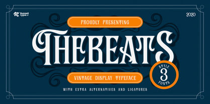 Thebeats font is perfect for many of your projects like logos & branding, photography, invitations, watermarks, advertisements, product designs, stationery, wedding designs, labels, product packaging, special events and much more.
 - SpaceMace by Scannerlicker,
$33.00 SpaceMace is a pixel-font designed for print work... or not! It features 950 glyphs, from Basic Latin to Greek and Cyrillic, with ligatures, swashes and much, much more!
 - Welotils by Runsell Type,
$16.00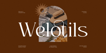 Welotils font is perfect for many of your projects like logos & branding, photography, invitations, watermarks, advertisements, product designs, stationery, wedding designs, labels, product packaging, special events and much more.
 - Myavit by Runsell Type,
$16.00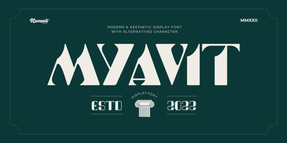 Myavit font is perfect for many of your projects like logos & branding, photography, invitations, watermarks, advertisements, product designs, stationery, wedding designs, labels, product packaging, special events and much more.
 - Dheatnote by Runsell Type,
$16.00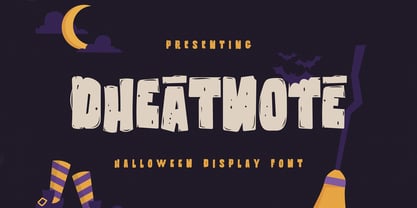 Dheatnote font is perfect for many of your projects like logos & branding, photography, invitations, watermarks, advertisements, product designs, stationery, wedding designs, labels, product packaging, special events and much more.
 - Colaste by Runsell Type,
$16.00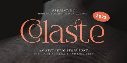 Colaste font is perfect for many of your projects like logos & branding, photography, invitations, watermarks, advertisements, product designs, stationery, wedding designs, labels, product packaging, special events and much more.
 - Brooklyn Syndrome by Krakenbox Studio,
$12.00 Brooklyn Syndrome is a modern, cool, squared lettered and bold display font. It will elevate a wide range of crafting ideas, from cards, to branding, labels and much more.
 - Rakels by Runsell Type,
$16.00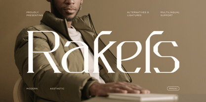 Rakels font is perfect for many of your projects like logos & branding, photography, invitations, watermarks, advertisements, product designs, stationery, wedding designs, labels, product packaging, special events and much more.
 - Bestro by Maulana Creative,
$17.00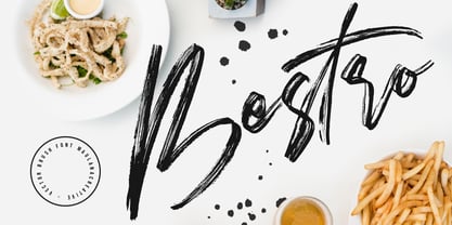 Give your designs an authentic handcrafted feel. "Bestro" is perfectly suited to signature, stationery, logo, typography quotes, magazine or book cover, website header, clothing, branding, packaging design and more.
 - Cigesar by Runsell Type,
$16.00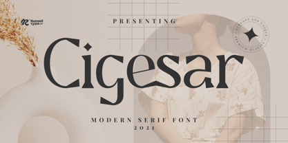 Cigesar font is perfect for many of your projects like logos & branding, photography, invitations, watermarks, advertisements, product designs, stationery, wedding designs, labels, product packaging, special events and much more.
 - Scuad by Runsell Type,
$16.00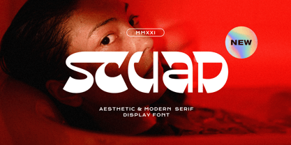 Scuad font is perfect for many of your projects like logos & branding, photography, invitations, watermarks, advertisements, product designs, stationery, wedding designs, labels, product packaging, special events and much more.
 - Rackham by Scriptorium,
$18.00Rackham Italic is based on the hand lettered titles of Arthur Rackham from the book English Fairytales. The Rackham font is based on his more familiar title lettering style. - Roxike by Runsell Type,
$16.00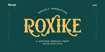 Roxike font is perfect for many of your projects like logos & branding, photography, invitations, watermarks, advertisements, product designs, stationery, wedding designs, labels, product packaging, special events and much more.
 - Gargefo by Runsell Type,
$16.00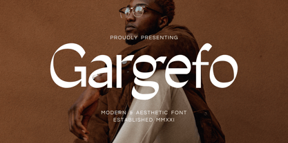 Gargefo font is perfect for many of your projects like logos & branding, photography, invitations, watermarks, advertisements, product designs, stationery, wedding designs, labels, product packaging, special events and much more.
 - Astrolove by Maulana Creative,
$15.00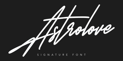 Give your designs an authentic handcrafted feel. "Astrolove" is perfectly suited to signature, stationery, logo, typography quotes, magazine or book cover, website header, clothing, branding, packaging design and more.
 - Voina by Runsell Type,
$16.00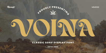 Voina font is perfect for many of your projects like logos & branding, photography, invitations, watermarks, advertisements, product designs, stationery, wedding designs, labels, product packaging, special events and much more.
 - Qualie by Runsell Type,
$16.00 Qualie font is perfect for many of your projects like logos & branding, photography, invitations, watermarks, advertisements, product designs, stationery, wedding designs, labels, product packaging, special events and much more.
 - Quecker by Runsell Type,
$16.00 Quecker font is perfect for many of your projects like logos & branding, photography, invitations, watermarks, advertisements, product designs, stationery, wedding designs, labels, product packaging, special events and much more.
 - Canbera by Viswell,
$19.00 Canbera is an old style serif font, its funky, round, hight-contrast and bold shape with a retro touch is perfect for displayed, head text, logotype and many more.
 - Mastadoni by Eclectotype,
$40.00 Mastadoni is a bold headliner/masthead typeface, with high vertical contrast in a Didone style. That's the starting point at least. There's much more to this font than another modern clone. It is a specialized (only one weight) typeface that comes in five optical grades. Use G1 at very large sizes and G5 at smaller sizes. The grades can be combined so that the thins of type set at different point sizes appear the same thickness - a very useful feature for magazine layouts. Optical grades could also be used in circumstances where a logo needs to be size-specific; the text on your bistro sign can afford to be more delicate than that on your coffee cups. This is a typeface with a big x-height, small cap-height and stubby ascenders and descenders, which contribute to an overall appearance somewhat different from must Didones, and make for some interesting layout possibilities in tight spaces. Mastadoni features a number of useful OpenType features. All fonts include standard ligatures and automatic fractions. In the discretionary ligature feature, you'll find the esoteric "percent off" glyph. Just type '%ff' with dlig engaged and there it is! Case-sensitive forms are available in all the fonts. The contextual alternates feature performs a subtle trick that resolves an optical illusion whereby two ascenders next to each other appear to be different heights. The Roman and Italic styles have a different group of stylistic sets as follows: Roman: SS01 substitutes a less decorative 4; SS02 is a different eszett; SS03 substitues the # with an attractive numero glyph; and SS04 gives an alternate K. Italic: SS01 and SS03 are the same as in the Romans; SS02 gives you more bulbous variants of v, w, and y letters; SS04 is a single storey g; SS05 changes C, G and S to non-ball-terminal varieties; and SS06 changes the swash versions of E, L, N and Q (when the swash feature is engaged). Speaking of the swash feature, the italic fonts feature swash capitals from A to Z, and swash variations for lower case h k m n v w and z. Lastly, the discretionary ligature feature in the italic fonts has vi, wi, KA and RA ligatures. Mastadoni is a typeface that would find itself immediately at home in glossy magazines, while offering a different aesthetic palette from the more standard choices of Didones.
 - BD Gitalona Moxa by Balibilly Design,
$19.00 This is an Experimental typeface, a direct descendant of the BD Gitalona font family, which has a supermassive family with Variable technology. However, this version is more on the aesthetic aspect, which is experimental and exploratory. It complements the beauty of the primary typeface that we released separately. If you are a fan of Effectiveness and flexibility, please learn more about BD Gitalona and BD Gitalona Variable! Inspiration The world of entertainment moves non-stop. One by one, figures appeared and left. We expect to create something to entertain previous trends with packaging more relevant to the present. More specifically, we admire and are inspired by some of the world's leading and top singers with a segmented nature. We imagine so many figures that can affect every viewer. However, each artist or singer has a segment because almost all of them have characteristics. The Design The basic design of this typeface begins with a transitional serif shape with sharp, shapeless corners. Then in the middle of the invention, there was an opportunity to explore it further from the readability side by adding an optical variable that can adjust the serif thickness when used together between large, medium to paragraph text sizes for editorials. The shift from serif to sans-serif with the contrast initiated by the shift of the serif family form as a different variable also makes this font richer in terms of the features it contains. Parts are expected to add to the user satisfaction with the complexity of this font. The Features BD Gitalona consists of one sub-family intended for body text with nine weights from Thin(100) to Black(900) and four other display sub-families such as Display serif, Flick, Harmony Sans and Contrast Sans. Each consists of four weights Thin(100), Regular Weight(400), Bold(700), and Black(900). And again, there are also retailed separately; the BD Gitalona Variable font, which is designed to accommodate all Subfamily in 1 font file, and BD Gitalona Moxa, an experimental typeface. A total of 700+ glyphs in each style. Advanced OpenType features functionally and aesthetically, such as Case-sensitive forms, small caps, standard and discretionary ligatures, stylistic alternates, ordinals, fractions, numerator, denominator, superscript, subscript, circled number, slashed zero, old-style figure, tabular and lining figure. Supports multi-languages including Western Europe, Central Europe, Southeast Europe, South America, and Oceania.
 - Bodoni Ornamental by FontMesa,
$30.00 New for 2020 Bodoni Ornamental now has two italics to choose from, one basic italic and a second which is more of a true italic with a few uppercase letters that have been stylized. Only one italic can be style linked to the regular upright version so in the second italic we've added Avanti to the name which means forward in Italian. When purchasing the regular upright and Avanti italic together they will install as two separate families. Bodoni Ornamental is a revival of a very old typeface based on the Poster Bodoni letter shape. Giambattista Bodoni passed away in 1813, this decorative version was created in the 1820’s or 1830’s which was the time period when many of these ultra bold decorated type faces began to appear, the original artist is currently unknown. The original version of this ornate classic was only available as a set of uppercase letters, today over one hundred eighty years later this font is now complete with a new lowercase, numbers and accented characters for Eastern, Central and Western European countries. Due to the ornate detail in Bodoni Ornamental when printing itís recommended to use a laser printer 600dpi or greater, a 1200dpi printer will give you the best results rendering the most detail at the smallest possible point size for this font. Small home user Ink Jet printers are not recommended for Bodoni Ornamental unless you set the font to a very large point size. With Ink Jet printers much of the detail in the letters will bleed together as the ink hits the page, commercial Ink Jet printers such as GiclÈe printers may give good results. When using Bodoni Ornamental for digital images including web site graphics it may help to add a one pixel stroke fill around the letters setting color to white or grey, this may help the web site images display better on some computer's. You will need a photo editing application such as Adobe Photoshop to create your image adding the stroke fill and save as a jpg , png or gif file. I hope you enjoy this old font as much as I did making it. Note: When previewing the Bodoni Ornamental font in the Windows font preview you may notice some letters appearing lighter and some darker, this is a problem with the preview window and some ornate fonts, Bodoni Ornamental will print normal and not with mixed light and dark letters.
 - FF Info Pict by FontFont,
$62.99 Erik Spiekermann, working in collaboration with Ole Schäfer, originally designed FF Info® Display for use in the context of wayfinding systems. The variants FF Info™ Text and FF Info™ Correspondence were developed later for text setting and office communication. FF Info Display The sober and clear forms of the sans serif FF Info Display have been deliberately molded to make them perfect for use on wayfinding systems. The font by Ole Schäfer and Erik Spiekermann not only takes the problem of lack of space into account - it is some 15% narrower than comparable typefaces - the characters have also been designed to ensure they remain legible even in adverse conditions for reading. As text on signs often contains words with which readers are unfamiliar and which are thus deciphered letter for letter rather than perceived as whole words, it is essential to provide for a clear differentiation between glyphs. Additional serifs on the lowercase "i" and uppercase "I" and a small arch on the terminal of the lowercase "l" ensure that it is possible to readily discriminate between these particularly problematic letters. Moreover, sharp corners on glyphs can also make it difficult to read signs with backlighting or when driving past. The rounded corners of FF Info Display counteract this effect and make sure that the character forms remain well defined.FF Info Display is available in five carefully coordinated weights, from Regular to Bold. In the corresponding italic variants, the letters appear overall more rounded while the lowercase "a" has a closed form and the "f" has a descender. Also included among the glyphs of FF Info Display are several ligatures and arrow symbols. Pictograms with different themes that complement the typeface are also available in four weights. FF Info Text Thanks to his know-how gained through designing other typefaces, Erik Spiekermann became aware that fonts created for use in problematic environments can be used in many different situations. In smaller point sizes, FF Info Display cuts a fine figure when used to set longer texts. So Spiekermann carefully reworked FF Info Display to produce FF Info Text, a font perfected for use in this context. Not only can the characters be more generously proportioned, certain features, such as additional serifs to aid with the differentiation of problematic letters, are also no longer necessary in textual surroundings. The upright styles have a double-story "g" while Spiekermann has added oldstyle figures and small caps. FF Info Correspondence FF Info Correspondence has also been designed for setting block text although it recalls the style of old typewriter characters and is specifically intended for use in office communication. The characters of this third member of the family are thus more formal, without rounded terminals but with rectangular punctuation marks. The narrower letters are provided with large serifs to give them more space although, at the same time, this reduces the differences in terms of letter width among the alphabet. In contrast with its two siblings, FF Info Correspondence has only three weights, each with corresponding italic.The three styles of the FF Info super family cover an extensive range of potential applications. If the different kerning is adjusted manually, the three styles harmonize happily with each other and can be readily used in combination to set, for example, headlines and texts and also creative display options.
 - Eskapade by TypeTogether,
$53.50 The Eskapade font family is the result of Alisa Nowak’s research into Roman and German blackletter forms, mainly Fraktur letters. The idea was to adapt these broken forms into a contemporary family instead of creating a faithful revival of a historical typeface. On one hand, the ten normal Eskapade styles are conceived for continuous text in books and magazines with good legibility in smaller sizes. On the other hand, the six angled Eskapade Fraktur styles capture the reader’s attention in headlines with its mixture of round and straight forms as seen in ‘e’, ‘g’, and ‘o’. Eskapade works exceptionally well for branding, logotypes, and visual identities, for editorials like magazines, fanzines, or posters, and for packaging. Eskapade roman adopts a humanist structure, but is more condensed than other oldstyle serifs. The reason behind this stems from the goal of closely resembling the Fraktur style to create harmony in mixed text settings. Legibility is enhanced by its low contrast between thick and thin strokes and its tall x-height. Eskapade offers an airy and light typographic colour with its smooth design. Eskapade italic is based on the Cancellaresca script and shows some particularities in its condensed and round forms. This structure also provided the base for Eskapade Fraktur italic. Eskapade Fraktur is more contrasted and slightly bolder than the usual darkness of a regular weight. The innovative Eskapade Fraktur italic, equally based on the Cancellaresca script previously mentioned, is secondarily influenced by the Sütterlin forms — an unique script practiced in Germany in the vanishingly short period between 1915 and 1941. The new ornaments are also hybrid Sütterlin forms to fit with the smooth roman styles. Although there are many Fraktur-style typefaces available today, they usually lack italics, and their italics are usually slanted uprights rather than proper italics. This motivated extensive experimentation with the italic Fraktur shapes and resulted in Eskapade Fraktur’s unusual and interesting solutions. In addition to standard capitals, it offers a second set of more decorative capitals with double-stroke lines to intensify creative application and encourage experimental use. The Thin and Black Fraktur styles are meant for display sizes (headlines, posters, branding, and signage). A typeface with this much tension needs to keep a good harmony between strokes and counters, so Eskapade Black has amplified inktraps and a more dynamic structure seen in the contrast between straight and round forms. These qualities make the family bolder and more enticing, especially with the included uppercase alternates. The Fraktur’s black weights are strident, refusing to let the white of the paper win the tug-of-war. It also won’t give away its secrets: Is it modern or historic, edgy or amicable, beguiling ornamentation or brutish presentation? That all depends on how the radically expanded Eskapade family is used, but its 16 fonts certainly aren’t tame.
 - Dynascript by Alphabet Soup,
$60.00 Typography enters the Space Age! Dynascript brings the ease of “Pushbutton Automatic” to your typesetting experience. Dynascript is actually Two fonts in One–without switching fonts you can instantly change from Dynascript’s connecting font to the non-connecting italic with the simple push of a button. For more details download “The Dynascript Manual” from the Gallery Section. What is Dynascript? Dynascript is the slanted script cousin of Dynatype. It shares many of the characteristics of it’s sibling, but is drawn entirely from scratch and has it’s own unique character. To some it may be reminiscent of various mid-century neon signage, and of sign writing, Speedball alphabets and even baseball scripts. The design of Dynascript also takes some cues from a historical typographic curiosity that began in Germany in the ‘20s and which lasted into the ‘60s—when Photo-Lettering gave it the name "Zip-Top". Basically it was believed to be the wave of the future—that by weighting an alphabet heavier in its top half, one could increase legibility and reading speed. The jury’s still out on whether or not there’s any validity to this claim, but I think you’ll agree that in the context of this design, the heavier weighting at the top of the letters helps to create some uniquely pleasing forms, and a script unlike any other. Typesetters across the planet will also be able to set copy in their language of choice. Dynascript’s 694 glyphs can be used to set copy in: Albanian, Basque, Catalan, Cornish, Croatian, Czech, Danish, Dutch, Esperanto, Estonian, Faroese, Finnish, French, Galician, German, Hungarian, Icelandic, Indonesian, Irish, Italian, Kalaallisut, Latvian, Lithuanian, Malay, Maltese, Manx, Norwegian Bokmål, Norwegian Nynorsk, Oromo, Polish, Portuguese, Slovak, Slovenian, Somali, Spanish, Swahili, Swedish, Turkish, and Welsh—and of course English. Sorry! Off-world languages not yet supported. PLEASE NOTE: When setting Dynascript one should ALWAYS select the “Standard Ligatures" and “Contextual Alternates” buttons in your OpenType palette. See the “Read Me First!” file in the Gallery section.
 - FS Emeric by Fontsmith,
$60.00 Right now! FS Emeric reconciles a pair of seemingly opposing approaches: the systematic but chilly functionalism of early modernist typography, trapped in time, and a warmer, more emotional, more optimistic spirit. What Fontsmith created was something that marries precision with expression, geometry with movement, functionality with humanity. FS Emeric has a sharp, kinetic edge that cuts across design disciplines – graphic, fashion, product, automotive. It’s about what’s happening right now. Contemporary, optimistic, distinctive – a classic working sans serif. Appetite Discussions with some of Fontsmith’s design studio clients had revealed an appetite for a new kind of typeface that could express mid-century modernist principles in a fresh, contemporary voice. As he crafted the letterforms that would form FS Emeric, Phil Garnham was guided by two central ideas. First, there was Jan Tschichold’s contention that a good letter is “one that expresses itself, speaking with the utmost distinctiveness and clarity”. Second was a belief that a font can be personally expressive without compromising its functionality. These provided the fuel that drove the project to its conclusion. Posters To mark the launch of FS Emeric, Fontsmith asked 11 eminent design studios from around the world – the likes of Pentagram, Studio Dumbar, Bibliotheque, Non-Format and Build – to create a limited edition A1 poster. Each poster celebrated a different weight of FS Emeric, and just 50 of each were screen-printed by Dan Mather onto 175gsm Colorplan stock. “We gave away a randomly selected poster every time two or more weights of the FS Emeric were purchased,” says Phil Garnham. “They’ve now become somewhat of a collector’s item in their own right.” Superfamily In the spirit of Univers, the original font superfamily, FS Emeric now comprises 22 Roman and italic typefaces overall, making it one of the most versatile and functional modern fonts across all kinds of media, as well as one of the most distinctive.
 - ATF Franklin Gothic by ATF Collection,
$59.00 ATF Franklin Gothic® A new take on an old favorite Franklin Gothic has been the quintessential American sans for more than a century. Designed by Morris Fuller Benton and released in 1905 by American Type Founders, Franklin Gothic quickly stood out in the crowded field of sans-serif types, gaining an enduring popularity. Benton’s original design was a display face in a single weight. It had a bold, direct solidity, yet conveyed plenty of character. A modern typeface in the tradition of 19th-century grotesques, Franklin Gothic was drawn with a distinctive contrast in stroke weight, giving it a unique personality among the more mono-linear appearance of later geometric and neo-grotesque sans-serif types. Franklin Gothic has been interpreted into a series of weights before, most notably with ITC Franklin Gothic. But as the original type was just a bold display face (later accompanied by a few similarly bold widths and italics), how Benton’s design is expanded to multiple weights and styles as a digital type family can vary significantly. Benton designed several gothic faces that harmonize with one another, including Franklin Gothic, News Gothic, and Monotone Gothic, that can serve as models for new interpretations of his work. With ATF Franklin Gothic, Mark van Bronkhorst looked to Benton’s Monotone Gothic—originally a single typeface in a regular weight, and similar to Franklin Gothic in its forms—as the basis for lighter styles. ATF Franklin Gothic may appear familiar given its heritage, but is a new design offering a fresh take on Benton’s work. The text weights are wider and more open than some previous Franklin Gothic interpretations, and as a result are quite legible as text, at very small sizes, and on screen. ATF Franklin Gothic maintains the warmth and the spirit of a Benton classic while offering a suite of fonts tuned precisely for contemporary appeal and utility. The 18-font family offers nine weights with true italics, a Latin-extended character set, and a suite of OpenType features. Download the PDF specimen for ATF Franklin Gothic.