10,000 search results
(0.203 seconds)
- Krosta by Ekahermawan,
$19.00 Krosta is an unique display family that consists of 6 weights from ExtraLight to ExtraBold. All the alternates and ligatures characters of Krosta are specially designed to make your typography design result looks more unique and attractive. Krosta is suitable for many different projects such as logo design, wedding, branding, poster, magazines, labels, merchandise, invitation, presentation, advertising and so much more! FEATURES: OpenType support Playful to use (with ligatures and alternates options) Multilingual support PUA Encoded If you need support or more information about this item, please kindly contact me: ekahermawanputu@gmail.com Thank you so much...I really hope you enjoy when using it!
 - Balgino Display by Natural Ink,
$12.00 Balgino Display - a serif look with simple, clean and visual elegance with smooth curves and beautiful ligatures, A very versatile font that works in both large and small sizes. This font is suitable for a wide variety of projects such as: headlines, logos, labels, branding projects, magazines, homeware designs, product packaging, mugs, quotes, posters, and more. It can also be more expressive and fun, thanks to the many alternatives and binders that combine harmoniously in this font and make it more interesting and versatile. Try to change alternatives, binders and you will get many options for your project which will make it Smooth & beautiful.
 - Cordon Bleu by Pen Culture,
$17.00 Proudly present our newest font called “Cordon Bleu” Cordon bleu is a modern and elegant serif font that comes with more than 50 alternate. With alternates that have an elegant shape, this font will be very suitable for various needs such as branding, logo design, magazines, posters, Instagram feeds and of course there are many more that you can explore with this font. I really hope you enjoy it – please do let me know what you think, comments & likes are always hugely welcomed and appreciated. More importantly, please don’t hesitate to drop me a message if you have any issues or queries. Thank you
 - Marmaris by Larin Type Co,
$15.00 Marmaris this is a soft and elegant serif font. It carries a bold weight, round shapes it is well readable and works well in headlines and with text. This font is suitable for a wide variety of projects such as: logos, labels, branding projects, magazines, homeware designs, product packaging, mugs, quotes, posters and much more. It can also be more expressive and playful, thanks to the many alternatives and ligatures that are harmoniously combined in this font and make it more attractive and versatile. Try to change the alternatives, ligatures and you will get a lot of options for your project that will make it unique.
 - Kansas Casual by Kyle Wayne Benson,
$10.00 Kansas Casual offers a more upright, gothic, and modern alternative to the conventional sign painter's one stroke. Kansas provides a completely unique take on a overdone classic with proportions and crossbar heights inspired by the more friendly Chicago style. This all-caps set provides six weights so that you can adjust size with weight to maintain that authentic single brush weighted look. The proofing process included projecting, tracing, and then painting the letters out to see how true the small details were to the medium. The set also includes wide language support, opentype fractions, and arrows. You can learn more about its development here.
 - Lubaline by Lián Types,
$39.00 Who haven't heard the phrase that ‘any past time was better’?. Although I sometimes find this phrase a little too pessimistic (because I try to think that the best is yet to come), it may be true regarding my passion, typography. I'm too young (29) unfortunately, and this means I did not have the pleasure of being contemporary with maybe the man who has influenced my work the most (1). The man that showed that letters are more than just letters to be read. Herb Lubalin (1918-1981), also called sometimes as ‘the rule basher’ (2), smashed the taboos and sacred rules of type design and gave it personality. He rejected the functionalist philosophy of europeans in favor of an eclectic and exuberant style. To him, letters were not merely vessels of form, they were objects of meaning. (3). Nowadays, when looking at his portfolio, who dares to deny that the term ‘typography’ and ‘beauty’ may go hand-in-hand without any problem? Ed Benguiat, one of Herb’s partners, still likes making jokes with the phrase “screw legibility, type should be beautiful” and what I understand of this is not to forget the rules, but to know and break them carefully. In an era of pure eclecticism, we, the lovers of flourishes and swashes, can't do nothing but admire all the legacy that Lubalin, this wonderful type-guru, left. My font Lubaline read as “the line of Lubalin” is my humble tribute to him. Those who know his work, may see the influences easily like in his ‘Beards’ (1976) and ‘The Sound of Music’ (1965) posters; the art-deco forms in many of his amazing logos and practically in all his creations where letters seem to be alive just like you and me. I really hope that the future finds me still learning more and more about type-design and letterforms, and like him, always willing to make innovations in my field: Because letters are not just letters to be read. NOTES (1) These are some of my fonts in which some of Lubalin’s influences can be seen (in order of creation): Reina, Aire, Erotica, String, Beatle, Heroe, Selfie, Model, Seventies, and many others that are still in progress. (2) (3) Steven Heller. Herb Lubalin: Rule Basher. U&lc (1998) http://www.printmag.com/imprint/my-favorite-lubalin/
 - Kisba Nova by Identity Letters,
$29.00 Kisba Nova – A character actor that turns heads. Spiky serifs, soft ball terminals. All eyes on Kisba Nova: enter a typeface designed to arouse attention. Kisba Nova is that one guest who joins a party, and a murmur goes through the crowd. Kisba Nova is pure charisma. Opposites attract: Kisba Nova combines sharp wedge serifs and spiky spurs with round and soft ball terminals. Infuse this with a neoclassical stroke contrast and you get a thrilling typeface driven by visual extremes. Sure: Kisba Nova is a diva. But it’s a pro, after all. That’s why it comes in two optical sizes: Headline and Text. This makes sure it looks gorgeous in any situation. The Kisba Nova Headline subfamily is flaunts the trademark flamboyant looks and extravagant letters like f and k. They bring you all of the excitement of the showbiz in large applications—use it for sizes of 24 Pt. and more. The extraordinarily designed, thin and monolinear diacritics, punctuation marks, and symbols of Kisba Nova Headline add to this modern and elegant character. Kisba Nova Headline consists of seven weights from Thin to Black, offering plenty of possibilities to set headlines and titles. With about 600 characters per weight, it contains enough functionality for the demands of a skilled typographer. OpenType features, such as a large set of ligatures, extended language support, case-sensitive forms, different sets of figures, and arrows, enable sensational designs both in web & print layouts. The Kisba Nova Text subfamily comes with decreased contrast, more generous letter proportions, and wider spacing. Instead of employing flashy thin and monolinear diacritics, punctuation marks, and symbols, Kisba Nova Text aims for a more even texture on the page. It retains the true, elegant Kisba DNA while allowing you to set legible copy in sizes between 9 and 18 Pt. Nothing will distract your reader–Kisba Nova Text aims to please. Kisba Nova Text consists of seven weights from Thin to Black, offering plenty of possibilities to set body copy and subheadlines. With about 600 characters per weight, it contains enough functionality for the demands of a skilled typographer. OpenType features, such as a large set of ligatures, extended language support, case-sensitive forms, different sets of figures, and arrows, enable sensational designs both in web & print layouts. Kisba Nova celebrates the dual nature of softness and sharpness in a single typeface. It’s a character actor that turns heads.
 - Equine - Unknown license

- Asenine - Unknown license

- Troglodyte - Unknown license

- Dekon - Unknown license

- Grill Sans - Unknown license

- Kantor - Unknown license

- Kantor Ligatures - Unknown license

- ROHS Simplicity by Lemonthe,
$15.00 ROHS Simplicity is a handwritten font. It's perfect for , branding, stationery design, social media, packaging, magazine layout, prints, and more.
 - Science Noire by Fonts of Chaos,
$10.00 Science Noire is a special font with more than 154 glyphes, upper and lower case, punctuation, number and special characters.
 - Margaret River by Epiclinez,
$13.00 Margaret River is a cute, funny handwritten font. It is very cool for use with logos, headlines, branding, and more.
 - Lathinolo by Midtype,
$24.00 Lathinolo is a handwritten font. Perfect for greeting cards, wedding stationery, photographer watermarks logos, modern websites, apparel design and more.
 - Elah Spring by RodrigoTypo,
$25.00 This is a more artistic version of "Elah Pro" containing Regular and alternative version as well as Dingbats and Ornaments.
 - Vogue by E-phemera,
$12.00Vogue is extrapolated from some words in a 1930s brochure from Western Union called The Vogue of the Social Telegram. - Roka by Thinkdust,
$10.00 Roka is a remix of the original 2010 Rika typeface. This time it's got texture and a lot more attitude.
 - Quilted Butterfly by Hanoded,
$15.00 Quilted Butterfly is a rather elegant, yet messy font. It has some interesting glyphs and comes with all the accents.
 - Brilliant Starlight by Silverdav,
$14.00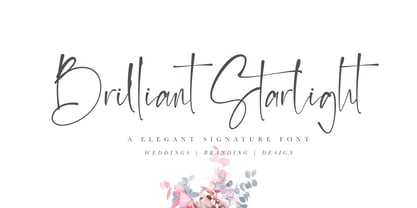 Brilliant Starlight is a very elegant and simple handwritten font, suitable for business cards, signatures, brochures, logos, quotes and more.
 - Joshico by Supfonts,
$15.00 Joshico - a new fresh handmade calligraphy font. Very suitable for greeting cards, branding materials, business cards, quotes, posters, and more!
 - Brutto MF by Masterfont,
$59.00 This clean and geometric font family will suit you as a great companion fo signage, headline, website and much more.
 - Harollds by Maulana Creative,
$11.00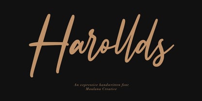 Give your designs an authentic handcrafted feel. Harollds Expressive Handwritten Font is perfectly suited to stationery, logos and much more.
 - LD Chaplin by Illustration Ink,
$3.00Put some style in your layouts—with LD Chaplin. Guaranteed to take you back to a simpler place and time! - Chordettes by Maulana Creative,
$10.00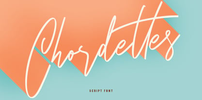 Give your designs an authentic handcrafted feel. Chordette is perfectly suited to stationery, logos and much more. Many Thanks, MaulanaCreative
 - Camerota by Lemonthe,
$15.00 Camerota is a relaxed handwritten font. It’s perfect for branding, stationery design, social media, packaging, magazine layout, prints, and more.
 - Abstrak BF by Bomparte's Fonts,
$14.95 A delightfully odd assortment of characters: some letters are futuristic in design, while others are derived from classical Greek forms.
 - Ameriondela by Maulana Creative,
$21.00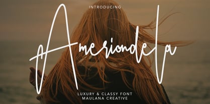 Give your designs an authentic handcrafted feel. "Ameriondela" is perfectly suited to stationery, logos and much more. Thanks for Watching!
 - Tattoo God by Forberas Club,
$16.00 Tattoo God font is good to application for tattoo artist logo, vintage style, and black letter style and many more.
 - TB Matrix by TrueBlue,
$10.00A creative dot matrix font with more likeable and funny types of dots. Also contains an extended set of characters. - Life Mission by Epiclinez,
$18.00 Life Mission is a stylish handwritten script font. It is suitable for logo, branding, packaging, apparel, social media, and more.
 - Livercool by Epiclinez,
$18.00 Livercool is a bold and playful handwritten script font. It is suitable for logo, branding, apparel, social media, and more.
 - Treasury Pro by Canada Type,
$79.95 The Treasury script waited over 130 years to be digitized, and the Canada Type crew is very proud to have done the honors. And then some. After seven months of meticulous work on some of the most fascinating letter forms ever made, we can easily say that Treasury is the most ambitious, educational and enjoyable type journey we've embarked upon, and we're certain you will be quite happy with the results. Treasury goes beyond being a mere revival of a typeface. Though the original Treasury script is quite breathtaking in its own right, we decided to bring it into the computer age with much more style and functionality than just another lost script becoming digital. The Treasury System is an intuitive set of fonts that takes advantage of the most commonly used feature of today's design software: Layering. Please do help yourself to the PDF and images in the MyFonts gallery for a quick look at the some of the limitless possibilities Treasury has to offer, from simple attractive elegance expressed in the main script, all the way into mysteriously magnificent calligraphic plates. To date in digital type history, this is the most comprehensive and versatile work of its kind. Every designer loves many options to experiment. Experimentation has never been as much fun and productive as it is with Treasury. If you're "compudling" your initial ideas for a layout, or you're just an alphabet fan who loves spending time with letters, working with Treasury is very inspiring and fulfilling. Some of Treasury's features are: - No more endless searching for initial caps that fit your project. The Treasury System lets you build your own initial caps, in any combination of colors, fills, linings or dimensions you like, with a few simple clicks of the mouse. - With two base styles and nine layer fonts, the Treasury System set helps you produce endless possibilities of alternation and variation in dimension, color, and calligraphic combinations to fit your layout's exact needs, down to the very last detail. - 12 pre-combined Treasury fonts are also there to help and inspire layout artists who love shortcuts and don't want to fiddle with too many layers in their layout. Available in small packages on their own, or as part of the complete Treasury package, these 12 fonts can start you up on your way to discovering the perfect fit for your layout. - Every single letter in the Treasury System comes with at least one alternative. Some characters have even three or four alternates. Although the main character set is an authentic rendition of Ihlenburg's 1874 classic, we made sure to include a treasure trove of alternates for maximum usability. - The most gorgeous set of numerals we have seen in a long, long time. The Treasury numbers are what really turned us onto this project in the first place. - Treasury Pro, the incredibly sophisticated OpenType version, combines the complete Treasury System into a single font, programmed for compatibility with Adobe's latest CS and CS2 software programs. Over 2000 characters in one font, for thousands of possibilities. Setting the ideal elegant wordmark, logotype, intitial cap, or headline, no matter how simple or complex, is as easy as taking a minute or two to push a few buttons in Illustrator, Photoshop, or InDesign. We can go on endlessly about the beauty and functionality of this Treasury set, but we really cannot do it justice with words. So try Treasury for yourself and see the amazing possibilities of fun and creativity it has. It can be used pretty much anywhere - signs, book covers, certificates, music inserts, movie posters, greeting cards, invitations, etc. Much thanks are due to the generous and considerable help Canada Type received from the Harvard Library in Boston, Klingspor Museum in Frankfurt, and many type hobbyists and researchers in Canada, England, Germany, the Netherlands, and the United States. Without them it would was near-impossible to track down the lost history of Hermann Ihlenburg, the most prolific German/American type designer and punch cutter of the 19th century. We hope Mr. Ihlenburg is proudly smiling down on us from type designer heaven.
 - Chickweed by Typodermic,
$11.95 Chickweed: The Perfect Typeface for Effortlessly Captivating Headlines If you’re looking to make a bold statement with your typography, Chickweed is the font for you. This dynamic typeface effortlessly commands attention with its engaging, informal style that is perfect for headlines and subheadings that need to pack a punch. What’s more, Chickweed’s compact design allows it to take up less space while still making a big impact. Chickweed’s OpenType-savvy features automatically jumble up the variations, giving your design a more natural and exuberant look. This means that you can let your creativity flow, without being bogged down by technicalities. At the core of Chickweed’s design is a style that is stylish, playful, and contemporary. Its unique curves and swoops exude a sense of energy and excitement that is sure to captivate your audience. Whether you’re designing a poster, a logo, or a website, Chickweed is the perfect choice for creating designs that stand out. Why settle for ordinary typography when you can choose Chickweed? Let this dynamic typeface elevate your designs to the next level and bring your message to life in a way that is both engaging and memorable. Try it out today and see the difference for yourself. Most Latin-based European writing systems are supported, including the following languages. Afaan Oromo, Afar, Afrikaans, Albanian, Alsatian, Aromanian, Aymara, Bashkir (Latin), Basque, Belarusian (Latin), Bemba, Bikol, Bosnian, Breton, Cape Verdean, Creole, Catalan, Cebuano, Chamorro, Chavacano, Chichewa, Crimean Tatar (Latin), Croatian, Czech, Danish, Dawan, Dholuo, Dutch, English, Estonian, Faroese, Fijian, Filipino, Finnish, French, Frisian, Friulian, Gagauz (Latin), Galician, Ganda, Genoese, German, Greenlandic, Guadeloupean Creole, Haitian Creole, Hawaiian, Hiligaynon, Hungarian, Icelandic, Ilocano, Indonesian, Irish, Italian, Jamaican, Kaqchikel, Karakalpak (Latin), Kashubian, Kikongo, Kinyarwanda, Kirundi, Kurdish (Latin), Latvian, Lithuanian, Lombard, Low Saxon, Luxembourgish, Maasai, Makhuwa, Malay, Maltese, Māori, Moldovan, Montenegrin, Ndebele, Neapolitan, Norwegian, Novial, Occitan, Ossetian (Latin), Papiamento, Piedmontese, Polish, Portuguese, Quechua, Rarotongan, Romanian, Romansh, Sami, Sango, Saramaccan, Sardinian, Scottish Gaelic, Serbian (Latin), Shona, Sicilian, Silesian, Slovak, Slovenian, Somali, Sorbian, Sotho, Spanish, Swahili, Swazi, Swedish, Tagalog, Tahitian, Tetum, Tongan, Tshiluba, Tsonga, Tswana, Tumbuka, Turkish, Turkmen (Latin), Tuvaluan, Uzbek (Latin), Venetian, Vepsian, Võro, Walloon, Waray-Waray, Wayuu, Welsh, Wolof, Xhosa, Yapese, Zapotec Zulu and Zuni.
 - Sabor by Intellecta Design,
$59.90 Sabor is a voluptuous upright connected display font with mixed taste of script fonts. There were many inspirations for Sabor, but all started with a book from the 1950s about the battles of World War II. To that first sketches of a naive dense display typeface we, day by day, start to create a mixed style evolving some lettering concepts from 1950s, some calligraphy notions and the first display ideas. The feeling of this font is good to be used in many artworks, like logos, packaging, party invitations, layouts for t-shirts, magazine headings, and much more, since websites to and all kind of printed jobs. That font is not really a script, but, like the scripts we strongly recommends to use the caps only in the beginning of words and sentences, to contrast with the lower cases : it’s not designed for all-caps settings, so avoid that kind of use. This font has almost 700 glyphs and supports the most important Latin-based languages. We works hard in a tour-de-force kerning: over 12.000 kerning pairs soft adjusted handily. Its OpenType features include final forms, initial forms, special sets (upper and lowercase's), hundreds of contextual alternates ligatures providing letter-form variations and connections that make your designs really special, and ornaments (tails). Because of its high number of alternate letters and combination's, we suggest the use of the glyph palette to find ideal solutions to specific designs. The sample illustrations will give you an idea of the possibilities. You have full access to this amazing stuff using InDesign, Illustrator, QuarkXpress and similar software. However, we still recommend exploring what this font has to offer using the glyphs palette: principally to get all the power of the Contextual Alternates feature. You can get an idea of the power of this font looking at the “Sabor User Guide”, a pdf brochure in the Gallery section. Also available two sister fonts easy to use : SaborWords and SaborRasgosEscritura Sabor has original letters designed by Iza W and overall creative direction plus core programming by Paulo W.
 - Lady Ice - SC - Unknown license

- Lady Ice - Light - Unknown license


