10,000 search results
(0.066 seconds)
- Homesteader by Jeff Levine,
$29.00Jeff Levine took Crown Heights JNL [named after his childhood neighborhood in Brooklyn, NY] and gave it a make-over; transforming it into a Western-style all-caps display face called Homesteader JNL. The point of interest being the rounded characters: C, G, O and Q - usually not as geometric in Old West typography. - BenderHead AEF by Altered Ego,
$45.00Now, more than ever, the world needs BenderHead. Why? – Because... it just does. Don't ask why, just take our word for it. BenderHead has its thicks and thins all mixed up. For you typographic aficionados, stroke weights and hairline weights aren't consistent, and many rules of typographic design were broken to make this font. We're sure there's a use for it... we've used it on CD covers and posters - and have seen it on a poster for the Zelda video game at Babbages. It's offered here for the first time through Altered Ego Fonts. I don't think we need to explain its history, its inspiration, or its historical reference to you... (we're not certain there is any.) Just accept it as it is, and use it profusely. Benderhead AEF features a full character set, including the Euro. It supports the following codepages: -Latin 1 -Latin 2 (Eastern Europe) -Western Baltic -Turkish AEF highly recommends the OpenType version for compatibility with future Macintosh and Windows operating systems. Not to mention they work better in Adobe InDesign. - HWT Artz by Hamilton Wood Type Collection,
$24.95 HWT Artz is the newest wood type to be cut at Hamilton Wood Type and Printing Museum. It was designed by venerable type designer Erik Spiekermann exclusively for his own print studio (P98a in Berlin), specifically to be cut into large size wood type. The digital version is being offered to the general public with proceeds of sales to benefit the museum's ongoing operations. HWT Artz evokes bold early 20th century European poster lettering. The design itself is intended to minimize hand-finishing and thus production time with rounded corners rather than sharp interior corners that would normally have to be hand-finished. In keeping with the tradition of naming new Hamilton designs after key figures from the living history of Hamilton (and following Spiekermann's tradition of four letter font names), Artz is named after Dave Artz- Hamilton Manufacturing retiree and master type trimmer.
 - Amigo by Monotype,
$29.00Amigo was designed by Arthur Baker in 1989 and consists of a single weight. Its basic forms are based on Venetian old face types, as can be seen for example in the slightly slanted cross stroke of the lower case e. But Baker also gave his figures eccentric contours, for example, a marked stroke contrast which gives the look of having been written with a broad-tipped pen, and the change in stroke is by no means regular in the lower case characters. The heavier upper parts become thinner as they progress downward, in contrast to the tendency of most text typefaces. The eccentricity of the forms give the characters a lively almost comic look and is best highlighted in large point sizes. However, Amigo is also legible in point sizes as small as 10 and well-suited for middle length texts and headlines. - Salvatore by W Type Foundry,
$25.00 Salvatore is the neo-grotesque younger brother of Nutmeg type family. It comes with 36 weights that have been separated in two flavours. The first half is Salvatore normal, which has more neutral features; and the second one is Salvatore Roman, which has more versatility at the end of the characters. The name comes from the Mad Men character Salvatore Romano, who was a publisher in the mid 60s. In that period, grotesques typefaces ruled advertising, nevertheless, there wasn't a typeface that represented publishers as Salvatore Romano, that’s why we gave birth to this project. Designed with powerful OpenType features in mind, each weight includes alternate characters, ligatures, fractions, special numbers, arrows, extended language support and many more… Perfectly suited for graphic design and any display/text use. The 36 fonts are the first part of a larger Salvatore family. We’re proud to introduce: Salvatore.
 - Schism One by Alias,
$55.00 Schism is a modulated sans-serif, originally developed from our Alias Didot typeface, as a serif-less version of the same design. It was expanded to three sub-families, with the thin stroke getting progressively heavier from Schism One to Schism Three. The different versions explore how this change in contrast between thick and thin strokes changes the character of the letterforms. The shape is maintained, but the emphasis shifts from rounded to angular, elegant to incised. Schism One has high contrast, and the same weight of thin stroke from Light to Black. Letter endings are at horizontal or vertical, giving a pinched, constricted shape for characters such as a, c, e and s. The h, m, n and u have a sharp connection between curve and vertical, and are high shouldered, giving a slightly square shape. The r and y have a thick stress at their horizontal endings, which makes them impactful and striking at bolder weights. Though derived from an elegant, classic form, Schism feels austere rather than flowery. It doesn’t have the flourishes of other modulated sans typefaces, its aesthetic more a kind of graphic-tinged utility. While in Schism Two and Three the thin stroke gets progressively heavier, the connections between vertical and curves — in a, b, n etc — remain cut to an incised point throughout. The effect is that Schism looks chiselled and textural across all weights. Forms maintain a clear, defined shape even in Bold and Black, and don’t have the bloated, wide and heavy appearance heavy weights can have. The change in the thickness of the thin stroke in different versions of the same weight of a typeface is called grading. This is often used when the types are to used in problematic print surfaces such as newsprint, or at small sizes — where thin strokes might bleed, and counters fill in and lose clarity, or detail might be lost or be too thin to register. The different gradings are incremental and can be quite subtle. In Schism it is extreme, and used as a design device, giving three connected but separate styles, from Sans-Didot to almost-Grotesk. The name Schism suggests the differences in shape and style in Schism One, Two and Three. Three styles with distinct differences, from the same start point.
 - Schism Three by Alias,
$55.00 Schism is a modulated sans-serif, originally developed from our Alias Didot typeface, as a serif-less version of the same design. It was expanded to three sub-families, with the thin stroke getting progressively heavier from Schism One to Schism Three. The different versions explore how this change in contrast between thick and thin strokes changes the character of the letterforms. The shape is maintained, but the emphasis shifts from rounded to angular, elegant to incised. Schism One has high contrast, and the same weight of thin stroke from Light to Black. Letter endings are at horizontal or vertical, giving a pinched, constricted shape for characters such as a, c, e and s. The h, m, n and u have a sharp connection between curve and vertical, and are high shouldered, giving a slightly square shape. The r and y have a thick stress at their horizontal endings, which makes them impactful and striking at bolder weights. Though derived from an elegant, classic form, Schism feels austere rather than flowery. It doesn’t have the flourishes of other modulated sans typefaces, its aesthetic more a kind of graphic-tinged utility. While in Schism Two and Three the thin stroke gets progressively heavier, the connections between vertical and curves — in a, b, n etc — remain cut to an incised point throughout. The effect is that Schism looks chiselled and textural across all weights. Forms maintain a clear, defined shape even in Bold and Black, and don’t have the bloated, wide and heavy appearance heavy weights can have. The change in the thickness of the thin stroke in different versions of the same weight of a typeface is called grading. This is often used when the types are to used in problematic print surfaces such as newsprint, or at small sizes — where thin strokes might bleed, and counters fill in and lose clarity, or detail might be lost or be too thin to register. The different gradings are incremental and can be quite subtle. In Schism it is extreme, and used as a design device, giving three connected but separate styles, from Sans-Didot to almost-Grotesk. The name Schism suggests the differences in shape and style in Schism One, Two and Three. Three styles with distinct differences, from the same start point.
 - Schism Two by Alias,
$55.00 Schism is a modulated sans-serif, originally developed from our Alias Didot typeface, as a serif-less version of the same design. It was expanded to three sub-families, with the thin stroke getting progressively heavier from Schism One to Schism Three. The different versions explore how this change in contrast between thick and thin strokes changes the character of the letterforms. The shape is maintained, but the emphasis shifts from rounded to angular, elegant to incised. Schism One has high contrast, and the same weight of thin stroke from Light to Black. Letter endings are at horizontal or vertical, giving a pinched, constricted shape for characters such as a, c, e and s. The h, m, n and u have a sharp connection between curve and vertical, and are high shouldered, giving a slightly square shape. The r and y have a thick stress at their horizontal endings, which makes them impactful and striking at bolder weights. Though derived from an elegant, classic form, Schism feels austere rather than flowery. It doesn’t have the flourishes of other modulated sans typefaces, its aesthetic more a kind of graphic-tinged utility. While in Schism Two and Three the thin stroke gets progressively heavier, the connections between vertical and curves — in a, b, n etc — remain cut to an incised point throughout. The effect is that Schism looks chiselled and textural across all weights. Forms maintain a clear, defined shape even in Bold and Black, and don’t have the bloated, wide and heavy appearance heavy weights can have. The change in the thickness of the thin stroke in different versions of the same weight of a typeface is called grading. This is often used when the types are to used in problematic print surfaces such as newsprint, or at small sizes — where thin strokes might bleed, and counters fill in and lose clarity, or detail might be lost or be too thin to register. The different gradings are incremental and can be quite subtle. In Schism it is extreme, and used as a design device, giving three connected but separate styles, from Sans-Didot to almost-Grotesk. The name Schism suggests the differences in shape and style in Schism One, Two and Three. Three styles with distinct differences, from the same start point.
 - Scurlock by Scriptorium,
$18.00Scurlock is an original Dave Nalle design. It is a rough-hewn, hand-drawn font with some interesting character. It's excellent for doing unique, eye-catching titles and has a bit of a wicked, fantastical look. - Arcade by Solotype,
$19.95A neat face with pronounced spur serifs which several foundries have already digitized. We like ours better though, because we have drawn a lowercase which was lacking in the original. Barnhart Bros. & Spindler of Chicago introduced this type in 1888. - Frontiersman JNL by Jeff Levine,
$29.00 The pages of the Speedball® Lettering Textbook have yielded a number of classic typefaces for digital designers. Frontiersman JNL and Frontiersman Black JNL have the wonderful hand-lettered look that adds just the right touch of nostalgia to any layout.
 - Euroika by Ingrimayne Type,
$12.95 Crisp and clean with a non-traditional italics, Euroika is a decorative, serifed alphabet. The letters have high contrast between the thick and thin strokes and the lower-case letters have a small x-height. The family consists of ten members.
 - Fiddle Sticks NF by Nick's Fonts,
$10.00The roly-poly serifs, inspired by West Banjo, designed by Dave West, add such irrepressible charm to this typeface that you just want to pinch its little cheeks, if you are so inclined. Equally at home in the 1960s, when it was originally released, as the 1860s, from which it drew its inspiration. The PC Postscript, Truetype and Opentype versions contain the complete Latin language character set (Unicode 1252) plus support for Central European (Unicode 1250) languages as well. - Schotis Text by Huy!Fonts,
$35.00 Schotis Text is a workhorse typeface designed for perfect reading on running texts. Its design is based in Scotch Roman 19th-century style but designed from scratch, with a more contemporary and not nostalgic look. It has seven weights plus matching italics, with 1100 glyphs per font, with a very extended character set for Latin based languages as well as Vietnamese, and shows all its potential with OpenType-savvy applications. Every font includes small caps, ligatures, old-style, lining, proportional and tabular figures, superscript, subscript, numerators, denominators, and fractions. The Scotch Romans were one of the most used letters during the 19th and early 20th century, but they don’t have their own place in the main typographical classifications. They appeared at the beginning of the 19th century with Pica No. 2 in the catalog of William Miller (1813) and assumed the British route towards high contrast and vertical axis modern Romans. In fact, they were called just Modern. In opposition to the continental route of Fournier, Didot, and Bodoni, the English way opted for a wider, more legible letter also resistant to bad printing conditions. The name Schotis comes from the misspelling of Scottish that gave the name to a popular dance in Madrid in the 19th-century. It first was called Schotis and today is knows as Chotis.
 - 1886 Romantic Initials by GLC,
$20.00 This family of decorated initial letters was inspired from a French catalogue dedicated to engravers, embroiders and jewelers. unfortunately, we don't know the name of the illustrator, no more than the publisher, because a large part of the pages seems to have been lost or have been damaging, so, we have had to redrawn a few of figures. The font is containing standard Latin capitals without diacritics, identically repeated in lower case keys, and numerals.
 - Bleck Stome by Malindo Creative,
$10.00 Introducing Bleck Stome Is a Layered fonts of retro style, with Bleck Stome Give your typography design a touch of retro style, Bleck Stome is one of hand lettering project. It was very inspired from the famous retro typography designs, Bleck Stome also comes with extra Extruded Font version. So you don’t need extra effort for create an extrude effect for this font. This mean it will saves your time. With Bleck Stome Font it suitable for Logotype, posters, business cards, merchandise, wedding invitations, greeting cards, banners blogs, clothing, water-based paint designs / prints, correspondence, quotes and more! . Bleck Stome Comes With 480+ Glyphs and OpenType Features are also added to this font. The Features includes: Stylistic Alternates, Swashes, Ligatures, and Stylistic Set. You can pick the alternate for all style Bleck Stome has given PUA encoded (fonts with special code). If you have any questions,please contact me at: malindocreative@gmail.com. Feel free to contact me, I am happy to help you. To enable the OpenType Stylistic alternates, you need a program that supports OpenType features such as, Adobe Indesign ,Adobe Illustrator CS & CorelDraw X6-X7, Microsoft Word 2010 or later versions. How to access alternate glyphs? you can see it on this link goo.gl/1vy2fv Thank you for your kindness and support,it’s not hidden,what you see in preview is what it contains, Hopefully Useful, Good Luck For You, And Love You All.
 - Drakalligro Sans by G3 Typefaces,
$- This typeface was inspired in my dragon drawings, I like dragons and I thought in designing a special font with that inspiration. As the picture tells it, I gave a beveled shape to its terminals, looking like brush traces. Some characters are intentionally opened to give it a distinctive appearance. The number "3" has a different form, combining a wide angle and an opened circle, variating the way to make it. This font is special for some titles and it can even be used in comic dialogues.
 - Whale Song by Hanoded,
$15.00 I grew up with the ‘Save The Whales’ slogan: I remember watching the news and seeing little Greenpeace dinghies taking on huge Japanese whalers, and activists clinging on for dear life. I haven’t heard that slogan for a while: maybe because whaling is soooo 1890’s, but also maybe because the world has other problems to address. Out of respect for the ‘Save The Whale’ activists, I named this fattish font Whale Song. Whale Song is a robust comic font. It was especially created for book covers, product packaging and posters and, of course, it comes with a whale of diacritics.
 - Urbana by César Puertas,
$24.00 Urbana is a contemporary, naturally condensed sans-serif typeface inspired by the traditional lettering found in Colombian city buses. A mixture of influences reminiscent of modernism, hand lettering, cluttered spaces and improvisation are the source of its unique forms. Urbana was designed to save space and catch the reader’s attention while keeping a high legibility in virtually all situations. Urbana is recommended for setting headlines and short paragraphs in newspapers and magazines or wherever graphic designers need to save space. Its distinctive shapes also help designers to produce easy-to-recognize logos and work as an ideal companion of visual identity systems.
 - Rainy Candy by Illushvara,
$14.00 Hello, We are so excited to announce our new fonts "Rainy Candy" is unique display font. Use it to make your ideas even more realistic like a kids, sweet packaging, merchandise and create spectacular the Christmas designs! Features : Uppercase and lowercase Numbers Symbols Multilingual Accent What you get : Rainy Candy. OTF If you have any question, don’t hesitate to contact me. Happy Designing !!! Thank You, Bayu Suwirya
 - Automoto by Device,
$39.00 Automoto is built from a limited number of curved and straight segments that have been flipped and rotated. It has an extensive set of two- and three-letter ligatures that form a triple ribbon resembling a model car racetrack. For clarity, some character combinations were excluded as they proved to be ambiguous in context. The upper- and lowercase characters can be freely intermixed according to taste.
 - Nala Junior by Sipanji21,
$16.00 Nala Junior is a chubby, fun and charming display font. Its simple and friendly style makes this design incredibly versatile, fitting a wide variety of creative ideas. If you have any queries, questions, or issues please don't hesitate to contact us direct. Download within a few clicks and use across a huge range of programs including Photoshop, InDesign, Illustrator, and Microsoft Word as well as many more.
 - Hokkien by AdultHumanMale,
$12.00 HOKKIEN is an all caps sister to my other font Penang. It was inspired by some old pieces of Art Deco signage I had discovered in Penang Malaysia, The font is available in one weight for now. The font is loaded with plenty of foreign extras and currency symbols. I have also included an alternate cap S which works better visually in blocks of copy.
 - Seductive Height by Wildan Type,
$15.00 Seductive Height has been realised Seductive Height is sans serif font. It is unic font. all Character have hight stem. That make this font look simple but elegant. Seductive Family has 10 font style with different wieght. you also will get lowercase, uppercase, number, function, multilingual, and some alternate. Suitable for many project (formal or informal). Features Lowercase/Uppercase/ Numbers & Punctuation / Extensive Language Support/Alternate
 - Bookbag by Letradora,
$15.00 Bookbag is a font for teaching kids to read and write. It comes in 4 weights, from light to extrabold, and has dotted and lined versions for students to practice. Many glyphs have alternate versions, that can be accessed either through OpenType stylistic alternates, or using the Alt versions of the font. Bookbag has a very wide language support, with most latin languages supported.
 - Lamiran by RagamKata,
$14.00 Lamiran is a Distorted Wavy Font . You're not going to write a novel with this font, I will tell you that but... if you want something seriously psychedelic thats part art and part font, then this is the font for you. Using it sparingly to mix and match with a clean sans serif or go all out for a good time. Thanks, Have a wonderful Day. Ragamkata
 - Alien Argonaut AOE by Astigmatic,
$19.95The Alien Argonaut typeface is an emaciated typeface made from the lettering of beings that have lived amongst us for centuries, evolving with humankind. Study your environment, all is not what it seems. Use this typeface to try and blend into their world within ours. Purchase Alien Argonaut today, for knowing the roots of others may help you learn to live in harmony with them. - Robot Monster NF by Nick's Fonts,
$10.00A design experiment run amok! To some, the upper case A of this font resembles a diving helmet. If you put same on a guy in a gorilla suit, you have the really cheesy 50s sci-fi movie that gives the font its name. Both versions of this font contain the Unicode 1252 (Latin) and Unicode 1250 (Central European) character sets, with localization for Romanian and Moldovan. - Daniels Signature by madeDeduk,
$15.00 Introducing Daniels Signature, Oblique and Extras. It includes more than 170 ligatures to make everything look natural handmade signature. This font perfect for poster design, book covers, merchandise, fashion campaigns, newsletters, branding, advertising, magazines, greeting cards, album covers, and quote designs and more. Features: - Uppercase - Lowercase - Numbers & Symbols - International Glyphs - Ligature - Extra If you have any questions please shoot my by email : dedukvic@gmail.com Cheers
 - Gimbo by Halbfett,
$30.00 Gimbo is bold. This heavy sans-serif design features thin counters. The interior spaces inside letterforms have been reduced as much as possible. Often, they seem abstract. There are three fonts in the Gimbo family: Black, Ultra, and Ultra Shadow. What do those terms mean? Well, Ultra is wider than Black. It takes up more pixels on-screen or brings more ink to the page.
 - Blues Malone by Subectype,
$17.00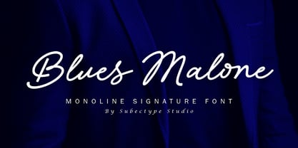 Blues Malone is a monoline signature font with an elegant style. It has good readability and is perfect for logos, invitations, wedding, signatures, Branding, clothing, headline, and much more! Blues Malone comes with ending swash alternate which will make your design more beautiful and elegant. I hope you enjoy this font. If you have any questions please don't hesitate to drop me a message :) Thank You, Subectype
 - Mogena by Kulokale,
$20.00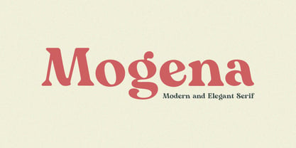 Mogena is a modern and elegant serif. It has a unique and different style and will give your design a friendly and expressive look. Mogena is perfect for many different projects such as logos and branding, invitation, stationery, wedding designs, social media posts, advertisements, product packaging, product designs, label, photography, watermark, special events or anything. We hope you enjoy the font and have fun! Thank You.
 - Stockers by Azzam Ridhamalik,
$14.00 Stockers is a high contrast serif font. It's long serifs make it looks mixed between classic and modern. Stockers support multilingual language, numbers, punctuation, alternative, standard and discretionary ligatures. A must have for any modern graphic designer as an elegant solution for your next magazine layout or any graphics design that require an elegant flair! FEATURES : Uppercase Lowercase Number Punctuation Multilingual PUA Encode Opentype
 - Sedhayu by Kulokale,
$19.00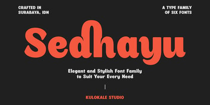 Sedhayu is a modern and bold sans serif font. It has a unique style and will give your design a friendly and expressive look. Sedhayu is perfect for many different projects such as logos and branding, invitation, stationery, wedding designs, social media posts, advertisements, product packaging, product designs, labels, photography, watermark, special events or anything. We hope you enjoy the font and have fun! Thank You.
 - Deco Redux JNL by Jeff Levine,
$29.00 A long-set aside Art Deco typeface design begun (but not completed) may or not have been from a vintage source, but its roots go well back into Art Deco lettering. Taking the existing letters and thickening their weights, removing the counters and ending up with a completely new, solid alphabet design resulted in Deco Redux JNL, which is available in both regular and oblique versions.
 - Native Txt by XdCreative,
$25.00About Native-Txt It is combine of transitional and contemporary type style, with variable stress angle and more stroke contrast. Native-txt has vary styles and most have a large x-height with bracketed serif and square terminal also a litle open aperture. Native-Txt comes up with a true italic with calligraphic latin style, this is a very contrasting and perfectly elegant. Thank you _xdCreative - Gogles by Aqeela Studio,
$18.00 Inspired by strange classic typography, Gogles has its own unique style. This font is best suited for headlines of all sizes, as well as for blocks of text that have maximum and minimum variations. The Gogles style applies to all types of graphic designs on the web, print, moving images and more, and is perfect for t-shirts and other items such as posters and logos.
 - Diastema by Issam Type,
$22.00 Diastema is a modern ligature serif typeface comes with joining ligatures that give it a fancy and unique style. This font perfect for branding, logos, invitation, watermark and more. Diastema typeface comes with regular, italic, bold and bold italic font styles. Uppercase & lowercase letters, numbers, punctuation, ligatures, alternates Multilingual support. If you have any questions, please feel free to get in touch. Thank you
 - Inkster by Typadelic,
$19.00Inkster breaks all the rules. The serifs vary from letter to letter, if they have any serifs at all. The upper and lower case letters intermingle and the contrasting characters bounce all over the baseline. Loosely based on the character shapes of Frisco, I developed a tightly spaced calligraphic version and called it Inkster. Use this artistic font when youre looking for a distinctive style! - Radonezh by Simeon out West,
$22.00 The Radonezh font is a Latin alphabet layout based on Russian Lettering I have seen. The font is designed to give a classic Medieval Eastern European feel with a hand-lettered style. Radonezh comes with full punctuation, a complete character set for most Western European Latin alphabet languages, Cyrillic languages, and polytonic orthography for Greek. Being a decorative font, it works best at larger point sizes.