10,000 search results
(0.162 seconds)
- The Snowday by Sronstudio,
$15.00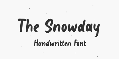 The Snowday is a Handwritten Font, this font Is perfect for product packaging, product designs, label, photography, watermark, special events, or anything. The Snowday comes with uppercase and lowercase letters, multilingual symbols, numerals, punctuation. If you have any questions please don't hesitate to drop me a message :) Thank You, Sronstudio
 - Cloudster by Sarid Ezra,
$15.00 Introducing, Cloudsters, a logo font with ligatures! Cloudsters is a sans based font with unique ligature that will make your design looks clean and modern. You can use this font for any purpose, especially to make logotype. This font have special ligatures that will make your design more stand-out!
 - Roma Initial Caps JNL by Jeff Levine,
$29.00Roma Initial Caps JNL is a set of alphabet caps drawn from elegant lettering found in an old sign painter's manual. The upper case keys have the letters in white on black backgrounds, while the lower case has the letters in black on a white background with a black border. - Faux Hebrew by Page Studio Graphics,
$24.00 The simulated font is based on the characteristic Hebrew calligraphy. Some of the original Hebrew characters have been given new roles, others modified to resemble modern Latin characters. The font includes an upper case alphabet, numerals, and basic faux punctuation, plus Harp of David, Menorah, and Star of David symbols.
 - YT basic Latin by Yangtype,
$9.00 The reason you should buy this font is simple and clear. This is because we have accumulated experience in realistic typography. This typeface exists as a unity with diversity. The intuitive form of letters and the subtlety of letter spacing create artistic value in the combination of words and sentences.
 - Fright Ghosts by Supfonts,
$14.00 Fright Ghosts Cyrillic will be perfect for halloween lettering, beautiful frame for your home, book covers, greeting cards, logos, marketing, magazines or anything that requires cute handwritten lettering :) What's inside: Fright Ghosts Script Multilingual support Cricut support If you have any questions, please contact me directly or in instagram @superdizigner
 - Eurocrat by Club Type,
$36.99 Everyone in each member country of the European Economic Community is represented by a Member of the European parliament. An MEP. The Eurocrat font family celebrates the work of these Eurocrats. Several features have been incorporated which, together, go to make a characteristically European style without any single one being dominant.
 - Chinte by FonTastic Designs by Chez,
$10.99 Looking for a fun new font? Look no further I have just what you've been waiting for. This new novelty font that I call Chinte is a bold fullcase font. This font comes with multiple languages and symbols. And had multiple uses: Branding, Logos, and many more of your projects.
 - KyivType Variable by Dmitry Rastvortsev,
$- KyivType superfamily, consisting of three subfamilies: Sans, Serif and Titling. Fonts have variability in weight and contrast. There are also alternates. Initiated by Projector, Dmytro Bulanov Creative Büro, and Banda Agency for Kyiv city (Ukraine) identification and promotion. Freeware. Fonts are free for commercial and non-commercial use. More at Behance
 - Farmstand by Atlantic Fonts,
$26.00 Farmstand is a fresh and joyful font with the same kind-hearted feeling and naiveté of your local farmstand. Paired with Farmstand Goodies, 52 hand-drawn images of funky farmers' fare, you can celebrate and have some pickles, savor sweet strawberries, or get creative with Cosmos. Sometimes life can be simple.
 - Southville by Rillatype,
$15.00 Introducing, Southville! a bold and fun display font. it's bold characteristic and round at the edges makes this font bold and brave but have soft and fun charm. this font is perfect for books, packaging, branding, make up, novel, label, etc. Features : uppercase & lowercase numbers and punctuation multilingual PUA encoded
 - Always Lovely by Sronstudio,
$15.00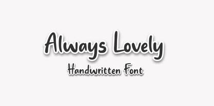 Always Lovely is a Handwritten Font, this font Is perfect for product packaging, product designs, label, photography, watermark, special events, or anything. Always Lovely comes with uppercase and lowercase letters, multilingual symbols, numerals, punctuation. If you have any questions please don't hesitate to drop me a message :) Thank You, Sronstudio
 - Vishenka by Supfonts,
$9.00 Vishenka Cyrillic will be perfect for wedding lettering, beautiful frame for your home, book covers, greeting cards, logos, marketing, magazines or anything that requires cute handwritten lettering :) What's inside: Vishenka Script Multilingual support Cyrillic support Cricut support If you have any questions, please contact me directly or in instagram @superdizigner
 - Sunday Snow by Sronstudio,
$15.00 Sunday Snow is a fun Handwritten Font, this font Is perfect for product packaging, product designs, label, photography, watermark, special events, or anything. Sunday Snow comes with uppercase and lowercase letters, multilingual symbols, numerals, punctuation. If you have any questions please don't hesitate to drop me a message :) Thank You, Sronstudio
 - Gilhampton by Rillatype,
$15.00 Introducing, Gilhampton organic typeface! Gilhampton is an organic display font that have an organic and quirky characteristic that makes this font looks natural and hand drawn. this font is perfect for people who are looking for design with organic touch. this font is suitable for branding, packaging, headline, quotes, etc.
 - Evil Laughter by Hanoded,
$10.00 I am working on my Halloween font collection and realised I did not have a ‘blood drip font’. So, I bought a second hand typewriter and typed all the glyphs. Then I made the blood drips using syrup, paper and gravity! The result is a halloween font with a twist!
 - TT Smalls by TypeType,
$19.00 Forget everything you know about TT Smalls because we have re-released the font! TT Smalls useful links: Specimen | Graphic presentation | Customization options TT Smalls is now a decorative font that makes it easy to attract attention. Use it to design expressive headings, in the packaging design or to highlight text on a site. Be sure that the text set in TT Smalls will arouse the interest of the audience. Once TT Smalls was a neutral geometric sans serif, and the inline version was an alternative stylistic set. However, the TypeType collection of universal fonts is extensive, so we focused on creating a unique and expressive font and released an updated TT Smalls. The font contains only uppercase characters in the inline version, and glyph designs are based on a geometric sans serif. With an increase or decrease in weight, the number of strokes in the font goes up or down, respectively. Stylish and easy to use, the TT Smalls font can complete a collection of eye-catching decorative typefaces. Font TT Smalls contains 12 styles: 6 upright and 6 inclined. The character set of the font is 172 glyphs. It has basic Latin and Cyrillic and the main punctuation marks. The standard OpenType feature calt has been added to the font.
 - Linotype Ergo Paneuropean by Linotype,
$103.99Linotype Ergo was designed by American Gary Munch, and was a winner in Linotype's Second International Digital Design Contest in 1997. Conceived as a blend of traditional and modern type concepts, it works as a legible text family as well as a lively display or headline font. The word ergo means consequently," but it also comes from the Greek word "ergon" for "work." Consequently, Munch sees this family as full of energy -- an ideal font for working hard to make a point, and able to get it across with friendly vigor. The strokes of the characters are carefully designed to accommodate the tendency of the eye to enlarge horizontals and perceive verticals as lighter. The lowercase forms have open, friendly counters and are enhanced by small quirks, such as the slightly leaning s and the wide t. The deep branching of curves from main strokes helps this humanist sans to be very readable at smaller sizes. Linotype Ergo has four normal-width weights, five condensed weights, and two compressed weights - all with companion Italics! The family also includes a clever "Sketch" font for use in headlines, bringing the total number of font styles to 23. Ergo is available with Greek and Cyrillic and as W2G fonts with Hebrew." - Abril Titling by TypeTogether,
$35.00 Abril is an extension of the Abril typographic system that was engineered as a response to a very specific requirement from the editorial design community: a low contrast typeface for head- lines. Given its broad range of styles though, Abril deserves to be considered a separate font family on its own. Based on the original text styles of Abril, the letter shapes are sturdy, very legible, and deliver a newsy and trustworthy feel. The accented editorial style of the Scotch Roman finds continuity in this new type family, but some of the details have been ironed out for improved performance in headline, both in print and on screen. The family is conceived as four series of different widths, with four weights in each series plus matching italics, a total of 32 fonts. This wide range of styles allows for setting titles at almost any size. The wider series are aimed for smaller point sizes while the con- densed weights can deliver a striking and cohesive appearance as front cover headlines. Abril was designed as a versatile tool for those graphic and web designers looking for a workhorse with high impact. It is also an excellent companion for the rest of the Abril type family: Abril Titling and Abril Narrow.
 - Armatura by Nechit,
$25.00 Armatura — a bold, sporty font with a modern and futuristic alphabet design. Elevate your design projects to new heights with Armatura's cutting-edge typography, perfect for branding, headings, technology, digital media, movie titles, invitations, signatures, logos, labels, and much more! This modernist capital font is tailor-made for eye-catching headlines and captivating titles. Armatura boasts an extensive character set, including Latin, Cyrillic, and Arabic numerals, making it versatile and adaptable for diverse linguistic and cultural contexts. Key Features: Sporting Boldness: Armatura exudes energy and daring style, capturing attention and infusing dynamic flair into your designs. Versatility at its Best: This font seamlessly fits various projects, from large-scale advertising banners to petite cards. Embrace Technological Edge: Armatura effortlessly integrates with modern technology, ideal for digital and interactive media ventures. Multilingual Support: With Latin and Cyrillic alphabets, plus Arabic numerals, Armatura accommodates a multitude of languages and regions. Expressive Appeal: Its geometric forms and audacious details bring character and distinctiveness to every design element. Unleash the power of Armatura to make your projects stand out, commanding attention with a contemporary touch of uniqueness. This font is a must-have for ambitious and forward-thinking designers seeking to create something exceptional and truly captivating.
 - Praxis Next by Linotype,
$57.99 Praxis® Next has the same robust shapes and proportions as the original 1976 Praxis design. Its large x-height, substantial counters and open apertures guarantee high levels of legibility and reading ease in print and on screen. More weights, condensed designs and true cursive italics differentiate Praxis Next from the older design. Praxis Next shines where space is at a premium. The regular designs are modestly narrow while the condensed typefaces perform with grace in the most crowded of environments. The bold designs create powerful headlines and banners and the lighter weights are ideal for both long and short-form text copy. Because of its many weights and proportions, Praxis Next is also an ideal design to build a brand identity. Praxis Next Variables are font files which are featuring two axis and have a preset instance from Light to Ultra and Condensed to Roman. Pair Praxis Next with old-style designs like Bembo® Book and Stempel Garamond™ to create a dynamic typographic contrast. Or complement the design with its serifed counterpart, Demos® Next . Unger also drew ITC Flora® as an alternative italic design. Looking for something a little different? Pair Praxis Next with Masqualero™ .
 - Lapoya by Cuchi, qué tipo,
$9.95 “LAPOYA” (meaning in english “the coolest”) is a large slab serif typeface family, with a certain Italian inverted contrast touch. Specially designed for advertising big shows and commerces, Lapoya has 36 variables and four axes, including a text and decorative versions, where the drawing and width of its counterforms vary. It also has icons that remember the old aesthetics of wood types from the early 20th century, and more than 400 characters with a multitude of signs and ligatures, that make Lapoya ideal for up to 89 languages. It is clearly inspired by the large wood types designed for posters, advertisements and newspapers. Since they were introduced in the 19th century, slab serifs have become extremely popular. In fact, serifs are often enlarged, not so much to look like beautiful or balanced letters, but to be more graphic and visual powerful than others. Furthermore, in the case of this typeface, this idea has been applied not only to capital letters, but also to the lowercase, numbers and signs of all kinds. “That’s why this typeface is LAPOYA!” Designed by Carlos Campos in 2023. cuchi@cuchiquetipo.com OPENTYPE FONT 426 GLYPHS 388 CHARACTERS 4 AXES 36 INSTANCES 9 LAYOUT FEATURES 89 LANGUAGES
 - Linotype Ergo W2G by Linotype,
$124.99Linotype Ergo was designed by American Gary Munch, and was a winner in Linotype's Second International Digital Design Contest in 1997. Conceived as a blend of traditional and modern type concepts, it works as a legible text family as well as a lively display or headline font. The word ergo means consequently," but it also comes from the Greek word "ergon" for "work." Consequently, Munch sees this family as full of energy -- an ideal font for working hard to make a point, and able to get it across with friendly vigor. The strokes of the characters are carefully designed to accommodate the tendency of the eye to enlarge horizontals and perceive verticals as lighter. The lowercase forms have open, friendly counters and are enhanced by small quirks, such as the slightly leaning s and the wide t. The deep branching of curves from main strokes helps this humanist sans to be very readable at smaller sizes. Linotype Ergo has four normal-width weights, five condensed weights, and two compressed weights - all with companion Italics! The family also includes a clever "Sketch" font for use in headlines, bringing the total number of font styles to 23. Ergo is available with Greek and Cyrillic and as W2G fonts with Hebrew." - Callimathy by Anomali Creative,
$15.00 Broken letters or Gothic letters, also known as German letters, are the typeface used in Europe West from the 12th century to the 17th century. Meanwhile, Danish spoke it until 1875 and German, Estonian and Latvian spoke it well into the 20th century. Fracture is one of the broken typefaces that is often considered to represent the entire broken typeface. Broken letters are sometimes also called Old English, but not in the Old English or Anglo-Saxon sense that was born centuries earlier. This group of letters is so named because it contains Latin letters that have breaks in the curvature of the letters, either in part or in whole designs. The fracture arises from a sudden dip when writing certain parts of the letter. In contrast, letters with perfect, unbroken curves, such as Antikua, are created from smooth, flowing writing movements. Callimathy is a font inspired by the Blackletter typeface, made with a modern impression but still looks strong and unique. In addition, Young Best font is also supported with multilingual characters that can be used in several international languages. Callimathy font is very suitable for use in making music album cover designs, tattoo logos, wishkey labels, packaging pomades and so on which are made with dark and strong concepts.
 - Bengala by Andinistas,
$59.95 Bengala is a font based on Calligraphy & Geometry designed by Carlos Fabián Camargo. Its purpose is to be an innovative typographic system combining Script letters with geometric and hard Caps letters. The contradictory styles are ideal for designing covers, posters, branding and packaging. Its smooth calligraphic look meticulously incorporates characters to design logos and phrases that communicate dynamism and strategy. Bengala Script was inspired by Mistral by R. Excoffon. Bengala Script provides violent and unstable lines with generous spacing between the letters and tight horizontal proportions, producing showy upper and lower case italics inspired by French Gothic calligraphy late fifteenth century. For this reason, Bengala Script retains some uninterrupted calligraphic logic, up and down sometimes higher or shorter than the height of the lowercase, creating dynamism through a variable amount of contrast between thick and thin strokes. Bengala Dingbats has 62 drawings designed to accompany the designs. Script and Caps Bengala have different gender and the similar X height produces more visual appeal. This way Bengala Caps - inspired by the Porshe logo, due to its geometric uppercase Roman construction, extended horizontal proportions, light caliber, rounded strokes terminations and generous spacing between letters. Special thanks to John Moore and Manuel Corradine for their help with Open Type.
 - K-Block by HiH,
$10.00 K-Block was inspired by a hand-lettered sign by a young lady by the name of Kristina Lee. It captures a light-hearted, youthful feeling and is not intended to be taken too seriously. It was drawn for fun and is fun to use. Its very inconsistency insists on being casual and relaxed. Probably better for a birthday party announcement than a bank letterhead. Can you imagine a Just-For-Fun National Bank? K-Block Solid compliments K-Block and provides a stronger presence when required. For two-color work, K-Block can be layered on top of K-Block Solid to provide a different color outline for a very effective presentation. Full Western European character set plus alternate g and y, as well as a Th ligature. If you have a drawing program like Corel Draw, you can easily convert the alternate g and y to curves and stretch out the tails to underline an entire word. The zip package of each font includes two versions. There is an OTF version which is in Open PS (Post Script Type 1) format and a TTF version which is in Open TT (True Type)format. Use whichever works best for your applications. K-Block and K-Block Solid are sold separately.
 - Mather Laord by Twinletter,
$17.00 Mather Laord is the perfect hero font for those who want to create powerful and unforgettable hero branding. Its sharp and pointed serif exudes a sense of strength and precision that is perfect for heroes who wield swords or are ninjas. The font’s 143 alternate characters for uppercase and 34 ligatures offer a wide range of options to create unique and memorable typography designs. Not only does Mather Laord have a stunning appearance, but it also supports multilingual characters, making it a versatile font that can be used globally. Whether designing a logo for a hero-themed brand, creating merch for your favorite hero, or designing a poster for a hero movie, Mather Laord can help you create an impactful and unforgettable design. So, if you want to stand out from the crowd and make a lasting impression on your audience, Mather Laord is the perfect choice for your next hero design project. What’s Included : - File font - All glyphs Iso Latin 1 - Alternate, Ligature - Simple installations - We highly recommend using a program that supports OpenType features and Glyphs panels like many Adobe apps and Corel Draw so that you can see and access all Glyph variations. - PUA Encoded Characters – Fully accessible without additional design software. - Fonts include Multilingual support
 - Peridot Devanagari by Foundry5,
$9.00 Mesmerised by the sparkling greenish-yellow mineral called Olivine hidden within the black basalt of Lanzarote's lava fields, we named the gem of our library after this natural beauty. Peridot is not just another typeface – it's a multifaceted sans serif type system crafted with passion and precision by Foundry5. Painstakingly developed through long hours and a keen focus on every minute detail, this typeface boasts a high-quality 10 weight family with matching italics in 6 widths, and the highly versatile variable format. Brimming with character, Peridot invites you to experiment with its various stylistic variants, allowing you to tailor the typographic tone to fit your creative vision perfectly. The diverse range of widths and styles in Peridot offers a dynamic typographic toolbox, ready to inspire and captivate even the most innovative designers. Peridot Devanagari supports Devanagari and Latin and covers over 330 languages. It includes all required localised variants, tabular numerals and currencies, fractions, clever discretionary ligatures and many more features. Peridot performs in varied environments – from branding, display, corporate use, editorial, advertising, poster, web, screen usage etc. Think of any other use case as well, and Peridot will perform. Peridot Devanagari comprises 20 static fonts, family package, and variable support. It is the gem you ought to have in your collection.
 - Khatija Calligraphy by 38-lineart,
$24.00 Khatija Calligraphy is a beautiful calligraphy font in base style of penmanship with a modern look, an eclectic concept by paying attention to the beautiful choice models. This fonts consist of 2,484 letters ready to use. To make it easier for you to use it, we utilize the access all alternates feature so that you only need to type and then select one of the letters then the alternative letters will appear automatically. We also use the stylistic set selection feature from SS01 - SS20, because we made a very unique alternate pair, alternate 1 paired with alternate 2, alternate 3 paired with alternate 4. We matched the alternate pair's kernings perfectly. For wedding themes and elegant product brands, believe it.. this font is the perfect choice, because we also prepare a ligature that raises flower ornaments to complement your design, you only need to press your keyboard | 1 | 2 | 3 to | 10. Now you have very beautiful flower ornaments. You can combine these ornaments again according to your needs. Khatija Calligraphy has 27 language support: Afrikaans Albanian Catalan Croatian Czech Danish Dutch English Estonian Finnish French German Hungarian Icelandic Italian Latvian Lithuanian Maltese Norwegian Polish Slovak Slovenian Spanish Swedish Turkish Zulu.
 - Sociato by insigne,
$35.00 Introducing Sociato: a typographic trendsetter. It's a quirky font that perfectly blends modernity and antiquity. The French Revolution was a period of uncompromising innovation in art and fashion, with celebrity artists, notably Jacques Louis David, creating propaganda for the new regime. This regime failed, but we have rare historical artifacts related to this historical upheaval. The typeface was inspired by a declaration published during the French Revolution that extolled the development of a new religion, the cult of the Supreme Being. It's a stunning piece of work, with a wild, baroque layout and hand drawn typography. Words leap off the page in a cascade of sounds and shapes, and quirky letterforms give it a lively, almost mischievous character. It's a veritable goldmine of typographic ideas. This typeface is based on the hand lettering in the original manuscript, but it has been enhanced by adding a full variety of characters. The typeface comes with a comprehensive range of diacritics, including old-style figures. The typeface is suitable for a wide range of uses, including titles and headers, and it should look beautiful in any typographic setting. Use Sociato to create a revolutionary identity, as bold and audacious as the French Revolution!
 - Bradley Texting by Monotype,
$57.99Bradley Texting: a clear, friendly and easily legible calligraphy font, also suited to electronic devices With Bradley Texting, Richard Bradley has published another calligraphic typeface that recalls the style of Bradley Hand and Bradley Type. In this case, however, Bradley has advanced the style with clearer forms for display on electronic instruments and on other formats. Two other font families paved the way to the newly introduced Bradley Texting. In the mid-1990s, Bradley published Bradley Hand, with its rough contours. Since these coarse forms do not cut a good figure in the larger font sizes, Bradley Type followed, with smooth letters. During the development of Bradley Type, the idea for a further font came about ? one in the style of the two other calligraphic typefaces, but with simpler, easily legible forms and suited to electronic devices like mobile phones or tablets. The letters for Bradley Texting began with a marker on paper. Looking back, Bradley describes one of the biggest challenges as having the calm required to draw the relaxed-looking letters repeatedly while still making them fit the general style.The somewhat narrow and dynamically designed letters have round line ends, like those left by a felt-tipped pen. As a hand-written print font, the individual letters are not connected to one another. Nonetheless, they demonstrate the influence of a written font, such as the extended ends and the flowing transitions. Clear forms with open counters and a large x-height guarantee Bradley Texting good legibility in the smaller font sizes. Bradley Texting is also effective under more challenging conditions, such as on mobile phones, e-book readers or tablets; the fonts friendly and lively character comes through. With Regular, Semibold and Bold, Bradley Texting is adequately equipped for use as a headline or text font in various sizes. The selection of characters covers the Western European languages and German typographers will be happy to note the presence of the upper-case ß. Use the dynamic and clear forms of Bradley Texting anywhere you need a friendly character with a personal accent. Bradley Texting is persuasive in the print realm, in advertisements or on posters, as well as on electronic devices. - Bunaero Pro by Buntype,
$33.50 Buntypes Bunaero™ combines classical and contemporary characteristics to a unique and distinctive font family with extravagant but also harmonious appearance. The characters are clear, open and sometimes bellied. Especially the caps have a very high waistline. Based on this, four main states with different moods have been composed: The original Bunaero™, the more conservative “Classic”, the elegant and curvy “Up” and the matching ”Italic”. All states offer weights from a considerably thin „Hair“ to a real fat „Heavy“, so the family consist of 34 Styles, all with rather narrow width and very good legibility. The font was manually hinted and contains extensive handcrafted kerning tables to ensure flawless appearance in all media. It supports at least 99 languages incl. Vietnamese and provides ligatures, alternative glyphs, special localized forms and even more enjoyable OpenType® features. This Pro version of Bunaero also includes a lot of features for sophisticated users: Lining figures for headline setting; Intermediate linings and oldstyle figures for text setting; Tabular versions of all figures; Superiors, inferiors, numerators, denominators and automated fractions; Language specialities like a capital Eszett for the german language and extra characters with a polish kreska instead an acute; And many more. Further information: Bunaero™ Pro Specimen PDF Bunaero™ Pro OpenType® Quickguide Feature Summary*: -4 Moods: Normal, Classic, Up and Italic -9 weights: Hair, Light, Thin, SemiLight, Regular, SemiBold, Bold, ExtraBold and Heavy -Supports at least 99 Languages incl. eastern european and vietnamese languages -Overall width: Narrow or Space-Saving -Advanced f- ligature set including fb -Discretionary s- and c- ligatures -Alternative Characters: a, e, f, g, i, k, l, t, v, w, y, J, K, Q, R, and more -6 sets of figures: -Capital sized figures, oldstyle figures and intermediate figures, each in proportional and carefully adjusted tabular versions -Superiors, inferiors, numerators and denominators -Circled and negative circled figures -Capital German Eszett -Extra characters with Polish Kreska -Catalan Punt Volat -Extra characters with alternate minmalistic Cedille -Arrows -Automated feature for fractions as well as extended fraction character set -More than 1000 characters per font * Some features may only be available in OpenType®-savvy applications
 - Gorod.Volgograd by FontCity,
$15.00The general idea: Can You imagine to yourself, what the hydroelectric power station is? The building of this electricity production foundry is half hidden under the water, but the visible above-water part astonishes your sense. It is a construction almost 1,5 km length dammed out the powerful river stream. Besides thousand of electricity conduction lines supports it bears also the highway and the railroad. From a faraway distance the train seems like a caterpillar that has climbed up the stout tree. There are also the navigable sluices, the flood channels and other erections. The idea of this typeface outlines arrived to the authors exactly on the viewing platform, under the impression of the waterfalls, which are escaping from the dam womb, falling from almost 50 meters altitude and becoming white-haired during this flight. Release: in the form of "gorod.Volgograd" font with the one style. We work with other styles now and sometime we will be very glad to introduce the Bold and Italic styles to You. We should explain the font name meaning. "Gorod" is "city of" in Russian and Volgograd is the old, big and famous Russian city. The Volga hydroelectric power station of a name of XXII congress of the CPSU caused the Volgograd sea formation. It expands of 14 km width and more than 600 km along the Volga river-bed. But HEPS isn't the sole Volgograd sight. There are many interesting places here. The most known tourist sight, the visit card of Volgograd is the Mamaev Hill. Being here You can see almost all 100 kilometers of city length. Due to its geographical position, Mamaev Hill has got a great importance during the Great Patriotic War (1941-1945). It became and still is the Main Height of Russia. Soviet people have built the huge stately memorial ensemble here. There are many other witnesses of the heroic past of Volgograd: the Alley of Heroes, the Perished Fighters Square, the Soldiers Field and others. The line of tank turrets is stretched out along all town not far from Volga bank. It marks the line, where fascist troops was stopped in 1943. It is very amazingly when You dive under the ground on a usual tram. Volgograders have built a few underground station for the high-speed tramway. The river tram need a quarter of an hour to get an island in the Volga. And You need the same time to walk across the river station. The Volga-Don navigable channel starts from Volgograd. There are planetarium, circus, some theatres, many museums in Volgograd. One of football matches of Euro-2004 qualifying round took a place in the "Rotor" stadium in Volgograd. Volgograd holds the longest - above 50 km - park in the world. Its avenues, squares, embankments are beautiful, Volgograd central districts are built in unique architecture style called the Stalin Empire. You can enjoy fountains, parks, attractions, water-pools and other Volgograd sights. If You visit Volgograd once You'll never forget it. You can read about the ancient history of Volgograd city on the Tsaritsyn font page. Also we plan to create the Stalingrad font and give You a short story about another period in Tsaritsyn-Stalingrad-Volgograd history. - CemeteryWalk by Ingrimayne Type,
$5.00 I created CemeteryWalk in 2018 to illustrate a program for a local cemetery walk. CemeteryWalk places letters on pictures of gravestones. In 2022 I expanded the family by placing three different sets of letters on the gravestones. Each of the four different sets of letters on gravestones has two styles, one with black letters on white gravestones and the other with white letters on black markers (the bold style). The bold style can be placed beneath the plain style to add color or texture. All eight styles are caps only, with the lower-case letters having different shapes for the tombstones but the same letters as in the upper case. There is only one set of accented characters and it is where the upper-case letters are found. Each also has an alternate set of characters that are somewhat similar in appearance and it can be accessed using the OpenType feature of stylistic sets. A final typeface in the family is a picture font of items that may be found on old tombstones.
 - Platipus Script by Areatype,
$15.00 Platipus Script A sweet handlettered font, casual and dynamic with a dancing baseline.. all to add an authentic touch to your designs. perfect for Branding, Logos, Greeting Cards, Wedding Stationery, Quotes etc. It comes with a handy set of Opentype Stylistic Alternates, Ligatures and multiple language support. To enable the OpenType Stylistic alternates, you need a program that supports OpenType features such as Adobe Illustrator CS, Adobe Indesign & CorelDraw X6-X7, Microsoft Word 2010 or later versions. Files included: These coded with PUA Unicode. Mac users can use Font Book and Windows users can use Character Map to view and copy any of the extra characters to paste into your favourite text editor/app. How to access all alternative characters, using Windows Character Map with Photoshop: https://www.youtube.com/watch?v=Go9vacoYmBw How to access all alternative characters using Adobe Illustrator: http://youtu.be/iptSFA7feQ0nn Thanks so much for looking, I really hope you enjoy it and please don't hesitate to drop me a message if you have any issues or queries :)
 - Belanga by Gatype,
$10.00 Balanga is a smooth, elegant and flowing handwritten font. It has a beautifully balanced character, goes well with many designs. Balanga features varied baselines, smooth lines, beautiful glyphs, and stunning alternatives. Hand-drawn design elements allow you to create many beautiful typographic designs in an instant such as branding, web and editorial designs, prints, crafts, quotes, It's great for logo types, wedding invitations, romantic cards, labels, packaging, name spelling and other . Add to your most creative ideas and see how they make it happen! Balanga includes OpenType style alternatives, ligatures, and International support for most Western Languages. To enable the OpenType Stylistic alternative, you need a supporting program such as Adobe Illustrator CS, Adobe Indesign & CorelDraw X6-X7, Microsoft Word 2010 or a later version. Balanga is coded with PUA Unicode, which allows full access to all additional characters without having to design special software. Mac users can use Font Book , and Windows users can use Character Map to view and copy any additional characters to paste into your favorite text editor/application.
 - Sassoon Primary Cond by Sassoon-Williams,
$48.00 Those who design books for young children should consider the different needs of their readers. When laying out pages for young readers, particular care should be taken over word spacing. Don't forget that justifying short lines disrupts spacing. Justification should be used only when absolutely necessary. In the research undertaken with young readers the importance of consistent spacing was clear. It also appeared that the poorer readers profited from wider word spacing, while spacing that suited the poorest readers, positively annoyed the better readers. These typefaces have built-in letter spacing because of their exit strokes, as well as extra clarity designed into them. Sassoon Primary Medium Condensed is a compact style for headlines combining the right amount of weight, yet in a friendly style. When used at large sizes the friendliness of Sassoon types really shines. Why not use it for headings throughout a book. You can find many other new ways to use this typeface. Ideal perhaps for the masthead or a magazine? Free to download resources: How to access Stylistic Sets of alternative letters in these fonts
 - Marsmila by Colllab Studio,
$19.00 "Hi there, thank you for passing by. Colllab Studio is here. We crafted best collection of typefaces in a variety of styles to keep you covered for any project that comes your way! Introducing Marsmila, a luxury beauty calligraphy font inspired by the Victorian era and the Grace of the Roman letterforms as well as modern calligraphic aesthetics. Its graceful, curving lines and elegant swirls are a delight to behold. Marsmila comes with massive number of glyphs and stylistic alternates, including extra beginning and ending swashes. Perfect for your next calligraphy project, or when you want to make your text look fancy! Make your next design projects look like you took them to an expensive calligrapher to be done for hundreds of dollars, but you didn't! You can use it in any design and any way you want. Marsmila typeface works best for logos, posters, styling purposes such as invitations, greeting cards or any design projects which have some elegant vibe to them. A Million Thanks Colllab Studio www.colllabstudio.com
 - Mule Cargo by Menagerie Type,
$20.00 The Mule is a very special mix – it has a donkey father and horse mother, and they often inherit the best qualities of both. "The mule is an example of hybrid vigor, Charles Darwin wrote: The mule always appears to me a most surprising animal. That a hybrid should possess more reason, memory, obstinacy, social affection, powers of muscular endurance, and length of life, than either of its parents, seems to indicate that art has here outdone nature." They are typically very strong for their size compared to horses and are able to cope with bad weather better than donkeys. Mules rarely become ill and their behavior is Intelligent and sensitive. In the right home, they can make great companions for other equines, and wonderful pets. However, if they are unhandled or not correctly trained, mules have the potential to be dangerous. The inner shapes of Mule Cargo are almost identical between the Regular and the Heavy weight. This shared genom make them very powerful pair and a useful design tool for display purposes.
 - Sophistic by Redy Studio,
$19.00 Sophistic – Luxurious Script Font Fashion and luxury are the first things that come to mind when you see or hear this font. Sophistic is an authentic and luxurious font that is dynamic with a hand-drawn stroke. It is full of life and movement which will add a modern sensibility to your graphic designs. Think runway shows, model and designer photography, fashion mags, beauty, cosmetics, and jewelry marketing campaigns. See how good it looks in tandem with other script font styles? Watch out because consumer appetite for luxe products is at an all-time high! This curly font can also be used for wedding invitations or to define your blog header. Sophistic features: A full set of upper & lowercase characters Numbers & punctuation 23 Gorgeous ligatures Uppercase beginning swashes Lowercase beginning swashes Lowercase ending swashes Lowercase alternates characters Multilingual symbols PUA Encoded Characters – Fully accessible without additional design software. Feel free to give me a message if you have a problem or question. Thank you so much for taking the time to look at one of our products.