10,000 search results
(0.029 seconds)
- TAN The Laundry Room by TANTypeCo.,
$19.00 TAN - THE LAUNDRY ROOM is a fun display serif. Wonky yet composed and retains the legibility. *the italic font used in the display is TAN - ANGLETON (italic) — Our fonts are supported by most design software, please make sure it can read the OpenType fonts to be able to access all ligatures. Please be informed that while our font works well in Canva, but Canva itself doesn’t support advance opentype features such as special characters. For support, please don’t hesitate to contact us at tantypeco@gmail.com.
 - Before The Rain Arabic by Mans Greback,
$59.00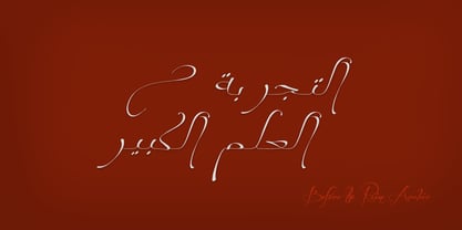
- Right In The Kisser by Comicraft,
$29.00 SECONDS OUT! ROUND ONE! The champ comes out swinging, there’s a left hook, a right hook, another left, another left to the chin, a box to the ears, a punch to the stomach, the challenger is reeling, he’s on the ropes, there’s another left to the chin and here’s the knockout, RIGHT IN THE KISSER! The Kisser. The Mouth. You know, what you kiss with? SMAK! It’s a font with a fat lip or one that makes you look like you’re talking’ with a fat lip. Or if you’re more of a lover than a fighter, it’s a big wet kiss from your loved one when the clock strikes midnight on New Year’s Eve. Either way, you win!
 - The House Of Usher by Intellecta Design,
$13.90 The House Of Usher is a beautiful set of decorative initials, mixing Victorian style in the boxes with gothics capitals. Perfect for beginning of paragraphs in artistic publications, storybooks and several texts conveying the feel of the Art Nouveau period with the gothic writing.
 - Darkness of the Night by Letterara,
$10.00 Darkness of the Night is a modern style sans serif brush font. What’s included: 1. Darkness of the night TTF 2. Style in this font include: Regular & Italic 3. Works both on Mac & PC 4. Simple installations 5. Accessible in the Adobe Illustrator, Adobe Photoshop, Adobe InDesign, CorelDraw, even work on Microsoft Word. 6. Support multilingual; ä ö ü Ä Ö Ü ß ¿ ¡ To access the alternate glyphs, you need a program that supports OpenType features such as Adobe Illustrator CS, Adobe Photoshop CC, Adobe Indesign and CorelDraw. More information about how to access alternate glyphs, check out this link
 - Is This The End by Intellecta Design,
$19.90 Is This the End has three different ornamental endpieces ready to use in end chapters, final pages in books, magazines and several artistic representations. Each endpiece may be used in different languages like German, Bulgarian, Croatian, Danish, Spanish, Finnish, French, Dutch, Italian, Norwegian, Polish, English and Portuguese. Intellecta Design researched these endpieces from the very rare Richard Gans type catalogue from 1882.
 - Down With The King by A New Machine,
$19.00 Down With the King is a very bold all caps font best used for large titles, headers and logo work. The lower case letters have rounded edges for a softer feel.
 - Rabbit On The Moon by Hanoded,
$10.00 This font is ideal for cartoons, greeting cards and children's books, as it has a happy 'feel' to it.
 - Message Of The Birds by chicken,
$14.00 A handful of these spiky, sprightly letters made up the twittering title page of 'Message Of The Birds', a song by one Flora Warner, found in stacks of crumbling scores on an old upright piano in the basement of a favorite London bookstore.
 - Fox in the snow by Roland Hüse Design,
$15.00 FOX IN THE SNOW is a cursive, casual handwriting font. Please contatct me if you have any questions, requests or feedback.
 - The King Of Romance by Creativework Studio,
$18.00 The King Of Romance is a classic and elegant handwritten font. It is enriched with alternative characters and ligatures that make this font even more beautiful. Add it to your favorite creative ideas and make them stand out!
 - Behind The Nineties Sans by Casloop Studio,
$9.00 Introducing Behind The Nineties Sans - the perfect counterpart to our beloved font, "Behind The Nineties." This new sans-serif addition effortlessly captures the classic vibes of the 80’s and 90’s while infusing a contemporary touch for a timeless yet modern aesthetic. Key Features: Sans Serif Sophistication: "Behind The Nineties Sans" exudes sleek and modern elegance, offering a clean alternative to its serif predecessor. Regular and Italic Styles: Whether you prefer a straightforward look or a touch of italicized flair, this font provides versatility for all your design needs. Classic with a Contemporary Twist: Embrace the spirit of the 80’s and 90’s with a font that seamlessly blends classic elements with contemporary sophistication. Editorial Excellence: Elevate your editorial projects with the precision and clarity of "Behind The Nineties Sans," ensuring a polished and professional appearance. Luxury Serif Companion: Pair it with "Behind The Nineties" serif font for a cohesive design that radiates opulence and luxury. Dramatic Impact: Make a statement with the font's dramatic presence, capturing attention and adding a bold touch to your creative endeavors. Multi-language support including Western European, Central European, South Eastern European, South American, Oceanian, and even Esperanto. "Behind The Nineties Sans" is your go-to font for achieving a harmonious blend of nostalgia and modern flair. It's time to redefine classic design with this exquisite sans-serif typeface.
 - Agent Of The Uncanny by Device,
$39.00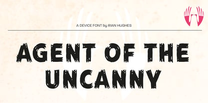
- VVDS The Dickens Tale by Vintage Voyage Design Supply,
$10.00 The Dickens's Fairytale – it's a new chapter of VVDS products - The collections of fancy display fonts which will include many typefaces that will be perfectly combined not only with each other, but also with other collections of this series. As a result, you will get a large collection of beautiful fonts and graphics that will help you create beautiful designs without having to look for anything else. All these collections are inspired by classic books design of XIX and XX centuries like Franklin's Library Classic Collection and modern publishing houses like Barnes & Nobel Collectible Editions. This collection is the first one and including 12 font files. The Serif presented in two styles - cutted and normal. The cutted style has two weights - Regular and Bold. Also, there are two types of shadows - block and offset. Plus decor for cutted serif. The cherry on top - curly calligraphic Script with Swirl calligraphy elements for decoration. The both of types has many Open Type Features as Oldstyle Figures, Fractions, Stylistic Alternates and ending lowercase letters for script. • OTF & WEB • Multilingual
 - OL America The Beautiful by Dennis Ortiz-Lopez,
$40.00 Oh Beautiful, for Spacious Skies, for Amber Waves of Grain This font was designed to honor the Land of My Birth, The United States of America, a Nation that has given me the Freedom to be what I want to be, to Create what I feel fit to create and to Live in Peace. God Bless America!
 - Wooden Shoe Revue NF by Nick's Fonts,
$10.00A poster for a Dutch stage revue from the nineteen-teens, designed by Willy Sluiter, provided the template for this warm, wavy and whimsical headline font. The Opentype version of this font supports Unicode 1250 (Central European) languages, as well as Unicode 1252 (Latin) languages. - Celebrate The Day Pro by CheapProFonts,
$10.00 The freeflowing and quite feminine style of this script appealed to me, but it needed a bit of taming. Quite a few of the letterforms have been normalized - to better accommodate the diacritics. :) All fonts from CheapProFonts have very extensive language support: They contain some unusual diacritic letters (some of which are contained in the Latin Extended-B Unicode block) supporting: Cornish, Filipino (Tagalog), Guarani, Luxembourgian, Malagasy, Romanian, Ulithian and Welsh. They also contain all glyphs in the Latin Extended-A Unicode block (which among others cover the Central European and Baltic areas) supporting: Afrikaans, Belarusian (Lacinka), Bosnian, Catalan, Chichewa, Croatian, Czech, Dutch, Esperanto, Greenlandic, Hungarian, Kashubian, Kurdish (Kurmanji), Latvian, Lithuanian, Maltese, Maori, Polish, Saami (Inari), Saami (North), Serbian (latin), Slovak(ian), Slovene, Sorbian (Lower), Sorbian (Upper), Turkish and Turkmen. And they of course contain all the usual "western" glyphs supporting: Albanian, Basque, Breton, Chamorro, Danish, Estonian, Faroese, Finnish, French, Frisian, Galican, German, Icelandic, Indonesian, Irish (Gaelic), Italian, Northern Sotho, Norwegian, Occitan, Portuguese, Rhaeto-Romance, Sami (Lule), Sami (South), Scots (Gaelic), Spanish, Swedish, Tswana, Walloon and Yapese.
 - The Brande and Lotaline by Arterfak Project,
$25.00 A beautiful bold serif specially designed for display. Inspired by modern fashion and classic typography, this font equipped with hundreds of alternative characters and ligatures. The Brande and Lotaline typeface represented luxurious, elegant, glamour, fashion, and wealthiness. This font works perfectly for logotype, invitation, cards, magazine, apparel, fashion, lifestyle, poster, social-media kit, and many more!
 - The Red Devil Script by Bal Studio,
$12.00 The Red Devil is a handmade script font with clear style and creative projects such as logos, printed quotes, invitations, cards, product packaging, headers, logos, letterhead, posters, clothing designs, labels, as you can use the illustrative qualities of the shapes to create an art piece. The Red Devil Script come with uppercase letters, lowercase letters, numbers, punctuation, and so many variations on each character including alternative opentype, general binder. It's fun to use because each word can be transformed to you like. To enable the OpenType Stylistic alternates, you need a program that supports OpenType features such as Adobe Illustrator CS, Adobe Indesign & CorelDraw X6-X7, Microsoft Word 2010 or later versions. How to access all alternative characters, using Windows Character Map with Photoshop: https://www.youtube.com/watch?v=Go9vacoYmBw How to access all alternative characters using Adobe Illustrator: https://www.youtube.com/watch?v=XzwjMkbB-wQ The Red Devil Script is coded with PUA Unicode, which allows full access to all the extra characters without having special designing software. Mac users can use Font Book , and Windows users can use Character Map to view and copy any of the extra characters to paste into your favourite text editor/app. Thanks so much for looking and please let me know if you have any questions.
 - Off The Wall JNL by Jeff Levine,
$29.00Off the Wall JNL is a unique typeface that combines graffiti-style lettering with a brick wall background. special keystroke features give you a complete "wall of text": { (left bracket) places a smaller closed end cap on the left side of the text. } (right bracket) places a medium closed end cap on the right side of the text. [ (left brace) places a regular closed end cap on the left side of the text. ] (right brace places a regular closed end cap on the right side of the text. | (vertical bar key) adds a space between words. \ (backslash) adds a larger space between words. - The Northland & Southland Combinations by Almeera Studio,
$10.00 Introducing The Northland Combinations. is a pair of Northland script and Southland sans font that perfectly. The classic feel is really perfect for you who needs a typeface for especially logotype, apparel, invitation, branding, packaging, advertising etc. This typeface is comes in uppercase, lowercase, punctuations, symbols & numerals,swashes, 05 stylistic set alternate, ligatures,underlines and also support multilingual and already PUA encoded. to access the underlines you simply press numbers 1-5 followed by an underscore after the last letter. For example: 1_ 2_ 3_ 4_ 5_ We highly recommend using a program that supports OpenType features and Glyphs panels like many of Adobe apps and Corel Draw, so you can see and access all Glyph variations. HOW TO ACCESS ALTERNATE CHARACTERS Open glyphs panel: -In Adobe Photoshop go to Window - glyphs -In Adobe Illustrator go to Type - glyphs
 - Fresh Bionik SE - Personal use only

- Vega VW SH by Scangraphic Digital Type Collection,
$26.00 Since the release of these fonts most typefaces in the Scangraphic Type Collection appear in two versions. One is designed specifically for headline typesetting (SH: Scangraphic Headline Types) and one specifically for text typesetting (SB Scangraphic Bodytypes). The most obvious differentiation can be found in the spacing. That of the Bodytypes is adjusted for readability. That of the Headline Types is decidedly more narrow in order to do justice to the requirements of headline typesetting. The kerning tables, as well, have been individualized for each of these type varieties. In addition to the adjustment of spacing, there are also adjustments in the design. For the Bodytypes, fine spaces were created which prevented the smear effect on acute angles in small typesizes. For a number of Bodytypes, hairlines and serifs were thickened or the whole typeface was adjusted to meet the optical requirements for setting type in small sizes. For the German lower-case diacritical marks, all Headline Types complements contain alternative integrated accents which allow the compact setting of lower-case headlines.
 - Cooper Black SH by Scangraphic Digital Type Collection,
$26.00Since the release of these fonts most typefaces in the Scangraphic Type Collection appear in two versions. One is designed specifically for headline typesetting (SH: Scangraphic Headline Types) and one specifically for text typesetting (SB Scangraphic Bodytypes). The most obvious differentiation can be found in the spacing. That of the Bodytypes is adjusted for readability. That of the Headline Types is decidedly more narrow in order to do justice to the requirements of headline typesetting. The kerning tables, as well, have been individualized for each of these type varieties. In addition to the adjustment of spacing, there are also adjustments in the design. For the Bodytypes, fine spaces were created which prevented the smear effect on acute angles in small typesizes. For a number of Bodytypes, hairlines and serifs were thickened or the whole typeface was adjusted to meet the optical requirements for setting type in small sizes. For the German lower-case diacritical marks, all Headline Types complements contain alternative integrated accents which allow the compact setting of lower-case headlines. - Lightline Gothic SH by Scangraphic Digital Type Collection,
$26.00 Since the release of these fonts most typefaces in the Scangraphic Type Collection appear in two versions. One is designed specifically for headline typesetting (SH: Scangraphic Headline Types) and one specifically for text typesetting (SB Scangraphic Bodytypes). The most obvious differentiation can be found in the spacing. That of the Bodytypes is adjusted for readability. That of the Headline Types is decidedly more narrow in order to do justice to the requirements of headline typesetting. The kerning tables, as well, have been individualized for each of these type varieties. In addition to the adjustment of spacing, there are also adjustments in the design. For the Bodytypes, fine spaces were created which prevented the smear effect on acute angles in small typesizes. For a number of Bodytypes, hairlines and serifs were thickened or the whole typeface was adjusted to meet the optical requirements for setting type in small sizes. For the German lower-case diacritical marks, all Headline Types complements contain alternative integrated accents which allow the compact setting of lower-case headlines.
 - Commercial Script SH by Scangraphic Digital Type Collection,
$26.00Since the release of these fonts most typefaces in the Scangraphic Type Collection appear in two versions. One is designed specifically for headline typesetting (SH: Scangraphic Headline Types) and one specifically for text typesetting (SB Scangraphic Bodytypes). The most obvious differentiation can be found in the spacing. That of the Bodytypes is adjusted for readability. That of the Headline Types is decidedly more narrow in order to do justice to the requirements of headline typesetting. The kerning tables, as well, have been individualized for each of these type varieties. In addition to the adjustment of spacing, there are also adjustments in the design. For the Bodytypes, fine spaces were created which prevented the smear effect on acute angles in small typesizes. For a number of Bodytypes, hairlines and serifs were thickened or the whole typeface was adjusted to meet the optical requirements for setting type in small sizes. For the German lower-case diacritical marks, all Headline Types complements contain alternative integrated accents which allow the compact setting of lower-case headlines. - Egyptian 505 SH by Scangraphic Digital Type Collection,
$26.00Since the release of these fonts most typefaces in the Scangraphic Type Collection appear in two versions. One is designed specifically for headline typesetting (SH: Scangraphic Headline Types) and one specifically for text typesetting (SB Scangraphic Bodytypes). The most obvious differentiation can be found in the spacing. That of the Bodytypes is adjusted for readability. That of the Headline Types is decidedly more narrow in order to do justice to the requirements of headline typesetting. The kerning tables, as well, have been individualized for each of these type varieties. In addition to the adjustment of spacing, there are also adjustments in the design. For the Bodytypes, fine spaces were created which prevented the smear effect on acute angles in small typesizes. For a number of Bodytypes, hairlines and serifs were thickened or the whole typeface was adjusted to meet the optical requirements for setting type in small sizes. For the German lower-case diacritical marks, all Headline Types complements contain alternative integrated accents which allow the compact setting of lower-case headlines. - Franklin Gothic SH by Scangraphic Digital Type Collection,
$26.00Since the release of these fonts most typefaces in the Scangraphic Type Collection appear in two versions. One is designed specifically for headline typesetting (SH: Scangraphic Headline Types) and one specifically for text typesetting (SB Scangraphic Bodytypes). The most obvious differentiation can be found in the spacing. That of the Bodytypes is adjusted for readability. That of the Headline Types is decidedly more narrow in order to do justice to the requirements of headline typesetting. The kerning tables, as well, have been individualized for each of these type varieties. In addition to the adjustment of spacing, there are also adjustments in the design. For the Bodytypes, fine spaces were created which prevented the smear effect on acute angles in small typesizes. For a number of Bodytypes, hairlines and serifs were thickened or the whole typeface was adjusted to meet the optical requirements for setting type in small sizes. For the German lower-case diacritical marks, all Headline Types complements contain alternative integrated accents which allow the compact setting of lower-case headlines. - Gillies Gothic SH by Scangraphic Digital Type Collection,
$26.00Since the release of these fonts most typefaces in the Scangraphic Type Collection appear in two versions. One is designed specifically for headline typesetting (SH: Scangraphic Headline Types) and one specifically for text typesetting (SB Scangraphic Bodytypes). The most obvious differentiation can be found in the spacing. That of the Bodytypes is adjusted for readability. That of the Headline Types is decidedly more narrow in order to do justice to the requirements of headline typesetting. The kerning tables, as well, have been individualized for each of these type varieties. In addition to the adjustment of spacing, there are also adjustments in the design. For the Bodytypes, fine spaces were created which prevented the smear effect on acute angles in small typesizes. For a number of Bodytypes, hairlines and serifs were thickened or the whole typeface was adjusted to meet the optical requirements for setting type in small sizes. For the German lower-case diacritical marks, all Headline Types complements contain alternative integrated accents which allow the compact setting of lower-case headlines. - Mirage Against Sh by Sohel Studio,
$16.00 Mirage Againts is a Modern elegant serif typeface with Unique alternative , multilingual support with perfect kerning. This typeface is perfect for an elegant & luxury logo , classy editorial design, women's magazine, fashion brand , cosmetic brand, fashion promotion , modern advertising design, invitation card, art quote, home decoration , book/cover titles, special events, Tote bag, T-shirt, Advertising and much more. Mirage Against Features: · Uppercase And Lowercase · Alternates · Numerals & Punctuation · Accented characters · Multilingual Support · Unicode PUA Encoded While using this product, if you encounter any problem or spot something we may have missed, please don't hesitate to drop us a message. We'd love to hear your feedbacks in order to further fine-tune our products. Thanks and have a wonderful day .
 - Futura Display SH by Scangraphic Digital Type Collection,
$26.00 Since the release of these fonts most typefaces in the Scangraphic Type Collection appear in two versions. One is designed specifically for headline typesetting (SH: Scangraphic Headline Types) and one specifically for text typesetting (SB Scangraphic Bodytypes). The most obvious differentiation can be found in the spacing. That of the Bodytypes is adjusted for readability. That of the Headline Types is decidedly more narrow in order to do justice to the requirements of headline typesetting. The kerning tables, as well, have been individualized for each of these type varieties. In addition to the adjustment of spacing, there are also adjustments in the design. For the Bodytypes, fine spaces were created which prevented the smear effect on acute angles in small typesizes. For a number of Bodytypes, hairlines and serifs were thickened or the whole typeface was adjusted to meet the optical requirements for setting type in small sizes. For the German lower-case diacritical marks, all Headline Types complements contain alternative integrated accents which allow the compact setting of lower-case headlines.
 - Futura Shaded SH by Scangraphic Digital Type Collection,
$26.00 Since the release of these fonts most typefaces in the Scangraphic Type Collection appear in two versions. One is designed specifically for headline typesetting (SH: Scangraphic Headline Types) and one specifically for text typesetting (SB Scangraphic Bodytypes). The most obvious differentiation can be found in the spacing. That of the Bodytypes is adjusted for readability. That of the Headline Types is decidedly more narrow in order to do justice to the requirements of headline typesetting. The kerning tables, as well, have been individualized for each of these type varieties. In addition to the adjustment of spacing, there are also adjustments in the design. For the Bodytypes, fine spaces were created which prevented the smear effect on acute angles in small typesizes. For a number of Bodytypes, hairlines and serifs were thickened or the whole typeface was adjusted to meet the optical requirements for setting type in small sizes. For the German lower-case diacritical marks, all Headline Types complements contain alternative integrated accents which allow the compact setting of lower-case headlines.
 - Century Expanded SH by Scangraphic Digital Type Collection,
$26.00Since the release of these fonts most typefaces in the Scangraphic Type Collection appear in two versions. One is designed specifically for headline typesetting (SH: Scangraphic Headline Types) and one specifically for text typesetting (SB Scangraphic Bodytypes). The most obvious differentiation can be found in the spacing. That of the Bodytypes is adjusted for readability. That of the Headline Types is decidedly more narrow in order to do justice to the requirements of headline typesetting. The kerning tables, as well, have been individualized for each of these type varieties. In addition to the adjustment of spacing, there are also adjustments in the design. For the Bodytypes, fine spaces were created which prevented the smear effect on acute angles in small typesizes. For a number of Bodytypes, hairlines and serifs were thickened or the whole typeface was adjusted to meet the optical requirements for setting type in small sizes. For the German lower-case diacritical marks, all Headline Types complements contain alternative integrated accents which allow the compact setting of lower-case headlines. - Friz Quadrata SH by Scangraphic Digital Type Collection,
$26.00 Since the release of these fonts most typefaces in the Scangraphic Type Collection appear in two versions. One is designed specifically for headline typesetting (SH: Scangraphic Headline Types) and one specifically for text typesetting (SB Scangraphic Bodytypes). The most obvious differentiation can be found in the spacing. That of the Bodytypes is adjusted for readability. That of the Headline Types is decidedly more narrow in order to do justice to the requirements of headline typesetting. The kerning tables, as well, have been individualized for each of these type varieties. In addition to the adjustment of spacing, there are also adjustments in the design. For the Bodytypes, fine spaces were created which prevented the smear effect on acute angles in small typesizes. For a number of Bodytypes, hairlines and serifs were thickened or the whole typeface was adjusted to meet the optical requirements for setting type in small sizes. For the German lower-case diacritical marks, all Headline Types complements contain alternative integrated accents which allow the compact setting of lower-case headlines.
 - Futura Round SH by Scangraphic Digital Type Collection,
$26.00
- Honey Beachy Sh by Sohel Studio,
$14.00 Honey Beachy is a retro display serif font that exudes a classic charm and bold character. With its design inspired by retro styles, this font brings an elegant touch and evokes a sense of the past. Each letter is meticulously crafted with careful attention to detail and proportion, resulting in a visually appealing and unique appearance. Honey Beachy is perfect for projects that require a vintage feel, such as posters, logos, packaging, and promotional materials that aim to capture a nostalgic and sophisticated atmosphere. This font will add a special touch to your designs and captivate viewers with its retro allure and distinctiveness. Honey Beachy Features: - Regular And Outline - Uppercase And Lowercase - Alternates And Ligature - Numerals & Punctuation - Accented characters - Multilingual Support - Unicode PUA Encoded While using this product, if you encounter any problem or spot something we may have missed, please don't hesitate to drop us a message. We'd love to hear your feedbacks in order to further fine-tune our products. Thanks and have a wonderful day .
 - Hans Kendrick SE by Hanken Design Co.,
$30.00 Hans Kendrick SE is geometric sans typeface inspired by Avenir and Futura. It is the second edition of the Hans Kendrick typeface improving on its geometric consistency, weight distribution, and overall rendering quality.
 - Dom Casual SH by Scangraphic Digital Type Collection,
$26.00Since the release of these fonts most typefaces in the Scangraphic Type Collection appear in two versions. One is designed specifically for headline typesetting (SH: Scangraphic Headline Types) and one specifically for text typesetting (SB Scangraphic Bodytypes). The most obvious differentiation can be found in the spacing. That of the Bodytypes is adjusted for readability. That of the Headline Types is decidedly more narrow in order to do justice to the requirements of headline typesetting. The kerning tables, as well, have been individualized for each of these type varieties. In addition to the adjustment of spacing, there are also adjustments in the design. For the Bodytypes, fine spaces were created which prevented the smear effect on acute angles in small typesizes. For a number of Bodytypes, hairlines and serifs were thickened or the whole typeface was adjusted to meet the optical requirements for setting type in small sizes. For the German lower-case diacritical marks, all Headline Types complements contain alternative integrated accents which allow the compact setting of lower-case headlines. - Math Symbols SH by Scangraphic Digital Type Collection,
$26.00Since the release of these fonts most typefaces in the Scangraphic Type Collection appear in two versions. One is designed specifically for headline typesetting (SH: Scangraphic Headline Types) and one specifically for text typesetting (SB Scangraphic Bodytypes). The most obvious differentiation can be found in the spacing. That of the Bodytypes is adjusted for readability. That of the Headline Types is decidedly more narrow in order to do justice to the requirements of headline typesetting. The kerning tables, as well, have been individualized for each of these type varieties. In addition to the adjustment of spacing, there are also adjustments in the design. For the Bodytypes, fine spaces were created which prevented the smear effect on acute angles in small typesizes. For a number of Bodytypes, hairlines and serifs were thickened or the whole typeface was adjusted to meet the optical requirements for setting type in small sizes. For the German lower-case diacritical marks, all Headline Types complements contain alternative integrated accents which allow the compact setting of lower-case headlines. - Vega TV SH by Scangraphic Digital Type Collection,
$26.00 Since the release of these fonts most typefaces in the Scangraphic Type Collection appear in two versions. One is designed specifically for headline typesetting (SH: Scangraphic Headline Types) and one specifically for text typesetting (SB Scangraphic Bodytypes). The most obvious differentiation can be found in the spacing. That of the Bodytypes is adjusted for readability. That of the Headline Types is decidedly more narrow in order to do justice to the requirements of headline typesetting. The kerning tables, as well, have been individualized for each of these type varieties. In addition to the adjustment of spacing, there are also adjustments in the design. For the Bodytypes, fine spaces were created which prevented the smear effect on acute angles in small typesizes. For a number of Bodytypes, hairlines and serifs were thickened or the whole typeface was adjusted to meet the optical requirements for setting type in small sizes. For the German lower-case diacritical marks, all Headline Types complements contain alternative integrated accents which allow the compact setting of lower-case headlines.
