10,000 search results
(0.039 seconds)
- Adenium by Inumocca,
$17.00 Adenium Typeface inspired by the Shape of the Adenium Tree, Vintage Display typeface , Classic Taste with some Curly and Curved its Great flexible typeface. unique Stylictic Set and Beautiful Ligature, Really playful typeface to covering your Project, like Lettering, Website Interface, Bookcover or Book Content, Magazine cover, Branding, Poster, wedding invitations, Quotes Lettering, Logos, and more your project design. - Unique glyphs - Multilingual Characters - UPPERCASE - Lowercase - Numeric - Symbol - Punctuation Character - Ligature - SS01, SS02, SS03, SS04 inumoccatype Studio
 - Luben by Octopi,
$7.00 Luben is a quirky serif font in five weights. The high x height gives it excellent readability and the curves give it a kind of retro feel.
 - ATC Timberline by Avondale Type Co.,
$20.00 ATC Timberline, is an ultra wide-set sans-serif typeface. With its sharp points and extended curves, ATC Timberline feels just at home in mid-century modern as it does in forward-looking modern settings. Contains 370+ glyphs, full alphabet, ligatures, numberals, accents and punctuation. File type included in download is .otf. ATC Timberline was released in 2016.
 - Love Bubble by Mazkicibe,
$10.00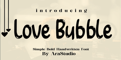 Love Bubble Font is a handwritten and modern font that combines a sweet touch and beautiful curves in every letter. using a touch of soft body curves so that it is pleasing to the eye Love Bubble Font is great for: Wedding invitations, Birthday invitations, fashion magazines, logos, signatures and is great for watermark photography.
 - Lucca by João Henrique Lopes,
$39.00 Inspired by Italian Renaissance fonts like Poliphilus, Blado, Centaur and Arrighi, Lucca presents a simple charm and a powerful classic feel. It is cute, friendly, clear and superbly readable. Its low contrast provides Lucca a firm yet flexible substance, making it sensual and enticing. There’s a certain degree of abstraction in the precise endings, and the whole design was made to survive even in the harshest conditions, conserving its readability and beauty.
 - WHISPERS CALLIGRAPHY_DEMO_essential_BOLD - Personal use only

- Frames And Borders by Outside the Line,
$19.0032 borders and frames, round ones, square ones, rectangles and an oval. Curly Qs, vines, flowers, dots and swirls in outline and reverse. Plz note that this is not a dingbat font and needs to be used in large sizes of 72 point or more. Don't miss Rae's other frame fonts. Frames & Borders Too and the new Frames and Banners. - Restrick by ZetDesign,
$15.00 Restrick is a strong display font. uses curved corners for flexible use on a variety of media displays. This font is very suitable for use as a headline in a newspaper, poster, or magazine. This font is available in regular and italic format.
 - Danu by Phoenix Group,
$12.00 Danu font is a font with a traditional style with a minimalist approach, this font is inspired by Javanese script with curved letters and some dots in it.
 - Aunchanted Elite by Typotheticals,
$5.00 Originally released free as Aunchanted, but completely redrawn with gentler curves to give a softer feel to the face. Aunchanted Elite has been expanded and updated in 2022
 - Handyplast by Gian Studio,
$14.00 More information about this Font Handyplast is a classy serif font with a handful of curvy ligatures. Think Handyplast ! This font is both bold and elegant.. modern yet vintage.. either way, it is sure to bring attention to your brand and designs! Handyplast includes alternate letters (letters with the curvy swashes). These letters are embedded into the font file and easily accessible in programs such as photoshop and illustrator. You can access these in more basic design programs but you will need to use your character map or font book. Use this font to create your logo, branding, advertisements, craft projects, shirts, decor, wedding invitations, packaging, stickers, social media, quotes, magazines and more! Thank you!
 - Boxley by Shinntype,
$45.00 The original superellipse typefaces coincided with the emergence of the CRT (cathode ray tube) TV screen, but there is more than this visual analogy of high-tech in play, as the pumped up angularity of the curved components of the genre also informs the quality of set text. In particular, due to the straightness of the round letters’ side stems, there is a neat modularity of vertical letter spacing, which denotes authority, with precision, complementing the tautness of the face’s curves.
 - London Handlettering by Axara Creative,
$39.00 The London Signature is an amazing Ellegant Signature font. It was made with perfect precision for every single curve that was build with a horizontal, vertical path & smooth. London signature script font which stylish natural handwritten font with beautiful curve in every single corner. This font is so fashionable & elegant and perfect for photography, branding, signature and logo .
 - Gravesend Sans by Device,
$39.00 Smart, legible and elegant, Gravesend Sans is a based on the unique typeface used for the iconic grass-green signage for the Southern Railway. In existence from 1923 to 1948, when the network was nationalised, the Southern Railway linked London with the Channel ports, South West England, the South coast resorts and Kent. The same design was also used for the ‘hawkeye’ signs on the London, Midland and Scottish Railway, differentiated by black letters on a yellow background. Reference for each letter was taken from vintage ‘target’ station nameplates and other platform signage. The rarest letters were the Q, seen in Queens Road Battersea, the X, seen in East Brixton, and the Z, used in Maze Hill, site of an infamous train crash in 1958. Being hand-made, the letters often differ in width and thickness. There was no lower case. The Bluebell Railway, a heritage steam line, runs over part of the old Southern Railway network and uses a very similar type. The design of the numbers differed considerably, but here have been taken from the Device 112 Hours font Smokebox. As well identifying platforms, they were used on the front of the steam engine’s smokebox, hence the name, and stylistically are more in keeping with the letters than some of the squarer versions that can be seen in old photographs. William Caslon IV is credited with the first Latin sans-serif type, shown in a 1816 Caslon specimen book. ‘Two Lines English Egyptian’, as it was called, was caps-only, and there are several other correlations between that type design and this one. Includes a selection of authentic arrows and manicules, plus abbreviated ligatures such as ‘St.’ (Saint or Street) ‘Rd.’ (Road) and ‘Jn.’ (Junction). The Cameo version includes many graphic banner elements that can be freely combined.
 - Kursivfraktur by RMU,
$25.00 Inspired by Rudolf Engelhardt's Journal-Kursiv, released by Ludwig Wagner, Leipzig, in 1913, Kursivfraktur was freshly drawn and redesigned, and comes as one of those rare beautiful italic blackletter fonts. This font contains the letter long s which can be reached in two ways. Either you use the OT feature historical forms, or you type the integral sign [ ∫ ] on your keyboard. There are two graphic elements implemented, a corner element and a straight element for framing. The corner element lies on the Product sign [ ∏ ], the straight element you will find on the pi-key [ π ]. Furthermore it is recommended to activate the discretionary ligatures OT feature.
 - Sundae by SparkyType,
$25.00Sundae is a brush script drawn with a naïve hand-made twist. The flow of curves, contrast in stroke and variations in letter heights add a human touch while the consistency in design allows for semi-extended setting. Sundae is best suited for large, confident headings where a personal impact is desired. - Dans Le Noël by Latinotype,
$29.00 Dans Le Noël is a Christmas dingbat. Perfect for use as ornament greeting cards, patterns, posters, websites and visual compositions that need Christmas show in a language full of personality, inspired by vintage illustrations. Dans Le Noël is part of the serie Dans, with Dans Le Cuisine and Dans Le Jardin. You can combine them as you like. Enjoy!
 - Spaghetti Joint JNL by Jeff Levine,
$29.00 An image from the Library of Congress showing a New York City Italian Kitchen storefront window and its various neon signs inspired Spaghetti Joint JNL, which is available in both regular and oblique versions. The term “Spaghetti Joint” is old-fashioned slang for any restaurant serving Italian cuisine, especially those featuring spaghetti or other pasta dishes.
 - Zampichi by Okaycat,
$24.50 Zampichi simulates an old school video game or halftone print. Nine futuristic styles are delivered in gritty pixelated format. Dingbats such as cursor symbols, radio buttons, checkboxes and (surprisingly) cats replace a few of the least useful alternate symbols. Zampichi is extended, containing West European diacritics and ligatures, making it suitable for multilingual environments and publications.
 - Jaina Sans by Linh Nguyen,
$8.00 A display font with expanded width, bold weight is cultivated with high contrast in strokes, suitable for ephemeral design applications. It simulates the impact of cut tools with paper, cloth, and comes along with a feeling of geometric suggestions. Jaina Sans also supports over 200 latin based languages with 235 accented characters along with basic OpenType features.
 - Engrace by Angele Kamp,
$26.00 Meet Engrace, a serif font family with elegant & stylish curves. She’s romantic, classy and modern all wrapped into one, and surely can not be missed in your font collection.
 - Chorus by Soneri Type,
$23.00 Chorus is a collective effort to sing in harmony. Similarly, each letter is designed to reflect harmony when used together to form a letter, sentence or paragraph. Letters like B, D, P and R have curved stroke (instead of straight line) while joining vertical stem. Letter K, k, and R have similar disjoint point in middle and unique plus stylish curve at foot. Letter C and G has distinct horizontal cut at top as compared to other letters in typeface e.g. S. Letter like b, h, m, n, and p have consistent stroke joint style with vertical stem. Ink traps in various letters are designed such that they blend with the letter form at certain degree instead, getting emphasised. The family comes in various styles in weight and width.
 - Bonfires by Ditatype,
$29.00 Bonfires is an elegant font in beautiful handwriting styles interconnected to each other to create smooth, continuous flows. The letters are shaped in curvy, smooth pen lines and the low letter contrasts can express smooth nuances. Details of this font are crucial as each curve and connection must look equal and proportional to create visually balanced, solid displays. Furthermore, its smooth, connected texts are able to let readers’ eyes stay warm and comfortable. In addition, you may enjoy the available features here. Features: Ligatures Multilingual Supports PUA Encoded Numerals and Punctuations Bonfires fits best for any design projects requiring casual, personal displays such as greeting cards, merchandise designs, and any casual-related designs. In web designs, this script font is perfectly applicable for blogs and sites to show intimate and personal nuances to the contents. Find out more ways to use this font by taking a look at the font preview. Thanks for purchasing our fonts. Hopefully, you have a great time using our font. Feel free to contact us anytime for further information or when you have trouble with the font. Thanks a lot and happy designing.
 - Envisage by Type Innovations,
$39.00 Envisage is a distinctive new grotesk design by Alex Kaczun. Characterized by distinct details throughout as particularly visable in the capitals A, H and N. There is a more organic and natural feel to the overall design as in the sutle curves introduced in many of the lower case letter forms, specifically the a, h, m and n. And, especially evident in the warm overall curves within the l‘case g. In addition, incorporating flexibility in form and function, Alex has also included alternate letter forms in this OpenType font; allowing the graphic designer a choice in the overall look and feel. Envisage has impact and zeal. It's a wonderful choice for a distinctively unique headline treatment, and works equally well in text in a large range of point sizes. Use this friendlier sans serif as an alternate to Futura and Gill Sans. We think you will like what you see. The large Pro font character set supports most Central European and many Eastern European languages.
 - ITC CuppaJoe by ITC,
$29.99 Nick Curtis's love affair with typography began when he was barely past adolescence, in a neighborhood alley of East Dallas. On a routine patrol for tossed treasures, he came across a type specimen catalog: a big, fat green binder displaying hundreds of fonts! He was hooked. Curtis's career has taken him from production art to graphic design to art direction, but type has always remained his graphic passion, especially the provocative designs produced from the late 19th through the early 20th centuries. Curtis's inspiration for ITC CuppaJoe comes from Art Deco lettering, but not from the typical sources. Depending upon your age or your interest in early twentieth-century package design ITC CuppaJoe might look familiar. Its foundation is the label art for Bokar, A&P's premium coffee during the 1930s. Curtis built on the gently sweeping curves and bold angular strokes of the original coffee-can lettering to create a distinctive typeface that commands attention. Rich, full-bodied, satisfying - now that's a ITC CuppaJoe!
 - MondoRedondo - Unknown license

- Subito - Personal use only

- GALLAECIA - Unknown license

- Military Scribe by Three Islands Press,
$39.00 The 10th Regiment of Foot is a British military unit raised more than three centuries ago—and perhaps most famous in the U.S. for seeing action on American soil during the Revolutionary War in the Battle of Lexington and Concord and the Battle of Bunker Hill. Military Scribe is modeled after the compact, utilitarian script on the mid- to late-1770s muster rolls of the Tenth of Foot. I incorporated the work of at least three separate scribes, merging their neat old penmanship into a legible disconnected cursive. Perhaps the most versatile of all our vintage handwriting fonts, Military Scribe might faithfully reproduce antique letters, labels, lists, or just about any document of the period. OpenType features include multiple stylistic sets, scores of historical, contextual, and discretionary ligatures (including nine terminal “d”s) lining and old-style figures, ink blots, cross-outs, and full support for Central and Eastern European alphabets—more than 1,000 glyphs in all.
 - Brophy Script by Monotype,
$29.99Brophy Script is a bold connecting brush alphabet. This brush script typeface was designed in 1953 by the American type designer Harold Broderson. Broderson worked for ATF (the American Type Founders), who were the original publishers of this design. Brophy Script is a version with more handwritten letters than to its other version called Body. This a brush script face that mimics the show card style of lettering, which was very popular throughout the United States during the first half of the 20th Century. The letters appear as if they were drawn quickly and spontaneously with a wide, flat lettering brush. The lowercase letters connect to each other, cursive script style. Brophy Script is the perfect display face to provoke a nostalgic feeling for the 1950s. Anything having to do with apple pie, home cooking, or last minute sales would look great in this face. You could outfit a whole supermarket signage system in a snap with Brophy Script. - Serenus by Eurotypo,
$28.00 Serenus is a new cursive typeface whose main characteristic is the dynamism of its spontaneous and agile “ductus”, with a subtle difference in thickness that gives it elegance and presence. This font comes with a condensed version that can be used for more extensive texts. Both fonts are enriched with OpenType features, Serenus has a total of 612 characters, in OpenType format, such as Stylistics Alternatives, Swashes, Ligatures, stylistic sets. To this, we add a support of central European language to adjust your design. Enabling them makes it possible to create beautiful and elegant typographic designs. Make sure you open up the OpenType panel in Illustrator, Photoshop, and InDesign (or any OpenType compatible application) or the character map to make use of all of those features. With virtually endless ways to personalize its use, Serenus helps you to design invitations, greeting cards, logos, business cards, fashion magazines, food, packaging and menus, book covers, websites and whatever your imagination!
 - Due Giorni by Eurotypo,
$80.00 “Due Giorni”, two days in italian language, express a measurement of time, it can be little or a lot, depending on who or what it is used for. “Due Giorni” is a script font very expressive, fresh, agile and dynamic, hand-drawn with connected forms on slanted angle of 23º This font contain 542 glyphs with plenty OpenType features: Standard and discretionary ligatures, stylistic alternates, swashes, Old style figures, small caps, case sensitives and ornaments. It come also, with three kind of capitals: Roman Capitals, Small Caps (different proportions) and Swashes. Roman Capitals are inspired on the beautiful inscription found in the Augustorium’s house in Ercolano, Naples.those letters have been carefully drawn and sculpted. Swashed Cursive Capitals are similar to 18th century penmanship. “Due Giorni” is a versatile font that may give you the chance to create original logos and headlines, specially by many stylistic sets, ligatures and alternates that can be combined with them.
 - Fallujah by Arabetics,
$39.00 A typeface design with extra isolated scattered letters and random careless look. It has six members, normal, bold, and medium, all of which come in two styles, regular and left-slanted italic styles. This font family design follows the guidelines of Mutamathil Taqlidi type style with one glyph for every basic Arabic Unicode character or letter, as defined by the Unicode Standards, and one additional final form glyph, for the freely-connecting letters in traditional Arabic cursive text. Fallujah employs variable x-height values. It includes only the Lam-Alif ligatures. Soft-vowel diacritic marks, harakat, are selectively positioned. Most of them appear by default on the same level, following a letter, to ensure that they would not interfere visually with letters. Tatweel is a zero-width glyph. Keying the tatweel key before Alif-Lam-Lam-Ha will display the Allah ligature. Fallujah includes both Arabic and Arabic-Indic numerals, in addition to standard punctuations.
 - Quanticoverse by JK Typeface,
$12.00 Semi-condensed sans-serif with expressive curves on the outside and closed on the inside, with diagonal stems to convey modernity and a unique personality. Perfect for titles and headers in graphic and editorial design projects, as well as standing out in digital applications.
 - Jambo by Hanoded,
$15.00 Jambo ('hello' in Swahili) is a cute and bouncy typeface. I guess you can say that it is didone-ish in nature, but comic would also be an apt description. Jambo has generous curves, swirls and curls and comes with a jumbo amount of diacritics.
 - APF Lagoon Regular by Pomegranate,
$30.00 In 2007-8, Carolyn Puzzovio developed this OpenType typeface: Lagoon which is based on an Armenian model from the Mechitarist monastery, Venice, 1810. This project was supported by a grant from the AHRC (Arts & Humanities Research Council, UK) and won a first prize in the Granshan 08 type design competition. Oſten, Armenian digital types are designed to match the forms of Latin type characters and ‘Latinized’, by uprighting the forms; truncating ascenders and descenders and raising the x-height – but in this case the Latin characters in the OpenType font have been designed to blend in with the traditional Armenian proportions which are based on cursive forms – also incorporating some of the quirky shapes from the original model. Faithfully following the original created difficulties of ‘clashing’ characters, particularly those with long descenders, so the font contains over 100 alternative characters in the Armenian part, which will normally substitute automatically where necessary. The sloping lower case characters and upright capitals are traditional in Armenian – capitals are used less in the Armenian language. Three new characters for the Armenian unicode range are included: the Armenian dram (currency) symbol; the eternity symbol; and the index number symbol. This font which will be one of the first OpenType fonts to incorporate these newly unicoded characters.
 - Fushar Arabic by Mikołaj Grabowski,
$19.00 Fushar Arabic is a bold comic color font family which comes in 5 layer-styles easy to compose in a multicolor manner and 3 OpenType-SVG color styles to make the work faster and easier. Character set covers Latin A-Z all caps, Arabic, Persian and Urdu with 230 ligatures, European, Arabic and Persian / Urdu localized digits, punctuation, currencies and other symbols - the total of 729 glyphs. The idea came from a custom logotype I made several years ago for a local charity organisation that helps children. The logotype was based on bold letters with light that make the "balloon" effect visible in "Holes" style. Later I expanded the family with "Cuts" and all the derivative fonts that make the whole color family. The purpose was to create a funny, friendly and playful script that would embrace the beauty of the Arabic alphabet. Solid, Cuts and Holes are classic one-color styles which can be used separately to compose a simple text. With Shadows and Lights they can produce a multicolour design, as shown on the images above. To save the time, there are three already prepared combinations in the new OpenType-SVG color format. The features include required ligatures, discretionary ligatures, proper mark attachment, contextual alternates, case-sensitive forms, ordinals, localised Persian/Urdu numerals, superscript (1, 2, 3) & fractions. Now you can buy Extended Latin character set (uppercase and lowercase) at Fushar font family page on MyFonts. European languages, Vietnamese and Pinyin included.
 - P22 Brass Script by IHOF,
$39.95 P22 Brass Script is a new font from an old source. This script font was discovered in a booklet from Dornemann & Co. of Magdeburg Germany, circa 1910. The book was titled Messingschriften fur Handvergoldung, which roughly translates to “Brass types for hand foil stamping.” The mini catalog called this type simply “Script.” It has not been previously digitized or seen in standard metal type form. The antique specimen book featured most of the characters needed for a full alphabet, but a number of letters were not shown. Since no other examples of this style could be found, P22 enlisted the assistance of master calligrapher Michael Clark to draw the missing characters in the same style as the original. The style is very loosely based on the secretarial hands and reminiscent of “French Hand” with a very early 20th century, pre-modern feel. It has an unusual flow that is neither too casual nor too formal. The font would be useful for wedding invitations or packaging and advertising. P22 Brass Script Pro features include: automatic ligatures for common pairs such as ll, tt, qu and a variety of f ligatures, full CE language support including Turkish and Romanian and a variety of swash underscores for different length words that can be added manually in OpenType ready applications with the glyph palette or with the contextual alternates. The length of the word will automatically select the best length of swash for the work.
 - East Village JNL by Jeff Levine,
$29.00 The Federal Art Project division of the WPA (Works Progress Administration) employed numerous artists, musicians, actors and other creative sorts in a effort to help many survive the Great Depression of the 1930s. One of the posters created by this project was for a "Card Party and Barter Benefit" with proceeds going toward the Nassau Art Teachers Benefit Fund - taking place at the Coca-Cola plant in Rockville Centre, New York. East Village JNL was derived from this poster, and is available in both regular and oblique versions.
 - ITC Atelier Sans by ITC,
$29.99ITC Atelier Sans began as one of Curtis's renovations. His goal was to create a monoline design with Art Deco “sensibilities,” but without the geometric precision and relatively small x-height of faces like Futura or Kabel. Gentle curves and suggestions of serifs create a crisp, clean and open face that is at once sleek, sensuous and still affable. Available as a two-weight family with complementary italics, ITC Atelier Sans is another successful and usable revival from Nick Curtis.


