10,000 search results
(0.04 seconds)
- Dutch Mediaeval Book by Canada Type,
$29.95This is the elaborately expanded version of what is arguably the most classic and popular of all historic Dutch faces: Sjoerd Hendrik de Roos's Hollandse Mediaeval from 1912. Over the decades, many pressmen and typography connoisseurs have gushed loving prose about this typeface. An extended family of two weights, corresponding italics, small caps, four condensed fonts, four book fonts, a set of initials and some very Dutch ornaments, Dutch Mediaeval is a versatile workhorse that flows comfortably and artistically, with the elegance of the main weights nicely complemented by the sturdiness of the bolds. Very few text faces are this clean and inviting while being crafty as well. The Dutch Mediaeval family comes with quite a few OpenType features and extended Latin language support. - Dutch Mediaeval by Canada Type,
$29.95This is the elaborately expanded version of what is arguably the most classic and popular of all historic Dutch faces: Sjoerd Hendrik de Roos's Hollandse Mediaeval from 1912. Over the decades, many pressmen and typography connoisseurs have gushed loving prose about this typeface. An extended family of two weights, corresponding italics, small caps, four condensed fonts, four book fonts, a set of initials and some very Dutch ornaments, Dutch Mediaeval is a versatile workhorse that flows comfortably and artistically, with the elegance of the main weights nicely complemented by the sturdiness of the bolds. Very few text faces are this clean and inviting while being crafty as well. The Dutch Mediaeval family comes with quite a few OpenType features and extended Latin language support. - Tabita BT by Bitstream,
$50.99The creation of designer Boris Mahovac, Tabita is a fun, freeform display typeface. The whimsical swirls and marks within the characters impart a childlike playfulness. There are many great glyphs in this typeface that lend themselves to expressive phrasing. The lowercase “q”, is especially animated! The extended glyph set supports Central Europe. - Tabloid Edition JNL by Jeff Levine,
$29.00 The headline across the October 7, 1918 edition of the UK’s Daily Mail stated: "Germany Asks the Allies for Peace". Set in extrabold sans serif lettering, it’s now available digitally as Tabloid Edition JNL in both regular and oblique versions. This is another “redrawn from the headlines” typeface from Jeff Levine Fonts.
 - Ribbon Cursive by Okaycat,
$29.50 Ribbon Cursive was developed largely from Mercator's Italic Hand, which originated from Italy, during the Renaissance. Ribbon Cursive is fancy, legible, and luxurious text. Works great if you are designing a logo, or use it to create some beautiful titling. Use it for advertisement copy, or even for short to medium-length bodies of text. It should be noted that, due to the heavy embellishment of all the capital letters, this font will not work well if your text is set in all capitals! Ribbon Cursive is contains the full West European diacritics and a full set of ligatures, making it suitable for multilingual environments and publications.
 - Strong Stencil JNL by Jeff Levine,
$29.00 Strong Stencil JNL derives its name from its visual appeal. Strong, rugged, all-purpose; this type design (modeled from a set of brass stencils) can take on the toughest type chores and deliver.
 - Kaprice NF by Nick's Fonts,
$10.00This unusual sans typeface was inspired by a serif face called Faust, designed by Albert Kapr for the Institut für Buchgestaltung in 1959. Its mix of medieval, Jugenstil and Bauhaus influences makes it an intriguing choice for your next project. Both versions of this font include the Unicode Latin 1252 and 1250 Central European character sets, with localization for Moldovan and Romanian. - Lyric Stencil NF by Nick's Fonts,
$10.00This elegant stencil face is based on an alphabet found in one of the innumerable Dover Books volumes edited by Dan X. Solo. Intended for headline use, it can also be employed effectively for short blocks of body copy. This font contains the complete Latin language character set (Unicode 1252) plus support for Central European (Unicode 1250) languages as well. - Hardy Har Har NF by Nick's Fonts,
$10.00In their circa 1900 specimen catalog, Barnhard Brothers and Spindler called this typeface "Samoa", suggesting exotic locales. On the other hand, it also suggests some serious fun, and is named in honor of British artist Dudley Hardy, whose posters used a very similar typeface extensively. Both versions of this font include the complete Unicode Latin 1252 and Central European 1250 character sets. - Novadam Obese NF by Nick's Fonts,
$10.00This typeface derives both its style and its name from a logotype design for an eponymous magazine, executed in the 1940s by Catalán type designer Joan Trochut Blanchard, of Supertipo Veloz fame. Its strong geometric forms and large x-height make for commanding headlines. Both versions of this font include the complete Unicode 1252 Latin and Unicode 1250 Central European character sets. - Broken by Canada Type,
$24.95 Broken is a grunge font with two interchangeable sets of uppercase. Its forms are in the Egyptian style of the early- to mid-nineteenth century, and the totality of its setting gives off the impression of a most unfortunate letterpress situation, with badly cut punches, uncontrolled ink spread, and metal shards and slivers strewn all about. Available in all mainstream font formats, Broken works very well and has a very unique appearance in design concepts where the overall visual can benefit from harshness, erosion, destruction or weathering.
 - Victorian Leaf Ornaments by Gerald Gallo,
$20.00 Victorian Leaf Ornaments are a collection of leaves drawn in the exotic Victorian style. There is an assortment of 47 ornaments all located under the character set keys.
 - Weekend Tabloid JNL by Jeff Levine,
$29.00Weekend Tabloid JNL is a classic sans serif wood type design that found its way into the setting of newspaper headlines during the pre-electronic age of publishing. - Rawhide by Canada Type,
$29.95 Rawhide is a fresh digitization and expansion of a very popular (yet uncredited) early 1970s film type called Yippie, which was commonly used in wild west cartoons and comics. Publishers of Lucky Luke, the famous Belgian comic by Morris, used these bouncy letters for the titling on a few of their soft cover editions, and different variations of it were used throughout the 1970s and 1980s by cartoon classic Looney Tunes and a variety of wild west animations and comics. It slowly disappeared without fanfare when desktop publishing became the norm. Here it is again now for the computer age, available as a high quality font with a complete character set that accommodates more than 20 Latin-based languages. In short, Rawhide comes with an impressive track record, and is a must for any funny cowboy design or off the wall wild west layout. This set of fonts contains a very expanded character set that includes full support for Central, Eastern and Western European languages, as well as Baltic, Turkish, Esperanto, Greek, Cyrillic and Vietnamese.
 - Bon Mot NF by Nick's Fonts,
$10.00What’s the good word? This elegant, stylish typeface, based on an early twentieth-century Barnhart Brothers & Spindler release, named simply "Engravers Upright Script". Based on French ronde letterforms, this version is bolder—which makes it suitable for text settings, even at smaller sizes—and has more pronounced stroke contrast—which makes it suitable for headlines. Versatile, handsome and charming, this typeface is an invaluable addition to any type repertoire. Both versions of the font contain the complete Unicode 1252 (Latin) and Unicode 1250 (Central European) character sets, with localization for Romanian and Moldovan. - Clearstone by Nathatype,
$29.00 Your corporate design project is one of the factor of the business where you can attract the customers and get their first impression. Make the moment count by making it as stand out as your business. With Clearstone, you can showcase a delightful yet fancy viewing experience that may powerfully highlight your values and communicate well with your customers. Clearstone is a script font that resembles the actual handwriting style. This font is elegant, readable, and has a timeless quality that never goes out of style. Furthermore, this awesome font has fascinating features that allows you maximize your design. Features: Stylistic Sets Ligatures Multilingual Supports Numerals and Punctuations PUA Encoded It is perfect to be used for many design projects, such as poster, logo, book cover, branding, heading, printed product, merchandise, quotes, social media campaign, etc. Learn more about how to use it by seeing the font preview. Thank you for purchasing our fonts. Please don’t hesitate to contact us, if you have any further question or issues. We’re happy to help. Happy Designing.
 - Normandia by Canada Type,
$30.00 Designed over three years after the second World War, and published in 1949 by the Nebiolo foundry, Normandia was Alessandro Butti’s take on the fat face. As it usually was with Butti’s designs, this face effectively injected a catchy yet expertly calculated calligraphic spin into its source of inspiration — which was the essentially geometric/deco, thicker model of Bodoni’s very popular aesthetic. The metal Normandia saw some widespread use for a handful of years after its publication, not least because of the multitude of sizes in which it was available. It stepped out of the limelight by the mid-1950s, due to a combination of the popularity of cold type and Nebiolo’s refusal to retool its faces for new technologies. It was copied by a few small film typesetting outfits on both sides of the Atlantic, but never really found its way back to the mainstream. By the time computer type became the norm, Normandia was pretty much relegated to a type historian’s collection of anecdotes. This digital update of the classic series revives and refines the three original metal designs (Tonda/Regular, Corsiva/Italic, and Contornata/Outline) and expands the character set to more than 600 glyphs per font, including small caps, six types of figures, fractions and nut fractions, a full set of f-ligatures, some stylistic alternates, and other fine typography niceties.
 - ASTYPE Ornaments Accolades B by astype,
$28.00 The astype series Accolades B offers the advanced designer a fine set of calligraphic swashes, swirls and figural ornaments. Accolades B and B2 share most of the base set of ornaments but differ in some of the major shapes. If you're looking for some good companion fonts, give Gracia and Adana a try. Every classic high contrast stroke design like Didot or Bodoni works well. Note: Each package comes with a technical documentation and an InDesign2 sample file with lots of ready made borders.
 - Lookey Here JNL by Jeff Levine,
$29.00Lookey Here JNL is an "Alphading" - a term coined by Jeffrey N. Levine to describe dingbat fonts containing both images and letters and/or numbers. This one - partially based on the classic "Kilroy" icon from the World War II era is a newer, cleaner reworking of one of Jeff's early freeware fonts. The typeface used inside the images is Casual Lunch JNL, so you can match this text for a particular project. Limited character set. - Pagoda International by Poole,
$18.50Imagine there's an explosion in a comic book, the exclamation that follows is set in PAGODA INTERNATIONAL. This font is inspired by the graphics on one of Honolulu's 1950's skyscrapers - The Pagoda Hotel with the International Ballroom. Created by former wine label designer, Wesley Poole, Pagoda is the opposite of sophisticated elegance. "Big, fat, and horsy, that's what I was after. It's the wacky juxtaposition of these familiar shapes that makes it work. Just try a couple words. You'll be surprised! I'm glad this one's behind me. It's my first pancake." - Monumental Gothic by Scriptorium,
$18.00For Monumental Gothic, we delved into the archives and found some old rubbings and photos of monumental brasses from British tombs of the 12th and 13th centuries. The sources included famous monuments like the tomb of Richard II and less well known inscriptions with similar style lettering. The rubbings were made by Dave Nalle in the 1970s (when they still let you have access to the the brasses). Monumental Gothic includes some alternate characters, plus upper and lower case characters, numbers and a selection of very interesting decorative emblems to complement the text. - Shàngó Sans by CastleType,
$59.00 Taking the concept of a monoline version of Shàngó — as exemplified in Shàngó Gothic — to its extreme, resulted in the latest addition to the popular Shàngó family of typefaces: Shango Sans. This is a minimalist face, still maintaining the elegant classic letterforms of Professor F.H. Ernst Schneidler's original design, but without obvious contrast in the stroke widths, and of course, without serifs. An extensive set of ligatures and alternate letterforms, along with powerful OpenType features, give Shàngó Sans a great deal of versatility. This elegant, modern typeface supports dozens of languages that use the Latin alphabet as well as modern (monotonic) Greek and most languages that use the Cyrillic alphabet. Shàngó Sans is a member of the extended Shàngó family (Classic, Chiseled, Sans, Gothic).
 - Chalobah by Natural Ink,
$17.00 Chalobah - a serif look with simple, clean and visual elegance with smooth curves and beautiful ligatures, A very versatile font that works in both large and small sizes. This font is suitable for a wide variety of projects such as: headlines, logos, labels, branding projects, magazines, homeware designs, product packaging, mugs, quotes, posters, and more. It can also be more expressive and fun, thanks to the many alternatives and binders that combine harmoniously in this font and make it more interesting and versatile. Try to change alternatives, binders and you will get many options for your project which will make it Smooth & beautiful. Features: Section • Full set of uppercase, lowercase • Ligatures • Alternative • A wide variety of numbers, symbols & punctuation • Characters with accents • Support Multiple Languages • PUA encoded
 - Only You Sexy by LeType,
$49.90 Is the real romanticism over? This is not the intention achieved on a creation of the new version of Only You Pro. Develop a font that reflects the perfect union of sensuality and romanticism: Only You Sexy. It has a soft trait and delicated curves that evokes contemporary and musicality while has erotic and sensual references. The icons are a piece of show. They make reference to hipsters concept a recurring nostalgia and a recovery of an almost forgotten romanticism. Bring all that romance back. Bring the sensuality in your work and graphic texts. This font brings back everything that the true romanticism deserves: a font that allows you to write using beauty, sensuality and the sounds from the hearts. Only You Sexy is handmade, stylish, modern and multilingual. With more than 800 glyphs it is possible to get an infinity of combinations at your disposal. The font doesn't have PDF and works better in softwares that support the complete OpenType function.
 - MFC Patisserie Monogram by Monogram Fonts Co.,
$19.95 The source of inspiration for MFC Patisserie Monogram is a letter set from the book, "Letters and Lettering" by Paul Carlyle & Guy Oring, published in 1938. This elegant decorative style was shown as Capitals & Numerals only, but we've expanded it out to include Capitals, Smallcaps, Numerals, an Ampersand, and ornamental parenthesis, brackets, and braces. MFC Patisserie Monogram can create one, two, or three letter monograms as well as basic headline and titling settings. It is a refined look that is as darling as it is delicate. The numeral set and bullet dividers allow for more detailed and personalized monograms. If you want an even more customized look, you can add any of a handful of brackets, braces, or parenthesis to surround your monograms in a complimenting style.
 - Southland Letter by Hanzel Space,
$25.00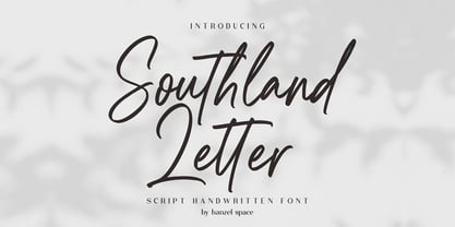 Southland Script Handwritten Font with contemporary, sophisticated accents. It is perfect for branding, wedding invites, tagline, cards, maybe for label and logo. Southland includes full set of gorgeous uppercase and lowercase letters, numerals, a large range of punctuation and ligatures. It expresses beauty of handwriting. What you get, darling? In order to use the beautiful ligatures, you need a program that supports OpenType features such as Adobe Illustrator CS, Adobe Photoshop CC, Adobe Indesign and Corel Draw. Feel free to give me a message if you have a problem or question.
 - Market Street Neon by LLW Studio,
$22.00 Market Street Neon is an all-caps condensed display font constructed with two rounded-end strokes; the lowercase set is included as a repeat of the uppercase to make setting type just that little bit easier. I designed this font to be a little bit more “San Francisco” (hence the name of the font), with a contemporary and upscale feeling. It’s intended for use in larger sizes of type, upwards of 48 pt. Market Street Neon is perfect for a design that wants to imitate neon—use it in Photoshop, InDesign, Illustrator or Corel with color & blend effects, and its geometry also lends itself well to simple color for signage, packaging, posters etc. that will pop.
 - LiebeOrnaments by LiebeFonts,
$19.90 You think swirls, swashes and curls are kitsch? Wait till you've seen our self-confident set of uncomplicated hand-drawn ornaments. If you're looking for the right flourish to spice up your greeting cards or prettify your wedding invitations, look no further! With LiebeOrnaments your designs will look as accurate as if you had spent three weeks in calligraphy boot camp—while maintaining an aura of softness and loveliness. This single font includes an impressive set of almost 200 variations on classical ornaments (many accessible directly with the keyboard). LiebeOrnaments is the perfect companion for our best-selling typeface LiebeErika, which has a cameo appearance on some of the samples shown above.
 - LifeAfterCollege by Ingrimayne Type,
$13.95 The LifeAfterCollege family began as a set of four fonts based on two styles of Ranger, which are slab-serif, geometric fonts with no curves. Two of the four are outlines with hollow insides, and two have-filled insides. The two fonts that are outlined have been taken apart and made into three typeface that can be layered. This allows one color for the inside, another for the middle ring, and a third for the outside outline.
 - ITC New Esprit by ITC,
$29.99Originally drawn in 1985, Jovica Veljović had intended to add a few kerning pairs and make some minor refinements to the letterforms. However, his work lead him to take a fresh look at the family. Veljović recalls, … I soon realized that some characters could benefit by more refined shapes and proportions. By the time I was done, I had worked on just about every character in the original design." In fact the end result is two systems: one optimized for extended texts; the other for display settings. The original elegance of the design is not lost, but the new design brings with it letterforms that are altogether more harmonious and balanced. The roman is dynamic and spirited, just oozing character. The italic by contrast is a little more restrained, but nonetheless an elegant and fitting accompaniment. The text-optimized fonts come with a generous x-height, and slightly less contrast; though its marginally wider proportions let in the light, making it very legible even at small sizes. ITC New Esprit ® is a versatile family, brought to you in four weights from regular to black. OpenType features like small caps, alternates, and a broad character set make this a welcome addition to everyone's font library. Whether you want elegant and legible text, or dynamic and personable headlines, then you'll want to click through to see more of ITC New Esprit. " - Romile by Nathatype,
$29.00 Looking for an elegant font? Romile is a elegant and bold serif font. It comes to be a single font all in uppercases. Thanks to the cursive and unique swirls at the end of some characters carries a sense of elegant looks. On the other hand, the weight of the font brings strength to any title or header you apply it to. Features: Stylistic Sets Ligatures Swashes Numerals and Punctuations PUA Encoded It can be used for many design projects, such as poster, logo, book cover, branding, heading, printed product, merchandise, quotes, social media campaign, etc. Get more inspiration about how to use it by seeing the font preview. Thank you for purchasing our fonts. Please don’t hesitate to contact us, if you have any further question or issues. We’re happy to help. Happy Designing.
 - Baraboo Banner by Solotype,
$19.95This was put together by Dan X. Solo to provide a quick way to set headings for a circus brochure. The name was given in recognition of the Baraboo Circus Museum. The end pieces are in pairs on the uppercase keys A-B, C-D, etc. The alphabet itself is in the lowercase position. - Octavian by Monotype,
$29.99Octavian font was designed by Will Carter and David Kindersley for the Monotype Corporation in 1961. Mr. Carter writes: While the ultimate authority is the ancient inscriptional pattern, the physical characteristics of the present rendering are manifest in the economic proportions of the shapes and the modified relations of the strokes. Thus, the letters are narrower than the classical forms and their weight heavier." Octavian is a fine book font and works well for other text settings that are less demanding, such as magazines and brochures." - Sticker by DonyaDesign,
$14.00 Special creative products for you, our products will give you an extraordinary experience that will not be forgotten. A popular and professional script font. Modern and elegant, this typeface is made of beautiful creative strokes. This font is perfect for your creative ideas, both formal and informal. It has a modern style with a touch of creative ideas that is very suitable to be applied anywhere that requires creative ideas such as invitation cards, letterheads, website logos, social media, banners, advertisements, brochures, packaging products, leather products, and any product that requires writing. By using this font, all of your products will look luxurious, elegant, and attractive, please try and see the results. This font includes a complete set of beautiful upper and lowercase letters, numbers, a wide variety of punctuation marks, and ligatures. All lowercase letters include a start and end, providing a realistic style. everything you get.
 - ITC Bodoni Seventytwo by ITC,
$29.99Giambattista Bodoni (1740-1813) was called the King of Printers; he was a prolific type designer, a masterful engraver of punches and the most widely admired printer of his time. His books and typefaces were created during the 45 years he was the director of the fine press and publishing house of the Duke of Parma in Italy. He produced the best of what are known as modern" style types, basing them on the finest writing of his time. Modern types represented the ultimate typographic development of the late eighteenth and early nineteenth centuries. They have characteristics quite different from the types that preceded them; such as extreme vertical stress, fine hairlines contrasted by bold main strokes, and very subtle, almost non-existent bracketing of sharply defined hairline serifs. Bodoni saw this style as beautiful and harmonious-the natural result of writing done with a well-cut pen, and the look was fashionable and admired. Other punchcutters, such as the Didot family (1689-1853) in France, and J. E. Walbaum (1768-1839) in Germany made their own versions of the modern faces. Even though some nineteenth century critics turned up their noses and called such types shattering and chilly, today the Bodoni moderns are seen in much the same light as they were in his own time. When used with care, the Bodoni types are both romantic and elegant, with a presence that adds tasteful sparkle to headlines and advertising. ITC Bodoni™ was designed by a team of four Americans, after studying Bodoni's steel punches at the Museo Bodoniana in Parma, Italy. They also referred to specimens from the "Manuale Tipografico," a monumental collection of Bodoni's work published by his widow in 1818. The designers sought to do a revival that reflected the subtleties of Bodoni's actual work. They produced three size-specific versions; ITC Bodoni Six for captions and footnotes, ITC Bodoni Twelve for text settings, and ITC Bodoni Seventytwo - a display design modeled on Bodoni's 72-point Papale design. ITC Bodoni includes regular, bold, italics, Old style Figures, small caps, and italic swash fonts. Sumner Stone created the ornaments based on those found in the "Manuale Tipografico." These lovely dingbats can be used as Bodoni did, to separate sections of text or simply accent a page layout or graphic design." - ITC Bodoni Twelve by ITC,
$29.99Giambattista Bodoni (1740-1813) was called the King of Printers; he was a prolific type designer, a masterful engraver of punches and the most widely admired printer of his time. His books and typefaces were created during the 45 years he was the director of the fine press and publishing house of the Duke of Parma in Italy. He produced the best of what are known as modern" style types, basing them on the finest writing of his time. Modern types represented the ultimate typographic development of the late eighteenth and early nineteenth centuries. They have characteristics quite different from the types that preceded them; such as extreme vertical stress, fine hairlines contrasted by bold main strokes, and very subtle, almost non-existent bracketing of sharply defined hairline serifs. Bodoni saw this style as beautiful and harmonious-the natural result of writing done with a well-cut pen, and the look was fashionable and admired. Other punchcutters, such as the Didot family (1689-1853) in France, and J. E. Walbaum (1768-1839) in Germany made their own versions of the modern faces. Even though some nineteenth century critics turned up their noses and called such types shattering and chilly, today the Bodoni moderns are seen in much the same light as they were in his own time. When used with care, the Bodoni types are both romantic and elegant, with a presence that adds tasteful sparkle to headlines and advertising. ITC Bodoni™ was designed by a team of four Americans, after studying Bodoni's steel punches at the Museo Bodoniana in Parma, Italy. They also referred to specimens from the "Manuale Tipografico," a monumental collection of Bodoni's work published by his widow in 1818. The designers sought to do a revival that reflected the subtleties of Bodoni's actual work. They produced three size-specific versions; ITC Bodoni Six for captions and footnotes, ITC Bodoni Twelve for text settings, and ITC Bodoni Seventytwo - a display design modeled on Bodoni's 72-point Papale design. ITC Bodoni includes regular, bold, italics, Old style Figures, small caps, and italic swash fonts. Sumner Stone created the ornaments based on those found in the "Manuale Tipografico." These lovely dingbats can be used as Bodoni did, to separate sections of text or simply accent a page layout or graphic design." - ITC Bodoni Ornaments by ITC,
$29.99Giambattista Bodoni (1740-1813) was called the King of Printers; he was a prolific type designer, a masterful engraver of punches and the most widely admired printer of his time. His books and typefaces were created during the 45 years he was the director of the fine press and publishing house of the Duke of Parma in Italy. He produced the best of what are known as modern" style types, basing them on the finest writing of his time. Modern types represented the ultimate typographic development of the late eighteenth and early nineteenth centuries. They have characteristics quite different from the types that preceded them; such as extreme vertical stress, fine hairlines contrasted by bold main strokes, and very subtle, almost non-existent bracketing of sharply defined hairline serifs. Bodoni saw this style as beautiful and harmonious-the natural result of writing done with a well-cut pen, and the look was fashionable and admired. Other punchcutters, such as the Didot family (1689-1853) in France, and J. E. Walbaum (1768-1839) in Germany made their own versions of the modern faces. Even though some nineteenth century critics turned up their noses and called such types shattering and chilly, today the Bodoni moderns are seen in much the same light as they were in his own time. When used with care, the Bodoni types are both romantic and elegant, with a presence that adds tasteful sparkle to headlines and advertising. ITC Bodoni™ was designed by a team of four Americans, after studying Bodoni's steel punches at the Museo Bodoniana in Parma, Italy. They also referred to specimens from the "Manuale Tipografico," a monumental collection of Bodoni's work published by his widow in 1818. The designers sought to do a revival that reflected the subtleties of Bodoni's actual work. They produced three size-specific versions; ITC Bodoni Six for captions and footnotes, ITC Bodoni Twelve for text settings, and ITC Bodoni Seventytwo - a display design modeled on Bodoni's 72-point Papale design. ITC Bodoni includes regular, bold, italics, Old style Figures, small caps, and italic swash fonts. Sumner Stone created the ornaments based on those found in the "Manuale Tipografico." These lovely dingbats can be used as Bodoni did, to separate sections of text or simply accent a page layout or graphic design." - ITC Bodoni Brush by ITC,
$29.99Giambattista Bodoni (1740-1813) was called the King of Printers; he was a prolific type designer, a masterful engraver of punches and the most widely admired printer of his time. His books and typefaces were created during the 45 years he was the director of the fine press and publishing house of the Duke of Parma in Italy. He produced the best of what are known as modern" style types, basing them on the finest writing of his time. Modern types represented the ultimate typographic development of the late eighteenth and early nineteenth centuries. They have characteristics quite different from the types that preceded them; such as extreme vertical stress, fine hairlines contrasted by bold main strokes, and very subtle, almost non-existent bracketing of sharply defined hairline serifs. Bodoni saw this style as beautiful and harmonious-the natural result of writing done with a well-cut pen, and the look was fashionable and admired. Other punchcutters, such as the Didot family (1689-1853) in France, and J. E. Walbaum (1768-1839) in Germany made their own versions of the modern faces. Even though some nineteenth century critics turned up their noses and called such types shattering and chilly, today the Bodoni moderns are seen in much the same light as they were in his own time. When used with care, the Bodoni types are both romantic and elegant, with a presence that adds tasteful sparkle to headlines and advertising. ITC Bodoni™ was designed by a team of four Americans, after studying Bodoni's steel punches at the Museo Bodoniana in Parma, Italy. They also referred to specimens from the "Manuale Tipografico," a monumental collection of Bodoni's work published by his widow in 1818. The designers sought to do a revival that reflected the subtleties of Bodoni's actual work. They produced three size-specific versions; ITC Bodoni Six for captions and footnotes, ITC Bodoni Twelve for text settings, and ITC Bodoni Seventytwo - a display design modeled on Bodoni's 72-point Papale design. ITC Bodoni includes regular, bold, italics, Old style Figures, small caps, and italic swash fonts. Sumner Stone created the ornaments based on those found in the "Manuale Tipografico." These lovely dingbats can be used as Bodoni did, to separate sections of text or simply accent a page layout or graphic design." - ITC Bodoni Six by ITC,
$40.99Giambattista Bodoni (1740-1813) was called the King of Printers; he was a prolific type designer, a masterful engraver of punches and the most widely admired printer of his time. His books and typefaces were created during the 45 years he was the director of the fine press and publishing house of the Duke of Parma in Italy. He produced the best of what are known as modern" style types, basing them on the finest writing of his time. Modern types represented the ultimate typographic development of the late eighteenth and early nineteenth centuries. They have characteristics quite different from the types that preceded them; such as extreme vertical stress, fine hairlines contrasted by bold main strokes, and very subtle, almost non-existent bracketing of sharply defined hairline serifs. Bodoni saw this style as beautiful and harmonious-the natural result of writing done with a well-cut pen, and the look was fashionable and admired. Other punchcutters, such as the Didot family (1689-1853) in France, and J. E. Walbaum (1768-1839) in Germany made their own versions of the modern faces. Even though some nineteenth century critics turned up their noses and called such types shattering and chilly, today the Bodoni moderns are seen in much the same light as they were in his own time. When used with care, the Bodoni types are both romantic and elegant, with a presence that adds tasteful sparkle to headlines and advertising. ITC Bodoni™ was designed by a team of four Americans, after studying Bodoni's steel punches at the Museo Bodoniana in Parma, Italy. They also referred to specimens from the "Manuale Tipografico," a monumental collection of Bodoni's work published by his widow in 1818. The designers sought to do a revival that reflected the subtleties of Bodoni's actual work. They produced three size-specific versions; ITC Bodoni Six for captions and footnotes, ITC Bodoni Twelve for text settings, and ITC Bodoni Seventytwo - a display design modeled on Bodoni's 72-point Papale design. ITC Bodoni includes regular, bold, italics, Old style Figures, small caps, and italic swash fonts. Sumner Stone created the ornaments based on those found in the "Manuale Tipografico." These lovely dingbats can be used as Bodoni did, to separate sections of text or simply accent a page layout or graphic design." - Jakarta Culture by Black Studio,
$19.00 Introducing Jakarta Culture, Thank you for visiting Jakarta Culture! A very fun yet elegant script font with lots of energy, it lets you create beautiful handcrafted typography in an instant. With extra curves & twists, Jakarta Culture is guaranteed to make your text stand out - perfect for logos, printed quotes, invitations, cards, product packaging, headers, weddings and anything else you can imagine. What's really awesome is that Jakarta Culture comes with a full set of lowercase alternatives, which allow you to create more authentic custom-feel texts. This type has become the work of true love, making it as easy and fun as possible. I can't wait to see what you do with Jakarta Culture! Feel free to use the #Black Studio tag and the #Jakarta Culture font to show what you've been up to, I really hope you enjoy it! Thank you!