10,000 search results
(0.04 seconds)
- Linotype Party Time by Linotype,
$29.99Linotype Party Time is part of the Take Type Library, chosen from the entries of the Linotype-sponsored International Digital Type Design Contests of 1994 and 1997. The typeface is the work of Bulgarian designer Christo Velikov and is composed exclusively of capital letters. Different components make up this cheeful, frolicking font: stripes, dots, triangles, arrows, a trumpet, a ribbon, and others. The characters of Linotype Party Time stand straight on the base line while those of Linotype Party Time Drunk take on the stance typical of this state. Linotype Party Time is perfect for anything which has to do with fun and should be used exclusively in larger point sizes to emphasize the details which make the figures so unique. - Conthey Inline by ROHH,
$29.00 Conthey Inline™ is your new retro-display best friend! The one and only, unique IN-AND-OUT typeface with strong personality and outstanding flexibility. This display sans features amazing variable fonts letting you adjust not only width of the letters, but also let you fluently transition from thin inline styles to thin outline ones. This mechanics opens a world full of layering possibilities as well as a great fine-tuning ability. The family consists of 39 OpenType fonts - 18 pure inline/outline styles in 3 widths (Narrow, Condensed, Normal) and 21 styles carefully prepared and tuned for layering. For even greater flexibility 3 variable fonts are included in the set. In addition to flexible width and inline-outline transitioning, this playful typeface features 4 different inline styles to spice up things even more! All styles were meticulously crafted with the highest attention to detail in the letterforms as well as spacing. Conthey Inline is a sibling of Conthey, a display unicase family as well as Lutschine, a versatile modern narrow display typeface. Conthey Inline composes perfectly with its family members, covering a very broad range of design scenarios. All these typefaces are a part of big type system containing also a workhorse sans serifs such as Rothorn and Montreux Grotesk. You will have a lot of success using Conthey Inline for any kind of playful, vintage/retro, organic, friendly and stylized designs. Especially, industries such as food & beverage, travel, hospitality, fashion, healthcare, sports, lifestyle, music, art, entertainment and products for youth are perfect areas to make Conthey Inline shine with all its charm.
 - Carissa by Just My Type,
$20.00 Everyone likes getting a handwritten letter. At least, they would if anyone still hand wrote letters. We heard a story about a type designer who gets a Christmas card from his niece. He’s been out of touch with her for years and is both delighted and surprised to receive a handwritten note. His first thought is “How sweet; how very nice to hear from her.” His second thought is,”Great font potential; I could use this.” And he did. Carissa has a fresh, spontaneous feel, with a wonderful use of uppercase letters (B and R, etc.) within the lower case. Useful as a personal font or for an off-beat menu...
 - Euro Icon Kit by TypoGraphicDesign,
$9.00 The typeface EURO Icon Kit is designed at 2020 for the font foundry Typo Graphic Design by Manuel Viergutz. The display font is inspired by the here and now. 763 glyphs incl. icons, dingbats & symbols. Decorative extras like arrows, emojis, ornaments, geometric shapes, catchwords, decorative ligatures (type the word #LOVE for ❤ or #SMILE for ☺ as OpenType-Feature dlig) and stylistic alternates (20 stylistic sets) + sign of the zodiac. Have fun with this font & use the DEMO-Font (with reduced glyph-set) for FREE!
 - Sensual Initials JNL by Jeff Levine,
$29.00Sensual Initials JNL is a revamped and cleaned-up version of an old freeware font by Jeff Levine. Redrawn, and now utilizing the typeface French Art Initials JNL - Are You Shaw NF by Nick's Fonts,
$10.00This decorative delight is based on a typeface discovered within the pages of "Schriftatlas: Alphabete von A bis Z," and originally named Pygmalion. The swash caps and plain caps in the lowercase positions allow for wide-ranging creativity in the composition of dramatic headlines. Both versions include the complete Latin 1252, Central European 1250 and Turkish 1254 character sets, as well as localization for Moldovan and Romanian. - Foo Bar Inline NF by Nick's Fonts,
$10.00One of countless variations possible from the modular lettering system called "Super Veloz", developed by Spanish type designer Joan Trouchut-Blanchard in the 1930s. The name is a play on the old G.I. acronymn FUBAR, translated politely as "fouled up beyond all recognition". Both versions of this font contain the Unicode 1252 Latin and Unicode 1250 Central European character sets, with localization for Romanian and Moldovan. - Morris Sans by Linotype,
$40.99 Morris Sans is a newly revised and extended version of a small geometric family of typefaces originally produced by Morris Fuller Benton in 1930 for ATF. His initial design consisted of an alphabet of squared capital letters with a unique twist that characterized its appearance: corners with rounded exteriors and right-angle interiors. The types were intended for use in the fine print found on business cards, banking or financial forms, and contracts. But over the ensuing decades, this design became a popular element in all sorts of design environments, and several foundries revived the typeface in digital form. Since digital fonts are bicameral, with slots for both upper and lowercase letters, new cuts of the type opted filled the lowercase slots with small caps. In 2006, Linotype commissioned its own version of the typeface-an extension for 21st century use. Under the advisement of Linotype's type director Akira Kobayashi, Dan Reynolds redrew the uppercase and added an original lowercase for the first time. Additionally, a number of extras were brought into the fonts, including six figure styles (tabular and proportional lining figures, tabular and proportional oldstyle figures, and special tabular and proportional small cap" figures). Small caps, which have become an iconic element over time, are accessible in each font as an OpenType feature. To differentiate this version from the original, Linotype's new family is named Morris Sans, in honor of Morris Fuller Benton. All fonts in the Morris Sans family are OpenType Com fonts; they include a character set capable of setting 48 European languages that employ the Roman alphabet, including all Central and Eastern Europe languages, those from the Baltics, and Turkish. This glyph coverage extends to the small caps as well. Morris Sans is a wide typeface, especially in its regular widths; the condensed faces set a more conventional line of text. The new lowercase letters are less geometric than the uppercase, except for those that share the same basic forms (e.g., c, o, and s). Instead of following this geometric trend, the new lowercase tends to strengthen the humanist elements that were present in several characters from the original type, including the uppercase D and the figures 5, 6, and 9. Morris Sans also sports a number of glyphic flares, like the stroke found on the original uppercase Q. Morris Sans is a clean, modern design best suited for headlines, advertising, posters, expressive signage (especially on storefronts), and corporate identity work."
 - FS Conrad by Fontsmith,
$50.00 Art into type In 2008, Fontsmith were approached by their friend, Jon Scott, to investigate whether a typeface could assume the aesthetic of one artist’s body of work. Jon’s not-for-profit charity, Measure, was organising an event for the artist, Conrad Shawcross, whose giant mechanical installation, entitled Chord, was going on public display in the long-disused Kingsway tram tunnel in Holborn. Chord explores the way we perceive time, as either a line or a cycle. Two enormous machines with dozens of rotating arms and moving in opposite directions, weave rope with almost infinite slowness. An unusual brief Phil Garnham visited Conrad in his Hackney studio to get a feel for his work and ideas. “Conrad is a very clever and philosophical guy. He struggled to see how typeface design had any relevance to him and his art. This was going to be a challenge.” The artist presented the type designer with a pile of rope and a huge diagram of sketches and mathematical workings. “This was, in essence, my brief.” Phil developed three concepts, the simplest of which ticked all the boxes. “The idea of the strokes in the letterforms appearing and ending at peaks or points of origin fitted perfectly with Conrad’s idea of time occurring and ending at two ends of the sculpture.” Two versions Phil planned modules for two versions of the typeface: one with five lines in the letterforms and one with seven. He then drew the modules on-screen and twisted and turned them to build the machine that is FS Conrad. “This is not a simple headline typeface,” says Phil. “It’s not a rigid structure. It has varying character widths, and it’s informed by real typographic insight and proportions so that it actually works as piece of functioning, harmonious type.”
 - MFC Spindler Borders by Monogram Fonts Co.,
$19.95 The inspiration source for MFC Spindler Borders is a collection of border treatments revived from the “Catalog 25 TYPE FACES” by Barnhart Brothers & Spindler. The border designs were recreated from two different border sets, “Classic Art Borders” and “Classic Black & White Borders”. This collection of borders represents a structured repetition of elements in various ways to create elegant patterns and backgrounds. You can start with a new document or work on a new layer within an existing document. Select MFC Spindler Borders from the font menu. (Some users may have font previewing enabled in the font menu which will cause the font name to appear as border elements, disable this option in order to choose the name) Make certain that the point size of the font is the same as the leading being applied to the font so the borders will meet up properly. While we’ve adjusted this within the font, your program may override these settings. For instance a 12 point font should have 12 points of leading. Download and view the MFC Spindler Borders Guidebook if you would like to learn a little more.
 - PF Bague Inline Pro by Parachute,
$79.00 Bague Inline Pro is the inline version of Bague Universal a contemporary geometric typeface family which blends distinct minimalist characteristics with mainstream details. Despite its inspiration from Herbert Bayer’s drawings of the 1920s, it diverts from the constructivist rigidity and display structure of early geometric typefaces by incorporating humanist characteristics as well as classic letterform shapes which balance out the extremity of the minimal shapes. Bague Inline is a typeface that stays true to its urban nature and heritage. A very interesting feature of Bague Inline is its vast array of uppercase alternates and ligatures which truly shine when set at display sizes. Make your selection from 4 groups of alternates as well as a rich set of discretionary ligatures and watch it transform into a flexible, charming and stylish typeface with strong modern aesthetics. This typeface offers enormous possibilities and variations for editorial design and branding. Bague Inline is the only commercially available inline typeface that comes in 4 weights for uppercase and lowercase letters. Each style consists of 775 glyphs with more that 128 alternates and ligatures and an extended set of characters which supports simultaneously Latin, Cyrillic and Greek. PDF Specimen Bague Inline on Behance
 - Colville by Canada Type,
$29.95 The Colville fonts began their existence in 2015 as a project-specific typeface, made to be used on a custom-made headstone commemorating Canadian artist Alex Colville (1920-2013) and his wife Rhoda Wright. For that purpose, some initial shapes were modelled after letters Colville himself had used on a Governor General gold medal he designed in the mid-1970s. From there started a year-long project that culminated in a set of four comprehensive fonts ranging in weight from Light to Bold, each containing over 750 glyphs to cover Pan European language support, stylistic alternates, five sets of figures, automatic fractions, and some ornaments rooted in Alex Colville’s art. These fonts exhibit a strong art deco aesthetic that has always been a favourite of architects, metal casters, and sign makers. This is a very humanist geometry alternating from the precisely calculated to the curvy and lithe, subtle contrast, flat stroke stops, and airy proportions that make for a counterspace built for accommodation and comfort. The breadth and timeless humanism of the Colville set makes fit in a variety of applications, from straightforward headlines, titles, and emphasis captions, to branding and packaging.
 - Scala Jewel Pro by Martin Majoor,
$29.00 Scala Jewels is a set of four highly decorative typefaces, based on the bold capitals of Scala. Whereas Crystal and Pearl are modelled on historic examples, Diamond and Saphyr are original designs. Scala Jewels offers the possibility to set decorated borders, designed in the style of each of the four variations. There are corners and different sorts of long and short elements. One of the best ways to use Scala Jewels is as a two- or three-line drop cap at the start of a chapter. The award-winning Scala family (1990-1993) is a worldwide bestseller and has established itself as a ‘classic’ among digital fonts.
 - Bebopalula by Studio K,
$45.00 No prizes for guessing this font family was inspired by the 1950s - the sounds (Buddy, Eddie, Elvis), the styles (polka dots, petticoats and Dior's New Look), and the kitsch, from furry dice above the dashboard to plaster ducks over the mantlepiece! A particular point of reference is the furnishings and fabrics of the Fifties (with their distinctive kidney shapes and angular curves) as showcased in the Festival of Britain 1951. See also my other fun fonts Barrowboy, Calypso and Pier Arcade.
 - Lapidaria by SIAS,
$34.90 Lapidaria is a typeface that may be described as a ‘geometric sans with humanist qualities’. Its mood is smart and sober, its appeal is calm, cool and classical. Though quite well performing even in longer text bodies, a particular strength of Lapidaria lies in display typography. The most peculiar aspect of Lapidaria is its new family concept: for the very first time ever a tricameral alphabet model has been realized as a general-use sans: uppercase, lowercase and middlecase letters blending smoothly into one typographic tone, thus offering entirely new typographic possibilities. – The middlecase (or uncial) sorts being accommodated in the lowercase positions of the Medior fonts. All nine fonts equally offer full character coverage for all Euro-Latin languages – and for Greek. There are a lots of special characters and ligatures. Last but not least, a set of ten ornament characters (in each font) will let you make sparkling designs which will thrill your clients. Each font contains about 500 characters, that makes over 4,500 in total for the complete Lapidaria family package. __________________________________________________________________________________________
 - ASTYPE Ornaments Christmas A2 by astype,
$28.00 Christmas A2 uses the following OpenType features to set up to four different color layers. - Superscript/Superior (Trees) - Subscript/Inferior (Stars) - Numerator (Candles) - Denominator (Light, Bells) Note: Due to the complexity of some parts of the font, some printers may have problems of rendering it smoothly. To avoid this problem you should always outline the font data for the final documents. On lower systems turn font antialiasing off for faster screen redrawings.
 - ASTYPE Ornaments Christmas A by astype,
$28.00 Christmas A uses the following OpenType features to set up to four different color layers. - Superscript/Superior (Trees) - Subscript/Inferior (Stars) - Numerator (Candles) - Denominator (Light, Bells) Note: Due to the complexity of some parts of the font, some printers may have problems of rendering it smoothly. To avoid this problem you should always outline the font data for the final documents. On lower systems turn font antialiasing off for faster screen redrawings.
 - Drakune by Shakira Studio,
$19.00 Introducing Drakune - Beauty Elegant Serif a font that epitomizes the essence of Beauty Elegant Serif. This font, meticulously crafted, offers a perfect blend of timeless beauty and contemporary sophistication. Drakune transforms your designs with its graceful serifs and intricate details, providing a touch of refined elegance that is currently in high demand. Explore the versatility of Drakune through its diverse alternates and ligatures, each contributing to a stylish and distinctive typographic experience. Elevate your creative projects with the allure of Drakune, setting a new standard for Beauty Elegant Serif fonts in the current design landscape. Here's what you get: Regular & Italic All Multilingual symbol Opentype features ( ligature, alternate ) Accessible in the Adobe Illustrator, Adobe Photoshop, Adobe InDesign, even work on Microsoft Word. PUA Encoded Characters - Fully accessible without additional design software. Multilingual character supports : (Afrikaans, Albanian, Catalan, Croatian, Czech, Danish, Dutch, English, Estonian, Finnish, French, German, Hungarian, Icelandic, Italian, Lithuanian, Maltese, Norwegian, Polish, Portuguese, Slovenian, Spanish, Swedish, Turkish, Zulu) Follow my shop for upcoming updates, and for more of my work, Thank you!
 - ITC Verkehr by ITC,
$29.99ITC Verkehr was designed by Mott Jordan, who based its forms on those of narrow sans serif typefaces but also chose a departure from the tradition to set the font apart from the rest. The upper half of each character is heavier than the lower half, although this is usually the other way around. Diagonal strokes, like the horizontal of the lower case e, relax the otherwise regular, bar-like look of the font. ITC Verkehr is suited exclusively for use in headlines and display in larger point sizes. - Wolby by LetterMaker,
$16.00 Wolby is a rough and organic hand drawn typefamily which draws inspiration from a variety of sources such as sign painting, hand lettering, comic books, cartoons, health food, sticks and stones to name a few. The letter shapes were all originally created by writing with a pointed brush. The use of one writing tool results in an aesthetical harmony between the very different styles making them all fit together. The family consists of eight styles; upright and slanted caps in regular and bold, a layered block style in fill, outline and shadow styles and a lively script. Wolby is capapble of creating very different moods depending on which style you choose to highlight. Because of it’s aesthetics, range of styles and extensive language support, Wolby is especially suitable for use in advertising, packaging design and gritty branding & fashion design. When using the layered block styles you’ll get the best result by placing the shadow layer on the bottom, the fill in the middle and the outline layer on top. These can also be combined freely so you can use just shadow + fill, shadow + outline or fill + outline. The script style is armed with a set of ligatures and swash capitals which allow you to supercharge your designs.
 - Chubs by Type.p,
$24.00 "Chubs," a typeface specifically designed for large display sizes, perfect for making a bold statement. Each letter in Chubs has been meticulously crafted to possess a thick and prominent appearance, ensuring that your designs leave a lasting impact on viewers. Chubs's distinctive weight and blackness make it an ideal choice for a wide range of applications, including posters, packaging, and logos. Whether you want to create eye-catching promotional materials or design a powerful brand identity, Chubs has got you covered. Within the Chubs typeface family, you'll find two distinct styles, each with its own personality and visual appeal. The first style, "Chubs Black," features letters with a captivating slit, reminiscent of a belly that overlaps. This distinctive groove adds an extra layer of visual interest and uniqueness to your designs. On the other hand, "Chubs Filled" offers a solid and plump appearance, without the characteristic slit. This style amplifies the chubby nature of the letters, resulting in a bold and impactful display. To further enhance your creative options, both styles within the Chubs family include an alternate character set featuring a wink shadow in every letter. These additional characters provide a touch of fanciness and playfulness, allowing you to experiment and add unique elements to your designs. Choose "Chubs" for your next big project, and witness the boldness and charm that sets your designs apart from the rest. Let Chubs bring your ideas to life and make a powerful visual statement that captures attention and leaves a lasting impression.
 - Verlyana by Gatype,
$12.00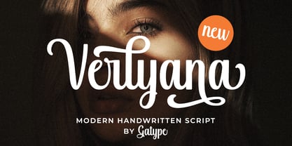 Verlyana is an organic, handwritten font suitable for branding, signatures, wedding invitations, promotions, product packaging, and other needs. This font is modern, simple, but still authentic. You'll get a full set of lowercase and uppercase letters, numbers and punctuation, multilingual symbols, initial and final lowercase swashes, binders, and extra swashes. Verlyana features OpenType style alternatives, International binders and support for most Western Languages included. To enable the OpenType Stylistic alternative, you need a program that supports OpenType features such as Adobe Illustrator CS, Adobe Indesign & CorelDraw X6-X7, Microsoft Word 2010 or a later version.
 - Calita by Gatype,
$14.00 Calita Calligraphy Modern thick and firm style that you can get now! With character replacement styles updated with special glyphs that have been given a combination of fantasy and handwritten ink. This font will look beautiful on all designs, New Year designs, Weddings, branding materials, blog titles, quotes and invitations, and business cards. Open Type includes: Alternative Style Set style Swash To enable the OpenType Stylistic alternative, you need a program that supports OpenType features such as Adobe Illustrator CS, Adobe Indesign & CorelDraw X6-X7, and Microsoft Word 2010, or later.
 - Killarney by Fontdation,
$15.00 Introducing our new font Killarney. A bold and heavy display font that inspired by the vintage/classic letterforms used in old-advertisements. Mouse-crafted with high attention to details; clean lines, sharp edges and tempting curves. Its square and blocky letterforms make Killarney a great for headlines and space killer. Packed with 500+ glyphs, Killarney composed of slanted version, standard upper/lower case characters, numerals, punctuations, some multilingual letters, alternate characters, stylistic sets, ligatures, etc. This font is a must have item for your designing arsenal. Go get yours now while it's hot. :D
 - Samhain by Hanoded,
$15.00 Samhain is a Gaelic festival marking the end of the harvest season and the beginning of winter. There is no set date, but normally it is held around the end of October and beginning of November. Samhain font was made with a bamboo pen and Chinese ink on rough paper - hence the grungy look. It is quite a heavy font, so I wouldn't set a complete text in it, but it is ideal to create headlines, posters, postcards and invitations. Of course, Halloween comes to mind! Samhain comes with extensive language support.
 - 1546 Poliphile by GLC,
$38.00 This family was inspired from the French edition of Hypnerotomachie de Poliphile ("The Strife of Love in a Dream") attributed to Francesco Colonna, 1467 printed in 1546 in Paris by Jacques Kerver. He was using a Garamond set (look at our 1592 GLC Garamond), including two styles: Normal and Italic (Normal carved by Claude Garamond, Italic we don't know; it was an Italic pattern very often in use in Paris at that time). We have modified the slant angle of the Capitals used with Italics because the Normal capitals were used in both styles in the original. The present font includes all of the specific latin abbreviations and ligatures used in this edition (with a few differences between the two styles). Added are the accented characters and a few others not in use in this early period of printing. Decorated letters such as 1512 Initials, 1550 Arabesques, 1565 Venetian, or 1584 Rinceau can be used with this family without anachronism.
 - Audiowide Pro by Stiggy & Sands,
$29.00 Our Audiowide Pro has vague inspirations from other styles like that of Handel Gothic and the Converse logo, yet it veers off in a direction of its own for a slightly more techno-futuristic and yet cleanly readable format. Great for both headlines and shorter body copy, its cleanly legible forms lend itself to a plethora of uses. The SmallCaps and extensive figure sets offer Audiowide an even wider breadth of design options. Opentype features include: - SmallCaps. - Full set of Inferiors and Superiors for limitless fractions. - Tabular, Proportional, and Oldstyle figure sets (along with SmallCaps versions of the figures). - Stylistic Alternates for Caps to SmallCaps conversion.
 - Vocal by Ani Dimitrova,
$35.00 Vocal is a sans serif type family designed by Ani Dimitrova. The family has 28 weights, ranging from Hairline to Heavy with matching Italics and Small Caps. In addition, you get a nice alternate version of the Heavy weight with extra thin accents. Which is a pure joy for setting titles. Vocal comes with extended coverage of the Latin, Greek and Cyrillic Script. The Regular and Medium weights are perfect for body text while the extra drawn Italic gives an interesting texture to the text. The stems are a little tapered to the middle and the corners are cutted, which makes them a little rounded in small sizes. That gives the font an organic, warm and friendly touch. Vocal is equipped for complex, professional typography with Open Type Features including — small caps, localized forms, standard ligatures, subscripts, superscripts, numerators, denominators, numbers in circles arrows, currency symbols and fractions. The fonts are carefully hinted and its wide proportions make them a perfect choice for screen usage. Vocal suits also ideal for book and editorial design.
 - Poynter Old Style by Font Bureau,
$40.00 In the 1670s, Christopher Plantin was the largest publisher of his day. Hendrik van den Keere cut for him an astounding series of romans. As Stanley Morison once observed, such types adopted features of Flemish blackletter to strengthen elegant French romans. Large on the body, strong in color, economical in fit, widely (if anonymously) distributed, they established effective standards for all that followed; FB 1997–2000
 - Popular Vote by Hanoded,
$10.00 I made this font during the rather hectic start of 2021. Popular Vote is an easygoing, laid-back kinda font. It fits just about anywhere, regardless of your political orientation, your sense of aesthetics or the job you will use it for. Popular Vote will feel at home on a box of crackers, on the cover of a book about keto diets, or on that T-shirt you have always wanted to design. Enjoy!
 - Ways by Fontfabric,
$30.00 Born at a crossroads, the collaborative sans family of 18 styles Ways is the latest arrival in our portfolio. The name is no coincidence, as Ways pulls out all the stops to bring you excellent legibility. Combined with brutal and elegant details for a distinct humanist flair, this sans offers perfect functionality across all weights. Visual compensations, extra white space, wider apexes, subtle tweaks, and moderate inktraps distinguish Ways among similar typefaces. Use over 690 glyphs, extended Latin and Cyrillic support, extensive OT features set, icon set of more than 60 navigation pictograms, and one variable style, to design full-fledged signage systems that get you from point A to point B without relying on G-Maps. Family overview: 9 weights (from Thin to Black) + italics Extended Latin Cyrillic 690+ glyphs languages 1 variable font (2 axes) 1 free font - Ways SemiBold OpenType Features: Localized Forms Standard Ligatures Contextual Alternates Lining Figures Tabular Figures Subscript Scientific inferiors Superscript (Superiors) Numerators Case-Sensitive Forms Standard and Discretionary Ligatures Stylistic Alternates Contextual Alternates
 - Kenosha Antique NF by Nick's Fonts,
$10.00 The inspiration for this elegant, willowy typeface was found in the 1903 type specimen catalog of Barnhard Brothers & Spindler. The original version was named "Racine"; this version takes its name from another town in Wisconsin. The Postscript and Truetype versions contain a complete Latin language character set (Unicode 1252); in addition, the Opentype version supports Unicode 1250 (Central European) languages as well.
 - Cambridge Pinstripe NF by Nick's Fonts,
$10.00A strong geometric font of lowercase letter only, with the look and feel of Jazz-age neon. Both versions of the font include the 1252 Latin and 1250 CE character sets (with localization for Romanian and Moldovan). - Sungar by Twinletter,
$12.00 Introducing Sungar sans serif font. Your customers will be captivated by the unique combination of inspiration, craftsmanship, and style that comes with this new typeface. You’ll get the full power of professional design without the hard work or hefty price tag. Of course, your various design projects will be perfect and extraordinary if you use this font because this font comes with a font family, both for titles and subtitles and sentence text, start using our fonts for your extraordinary projects.
 - Prince And Princess Charming by Harald Geisler,
$68.34 Prince and Princess Charming are very extravagant and extroverted about their feelings. Prince Charming puts a heart on everything. If you're convinced that you love you've got to go with Prince Charming. Compared to the Prince, Princess Charming puts more hearts on every letter. Convince that you have to be loved: follow Princess Charming. As you would expect from Aristocrats the family members are fluent in many languages and have a surprising extensive character set that even covers Cyrillic. Prince and Princess Charming are a part of the Light Hearted Font Collection that is inspired by a recording of Jean Baudrillard with the title, "Die Macht der Verführung" (The Power of Seduction) from 2006. Further inspiration came from the article, "The shape of the heart: I'm all yours". The heart represents sacred and secular love: a bloodless sacrifice. by British writer Louisa Young printed in EYE magazine (#43) London, 2002.
 - Fazon by Tour De Force,
$30.00 Compact and condensed, Fazon font family belongs to design inspired by vintage typefaces. It is available in 7 weights – from Light to Black. Contrast in letter design gets higher as weights get thicker which assigns dose of display elements in heavier weights of Fazon. Contains 5 stylistic sets (4 for uppercase and 1 for lowercase letters) and fractions. Fazon covers extended Latin character map. Ideal usage: packages and labels, posters, titles, websites.
 - Oo Boodlio Doo NF by Nick's Fonts,
$10.00Bongo drums at the ready! Freeman Craw's archetypal beatnik typeface Ad Lib provided the inspiration for this indubitably eccentric excursion in coolsville typography. Both versions of the font include complete Latin 1252, Central European 1250 and Turkish 1524 character sets, with localization for Moldovan, Romanian and Turkish. - Educator JNL by Jeff Levine,
$29.00Educator JNL joins the large library of Jeff Levine's stencil fonts and was re-drawn from a set of individual letter stencils with the distinctive look of Franklin Gothic. All of the irregularities of the original die-cut letter forms were left intact, giving a "real world" look to the font. - Matrixoid by Haksen,
$13.00 Matrixoid come with natural taste of letters. with the real hand done I created them, also additional variation in outline font to make good sensation feel. When you type with this font, I believe you will enjoy the sensation of the natural feel of this font, equipped with ligature and outline version features make the display even stronger for your projects such as posters, logos, advertisements, book covers and all brands for your requirement. I recommend for you to use photoshop or illustrator to make design with this font and let see when you will say WOW :) So what include when You want to use them ? OTF files Ligatures Numbers + Punctuation Non-English support Ligatures Please contact me if anything question, I'm glad to help :) Happy Designing, Haksen
 - Mobalys by Alit Design,
$19.00 Introducing Mobalys - Where Elegance Meets Nature Embrace the beauty of nature with Mobalys, a captivating font that seamlessly blends the grace of elegant script with the modern simplicity of sans serif. Immerse your designs in the lush greenery of a go-green theme, accompanied by stunning leaf illustrations that breathe life into your creations. Elegance in Every Curve: Mobalys boasts an exquisite script style that adds a touch of sophistication to your projects. Each curve and swirl is carefully crafted to exude elegance. Modern Simplicity: The sans serif elements bring a contemporary flair, ensuring versatility in usage. Whether it's a sleek logo or a clean headline, Mobalys adapts effortlessly. Nature's Embrace: Dive into a world of greenery with Mobalys. The font is adorned with enchanting leaf illustrations, adding a touch of organic charm to your designs. Let the beauty of nature seamlessly integrate into your projects. Extensive Character Set: With 730 characters at your fingertips, Mobalys provides a diverse range of options to express your creativity. Explore a plethora of possibilities with ligatures, alternates, swashes, and more. PUA Unicode: Unleash your design freedom with Mobalys' Private Use Area (PUA) Unicode support. Access additional characters and symbols for a truly customized touch to your work. Elevate your designs with Mobalys, where the synergy of elegance and nature creates a visual masterpiece. Immerse your audience in the refreshing green world and let your creativity flourish. Mobalys is not just a font; it's an experience.