10,000 search results
(0.052 seconds)
- Nightmare Street by Wing's Art Studio,
$12.00 Take a midnight stroll if you dare through the shadowy terrace of terror, in Nightmare Street! A bloodcurdling design supplied in two styles with additional underlines and paint spills, Nightmare Street is an 80s inspired horror font straight from the video store. It’s the perfect choice when you want a hand-made look for your movie posters and trailers, album covers, books and Halloween promos. This font includes complete uppercase and lowercase characters plus punctuation, numerals and language support. It also comes with a full set of alternatives ensuring that you’ll never have to repeat your e’s or t’s for a more convincing and authentic hand-drawn look. Check out the visuals for more details and usage examples.
 - Devils Haircut by PintassilgoPrints,
$24.00 Devils Haircut is an explosive font duo, consisting of two completely different styles, creative and expressive in their own way, with a touch of punk and counter-culture aesthetic. Together they make a decidedly eye-catching pair and a rad option for numerous display moods, from album covers to food packaging, from title screens to editorial pages. Both fonts are all caps with different designs stored on upper- and lower-case slots, so you can reach the alternate forms easily through the keyboard. Or use the Contextual Alternates OpenType feature to instantly cycle the alternate glyphs and get an even more uneven look. Make Devils Haircut yours and fire up your designs, hell yes!
 - Rather Both by PintassilgoPrints,
$24.00 Rather Jazzy, Rather Loud: a family of two quite distinct fonts that perform together handsomely well. Both fonts include 2 versions for each letter, easily reachable through keyboard upper and lower keys. They also come packed with Contextual Alternates functionality to instantly cycle the alternates, providing a realistic handcrafted feel: just turn on the feature in any OpenType savvy application and let the music sound. Rather Loud brings yet another cool feature: lots of interlocking pairs that will add that nice extra twist your projects sometimes ask for. Trigger the discretionary ligatures feature button (OpenType savvy applications needed!) or pick up your choices through a glyphs palette or character map. Jazzy? Loud? I'd Rather Both, for sure!
 - Antoine by Anastasia Kuznetsova,
$19.00 Introducing Antoine — is a vintage retro display typeface. The three font combinations I launched are very compatible if for the victorian classic design concept. As for if the font was worn by itself, without combinations are also brave!! In addition to many get unique character, luxury, brave and elegant. You also have a collection ornament, very suitable if in the gradient. This font is also very easy to use with other design programs or with out design program. Antoine Typeface is perfect for beverage label design project. coffee label. logotype design, badges, classic wedding concept. victorian design concept and so on. gig poster, letterhead, droop cap, titles, and any artworks. Now it’s your time to go crazy and explore the uniqueness of this typeface!! I invite you to familiarize yourself with the preliminary images and hope that you will be imbued with my vision of this creative font, which, I am sure, will be suitable for all the interesting projects you are working on. Fonts can be opened and used in any software that can read standard fonts, even in MS Word. No special software is required to get started. It is recommended to use it in Adobe Illustrator or Adobe Photoshop. Made with love and magic ♡ Thank you for reading it, and do not hesitate to send me a message if you have any questions! ~ Anastasia
 - Waves by Radko Hromátka,
$30.00 Waves is a sans serif typeface with pure but expressive look, which is notable even in smaller sizes. The softly decorative characters are also nicely visible in bigger sizes what makes Waves unique. A user can choose from two sets in all four weights. Each font features alternate letters, offers wide sets of characters including fractions and language support with all characters for Central European countries.
 - Manicuore by PintassilgoPrints,
$29.00 Manicuore is a hand-drawn typeface inspired by Italian movie posters by the prolific movie poster artist Symeoni (a.k.a. Sandro Simeoni). Being a talented and skilled painter, portraitist and illustrator, Symeoni enjoyed a long and fruitful career and was remarkably productive during the sixties and seventies. He counts over 3,000 works to his credit, which truly fed the imagination of several generations. This all-caps font brings different lettershapes on upper and lower case slots, which work as alternates, providing handy options to spice up your compositions. When using it in OpenType savvy applications just turn on contextual alternates feature to instantly cycle lettershapes – a one click way for adding spontaneity while also preventing neighbor double letters from using the same glyph. To put the icing on the cake, Manicuore brings a cool set of graphic elements that match the typeface look and feel. An inspiring toolbox for creative lettering designs. Now... Lights! Camera! Action!
 - Lichtspiele by Typocalypse,
$29.00 Cinemas from the early 20th century are called “Lichtspiele” in Germany. “Lichtspiele” transports you back to a time where neon lights and marquee letters decorated cinema façades. Of the five styles, three have two versions of italics — the left-leaning italic evokes looking up from lower-left, the right-leaning italic is as if we are looking from lower-right. Display is the basic style, while Neon is inspired by the old neon letters found outside cinemas. Try placing Neon Outline on top of Display or Neon to add another layer to your artwork. Neon 3D is a extruded version of Neon. The Screen Credits style is based on the notes — producers, cast, crew and so on — on movie posters. Get more out of life, go out to a movie.
 - Didonesque Ghost by Monotype,
$25.99 Didonesque Ghost is a family of 10 fashionable fonts that will enhance any project that requires a touch of class. These fonts turn the contrast right up to 11 – giving each weight a ghost-like appearance by means of their hairline stems and serifs. This extreme contrast gives Didonesque Ghost a very stylish appearance which is intended for use in display purposes at very large sizes – posters, signage, branding, corporate identities, headlines, advertising, wedding invitations and the like. See more detailed examples here . Key features: • 5 Weights in Roman and Italic • Small Caps, Petite Caps, Contextual Alternates, Ligatures and Discretionary Ligatures • European Character Set – Latin Only • 750 glyphs per font.
 - Rundgotisch by HiH,
$10.00 One of my favorites. Rundgotisch is a easy to read for eyes that are accustomed to roman letterforms, yet keeps in touch with its blackletter roots. It was released around 1900 by Schelter & Giesecke of Leipzig, Germany. Can be used to set short text passages and pairs easily with many different decorative initials of the period. A very useful typeface. Don't leave home without it. According to Bringhurst, Schelter & Giesecke was formed in 1819 by Johann Gottfied Schelter and Christian Friedrich Giesecke. This old German printing house was sucked up by state-owned Typoart in 1946, after Marshall Zhukov and the Red Army had established Soviet dominion over East Germany.
 - Floresta by Great Studio,
$21.00 Floresta is a modern vintage serif font packaged in a modern and classy style, complete with access to your OpenType features to access a large selection of alternates letters and ligatures, the choice of letters you like from variations of uppercase and lowercase letters to get a display luxurious and elegant. Floresta Display has 433 glyphs with 11 ligatures and 197 alternates to beautify the design you like. This font is perfect for branding projects, Logo design, Clothing Branding, packaging, magazine headings, advertising, T-shirts, postcards and much more. Features · All Uppercase and Lowercase · Number & Symbol · Supported Languages · Alternates and Ligatures · PUA Encoded Thank you, Great Studio
 - Mittelhorn by High Peak,
$23.00 Mittelhorn is a clean, readable, distinctive neo-grotesque. Use it for logotypes, web, signage, or editiorial design. Make a statement and choose one of the alternate sick glyphs… Main features: The family comes in three weights and matching italics Reinterpreted numbers and punctuation Comprehensive character sets for Western and Central European language Selected alternate uppercase sick glyphs for extra character Each glyph in this family was crafted with intention and care. It is a creative yet versatile and very readable font that you can easily use on a range of applications - headlines, billboards, signage, web copy, editorial, publishing… Most of all, have fun with it!
 - Bigola Display by Great Studio,
$20.00 Bigola Display is a modern vintage serif font packaged in a modern and classy style, complete with access to your OpenType features to access a large selection of alternates letters and ligatures, the choice of letters you like from variations of uppercase and lowercase letters to get a display luxurious and elegant. Unique, playful and versatile serif family with 14 ligatures and 170 alternates to beautify the design you like. This font is perfect for branding projects, Logo design, Clothing Branding, packaging, magazine headings, advertising, T-shirts, postcards and much more. What is included: Bigola Display Regular Features · All Uppercase and Lowercase · Number & Symbol · Supported Languages · Alternates and Ligatures · PUA Encoded
 - Redfighter by Ditatype,
$29.00 Redfighter is an attention-grabbing display font with a games theme, featuring large letters and a rectangular shape with sharp corners. This font shows large letters that demand attention and make a statement. The generous size of each character ensures maximum visibility and impactful design elements. This design choice allows this font to stand out and grab the viewer's attention with its imposing presence. The rectangular shape with sharp corners in Redfighter adds a sense of structure and strength to the font. The clean lines and defined angles create a visually bold and striking appearance. This unique feature evokes a sense of power and precision, reflecting the intensity and competitiveness found in the gaming world. For the best legibility you can use it in the bigger text. Enjoy the available features here. Features: Stylistic Sets Multilingual Supports PUA Encoded Numerals and Punctuations Redfighter fits in headlines, logos, posters, titles, branding materials, print media, editorial layouts, website headers, and any other projects that aim to create a strong visual impact. Find out more ways to use this font by taking a look at the font preview. Thanks for purchasing our fonts. Hopefully, you have a great time using our font. Feel free to contact us anytime for further information or when you have trouble with the font. Thanks a lot and happy designing.
 - Malikon by Alcode,
$20.00 Malikon is a classic script, with each letter having been carefully made to make your text look beautiful. This font is perfect for logos, badges, shirts, labels, clothing designs, etc. Try Malikon and enjoy the richness of OpenType features and let the fun and elegant fun make you happy and increase your creativity! You can use this font very easily. If you do not have programs that support OpenType features like Adobe Illustrator and CorelDraw X Versions, you can access all alternative flying machines using Font Book (Mac) or Character Map (Windows).
 - Frank Ruehl BT by Bitstream,
$29.99Frank-Rühl (or Ruehl) is the ubiquitous Hebrew text font style. There are many fonts that belong to this style, and all are based on an early 20th-century design by Raphael Frank. Some of the fonts are actually called Frank-Rühl (or Ruehl) and some are not. It was originally designed in a single weight. Bitstream developed Frank Ruehl for the Microsoft Windows operating system. The font is encoded with a Microsoft defined Hebrew character set, Hebrew Code Page 1255. Within the TrueType fonts, the characters are assigned Unicode character IDs. The font includes Hebrew characters, and Latin glyphs from Dutch 801 bold. - Lech Sans Pro by Ingo,
$44.00 A modern sans serif – large x-height, lively forms The Lech Sans Pro is businesslike-modern but at the same time present the effect of liveliness and movement. The shapes of the individual characters follow the "humanistic" form language of modern faces. In this way, Lech Sans Pro offers an attractive alternative to most of the sans serif fonts used today. The proportions have been selected to be very legible even as a body type for longer texts. The font is so robust in detail that a title in large capitals is very eye-catching. It can function positively as well as negatively and is also still legible from a great distance. Lech Sans Pro supports West European languages including Scandinavian, Central and Eastern European languages, also including Turkish, Vietnamese as well as Greek and Cyrillic. Along with ligatures for the letter combinations fi, ff, fl, tt and tz the font also includes stylistic alternates for N, R, f, l as well as for the German sharp s and the figure 3. Additionally, Lech Sans Pro offers several sets of figures: proportional standard figures of equal height lining figures in height of the capitals proportional medieval figures with ascenders and descenders disproportional tabular figures of equal width superior and inferior scientific figures and numerators resp. denominators for fractions circled figures
 - Termit by Ditatype,
$29.00 Termit is a striking display font designed with a game theme, featuring large letters with a fairly thick weight and a rectangular shape with sharp corners. This font shows large letters that demand attention and create a bold statement. The rectangular shape with sharp corners in Termit adds a sense of structure and stability to the font. The clean lines and defined angles create a visually bold and impactful appearance. This unique feature evokes a sense of strength and resilience, reflecting the competitive and strategic nature of the gaming world. Each character shares the same height and width, creating a cohesive and pleasing visual experience. With its low-contrast design, it offers a subtle and understated look. The minimal variation in stroke width adds a sense of uniformity and simplicity to the font, allowing the overall design to take center stage. This feature ensures that the focus remains on the content while still maintaining a strong visual impact. Enjoy the available features here. Features: Stylistic Sets Multilingual Supports PUA Encoded Numerals and Punctuations Termit fits in headlines, logos, posters, titles, branding materials, print media, editorial layouts, website headers, and any other game-themed projects. Find out more ways to use this font by taking a look at the font preview. Thanks for purchasing our fonts. Hopefully, you have a great time using our font. Feel free to contact us anytime for further information or when you have trouble with the font. Thanks a lot and happy designing.
 - FS Hackney by Fontsmith,
$80.00 Elliptical The squareness of curves. That was the elliptical – in more than one sense – notion being explored in the making of FS Hackney. The squareness of curves and vertical terminals to create a gentle, soft sans serif, with a little bit of magic. A momentary thought – “It doesn’t have to be like this” – provided the spur to explore the verticals and skeletons of letterforms beyond conventional type design limits. A 12-month gestation period gave rise to a font with a larger-than-usual character set, including non-lining figures, small caps and superior and inferior numbers. It’s a collection that speaks confidently for itself. Assertive It was the Hackney carriage – the black London cab – that gave this font its name, not the north London neighbourhood. Solid, dependable, effective and built to last, FS Hackney was honed to perform in all conditions. Cool, compelling lines and a satisfying overall simplicity lend FS Hackney its assertive air. Assured, versatile and effective; just like a black cab (but without the grumbling). Machined Over a string of meetings, Jason Smith and FS Hackney designer Nick Job worked out how to infuse Nick’s sketched letterforms with Fontsmith’s familiar geniality. “Nick is very meticulous and produces very clean design work,” says Jason. “Hackney is ideal for branding as it’s very clear and its quirks are sensible ones, not odd ones, that don’t distract from the message.”
 - GEOspeed by deFharo,
$22.00 GEOspeed, a typeface that redefines design standards, this typeface goes beyond conventional, fusing robustness with elegance. Ideal for advertising use, posters or banners, GEOspeed is the very essence of modern visual expression. The typography includes 28 geometric icons accessible through the Open Type Functions: smcp and c2sc. Regular and Versalite: Two Styles, One Powerful Visual Identity: GEOspeed features two unique styles to meet all your creative needs. The Regular version provides solidity and clarity, while the Versalite adds a bold and distinctive touch. Together, these styles allow you to explore an unlimited range of visual expressions. 22 degree inclination: Movement and modernity in each letter: With a 22-degree incline, GEOspeed is not just about movement, it also has an avant-garde feel. Each letter is an expression of dynamism, capturing attention and carrying your message into the future. Each letter is a statement of progression and avant-garde. Sans serif geometry. GEOspeed's sans serif geometry sets a new standard for modernity. Each character is a geometric masterpiece, creating a contemporary look that highlights strength and elegance. Readability is guaranteed with meticulous metrics and kerning. Advanced OpenType features. GEOspeed's advanced Open Type features give you precise control over the appearance of your text. From sophisticated ligatures to typographic variations, your creativity is the limit. Explore an infinite range of possibilities with GEOspeed's numbers and letters set. From striking figures to expressive letter combinations, each design is unique. Includes dynamic fractions that maintain readability without sacrificing style. Every detail has been perfected to ensure a flawless typographic experience.
 - Gloversville AOE by Astigmatic,
$19.95 Gloversville is a casual marker handwritten style font. Originating from some turn of the century letters to a defunct blinds and shutters company in Gloversville, NY, what began as a limited reference of Capitals, lowercase, numbers and punctuation was expanded to a full typeface with an expanded language glyph set. It contains a unique mixing of capitals and lowercase in the lowercase glyph slots to create a unique typesetting feel. Perfect for a range of designs that require a heavy handed personal touch.
 - Parametra by URW Type Foundry,
$39.99 This humanistic sans serif distinguishes itself by its Japanese calligraphy influence. Being written with a felt tip rather than with a brush, its Japanese connotation is remote and non-dominant, thus providing excellent readability and a charm of its own. Parametra is a very elegant and modern typeface achieved by the strong form reduction of the individual characters and at the same time harmonizing them by given parameters. It is something of its own, but quite legible and well-suited for small text. Also, Parametra and Bohemian can be mixed perfectly since their proportions and dimensions are the same.
 - Compiler by Identity Letters,
$39.00 Legible, technical, clear—with a hint of retro: Compiler is a no-frills font family straight from the heart of a microprocessor. Inspired by console typefaces, the humanist sans serif typeface combines a large x-height with striking serifs on certain letters such as i and l. Those serifs evoke the aesthetics of monospace typefaces for programming. Even though Compiler is a proportional typeface, this detail improves glyph recognition and helps differentiate between individual letters. Combined with vertical stroke ends, which allow for particularly even spacing, the serifs make for an extremely legible typeface. (Even in small sizes.) Brand recognition guaranteed: Compiler is ideal for applications that require a mechanical flavor without appearing offish. You can use it for websites, apps, branding, corporate design, annual reports, signage, and many other areas with perfect results. Compiler consists of two font families; the second one is Compiler Plain. In Compiler Plain, the signature letters lose their serifs and the forms of "a" and "g" are simplified. This way, the shapes are neutralized. The technical impression recedes into the background. Both families can be combined smoothly: you might use the standard Compiler fonts for display sizes and Compiler Plain styles for body copy. For total design control, you can toggle each of the defining design elements individually from Compiler to Compiler Plain and vice versa. Just use Stylistic Sets to fine-tune your Compiler fonts. Compiler provides you with 8 weights in 4 variations: Upright, Italics, Plain Upright and Plain Italics. That's a total of 32 fonts. Each style contains more than 860 glyphs, including advanced typographic tools such as proportional and tabular figures (both lining and old-style) or small caps—something you'll rarely find in this genre. Other glyphs are optimized for display sizes, such as circled figures and various arrows. There's also a set of glyphs designed for web use: with symbols for shopping carts, hamburger menus or checkboxes, you can implement your web projects elegantly and consistently without relying on third-party tools (like an external icon font). Powered by highly productive OpenType functions, Compiler is an intermedia workhorse straight from cyberspace.
 - Tempting by RGB Studio,
$19.00 Tempting Script is one of the Elegant script fonts that comes with a very beautiful character change, a kind of classic copper decorative script with a modern touch, designed with high detail to present an elegant style. Files Include : Basic Latin A-Z and a-z Numbers Symbols PUA Encode Multilanguage Support Tempting Script is interesting because the typeface is pleasing to the eye, clean, feminine, sensual, glamorous, simple and very easy to read, because of the many luxurious letter connections. I also offer a number of decent stylistic alternatives for some of the letters. This font perfectly made to be applied especially in logo, and the other various formal forms such as invitations, labels, logos, magazines, books, greeting / wedding cards, packaging, fashion, make up, stationery, novels, labels or any type of advertising purpose. Tempting has 349+ , including multiple language support. With OpenType features with alternative styles and elegant. The OpenType features don't work automatically, but you can access them manually and for best results your creativity will be required in combining variations of these Glyphs. I highly recommend using a program that supports OpenType features and the Glyphs panel such as Adobe Illustrator, Adobe Photoshop CC, Adobe InDesign, or CorelDraw, so that you can view and access all variations of Glyphs. Thanks and have a wonderful day, If you have any questions, please get in touch with us Don't forget to check out our other products.
 - Waterloo Bold by ITC,
$29.99The slab serif Waterloo Bold was designed by Alan Meeks. He chose unique and individual forms to give this alphabet its unmistakable character. The cross strokes of the capitals are not in the optical center, the serifs have light furrows, and the figures have a slight slant tot he right, giving this font a dynamic, flowing look. Waterloo Bold is reminiscent of cigars, whiskey and the 1930s and should be used only in headlines in large point sizes. - Garava - 100% free

- LTC Bixler Ornaments by Lanston Type Co.,
$24.95 LTC Bixler Ornaments One includes all designs found in the metal Bixler Type Handypacks #1–6 from P22 that were created using actual Lanston mats to cast these metal type sets. The 14 designs found in the metal type are presented in this digital version—each rotated and optimized to align easily and tightly for digital layouts.? LTC Bixler Ornaments Two incudes all designs found in the metal Bixler Type Handypacks #7–14 from P22 that were created using actual Lanston mats to cast these metal type sets. The 17 designs found in the metal type are presented in this digital version—each rotated and optimized to align easily and tightly for digital layouts.
 - Bu Global by Butlerfontforge,
$18.00 While throned before your keys, under your drumming fingers awaits the most astounding standard computer typeface ever devised: BuGlobal. In addition to all the usual alphanumeric characters and symbols, this lone font lets you type more than 400 accented letters appearing in more than 80 English-variant languages worldwide, 70 common math and science symbols, and dozens of other useful characters —more than half a thousand all told— all within the digital parameters of one standard computer typeface, without needing any alternate keyboards or other clumsy digital luggage. Here is a sample: You can add any accent appearing in more than 80 English-variant languages used around the world to any letter appearing in all these languages simply by typing ANY letter then the accent. This includes more than 400 diacritic-laden letters in all —without needing to remember several keystrokes to type any of these letters as a few of them appear in standard computer typefaces. You can type more than 50 math/science symbols that do not appear in standard computer typefaces. These new symbols include several kinds of arrows plus constants, centerlines, dimensions, and graphs and scales that when retyped create continuous scales and graphs. Common symbols such as ballot boxes, rating stars, checkboxes, hearts, fancy fleurons, and similar motifs that do not appear in standard computer typefaces. Dozens of flashy arabesques like ========= [in BuGlobal these equal signs are kerned together so when you type them you create a continuous double line]. In this typeface more than 30 symbols that never appear twice in a row are kerned together so when you continuously type them you create all kinds of flashy arabesques that will make your typing more attractive. No other standard compute typeface allows you to do this. As for Beauty, BuGlobal’s characters are designed according to several axioms of ocular perception until each profile is as iconically simple as Shaker furniture. These axioms make BuGlobal’s letters easier to read compared to other typefaces, and a few of them are: Each letter should look much like the others but for one defining detail. The letters should be as similarly wide as possible. The letters’ midbars should be the same height and thickness. The higher the lowercase letters are compared to capital letters, the more legible and easily readable are their texts. BuGlobal has a typeface user’s guide, titled A Lovely Face, in which a description of each ocular axiom compares BuGlobal with Baskerville, Georgia, Palatino, and other commonly-used standard computer typefaces so you can quickly see why the other typefaces are inferior. You can download a pdf file of this typeface user’s guide, for free, at BuGlobal’s website, butlerfontforge.com, at any time so you can learn all about BuGlobal’s many amazingly new features before possibly buying it. BuGlobal’s plain letters are perfect for texts, its italics are gracefully emphatic, its bolds are ideal for titles and headers, and its arabesques are a fancy way to make your texts look dressy —all of which will add more shimmer to your semantic plumage. One good typeface is more useful than an infinity of poor ones. Robert Bringhurst
 - Hopeless Diamond by Barnbrook Fonts,
$50.00 Hopeless Diamond is a contemporary display typeface inspired by the sculptural muscle of 19th century carved lettering and the radical forms of the B-2 Spirit stealth bomber and the F-117 Nighthawk stealth strike aircraft. The typeface itself contains three different styles, each with an italic and an alternate character set that can be used to generate a number of interesting permutations. The name was taken from the derisive term that test pilots used for Have Blue, a late '70s stealth demonstration aircraft –and early prototype for the F-117— designed and built by Lockheed's Skunkworks division. Due to its unusual shape and departure from received aerodynamic wisdom, Have Blue was referred to as the ‘Hopeless Diamond’.
 - Realtime Stencil Rounded by Juri Zaech,
$30.00 Realtime Stencil Rounded is part of the Realtime type family which draws inspiration from information displays. The result is a technical yet friendly design with details that serve function and visual impact alike. As a monospaced typeface it lends itself to tabular designs, sturdy columns and tidy layouts. Nevertheless Realtime Stencil Rounded comes with a feature for setting continuous text — a proportional design employable through OpenType — it further comes in five weights, from light to black, and with a character set that covers over 200 latin languages. Please see the Realtime Stencil Rounded Type Specimen PDF in the gallery. Realtime Stencil Rounded is the soft companion to the standard Realtime Stencil typeface which is available separately.
 - VVDS Clementia by Vintage Voyage Design Supply,
$15.00 • Clementia – a stylish condensed serif font with Art Deco mood and huge variety of stylistic alternates and ligatures. Thereby your typographic gets a unique and authentic style for a vide variety of projects. Cafe's menu, wedding invitation, branding, magazine's headers, t-shirt prints, posters - all these projects will breathe uniqueness. Your typography may be more discreet with basic stylistic set or it can be more playful, artistic and expressive with any of ligatures or stylistic alternates. • 970 Glyphs total; True Italics; Open Type Features as stylistic alternates, ligatures, old style / tabular / fraction / superior figures, manicules and small caps; Multilingual (Include alternates)
 - Galix Mono by Eclectotype,
$25.00 This monospaced version of Galix was commissioned in 2037 by the space exploration company Earth2, as part of a major overhaul of their branding, which had used, since 2021, a generic sans serif (much like every other company). Many specialists in both design and space exploration suggested that this very rebrand started a chain of events that concluded with the invention of time travel in 2041. Contrary to the perceived notion put forward in popular Science Fiction, time travel is only (as of now) possible in the digital realm. It was considered fitting that included among the first files sent back in time should be the Galix Mono typeface, which was remade in OTF format to ensure that it would work with the technology available in 2019. Earth2, for all their insight, did not foresee that the release of the typeface in September of 2019, would lessen the impact of their rebrand. What kind idiots would rebrand a forward looking company with a font that was, by then, almost 18 years old? The subsequent lacklustre response to the redesign didn’t inspire the tidal wave of R&D funding Earth2 had anticipated, and the company went into administration in the summer of 2039, having never invented the time travel which made the release of Galix Mono in 2019 possible. Experts believe that the files sent back in time, although their very sending made it impossible for them to be sent, remained as “time relics” of the future that might have been.
 - Capistrano BF by Bomparte's Fonts,
$39.00 Capistrano BF is an all-connecting, monolinear handwritten script that exudes much verve and vigor. A number of Automatic Ligatures and Contextual Alternates, for beginning and ending (lowercase) letters are included in the font, along with Stylistic Alternates for uppercase letters A, F, and T. Enable these features in OpenType-savvy programs (such as InDesign CS+, Illustrator CS+ and QuarkXpress 7 and later) to enhance your typography. In line-upon-line settings, Capistrano benefits from generous line spacing. As with most scripts, it is not recommended that word settings be in all uppercase, but rather in settings of initial capitals together with lowercase letters.
 - Monstain by Letterhend,
$19.00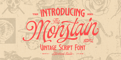 Introducing, The Monstain - a script with a touch of vintage look and feel. You will also get several detailed hand drawn objects ready to use. This type of font perfectly made to be applied especially in logo, headline, signage and the other various formal forms such as invitations, labels, logos, magazines, books, greeting / wedding cards, packaging, fashion, make up, stationery, novels, labels or any type of advertising purpose. Features : uppercase & lowercase numbers and punctuation multilingual alternates / swashes and ligatures PUA encoded hand drawn objects We highly recommend using a program that supports OpenType features and Glyphs panels like many of Adobe apps and Corel Draw, so you can see and access all Glyph variations.
 - American Spirit STF by Altered Ego,
$30.00American Spirit STF is a glorious collection of contemporary patriotic symbols: US Flags (traditional and contemporary), a variety of stars, eagles, torches, and combinations of them all. Designed for print and web, this collection is useful for embellishing your designs with a subtle (or not-so-subtle) patriotic touch. The flags have been designed for easy ungrouping in a drawing program, in order to colorize the union and stripes. And as a special feature, American Spirit™ splits the flags into two characters (the union and the stripes) that can be separately colored and will kern together based on the character chosen. Suggestions for doing this are included in every package. This versatile collection also contains a special contemporary version of the US Flag, with rounded corners on the union and stripes, and a five-pointed asterisk-like shape as the stars. (This allows the stars to appear as stars at smaller sizes.) Show your American Spirit! Sign up today for this contemporary collection of patriotic symbols! - Anziano Pro by MAC Rhino Fonts,
$59.00 Anziano follows the direction staked out with Delicato. When creating traditional typefaces, it is inevitable to be influenced by earlier designs. Anziano does show touches of another classic typeface – Weiss (by Emil Rudolf Weiss, 1926). Weiss is often misjudged and overlooked. Perhaps the most well known Swedish typeface – Berling (by Karl-Erik Forsberg, 1914–1995) is actually based largely on Weiss. MRF have appreciated the design of Weiss uprights for a long time. When Stefan Hattenbach bought the first Swedish edition of The Lord of the Rings (1959–61), in 2004, he was amazed by the excellent flow of the text presented on each page. Despite the very original character that Weiss has, it was a pleasure to read a book set in such a typeface. MRF realized that several major foundries had already done interpretations of Weiss, more or less true to the original. MRF didn’t want to add on to that list! Instead Stefan tried to find his own path. Anziano consists of three core styles, Regular, Italic and Bold; each with small caps, ornaments, stylistic ligatures, and extended Latin accents. Lining, tabular, oldstyle and smallcap numerals help round out Anziano’s typographic range and function.
 - Battle Damaged by Comicraft,
$19.00 Some say The Silver Age Will End in Fire; others say The Silver Age Will End in Ice! Know, O Prince, that In Your Darkest Hour, the Masters of Evil Will Live Again! But from The Ashes of the Bitter Taste of Defeat, A New Power will be Unleashed! Lo, There Shall be A Frenzy in a Far Off Land, There Will be a Great Price AND a Great Prize! There Will Be a Bitter Victory in a World Gone Mad -- a World You Never Made... Face it, Tigers, You are Captives of The Coming of The Return of The Mad Mysterious Menace of He Who Would Destroy You...This Man, This Monster... This Final Font in our collection of Silver Age Display Lettering -- BATTLE DAMAGED! See the families related to Battle Damaged: Battle Cry & Battle Scarred .
 - Akceler by Adtypo,
$45.00 Many sport publications missed typefaces designed especially for sport communication conditions. We usually see only mechanically slanted or other synthetically destroyed standard typefaces. I want to fill in this space and create a system of fonts, that will be used primarily in sport. It is usable for many prints - logotypes, magazines, catalogues, posters etc. Elasticity of glyphs reflected an adrenalinous shapes of latest bikeframes, skies or sportcars. Maximum open arches guaranteed good readability in very small sizes and prevented interchanges of glyphs „o, c, e“ per poor reading conditions. Softness of lowercase is at uppercase balanced in bottom arches, that are subtly kicked-up. Numerals are an important component of sport communication, so this font offers expressive design, different from numerals of book typefaces. Every font has 9 kinds of numerals. Character case contains over 1000 glyphs, sport icons and othes signs creating the sport feeling. The font name, Akceler, represents acceleration, which is characteristic attribute of this typeface. It’s suitable for display and text usage, too. To see more please visit the PDF specimen. ■24 styles (2 alternatives, 3 grades of dynamics, 4 weights) ■over 1 000 glyphs per font ■9 kinds of numerals ■icons of sport equipment ■8 stylistic sets ■8 kinds of arrows ■23 OT features ■support of latin languages
 - Swing Vote JNL by Jeff Levine,
$29.00 A 1964 piece of sheet music entitled “Old Soldiers Never Die (They Just Fade Away)” was based on the farewell speech General Douglas MacArthur gave to Congress on April 19, 1951. This particular edition of the song sheet had part of his speech (as well as its title) hand lettered in a free-form sans serif reminiscent of the lettering done by such noted lettering artists as Paul Coker and Saul Bass. The casual and playful style of this type design became the inspiration for Swing Vote JNL, which is available in both regular and oblique versions.
 - Petit Nuage by Nantia.co,
$24.00 Petit Nuage is a signature decorative font with which you can achieve a handwritten-type lettering feeling. Petit Nuage it’s a multilingual lettering font with Greek (of course), Latin character set, and diacritics. This signature style is perfect for your modern graphic design needs. This font has a really nice flow so you use it in a large text if you want to give them a touch of personality. It can be used on social media content, for branding or packaging. Also, Petit Nuage is the ideal typeface for organic products branding and packaging. Additionally, you can use this typeface romantic vibes for wedding and baby shower invitation designs. Especially if you are looking for a font for Instagram quote posts or any other social media content, this typeface is for you!
 - Cut Along by Hanoded,
$15.00 I made Cut Along by stealing some red cardboard from my kids (red, because they didn’t have any black…) and cutting out the glyphs one by one with a pair of scissors. I then pasted the shapes onto white paper, scanned them and turned them into a font. Cut Along is a very nice font for ads, book covers, packaging and children’s books. Enjoy!
