9,127 search results
(0.054 seconds)
- DR Krapka Square by Dmitry Rastvortsev,
$29.99 In the DR Krapka Square typefamily, the pixel has a square shape. The font supports OpenType features and contains small capitals, ligatures, oldstyle figures, terminal forms, historical forms, stylistic sets. The dingbats, arrows, emoji are also present. For small texts, it is recommended to use DR Krapka Square-FontSize10px in the font size 10 px. DR Krapka Square typefamily supported European languages based on Latin, Cyrillic and Greek scripts. If you want to use fonts with a different shape of pixels, there are also typefaces from DR Krapka family: DR Krapka Round, DR Krapka Rhombus.
 - Architype Van der Leck by The Foundry,
$50.00 Architype Konstrukt is a collection of avant-garde typefaces deriving mainly from the work of artists/designers of the inter-war years, whose ideals have helped to shape the design philosophies of the modernist movement in Europe. Due to their experimental nature character sets may be limited. Architype Van der Leck originates from the lettering that Bart Van der Leck created for ‘Flax’ magazine in 1941. The letterforms‘ restricted shapes and abstract, stencil-like forms reflect the strong geometric language of De Stijl and show influence from his abstract paintings.
 - Mechanic Gothic DST by Red Rooster Collection,
$60.00 Based on character shapes with origins rooted in the work of 19th Century American wood type makers, DST Mechanic Gothic draws influence from the poster types found in the impactful advertising during the Industrial revolution. It has several classic condensed sans-serif elements, and although Darren Scott has injected a contemporary twist to refresh the character shapes, this typeface does not deny its roots. Darren Scott's original Mechanic Gothic design has been adapted and re-crafted to give a more conventional range of weights and italics for this exclusive re-release.
 - Perrywood by Monotype,
$29.99Loosely based on Bembo and Plantin, the Perrywood font family retains some old style characteristics which give the face a familiar feel, however much attention has been paid to optimizing the design to give good quality output at small point sizes and from low resolution output devices. The consistency of character shapes allows close letter spacing to give compact word shapes, excellent word recognition and an overall economy in text. Perrywood offers good legibility and, coupled with an even text color will be very useful for text setting, in correspondence, for faxes and reports. - Yummo by Dharma Type,
$24.99 Yummo is a geometric and somewhat condensed sans serif type family that can be used in a wide range of applications. The minimal glyphs that have been shaped superbly will give modern and contemporary impressions. At the same time, the rounded shape makes your typography softer and cuter. Yummo is not only a ‘geometric rounded font’ but also conveys humanness and loveliness as though the forms were handwritten. To accommodate a wide range of usage, This family consists of 5 weights and includes diacritics for most European languages in each weight.
 - Mag Mixer by ParaType,
$30.00 MagMixer, a display typeface, was designed in 2005 for ParaType by Dmitry Kirsanov. During work on Magistral the designer had an idea of creating a more decorative face based on Magistral shapes but reflecting an industrial and mechanichal approach. Each glyph has maximal contrast between strokes and horizontal shift in shape. The result is some strange and enigmatic but legible letterforms with active inner rhythm. Its letters are reminiscent of building construction, chess board, and many other things that corresponding to author's task. For use in advertising and display typography.
 - Postulat by ParaType,
$30.00 Postulat is a contemporary slab serif typeface. The family contains 16 fonts: 8 romans with matching italics, from Hairline to Bold. The character set include contains more than 600 glyphs which support most Latin and Cyrillic languages. The font uses a combination of smooth and extremely simple straight shapes. The author abandoned the use of teardrop-shaped classical elements, replacing them with straight ones, which makes Postulat more dynamic and modern. These unique features give the font a unique personality. Postulat is the perfect choice for headlines, logos, branding, packaging, publications and websites.
 - Tinkerer by Ingrimayne Type,
$9.00 Tinkerer, TapedUp, and Rumpled are based on the template I used for several letterbat fonts—fonts made of wrenches and bolts, hammers, or paper clips. TapedUp can be thought of as a font made from masking tape, and Rumpled is the same design but the tape pieces are wavy. Tinkerer is the same design but with elements that resemble what might happen if one constructed letters from Tinker Toys. All are caps only, but some of the shapes on the lower-case keys differ from the corresponding shapes on the upper-case keys.
 - Laca Text by Nova Type Foundry,
$21.99 Laca Text is a sans-serif version of Laca. It was designed starting from the shapes of Laca. It is a cleaner version of Laca. Laca Text has characteristics like a bigger x-height, open counters, and smaller ascenders. It works better in smaller text than Laca because it keeps the structure without the stylistic features of Laca. Laca Text has more straight lines and follows the round shapes of Laca. Laca Text, as the name says, is more proper for long text but also for identity and branding.
 - Simarigo by Asenbayu,
$15.00 Simarigo is a serif-stencil display font with a unique shape. Simarigo has an interesting combination of typography, crafted from serif shapes that make it elegant and luxurious, yet one of those stencils that are abstract and strong. You can use this font in modern, vintage and retro design. This font is perfect for a variety of projects, such as branding, poster displays, logo designs, magazine, headline, sticker and more. Simarigo font feature open type, kerning, ligatures, and alternative styles. Simarigo font include uppercase, lowercase, numbers, punctuation and multilingual support.
 - Trečiokas by Rokas Cicenas,
$9.00 I present you Trečiokas typeface. This two font family is based on written letters that were sketched by using paint markers and afterwards pollished digitally. Glyphs mostly are connected, leaving some separate, as a contrast to round and soft letter shapes. It includes extended latin character set. In 2013 I made the Aerofont project, which included custom music instruments that were made based on Trečiokas Normal letter shapes. The main idea was to connect music and typography, by making sound emitting letters. You can watch the project video here.
 - Banery by Arterfak Project,
$28.00 Banery is a minimalist serif in modern style. Made with geometric shapes and high contrast of strokes, also accompanied by alternates characters with unique shapes, and full of beautiful twists which give a pretty, elegant, and exclusive impression. Banery is very suitable for use on various media such as posters, magazines, catalogs, logos, logotypes, labels, flyers, and branding. You can use this font, especially on minimalist themes such as furniture, invitation, wedding, fashion, beauty, real estate, perfumery, and many more. What you'll get : Uppercase & lowercase Numbers & punctuation Accented characters Stylistic sets Ligatures. Thank you!
 - Crazy Fever by PizzaDude.dk,
$18.00 Is it snow? Is it water? Is it slime? Is it from this earth? The questions are many - one thing is certain - with this font you can create cool effects by mixing the layers - and in the end, you decide whether the result is going to be scary, delicious or somewhere in between! Use the different layers and your favourite color scheme and just type ahead - the contextual alternates (with 4 different versions of each letter) automatically cycles the letters and make your text look more lively - or maybe even scary!
 - Snippity Snap by Hanoded,
$15.00 Snippity Snap is a font made up of glyphs I cut out from black paper with some household scissors, then pasted onto white paper. When I was cutting out the shapes, my children asked me what I was doing, and when I told them, they thought it was pretty cool and started cutting out shapes from paper themselves. The result is a house filled with paper cuttings, which I keep finding everywhere - even in my bed. Snippity Snap is a very nice font for ads, book covers, packaging and children's books. Enjoy!
 - Architype Schwitters by The Foundry,
$99.00 Architype Konstrukt is a collection of avant-garde typefaces deriving mainly from the work of artists/designers of the inter-war years, whose ideals have helped to shape the design philosophies of the modernist movement in Europe. Due to their experimental nature character sets may be limited. Architype Schwitters was developed from the phonetic experiments made by Kurt Schwitters with his 1927 universal alphabet, where he attempted to link sound and shape. He ‘played with’ using heavier, wider, rounded forms to convey the vowels, creating a unique visual speech texture.
 - SK Clumster Sans by Shriftovik,
$32.00 SK Clumster Sans is an extravagant multilingual geometric grotesque, developed under the impression of the unique and exciting aesthetics of font design. Its structure is enlivened by an innovative combination of geometric and organic shapes that transform the familiar letter pattern. SK Clumster Sans creates a unique visual impression through a combination of shapes, a large symbolic and weights set, in addition to lively and dynamic angles and lines. The font is suitable for creating original design works that reflect the creative potential of the author and his bold experiments in the field of design.
 - Tabac by Suitcase Type Foundry,
$125.00 The Tabac type system is a static typeface with modern shapes and distinct, wedge-shaped serifs. It is primarily designed for the setting of newspapers, magazines and books. Tabac boasts great variability in terms of letter weight in all of its styles. Each style works as a font of its own, featuring the full set of glyphs. The styles may be combined depending on the user; the choice of text and title face thus depends fully on the designer’s own taste, on the needs of the readers and the technologies of printing in use.
 - Blank Manuscript by Aah Yes,
$14.95Blank Manuscript allows you to produce sophisticated musical scoresheets even on basic Word Processors - anything from simple plain staves to complex full-page orchestral scores of your own design, to write in the notation yourself. The basic stuff is really easy and straightforward, but there's some quite advanced things you can do as well. So Copy and Save these Instructions. • The main stuff is simple and tends to follow the initial letter. Treble, Bass and Alto clefs are on upper case T B A (there are more clefs, below). The 5 Lines for the clefs are on L or l. • A small v will give a small vertical line (like a bar line) and a Big U will give a Big Upright - these can start or end a line or piece. • Time Signatures - type the following letters: Think of W for Waltz and it's easy to remember that 3/4 time is on W. Then from that they go up or down together like this: V=2/4 W=3/4 X=4/4 Y=5/4 Z=6/4 Compound Times are on H I J K like this: H=3/8 I=6/8 J=9/8 K=12/8 Common Time and Cut Common symbols can be found on semi-colon and colon respectively (all begin with Co- ). 2/2 3/2 are on lower case a and b, 7/4 and 7/8 are on lower case c and d, 5/8 is on small k (think POL-k-A) • Flat signs are on the numbers. Flat signs on LINES 1 to 5 are on numbers 1 to 5. Flat signs on SPACES 1 to 5 are on numbers 6 to 0 (space 1 being above line 1, space 5 being above the top line of the stave). Sharp signs are on the letters BELOW the long-row numbers. Which is q w e r t for the sharp signs on Lines 1 to 5, and y u i o p for sharp signs on spaces 1 to 5. Doing it this way means it works the same for all clefs, whether Treble, Bass, Alto, Tenor or any other. Sharp and Flat Signs always go in this order, depending on how many sharps or flats your key signature requires: Treble Clef Sharps t i p r u o e Flats 3 9 7 4 2 8 6 Bass Clef Sharps r u o e t i w Flats 2 8 6 3 1 7 = Alto Clef Sharps o e t i w r u Flats 7 4 2 8 6 3 1 • Guitar Chord Boxes are on G and g (G for Guitar) Upper Case G has a thick line across the top Lower case g has an open top, for chords up the fretboard TAB symbols are available: Six-string Tablature is on s & S for Six. Four-string Tablature is on f & F for Four. (Lower case has the "TAB" symbol on it, Upper Case has just the lines to continue.) Five-string tablature, is on lower case "j" (as in BAN-j-O) and of course L or l will continue the 5 lines. •RARE CLEF SIGNS including Tenor Clef, are on various punctuation marks, i.e. dollar, percent, circumflex, ampersand & asterisk, above the numbers 4 to 8. NOTE: The important symbols were kept on the letter and number keys, which are fairly standard all over, but some of the less important symbols are on various punctuation keys, which in different countries are not the same as on my keyboard. If it comes out wrong on your system, all I can say is it's right on the systems we've tried, and they'll be in here somewhere, probably on a different key. CLOSING THE ENDS OF THE LINES and BAR-LINES is done with the 3 varieties of brackets - brackets, brace and parentheses - Left/Right for the Left/Right end of the line. Parentheses L/R () which are above 9, 0 give a clef with a small vertical upright (the same as a bar line). Brace L/R and Brackets L/R (both on the 2 keys to the right of P on my keyboard) will close off a staff line with tall upright bars. Brace gives a double upright - one thick, one thin. Brackets give a single tall upright. A Big Upright is on Big U, (Big U for Big Upright) and a small vertical line is on small v (small v for small vertical). The Big Upright is the maximum height, and the small vertical is exactly the same height as a stave. And there's a tall upright Bar, on Bar (which is to the left of z on my keyboard, with Shift,) which is the same height as the bar on upper case U but twice as broad. • There's a staff intended for writing melodies, which is a little bit higher up than an ordinary treble clef giving a space underneath to put lyrics in - on m and M for Melody line. Lower case has the Treble Clef on, Upper case M has just the higher-up staff lines with no clef. (Use mMMMMMMM etc.) However this clef will be in the wrong place to put in sharp and flat signs, key signatures and so on, so if you use this clef you'll have to write the sharps, flats and key signature yourself. There's also a clef that's smaller (less tall) than the ordinary clef, but with the same horizontal spacing so it will align with other standard-sized clefs - on slash (a plain clef) and backslash (with a Treble Clef). • There are some large brackets for enclosing groups of staves, such as you'd use on large orchestral scores, on Upper Case N O P Q R, which can aid clarity. N and O on the left, Q and R on the right. P is a Perpendicular line to be used on both sides to increase the height of the enclosure, in this way but with the staff lines in between: N Q P P P P P P O R OTHERS —————————————— • Repeat marks are on comma (left) and period/full stop (right). • Hyphen is left as a sort of hyphen - it's a thin line like a single staff line, with the same horizontal spacing as ordinary staff lines - in case you want to draw a line across for a Percussion Instrument, or a Title or Lyric Line. • Space is a Space, but with HALF the width or horizontal spacing as ordinary staff lines, so 2 space symbols will be the same width as a clef symbol or line. • Grave (to the left of 1 on the long row, or hold down Alt and type 0096 then let go) gives a staff line that is one eighth the width of an ordinary staff line. • If you want manuscript in a clef and key which requires a flat or sharp sign in the space underneath the 5 lines, they’re on = equals and + plus . SYMBOLS • Many of these symbols will only be useful if you have worked out in advance which bars will need them, but they are here in case you've done that and wish to include them. • Symbols for p and f (piano and forte) are on 'less than' and 'greater than' < > (above comma and full stop) and m for mezzo is on Question, next to them. They can be combined to make mp, mf, ff, pp, etc. These signs -- and other signs and symbols like Pedal Sign, Coda Sign and so on -- can be found on various punctuation mark keys, including above 1, 2, 3 in the long row, and others around the keyboard. There's a sort of logic to their layout, but in different countries the keys are likely to give different results to what is stated here, so it's probably best to just try the punctuation and see if there's any you might want to use. (But on my keyboard a Coda sign is on circumflex - because of the visual similarity. Pedal sign is on underscore. A "Sign" symbol is on exclamation mark.) They were only included in case you really need them to be printed rather than handwritten. • However, a Copyright symbol is deemed necessary, and also included are a "Registered" symbol and a TradeMark symbol. They are found in the conventional places, and can be accessed by holding down ALT and typing 0169, 0174 or 0153 respectively in the numberpad section and letting go. • Staff lines with arco and pizz. above are on capital C and D respectively ---C for ar-C-o. • An empty circle above a staff line (to indicate sections by writing letters A, B, C or 1,2,3 inside for rehearsal marks) is on n. The actual signs for an A, B, C and D in a circle above the staff line can be produced by holding down ALT and typing 0188, 0189, 0190 and 0191 respectively and letting go. • The word "Page", for indicating page numbers, is on the numbersign key. • The two quotes keys, (quote single and quote double) have symbols representing "Tempo is", and "play as triplets", respectively. • INSTRUMENT NAMES There's a whole lot of Instrument Names built in (over a hundred) which can be printed out above the clef, and you do it like this. Hold down Alt and type in the given number in the numberpad section, then let go. For Piccolo it's 0130, for Flute it's 0131, Cornet is on 0154, Violin is on 0193, and the numbers go up to over 0250, it's a fairly complete set. There's also a blank which is used to align un-named clefs on 0096. Put them at the very beginning of the line for the best results. Here they are: WOODWIND Piccolo 0130 Flute 0131 Oboe 0132 Clarinet 0133 Eng Horn 0134 Bassoon 0135 Soprano Sax 0137 Alto Sax 0138 Tenor Sax 0139 Baritone Sax 0140 Saxophone 0142 Contrabassoon 0145 Recorder 0146 Alto Flute 0147 Bass Flute 0148 Oboe d'Amore 0149 Cor anglais 0152 Pipes 0241 Whistle 0242 BRASS Cornet 0154 Trumpet 0155 Flugelhorn 0156 Trombone 0158 Euphonium 0159 Tuba 0161 French Horn 0162 Horn 0163 Tenor Trombone 0164 Bass Trombone 0165 Alto Trombone 0166 Piccolo Cornet 0167 Piccolo Trumpet 0168 Bass Trumpet 0170 Bass Tuba 0171 Brass 0172 VOICES Vocal 0175 Melody 0176 Solo 0177 Harmony 0178 Soprano 0179 Alto 0180 Tenor 0181 Baritone 0182 Treble 0183 Bass 0197 (see also PLUCKED STRINGS) Descant 0184 Mezzo Soprano 0185 Contralto 0186 Counter Tenor 0187 Lead 0206 BOWED STRINGS Strings 0192 Violin 0193 Viola 0194 Cello 0195 Contrabass 0196 Bass 0197 Double Bass 0198 Violoncello 0199 Violin 1 0200 Violin 2 0201 Fiddle 0252 PLUCKED STRINGS Harp 0202 Guitar 0203 Ac. Gtr 0204 El. Gtr 0205 Lead 0206 Bass 0197 Ac. Bass 0207 El. Bass 0208 Slide Gtr 0209 Mandolin 0210 Banjo 0211 Ukelele 0212 Zither 0213 Sitar 0214 Lute 0215 Pedal Steel 0216 Nylon Gtr. 0238 Koto 0239 Fretless 0244 KEYBOARDS + ORGAN Piano 0217 El. Piano 0218 Organ 0219 El. Organ 0220 Harpsichord 0221 Celesta 0222 Accordion 0223 Clavinet 0224 Harmonium 0225 Synth 0226 Synth Bass 0227 Keyboards 0228 Sampler 0249 PERCUSSION and TUNED PERCUSSION Percussion 0229 Drums 0230 Vibes 0231 Marimba 0232 Glockenspiel 0233 Xylophone 0234 Bass marimba 0235 Tubular Bells 0236 Steel Drums 0237 Kalimba 0240 OTHERS Harmonica 0246 Mouth Organ 0247 FX 0251 Intro 0243 Verse 0245 Refrain 0248 Chorus 0250 un-named 0096 (this is a small spacer stave for aligning clefs without a name) ALSO copyright 0169 registered 0174 TradeMark 0153 Rehearsal marks 0188-0191 (giving A, B, C, D in a circle, an empty circle is on n ) Clef signs for Treble Bass Alto without any staff lines 0253-0255 An Alphabetic List of all signs: a 2/2 time b 3/2 time c 7/4 time d 7/8 time e sharp sign, centre line f Tab sign for 4-string tab g Guitar Chord Box, no nut h half-width stave I sharp sign, third space up j Tab sign for 5-string tab k 5/8 time l Lines - 5 horizontal lines for a stave m Melody Clef - a standard clef but placed higher up, with Treble sign n Stave with an empty circle above o sharp sign, fourth space up p sharp sign, space above stave q sharp sign, bottom line r sharp sign, fourth line up s Tab sign for 6-string tab t sharp sign, top line (fifth line up) u sharp sign, second space up v vertical line (bar-line) w sharp sign, second line up x Fretboard, four strings y sharp sign, first space up z Fretboard, five strings A Alto Clef B Bass Clef C “arco” above stave D “pizz.” above stave E Double Vertical Lines F Four Horizontal lines (for 4-string tab) G Guitar Chord Box with nut H 3/8 time I 6/8 time J 9/8 time K 12/8 time L Lines - 5 horizontal lines for a stave M Melody Clef - a standard clef but placed higher up, plain N Bounding Line for grouping clefs - top left O Bounding Line for grouping clefs - bottom left P Bounding Line for grouping clefs - Perpendicular Q Bounding Line for grouping clefs - top right R Bounding Line for grouping clefs - bottom right S Six Horizontal lines (for 6-string tab) T Treble Clef U tall, thin Upright line V 2/4 time W 3 / 4 time X 4/4 time Y 5/4 time Z 6/4 time 1 flat sign, first line up (the lowest line) 2 flat sign, second line up 3 flat sign, third line up 4 flat sign, fourth line up 5 flat sign, fifth line up (the top line) 6 flat sign, first space up (the lowest space) 7 flat sign, second space up 8 flat sign, third space up 9 flat sign, fourth space up 0 flat sign, space above stave - Quidic by Ingrimayne Type,
$12.95 Quidic is an unusual display typeface. The upper-case letters are strongly vertical, condensed, and bold. Used by themselves, they make headlines and titles that stand out. The lower case letters do not have serifs similar to those on the upper-case letters, but rather have the serif shapes one expects from an italic style. The lower-case is also quite short compared to the upper-case letters. The italic styles of the family are unusual because the lower-case letters keep their shapes and the upper-case letters and numbers change. The family has three styles that differ more by width rather than by weight. Although some Bauhaus fonts have several letter shapes that are similar, there is no other typeface quite like Quidic. The family can be used for many things, but not for text. For a "normalized" version of this typeface, see Qwatick.
 - Corner C by CarnokyType,
$20.00 Corner C is a part of Corner type family. This subfamily is designed with rounded shapes in the corners. The concept of the typeface Corner is based on variation of corner shapes in font characters, from what is also its name derived. The basis is a bitmap modular principle, to which by simple addition of “the missing pixels” in corners of the characters ( Corner A ) to the shape of diagonal ( Corner B ), curvature (Corner C), or inversion curvature ( Corner D ), three more font variations are created. The basic monolinear bitmap weight is supplemented by two more extreme thicknesses – hairline and fat weight. The character set supports the complete Latin, while the x-height of lowercase is drawn at the same height as in the uppercase characters. Corner is a strong display typeface, which allows you to easily experiment and to combine it with its mutual font variations.
 - Kejaxi by Twinletter,
$18.00 Kejaxi font groovy is a psychedelic-inspired typeface. It has a fun and bold shape, perfect for all your creative projects that need a retro style. This Groovy font is a free display font with bold and geometric shapes, perfect for branding and editorial design. This font is also ideal for product packaging or even just to add a little flair to your design work. Kejaxi is a contemporary font with geometric shapes and accuracy that will add a touch of elegance to any design. So stop procrastinating and incorporate it into your designs right away! What’s Included : Standard glyphs Iso Latin 1 Simple installations We highly recommend using a program that supports OpenType features and Glyphs panels like many Adobe apps and Corel Draw, so you can see and access all Glyph variations. PUA Encoded Characters – Fully accessible without additional design software. Fonts include Multilingual support
 - Corner D by CarnokyType,
$20.00 Corner D is a part of Corner type family. This subfamily is designed with inverse rounded shapes in the corners. The concept of the typeface Corner is based on variation of corner shapes in font characters, from what is also its name derived. The basis is a bitmap modular principle, to which by simple addition of “the missing pixels” in corners of the characters ( Corner A ) to the shape of diagonal ( Corner B ), curvature ( Corner C ), or inversion curvature (Corner D), three more font variations are created. The basic monolinear bitmap weight is supplemented by two more extreme thicknesses – hairline and fat weight. The character set supports the complete Latin, while the x-height of lowercase is drawn at the same height as in the uppercase characters. Corner is a strong display typeface, which allows you to easily experiment and to combine it with its mutual font variations.
 - Corner A by CarnokyType,
$20.00 Corner A is a part of Corner type family. This subfamily is designed with square shapes in the corners. The concept of the typeface Corner is based on variation of corner shapes in font characters, from what is also its name derived. The basis is a bitmap modular principle, to which by simple addition of “the missing pixels” in corners of the characters (Corner A) to the shape of diagonal ( Corner B ), curvature ( Corner C ), or inversion curvature ( Corner D ), three more font variations are created. The basic monolinear bitmap weight is supplemented by two more extreme thicknesses – hairline and fat weight. The character set supports the complete Latin, while the x-height of lowercase is drawn at the same height as in the uppercase characters. Corner is a strong display typeface, which allows you to easily experiment and to combine it with its mutual font variations.
 - Corner B by CarnokyType,
$20.00 Corner B is a part of Corner type family. This subfamily is designed with diagonal shapes in the corners. The concept of the typeface Corner is based on variation of corner shapes in font characters, from what is also its name derived. The basis is a bitmap modular principle, to which by simple addition of “the missing pixels” in corners of the characters ( Corner A ) to the shape of diagonal (Corner B), curvature ( Corner C ), or inversion curvature ( Corner D ), three more font variations are created. The basic monolinear bitmap weight is supplemented by two more extreme thicknesses – hairline and fat weight. The character set supports the complete Latin, while the x-height of lowercase is drawn at the same height as in the uppercase characters. Corner is a strong display typeface, which allows you to easily experiment and to combine it with its mutual font variations.
 - Orotund by Canada Type,
$24.95 This is the digitization and considerable expansion of the cheeky and enormously popular film type Eightball, one of the most widely used faces of the 1970s and 1980s. Round and happy like a bouncy ball, these are letters after a sign maker’s own heart. Seen everywhere in its film version, from bingo and pool hall parlor signs to comic books, now this computer version opens the door for the happy roundness to be used on a much larger scale by anyone who designs layouts on a computer. The original film type included a few alternates. We included them, but we added many more as well. So make sure to check out the various OpenType features in your program while using this font. Eightball is great for a variety of applications, including signage, rubber stamps, poster design, titling, cartoons, comics, and pretty much anything where happy and round fit in.
 - Rational TW by René Bieder,
$39.00 Rational TW is the typewriter addition to the Rational family. It is a monospaced font building on the same principles as its proportional, neogrotesque brother, such as maximum legibility and flexibility while combining Swiss and American gothic elements with a modern aesthetic. Due to the monospaced environment, some of its letter shapes like “r”, “m”,“f”, “i” and “w” have been slightly adapted but kept the same in appearance. Rational TW comes in two version: Rational TW Display and Rational TW Text. As indicated by its name, Rational TW Text is not limited to, but works best in small font sizes because it features distinctive letter shapes like a double storey “a” or “g” in order to help differentiate similar glyphs in small sizes. Rational TW Display, on the other hand, creates a geometric uniformity by implementing round shapes in “a” and “g”, giving it a subtle friendly and open character. Unlike many other monospaced fonts, Rational TW has a large amount of opentype features like small caps, alternative glyphs, case sensitive shapes, and many more making it the perfect choice for countless scenarios. With more than 700 glpyhs per font, it performs excellently in any project from print to digital.
 - Textan - Unknown license

- Farmland JNL by Jeff Levine,
$29.00Farmland JNL is an unusual Western version of Cornfield JNL. The shape of the original letters (inspired by a 1950s popcorn box) create a new variation on the lettering of the Old West. - Derania by limitype,
$15.00 Derania is a typeface that is inspired by the shape of the monstera leaf, Derania is made with fun and bold fonts. Derania is equipped with uppercase numbers, symbols, icon and some multilingual
 - Anzylna by Cititype,
$12.00 Anzylna is a cheerful and friendly handwritten font. It is perfect for illustrations, posters, logos, book covers and much more! Include this font in your next project and give it a happy personality.
 - Quira by WildOnes,
$12.00 Quint Extended font has geometric construction with round details that creates elegant letter shapes. Modern and contemporary style and retro details make it an excellent choice for headlines, logotypes, branding, posters and magazines.
 - Hanger by Wordshape,
$20.00 Hanger is a limited character display typeface. Based on the shapes of the alphabet if made out of a bent wire hanger, Hanger is suitable for apparel design, merchandising, and identity design projects.
 - Quinlophe by ZetDesign,
$12.00 Quinlophe is a cute font with the theme of romance, and is made by paying attention to the shape and anatomy of the letters so as to produce unique and beautiful letter characters.
 - Breadfast by Letterhend,
$19.00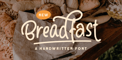 Breadfast is a handwritten font that contain uppercase, lowercase, symbol, alternate, and also support multi language. you can use this font to make a logo for branding, quote, and playful design. Happy Creating!
 - Zuider Zee NF by Nick's Fonts,
$10.00Handlettering discovered on a 1937 brochure for the Dutch Mails Shipping Company provided guidance in developing this rather unusual but commanding typeface, marked by strong geometric shapes and a very large x-height. - Love Affair by Gleb Guralnyk,
$12.00 Love Affair is an art nouveau vintage style font. It's an old-school typeface, perfect for creating some classic lettering compositions. Love Affair includes lots of ligatures to create more organic text shape.
 - Ribbonshoe by Curvature Creations,
$10.00 My font Ribbonshoe is created with Power Point shapes Block Arc and Punched Tape and they resemble ribbons and horse shoes. This font is very unique, stylish and very attractive to the eye.
 - Bendita by La Tipomàtica,
$6.00 Bendita could evoke the didones of the 19th century. It has and an extreme contrast that makes it only suitable as a display typeface, with its characteristic shapes. The fatty type par excellence.
 - Trainbridge by Curvature Creations,
$10.00 My font Trainbridge is created by Power Point shapes, Block Arc and flowchart. It resembles a train and bridge, which gives it a unique look that will be eye catching and out standing.
 - Dos De Tres by Volcano Type,
$19.00 This is an idea to reproduce the masks of the Mexican wrestlers of the late 60s and 70s. The typography is based in keeping the shape of the face in the wrestler's masks.
