10,000 search results
(0.038 seconds)
- Astine Sophiya Script by madjack.font,
$13.00 Astine Sophiya Script, a handwritten script font inspired by handwriting with an aesthetic touch. Aliya Script is flexible enough for web and print and can be used in a variety of projects such as stationery, packaging, apparel, wedding stationery, prints, quotes, social media graphics, planners, greeting cards, logos, branding and much more. The script includes a set of uppercase characters, numbers, symbols, two sets of lowercase letters, and ligatures. Complete Set of standard alphabet and punctuation marks Additional set of brushed lowercase endings Handwritten ligature. Thank you so much for checking out my shop!
 - Standard Shaded Slab by Yes Please,
$35.00 The Standard Shaded family is an homage to the grandiose Woodtypes of yesteryear. Standard blends a contemporary sense of craft and proportion with a dash of Woodtype-era personality to keep things interesting. The Standard Shaded family features OpenType conventional ligatures, discretionary ligatures and stylistic alternates as well as a standard set of accents and symbols to provide a versatile end-user experience. The Standard Shaded family has seen action in the print, web and motion arenas for clients such as IFC, Showtime, Nike Women's Training, Nike Sportswear, Target and Starbucks.
 - Sachiko - Personal use only

- Boxy by Hackberry Font Foundry,
$24.95 In my on-going quest for display fonts to be used with my books and on my book covers, I decided I need a squared sans serif. I started the build off of Fiscal, a font I designed back in 2006. I never liked the font, plus my tastes have changed. So, I opened it, made it narrower, increased the x-height, and various stuff like that. I made it much heavier—an ended up with Boxy. Then my brain slapped me and said, "Why don't you make a sorta modern version?" So, I did and decided to call that style Chic. But then I wanted a thin version also. Fiscal was always too heavy and ponderous for me. So, I made the Thin style. Finally, I felt I needed an italic of Chic. OpenType features didn't seem to work well with the family, so all I added was oldstyle figures. So, I ended up with another of my unique families—with two unmodulated fonts: Thin and Medium, and two modulated fonts: Chic and Chic Italic. But, I'm pleased with it. My hope is that you will like it also.
 - Aprilis by Eurotypo,
$34.00 Are you looking for a new casual and organic script font? Please, take a look to the Aprilis! In times of early Roman calendar, "Aprilis" followed and preceded "Martius" "Maius" when spring came, was green nature and flowers burst into colours to greet the sun. And Aprilis font was conceived in April... The Aprilis font is the perfect blend of elegant and casual. (It is best used in OpenType-aware software). With the total number of 625 glyphs, is equipped with plenty of OpenType features. Uppercase letters can alternate between at least two different forms and lowercase letters have leastways four choices more to avoid repetition. These effects include start and end forms of lowercase letters, which are automatically substituted in at beginnings or ends of words. To activate the optional glyphs you may click on Swash, Contextual, Standard Ligatures, Stylistic or Discretionary Ligatures buttons in any OpenType savvy program or manually choose the characters from Glyph Palette. Also, there’s a set of 50 ornaments designed to support the font (access the ornaments through the Glyph Palette). The Aprilis font might be the choice to use on creating headlines, logos & posters for branding and packaging purposes. Hope you enjoy.
 - Corinthiago by 38-lineart,
$19.00 “Corinthiago” feels equally charming and elegant. This stunning handwritten font is a stylish homage to classic calligraphy. It features a varying baseline, smooth lines, gorgeous glyphs and stunning alternates Alternates to help enrich your designs: 1. Titling (titl) alternates, are accents for initial letters. is the first stroke that is long and and slightly curved according to the letters, both lowercase and uppercase. 2. Swash (swsh) alternates, is an accent at the end of a letter, is an additional stroke to end writing. 3. Stylistic alternate (Salt), is an alternative glyph to add style emphasis. 4. Stylistic set (SS), some additional glyphs for design alternatives. If you use a combination of two lowercase with a combination of tilt and swsh it will produce a harmonic letter that you can use for a logo, no problem also for a logo consisting of more than two letters, all you have to make sure is starts with a titl and ends with swsh. All glyph alternates (titl, swsh, Salt and SS) are also supported by multiple languages. Another OpenType that is also very important is Ligature (league), this font consists of 51 Ligatures including: Abe, Ade, Ale, Ab, Ad, Af, Aj, Ak, Al, Am, An, Ao, Ap, As, Ax, Ay, Az, aa, ar, be, cc, da, de, di, do, du, dy, ee, er, ii, ir, is, le, ll, lt, om, on, oo, op, or, ov, ow, ox, oy, oz, ss, st, th, tl, tt, ur and uu. We continue to see the possibility to update ligatures in the future. This font is the right choice for a modern design, can be applied to invitations, writing messages in the form of quotes, book and magazine covers, and of course for your brand logo text.
 - Adventuring by K-Type,
$20.00 Rock-steady and friendly, yet animated and exciting, Adventuring evolved from the hand drawn, uppercase title lettering used for the 1950s and 1960s dust jackets of Enid Blyton’s Famous Five series of books.
 - Yasashii by Dharma Type,
$14.99 Yasashii is an art deco font based on Japanese designs for cosmetic packaging and posters used from the end of the 19th century to the early 20th. When you prefer more geometric letter form, please try our Diamond Ring.
 - Jelly Bean by Typadelic,
$19.00I attempted to emulate children's handwriting with this typeface. As a kid, I remember trying to create "fancy" handwriting and I ended up with something like Jelly Bean. Ideal for all designs where a happy uplifting look is desired. - Big Stomach by Haksen,
$13.00 "Big Stomach" is a stylish modern handwritten font with casual quirky style. It is perfect for branding, birthday/valentine invitation, promotion, product packaging, and other needs. You will get full set of lowercase and uppercase letters, numerals and punctuation, multilingual symbols, ligatures and extra swashes that giving realistic hand-lettered style. In order to use the beautiful swashes, you need a program that supports OpenType features such as Adobe Illustrator, Adobe Photoshop, Adobe Indesign and Corel Draw. Or please check the end of the preview to know how to get the swashes. Thanks and have a wonderful day, Haksen Std
 - Baby Bloom by Haksen,
$14.00 "Baby Bloom" is a stylish modern handwritten font with casual quirky style. It is perfect for branding, birthday/valentine invitation, promotion, product packaging, and other needs. You will get full set of lowercase and uppercase letters, numerals and punctuation, multilingual symbols, ligatures and extra swashes that giving realistic hand-lettered style. In order to use the beautiful swashes, you need a program that supports OpenType features such as Adobe Illustrator, Adobe Photoshop, Adobe Indesign and Corel Draw. Or please check the end of the preview to know how to get the swashes. Thanks and have a wonderful day, Haksen
 - Valentine Heart by Haksen,
$13.00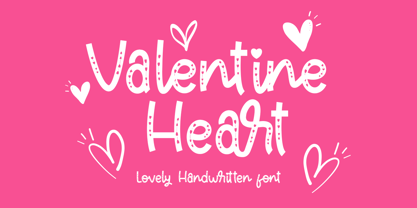 "Valentine Heart" is a stylish modern handwritten font with casual quirky style. It is perfect for branding, birthday/valentine invitation, promotion, product packaging, and other needs. You will get full set of lowercase and uppercase letters, numerals and punctuation, multilingual symbols, ligatures and extra swashes that giving realistic hand-lettered style. In order to use the beautiful swashes, you need a program that supports OpenType features such as Adobe Illustrator, Adobe Photoshop, Adobe Indesign and Corel Draw. Or please check the end of the preview to know how to get the swashes. Thanks and have a wonderful day, Haksen
 - Quality Times by Gilar Studio,
$16.00 Quality Times is a stylish modern calligraphy font with casual chic flair. It is perfect for branding, wedding invites and cards, and maybe for red wine label. Quality Times includes full set of gorgeous uppercase and lowercase letters, numerals, a large range of punctuation and ligatures. All lowercase letters include beginning and ending swashes, giving realistic hand-lettered style. What you get, darling? In order to use the beautiful swashes, you need a program that supports OpenType features such as Adobe Illustrator CS, Adobe Photoshop CC, Adobe Indesign and Corel Draw. Check my other Font here : https://gilarstudio.com/
 - Blessed Signature by Pen Culture,
$19.00 Proudly present Blessed Signature Font, A stylish handwritten font with lovely curve which will be perfect for branding, wedding invitations, websites and more. Blessed Signature comes with a full set of uppercase and lowercase, number and punctuation, and 60 stylish ligatures + alternate. There are 2 types of ending swashes that you can use and combine to make your design project more interesting. I really hope you enjoy it – please do let me know what you think, comments & likes are always hugely welcomed and appreciated. More importantly, please don’t hesitate to drop me a message if you have any issues or queries. Thank you
 - Marydale by Three Islands Press,
$29.00 While helping produce a trade magazine years ago, I admired the hand-lettering of the art director -- a woman named Marydale -- and suggested she let me model a font after her penmanship. She agreed and drew out the alphabet, and I launched an old copy of Fontographer and (to shorten a long story) ended up developing my very first digital typeface. Which has since, astonishingly, become famous worldwide. So now the real Marydale gets the mixed blessing of seeing her handwriting (and name) plastered all over the planet. Full release has regular, bold, and black weights.
 - Premis by Fenotype,
$20.00 Do you often find yourself looking for a font that is universal and neutral on the one hand, and distinctive and special on the other? Here's one for you. Premis is a fairly broad font family that is suitable for versatile use, but still has plenty of original details, such as straight endings in the letters r, t and f. Equally current and timeless, Premis is available in three different widths. In terms of features, Premis is sensibly designed to meet demanding use, including, for example, capital letters and several different number styles. Make Premis your premise.
 - Workaday by Yes Please,
$45.00 Workaday from Yes Please is a bold and clean contemporary take on the classic American Sans Serif. Inspired by the wildly varied history of early to mid 20th century American signage, aircraft markings and industrial shipping vernaculars, Workaday exudes a timeless, classic flavor packed with a personality perfect for graphic headlines, packaging, copy setting and much more! Workaday features conventional ligatures, a standard set of accents and symbols, and a set of open type alternate characters to provide a versatile end-user experience. Workaday has seen action for Nike Sportswear, MSN, IFC, FX and more. Workaday is designed by Lee Schulz.
 - Nettle Sans by Duck Soup Design,
$11.00 Influenced by Blackletter type and highway fonts, the Nettle Sans font family sets out to be both a quirky and confident headline font (at the heavier weights), and an easily legible body font for print or screen (at the lighter weights). Careful attention was taken in choosing distinct shapes for each letter to maximise legibility, and to balance a daring experimental form with function. Through its brutal angled cuts out of the ends of tapered links, ink-traps, ascenders and descenders, Nettle Sans' defining motif offers a visual language that communicates speed, efficiency, advancement and the "cutting edge".
 - Nostalgia Peach Creme by PeachCreme,
$23.00 The "Nostalgia" font is a dark, vintage style that includes all the basic characters (letters, numbers, and punctuation) and is very simple to read. "Nostalgia" was inspired by inky handwriting with a natural flow and has fantastic starting and ending lowercase swashes. It works well for a wide range of projects, from wedding stationery to Instagram quotes to contemporary logos to packaging to websites. Consequently, these top-notch, traditionally-styled hand-drawn characters would be an excellent and priceless resource for those who want to write by hand. The headlines and titles you create will look fantastic with this font.
 - RF Marshall by Magpie Paper Works,
$18.00 RF Marshall was inspired by an 1883 tombstone, tucked away in a pioneer cemetery. The 4-sided marker is sparsely adorned with homespun carvings of a handprint, two tulip poplar leaves, and these words: "RF Marshall died 1883 Aged 72 years." The font faithfully reproduces the stone's hand-carved lettering and artwork, as well as artwork from other 18th and 19th century American headstones. It was drawn with calligraphy nibs dipped in walnut ink and delights in a range of end uses including period films, rustic decor, Halloween decorations, historical logos and branding, and on the pages of children's books.
 - Women Frame by Wildan Type,
$11.00 Women Frame is a modern calligraphy font with sweet pressure. i hope this font perfect for creating signature logos and watermarks for photography studio or wedding invitation. I made it with love and magic!! Women Frame includes full set of beautifull hand lettered uppercase and lowercase letters, numerals, a large range of punctuation and ligatures. All lowercase letters include beginning and ending swashes. In order to use the beautiful swashes, you need a program that supports OpenType features such as Adobe Illustrator CS, Adobe Photoshop CC, Adobe Indesign and Corel Draw. if you have questions, please provide a short message to us
 - Anavio by Greater Albion Typefounders,
$14.95 Anavio is named in honor of the ancient Roman name of an English Derbyshire town. Anavio is a classically inspired family of Roman faces, emphasizing simplicity of form and elegance. Regular and Bold weights are offered, along with condensed forms. Anavio is offered in both upper and lower case and small capitals faces. Its simple lines are immediately legible, lending it to both text and display uses. A range of ligatures, both standard and discretionary, are included as are stylistic alternates and two styles of numerals. Use Anavio to lend that indefinable air of elegance to your next project.
 - Shanghai Signature by Cititype,
$19.00 Shanghai Signature is a chic and natural calligraphy with natural impression. this font has a lot of alternate and stunning ligature. each glyph has stylistic alternate and 181 ligature that make you surprise and strengthen natural touch. not only this, we also equipped each lowercase with magical swash beginning and ending. this font is a great choice for modern branding and packaging. perfect for creating signature logos and watermarks for photography studio or wedding invitation and logo signature. you need a program that supports OpenType features such as Adobe Illustrator CS, Adobe Photoshop CC, Adobe InDesign and Corel Draw but don’t worry. if your software doesn't have Glyphs panel, we have parsed each alternate in a separate font.
 - Victory Speech by Comicraft,
$49.00 It's that time of year again, isn't it? And yes, we're speaking rhetorically, because our true intent is to rouse voters into action, claim a significant gain in support over our nearest rivals and lead the nation, perhaps The World, into a new era of prosperity, one in which our once proud nation can become great yet again! An era of Hope, a time of peace and an end to war! Because never, in the field of human conflict, have so many, given so much and gained so little so that the have nots can reward themselves and those that have and-and... Victory, and Hope, and Greatnessness! Related font: Victory Speech Lower
 - Atelier Femme by PeachCreme,
$14.00 Introducing our new font trio "Atelier Femme"! Featuring an elegant upright serif, light and clean italic, and a casual handwritten script, this trio brings a splendid, clean visage to websites, logos, brand identities, quotes, and anything else you can think of! Atelier Femme Serif - being something between light and regular, Atelier Femme Serif is a versatile font that gives your projects a modern and minimalist look. Atelier Femme Italic - is a classy and supremely legible font that stands out in both large and small designs be it a display or body text. Atelier Femme Script comes with adorable lowercase beginning and ending swashes and 68 quirky ligatures for a custom handwritten look.
 - Hexenhammer by Hanoded,
$15.00 The ‘Hammer of Witches’, ‘Malleus Maleficarum’ or ‘Hexenhammer’ in German is the best know and most important treatise on witchcraft. It was composed by Heinrich Kramer in 1487. I thought it was a rather apt name for my latest fairytale font! Hexenhammer is a rough, handwritten typeface with an attitude. It can be used for book covers, posters and even spells. Comes with a bunch of end ligatures and a pandemonium of diacritics.
 - Dom Casual by URW Type Foundry,
$89.99 Dom Casual is a very condensed script, almost monotone, with irregular vertical strokes ending at different heights, and which suggests a freehand effect. It was designed by Pete Dom in 1951 for American Type Founders. As its name suggests, the Dom Casual font gives the appearance of a quick brush-like lettering and is suitable for setting titles, subheadings and short copy. There is some variations of stress in the rounded letters.
 - ITC Eastwood by ITC,
$29.99 ITC Eastwood is the work of British designer Martin Archer and is named for Clint Eastwood. Archer was looking for a plain oldstyle typeface with open lower case forms and used Stempel Garamond as his starting point, although the result ended up well beyond its origins. In small point sizes the typeface looks interestingly rough while at display sizes it looks like a 16th century French typeface and its unique details come forward.
 - Baby Dualistic by Attract Studio,
$13.00 Baby Dualistic is a beautiful, modern script font, with stylish and lovely. It comes with a handy set of opentype stylistic, use the beautiful ligatures, alternates and swashes. You need a program that supports OpenType features such as Adobe Illustrator CS, Adobe Photoshop CC, Adobe Indesign, Microsoft Word 2010. It is perfect for logo, greetings, branding, quotes, prints, invitations and crafting. All lowercase letters include alternates, beginning & end swashes, that makes the font look fabulous!
 - Regeneration by Comicraft,
$69.00 It’s the end, but the moment has been prepared for... the Time War is over and things are wearing a bit thin, time for a new face, a new body, a new companion for our Timelord font... a REGENERATION! Features: 138 automatic connecting ligatures Language support for Western & Central Europe and Vietnamese Solid Variable Font for complete control of weight and italic Levels Variable font can access any point between Inline, Midline & Outline
 - Quida Rough by LetterMaker,
$21.00 Quida Rough is a textured display family with three styles; Regular, Italic and Script. The personality of the design comes the rough, worn outlines and concave vertical shapes, which are consistent through all styles. This makes them work together seamlessly. Quida Rough Script is packed with opentype goodness such as swash caps, stylistic alternates, ligatures and ending forms for lowercase letters. All styles have an extended language support for most European languages.
 - Eggad by Ingrimayne Type,
$9.00 Eggad features letters on eggs. It can be a fun font to use at Easter or for any egg-related message. Some of the eggs - those on the upper-case keys - have their large end on the bottom and others - those on the lower-case keys - have their large end on the top. The font uses the contextual alternatives feature of OpenType to alternate the big-bottom and big-top eggs. If you only want eggs with big tops or with big bottoms, turn this feature off. Eggad comes in two styles, a regular style in which the eggs are outlined and a bold style in which the eggs are solid. Both are monospaced. The two styles can be layered to color the eggs. Alternatively, background color can be added (dot accent and ring characters) or the outline color can be changed (sterling and yen characters) using layers in the regular style. If you are typing numbers and you want the start to be big-bottom number, switch on OpenType style set 1.
 - Weisy by MIX.Jpg,
$12.00 Weisy Signature is a modern calligraphy font that is light, smooth, modern with original pen strokes. This script includes holes or spaces in strokes, because all handwritten strokes with brushes use the ink flow structure. Suitable for branding, signatures, wedding invitations, and cards. Weisy Signature includes a complete set of upper and lower case letters, numbers, various punctuation marks and binders. All lowercase letters include the beginning and end of swash, giving a realistic handwriting style. All uppercase letters include the beginning of swash, which makes the font look great! If you don't have the Glyph panel to use swash, don't worry. You can type -1 instead of swash. For example, if you type -1A, the initial "A" swash appears and the "a" swash ends. If you type-1, the initial "a" swash will appear. PLEASE NOTE: With a Standard License you are NOT permitted to sell digital goods using fonts in editable software such as Templates. Please, contact me for a license extension. Thank you and enjoy MIX.Jpg
 - Cry Wolf by Hanoded,
$20.00 When I was a kid, I loved the story of The Boy Who Cried Wolf. I thought it was pretty stupid of the boy to trick the villagers into believing wolves are attacking his flock of sheep. But I also thought it was a bit sad that the sheep are eaten by a wolf in the end. I didn’t really feel sorry for the boy (he really was stupid), nor the wolf (he just does what he is supposed to do in life), but I did feel sorry for those poor sheep. I guess this is what disinformation leads to in the end. Cry Wolf is a bit of a scary font: it was made with a really old and battered brush, using Chinese ink and some quality French paper. It has a slight tilt to the right and I added some inky splatter for dramatic effect. Use Cry Wolf for your book covers, product packaging and headlines; use if to spice up you invitations and your halloween posters. Comes in a slightly tilted Regular style and an outright Italic style.
 - Heydista Notes by Colllab Studio,
$19.00 "Hi there, thank you for passing by. Colllab Studio is here. We crafted best collection of typefaces in a variety of styles to keep you covered for any project that comes your way! Heydista Notes is a traditional hand-written monoline signature font with clean, geometric outlines. This makes it the perfect choice for high-end branding or marketing materials. The font is modeled after the calligraphy of ancient Rome and Greece. It has a classic and timeless feel, but the clean lines give it a modern edge. Heydista Notes has been designed with attention to detail and with very high quality standards in mind. It includes over 200 glyphs, stylistic alternates with beginning and ending swashes that you can use with your designs, and alternate letters for each letter of the alphabet so you can create unique-looking words and phrases with ease. Whether you're looking for a classic feel or something more modern, Heydista Notes will elevate your designs to the next level. A Million Thanks www.colllabstudio.com
 - EDB Wild Things - Unknown license

- Today Sans Now by Elsner+Flake,
$59.00 With the publication of the “Today Sans Now” Elsner+Flake extends its offering of the “Today Sans Serif” type family, developed in 1988 by Volker Küster for Scangraphic, by another cut so that the gradation of the stroke width can now be more finely calibrated. The type complement is available for 72 Latin-based languages as well as Cyrillic. Where available, small caps were integrated, and mathematical symbols as well as fractions were included. In order to make the symbols for text applications in regard to headlines more flexible, the insertions which were formerly added, for technical reasons in order to sharpen the corners, were eliminated, and the optical size adjustments of the vertical and diagonal stem endings (I, v, H, V) to the horizontal bars (z, Z) were scaled back. Already since the end of 1984, Volker Küster experimented with broad sticks of chalk and a broad felt pen in order to develop a new sans serif typeface which, in the interest of easy legibility, would be built on the basic structures and proportions of the Renaissance-Antiqua. Using a normal angle of writing, his experiments lead to the form structure of the characters: a small contrast between bold and light weights, serif-like beginning and end strokes in some of the lower-case characters, and the typical, left-leaning slant of all round lower-case letters and the typical left-leaning axis of all round letter forms. In this way, a rhythmization of a line of type was achieved which created a lively image without being “noisy”. With this concept, Volker Küster has enlarged the Sans Serif by a distinctive, trend-setting form variation.
 - 52-Kfx by ILOTT-TYPE,
$49.00 Where most fonts are available in varying weights, 52-Kfx is a family consisting of 3 heights; High, Mid and Low. These offer the typographer a full palette, Low is readable for setting copy while at the opposite end High is better suited for display—names, headlines and logotypes. 52-Kfx has a sophisticated and elegant period feel with clean, modern lines that remain relevant for contemporary application. Exaggerated ascenders and descenders of the lowercase and a tall cap-height give it a lofty stature while the low x-height keeps characters grounded. The spacing and lyrical rhythm are perfectly in sync and epitomized by the fluidity seen in the ligatures.
 - Hanisha Lovely by Cooldesignlab,
$15.00 Hanisha Lovely - a modern calligraphy font designed with skill and care with strokes of love. Perfect for greeting cards, branding materials, business cards, shirt mockups, quotes, posters, and more! Hanisha Lovely includes a complete set of international uppercase letters, numbers, punctuation, and binders. All lowercase letters including the start and end of the attack. The script is coded with Unicode PUA, which allows full access to all additional characters without any special design software. Mac users can use Letter Book, and Windows users can use Character Map to view and copy additional characters to include in your favorite text editor / application. Thank you and have a nice day. CooldesignLab,
 - Rimbomba by Muykyta,
$13.00 Rimbomba is a freehand style font with long ascenders and descenders and a steep slant making it elegant yet casual. It is inspired by writing letters by hand, as it was done before, with strokes that in the normal style imitate the tip of a pen and in the medium and bold styles they imitate a round pen stroke. It is a font with strength in its movements and finesse in its curves, which creates a homogeneous set that is easy to read and which produces a certain reading speed. It is complemented with stylistic alternatives for the beginning and the end of the words.

