10,000 search results
(0.155 seconds)
- Hellebore by Harvester Type,
$15.00 Hellebore is a font inspired by the logo and the game Mortal Shell itself. The font conveys the medieval era, the spirit of cutting weapons and dark fantasy. It is sinister, dark, dark, Gothic, rough and sharp. Perfect for logos, headlines, posters, banners. The font is named after the plant of the same name. The name conveys the font's mood.
 - Goat by Oliveira 37,
$30.00 Goat is a font display with extremely fine and sharp serifs, inspired by Gothic architecture, which brings a vertical elongation in extent and an allusion to the typical ogival vaults of the style. A font that not only carries a texture of writing with magnitude and elegance, but also causes some kind of strangeness for the subversion of some typographic laws.
 - Shohibul by Arendxstudio,
$15.00 Shohibul - Brush Font with sharp and beautiful letters that create fonts that are modern, trendy and elegant. Came with opentype features such stylistic alternates, stylistic sets & ligatures good for logotype, poster, badge, book cover, tshirt design, packaging and any more. Features : • Character Set A-Z • Numerals & Punctuations (OpenType Standard) • Accents (Multilingual characters) • Ligature • Alternate There it is! I really hope you enjoy it
 - Plottage by Arendxstudio,
$14.00 Introducing a new font called Pottage - Handwritten Font inspired by urban fonts with sharp and beautiful letters that create fonts that are modern, trendy and elegant. Pottage came with opentype features such stylistic alternates, stylistic sets & ligatures good for logotype, poster, badge, book cover, tshirt design, packaging and any more. Features : • Character Set A-Z • Numerals & Punctuations (OpenType Standard) • Accents (Multilingual characters) • Ligature
 - Blade Halloween by FadeLine Studio,
$15.00 Halloween soon arrives!!! Blade Halloween is a natural Serif style handwritten font. This font has sharp angles that gives it a horror look, but it still remains firm and attractive. Blade Halloween includes uppercase & lowercase characters, alternate glyphs, punctuation, numerals, and multilingual support. That way this font is perfect for meeting your Design and Branding needs in welcoming Halloween day!
 - Ciutadella by Emtype Foundry,
$69.00 Ciutadella was originally commissioned by Mario Eskenazi’s studio. It is a versatile geometric sans serif, a simple, clean and direct family. Its power resides in an overhaul simplicity that reflects an “open” personality, easily suitable to be used across a wide range of applications, from identity systems to publications. Although it has been conceived to be used as a display typeface, it performs well in intermediate length texts mostly because of some specific characteristics such as the alternate two-story ‘a’. It is available in Open Type format and includes Alternate Characters, Ligatures, Tabular Figures, Fractions, Numerators, Denominators, Superiors and Inferiors. It supports Central and Eastern European languages. The type family consists of 10 styles, 5 weights (Light, Regular, Medium, SemiBold and Bold) plus italics. See also Ciutadella Rounded and Ciutadella Slab. Ciutadella PDF.
 - Ravensara Serif by NaumType,
$19.00 Ravensara Serif - elegant high contrast classic serif. Style of the typeface originates in a classic Didone but took a step to simplify some letter forms and make Didone feel more contemporary. Ravensara Serif is a part of the Ravensara superfamily, united by the same anatomy, which currently also includes Ravensara Sans and Ravensara Stencil. Ravensara Serif, despite its ancient roots and due to simplified and smoothed forms, can be used in a variety of different styles. It’s a perfect choice for bold headlines, oversize typography, fashion logos, branding, identity, website design, album art, covers, posters, advertising, etc. It is available in 7 weights, including Thin, Light, Regular, Medium, SemiBold, Bold and Black. Ravensara Serif extends multilingual support to Basic Latin, Western European, Euro, Catalan, Baltic, Turkish, Central European, Pan African Latin and Afrikaans.
 - Kefago by Grontype,
$15.00 Kefago is an elegant and stylish serif typeface. It's sharp and light edges, that creates beautiful typographic adjacency. The font is perfect for text quotes and other design graphic projects such as wedding invitation card, Magazine Header and body text, flyer header and even logo text. Kefago features: Uppercase and lowercase glyph Numeral and punctuation Multilingual support Ligatures and alternates Thankyou for picking this font. if you have question, send me a message and i'am gladly to answer. regard, Grontype
 - Cremotic by Gatype,
$14.00 Cremotic Sans is stylish with extreme cuts, sharp angles, and interactive straps. Affected characters are spread across three capital-only subfamilies, with distinct styles, and distinct personalities. The bold separation of characters and the considered standard of ligature create a type that is solid, modern, and attractive. Cremotic is a modern fashion serif font, each letter has been carefully crafted to make your text look unique. Don't hesitate to send me a message if you have any questions!
 - Carbines by Gatype,
$14.00 Carbines Serif is Retro with extreme cuts, sharp angles and interactive straps. Affected characters are spread across three capital-only subfamilies, with distinct styles, and distinct personalities. The bold separation of characters and the considered standard of ligature create a type that is solid, modern and attractive. Carbines is a modern fashion serif font, each letter has been carefully crafted to make your text look unique. Don't hesitate to send me a message if you have any questions!
 - Gearing by Heyfonts,
$15.00 Gearing is a typeface that is widely associated with the extreme music genre of death metal. It is characterized by its dark and aggressive appearance, evoking a sense of brutality and chaos. The font is typically designed with sharp edges, bold and angular letterforms, and intricate or distorted shapes. The death metal font typically features strong upper and lowercase letter variations, often with sharp, exaggerated serifs or thorn-like spikes. These embellishments contribute to its menacing and threatening aesthetic. The letters may also have broken or damaged elements, giving them a weathered or decayed look. Though death metal fonts come in various styles and variations, they often prioritize legibility and impact over ease of reading. This means that certain parts of the letters may be missing or disconnected, making them appear jagged or incomplete. Ligatures, which are unique letter combinations, are sometimes included in the font to add a sense of continuity or artwork to the overall design. In terms of color, death metal fonts are commonly depicted in monochromatic shades such as black, grey, or dark red to maintain their sinister appearance. The color contrast often enhances the sharpness and intensity of the font, making it more visually striking. Due to its association with the underground music scene, the death metal font has become an essential element in album covers, band logos, posters, and merchandise. It effectively conveys the aggressive and rebellious spirit of the genre, becoming instantly recognizable to fans and enthusiasts.
 - M Stiff Hei PRC by Monotype HK,
$523.99 Stems (豎) and crossbars (橫) are direct and simple, dots (點) are short but authoritative, downstrokes (撇、捺) are no longer curvy but straight and sharp, thus, a smart and straightforward typeface. Bold in this family is rough and tough, demonstrating a high extent of muscularity. Meanwhile Light is neatly, naturally and nicely crafted, aiming to achieve high legibility. A popular choice for advertising with diverse usages.
 - Blank Manuscript by Aah Yes,
$14.95Blank Manuscript allows you to produce sophisticated musical scoresheets even on basic Word Processors - anything from simple plain staves to complex full-page orchestral scores of your own design, to write in the notation yourself. The basic stuff is really easy and straightforward, but there's some quite advanced things you can do as well. So Copy and Save these Instructions. • The main stuff is simple and tends to follow the initial letter. Treble, Bass and Alto clefs are on upper case T B A (there are more clefs, below). The 5 Lines for the clefs are on L or l. • A small v will give a small vertical line (like a bar line) and a Big U will give a Big Upright - these can start or end a line or piece. • Time Signatures - type the following letters: Think of W for Waltz and it's easy to remember that 3/4 time is on W. Then from that they go up or down together like this: V=2/4 W=3/4 X=4/4 Y=5/4 Z=6/4 Compound Times are on H I J K like this: H=3/8 I=6/8 J=9/8 K=12/8 Common Time and Cut Common symbols can be found on semi-colon and colon respectively (all begin with Co- ). 2/2 3/2 are on lower case a and b, 7/4 and 7/8 are on lower case c and d, 5/8 is on small k (think POL-k-A) • Flat signs are on the numbers. Flat signs on LINES 1 to 5 are on numbers 1 to 5. Flat signs on SPACES 1 to 5 are on numbers 6 to 0 (space 1 being above line 1, space 5 being above the top line of the stave). Sharp signs are on the letters BELOW the long-row numbers. Which is q w e r t for the sharp signs on Lines 1 to 5, and y u i o p for sharp signs on spaces 1 to 5. Doing it this way means it works the same for all clefs, whether Treble, Bass, Alto, Tenor or any other. Sharp and Flat Signs always go in this order, depending on how many sharps or flats your key signature requires: Treble Clef Sharps t i p r u o e Flats 3 9 7 4 2 8 6 Bass Clef Sharps r u o e t i w Flats 2 8 6 3 1 7 = Alto Clef Sharps o e t i w r u Flats 7 4 2 8 6 3 1 • Guitar Chord Boxes are on G and g (G for Guitar) Upper Case G has a thick line across the top Lower case g has an open top, for chords up the fretboard TAB symbols are available: Six-string Tablature is on s & S for Six. Four-string Tablature is on f & F for Four. (Lower case has the "TAB" symbol on it, Upper Case has just the lines to continue.) Five-string tablature, is on lower case "j" (as in BAN-j-O) and of course L or l will continue the 5 lines. •RARE CLEF SIGNS including Tenor Clef, are on various punctuation marks, i.e. dollar, percent, circumflex, ampersand & asterisk, above the numbers 4 to 8. NOTE: The important symbols were kept on the letter and number keys, which are fairly standard all over, but some of the less important symbols are on various punctuation keys, which in different countries are not the same as on my keyboard. If it comes out wrong on your system, all I can say is it's right on the systems we've tried, and they'll be in here somewhere, probably on a different key. CLOSING THE ENDS OF THE LINES and BAR-LINES is done with the 3 varieties of brackets - brackets, brace and parentheses - Left/Right for the Left/Right end of the line. Parentheses L/R () which are above 9, 0 give a clef with a small vertical upright (the same as a bar line). Brace L/R and Brackets L/R (both on the 2 keys to the right of P on my keyboard) will close off a staff line with tall upright bars. Brace gives a double upright - one thick, one thin. Brackets give a single tall upright. A Big Upright is on Big U, (Big U for Big Upright) and a small vertical line is on small v (small v for small vertical). The Big Upright is the maximum height, and the small vertical is exactly the same height as a stave. And there's a tall upright Bar, on Bar (which is to the left of z on my keyboard, with Shift,) which is the same height as the bar on upper case U but twice as broad. • There's a staff intended for writing melodies, which is a little bit higher up than an ordinary treble clef giving a space underneath to put lyrics in - on m and M for Melody line. Lower case has the Treble Clef on, Upper case M has just the higher-up staff lines with no clef. (Use mMMMMMMM etc.) However this clef will be in the wrong place to put in sharp and flat signs, key signatures and so on, so if you use this clef you'll have to write the sharps, flats and key signature yourself. There's also a clef that's smaller (less tall) than the ordinary clef, but with the same horizontal spacing so it will align with other standard-sized clefs - on slash (a plain clef) and backslash (with a Treble Clef). • There are some large brackets for enclosing groups of staves, such as you'd use on large orchestral scores, on Upper Case N O P Q R, which can aid clarity. N and O on the left, Q and R on the right. P is a Perpendicular line to be used on both sides to increase the height of the enclosure, in this way but with the staff lines in between: N Q P P P P P P O R OTHERS —————————————— • Repeat marks are on comma (left) and period/full stop (right). • Hyphen is left as a sort of hyphen - it's a thin line like a single staff line, with the same horizontal spacing as ordinary staff lines - in case you want to draw a line across for a Percussion Instrument, or a Title or Lyric Line. • Space is a Space, but with HALF the width or horizontal spacing as ordinary staff lines, so 2 space symbols will be the same width as a clef symbol or line. • Grave (to the left of 1 on the long row, or hold down Alt and type 0096 then let go) gives a staff line that is one eighth the width of an ordinary staff line. • If you want manuscript in a clef and key which requires a flat or sharp sign in the space underneath the 5 lines, they’re on = equals and + plus . SYMBOLS • Many of these symbols will only be useful if you have worked out in advance which bars will need them, but they are here in case you've done that and wish to include them. • Symbols for p and f (piano and forte) are on 'less than' and 'greater than' < > (above comma and full stop) and m for mezzo is on Question, next to them. They can be combined to make mp, mf, ff, pp, etc. These signs -- and other signs and symbols like Pedal Sign, Coda Sign and so on -- can be found on various punctuation mark keys, including above 1, 2, 3 in the long row, and others around the keyboard. There's a sort of logic to their layout, but in different countries the keys are likely to give different results to what is stated here, so it's probably best to just try the punctuation and see if there's any you might want to use. (But on my keyboard a Coda sign is on circumflex - because of the visual similarity. Pedal sign is on underscore. A "Sign" symbol is on exclamation mark.) They were only included in case you really need them to be printed rather than handwritten. • However, a Copyright symbol is deemed necessary, and also included are a "Registered" symbol and a TradeMark symbol. They are found in the conventional places, and can be accessed by holding down ALT and typing 0169, 0174 or 0153 respectively in the numberpad section and letting go. • Staff lines with arco and pizz. above are on capital C and D respectively ---C for ar-C-o. • An empty circle above a staff line (to indicate sections by writing letters A, B, C or 1,2,3 inside for rehearsal marks) is on n. The actual signs for an A, B, C and D in a circle above the staff line can be produced by holding down ALT and typing 0188, 0189, 0190 and 0191 respectively and letting go. • The word "Page", for indicating page numbers, is on the numbersign key. • The two quotes keys, (quote single and quote double) have symbols representing "Tempo is", and "play as triplets", respectively. • INSTRUMENT NAMES There's a whole lot of Instrument Names built in (over a hundred) which can be printed out above the clef, and you do it like this. Hold down Alt and type in the given number in the numberpad section, then let go. For Piccolo it's 0130, for Flute it's 0131, Cornet is on 0154, Violin is on 0193, and the numbers go up to over 0250, it's a fairly complete set. There's also a blank which is used to align un-named clefs on 0096. Put them at the very beginning of the line for the best results. Here they are: WOODWIND Piccolo 0130 Flute 0131 Oboe 0132 Clarinet 0133 Eng Horn 0134 Bassoon 0135 Soprano Sax 0137 Alto Sax 0138 Tenor Sax 0139 Baritone Sax 0140 Saxophone 0142 Contrabassoon 0145 Recorder 0146 Alto Flute 0147 Bass Flute 0148 Oboe d'Amore 0149 Cor anglais 0152 Pipes 0241 Whistle 0242 BRASS Cornet 0154 Trumpet 0155 Flugelhorn 0156 Trombone 0158 Euphonium 0159 Tuba 0161 French Horn 0162 Horn 0163 Tenor Trombone 0164 Bass Trombone 0165 Alto Trombone 0166 Piccolo Cornet 0167 Piccolo Trumpet 0168 Bass Trumpet 0170 Bass Tuba 0171 Brass 0172 VOICES Vocal 0175 Melody 0176 Solo 0177 Harmony 0178 Soprano 0179 Alto 0180 Tenor 0181 Baritone 0182 Treble 0183 Bass 0197 (see also PLUCKED STRINGS) Descant 0184 Mezzo Soprano 0185 Contralto 0186 Counter Tenor 0187 Lead 0206 BOWED STRINGS Strings 0192 Violin 0193 Viola 0194 Cello 0195 Contrabass 0196 Bass 0197 Double Bass 0198 Violoncello 0199 Violin 1 0200 Violin 2 0201 Fiddle 0252 PLUCKED STRINGS Harp 0202 Guitar 0203 Ac. Gtr 0204 El. Gtr 0205 Lead 0206 Bass 0197 Ac. Bass 0207 El. Bass 0208 Slide Gtr 0209 Mandolin 0210 Banjo 0211 Ukelele 0212 Zither 0213 Sitar 0214 Lute 0215 Pedal Steel 0216 Nylon Gtr. 0238 Koto 0239 Fretless 0244 KEYBOARDS + ORGAN Piano 0217 El. Piano 0218 Organ 0219 El. Organ 0220 Harpsichord 0221 Celesta 0222 Accordion 0223 Clavinet 0224 Harmonium 0225 Synth 0226 Synth Bass 0227 Keyboards 0228 Sampler 0249 PERCUSSION and TUNED PERCUSSION Percussion 0229 Drums 0230 Vibes 0231 Marimba 0232 Glockenspiel 0233 Xylophone 0234 Bass marimba 0235 Tubular Bells 0236 Steel Drums 0237 Kalimba 0240 OTHERS Harmonica 0246 Mouth Organ 0247 FX 0251 Intro 0243 Verse 0245 Refrain 0248 Chorus 0250 un-named 0096 (this is a small spacer stave for aligning clefs without a name) ALSO copyright 0169 registered 0174 TradeMark 0153 Rehearsal marks 0188-0191 (giving A, B, C, D in a circle, an empty circle is on n ) Clef signs for Treble Bass Alto without any staff lines 0253-0255 An Alphabetic List of all signs: a 2/2 time b 3/2 time c 7/4 time d 7/8 time e sharp sign, centre line f Tab sign for 4-string tab g Guitar Chord Box, no nut h half-width stave I sharp sign, third space up j Tab sign for 5-string tab k 5/8 time l Lines - 5 horizontal lines for a stave m Melody Clef - a standard clef but placed higher up, with Treble sign n Stave with an empty circle above o sharp sign, fourth space up p sharp sign, space above stave q sharp sign, bottom line r sharp sign, fourth line up s Tab sign for 6-string tab t sharp sign, top line (fifth line up) u sharp sign, second space up v vertical line (bar-line) w sharp sign, second line up x Fretboard, four strings y sharp sign, first space up z Fretboard, five strings A Alto Clef B Bass Clef C “arco” above stave D “pizz.” above stave E Double Vertical Lines F Four Horizontal lines (for 4-string tab) G Guitar Chord Box with nut H 3/8 time I 6/8 time J 9/8 time K 12/8 time L Lines - 5 horizontal lines for a stave M Melody Clef - a standard clef but placed higher up, plain N Bounding Line for grouping clefs - top left O Bounding Line for grouping clefs - bottom left P Bounding Line for grouping clefs - Perpendicular Q Bounding Line for grouping clefs - top right R Bounding Line for grouping clefs - bottom right S Six Horizontal lines (for 6-string tab) T Treble Clef U tall, thin Upright line V 2/4 time W 3 / 4 time X 4/4 time Y 5/4 time Z 6/4 time 1 flat sign, first line up (the lowest line) 2 flat sign, second line up 3 flat sign, third line up 4 flat sign, fourth line up 5 flat sign, fifth line up (the top line) 6 flat sign, first space up (the lowest space) 7 flat sign, second space up 8 flat sign, third space up 9 flat sign, fourth space up 0 flat sign, space above stave - Hyperwave by Set Sail Studios,
$14.00 Crank up the intensity with HYPERWAVE! An energetic set of brush fonts with a sharp attitude. With THREE sets of each letter, each equipped with distinctive fast brush strokes, HYPERWAVE is ready and raring to make a big statement on your logo designs, brand imagery, handwritten quotes, product packaging, merchandise, music projects & social media posts.
 - Hoplight by Smith Hands,
$20.00 Hoplight is a friendly, curvy, hybrid. A fusion of the cool character of a roman, with the flow and informality of an italic. Throughout Hoplight, many sharp serifs have been replaced by dot style serifs, to allow the contours of the letters to flow seamlessly into the terminations. Hoplight embodies a sense of playful ease.
 - Asterx by Ingrimayne Type,
$7.95 In the 19th century typefaces with star-like serifs developed from the medieval type styles, retaining the sharp corners and peaks of some of the blackletter types but losing the flourishes on the upper-case letters. Asterx is in that tradition of star-footed typefaces, though it is not modeled on any particular one.
 - Anachak by Jipatype,
$25.00 Anachak font, Is a square structure. It emphasizes the sharpness of the serif, giving it a strong and formidable feeling. Suitable for headlines for various publications such as Packaging, Print Ad, Etc. Available in 18 styles. - ฟอนต์ อาณาจักร โครงสร้างเหลียมมีเชิง ขับเน้นความคมแหลมคมตรงช่วงจบเส้น และฐานเชิง ให้ความรู้สึกหนักแน่น น่าเกรงขาม ยิ่งใหญ่ และดุร้าย เหมาะสำหรับการพาดหัวสำหรับสิ่งพิมพ์ต่างๆ เช่น Packaging, Print Ad, Etc มีให้ถึง 18 สไตล์ เลือกใช้ได้ตามความเหมาะสม
 - Jolly Beat by PizzaDude.dk,
$18.00 Is it monospaced? Is it a numberplate font? What's up with all the different letters? The questions about Jolly Beat are many, but I can tell you this: No sharp edges, multilingual support, contextual alternates (5 different versions of each letter, that automatically cycles as you type!) and a good handful of unpredictable letters!
 - Latinate by K-Type,
$20.00 LATINATE is a condensed Latin typeface whose sharp serifs are not as fiercely pointed as traditional Latins. The fonts are derived from the serial numbers of bus tickets issued by the Bell Punch Company in the mid twentieth century, and the LATINATE ROUGH font is a distressed version based on scans of coarsely printed tickets.
 - Axion RX-14 by Type Innovations,
$39.00 Axion RX-14 is an original design by Alex Kaczun. It is but one of several alternate designs based on his original Axion family of fonts. Alternate design elements, specifically on capitals like 'A' , 'V' and terminals of 'C' and 'G', along with contrasting sharp and rounded corners, create a tension within this modern grotesque and add a class of destinction and interest. This display font is not intended for text use. It was designed specifically for display headlines, logotype, branding and similar applications. The entire font has an original look which is strong, dynamic, machine generated and can be widely used in publications and advertising. Axion RX-14 is a futuristic, techno-looking and expressive typeface with an apperance of machined parts with sharp and rounded edges. This attractive display comes in roman with lower case and lining figures. The large Pro font character set supports most Central European and many Eastern European languages.
 - SG Scratter by Studio Gulden,
$30.00 SG Scratter is a dynamic and eye-catching display font that is sure to make any design stand out. With its sharp and crisp edges, this font exudes a sense of boldness and confidence that is perfect for headlines, logos, and branding projects. This font is available in six distinct styles, each with its own unique personality and character. From the sleek and sophisticated SG Scratter Regular to the more daring and adventurous SG Scratter Bold, there is a style to suit any design need. With its clean lines and modern aesthetic, SG Scratter is versatile enough to be used in a variety of design applications, from print to digital media. Its legibility and clarity make it a great choice for everything from posters to websites. So if you're looking for a font that combines elegance and edge, look no further than SG Scratter. With its sharp angles and bold lines, it's sure to make your design pop and stand out from the crowd.
 - Diogenes by Ludwig Type,
$45.00 Diogenes is an elegant and crisp text typeface. While the skeletons of the individual characters are distinct and strong, the serifs are fine and sharp. This is especially true for the capitals with their comparatively strong horizontal strokes. The graceful appearance of Diogenes makes it an ideal choice for books, newspapers, and magazines, both at small text sizes and display sizes. See also this minisite.
 - Seattle Weather by Arendxstudio,
$16.00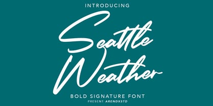 Seattle Weather was inspired by urban script fonts. The sharp and beautiful letter forms create glyphs that are modern, trendy and elegant. Seattle Weather comes with OpenType features such stylistic alternates, stylistic sets and ligatures and is great for logotypes, posters, badges, book covers, tshirt design, packaging and many more. Features : • Character Set A-Z • Numerals & Punctuations (OpenType Standard) • Accents (Multilingual characters) • Ligatures • Alternates
 - Definety by DEFNST,
$30.00 Definety is a clean and sharp pixel font with lowercase and uppercase glyphs including Basic Latin, Extended Latin A, Cyrillic, numbers, and special symbols. Carefully crafted for a wide range of purposes like branding, logo, posters, print, games, web, and a lot more. Pixel perfect font size starts from 8px/pt and continues by adding another 8 points to the size. Examples: 8px, 16px, 24px, 32px, 40px...
 - Cumbre by Antipixel,
$22.00 Cumbre is a slanted display type with unorthodox anatomy, a dynamic rhythmic structure, movement expression, and intense visual language. An eccentric rebel with ribbon-like moves, a balanced extrovert that makes meticulous use of ink traps. Both the name and design got inspiration from mountain peaks. "Cumbre" in Spanish means summit, and that's the motive for the spiked design and the angular serrated structure. Cumbre is built by balancing sharp angles and venturous curves. The stems are spiky, and they vary in width. Cumbre is slanted and unicase. It has condensed proportions, moderate weight contrast, spacious counters, pointy terminals, and square ink traps. Cumbre is meant for large display settings to make the most out of the precise outlines and the clean intersections. The font styles: 'Sharp' has straight paths and precise intersections. 'Round' has the same outlines but with round corners. 'Stamp' has irregular wavy contours and heavy swelling at intersections.
 - Sharplion by Zeki Michael,
$30.00 Sharplion is a typeface family designed by Zeki Michael and Leyla Melis Aslan. It’s a simple, but sharp display typeface with a clear yet powerful personality, created to not only optimize space, but also build contrast on the printed page and on the screen. Sharplion, coming in two weights and a matching slanted version, is designed to give that neo-vintage industrial feel in 'titles and hierarchic subheadings, logotypes and cases of short and simple copywriting for the artisan, hand-made and small batch look.’ The first 4 letters for what is now Sharplion, were designed in 2018 by Zeki Michael to be used as a logotype for Depo Coffee Roasting’s branding project. In early 2019 after Zeki designed all the letters, numbers and glyphs, he teamed up with talented designer, Leyla Melis Aslan to add strength to the project. The full Sharplion type system includes Regular, Black and Slanted styles – providing a simple but sharp contrast type solution for digital and print design work.
 - Pasto by Antipixel,
$15.00 Pasto is a fun and charming display type family of two styles with four weights each. 'Print' is a textured irregular stamp style, and 'Sharp' is a straightforward soft-edged type with clean strokes. It is clean, playful, and expressive, with a lightweight structure and fairly aired inner space. Pasto is perfect for display use and intended for medium and large settings. Still, it can be used in smaller point sizes for short sentences or words, providing a softer, delicate look. Pasto has three alternating alphabets that slightly differ from one another. Thanks to the Contextual Alternates, these alphabets are automatically replaced to avoid the same letterforms and textures appearing next to each other, creating a more spontaneous look when typing. This OT Feature is available for all the Sharp and Print styles. Some of Pasto's features are ligatures, stylistic alternates, numerators, fractions, special characters, currency symbols, and a glyph coverage that ensures extended language support.
 - Brasilica by CAST,
$45.00 Brasílica is a robust design, with wide proportions, that assimilates influences both from old style and modern types. This wide shapes, as well as the moderate contrast and sturdy serifs make it suitable to different conditions of printing. The sharp corners, as well as the abrupt connections and terminals are remarkable features of this typeface, that renders a sturdy and crisp texture, with a distinct aspect.
 - Heykido by Blankids,
$19.00 Introducing a new font combination script and serif called Heykido inspired by urban script fonts with sharp and beautiful letters that create fonts that are modern, tendy and elegant. Heykido came with opentype features such stylistic alternates, stylistic sets & ligatures good for logotype, poster, badge, book cover, tshirt design, packaging and any more. MULTILINGUAL ACCENT : ŽžŠŒšŸÀÁÂÃÄÅÆÇÈÉÊËÌÍÎÏÐÑÒÓÔÕÖØÙÚÛÜÝßàáâãäåæçèéêëìíîïðñòóôõöøùúûüýÿ FILES INCLUDE : Heykido Script. Otf Heykido Serif. Otf
 - Senhan by Studio Principle Type,
$17.00 A timeless serif with a distinctly contemporary attitude. The Senhan font family makes a statement with confidence. Defined by sexy, sharp, angular contours when used in headline and display scenarios, this family of 5 weights and italics is a real eye-catcher. But with a tall’ish x-height for legibility, and a medium contrast, Senhan is a workhorse at small sizes and in lengthy blocks of copy.
 - Molekyl by Typiskt,
$9.00 Designed in 2020 Molekyl is a modern neo grotesque family that consists of 6 weights. Rooted in simplicity Molekyl is workhorse typeface that suits many applications. The geometric details and subtleties also makes it a great fit for a clean, sharp and technical impression. The typeface has 420 glyphs (supporting many languages), arrows and opentype features such as kerning, f-ligatures, stylistic alternatives and tabular figures.
 - Cabarga Cursiva by ITC,
$29.00Cabarga Cursiva is the work of the father and son team of Demetrio E. Cabarga and Leslie Cabarga, both New York designers. The details of the sharp strokes almost give the impression of a knife blade, whether straight or curved like a scimitar. The capitals should be used only as initials and are complemented by a robust lower case alphabet as well as alternate forms and ligatures. - Deliria by Pedroglifos,
$11.00 Deliria is a decorative serif typeface that evokes a trippy feel from its wave-like body. The perfect balance between the flowing motion, and a fixed structure allows it to maintain readability while providing a unique aesthetic to your project. A great candidate for logos, single names, book titles and general decorative display. Combines well with simple sans or sharp serif fonts.
 - Sidefont by RainBomb Studio,
$16.00 Sidefont is a sharp, square family of 18 fonts inspired by the Sidemen Logo: The font broadens its use by supplying weights all the way from Thin to Black, Normal to Oblique. Perfect for posters, headlines and logotypes. OpenType features give you access to: Alternatives Kerning Fractions Numerals & Punctuation Accented characters Multilingual Support Supports most Latin-based languages and few others.
 - Dethrone by Rillatype,
$17.00 Introducing, Dethrone! Dethrone is a modern serif font that bring you clean and sharp feels. this font also comes with lowercase, ligatures, and multi lingual support. Dethrone is perfect for your branding project, headline, logotype, packaging, invitation, advertising, etc. I hope you enjoy the font, if you have any question please feel free to contact me at rillatype@gmail.com Thank You!
 - Meila Arabic by NamelaType,
$29.00 Meila Arabic is sibling of Meila with the addition of Arabic glyphs, for Arabic, Urdu, and Farsi. Still carrying a childish character with a cheerful font, visually featuring bold and cute characters. Meila has smooth lines on each side, especially on the outside, almost no sharp corners. On the inside there is only one line that functions as a counter space.
 - Rum Plakat by Trine Rask,
$30.00 Rum Plakat is a display type developed as a display face within the type family »Rum« Rum Plakat is an alternative version of Rum Soft Sans Black. It is suitable for posters and editorial design in large sizes & other eye catching matters. The complete family consists of Sans Serif & Serif in both sharp and soft version + the display fonts Rum Plakat & Rum Silhouette.
 - MVB Bovine by MVB,
$39.00A hand-rendered advertisement for a leather tanner, appearing in a French book from the ’40s, served as inspiration for MVB Bovine. Using its comic sway and slightly exaggerated forms, the typeface delivers bold headlines with a wink and a smile. MVB Bovine is all-caps with a set of discretionary ligatures. It's available in versions with sharp or rounded corners. - Linotype Salamander by Linotype,
$29.99Linotype Salamander is a part of the Take Type Library, selected from the contestants of Linotype’s International Digital Type Design Contests of 1994 and 1997. Designed by German artist Michael Struller, the font seems to be composed of strokes and curves jointed together to form characters. Yet Salamander also looks like a handwriting font, in part because of its slight lean to the right. The font contains four basic weights, from regular to demibold, and two particularly heavy double-weights. Linotype Salamander is a light and lively font, particularly good for short texts of point size 10 and up or, in its heavier weights, for headlines and displays. - Cavas Nera by Authentype,
$13.00 Cavas Nera modern & elegant font with discretionary ligatures that give each word a different shape. Also contains a swash with an elegant, contrasting, and clean, perfect for logo designs, posters, and various types of promotional media. Including 8 Font weight Thin, ExtraLight, Light, Medium, SemiBold, Bold, ExtraBold, Black. – Standard glyphs uppercase and lowercase letters – Numerals, a large range of punctuation and ligatures. – Swashes. – Multilingual – Works on PC & Mac. Simple installations, accessible in Adobe Illustrator, Adobe Photoshop, Adobe InDesign, even work on Microsoft Word. PUA Encoded Characters – Fully accessible without additional design software. Fonts include multilingual support for; ä ö ü Ä Ö Ü ß ¿¡ _________________________________________________________________________________________ Image used: All photographs/pictures/logo/vectors used in the preview are not included, they are intended for illustration purposes only. Thank you for your purchase! Hope you enjoy our font!