10,000 search results
(0.061 seconds)
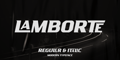
- Lamborte by Haksen,
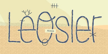
$18.00Lamborte is a strong modern sans serif style with All Caps feel nice balanced. Its wide range of uppercase with ligatures allow versatile design options and works perfectly for headlines, logos, posters, packaging, T-shirts and much more. Recommended to use in Adobe Illustrator or Adobe Photoshop with opentype feature. Ligatures feature is default setting in Adobe Illustrator or Adobe Photoshop in Uppercase character. So when you want not to use the ligatures. Open glyphs panel : In Adobe Photoshop choose tool Window Character and then please klick fi symbol In Adobe Illustrator choose tool Window Type Open Type and then please klick fi symbol If you have questions, just send me a message and I'm glad to help. Have a great day, Haksen - LeOsler by Antipixel,
$18.00LeOsler is a decorative, fun, handwritten font that includes the Latin, Greek and Cyrillic alphabets, and can be used in a wide range of languages, including English, Spanish, Italian, French, German, Polish, Czech, Vietnamese, Russian, Greek, among many others. Its OpenType features include ligatures for all repeated characters in upper & lowercase, contextual alternates for all supported alphabets, 4 ampersand alternates, scientific superior/inferior figures, fractions, etc. LeOsler also offers a set of icons that will provide a much more personal look to your work! Available in Regular and Light weights, and Rough and Stamp styles, for a perfect match with the font styles. In its first launch at MyFonts, LeOsler was featured among the HotNewFonts from the 28th of May, to the 2nd of July. - Dining Car JNL by Jeff Levine,
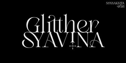
$29.00A 1929 German travel poster espoused the benefits of using a sleeping car with the caption “Wer Schlafwagen reist spart Zeit und Geld” (which translates to “Whoever travels in a sleeping car saves time and money”). Pictured on the poster is a passing train with the name "Mitropa" lettered on the side of a railway car in a bold, stylized font with thin slab serifs. "Mitropa" was an acronym of “Mitteleuropa” (German for Central Europe), and was used by a catering company than ran the sleeping and dining cars of numerous German railways for a good portion of the 20th Century. The lettering was modified and redrawn as Dining Car JNL, which is available in both regular and oblique versions. - Glitther Syavina by Sansakerta,
$19.00Glitther Syavina is a Fancy Modern vintage serif typeface with beautiful ligatures, tons of special alternative glyphs, and multilingual support. It's a very versatile font that works great in large and small sizes. Perfect for editorial projects, Logo design, Clothing Branding, product packaging, magazine headers, or simply as a stylish text overlay to any background image. Features: Lowercase and Uppercase Stylistic Alternates & Ligatures Numerals & Punctuation Open glyphs panel: In Adobe Photoshop go to Window - glyphs In Adobe Illustrator go to Type - glyphs Follow my shop for upcoming updates including additional glyphs and language support. And Please message me if you want your language included or If there are any features or glyph requests, feel free to send me a message, I would like to update it. - Farmer's Marker by Citrus Branding,
$3.99Farmer's Marker is an ode to the hobby-farmer and their honest and hardworking (but not too serious) lifestyle. The font reflects a vision of a farmer who quickly scrawls down her produce (72 Eggs + 20L of Milk + 2kg Honey) before she heads off to the market to do her best to sell what she has farmed. It is a casual, freehand, marker script that doesn't take itself too seriously. It is hand drawn by me, then meticulously perfected in Illustrator while leaving in just enough small imperfections that the font retains it's humanistic, hand-drawn and personal feel. The font will lend itself perfectly to rustic restaurant menu's, organic branding and packaging, social media content, child-centric design, travel posters, humanitarian organisations and much more. - Anttisol by Weape,
$15.00Introducing Anttisol, a handwritten brush font with a natural, rough, dry, and fast stroke. This font is perfect for signature logos, handwritten quotes, weddings, product packaging, fashion magazines, photography, merchandise, branding projects, poster, social media post, book covers, and advertising. You can create more easily with alternatives to each letter and make it as if you wrote it yourself. Anttisol contains upper and lowercase characters, numerals, ligatures, alternates, and a large range of punctuation. More information about how to access alternate glyphs, you can see on this link : http://goo.gl/ZT7PqK ) If you have any questions at all, feel free to send me a private message, I’m always more than happy to help you along :) Thank you! Happy creating. Enjoy! - Sabatons by Letterhend,
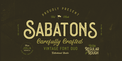
$14.00Sabatons is a sans and script font duo. The vintage feel is really perfect for you who needs a typeface for logotype, apparel, branding, packaging, advertising and more. The regular version will give you the clean and solid feel. The rough version will give you the vintage and aged feel. This typeface comes in uppercase, lowercase, punctuations, symbols & numerals, a bunch of alternates, ligatures, etc also support multilingual and already PUA encoded. Also with stamp version that will make the fonts more vintage! How to access opentype feature : http://letterhend.com/tutorials/using-opentype-feature-in-any-software/ We hope you enjoy the font, please feel free to comment if you have any thoughts or feedback. Or simply send us a PM or email us at www.letterhend.com - Monsterio by Haksen,
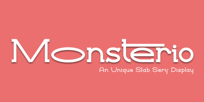
$17.00Monsterio is a futuristic modern slab serif style with Uppercase and Lowercase feel nice balanced. Provide alternates font in lowercase with wider style make the design letter looks incridible. Honestly it works perfectly for headlines, logos, posters, packaging, T-shirts and much more. Font Features : Regular and Italic version Character set A-Z in uppercase and lowercase Alternates in Lowercase Numerals & Punctuation Accented Characters Multiple Languages Supported Format File: OTF Recommended to use in Adobe Illustrator or Adobe Photoshop with opentype feature. How to access Alternate Characters? Open glyphs panel : In Adobe Photoshop choose tool Window glyphs In Adobe Illustrator choose tool Type glyphs If you have questions, just send me a message and I'm glad to help. Have a great day, Haksen Std - Emfatick NF by Nick's Fonts,
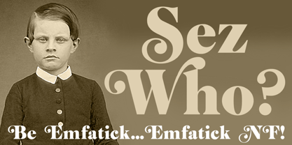
$10.00Here’s a fresh take on a classic, Caslon Black Swash by Ed Benguiat. Big, bold and beautiful, it’s a natural choice for distinctive and attractive headlines. Several alternate lowercase characters are included in the font, in place of some math operators. The PC Postscript, Truetype and Opentype versions contain the complete Latin language character set (Unicode 1252) plus support for Central European (Unicode 1250) languages as well. - PiS Wallride by PiS,
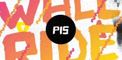
$34.00This font is the byproduct of a T-shirt line for a punk/hardcore band I did a while ago. The guys like it skatestyle, so I scribbled their bandname and tagline with fat edding markers, which was so much fun that I decided to make it into a whole font. PiS Wallride features ligatures and OpenType alternates for an even grittier and more authentic feel. - ITC Don't Panic by ITC,
$29.99ITC Don't Panic's distressed shapes and craggy outlines evoke the feeling you get when you're just barely in control of a situation. This is type design on the edge. ITC Panic is further down the emotional track, when you've actually lost control and there is no hope in sight. Thompson says the inspiration for these faces arrived one day in the mail. I received an envelope that looked like it had a rough trip; the type that was stamped on it had a tired, ragged appearance. Ironically, the haggard envelope woke me up. I got excited and wanted to replicate the look as a font of type." Thompson designed ITC Don't Panic, then stood back and looked at it and decided it cried out for a more agitated companion. ITC Don't Panic gave birth to the positively psychotic offspring, ITC Panic. Both are all-cap designs with alternate characters in the unshift position. Creating an authentically disturbed appearance proved to be a challenge for Thompson. "I tried to design agitated characters, but they looked staged. So I tried multiple photocopies, but that didn't work. Eventually, I laser-printed the basic characters, wadded up the lasers, then flattened them out and stomped on them with heavy boots. The end result was scanned and used as the basis for the rest of the design." Thompson's work on web sites and multimedia has influenced his interest in type and typography that transcends the cool, unemotional nature of the computer." - ITC New Esprit by ITC,
$29.99Originally drawn in 1985, Jovica Veljović had intended to add a few kerning pairs and make some minor refinements to the letterforms. However, his work lead him to take a fresh look at the family. Veljović recalls, … I soon realized that some characters could benefit by more refined shapes and proportions. By the time I was done, I had worked on just about every character in the original design." In fact the end result is two systems: one optimized for extended texts; the other for display settings. The original elegance of the design is not lost, but the new design brings with it letterforms that are altogether more harmonious and balanced. The roman is dynamic and spirited, just oozing character. The italic by contrast is a little more restrained, but nonetheless an elegant and fitting accompaniment. The text-optimized fonts come with a generous x-height, and slightly less contrast; though its marginally wider proportions let in the light, making it very legible even at small sizes. ITC New Esprit ® is a versatile family, brought to you in four weights from regular to black. OpenType features like small caps, alternates, and a broad character set make this a welcome addition to everyone's font library. Whether you want elegant and legible text, or dynamic and personable headlines, then you'll want to click through to see more of ITC New Esprit. " - Aeonian by Adorae Types,
$40.00Aeonian, designed by Emilia Adorno, was mostly inspired by the iconic morphology adopted by the arts of the 1920s. One hundred years later we can still see the resemblance between the wants and the needs of now and then to reach for the sky, to look ahead and enter the future in style. Now as then, we seek the right tools to do so, then once again, we embrace the rational, yet elegant and stylish forms of simplicity, geometry and symmetry. At the same time, there is a strong and growing need for a warmer approach to creating lovemarks. For that, Aeonian’s alternates hold attractive, soft and inviting shapes to an emotional appeal. Aeonian is a combination of all of them. A rational side entwined with an emotional one. Born a geometric sans, Aeonian ended up being a 2 in 1 font with a sans serif set and alternates reaching over 1200 glyphs. The entire family contains 6 weights, from thin to black, with its matching italics. It features a variety of ligatures to be used as connectors, specially for display. It also offers multilingual support, even for certain display ligatures. Later, Aeonian kept growing, with stylistic alternate sets of initial, mid and final glyphs. These are its arms to reach for infinity with a warm heart. The wide range of possibilities that Aeonian offers, makes it the best font for creating vast design systems with a rich visual language. - ITC Panic by ITC,
$29.99ITC Don't Panic 's distressed shapes and craggy outlines evoke the feeling you get when you're just barely in control of a situation. This is type design on the edge. ITC Panic is further down the emotional track, when you've actually lost control and there is no hope in sight. Thompson says the inspiration for these faces arrived one day in the mail. I received an envelope that looked like it had a rough trip; the type that was stamped on it had a tired, ragged appearance. Ironically, the haggard envelope woke me up. I got excited and wanted to replicate the look as a font of type." Thompson designed ITC Don't Panic, then stood back and looked at it and decided it cried out for a more agitated companion. ITC Don't Panic gave birth to the positively psychotic offspring, ITC Panic. Both are all-cap designs with alternate characters in the unshift position. Creating an authentically disturbed appearance proved to be a challenge for Thompson. "I tried to design agitated characters, but they looked staged. So I tried multiple photocopies, but that didn't work. Eventually, I laser-printed the basic characters, wadded up the lasers, then flattened them out and stomped on them with heavy boots. The end result was scanned and used as the basis for the rest of the design." Thompson's work on web sites and multimedia has influenced his interest in type and typography that transcends the cool, unemotional nature of the computer." - Amanah Script by Alifinart Studio,
$15.00Amanah Script is a handwritten font with a casual and modern calligraphy style. This font offers a large number of Stylistic Alternates, as well as beginning and ending swashes. This font has a total of 1660 glyphs, including capital letters, lowercase, numeral and punctuation, multilingual accents, swashes, and includes a large number of stylistic alternates and heart swashes (for lowercase letters). Amanah Script can be used for wedding card designs, invitation, best for photographer, traveling, blogging watermark or craft. Key Features: - Multilingual Accents - Stylistic Alternates up to 15 choices - Has a heart connected feature - Activate Stylistic Alternate by simply adding "period" (.) and “number” (1-15) to each lowercase letter. - Has ligature features so that the letters connect well together - Has OpenType and PUA Encodes feature. As I mentioned earlier, Amanah Script has a large number of Stylistic Alternates features, up to 15 options for lowercase letters. Interestingly, you can activate all Stylistic Alternates that are owned by each letter, just by typing; letter + period + number. For example: a.1 a.2 a.3 or b.1 b.2 b.3 and so on. As for activating the heart connected for each lowercase letters is quite easy, just by typing; letter + underscore + underscore + underscore + letter. For example: a___a or b___b and so on. If there are things you want to ask, don't hesitate to contact my email. Alifinart Studio alifinart@gmail.com Thank you. - Aviano Contrast by insigne,
$22.00The Aviano series returns, refined and sophisticated with an extended, high-contrast sans-serif family. Aviano Contrast is a contemporary typeface radiating with luxury. It's classic elegance makes it perfect for high-end applications such as cosmetic, jewelry or fashion brands. Aviano Contrast's extended forms give the face a smart look, and the curves are carefully honed to be sinuous and seductive. This high-contrast face is in a class of its own, composed in the style of a classic Didone but lacking the typical serifs. Aviano Contrast comes in six different weights and is packed with OpenType features. Need swash forms? Ball terminals? Art Deco alternates inspired by the inscriptions and signage of the '20s and '30s? Aviano Contrast includes 230 alternate characters. Twelve style sets are available, including four complete sets of art deco-inspired alternates, small forms, swash, titling and a wide array of other alternates to make your designs unique. As a complement to these characters, Aviano Contrast also includes 40 discretionary ligatures for artistic typographic compositions. Please see the informative .pdf brochure to see these features in action. OpenType capable applications such as Quark or the Adobe Creative suite can take full advantage of the automatically replacing ligatures and alternates. This family also includes the glyphs to support a wide range of languages. The rest of the Aviano series pairs very well with this face. These include Aviano, Aviano Serif, Aviano Sans, Aviano Didone, Aviano Flare, Aviano Future and Aviano Slab. - Play Day - Personal Use - Personal use only
- Mene One Mexicali by Handselecta,
$38.00This style mimics the flare or upward fade that comes with the use of a spray paint can, as the tops of the letters flare, and become wider. An original font style, named after the border town of Mexicali, this font style falls under the larger umbrella of what is called Cholo-graffiti style. Originally from New Jersey, MENE has made his home in, New York City. He had a brief albeit satisfying career of street bombing in the late 90s that saw its end with a brief encounter with the Vandal Squad. Now a family man, Mene has dedicated himself to the preservation and education of style in its many forms. - Last Date JNL by Jeff Levine,
$29.00A typographic conundrum presented itself with the hand lettered title on the cover of the 1919 song "I Am Always Building Castles in the Air". The capitalized portion ["Castles in the Air"] was a hybrid mix of a few Art Nouveau-influenced rounded letters, yet along with this were squared letters with rounded corners (reflecting the upcoming Art Deco movement to take place in about another decade). As a complete alphabet, it didnít mix as well as in those few short words. What to do? It was decided to go with the squared look and save the rounder characters for a future project. The end result became Last Date JNL; available in both regular and oblique versions. - Jorge by Galapagos,
$39.00(pronounced hor-hay) Some years ago my wife and I had our evening meal in a restaurant on what is called the northshore of Massachusetts. Of course, if you check a globe or map you'll see that the pilgrims needed a compass, it should have been called the eastshore as it's on the east end of the rectangle/hook we call the Commonwealth of Mass. In any event, the menu our waitress gave us was hand-lettered with shapes that I used to develop the 4 fonts called Jorge. When I brought the preliminary drawings into the office Steve Zafarana, a designer and cartoonist referred to them as Jorge's new design, the name stuck. - Love Duets by Ingrimayne Type,
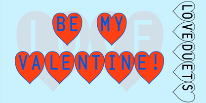
$9.00LoveDuets is a family of two novelty fonts that have letters on hearts. There are at least five other font families on myfonts that have have letters on hearts but LoveDuets differs from them because it uses the OpenType feature of Contextual Alternatives (calt) to put two letters on each heart, one on the left side and a second on the right side. The two styles in the family can be used in layers to increase color possibilities. The brace characters have empty half hearts that can be used to replace spaces or to complete hearts at ends of lines. LoveDuets can be used when hearts are appropriate such as for Valentines Day, anniversaries, and weddings. - Terra Ignota by Three Islands Press,
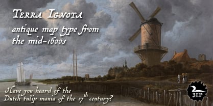
$39.00The idea for Terra Ignota came to me years ago as I was admiring a reproduction of "Amerique Septentrionale," a 1650 map by French cartographer Nicolas Sanson, given to me by my parents. The handlettering has a sort of rakish character, evocative of pirates or adventurers at a time of unbridled world exploration. I ended up putting the project aside, but the idea to create this font tugged gently at my mind until I simply couldn't ignore it any longer. The resulting typeface has an italic slant and a deliberate feel, in keeping with its historical roots. Useful for simulating old hand-lettered documents. Has a full character set (and then some). - Holidream by Subectype,
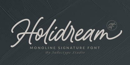
$16.00Introducing the new "Holidream" font, a monoline script font. For those of you who are needing a touch of clean monoline handwritten Font, chic and modernity for your designs, this font was created for you! Holidream was built with beautiful alternate ending. and It has an extensive lingual support, covering all European Latin scripts. What's Included: Web Fonts Ligature & Alternate Works on PC & Mac Simple installations Accessible in the Adobe Illustrator, Adobe Photoshop, Adobe InDesign, even work on Microsoft Word. PUA Encoded Characters - Fully accessible without additional design software. Fonts include multilingual support for; Afrikaans, Albanian, Czech, Danish, Dutch, English, Estonian, Finnish, French, German, Hungarian, Italian, Latvian, Lithuanian, Norwegian, Polish, Portugese, Slovak, Slovenian, Spanisch, Swedish. - HU Garaetteok by Heummdesign,
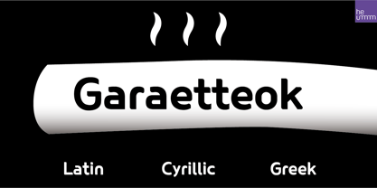
$15.00English HU Garaetteok is a cute headline typeface that expresses a straight stroke and end in a round shape. The characteristics of the writing were added with straight strokes and lively curves. There are 1 weights of HU Garaetteok : Extra bold Cyrillic HU Garetteok - это милый типограф заголовка, который выражает прямые штрихи и заканчивается в круглой форме. Характеристики письма были добавлены прямыми штрихами и оживленными кривыми. Есть 1 вес HU Garetteok : Extra gras Greek HU Garaetteok είναι μια χαριτωμένη γραμματοσειρά επικεφαλίδα που εκφράζει ένα ευθύ εγκεφαλικό επεισόδιο και να τελειώσει σε ένα στρογγυλό σχήμα. Τα χαρακτηριστικά της γραφής προστέθηκαν με ευθείες πινελιές και ζωντανές καμπύλες. Υπάρχουν 1 βάρη hu Garaetteok: Εξαιρετικά τολμηρό - Steak by Sudtipos,
$59.00Here I am, once again digging up 60-year sign lettering and trying to reconcile it with the typography of my own time. The truth is I've had this particular Alf Becker alphabet in my sights for a few years now. But in the typical way chaos shuffles the days, Buffet Script and Whomp won the battle for my attentions way back when, then Storefront beat the odds by a nose a couple of years ago. Nevertheless, revisiting Alf Becker’s work is always a breath of fresh air for me, not to mention the ego boost I get from confirming that I can still hack my way through the challenges, which is something I think people ask themselves about more often as they get older. You can never tell what may influence your work, or in this case remind you to dig it out of dust drawers and finally mould it into one of your own experiences. On my recent visits to the States and Canada, I noticed that quite a few high-end steak houses try their best to recreate an urban American 1930s atmosphere. This is quite evident in their menus, wall art, lighting, music, and so on. The ambience says your money is well spent here, because your food was originally choice-cut by a butcher who wears a suit, cooked by a chef who may be your neighbour 20 minutes from downtown, and delivered by a waitress who can do the Charleston when the lights dim and who just wouldn't mind laughing with you over drinks at the bar later. So Steak is just that, a face for menus and wall art in those places that see themselves in the kind of jazzy, noirish world where one-liners rule and exclamation points are part of a foreign language. As is usual with my lettering-inspired faces, there is very little left of the original Alf Becker alphabet. Of course, the challenges present in bringing typographic functionality to what is essentially pure hand lettering gives the spirit of the original art a hell of a rollercoaster ride. But I think that spirit survived the adventure, and may in fact be even somewhat magnified here. This font is over 850 glyphs. It’s loaded with ligatures, swashes, ending forms, alternates, ascender and descender variations, and extended Latin language support. Steak comes in 3 versions. According to your taste you can choose Barbecue, Braised or Smoked. It’s up to you! - Kefir by ROHH,
$39.00Kefir™ is charismatic, cheerful and full of character. It is inspired by such classics as Cooper and Windsor and serves as their modern alternative. It is a display font family with very strong personality and feels at home in editorial design, all kinds of headlines, posters, badges, websites and branding. Its light weights let you set friendly and legible paragraphs of text as well! Kefir has beautifully flowing lines, its nature is soft, rounded and elegant with charming retro vibes. The letterforms were crafted with much passion and love in order to send powerful positive message whenever used! Kefir has two additional stylistic sets to adjust the font to your liking and decide if you choose upright or sloping stems (in characters like h, m ,n , a) or go even more playful with some super-friendly letterforms. Kefir family consists of 7 styles + 1 variable font, letting you adjust the weight to your exact needs. It has extended latin language support as well as broad number of OpenType features, such as stylistic sets case sensitive forms, ligatures, swash caps, final forms, contextual alternates, lining & oldstyle figures, basic fractions, superscript and subscript, ordinals, currencies and symbols. - Fleischman BT by Bitstream,
$50.99Charles Gibbons' Fleischman BT Pro revives J.M. Fleischman's quirky and elegant text faces of the 1730s. Born in Germany, Fleischman worked in Holland, primarily at Enschedé en Zonen where he cut dozens of faces. His types represent some of the earliest examples of the Transitional style, predating and influencing the work of Fournier, Baskerville, and Bodoni. They were wildly popular in their day, used for everything from newspapers to currency, and Fleischman himself has enjoyed a renaissance of late. Fleischman BT Pro preserves the feel of the printed metal types while expanding the original to include four OpenType fonts: roman, italic, bold, and bold italic. They all include small caps, old style and lining figures, discretionary and historical ligatures, ornaments, and superiors. Fleischman Pro also supports Western, Central European, and Eastern European languages. - Gready PERSONAL USE ONLY, designed by Måns Grebäck, is a captivating font that embodies the essence of craftsmanship and elegance. This typeface, as the name suggests, is intended for personal use, o...
- OldSansBlack is a distinctive font that traces its roots back to the creative endeavors of Manfred Klein, a prolific typographer known for his wide range of fonts that vary from whimsical to seriousl...
- Cloister Black BT is a distinctive and historic typeface that traces its origins back to the late 19th and early 20th centuries, embodying the transition from Gothic to modern type designs. Character...
- "Dot.com" by Iconian Fonts is an eclectic and modern typeface that exemplifies the digital age with its unique characteristics, blending creativity and functionality in equal measures. Designed by th...
- "Manno" is a sophisticated and versatile font that captivates with its unique blend of elegance and contemporary design. Its genesis lies in the harmonious balance between traditional typeface charac...
- Ubicada is a contemporary and versatile typeface created by the talented typeface designer deFharo. It is a font characterized by its clean lines, geometric shapes, and modern feel, perfect for a var...
- Earth's Mightiest Bold Expanded, crafted by the notable typeface creator Iconian Fonts, stands as a testament to the power and influence of superhero themes within the realm of typography. The font e...
- Berolina, designed by the prolific German type designer Manfred Klein, is a font that commands attention through its blend of classical elegance and modern flair. Klein, renowned for his eclectic ran...
- DDD Cubic is a distinctive and visually engaging font created by D3, which embodies a modern and geometric approach to typography. This font stands out due to its cubic and block-like structure, offe...
- The SF Cosmic Age Outline font, designed by ShyFoundry, is an enthralling typeface that commands attention with its distinctive character and futuristic appeal. It encapsulates the essence of space-a...
- The Diablo font, much like the name suggests, embodies an aura of mystique and darkness, evoking images of ancient tomes and arcane secrets whispered in the dead of night. This font is not just a col...
- The "Soul Of Holitter Alternative" font, crafted with artistic expertise by Holitter Studios, is a font that exudes a unique blend of charisma and versatility, distinguishing itself from the multitud...
- The Dead Hardy font by Dirt2 stands out as an intriguing and bold display typeface, embodying a distinctive fusion of gothic sensibility and modern tattoo artistry. This font draws inspiration from t...
