10,000 search results
(0.068 seconds)
- 1525 Durer Initials by GLC,
$28.00 In 1525, Albrecht Dürer, the well known German great artist, was publishing the so-called “Underweysung der Messung mit dem Zirckel und Richtscheyt”, printed in Nuremberg. This handbook explained with numeral figures how to draw with a compass and ruler. A large part is devoted to the drawing of Roman characters, which can be used as decorative initials. We are offering two complete historical initial sets and also have entirely redrawn the missing letters: J, U and W, Eth, Lslash, Thorn and Oslash in the two forms, using the Dürer style. The font may be used with all our Humane and Garalde fonts, like 1543 Humane Jenson or 1592 GLC Garamond and others from the GLC foundry catalog.
 - Hakodate by Arendxstudio,
$16.00 Hakodate is a very unique and elegant font for you to use in your design project because it adapts to various themes. Hakodate is a font with distinctive handwritten characters and is perfect for branding projects, logos, wedding designs, media posts, advertisements, product packaging, product designs, labels, photography, watermarks, invitations, stationery, and any project that needs a handwritten feel. Features : • Character Set A-Z • Numerals & Punctuations (OpenType Standard) • Accents (Multilingual characters) • Ligature There it is! I really hope you enjoy it - comments and likes are always welcome and accepted. More importantly, don't hesitate to send a message if you have a problem or question. Now just read this, go there and make it happen!
 - Samsekrat by IbraCreative,
$17.00 Samsekrat is an authentic serif typeface that exudes timeless elegance and sophistication. With its meticulously crafted letterforms, Samsekrat strikes a harmonious balance between tradition and modernity, making it versatile for a range of design applications. The serifs are distinct and refined, lending a classic aesthetic to the typeface, while subtle nuances in letter spacing and stroke weights contribute to its overall grace. Samsekrat’s authenticity shines through in its attention to detail, capturing the essence of traditional serif typography while maintaining a contemporary edge. This typeface is a testament to the craftsmanship and artistry behind authentic design, making it a compelling choice for projects that demand a touch of refined character and enduring style.
 - Maleo by Tokotype,
$39.00 Maleo is a contemporary display sans with grotesque roots, taking cues from typefaces such as Benton’s Franklin Gothic & Alternate Gothic and contemporaries such as Obviously & Mars Condensed. Designed by Aditya Wiraatmaja as his debut retail typeface, Maleo is primarily designed with large-size usage in mind. Its tiny flare and angled cut terminal lends itself a friendly and approachable presence. With a family of 14 styles that range from thin to black with matching italics, it is a versatile display type that stands out in headlines, yet one that emits a charming personality. Maleo support various languages and is equipped with many Opentype features including; Old Style Figures, Ligature, Fractions, Numerators and Denominators, and Stylistic Alternates.
 - Ongunkan Sidetic by Runic World Tamgacı,
$49.99 The Sidetic language is a member of the extinct Anatolian branch of the Indo-European language family known from legends of coins dating to the period of approximately the 5th to 3rd centuries BCE found in Side at the Pamphylian coast, and two Greek–Sidetic bilingual inscriptions from the 3rd and 2nd centuries BCE respectively. The Greek historian Arrian in his Anabasis Alexandri (mid-2nd century CE) mentions the existence of a peculiar indigenous language in the city of Side. Sidetic was probably closely related to Lydian, Carian and Lycian. The Sidetic script is an alphabet of the Anatolian group. It has about 25 letters, only a few of which are clearly derived from Greek. Consensus is growing that the script has essentially been deciphered.
 - Cotford Variable by Monotype,
$188.99 New from the Monotype Studio, Cotford is a contemporary serif from Creative Type Director, Tom Foley. Dynamic, adaptable, and surprising—Cotford is a languid serif that ranges from delicate thins, bending and reaching like flower stems, to bold heavy weights that command the page and screen with confidence and vintage charm. And as a variable font, Cotford allows designers to explore and refine the design almost endlessly, unearthing its many visual tones and hidden secrets. Foley set out to design a soulful, contemporary serif typeface that delivers all the versatility and robustness today's designers expect. The variable font unlocks an expandsive spectrum of visual expression that allows designers to explore, tweak, and adjust the typeface until they find the perfect weight, contrast, and optical size for their project. At the same time, Cotford’s static weights follow a traditional model of 3 text and 5 display weights, making it a strong choice for brands looking for simple implementation. A pop serif for the digital age, Cotford takes you places.
 - Drefar by Craft Supply Co,
$20.00 Introducing Drefar – Slab Serif Font The Masculine Casual Blend Drefar – Slab Serif Font is a striking fusion of masculinity and casualness, making it a perfect choice for displays. Bold and Rugged Drefar’s bold and rugged appearance conveys strength and resilience, making it ideal for projects that require a robust presence. Informal Versatility This font’s informal nature lends itself to versatile applications, from posters to headlines and more, without sacrificing its bold character. Confident Typography Drefar is a font that exudes confidence. Its slab serifs and well-defined lines provide a sense of clarity and determination. In Conclusion In summary, Drefar – Slab Serif Font is the font that marries masculine and casual elements, offering bold, confident typography for your display needs. Its versatile and rugged nature ensures that your content carries a commanding presence, engaging a wide range of readers and viewers. Whether it’s posters, headlines, or other design projects, Drefar ensures your message is delivered with strength and determination.
 - Alchemila by Heyfonts,
$18.00 Alchemila "UNIQUE serif modern font" likely refers to a typeface that combines elements of traditional serif design with contemporary and distinctive features. Serif fonts have small lines or strokes attached to the ends of characters, which can contribute to a more formal or traditional appearance. The term "modern" in this context typically implies a contemporary or updated style. Here's an explanation of the characteristics and significance of a UNIQUE serif modern font: -Serif Elements: Serifs are the small lines or strokes at the ends of characters, and they are a hallmark of traditional typography. In a UNIQUE serif modern font, these serif elements are likely to be present but may have a distinctive shape or style that sets them apart from more conventional serif fonts. -Contemporary Design: The "modern" aspect of the font suggests a contemporary or updated design. This may involve a departure from the more classical serif styles seen in traditional typefaces, incorporating modern design principles, cleaner lines, and a more minimalist aesthetic. -Distinctive Characters: A UNIQUE serif modern font is likely to feature characters with unique and individual design elements. This could include unconventional serifs, letter shapes, or other stylistic details that make the font stand out and contribute to its uniqueness. -Versatility: While serif fonts are often associated with formality and readability, a UNIQUE serif modern font may offer versatility suitable for a range of design applications. It could be used in both traditional and modern contexts, providing flexibility for various design projects. -Applicability to Branding: Fonts play a crucial role in branding, and a UNIQUE serif modern font could be an excellent choice for businesses or projects that want to convey a sense of tradition and reliability while maintaining a contemporary and innovative image. -Digital and Print Design: Modern serif fonts are often designed with both digital and print applications in mind. The clarity of the typeface, even at smaller sizes, and its aesthetic appeal make it suitable for a variety of design projects, from websites and apps to print materials like brochures and posters. -Attention to Detail: The uniqueness of the font may be reflected in the careful attention to detail in each character. This could include refined curves, balanced proportions, and other design elements that contribute to the overall visual appeal and readability of the font. -Available Features: Unique serif modern fonts may come with additional features, such as alternative characters, ligatures, or stylistic sets, allowing designers to customize the appearance of the text for specific design needs. When selecting or working with a UNIQUE serif modern font, designers should consider the overall design goals, the intended audience, and the context in which the font will be used
 - Bibliophile Script by Sudtipos,
$79.00 A friend once jokingly told me that what I really do is mine extinct arts for parts to use in modern things, like going to the scrapyard to pick up bumpers, quarter-panels and dashboards off of Datsuns and Ponies to build a shiny new Ferrari. I still kind of grin at that, but I certainly do spend a lot of time looking at old things and imagining ways they would work today. This shiny new Ferrari here is called Bibliophile, and it contains scrap heap parts from various pages by Louis Prang, the Prussian-American printer and publisher who inspired my Prangs fonts. This is my second engagement with the late 19th century man, and it’s quite a bit more intricate than just an italic Didone with a connected lowercase. Bibliophile marries Round Hand calligraphy with Italian capitals, two styles not often relayed in the same alphabet, but work together beautifully when combined well. When you combine them well with a few long-practised tricks of the trade, then mix in a few trusted features from my previous work over the years, you get my usual crazy exuberance, like 17 different shapes for the d, 21 different forms for the y, endings, beginnings, swashes, ornaments, and so on. It’s no secret that I can get carried away when I’m so consumed by an idea. — Bibliophile comes in 2 weights, each of them with over 900 glyphs covering all the latin languages. Bibliophile also comes with a bold weight, something I’m always reluctant to do with something as adventurous and complex as the structure of this historical mashup. But I couldn’t chase away the idea of increasing the contrast while maintaining the hairlines in a lowercase this narrow. Part of it was the curiosity about the outcome, and part was the sheer challenge of it. I think it turned out OK. Words set in either weight will show delicateness and elegance, and the more time you spend inside the font and micro-manage the setting, the more ways you will find to magnify either. Bibliophile can be as muted or luxurious as you want it to be. This is the kind of alphabet that fits well in fashion marketing and high-end packaging, from the very subdued to the super-exquisite. Enjoy the gleaming new vehicle made with freshly polished old parts.
 - Negotiate by Typodermic,
$11.95 Indulge your senses with the exquisite elegance of Negotiate, a sans-serif typeface that exudes sophistication and style. This alluring font boasts a distinctive blend of rounded and flat stroke ends, creating a striking contrast that is both visually appealing and alluring to the eye. The smooth, curved lines of the rounded stroke ends provide a soft and gentle touch, while the flat strokes add a bold and assertive element that commands attention. This captivating contrast imbues Negotiate with a unique personality, making it a perfect choice for those seeking to convey a message that is both powerful and chic. What truly sets Negotiate apart is its versatility. The typeface is available in five distinct weights, allowing you to customize your design to achieve the perfect balance of grace and strength. Additionally, the italics add a touch of sophistication to your work, giving it a refined and polished edge that is sure to impress. If you’re looking for a font that truly embodies the essence of fashion and elegance, look no further than Negotiate. With its old-style numerals, this typeface is perfect for use in OpenType-capable apps. Its charming design and alluring character are sure to make an impact and leave a lasting impression on all who behold it. Choose Negotiate and let your creativity take flight. Most Latin-based European writing systems are supported, including the following languages. Afaan Oromo, Afar, Afrikaans, Albanian, Alsatian, Aromanian, Aymara, Bashkir (Latin), Basque, Belarusian (Latin), Bemba, Bikol, Bosnian, Breton, Cape Verdean, Creole, Catalan, Cebuano, Chamorro, Chavacano, Chichewa, Crimean Tatar (Latin), Croatian, Czech, Danish, Dawan, Dholuo, Dutch, English, Estonian, Faroese, Fijian, Filipino, Finnish, French, Frisian, Friulian, Gagauz (Latin), Galician, Ganda, Genoese, German, Greenlandic, Guadeloupean Creole, Haitian Creole, Hawaiian, Hiligaynon, Hungarian, Icelandic, Ilocano, Indonesian, Irish, Italian, Jamaican, Kaqchikel, Karakalpak (Latin), Kashubian, Kikongo, Kinyarwanda, Kirundi, Kurdish (Latin), Latvian, Lithuanian, Lombard, Low Saxon, Luxembourgish, Maasai, Makhuwa, Malay, Maltese, Māori, Moldovan, Montenegrin, Ndebele, Neapolitan, Norwegian, Novial, Occitan, Ossetian (Latin), Papiamento, Piedmontese, Polish, Portuguese, Quechua, Rarotongan, Romanian, Romansh, Sami, Sango, Saramaccan, Sardinian, Scottish Gaelic, Serbian (Latin), Shona, Sicilian, Silesian, Slovak, Slovenian, Somali, Sorbian, Sotho, Spanish, Swahili, Swazi, Swedish, Tagalog, Tahitian, Tetum, Tongan, Tshiluba, Tsonga, Tswana, Tumbuka, Turkish, Turkmen (Latin), Tuvaluan, Uzbek (Latin), Venetian, Vepsian, Võro, Walloon, Waray-Waray, Wayuu, Welsh, Wolof, Xhosa, Yapese, Zapotec Zulu and Zuni.
 - Reyes by Yock Mercado,
$9.00 Reyes is a modern typeface with influence on consumer product labels from the early 1900s, is ideal for use in display texts and thanks to its 6 typographical weights lends itself to complex typographic design compositions.
 - Flamenca by Eurotypo,
$28.00 Flamenco is an Andalusian art. Who think in flamenco, think in Spain. Is the result of a cultural mix: Gypsies, Arabs, Jews and Christians mixed elements of their respective cultures with traditional Andalusian elements. It incorporate dance, song and guitar music. Known for its emotional intensity, flamenco is distinguished by the graceful arm movements, ferocious stomping’s flamenco dancer, deep groans and strumming guitar. Flamenco is an art of passion. Flamenca Regular and Flamenca Luz is a brush script inspired by the flamenco dance. Flamenca is an organic, modern and casual calligraphy family font that has preserved in its glyphs its original textured appearance for a more personalized effect even more authentic. As an exclusively Open Type release, with 747 glyphs, it has several special alternatives for all letters with lots of possibility an infinity of combinations. There are plenty of options to allow you to create something unique and special: standard and discretionary ligatures, several swashes, initial and terminal forms and stylistics alternates for each letter, catchwords, ornaments that can be added to the beginning or end of each letter, and much more. Ornaments has been created inspired in the bars of the Andalusian patios where flamenco is danced. These lovely fonts have already an extended character set to support Central and Eastern as well as Western European languages. As a whole, Flamenca was made to make your project more beautiful and attractive! Have fun with it! Flamenca is fancy, delicious & fresh!
 - Mi Negra by Letritas,
$25.00 Mi negra is a funny and hilarious typography designed especially for children, thought and created by Isabel de Gregorio. It could be described as an original combination between a semi-handwright and semi sans-serif font. Thanks to its structure and nice endings "Mi Negra" is recommended for composing short texts (logotypes, packing, posters, etc.). It may similarly be used for illustrations and comics, as well as in printing press works for children from 6 to 13 years old for instance. Mi Negra has been conceived to be a useful support in all kinds of illustrations works (please note that Isabel, the type designer, considers herself primarily an illustrator). The font designer of Mi Negra tells that every time she needed to provide some text data (i.e. in children infographies) and needed to make them more understandable and suitable for children, she used this typography. The former idea was than to create a font who could be a second option to comic sans, but as the project started to reveal its forms, it was clear that it was revealing another connotation and its own character. In this way, Mi Negra went on modifying its forms and the more it developed, the more it was showing its new characteristics and concepts. The family is composed of three weighs: Light, regular and black. It provides also interesting functional ligatures. It also includes a dingbat with nice doggies. It has 434 characters and can work with 208 languages.
 - Costa Std by Typofonderie,
$59.00 A mediterranean style sanserif in 4 styles The original idea of Costa was to create a contemporary mediterranean typeface style. Costa is a synthesis of the purity, as found on Greek capitals, and softness, found in Renaissance scripts. First thing was the design concept that take its roots on the Chancery script. Such writing style appeared during Italian Renaissance. Later few typefaces have been developed from such cursive models. Today most serifed typeface italic take their roots on such triangular structure we can find on gylphs like the n, p, or d. The Costa capitals remains close to pure sanserif models when the lowercases features an ending serif on many letters like the a, n, d, etc. This ending serif being more like a minimal brush effect, creating a visual contrast and referencing the exoticness of the typeface. Knowing that the Costa typeface family began life in the 90s as a bespoke typeface for Costa Crociere, an Italian cruise company — it suddenly makes sense and explains well why Jean François Porchez focused so much on Italian Chancery mixed to a certain exotism. The curvy-pointed terminals of the Costa n can obviously get find on other glyphs, such as the ending of the e, c and some capitals. So, the sanserif looks more soft and appealing, without to be to pudgy or spineless. The general effect, when set for text, remains a sanserif, even not like Rotis Semiserif. Costa is definitly not a classical typeface, or serif typeface which convey past, tradition, historicism as Garamond does beautifully. Because of the Costa crocieres original needs, Costa typeface was designed to be appropriate for any uses. Anytime you’re looking for good mood, qualitative effects, informal tone, cool atmosphere without to be unconvential or blowzy, Costa will convey to your design the required chic and nice atmosphere, from large headlines sizes, brands, to small text sizes. It’s a legible typeface, never boring. A style without neutrality which doesn’t fit comfortably into any typeface classification! Does it proves the novelty of its design and guarantees as well as its originality? Its up to you to be convinced. Barcelona trip Originally not planned, this need appeared because of a trip to Barcelona at the time of the project, where Jean François was giving a lecture. He wanted to pay an homage to that invitation to create something special. So, he designed during his flight some variations of the Spanish Ch, following ideas developed by the Argentinian type designer Rubén Fontana for his typeface called Fontana ND (published by the Barcelona foundry Bauer). Then, he presented during his lecture variations and asked to the audience which design fit the best to their language. They selected the design you can find in the fonts today. Read more about pairing Costa Type Directors Club 2000 Typographica: Our Favourite Typefaces 2004
 - ITC Kallos by ITC,
$29.99ITC Kallos is the work of British designer Phill Grimshaw, a text typeface family with traditional calligraphic flair. It is the result of Grimshaw's first experiments with text typeface design. The long ascenders and descenders of the lowercase alphabet lend them a look of sophisticated elegance. The capitals display the unmistakable influence of the pen and the proportions of classic inscriptional forms. - Homemade Choco by Tlatous Type,
$19.00 Introducing Homemade Choco by Tlatoustype Homamade Choco is a Monoline handwritten Font. Homemade Choco is a cute, quirky and fresh handwritten font. It is ideal for holiday-themed greeting cards and for any crafting project that requires a sweet, romantic touch. Homemade Choco also multilingual support. Enjoy the font, feel free to comment or feedback, send me PM or email. Thank you!
 - Shadow Party by Balpirick,
$15.00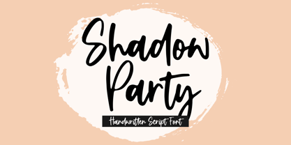 Shadow Party is a Handwritten Script Font. Shadow Party is a flowing handwritten font, described by an elegant touch, perfect for your favorite projects. Fall in love with its incredibly distinct and timeless style and use it to create spectacular designs! Shadow Party also multilingual support. Enjoy the font, feel free to comment or feedback, send me PM or email. Thank you!
 - Canoe Handwriting by Angie Makes,
$10.00 Canoe is a fun, all-caps font with a delightfully hand-written feel. It comes “water ready” to be used in the wild on the web, save the dates, and other design projects that need a homemade touch. Its characters are wiry and tall with crossbars that hit at varying heights. Canoe also includes 1st, 2nd, 3rd ordinal capabilities as well as fractions.
 - Callistera Script by Sarid Ezra,
$15.00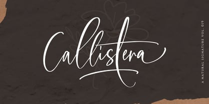 Callistera Script is a natural also expressive font that contain lowercase, uppercase, symbol, and also mult- language support. It comes with ligatures, contextual alternates, stylistic alternates, swashes, and also underline. Callistera Script also suitable for logo branding, beautiful fashion design, suitable for wedding invitations, or handwritten quotes. Also with PUA encoding. For another questions, please send a mail to saridezra@gmail.com. Thank You!
 - Magicline by Balpirick,
$15.00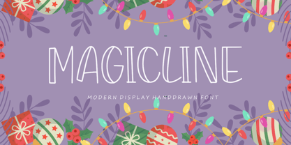 MAGICLINE is a Modern Display Handdrawn Font. Magicline is a trendy display font, described by an unique touch, perfect for your favorite projects. Fall in love with its incredibly distinct and timeless style and use it to create spectacular designs! MAGICLINE also multilingual support. Enjoy the font, feel free to comment or feedback, send me PM or email. Thank you!
 - Present by Linotype,
$40.99This lively calligraphic font was designed by Friedrich K. Sallwey and appeared with Linotype in 1974. Present is distinguished by the buoyant rhythm of its characters, with their flowing forms and stroke contrasts. This contrast lends the font a faint Asian character, which is perhaps what has made the font so popular in international advertisements, an accomplishment usually reserved for text fonts. - Rainbow Marbles by Aestherica Studio,
$14.00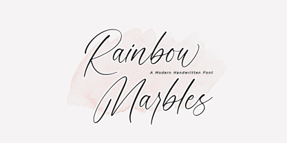 This is Rainbow Marbles by Aestherica Studio. Rainbow Marbles is a minimalist and elegant with unique curves and flowing modern script font. Rainbow Marbles is perfect for product packaging, branding project, megazine, social media, wedding, or just used to express words above the background. Rainbow Marbles also multilingual support. Enjoy the font, feel free to comment or feedback, send me PM or email.
 - Memphis River by Balpirick,
$15.00 Memphis River is a Modern Handwritten Font. Memphis River is a unique and elegant handwritten font. It looks beautiful on a variety of designs requiring a personalized style, such as wedding invitations, thank you cards, weddings, greeting cards, logos and so on. Memphis River also multilingual support. Enjoy the font, feel free to comment or feedback, send me PM or email. Thank you!
 - Santa Robin by Balpirick,
$15.00 Santa Robin is a Modern Handbrushed Font. Santa Robin is a sweet and friendly handwritten font. This playful font will look gorgeous on a variety of design ideas. It will add a joyful and romantic touch to each of your projects! Santa Robin also multilingual support. Enjoy the font, feel free to comment or feedback, send me PM or email. Thank you!
 - ITC Caribbean by ITC,
$29.99ITC Caribbean is the work of California designer Jill Bell, earthy yet exotic. In her typeface experiment, Bell combined unusual angles and curves to produce tall, thin letters whose stroke style completes the suggestion of palm trees which this typeface brings to mind. The typeface contains capitals and small caps. The natural look of ITC Caribbean lends any work a human touch. - Yorkside by Balpirick,
$15.00 Orkside is a Modern Calligraphy Font. Yorkside is a cool, trendy and paint brushed handwritten font. It looks beautiful on a variety of designs requiring a personalized style, such as wedding invitations, thank you cards, weddings, greeting cards, logos and so on. Yorkside also multilingual support. Enjoy the font, feel free to comment or feedback, send me PM or email. Thank you!
 - Oleandro by Balpirick,
$15.00 Oleandro is a Modern Calligraphy Font. Oleandro is a unique and elegant handwritten font. It looks beautiful on a variety of designs requiring a personalized style, such as wedding invitations, thank you cards, weddings, greeting cards, logos and so on. Oleandro also multilingual support. Enjoy the font, feel free to comment or feedback, send me PM or email. Thank you!
 - Dancinglove by Balpirick,
$15.00 Dancinglove is a Modern Calligraphy Font. Dancinglove is a unique and elegant handwritten font. It looks beautiful on a variety of designs requiring a personalized style, such as wedding invitations, thank you cards, weddings, greeting cards, logos and so on. Dancinglove also multilingual support. Enjoy the font, feel free to comment or feedback, send me PM or email. Thank you!
 - Golden Dates by Balpirick,
$15.00 Golden Dates is a Modern Calligraphy Font. Golden Dates is a stylish and trendy script font. It looks stunning on wedding invitations, thank you cards, quotes, greeting cards, logos, business cards and every other design which needs a handwritten touch. Golden Dates also multilingual support. Enjoy the font, feel free to comment or feedback, send me PM or email. Thank you!
 - Christmas Spirit 2 by Alphabet Zoo,
$14.00 Christmas Spirit was designed to incorporate some of the most familiar icons of the Christmas season into a highly decorative font. Each letter is unique with its own design, and lends itself to a festive environment. From the A as a decorated Christmas tree, to a reindeer that translates into a Z, Christmas Spirit will liven up holiday greetings, invitations, and announcements.
 - "Bowellberalta" is a distinctive and captivating font created by the talented designer Kirk Shelton. This font is a perfect blend of classic elegance and modern flair, making it a versatile choice fo...
- Just One by Supersemarletter,
$11.00 Just one is a fun and friendly handwritten font. Its casual charm makes it look very simple, easy to read and, ultimately, very versatile. This font will look amazing in any context, whether it’s used on a DIY, outdoor project or as a main title!. Honestly it works perfectly for headlines, logos, posters, packaging, T-shirts and much more. Font Features : • Regular version • Character set A-Z in uppercase and lowercase • Numerals & Punctuation • Accented Characters • Multiple Languages Supported Recommended to use in Adobe Illustrator or Adobe Photoshop with opentype feature. If you have questions, just send me a message and I'm glad to help.
 - Photo Developer JNL by Jeff Levine,
$29.00 An image found online of a vintage storefront sign for the Kraus Photo Shop was the inspiration for Photo Developer JNL, which is available in both regular and oblique versions. The sign featured a thick and thin Art Deco style lettering with an inline cutting through the thicker strokes. Before the advent of digital photography, and way before chain stores offered in-house processing, neighborhood photo labs were the only place for getting prints from your roll film (unless you wanted to send the film into Kodak for developing and printing). Customers of these stores could also purchase additional film, cameras and photographic accessories from the same location.
 - Peroba Rosa by Yahya Type,
$16.00 Peroba rosa is a modern sans serif type family featuring a blend of modern, classical, and playful characteristics. The simple, clean forms and classically inspired proportions give it a timeless quality and interesting visual rhythm. Peroba rosa is perfect for logo design, magazine headers, product packaging, branding projects, clothing or simply as a stylish text overlay to any images or websites. WHAT’S INCLUDED? • Comes with regular, thin, light, italic, bold, thin italic, light italic, bold italic and bold italic font styles. Uppercase & lowercase letters. numbers. punctuation Ligature & Huge Stylistic alternate. Multilingual support. Still got a question? Send me a message and I’ll be happy to answer! qura.yahya@gmail.com
 - Elfira by Allouse Studio,
$14.00 Proudly Presenting, Elfira a Handwritten Monoline Script Font which come with two styles Regular and Bold. Elfira has many Stylistic Alternates, multiple Swash, Ligatures and also Multi-Lingual Support which will give you much choices for your needs. We highly recommend using a program that supports OpenType features and Glyphs panels like many of Adobe apps and Corel Draw, so you can see and access all Glyph variations. Elfira is perfect for any tittle, logo, product packaging, branding project, megazine, social media, wedding, or just used to express words above the background. Enjoy the font, feel free to comment or feedback, send me PM or email. Thank You!
 - Burned Duck by Mightyfire,
$15.00 Introducing Burned Duck, the playful handwritten font. With each character meticulously shaped as if inked by a playful hand, Burned Duck exudes a sense of spontaneity and creativity. The irregular lines and slightly varying sizes contribute to the font's organic and dynamic appearance, making it a perfect choice for those seeking to infuse their designs with a dash of personality and humor. Whether you're designing comic strips, graphic novels, greeting cards, or any other creative endeavor, Burned Duck lends an air of authenticity to your text. Its playful imperfections add character and liveliness, making your words dance across the page as if penned by a skilled cartoonist.
 - Assasins by Supersemarletter,
$12.00 Assasins is a beautiful handwritten font, created with the help of a joyful brush pen. It looks lovely on invitations, thank you cards, quotes, greeting cards, logos and every other design which needs a romantic, trendy touch. This font is PUA encoded which means you can access all of the glyphs and swashes with ease! Font Features : • Regular version • Character set A-Z in uppercase and lowercase • Ligatures in Lowercase and special • Alternates option • Numerals & Punctuation • Accented Characters • Multiple Languages Supported Recommended to use in Adobe Illustrator or Adobe Photoshop with opentype feature. If you have questions, just send me a message and I'm glad to help. Best Regards, Supersemar Letter
 - Abhiarga by IbraCreative,
$17.00 Abhiarga is an elegant display serif font that seamlessly blends sophistication with a touch of modernity. Its gracefully crafted letterforms exude a timeless charm, characterized by subtly flared serifs and well-balanced proportions. The typeface strikes a harmonious balance between traditional serif elements and contemporary design trends, making it versatile for various applications. Abhiarga’s intricate details lend a sense of refinement, making it ideal for titles, headlines, and other prominent display settings where a touch of classical sophistication is desired. The font’s intricate strokes and intricate serifs contribute to a distinctive aesthetic, ensuring that Abhiarga stands out with a dignified presence while maintaining readability and visual appeal.
 - Goldstone by Fran Studio,
$20.00 Goldstone is a hand-brushed modern calligraphy script, created with both pen and brush. It includes a dancing baseline with separate swashes that can be applied to the beginning and ends of all lowercase. Goldstone includes several ligatures, alternates, and international support for most western languages. Perfect for branding, logos, greeting cards, wedding stationery and so much more. To activate OpenType Stylistic alternative, you need a program that supports OpenType features such as Adobe Illustrator CS, Adobe Indesign and CorelDraw X6-X7, Microsoft Word 2010 or later. How to access all of the alternate characters, using the Windows Character Map to Photoshop: https://www.youtube.com/watch?v=Go9vacoYmBw How to access all of the alternate character using Adobe Illustrator: http://youtu.be/iptSFA7feQ0nn How to use stylistic sets font in Microsoft Word 2010 or later versions: https://youtu.be/x1A_ilsBsGs Goldstone is PUA encoded with Unicode, which allows full access to all the extra characters without having to design special software. Mac users can use Font Book, and Windows users can use the Character Map to view and copy one additional character to paste into your text editor or favorite applications.
 - Franqueline Slab by Sudtipos,
$39.00 Introducing Franqueline Slab, the captivating new typeface family passionately designed by Estudio Vástago and expertly distributed by Sudtipos! This versatile font offers a diverse array of styles, ranging from delicately refined to boldly eye-catching on the weight axis, all elegantly inspired by the timeless Egyptian fonts of the late 19th century. With expressive character and exquisitely unique shapes, Franqueline Slab harmoniously blends the finesse of its delicate strokes with sophisticated endings, resulting in a truly remarkable typography. Every letter in Franqueline Slab has been meticulously crafted to strike the perfect balance between a contemporary edge and a touch of traditional charm, appealing to both the younger generation and typography enthusiasts who appreciate the artistry of the past. Its adaptability makes it ideal for captivating headlines that convey a message of youthful energy and playfulness, while still exuding the timeless elegance that only classic fonts can deliver. Embrace distinction and originality in your designs with Franqueline Slab. Whether it graces an editorial project, logo, or advertising material, this exceptional typeface family will undoubtedly stand out, leaving a lasting impression with its captivating personality. Watch your messages come to life and shine with the unparalleled charm of Franqueline Slab!