5,415 search results
(0.018 seconds)
- dubfresh - 100% free

- Starry Stitch - Personal use only

- imagine earth - Personal use only

- Roundico - Unknown license

- Linesquare Rounded Extended - 100% free

- Lehmann by ParaType,
$30.00 PT Lehmann™ was designed for ParaType in 2002 by Tagir Safayev. Inspired by letterforms of Shiroky (Wide) Renaissance typeface and other fonts of Ossip Lehmann foundry, St.-Petersburg, c. 1874. A face of the so-called Elzevir type has thin triangular serifs and sharp spiral-like terminals. For use in advertising and display typography.
 - Hyperwave by Set Sail Studios,
$14.00 Crank up the intensity with HYPERWAVE! An energetic set of brush fonts with a sharp attitude. With THREE sets of each letter, each equipped with distinctive fast brush strokes, HYPERWAVE is ready and raring to make a big statement on your logo designs, brand imagery, handwritten quotes, product packaging, merchandise, music projects & social media posts.
 - Monster Night by Supfonts,
$13.00 Monster Night spooky halloween font will be perfect for halloween lettering, beautiful frame for your home, book covers, greeting cards, logos, marketing, magazines or anything that requires cute handwritten lettering :) What's inside: Monster Night Regular Monster Night Sharp Multilingual support Cricut support If you have any questions, please contact me directly or in instagram @superdizigner
 - Hoplight by Smith Hands,
$20.00 Hoplight is a friendly, curvy, hybrid. A fusion of the cool character of a roman, with the flow and informality of an italic. Throughout Hoplight, many sharp serifs have been replaced by dot style serifs, to allow the contours of the letters to flow seamlessly into the terminations. Hoplight embodies a sense of playful ease.
 - Asterx by Ingrimayne Type,
$7.95 In the 19th century typefaces with star-like serifs developed from the medieval type styles, retaining the sharp corners and peaks of some of the blackletter types but losing the flourishes on the upper-case letters. Asterx is in that tradition of star-footed typefaces, though it is not modeled on any particular one.
 - Admark by Club Type,
$36.99 Advertising and Marketing often calls for the use of neutral typestyles; conveying a quiet but clear message with little stress and an even color on the page. Admarks' roman weights have simple slab serifs contrasting with generously rounded features. Italics provide a sharp emphasis, still keeping the delicate use of stress combined with contrast.
 - Anachak by Jipatype,
$25.00 Anachak font, Is a square structure. It emphasizes the sharpness of the serif, giving it a strong and formidable feeling. Suitable for headlines for various publications such as Packaging, Print Ad, Etc. Available in 18 styles. - ฟอนต์ อาณาจักร โครงสร้างเหลียมมีเชิง ขับเน้นความคมแหลมคมตรงช่วงจบเส้น และฐานเชิง ให้ความรู้สึกหนักแน่น น่าเกรงขาม ยิ่งใหญ่ และดุร้าย เหมาะสำหรับการพาดหัวสำหรับสิ่งพิมพ์ต่างๆ เช่น Packaging, Print Ad, Etc มีให้ถึง 18 สไตล์ เลือกใช้ได้ตามความเหมาะสม
 - Jolly Beat by PizzaDude.dk,
$18.00 Is it monospaced? Is it a numberplate font? What's up with all the different letters? The questions about Jolly Beat are many, but I can tell you this: No sharp edges, multilingual support, contextual alternates (5 different versions of each letter, that automatically cycles as you type!) and a good handful of unpredictable letters!
 - Green by ITC,
$29.99Green is the work of British designer Timothy Donaldson, known for his experimentation with letter forms. This typeface features a sharp stroke contrast and eccentric lower case letters, giving it a vital, clean-cut style. Green is perfect in both large display sizes and small text sizes and gives any work a fresh, new look. - Acantha by Solotype,
$19.95Originally made in seven sizes, 6 to 48 point. Our font was digitized from the 24 point which we found in 1947 in a Sparks, Nevada, newspaper shop. Typical of the late nineteenth century types for job printers, where the rule was “never start a line with a font used in the line above”. - ALS Agrus by Art. Lebedev Studio,
$63.00 Agrus in Ukrainian means "gooseberry". The letters are rounded like the berries and the sharp end elements remind of the barbs. In fact, the font is an intricate italic type. Optical compensations are purely decorative and rhyme with thin connecting lines. Design of this font is one hundred percent due to “strength of material”
 - Simply Marvelous by Comicraft,
$19.00 Darling, you don’t just look GOOD, you look FANTASTIC! IRRESISTIBLE! IMMACULATE! Those soft curves, those sharp lines, those INLINES... that MAGNIFICENT symmetry. This is a face that could launch a thousand spaceships, a face that doesn’t care if you feel good, because Heavens to Betsy, you LOOK good. Just utter those magic words: Simply Marvelous.
 - Strongbox JNL by Jeff Levine,
$29.00Strongbox JNL is based in part on an incomplete sample of an old wood type alphabet seen on an image sharing site. Commonly known as a grotesk (or grotesque) face, this style of sans serif lettering is well-suited for headlines, display work, price cards or anything where a bold, condensed typeface is needed. - Masculina by Brave Lion Fonts,
$8.00 Masculina is a strong font with sharp ends. It is a majuscule font and supports many languages. If you love capital letters, Masculina is a must-have. It is recommended for signs and headlines but there are many more ways to use it. Masculina is ready for you. Make the maximum out of it.
 - Harland Roselyn by Namara Creative Studio,
$20.00 Harland Roselyn is a romantic and sweet calligraphy typeface with characters that dance along the baseline. It will add a luxury spark to any design project that you wish to create! Bold decorative script with modern handwritten touch, warm, romantic and jolly. perfect for wedding invitations, logos, branding, packaging as well as cuttable designs.
 - Maltiner Display by Arterfak Project,
$28.00 Introducing Maltiner Display: A versatile, elegant, and sophisticated condensed serif font inspired by classic typography and newspaper headlines. Designed to excel in display settings, Maltiner Display prioritizes typographic excellence, offering a bold yet refined aesthetic. With unique letterforms and sharp edges, Maltiner Display provides ligatures and special characters, the perfect choice for luxury projects.
 - Lilycat by Letters&Numbers,
$26.00 Lilycat is based on paper cut-outs of circles and rectangles. Letter shapes share characteristics of early modern fonts such as Futura. Uneven edges give the typeface a hand-made, playful, authentic feel. The font is suitable for use in short paragraphs, headings and captions, logo types or whatever use you see fit. Enjoy!
 - HU Thegame KR by Heummdesign,
$25.00 'HU Thegame KR' was created with a game as a motif, and is a characteristic font with sharp and strong elements. The finishing of the same strokes gives the font a sense of unity and makes it look sharper and colder. This font is suitable for use as a headline. It contains Hangul, Korean.
 - Beval by The Northern Block,
$16.70 A humanistic sans-serif typeface with subtle chamfer detailing. It’s strong lateral emphasis is combined with open apertures to create sharp and legible letter forms. These balanced and narrow proportions make it ideally suited to a variety of online applications. Details include 8 weights, a standard character set, manually edited kerning and Euro symbol.
 - Latinate by K-Type,
$20.00 LATINATE is a condensed Latin typeface whose sharp serifs are not as fiercely pointed as traditional Latins. The fonts are derived from the serial numbers of bus tickets issued by the Bell Punch Company in the mid twentieth century, and the LATINATE ROUGH font is a distressed version based on scans of coarsely printed tickets.
 - Dupliciter by JAF 34,
$9.90 DUPLICITER is an experimental display sans serif font which has two typefaces for comfortable and experimental use. DUPLICITER is a (latest) part of new school in type design that could be called like mind-free and geometric direction in the world. Sans serif, condensed, sharp edges, geometric, experimental, these are the main attributes of DUPLICITER.
 - Systema by Gspr one,
$4.00 "Systema" is an innovative typeface that combines modularity and pixelated style in a surprising way. Its letters continuously transform, taking on shapes ranging from soft circles to sharp squares, with occasional flashes that add a touch of vitality. This versatility makes it the perfect choice for design projects looking for a dynamic and unique aesthetic.
 - KG Defying Gravity by Kimberly Geswein,
$5.00 Use the [ and ] key to create a unique flag ending on your words. Use alternating lowercase and uppercase with the Bounce version to create a bouncy look. To create a solid space instead of an empty space, use the bar key | which shares a key with the \ backslash on my keyboard. Your keyboard may vary.
 - Nasalization Free - Unknown license

- M Zhi Ngai HK by Monotype HK,
$523.99 Zhi series is inspired from vertical shop banners/signages from Japan, where each banners is attached to a slim simple structured skeleton. M Zhi Ngai™ takes reference from M Zhi Hei’s straightforwardness and masculinity but inserted plenty of ornaments and gentleness. Featuring a strong thick–thin contrast in the strokes, the typeface looks bright, smart and contemporary, suitable for promotional materials and more other media.
 - Piano Music JNL by Jeff Levine,
$29.00 A 1910 collection of piano sheet music called “Presser’s Economy Group” had that name hand lettered in a fancy serif lettering style that could fall somewhere between Art Nouveau and semi-calligraphic. No matter the label you attach to the style, it makes for a wonderful digital type revival. The end result is Piano Music JNL, which is available in both regular and oblique versions.
 - M Zhi Ngai PRC by Monotype HK,
$523.99 Zhi series is inspired from vertical shop banners/signages from Japan, where each banners is attached to a slim simple structured skeleton. M Zhi Ngai™ takes reference from M Zhi Hei’s straightforwardness and masculinity but inserted plenty of ornaments and gentleness. Featuring a strong thick–thin contrast in the strokes, the typeface looks bright, smart and contemporary, suitable for promotional materials and more other media.
 - Only You Icons by LeType,
$19.90 Only You Icons, with more than 300 options between icons, ribbons and frames that will make your project very attractive and romantic. Only You Icons is brilliant. Also available Only you Pro.
 - Handswell by Ghuroba Studio,
$15.00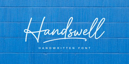 Handswell is a handwritten font with a natural and unique style that makes for an attractive and elegant design project. It is perfect for branding, business cards, clothing, quotes, logos, and more!
 - Reactor Sans - 100% free

- Sector 017 - 100% free

- Ines - 100% free

- Future Brake - 100% free

- Pullchain Bold - Personal use only

- Prometheus (Basic Set) - 100% free


