10,000 search results
(0.19 seconds)
- Flomic by Sergey Melnikov,
$24.00 Ukrainian type designer Melnikov Sergey created Flomic font between 2015 and 2016. Flomic is a geometric sans built from a folded lines. Most effective when used in short words or phrases at larger sizes, where the details can be appreciated.
 - Highrise by Michael Hill Design,
$6.00Highrise is a sans serif typeface inspired by tall industrial structures. Works great as both bodycopy and logotype, as the lowercase is clear and concise, but the statuesque caps letters can grab full attention. Available in Regular, Light and Bold. - Fairway by Alan Meeks,
$45.00 The thinking behind Fairway was to create a relatively conventional soft sans with a certain amount of movement at the top of the x-height line. The face is casual and quirky but can still be used as a text face.
 - Rockaway JNL by Jeff Levine,
$29.00The look of hand lettering often breaks up the monotony of the printed page. Rockaway JNL from Jeff Levine is a big, friendly sans serif that can give more of a human touch to your upcoming project without looking too informal. - Gavuel by Amera Type,
$15.00 Introducing Gavuel font with a unique, bold and wide sans serif look. The carefully crafted nodes and each line can create a luxurious look for high-level graphic branding Gavuel will be a perfect choice for labels, packages, covers, headlines, etc
 - Black Rovers by Pandanwangi,
$16.00 Black Rovers is a striking sans serif font with a bold and modern charm. It will add a touch of minimalism to any design project. If there is anything you need to ask, you can contact me at suratnokang@gmail.com
 - Colabero by Motokiwo,
$17.00 Colabero is a minimal and neat sans serif font. It can easily be matched to an incredibly large set of projects, so add it to your creative ideas and notice how it makes them stand out! Only Upper case characters.
 - Mandau by Yukita Creative,
$9.00 The Mandau Sans Serif Grotesk font is a typeface that has a modern and minimalist design. Inspired by typography styles that were popular in the 20th century, Mandau Sans Serif Grotesk has clean, bold lines, making it easy to read and perfect for a variety of graphic design purposes. Mandau Sans Serif Grotesk has distinctive characteristics, such as firm thin lines and strong thick lines, as well as very geometric letter shapes. The color of this font tends to be monochromatic, so it is suitable for use in minimalist and modern designs. Overall, Mandau Sans Serif Grotesk is a very flexible font suitable for a variety of design purposes. With a modern and minimalist design, this font can give your design a professional and elegant impression.
 - Linotype Vision by Linotype,
$29.99Linotype Vision is part of the Take Type Library, chosen from the entries of the Linotype-sponsored International Digital Type Design Contests of 1994 and 1997. Created by German designer Dan-André Neimeyer, the font contains five weights. The characters look as though they are constructed of fragments fitted only loosely together. Just enough of each character is put onto paper so that the eye of the reader can complete the conventional form. Based loosely on sans serif forms, the font has a futuristic, mathematical feel. Linotype Vision is exclusively for headlines in point sizes of 18 and larger. - Felabra by Keristyper Studio,
$14.00 Felabra adalah font kontemporer dengan kurva terhubung yang menyenangkan, memberikan nuansa unik tetapi juga bisa modern dan memukau. This font is good for logo design, Social media, Movie Titles, Books Titles, short text even long text letters, and good for your secondary text font with sans or serif. Featured: Standard Uppercase & Lowercase Numeral & Punctuation Multilingual : ä ö ü Ä Ö Ü ß ¿ ¡ Alternate & Ligature PUA encoded We recommend programs that support the OpenType feature and the Glyphs panel such as Adobe applications or Corel Draw. so you can use all the variations of the glyphs. Hope you enjoy our fonts!
 - Fairplex by Emigre,
$49.00 Zuzana Licko's goal for Fairplex was to create a text face which would achieve legibility by avoiding contrast, especially in the Book weight. As a result of its low contrast, the Fairplex Book weight is somewhat reminiscent of a sans serif, yet the slight serifs preserve the recognition of serif letterforms. When creating the accompanying weights, the challenge was to balance the contrast and stem weight with the serifs. To provide a comprehensive family, Licko wanted the boldest weight to be quite heavy. This meant that the "Black" weight would need more contrast than the Book weight in order to avoid clogging up. But harmonizing the serifs proved difficult. The initial serif treatments she tried didn't stand up to the robust character of the Black weight. Several months passed without much progress, and then one evening she attended a talk by Alastair Johnston on his book "Alphabets to Order," a survey of nineteenth century type specimens. Johnston pointed out that slab serifs (also known as "Egyptians") are really more of a variation on sans serifs than on serif designs. In other words, slab serif type is more akin to sans-serif type with serifs added on than it is to a version of serif type. This sparked the idea that the solution to her serif problem for Fairplex Black might be a slab serif treatment. After all, the Book weight already shared features of sans-serif types. Shortly after this came the idea to angle the serifs. This was suggested by her husband, and was probably conjured up from his years of subconscious assimilation of the S. F. Giants logo while watching baseball, and reinforced by a similar serif treatment in John Downer's recent Council typeface design. The angled serifs added visual interest to the otherwise austere slab serifs. The intermediate weights were then derived by interpolating the Book and Black, with the exception of several characters, such as the "n," which required specially designed features to avoid collisions of serifs, and to yield a pleasing weight balance. A range of weights was interpolated before deciding on the Medium and Bold weights.
 - Al Stagen by Aluyeah Studio,
$120.00 Stagen is a cloth with a length ranging from 5-10 meters and a width of about 15 cm which is usually used by traditional Javanese women as part of the traditional kebaya dress. The stagen is wrapped around the stomach to help maintain posture and "lock" the jarik cloth on the kebaya. Stagen existed before World War II in Indonesia and became an elegance in the harsh world at that time. Inspired by the rich culture, Stagen is a modern sans serif typeface that has an upright and sturdy impression, with unique curves in it. A simple, yet distinctive, elegant font that can be applied to many areas of design. Coming with 130+ stunning and super easy to use alternates and ligatures. Very suitable for magazine, headline, website, ads, product package and all type of design project you have. Features: OpenType support Multilingual support (15 languages) PUA Encoded Super Easy to Use alternates - It's OpenType support but you can easly call alternates character using special combination like A.2 R.3 L.A L.a etc so you don't need special software. To get results like the preview just type Sta.gen.
 - The Hohoho by Avchi,
$12.00 Tho Hohoho is a font specially designed for christmas purposes. This font is a condensed sans serif, have a round corner, and have a happy concept. The main target is for Christmas design, but can be use for another purposes such as kitchen, nature, and other. This Font Include : Ligatures Latin Numbers & Punctuation We wish this font can bring customers to happiness.
 - Aligant by Malgorzata Bartosik,
$29.00 Aligant is very fancy and rich sans serif typeface. It's perfect for graphic design of luxury products - fashion, jewelry, cars, cosmetics, entertainment, food, furniture. It contains diacritics from Western, Central and South Eastern Europe. It can be used especially as a display, but also as a body text. Aligant is both classic and modern, so it can be widely used.
 - Beiko Heavy by Minor Praxis,
$20.00 A heavy font made by Minor Praxis. Inspired by blocks toy design. Ideal use for headlines, medium and large prints format, displays, and posters. Built by a quite heavy structure and dense kern which can make a hefty and solid impression. It can be matched with basic sans serif fonts as a body copy. Available in 4 styles with multi languages support.
 - Lequire by Sarid Ezra,
$13.00 Introducing, Lequire - Modern logo typeface! Lequire is a sans based font with unique lowercase that will make your design looks hi-tech and modern. You can use this font for any purpose, especially to make logotype. You can mix and match the uppercase and lowercase to make your logo more readable. This font also comes with outline style! Happy Creating!
 - Queenlery by Letterara,
$21.00 Queenlery is an elegant, wavy, and delicate sans serif font. It features a classy look that can be used for logos, branding, poster, advertising, promotion, invitations, stationery, wedding designs, social media posts, and much more! Have fun with this cool font and explore its endless variations. This font is PUA encoded which means you can access all of the glyphs.
 - Asgardian by Letterara,
$16.00 Asgardian is a minimal and modern sans serif font. It can easily be matched to an incredibly large set of projects, so add it to your creative ideas and notice how it makes them stand out! Have fun with this cool font and explore its endless variations. This font is PUA encoded which means you can access all of the glyphs.
 - Crypton by Type Innovations,
$39.00 Crypton is a modern geometric design by Alex Kaczun. It’s an alternate style variation based on his popular Contax Pro family of fonts. The look is clean, smart and sophisticated—the chiseled end strokes reflect the rage of the 1980s; lettering that represented something to do with electronics, computers and outer space. It’s a futuristic sans-serif exploration of shape and form. This display font is not intended for text use. It was designed specifically for display headlines, logotype, branding and similar applications. The entire font has an original look which is strong and dynamic—it can be widely used in publications and advertising. Crypton is a futuristic, techno-looking and expressive typeface with the appearance of machined-like parts—round geometric shapes and sharp edges. This attractive display comes in roman with lower case and lining figures. The large Pro font character set supports most Central European and many Eastern European languages.
 - FF Mutual by FontFont,
$50.99 FF Mutual is a friendly geometric sans serif full of subtle, unexpected details. Designer Luis Bandovas drew inspiration from an unlikely source—the credits from one of his favorite childhood shows, Space 1999—and turned that spark into a typeface that is warm and approachable, but contemporary. Bandovas built FF Mutual on a geometric skeleton, but the typeface has enough humanist touches to offset the rigidity usually found geometric designs. These touches are most apparent in the italics, where curved strokes on the “a” and “l” bring a softness to text. Generous spacing, angular details on letters like the “r” and “t,” and flared terminals on the “e,” “s,” and “c,” add further character to the design. FF Mutual’s bold shapes and retro-inspired warmth make it ideal for headlines, where the subtle details can really shine. The typeface is similarly well-suited for small blocks of text such as captions and call-outs, packaging design, and branding.
 - Hejira by Sudtipos,
$49.00 Hejira means “rupture” and this concept was the primary principle that guided the creation of this typeface: to escape conventions and take up the challenge of designing letters with an unusual and fresh approach. Unlike traditional typefaces, each member of this somewhat atypical family has its own distinct personality and formal features. A thin, spiky font that looks like its sharp serifs could pierce through. A more experimental sibling, based on the same skeleton but taken to the extreme, that is best suited to setting big titles. An odd-one-out, sans-serif style whose shapes mimic those generated by the movement of a calligraphic pen. And a quirky fat-face with a flair for combining round curves with pointy elements. Regardless of how different they may be, all four styles feel part of the same system and can be used alongside each other seamlessly. The Hejira set includes multiple ligatures and supports a wide variety of Latin alphabet-based languages.
 - Halogen Slab by Positype,
$29.00 When I released Halogen, I asked ‘Who doesn't want or need an expansive contemporary extended sans that has a sense of style and swagger… what if it had a lowercase, small caps and various numeral options… how could you say no?’ Go, click on the Halogen link and read on, if you're interested. Halogen was well-received, so I decided to take it further with Halogen Slab (the name kinda tips you off as to what kind of typeface it is, don't ya think?). As always, I prefer not to take short cuts and provide an anemic offering of glyphs — a modern typeface offered today must provide more than just the basics and this one does — lowercase, smallcaps, old style numerals, tabular forms, stylistic and titling alternates, fractions, case-sensitive features, and even an alternate uppercase ordinal set is included. Now go make cool print and digital things with it, and share them with me.
 - Rotundus by dayflash,
$35.99 Rotundus is an elegant sans serif typeface based on geometric shapes. Precise lines and accurate curves with sharp corners are the main characteristics of this fresh and modern font family. While unconventional letterforms give Rotundus its distinctive appearance, a tall x-height and a condensed width provide good legibility and nice readability even at smaller sizes. With its contemporary feel, Rotundus is suitable for almost any type of analogue and digital application. A rounded sibling of Rotundus is available as Rotundus Rounded. The Rotundus font family includes unique letterforms, exclusive ligatures and extensive OpenType features. Rotundus comes in six weights with matching italics.
 - Fregan by Seniors Studio,
$15.00 Fregan Typeface is sharp serif font with an elegant feel. Unique character by combining geometric shapes with organic curvy details. It is a unique typeface for your individual personality. Inspired by old-style serif and contemporary fonts. And additional Fregan Sans, working in harmony with Fregan Serif to create typography awesome creations. Perfectly for elegant branding, magazine design, logo design, headlines, posters, packaging, cards or your wedding invitation and more. 4 styles: Regular and Bold Latin based languages. OpenType features, including ligatures. OTF files. If you need help or advice, please contact me by e-mail "seniorsstudio@gmail.com" Thank you!
 - Befrung by IbraCreative,
$17.00 Berfung is an elegant and commanding black condensed sans-serif font that exudes a sense of modern sophistication. With its tall, slender letterforms, this typeface makes a bold statement, offering a perfect balance between space efficiency and visual impact. The even stroke width and sharp edges contribute to its contemporary aesthetic, while the condensed design allows for efficient use of space, making it ideal for impactful headlines, striking signage, and sleek branding applications. Berfung’s distinctive presence and streamlined structure make it a versatile choice for design projects that demand a refined, edgy, and space-conscious typographic solution.
 - dT Ampla by dooType,
$35.00 dT Ampla shares many characteristics of the versatile sans typefaces of today: nice range of five weights with matching italics, 40+ supported languages, contemporary upper-to-lowercase proportions and impeccable performance in big and text sizes. However, all these features are designed with distinct shapes and details. Notice the angled terminals – the cut at the end of the strokes – or how the vertical strokes in the italics seem to 'bend' a little, for instance. The sum of these and many more design decisions result in a typeface capable of delivering a strong presence to sites, interfaces, apps, magazines and corporate graphic language.
 - Calps by Typesketchbook,
$55.00 Calps is a condensed sans serif font. An unfussy design, the font is designed to be consistent across such letters as a, b, d, q, p, g and C, G, O, Q, creating a uniformity for the set. Each corner of the line is carved to decrease its sharpness, adding a touch of friendliness. If the standard font is not sufficiently condensed, there is a slim variation offering narrower proportions. In addition to the slim variation, the font also comes in roman and italic versions in 9 weights, offering a total of 36 variations for the font.
 - Redtone by 38-lineart,
$19.00 Redtone is a Geometric Sans serif font family, a combination of straight lines and perfect circles and sharp edges. this geometric typeface is perfect for every display. This font has 14 fonts consisting of 7 weight from thin to bold with matching oblique. Redtone fonts have an extended character set to support Central and Eastern European as well as Western European languages. This font is a great choice for logo, packaging, greeting cards, presentations, headlines, lettering, posters, branding, quotes, titles, magazines, headings, web layouts, mobile applications, art quote, typography, advertising, invitations, packaging design, books, book title and more.
 - Sommet by insigne,
$24.99 Project a powerful image with Sommet. Sommet is a sans-serif with a high-tech web 2.0 feel. The typeface family is a powerful and sharp design that is highly legible onscreen even at small sizes. Sommet features a tall x-height, and its letterforms are compressed, perfect for when layout space is at a premium. Updated in early 2010, the Sommet family now includes six weights and italics for plenty of design options and is suitable for body copy and display text. Be sure to check out Sommet’s companion faces, Sommet Rounded and Sommet Slab.
 - Lark by Shana Hu,
$20.00 Lark is a modern calligraphic sans inspired by a rich history of broad-edge and translation contrast calligraphy. By combining its sharp geometry with flared curves, Lark exhibits a nice warmth as a display face. Lark was initially conceived as a final project as part of the Type@Cooper West Extended Program's post-graduate certificate program in typeface design, so its journey has benefitted from routine feedback from experienced typeface designers. Comes in Bold, Medium, Regular, and Light weights for both roman and italic, and supports multiple languages including Danish, Dutch, English, French, German, Italian, Portuguese, Spanish, Swedish, and more.
 - Kapra Neue Pro by Typoforge Studio,
$39.00 Kapra Neue Pro is a younger sister of Kapra Neue – he was the #1 bestselling Grotesque Sans released in 2017 on MyFonts and grandson of Kapra. Now you really have a lot of options to choose! New family is full of everything – 96 weights contain a wide range of instances, from Condensed to Expanded, everything with rounded corners or with sharp ones. Now, font has also: small caps, cyrillic script, and old-style figures. Kapra Neue Pro is inspired by a “You And Me Monthly” magazine, published by National Magazines Publisher RSW "Prasa” in Poland, from May 1960 till December 1973.
 - Belligan by Orenari,
$16.00 Belligan is rounded sans serif which looks calm, feminine yet elegant. Belligan is perfect for your next project, if your project is decided to be simple, modern, clean, and professional touch. Belligan Features: - All Character A-Z, a-z, numeral & punctuation. - Ligatures (BB, CC, DD, EE, FF, GG, LL, MM, NN, OO, PP, RR, SS, TT, Th, ZZ, bb, cc, dd, ee, ff, fi, gg, ll, mm, nn, oo, pp, rr, ss, tt, ti, zz) - Multilingual Support. Oh, and please don't hesitate to drop me a message if you have any questions or you wanna share some jokes! :) Thank You, Ari
 - Tapas by Fenotype,
$20.00 Tapas is a delicious multi type family with a little something for everyone's tastes and needs. The family consists of four distinct members that share same traits but communicate different aspects. Together they’ll create a bold and effortless mix of various flavors and accents. Naturally, the fonts can be used individually too. Use the Tapas type family in packaging, branding or editorial – wherever some delicious flavors are needed.
 - Blooming Valerian by Letterhanna Studio,
$19.00 Blooming Valerian is a thin handwritten calligraphy font with beautiful curves, the slightly wide spacing makes this font look very elegant. Blooming Valerian is a romantic and sweet calligraphy typeface with characters that dance along the baseline. It will add a luxury spark to any design project that you wish to create! This font is PUA encoded which means you can access all of the amazing glyphs and ligatures with ease!
 - Bornholm Sandvig by Trine Rask,
$25.00 Bornholm Sandvig is named after the village, "Sandvig", on the only rocky island in Denmark, Bornholm. It is the second face in a series of rough stone cut typefaces, that shares proportions, but differs in any other aspect like different pieces of rock. It is a powerful face, but still very friendly. Good for very big sizes, but can be used for small texts, movie titles, cartoons, etc.
 - Horror Night by Mvmet,
$12.00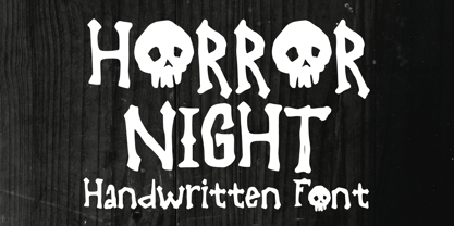 Horror Night is a very cool bones and skeleton horror display font. It will be perfect for your horror and Halloween-themed needs! You can use it for anything ranging from t-shirts and clothing, to your scary book designs, Halloween party needs, greeting cards, stickers, posters, banners, or anything that needs a horror touch. Try it to create fabulous designs and feel the horror and Halloween vibes with it!
 - Zafrada by Pedroglifos,
$12.00 Zafrada features classic wedge serifs that can be sharp like a machete or round like molasses. Inspired in the sugar cane, this typeface brings great display legibility with versatile expressions. While the edgy version reminds us of classical rustic grotesk typefaces, the round version brightness the tone considerably. Be it display, branding, campaigns or content creation, this font has a sure space in many projects for it's reliable and versatile nature.
 - Fancyou by Asenbayu,
$15.00 Fancyou is a classy vintage-inspired serif typeface with modern proportions consisting of 8 styles. Fancyou fonts are characterized by sharp serifs that bring a fashionable feel. You can use these fonts in modern vintage designs. These fonts are perfect for many projects such as logos, branding identity, magazines, business cards, posters, websites and many more. Fancyou fonts feature: Kerning, Ligature Style, Alternative Style, Numeral, Symbol and Multiple Languages Supported
 - Bornholm Tejn by Trine Rask,
$25.00 Bornholm Tejn is named after the Tejn village on the only rocky island in Denmark, Bornholm. It is the first face in a series of rough stone cut typefaces, that shares proportions, but differs in any other aspect like different pieces of rock. It is powerful face, but still very friendly. Good for very big sizes, but can be used for small texts, movie titles, cartoons and more.
 - Winterante by Aldedesign,
$25.00 Winterante is a beautiful and light handwritten font with a unique feel and a stunning impact. It will add a luxury spark to any design project that you wish to create! This font is PUA encoded which means you can access all of the amazing glyphs and ligatures with ease! Each Font Has: Stylish modern handwritten script Beautiful Swash (Ending tail) Beautiful Titling (Beginning tail) Special Ligatures Multilingual Support