10,000 search results
(0.048 seconds)
- Showcard Multiline JNL by Jeff Levine,
$29.00 On page 45 of Samuel Welo’s 1930 instructional book “Lettering Practical and Foreign” is a multi-line alphabet of Art Deco elegance that perfectly captures the spirit of the Streamline era. The digital version is available as Showcard Multiline JNL in both regular and oblique versions.
 - Zagora by CastleType,
$19.00 Based on an art deco design, with alternate characters and numerals. Named for a little town in Morocco on the border of the Sahara desert, with a billboard at the edge of a great expanse of sand that points the way to Timbuktu (several days by camel).
 - Fashion Statement JNL by Jeff Levine,
$29.00 An example of hand lettering from a vintage instructional book was the basis for Fashion Statement JNL; available in both regular and oblique versions. This extra-wide "thick and thin" design is perfect for replicating the classic signage and print work of the Art Deco era.
 - Persia BT by Bitstream,
$50.99Masoud Nejabati has drawn upon his capable calligraphic skills to create this typeface. Persia represents his first latin-based design. This gentle and finely rendered script reveals Nejabati's extensive background in Islamic calligraphic art. The slight back slant further enhances the appearance of hand-scribed pen calligraphy. - Streamlined Stencil JNL by Jeff Levine,
$29.00 Streamlined Stencil JNL is based on a photo of an Art Deco era shipping stencil saying "With Care" which was heavily influenced by the Futura Black style of lettering. The image was seen in the Steven Heller-Louise Fili book "Stencil Type" (published by Thames and Hudson).
 - Sleuth JNL by Jeff Levine,
$29.00 The movie trailer for the1936 film "After the Thin Man" is filled with text lettered in this classic Art Deco condensed typeface. Sleuth JNL seems the appropriate name for this digital revival, as the romantic comedy centers around detective Nick Charles' and his wife Nora's adventures.
 - Edangu by Twinletter,
$15.00 Edangu Arabic display font is a new typeface inspired by the oriental fonts used in Arabic calligraphy and other Middle Eastern architectural features. This font features a Kufic version that has beautiful and neatly arranged shapes. This font will make your design elegant, especially designs that carry the middle eastern theme.
 - Ephemera Shoemakers by Ephemera Fonts,
$30.00 Ephemera Shoemakers is a bold font with spurred serif & medium contrasted, vintage inspiration with letters in all caps. Traditionally this type of decorative font that emerged in Italy, France & England in the nineteenth century were used in large headlines and posters that were closely related to circus shows, carnival or environments of the Far West American. Perfect for signs, posters, handbills and other large format advertising. Ephemera Shoemakers Pdf Specimens
 - Tessie Letters by Ingrimayne Type,
$8.00 A tessellation is a shape that can be used to completely fill the plane—simple examples are isosceles triangles, squares, and hexagons. Tessellation patterns are eye-catching and visually appealing, which is the reason that they have long been popular in a variety of decorative situations, such as quilting. The TessieLetters fonts contain letter shapes that can be used to construct tessellation patterns. Each family has two styles, an outline style and a filled or black style. The black style can be used to construct colored patterns. To see how patterns can be constructed, see the files here for TessieLettersACE, TessieLettersFQ, TessieLettersGJKMN, TessieLettersLL, TessieLettersTT, TessieLettersOSZ, and TessieLettersSingles. Many or these patterns were discovered/created by the font designer during the past twenty years in the process of designing maze books, coloring books, and a book about tessellations. The TessieLetters are picture or dingbat fonts. For fonts of tessellating letter shapes that can be used for text, see the Tescellations family.
 - Alacrity Sans by Asenbayu,
$10.00 Alacrity Sans Fonts are modern multipurpose family fonts with sophisticated geometric shapes. You can use them in modern sophisticated design. These fonts are perfect for your various projects such: logo and brand identity, journal, business cards, web, stationary, display, sport product, technology and more. Alacrity Sans fonts feature opentype, kerning, and alternates packed in 10 fonts. Alacrity Sans fonts include uppercase letters, lowercase letters, numeral, punctuation and multilingual support.
 - Vicentina by Eurotypo,
$39.00 Vicentina has been created starting from gothic cursive calligraphy, widely used in Italy during XIV century. The ductus of Vicentina has been derived from the documents redacted by Master Domenico Dominici from Vicenza, while most of the inspiration comes from books preserved in the archives of Orvieto Cathedral (Archivi dell'Opera del Duomo di Orvieto). As a result, Vicentina takes form with an elegant, but fast and simplified ductus respect to gothic graphs, rich in ligatures and with over 400 OpenType glyphs, in perfect harmony with the rules of readability of a modern typeface.
 - Rahere Informal by ULGA Type,
$18.99 Rahere Informal is a slab semi-serif typeface that has a seriously charming personality and a little spring in its step. Serifs bend and flick, giving the characters a spirited, almost calligraphic feel. It's lively and friendly without being whimsical, great for messages that need a casual but credible tone with a bit of zing in the mix. Rahere Informal is suitable for a wide range of applications such as information signage, packaging, advertising, brochures, catalogues, screen text, visual identities and opera festivals. Want an annual report that pleases the board, shareholders and investors? Set it in Rahere Informal - that’ll put a smile on everyone’s face. The family comes in six weights from light to extra bold with corresponding italics. The lighter weights are more delicate, an evenly-spaced flamboyance of flamingos basking in the sun. As the weights get heavier, characters transform into a tight-knit group of line dancing rhinos. All styles contain a set of swash caps, a few ligatures and alternatives. Nice. The character set covers most European languages plus Vietnamese. Each weight contains lining & non-aligning numerals in both proportional & tabular spacing. The tabular numerals share the same width across all weights and styles (matching Rahere Sans and Rahere Slab). If a companion sans serif is needed, Rahere Sans is the ideal partner. They are both part of the extended Rahere typeface family and have been designed to complement each other. Seriously charming, charmingly serious. Seriously, what more do you want from a typeface? Rahere, founder of St Barts in London The typeface is named after Rahere, a 12th-century Anglo-Norman priest, who founded the Priory of the Hospital of St Bartholomew, London in 1123. In 2007 I was successfully treated at Barts for relapsed testicular cancer so I’m indebted to all the doctors, nurses and support staff who work there. A special shout out to Orchid Cancer – a UK charity that helps men affected by cancer – who funded the research for my treatment.
 - Kindly by Up Up Creative,
$16.00 Introducing Kindly, a friendly, hand-drawn, all-caps font with tons of symbols, wingdings, and word art. I’ve been developing this style of lettering for years in my custom design and lettering work, and now I’ve taken the time to turn it into something anyone can use to design with authentic, hand-drawn typography. Kindly is perfect for invitations, design for children, branding, and editorial design and comes with more than 100 extra elements to bring some fun to your layouts. Kindly comes with 504 glyphs and a smattering of OpenType features, including stylistic sets, character variants, and multilingual support (including multiple currency symbols). The OpenType features can be very easily accessed by using OpenType-savvy programs such as Adobe Illustrator and Adobe InDesign. (To access these awesome features in Microsoft Word, you'll need to get comfortable with the advanced tab of Word's font menu. If you need help with this, ask me!) The wingdings, word art, and other fun elements are all PUA-encoded so you can easily use them in OpenType-savvy software or with a character map.
 - Contribute by Fontscafe,
$39.00 The Contribute font is one that takes you back to the days of the fountain pen. To those who are old enough to remember, fountain pens were tiresome to fill and use – but also a pleasure to own, something to cherish that became so much a part of your daily life, a symbol of etiquette and sometimes even a style statement! Our Contribute fonts will definitely remind you of that, and everything else to do with a touch of vintage class. This 30s-like font is sure to become one of your favorite cursive fonts, be it for use on a poster or a web page. This font is ideal for those situations where you need your viewer to connect on a more personal level than formal. Think ‘writing a letter rather than typing it out’, and you will know what we mean!
 - Yolien by Reyrey Blue Std,
$16.00 Introducing, Yolien Font. A retro, cute, and modern inspired by the flowy freeform lettering of the '60s and '70s. This font has a unique shape where every corner is smoother and more rounded. Every curve is designed based on an authentic and natural style. Yolien is perfectly suitable for a layout design for quotes or body copy, best used as a display for headings, logos, branding, magazines, product packaging, invitations: logotypes, and much more.
 - Monteci by Pista Mova,
$14.00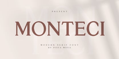 Monteci is a modern display serif font. Minimalist and classic typefaces are suitable for logos, quotes, branding, or editorial designs. Monteci has a unique character by combining geometric shapes with organic curved details. This is a unique typeface for your personality. This font is PUA encoded which means you can access all of the amazing glyphs and ligatures with ease! Feel free to contact us if you have any questions :) Thank you!
 - Infectious Halloween by Ardyanatypes,
$20.00 Infectious is a Halloween themed font with unique shapes that invite curiosity. Each letter is inspired by ancient magical symbols, with sharp strokes and curved lines that create a mysterious atmosphere. The font is not only visually appealing, but also interactive thanks to its advanced OpenType feature. Users can combine letters, slashes, and ligatures to create creative and unexpected looks. Features: A – Z Character Set a – z Characters set Numerals & Punctuations OpenType Multilingual
 - Umba Sans by TypeThis!Studio,
$29.00 UMBA Sans is a contemporary typeface designed by Anita Jürgeleit. The wide shaped curves show a new aesthetic appeal in an unexpected pleasant way. Umba Sans fulfills your corporate design needs as well as your editorial demands and helps to push your design to the next level. Thirty styles from thin to bold and matching italics - as well as small caps and alternates - help you create a contemporary design. Umba Sans provides a wide range of variations. Your design may have many faces but it all matches together. Separate styles for alternate and small caps will show up in your font menu, making sure that you stay aware of the wide range of possibilities your new favourite typeface provides. If you like our fonts, you might want to sign up at: www.typethis.studio
 - Analogue Pro by Ingo,
$42.00 very traditional forms strongly slanted italic consistant proportions extraordinary ligatures swashes alternate letters alternate figures lower case l with a hooked “foot” Believe it or not, there are hardly any sans serif fonts in which the lower case letter l also has the hooked form of an l. Instead, we readers have to constantly distinguish whether we are seeing an uppercase I or a lower case l — just take a look at the word “Illinois”... The ingoFont Analogue was developed for exactly this reason. The intent: To create a pretty much »ordinary«, even classical font with its most striking characteristic being the inclusion of the “crooked l.” As a model, I used the »mother of all sans serifs«, Akzidenz Grotesk from Berthold, with its beginnings going back to the 19th century. Analogue is so to say a new interpretation of Akzidenz Grotesk from ingoFonts. All characters — following the model — have been newly designed. And if you want to emphasize the shape of the hooked foot even more, you can also activate the alternate styles for d, h, m, n (Style Set 1). Conversely, the alternate a somewhat softens the “hooked” impression (Style Set 2). The slanted versions — it isn’t truly a real cursive font — are noticeably stronger with 13° than the italics in comparable fonts, and were given a round e with a mind of its own which distinguishes itself considerably compared to the upright characters in the overall appearance of the font. More modern and formal solutions in detail were chosen for some of the characters, for example the M was given lightly slanted sides; the a reflects the curves of the s; the “feet” of a, l and t match; the flared legs of K and R became a “foot”, too. General proportions were carried over almost completely with no changes from Akzidenz Grotesk as well as the slanted trimming on the open forms of a, c, e, s; in comparison, C, G and S were given straight endings. Analogue contains many ligatures, even discretional ligatures, plus proportional, old style as well as tabular figures. All in all, at first sight Analogue brings back memories of the charm of its well-known predecessor; and yet, many small differences give Analogue an unmistakable certain something...
 - Magnesit Stencil by Rekord,
$22.00 Sporty and brawly, Magnesit Stencil creates impact everywhere it lands. Impressive headlines are its specialty, but it feels right at home used in packaging, branding and poster design. With a very tall x-height, wide language support and minimalistic yet playful appearance, it can take on any serious typographic job. Four distinct styles expand the possibilites even further: the straight to the point Regular, the friendly Soft and the determined Hard styles share metrics across related Magnesit and Magnesit Dark families, so you can mix and match to achieve exactly the effect you need. The SuperSoft style unique to the Magnesit Stencil family carries the concept to the extreme, mixing soft organic curves with rigid modularity inherent to stencil signage. Magnesit Stencil works great with illustrations, the generous shapes can be easily filled with strong imagery to great effect. Based on the best-selling Grim, Magnesit is a vast improvement of the concept with long awaited addition of lowercase, reworked proportions, spacing and kerning, expanded language support and useful icons to satisfy even the most demanding typographers’ needs.
 - Neo Tech by Monotype,
$29.00 Neo Sans began as an intriguing assignment from a branding agency. The agency’s client wanted an “ultra modern” type family that was "futuristic without being gimmicky or ephemeral.” When a bureaucratic decision cancelled the project, Monotype staff designer Sebastian Lester decided to finish the design on his own. “I was left with a sketchbook full of ideas,” he said, “and thought it would be a shame not to see what came of them.” Lester decided that the principal ingredient of an "ultra modern" typeface was simplicity of character structure: a carefully drawn, monoline form, open letter shapes and smooth, strong curves. By further amplifying these qualities, he crossed the line from modern to futuristic. Two highly functional and versatile typefaces emerged. These are Neo Sans and Neo Tech, designs Lester describes as "legible without being neutral, nuanced without being fussy, and expressive without being distracting." Both the Neo Sans and the more minimalist Neo Tech families are available in six weights, ranging from Light to Ultra, with companion italics. Neo Tech offers a suite of alternate characters.
 - Module 4-4 by Sébastien Truchet,
$40.00 Sébastien Truchet designed a modular typographic system during his last year in the School of Fine Arts of Besançon. The system is made of a unique grid and 6 modules which are the components to build several typefaces. The most radical is the "2-2". The last one is the "10-12". This is the 4-4. It is built into a square grid. Four modules in width and in height. This font proposes to you two appearances : the caps are blackest and the small letters are more open.
 - Chankbats by Chank,
$39.00Chankbats are the original hand-drawn illustrations of artist Chank Diesel. Insert these nifty little doodles into your layouts when you feel an illustrator's touch would add personality to your designs. Or when you want a nice little horsie picture to break up the grayness of a long text passage. Or get yourself a tattoo. We trust you'll come up with a clever use for these whimsical, folk art drawings. The fonts in this family come in 4 varieties in cross-platform OpenType format for both Mac & Windows. - College Nouveau JNL by Jeff Levine,
$29.00 By the late 1920s, lettering and design had already begun to feel the influences of what would become the Art Deco Movement. The sheet music for the 1927 song "Without You Sweetheart" had its title hand lettered in a block style letter with rounded corners – with the exception of the 'S' and 'R' in "Sweetheart"; reflecting design elements of both styles. For consistency, those letters were changed to fit the rest of the design, and the result is the digital font College Nouveau JNL, available in both regular and oblique versions.
 - Scratchman by ZetDesign,
$15.00 Scratchman is a serif type font that has been scribbled by hand to present a neat text while still producing a natural and familiar look. thus this font can be an alternative for any designer who wants a different and unique look. This font is very suitable for use in the work of posters, t-shirts, comics, cartoons, doodle art, grafitty, flyers, etc. This font has two styles, regular and italic which are equipped with the open type feature. enjoy your font ...!
 - Lost Arcade by Chris Rogers Fonts and Symbols,
$19.00 Are you a game developer, retro enthusiast or lover of pixel art? Ever had trouble tracking down an 8-bit display font that's classy, coherent and truly complete? This type enthusiast and veteran pixel artist once had the same problem, and cut no corners to solve it. Lost Arcade features four styles, a myriad of special characters, broad language support and an accompanying symbol font with 64 pixel art symbols. For the purists out there, each square is proportional to its neighbor.
 - Flox by ParaType,
$30.00 Flox display typeface was designed in 2000 by Vladimir Pavlikov. Cyrillic was developed in 2005. The project was aimed to create a decorative vivid alphabet of geometric shapes. For use in advertising and display typography. Licensed by ParaType in 2005.
 - Kuzanyan by ParaType,
$30.00 The hand composition typeface was created at Polygraphmash type design bureau in 1959 by a well-known Soviet book and type designer Pavel Kuzanyan (1901-1992). It was reproduced in the 1960s for slugcasting and machine display composition. Sharp contrast, strong weight, slightly condensed Modern Serif with calligraphic elements. The typeface is useful in text and display composition, in scientific, fiction and art books. The revised and completed digital version was designed at ParaType in 2002 by Lyubov Kuznetsova.
 - Neva by ParaType,
$30.00 Neva Regular with Italic was created by Moscow book and type designer Pavel Kuzanyan (1901-1992) at Polygrafmash in 1970 for slugcasting and display composition. Based on simple strict letterforms of Russian classical typefaces. Neva typeface was rewarded on the Gutenberg international type design contest in 1971 (Leipzig). The typeface is useful in text and display composition, in fiction and art books. The digital version and bold styles were designed for ParaType in 2002 by Lyubov Kuznetsova.
 - Serif Sketch by Cititype,
$14.00 Serif Sketch simplifies elegance into one truly outstanding display font. Whether you’re looking for fonts for Instagram or calligraphy scripts for DIY projects, this font will turn any creative idea into a true piece of art!
 - Futuristic by WAP Type,
$10.00 Futuristic is modern display font with an incredibly futuristic feel. Whether you’re looking for fonts for Instagram or calligraphy scripts for DIY projects, this font will turn any creative idea into a true piece of art!
 - Gray Light by Ali Hamidi,
$10.00 Gray Light is a fun and friendly brushed display font. Whether you’re looking for fonts for Instagram or calligraphy scripts for DIY projects, this font will turn any creative idea into a true piece of art!
 - Postmodern Moderne by Jeff Levine,
$29.00 First published in 1938, Letters and Lettering by Paul Carlyle and Guy Loring was a textbook on lettering examples and how to do them. On one of the pages was found a solid black (counterless) Art Deco sans serif design that in its many variations so typified the era. The example shown in that book served as the model for Postmodern Moderne JNL, which is available in both regular and oblique versions.
 - Allay by Twinletter,
$15.00 Allay is a display font with a distinctive and appealing shape that may be used in a wide range of creative design projects. Each letter shape is created using a variety of combinations that provide a one-of-a-kind, innovative, entertaining, and unmistakably aesthetic impression when used. This typeface also comes with typical ligatures and can be used in other languages. This font is perfect for games, sporting events, branding, banners, posters, movie titles, book titles, quotes, logotypes, and more. of course, your various design projects will be perfect and extraordinary if you use this font because this font is equipped with a complimentary font family, both for titles and subtitles and sentence text, start using our fonts for your amazing projects.
 - Monograph by Pelavin Fonts,
$25.00 Monograph conjures ancient typewriters, telephone switchboards, vintage office machines past visions of the future. As though it were drawn with the rounded nib a of a Speedball "B" style pen, the soft curves and rounded serifs speak of a gentler less complicated time. It is nuanced with traces of the Arts and Crafts movement at the turn of the 20th Century which stressed craftsmanship and preserving and emphasizing the qualities of construction and materials.
 - Ardoise Std by Typofonderie,
$59.00 A straightforward sanserif in 20 fonts, 4 widths Ardoise met the needs of publications. By extension, it met the needs of a newpapers typeface featuring a low contrast, straightforward forms, as Franklin Gothic. The verticals metrics and proportions of Ardoise are calibrated to match perfectly others Typofonderie families. Four widths to answer all situations Ardoise, inspired by the needs of today’s fine newspapers offers simple and tense shapes designed to renew and revitalize. Ardoise could be considered as an homage to Antique Olive, but quite indirectly and as an organic result of the designer’s longstanding admiration of the work of Roger Excoffon. Ardoise shares a purity and dynamics with Excoffon’s designs giving it a unique elegance and excellent readability. Its sturdiness means it is virtually immune it to distortion. In addition, a few alternates glyphs (a, c, g) can be used to alter the overall tone of a text setting.
 - Hujan by Ezzazebra,
$15.00 A sans-serif font that I created when long raining in my city. The shape is clean with a dynamic semi-bold stroke. It's suitable for a minimalistic, "less is more" design and useful for display and larger body text.
 - Bloomy by BrandCarry,
$19.00 Bloomy is a picture font consisting of 52 high quality flower shapes with clean outlines and a minimum of vector points. This unique set of natural forms may be well used in graphical design projects like brochures, advertisements, posters, etc.
 - Koorkin by Monotype,
$29.99 “I originally drew the primary characters with a felt tip marker, scanned them and then proceeded to noodle on the computer,” says George Ryan of his new typeface, Koorkin. “Over the years, I’ve designed many original typefaces, but Koorkin has become one of my favorites. I’ve worked on hundreds of highly structured text faces. For the most part, the roots of all of them can be found in the handwritten letterforms we learn as children. I enjoy going back to these shapes whenever the opportunity presents itself. ”The happy result of Ryan‘s felt tip marker sketches and his love of simple letterforms is a new family of upright and italic scripts in medium and bold weights.
 - Tertius by Scholtz Fonts,
$21.00 Tertius, with its high ascenders and clubbed serifs, is a modern interpretation of the classic Carolingian style (7th - 9th centuries AD). There was no capital form in the Carolinian hand and Roman square capitals were originally used with it. The Carolingian hand began, after a while, to develop more cursive tendencies as people looked for a way to speed up the writing process. I have “capitalized” on this trend and have devised an appropriate and dramatic set of flowing capitals for this family. With its elegant swashes and bold letter shapes, Tertius embodies the romance of medieval life, of knights, castles, and chivalry. Tertius comes in four styles:- -- Regular: with elegant, smoothly penned characters; -- Crenellated: written with a scratchy pen over rough parchment -- many drops of ink and blotches have been left on the parchment (“Crenellated” means battlements -- the rough protrusions on the top of castle walls); and -- Romantic: the capitals have been loosely overwritten generating a contemporary version of illuminated capitals. -- Illuminated: richly decorated illuminated capitals for use with Tertius Regular (28 characters) All fonts have been carefully crafted, letterspaced and kerned and contain full character sets of 237 characters.