10,000 search results
(0.053 seconds)
- HU Discopangpang KR by Heummdesign,
$25.00 "Disco Pang Pang" is the Korean name for Tagada rides. It is a characteristic typeface that is good to use when you want to make use of a unique and bouncy feeling. Light and Extrabold are made with the thickness of normal typefaces, but Left and Right have strange shapes with stroke thicknesses that are biased to one side. Its unique shape can make a strong impression on people. This font contains Korean.
 - Spektra by Type Salon,
$35.00 Spektra is a multi-script type family that combines 5 scripts: Latin, Cyrillic, Arabic, Greek and Hebrew. It is a variable font - ranging from backslant to italic axis. Its condensed and black shapes are combining the same style concept throughout every script. Progressive shapes contribute to expressing statements on bigger mediums. Spektra combines different locations, cultures and ideas as statements around the world and celebrates the differences among them. Awards • Modern Cyrillic 2021
 - !CRASS ROOTS OFL - Unknown license

- Athena Rustic by Tigade Std,
$25.00 Athena is a handdrawn rustic sans serif font yet still looks elegant. It offers a professional look in one way and you serve in a retro look in another occasion. It is beautifully handdrawn on a paper to give the natural feeling to the shape for each characters. The texturized rustic effect give a retro and vintage style to your design. Athena Rustic features upper cases only at the moment but will have the lowercase update in the roadmap. It also standard International Characters. Of course it comes with bunch of alternates, numeral as well as the punctuations. The font family includes 2 styles: Athena Rustic Regular Athena Rustic Italic Athena Regular Athena Italic That's a wrap! I do really hope you like this font, and please don't hesitate to contact me if you have any questions. Also, drop by to our instagram! www.instagram.com/tigadestd Tigadestd | Doli Harahap
 - P22 Curwen by IHOF,
$24.95 P22 Curwen was originally designed by an unknown designer. This version was created by Colin Kahn. P22 Curwen Poster is a digitized version of a rare wood type used by the Curwen Press in England in the early 20th Century for poster work. The font was known to have been cut in 6 sizes—from 3-line (3/4 inch) to 16-line (3 inch) in height. The font was based from impressions made of the 6-line type. P22 Curwen Maxima is a hyper-stylized re-interpretation of Curwen Poster by Colin Kahn. As a post-modern poster type, it evokes an organic nature within a novel maximalist framework. It is reminiscent of early phototype display faces with an illogical three-dimensionality which serves to give the font continuity. The capitals are buried beneath stylistic wood shavings complementing the sculpture like quality of the lowercase. Perfect for (almost) any project.
 - Benida by Craft Supply Co,
$20.00 Introduction to Benida Serif Font Benida, an elegant serif font, offers a high-contrast serif design. Its unique style is perfect for various applications. The font’s design is both bold and refined, making it versatile. Ideal for those seeking a mix of elegance and assertiveness, Benida is a great choice. Design Features Benida features high-contrast serifs, adding sophistication to its look. The wedges in the serif are carefully crafted. These elements combine to create a distinct, impactful appearance. The font’s structure balances strength with grace, making it stand out. This balance ensures that Benida is suitable for both formal and creative uses. Usability and Applications Benida’s design makes it highly readable. It’s perfect for headings, logos, and editorial work. The font’s elegant nature suits wedding invitations and upscale branding. Its assertive qualities make it ideal for professional presentations. Benida truly shines in both digital and print formats, demonstrating versatility.
 - Kis Classico by Linotype,
$29.99Kis Classico™ is named after the Hungarian monk Miklós Kis who traveled to Amsterdam at the end of the seventeenth century to learn the art of printing. Amsterdam was a center of printing and punchcutting, and Kis cut his own type there in about 1685. For centuries, Kis's type was wrongly attributed to Anton Janson, a Dutch punchcutter who worked in Leipzig in the seventeenth century. Most versions of this type still go by the name Janson. In 1993, the Italian/Swedish type designer Franko Luin completed Kis Classico, his own contemporary interpretation of the Kis types. About the Kis/Janson story, Luin says: If you understand Hungarian I recommend you read the monograph, 'Tótfalusi Kis Miklós' by György Haiman, published in 1972 by Magyar Helikon. It has hundreds of reproductions from his Amsterdam period and from the time when he was an established printer in Kolozsvár (today's Cluj in Romania)." Kis Classico has five weights, and is an admirable version of this classic type. - Baro B by Our House Graphics,
$15.00 Baro is a powerful, fun and expressive font, great for loud, cheerful and super-fat headlines and packaging for odd novelty toys. With its bold and distinctive stylized geometric forms, it is ideal for logos, heavy machinery and wacky party invites. Baro had its beginning in a handful of rigidly geometric uppercase letters from an unidentified 1960�s or 70�s era press-down lettering font, which in turn was possibly a revival of a 20�s era Art Deco font. The exercise quickly expanded into a complete typeface with 300+ characters, including several catch words (word glyphs), stylistic alternates, discretionary ligatures, multilingual support and both lining and old style numerals. Baro maintains much of the characteristic geometric rigidity of the original handful of letters, but � With the addition of just a little bit of flare, a bit of cheerfulness breaks through, like a wink and a smile on the face of a fat and otherwise stern policeman.
 - Aqren by Product Type,
$17.00 Welcome to the world of Aqren, where the beauty of handwriting combines with the dynamics of display. This font comes with five graduated styles that include Regular for a classic look, Outline for a touch of clear contours, Blur for a soft effect, and Distort for an experimental feel. Aqren Specialty: Five Tiered Styles: Explore a variety of five Aqren style variants to create a unique and attractive design according to your wishes. A Touch of Handwritten Vulnerability: Every character in Aqren exudes a touch of handwritten vulnerability, creating an air of authenticity and humanity in every line. Aqren is the perfect choice for projects that want a beautiful handwritten touch and a variety of tiered styles. From promotional materials to greeting cards, this font brings an unmatched personal element. Do not miss this opportunity! Get Aqren Handwriting Font for Display now and watch how every word becomes a valuable work of art.
 - Typex by Device,
$39.00 Based on the lettering used on Alan Turing’s famous code-breaking machine at Bletchley Park, the “Bombe”, and the subsequent British answer to the German Enigma machine, the Typex. Research done at Bletchley Park on their restored and antique machines provided the inspiration. The unusual shapes for the capitals have all been retained - the square O, the monospaced characters and other eccentricities that make it unique. This reference material was then extended to the numerals (which did not exist in the original) and a full international character complement. The initial design of the bombe was produced in 1939 at the UK Government Code and Cypher School (GC&CS) at Bletchley Park by Alan Turing, with an important refinement devised in 1940 by Gordon Welchman. It was based on a device that had been designed in 1938 in Poland at the Biuro Szyfrów (Cipher Bureau) by cryptologist Marian Rejewski, and known as the "cryptologic bomb" (Polish: bomba kryptologiczna). The Bombe was used to break the German Enigma code on a daily basis, and was a vital part of the Allied war effort. The British “Typex" (alternatively, Type X or TypeX) machines were an adaptation of the commercial German Enigma with a number of enhancements that greatly increased its security. It was used from 1937 until the mid-1950s, when other more modern military encryption systems came into use.
 - Threva by GlyphStyle,
$15.00 Threva is a stylish sans serif font with 2 styles, solid and outline. You can combine the two into something creative. The shape is not too stiff, looks modern and elegant
 - Holy Nativity by Seemly Fonts,
$12.00 Holy Nativity is a simple lettered handwritten font; it's a celebration of warmth and joy. Its unique handwritten style invites endless possibilities for your design projects, allowing your creativity to shine.
 - Plinc Kerpow by House Industries,
$33.00 Inspired by the hand-lettered sound effects found in comic books, Dave West takes a three-dimensional deep dive into the genre with his extensive onomatopoeic alphabet originally designed for Photo-Lettering, Inc. The sonorous voice of Kerpow’s caps captures “cartoon” brilliantly, while the accompanying lowercase provides options for broader applications. Turn to Kerpow for eye-catching children’s book covers, fast casual restaurant marketing, or family fun centers, and…BAM!…all eyes will be on your design. Originally drawn in the late 1960s, Kerpow was digitized by Allen Mercer in 2011. Please note that the shaded version of the typeface is composed by layering the Regular font and a separate Drop Shadow font. Some assembly required. Like all good subversives, House Industries hides in plain sight while amplifying the look, feel and style of the world’s most interesting brands, products and people. Based in Delaware, visually influencing the world.
 - Archie by Canada Type,
$39.95 Archie is a wide attention-grabber based on a simple geometric alphabet drawn in the early 1930s by Dutch calligrapher and lettering artist Martin Meijer. This digital family expands considerably on the original letters, adding biform shapes, small caps, italics across the board, and support for many Latin-based languages. Archie's eye-catching forms are meant for clear, seamless and strong message delivery. In its upright styles, strong vertical strokes emphasize the sense of confidence and importance, and in its italics, that emphasis is further affirmed by a natural sense of urgency. This kind of alphabet is perfect for display typography aiming at the glance-and-go crowd. When used properly and placed prominently, no eye can escape it. The basic Archie family is comprised of six basic fonts, while the Pro set combines all three uprights in one font and all three italics in another.
 - Ishtar by Hanoded,
$15.00 Ishtar was the Babylonian goddess of war, fertility, love and sex - all in all a lethal combination. She wasn't the sweetheart her lovers had hoped for; I guess the 'war' part in her resume is a dead give-away. Ishtar font is no sweetheart either: it doesn't have a real baseline and its spooky character might not be everyone's cup of tea. It does have a certain charm, however, and befitting a Babylonian goddess, it comes with Babylonian language support!
 - Linotype Dummy by Linotype,
$29.00Linotype Dummy is a part of the Take Type Library, chosen from the contestants of Linotype’s International Digital Type Design Contests of 1994 and 1997. The Canadian artist Tad Biernot based the design of his font on optical illusions like those of M. C. Escher. The reader cannot always exactly decide if a character is twisting toward or away or both. Linotype Dummy is available in black and outline weights and is suited exclusively to short headlines in large point sizes. - Carbonium by Paweł Burgiel,
$38.00 Carbonium (with lining figures) and Carbonium OSF (with Old Style figures) is a cursive (upright and oblique) typeface. Its character set support Latin, Cyrillic and Greek scripts. Contain fraction- and scientific numerals, standard ligatures, currency symbols and popular recycling symbols used for packaging. Kerning is prepared as single ('flat') table for maximum possible compatibility with older software.
 - PR Valendoodle 01 by PR Fonts,
$14.00 This is a romantic set of ornaments inspired by Valentine’s Day. It includes calligraphic flourishes which include heart shapes, and many that can be combined to form heart shapes, as well as images of hearts, roses, and cupid’s arrows.
 - Raqilla Kids by Zamjump,
$15.00 Introducing Raqilla Kids - Playful Display Font Raqilla Kids is a display font with a cute character. This is a kids themed font look, inspired by children's writing in general, with a shape that looks irregular but is very distinctive, these characters will add a warm touch to any look. Add this beautiful display font to your every creative idea and see how it makes them stand out! FEATURES - Uppercase - Lowercase - Numbering - Punctuations - Ligature - Alternate - Swash - Multilingual Support - Works on PC or Mac - Simple Installation - Support Adobe Illustrator, Adobe Photoshop, Corel Draw, also works on Microsoft Word Thanks
 - Caught by Sensatype Studio,
$15.00 Caught is Unique Vintage Serif font with a fancy, unique, and vintage serif, font that you can combine to get any variations and unique shapes easily just in seconds with choose alternates of them. It is a serif display font with moderate contrast that perfect for branding projects, logo, wedding designs, social media posts, advertisements, product packaging, product designs, label, photography, watermark, invitation, stationery, and any projects, it makes with a high level of legibility. What's Included: Character set A-Z Numerals & Punctuation Accented Characters (West Europe) Works on PC & Mac Recommended using Adobe Illustrator or Adobe Photoshop. Wish you enjoy our font. :)
 - OTC New York by OTC,
$39.00 OTC New York is a geometric sans serif font family with support for Latin, Cyrillic and Greek. The display font comes in 18 styles, 9 weights (including italics) and as a variable font which supports two axis variability: weight and italic. It’s ideal for branding, logos, headlines, editorial design, packaging, web and television use. The font family is inspired by the Bauhaus school with its simplified geometric form, balanced layout, harmonious geometric shapes that are simple but strong. OpenType features contain stylistic alternates (for A, a, e & g); old style figures; fraction figures; subscript, superscript, numerator and denominator figure position and tabular figures.
 - Qukiha by Twinletter,
$15.00 Looking for the perfect font for your next gothic project? Do not look elsewhere than QUKIHA! A great place to look for fonts for your most recent logo, label, badge, music video, or movie is the QUKIHA Blackletter font. You can select the ideal word for your project by choosing from the beautiful and harmonious shapes available in the QUKIHA font. The capital letters are impressive, and the letters are slick and fashionable. QUKIHA Blackletter is a necessity if you’re designing labels, posters, or other things. They are also of a professional caliber, making them ideal for any design task.
 - Kinure by Twinletter,
$15.00 Look no further KINURE from Blackletter for the perfect Gothic font! This is a professional-grade font that you should use to design Labels, Retro, Stamps, Badges, Oktoberfest Posters, or anything else. It’s perfect for any kind of project that needs a bit of a gothic touch. Plus, it comes in a variety of beautiful, harmonized shapes so you can use the perfect word for your project. Whether you’re looking for a font for your logo, label, or badge, or you’re looking for a font for your latest music video or movie, KINURE Blackletter is the way to go!
 - Elanrose by Keristyper Studio,
$14.00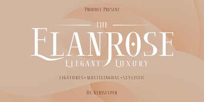 Introducing the modern-style serif font Elanrose with an elegant and luxurious feel in every shape. This font is good for logo design, Social media, Movie Titles, Books Titles, short text even long text letters, and good for your secondary text font with sans or serif. Featured: Standard Uppercase & Lowercase Numeral & Punctuation Multilingual : ä ö ü Ä Ö Ü ß ¿ ¡ Alternate & Ligature PUA encoded We recommend programs that support the OpenType feature and the Glyphs panel such as Adobe applications or Corel Draw. so you can use all the variations of the glyphs. Hope you enjoy our fonts!
 - Gautters Mickey by Creative17studio,
$18.00 Introducing : "Gautters Mickey" is a unique modern serif font. comes with a large selection of alternative characters and ligatures. The distinctive shape of each character makes this font even better for any design, both personal and corporate. Create your own unique design by using this font. very suitable for formal and informal use. Available in two types of styles: regular & italic. Features : 1. standard character set 2. multilingual support 3. numbers and punctuation marks 4. many ligatures and alternatives What are you waiting for, get this premium font right away. Free updates. Any questions? just ask. Thank you
 - Nettle Sans by Duck Soup Design,
$11.00 Influenced by Blackletter type and highway fonts, the Nettle Sans font family sets out to be both a quirky and confident headline font (at the heavier weights), and an easily legible body font for print or screen (at the lighter weights). Careful attention was taken in choosing distinct shapes for each letter to maximise legibility, and to balance a daring experimental form with function. Through its brutal angled cuts out of the ends of tapered links, ink-traps, ascenders and descenders, Nettle Sans' defining motif offers a visual language that communicates speed, efficiency, advancement and the "cutting edge".
 - SK Parnik by Shriftovik,
$32.00 SK Parnik is a modern display font inspired by the culture of vegetarianism. This font is based on the shape of a bean pod, which gives the symbols a unique playful character, perfect for working with the branding of companies that are aimed at a children's audience, as well as engaged in restaurant activities. The character composition consists of uppercase and lowercase letters and supports extended Cyrillic and Latin letters. This allows you to expand the scope of this font. Despite the pronounced decorative component, thanks to its tools, the font will fit perfectly into the collection of any designer.
 - SG Noxvile by Studio Gulden,
$24.00 Unleash the power of typography with Noxvile, a revolutionary font that demands attention and exudes confidence. Crafted with precision and designed to make a statement, Noxvile brings a whole new level of intensity to your words. Ignite your creativity and let your message roar with Noxvile's super bold style and captivating all-caps specimen. Whether you're designing eye-catching headlines, striking logos, or empowering social media posts, this font will make your words leap off the page and leave a lasting impression. Stand tall among the rest with Noxvile's commanding presence. Embrace its sharp edges, powerful curves, and unparalleled strength to create a visual experience that is truly unforgettable. Let your message shine brighter than ever before, cutting through the noise and leaving your audience captivated.
 - Address Sans Pro by Sudtipos,
$39.00 History is always in sight; it is constantly being reconsidered and reformulated in the context of now. We see approaches to art, fashion, textiles, homewares, furnishings … not to mention music, graphics and everything else that culturally enriches our daily lives, revisited and made anew for today. Address Sans indulges in the spirit and aesthetics of mid-century Modern – Italian industrial design, sleek coffee makers, stylish cars, seductive jazz pressed on vinyl – with a charm and charisma that defies time. It evokes history but is decisively created for today. Its design, in reality, is rooted in the condensed structure and block modulation of early 1950s German lettering intended for use in street signage, but when we started to work on the various weights and widths, the result was a set of fonts in a style similar to the typographic work developed by Butti and Novarese in the 60s. The multitude of potential applications for Address Sans then became clear. In a range of 3 widths and 8 weights each, Address Sans includes little verses, true italics, small caps and numerous alternative signs for a total of 48 fonts. The result is a functional typeface that is effortlessly seductive, with geometric features and design details that ooze cool, and take it away from mere reinterpretation towards typographic forms that adapt perfectly for contemporary use.
 - Breeder by Scratch Design,
$9.00 Introducing Breeder Font Duo it's a handwritten script. Enjoy this playful font in your designs with Breeder Script & Breeder Small Caps! This playful font consists of a natural handwritten and signature style, so this font is perfect for logos, menu design, social media posts, packaging, poster, name card, birthday card, etc. Breeder Script has a natural flow handwritten signature containing upper & lowercase characters, numerals, and punctuation. This font also has a ligature, stylistic alternate, swashes, multi-languages support, and doodles art for the bonus of this font. Breeder Small Caps comes with a natural & simple handwritten all-caps font. Complete with a-z letters, very charming handwritten font, and perfect for combining with Breeder Script. This font also includes multi-language support. Thank you for checking and visiting our store, and feel free to drop me a message if you had any questions! Visit our Instagram :) www.instagram.com/scratchdesignbali
 - Between The Lines BF by Bomparte's Fonts,
$29.00 The famous Catalan architect, Antoni Gaudí, used to say “there are no straight lines or sharp corners in nature…” However, with Between The Lines that’s exactly what you’ll find: straight lines, parallel and perpendicular, all in a glorious display of Art Deco style. Here the verticals and horizontals dominate while the diagonals “sit this one out”. Curvilinear lines also run free here: they serve as refreshing counterpoints to prominent straights. These forms suggest a somewhat expressive script-like characteristic, (especially in lowercase) wherever the font’s many initials, terminals and contextual alternates are employed. Between The Lines offers many options for alternate letterforms (ligatures, stylistic alternates, contextual alternates, etc.). When these OpenType features are used judiciously and selectively, your typography will be greatly heightened. You’ll find BTL right at home in a number of environments: music album covers, snack food packaging, magazine headlines, cosmetics, signage and more. PLEASE NOTE: due to its very tall ascenders, Between The Lines benefits from generous leading (line spacing). Multilingual support included.
 - TwentyFourNinetyOne by steve mehallo,
$19.91 TwentyFourNinetyOne [2491] is a reinterpretation of the alphabet of 1919 by Theo van Doesburg; the original a true rendering of the thinking of the Dutch-based art movement “de Stijl.” Jump forward to 1980 and prop lettering used on the Buck Rogers in the 25th Century television series; a vernacular typeface that was a utilitarian mix of geometry and pixel-based forms, used to symbolize the futuristic universe of 2491. At times it would appear on spaceships, laser guns, signage at space ports or in one episode, a Spandex tapestry. It only seemed logical to combine and rethink the letterforms, add ligatures + other extras, and see what the results would be. Futuristic, fun and bold to read! 2491: In the future, all type will look like this.
 - Millwright by 10four,
$24.95 Millwright is a display typeface family inspired by spunky DIY attitude and Industrial era hardware… an exercise in rendering glyphs with a rudimentary, hand-cut flavour. The type family’s built in Open Type features allow for easy substitution of glyphs… creating plenty of diversification for letter combinations, and multiple glyph variations. Millwright results in designs that are packed with bold character and Do-it-yourself pizzazz. Millwright’s quirky letterforms lend itself to a multitude of graphic applications; from serious branding applications, to light-hearted packaging, to children’s book publishing, to hand-crafted DIY projects. Millwright comprises a family of 4 styles; the utilitarian “Regular” weight, a brash “Black” weight, to the art-deco inspired "Inline" and the accompanying “Inside” for layering multiple colours.
 - Crewekerne by Greater Albion Typefounders,
$13.95 Crewekerne is a typeface family which speaks of the villages that are at the heart of English life. It is inspired by the arts and crafts movement of the early twentieth century, and is complimented by two other families, Crewekerne Magna and Crewekerne Magister. Three widths - condensed, regular and expanded and three weights - regular bold and heavy are offered. Crewekerne is especially good when combined with its two complimentary families and when used in poster and design work that needs a rustic hand crafted flair but still needs to be easily legible. Crewekene is a fun family and a serious set of faces all in one. Crewekerne, Crewekerne Magna and Crewekerne Magister can also be purchased together in the Crewekerne Value Pack.
 - Festival Script Pro by Sudtipos,
$69.00 Festival Script is a logical evolution within the deco script territory previously explored by Koziupa and Paul in efforts like Aranjuez, Bellas Artes, Heraldica and Tanguera. In Festival Script, strong bilinear contrast and ornamental swashes combine to convey a sense of modern luxury. This combination echoes the current trend in consumer goods of elevating simple, everyday products to objects of desire. Festival’s basic structure is the familiar Koziupa aesthetic of tapering stems and sharp endings, but this time informed by a more geometric sensibility. A wide variety of thin, ribbonlike strokes add a beautifully ornamental feel, evoking Argentine “filete” motifs. Almost every letterform includes multiple alternates, providing design possibilities from minimal to exuberant. Festival Script Pro is loaded with alternates, swashes, endings and Latin-based language support.
 - Crewekerne Magister by Greater Albion Typefounders,
$13.95 Crewekerne is a typeface family which speaks of the villages that are at the heart of English life. It is inspired by the arts and crafts movement of the early twentieth century, and is complimented by two other families, Crewekerne Magna and Crewekerne Magister. Three widths - condensed, regular and expanded and three weights - regular bold and heavy are offered. Crewekerne is especially good when combined with its two complimentary families and when used in poster and design work that needs a rustic hand crafted flair but still needs to be easily legible. Crewekene is a fun family and a serious set of faces all in one. Crewekerne, Crewekerne Magna and Crewekerne Magister can also be purchased together in the Crewekerne Value Pack.
 - Bonsai by Three Islands Press,
$29.00 Years ago, I developed an interest in the Japanese art of dwarfed potted trees, bonsai. I bought some books on the subject from Brooklyn Botanic Garden. In one -- Handbook on Bonsai: Special Techniques (seventh printing, February 1976) -- the type was bad. Old worn lead type, I suspect, spread wide in the tops of characters and disappearing on the bottoms. Two decades later, I came across my Brooklyn Botanic Garden collection and was struck again by this interesting type. Inspired, I made a typeface. Didn't take me long to decide on a name for it, either: a name with a double-meaning, based both on its look and its inspiration. Bonsai, the typeface, has two styles, a roman and a true italic.
 - Crewekerne Magna by Greater Albion Typefounders,
$13.95 Crewekerne is a typeface family which speaks of the villages that are at the heart of English life. It is inspired by the arts and crafts movement of the early twentieth century, and is complimented by two other families, Crewekerne Magna and Crewekerne Magister. Three widths - condensed, regular and expanded and three weights - regular bold and heavy are offered. Crewekerne is especially good when combined with its two complimentary families and when used in poster and design work that needs a rustic hand crafted flair but still needs to be easily legible. Crewekene is a fun family and a serious set of faces all in one. Crewekerne, Crewekerne Magna and Crewekerne Magister can also be purchased together in the Crewekerne Value Pack.
 - Magendfret by sugargliderz,
$24.00 Magendfret is a typeface that was designed very mechanically. However, it is also the optimal typeface for expressing soft warmth. Magendfret was designed by constructing a "line." That is: it is based on the concept "it is the combination of a straight line and a curve with a character." I made the character from the act of using and constructing a vector graphics editor, a mouse, and a keyboard. That, I thought when constructing it, should make neither a roman type nor italic type into a novel form, and a very general form. Once those characters were bit-map-ized, they traced again mechanically by the vector graphics editor. It became a soft impression by this work. The very mechanical act of changing the thickness of a line uniformly constitutes the family. The thickness of seven patterns was created first and, finally it results in four patterns. Respectively, styles called Light, Regular, Medium, and Bold are attached as usual. The name Magendfret is meaningless. It is an anagram of a certain words selected very arbitrarily.
 - Helvetica World by Linotype,
$149.00 Helvetica is one of the most famous and popular typefaces in the world. It lends an air of lucid efficiency to any typographic message with its clean, no-nonsense shapes. The original typeface was called Neue Haas Grotesk, and was designed in 1957 by Max Miedinger for the Haas’sche Schriftgiesserei (Haas Type Foundry) in Switzerland. In 1960 the name was changed to Helvetica (an adaptation of Helvetia, the Latin name for Switzerland). Over the years, the original Helvetica™ family was expanded to include many different weights, but these were not as well coordinated with each other as they might have been. At the beginning of the 21st Century, Linotype released an updated design of Helvetica, the Helvetica World typeface family. This family is much smaller in terms of its number of fonts, but each font makes up for this in terms of language support. Helvetica World supports a number of languages and writing systems from all over the globe.
