10,000 search results
(0.045 seconds)
- Beach Party by Cititype,
$9.00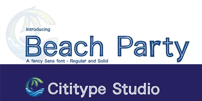 Beach Party is a cute and casual display font with an incredibly friendly feel. Whether you’re looking for fonts for Instagram or calligraphy scripts for DIY projects, this font will turn any creative idea into a true piece of art!
 - The Comic Struves by Stringlabs Creative Studio,
$25.00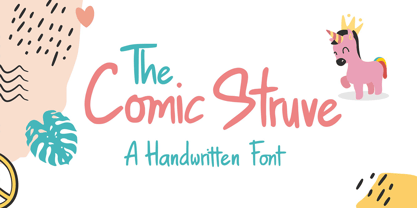 The Comic Struve is a cute and casual display font with an incredibly friendly feel. Whether you’re looking for fonts for Instagram or calligraphy scripts for DIY projects, this font will turn any creative idea into a true piece of art!
 - Lemon Rolls by Illushvara,
$12.00 Lemon Rolls is a cute and casual handwritten font with an incredibly friendly feel. Whether you’re looking for fonts for Instagram or calligraphy scripts for DIY projects, this font will turn any creative idea into a true piece of art!
 - Excritura by Linotype,
$29.99Excritura is the third typeface created by the Spanish designer Alex Camacho. The robust personality of this original calligraphy-derived italic font will undoubtedly also win you over.Organic shapes determine the character of Excritura, a calligraphic typeface by Alex Camacho. The font has been modelled on the work of the Spanish Architect Antoni Gaudí and was inspired by his love of natural forms and craftsmanship. This is perhaps unsurprising in view of the fact that Camacho grew up in Barcelona, home to much of Gaudí’s creative oeuvre. Organic shapes determine the character of Excritura, a calligraphic typeface by Alex Camacho. The font has been modelled on the work of the Spanish Architect Antoni Gaudí and was inspired by his love of natural forms and craftsmanship. This is perhaps unsurprising in view of the fact that Camacho grew up in Barcelona, home to much of Gaudí’s creative oeuvre. - Alleyster by Nurf Designs,
$19.00 Alleyster is a lovely curly script font in a modern calligraphic style and includes amazing handwritten characters. It’s perfect for logos, posters, headlines, and every other design which needs to stand out!
 - Theatrics JNL by Jeff Levine,
$29.00Theatrics JNL gives a rounded corner treatment to Prismatiq JNL; which in turn was modeled from lettering found in an early 1900s French lettering book displayed at an online image sharing site. Limited character set. - Mynor by The Northern Block,
$49.50 A modern squarish sans inspired by machine-readable typefaces of the 1950s, including OCR-A and B. Smooth curved contours with a humanist touch sit in harmony alongside pure straight lines. Contrasting shapes create a modern aesthetic pleasing to the eye and pixel perfect execution for modern-day scenarios. Details include seven weights with matching italics, six variable widths and 445 characters per style. Opentype features consist of five variations of numerals with stylistic zero’s, inferiors, superiors, fractions, case sensitive forms, ligatures, arrows and language support covering Western, South and Central Europe.
 - CamingoDos by Jan Fromm,
$45.00 CamingoDos is characterised by tight shapes, elliptical curves, subtle contrast and a strong, humanistic appearance: attributes that were all applied with particular care and attention for legibility. It comes in a wide range of seven weights from ExtraLight to Black which makes it perfectly suitable for editorial and corporate design. Furthermore it now has two additional related families: CamingoDos SemiCondensed and CamingoDos Condensed. CamingoDos comes with a Pro version that offers a rich set of expert typographic features like small caps, ligatures, stylistic alternates, different figure sets, arrows, fractions and ordinals.
 - Aljaraz by Cuchi, qué tipo,
$9.95 Aljaraz (meaning “small bell” in english) is a curvy typeface inspired on the “Fat face" letters with an extremely bold design from the early 19th century, but with an insolent touch of brave and psychedelic distortions. Aljaraz has a regular and italic variable, and in both styles the capital letters have a swash alternative where the naughty touch reaches its maximum expression. It is ideal to recall the lysergic era of the 60s, write funny words, or simply to express small texts in a display way that powerfully attracts attention. Let Aljaraz inspire you groovy kind of love! Designed by Carlos Campos cuchi@cuchiquetipo.com Secondary typeface: 'Escuela', also by Carlos Campos _ Aljaraz (“campanita”) es una tipografía curvy inspirada en las letras con un diseño extremadamente grueso y atrevido de principios del siglo XIX (las “Fat face”), pero con un toque insolente de valientes distorsiones psicodélicas. Aljaraz tiene una variable regular y cursiva, y en ambos estilos las mayúsculas tienen una alternativa súper decorada donde el toque travieso alcanza su máxima expresión. Es ideal para rememorar la época lisérgica de los años 60, escribir palabras graciosas, o simplemente expresar textos graciosos de una forma visual que llame poderosamente la atención. ¡Deja que Aljaraz te inspire su maravilloso amor!
 - SPARKS Free for All - Unknown license

- Whitehall JNL by Jeff Levine,
$29.00Whitehall JNL is the serif counterpart to Jeff Levine's Wingate JNL - both are strongly influenced by the Art Deco stylings of such condensed typefaces as Huxley Vertical and other narrow titling fonts. - FM Aloysius by FontMeister,
$24.95 Art Nouveau typeface ‘Aloysius’ draws inspiration from Wiener Secession Movement. You can use this font to create posters, greeting cards, scrapbooks, CD labels, T-shirts, coffee mugs, digital videos websites and banners.
 - Akastar by Sakha Design,
$9.00 Akastar is a gorgeous handwritten font that impresses through its natural and elegant style. Add it to your most creative ideas, and notice how it transforms them into authentic pieces of art!
 - Estella Gardens by Timurtype,
$14.00 Introduced by Timurtype Studio! Estella Gardens is a Handbrushed Script Font This font showcases the timeless elegance of handbrush script fonts, where each stroke tells a story and adds a twist to your design. With organic lines and graceful curves, these fonts effortlessly blend modern sophistication with a touch of artisanal craftsmanship, creating a harmonious balance that elevates any project to a level of refined beauty and individuality. Let the art of hand-brushed script fonts transform your words into visual poetry, capturing the essence of your message with a touch of bespoke charm. Estella Gardens Font also supports multilingualism. Enhance your designs with our original fonts, feel free to comment or provide feedback, Enjoy the fonts 😊 Thank You
 - Fashionable JNL by Jeff Levine,
$29.00 For years, the print ads for the Hickok Jewelry Company [renowned for their line of men's belts, suspenders, wallets, cufflinks, etc.] featured its name and related main line ad copy hand-lettered in a condensed monoline with Art Deco styling. This has been reproduced in Fashionable JNL, available in both regular and oblique versions. For those of you who are wondering: yes, the founder of the company was a distant relative of "Wild Bill" Hickok.
 - Nouveau Semi Stencil JNL by Jeff Levine,
$29.00 The cover on the sheet music for the 1922 song "If She Comes from Dixie" had the title hand-lettered in an Art Nouveau style with a semi-stencil effect. It's now available as Nouveau Semi Stencil JNL in both regular and oblique versions. The typeface is not considered a "pure" stencil because many of the letters were made solid; lacking the classic stencil "breaks" at key points found in more traditional stencil designs.
 - Future Bugler Soft by Breauhare,
$35.00 Future Bugler Soft is a soft version of Future Bugler, a font based on the second logo created by Harry Warren in early 1975 for his sixth grade class newsletter, The Broadwater Bugler, at Broadwater Academy in Exmore, Virginia, on Virginia’s Eastern Shore. This font can convey several perspectives or moods. It can suggest a space-age vision of the future, or an art-deco perspective of the future as in the movie “Sky Captain and the World of Tomorrow”. It also communicates the idea of high performance, or extreme sports, without the grunge. Also check out its siblings, the original Future Bugler, and Future Bugler Upright. Digitized by John Bomparte.
 - Gidglet by Nathatype,
$29.00 Gidglet is a serif font highlighting the height differences of the letters’ thick and thin parts, and has elegant, clear letters. Little hooks and lines on the letter edges show classical, traditional nuances to your designs. Moreover, the thick and thin letter parts are clearly seen in a high contrast serif font. The thin letter lines show elegant characteristics, while the thick ones express firm, clear nuances. Such high contrasts between the thick and thin parts add dimensions and prominence to the designs. As a result, such a font is perfectly applicable for designs with formal, elegant, professional impressions in big text sizes in order for the beauty and the contrasts of such thick and thin parts to be clearly seen. In addition, you may enjoy the available features here as well. Features: Ligatures Stylistic Sets Multilingual Supports PUA Encoded Numerals and Punctuations Gidglet fits best for various design projects, such as brandings, quotes, invitations, name cards, greeting cards, printed products, merchandise, social media, etc. Find out more ways to use this font by taking a look at the font preview. Thanks for purchasing our fonts. Hopefully, you have a great time using our font. Feel free to contact us anytime for further information or when you have trouble with the font. Thanks a lot and happy designing
 - Franqueline Slab by Sudtipos,
$39.00 Introducing Franqueline Slab, the captivating new typeface family passionately designed by Estudio Vástago and expertly distributed by Sudtipos! This versatile font offers a diverse array of styles, ranging from delicately refined to boldly eye-catching on the weight axis, all elegantly inspired by the timeless Egyptian fonts of the late 19th century. With expressive character and exquisitely unique shapes, Franqueline Slab harmoniously blends the finesse of its delicate strokes with sophisticated endings, resulting in a truly remarkable typography. Every letter in Franqueline Slab has been meticulously crafted to strike the perfect balance between a contemporary edge and a touch of traditional charm, appealing to both the younger generation and typography enthusiasts who appreciate the artistry of the past. Its adaptability makes it ideal for captivating headlines that convey a message of youthful energy and playfulness, while still exuding the timeless elegance that only classic fonts can deliver. Embrace distinction and originality in your designs with Franqueline Slab. Whether it graces an editorial project, logo, or advertising material, this exceptional typeface family will undoubtedly stand out, leaving a lasting impression with its captivating personality. Watch your messages come to life and shine with the unparalleled charm of Franqueline Slab!
 - Thataway JNL by Jeff Levine,
$29.00 Thataway JNL is an assortment of arrows in many different sizes, shapes and directions that were collected from antique letterpress blocks and other vintage sources.
 - HeartMatrixed by Ingrimayne Type,
$12.95 HeartMatrixed is based on a matrix of dots in the shape of little hearts. It uses the same design pattern for placing dots as Dottie.
 - Flipante by Resistenza,
$39.00 Our condensed to extended font is perfect for multiple uses, from branding to packaging designs. Its extendable and variable design makes it great for all kinds of projects. Its tubular shapes, ink traps and juicy curves make it both aesthetic and functional. Its condensation also allows a great flexibility, allowing you to adapt it to any project's need. Its versatility also makes it great for both print and digital projects. With this font's easy to use features, your designs will look good on any project or medium.
 - Regatta Condensed by ITC,
$29.00Regatta is a bold, narrow sans serif designed by Alan Meeks in 1987. Its strong, robust figures makes it a particularly good font for headlines in larger point sizes. Regatta is distinguished by its diamond shaped dots on i and j as well as the slanted strokes of several figures. These characteristics relax the closed, static image of Regatta and let the font seem cheerful and friendly. - Punch Pro by Produce,
$29.00 Punch was born because we wanted to create a stencil font. At first glance, Punch gives out an audacious persona with its bold shape and form. It’s softer side is revealed in it’s carefully cut stencil lines. The balance of heavy and refined gives the font family its very own charm. Punch Pro comes in six different weights; Slab, Bracketed, Wedge, Deco, Hairline and Sans.
 - Moon Type by Thomas Käding,
$1.00 This font of Moon Type is modelled after Dr. Moon's original poster. He developed this embossed writing system to help those who have lost their sight later in life, and so are familiar with the shapes of English letters. Moon writing is still used, and you can find books written with it. This font only contains the letters and punctuation that are in the Moon Type system.
 - Veto Sans by Monotype,
$50.99 Veto® Sans is both highly legible and handsomely distinctive – a rare blend in a typeface. It’s a design that stands out and fits in. Veto Sans is equally competent on screen and in print. It’s four carefully determined weights in both normal and condensed proportions, each with an italic complement, give the family an exceptionally deep range of applications. All the designs in the family are valuable design tools. None are superfluous. Advertising, brand, corporate, editorial and interactive design are all in Veto Sans’ wheelhouse. It also shines in wayfinding and other signage projects. And to all these, it brings a warmth and personality. An ample x-height, open counters, vertical stroke endings and subtly condensed capital letters enable Veto Sans fonts to perform with grace in print and digital environments while being space efficient. An added benefit is that all-capital typography set in Veto Sans is not only space saving, it’s also easy to read. Drawn as a complete reimaging of his earlier Veto design, Swiss designer Marco Ganz worked to create character shapes distilled to their purest forms while maintaining a relaxed and natural demeanor. Ganz, who is also a three-dimensional artist, is acutely aware that the negative space between letters and the internal space within letters is as important as the positive shape of the letters themselves. This dynamic balance between the negative and positive aspects of character forms gives Veto Sans a sense of immediacy without looking hurried. Ganz also took great care to draw a suite of italic designs that not only complement the roman weights perfectly, but also give the family a dynamic verve. A large international character set also ensures ease of localization. “Veto Sans,” says Ganz, “is a typeface for designers that search for a new and different solution to age-old typographic challenges.”
 - Pulp Magazine JNL by Jeff Levine,
$29.00 For a pulp magazine called Spicy Western Stories, it was unusual that the January 01, 1939 issue had its cover title hand lettered in an extra bold Art Deco style rather than Western influenced lettering. This did not stop the lettering from being used as the design model for a digital type revival. Pulp Magazine JNL, is available in both regular and oblique versions.
 - Nouveau Standard JNL by Jeff Levine,
$29.00 The hand lettering found on the cover of the 1912 sheet music for "Somebody Else is Getting It" featured a blockish Art Nouveau style with rounded corners and a very lurid title [although it likely had a more innocent meaning in those days than the casual observer might interpret today]. Now available as Nouveau Standard JNL, it is available in both regular and oblique versions.
 - Screen Star JNL by Jeff Levine,
$29.00 The opening credits to the original (1937) version of “A Star is Born” starring Janet Gaynor and Frederic March was hand lettered in an Art Deco style with rounded terminals that emulated the look of neon signage – alluding to the glitz and glamour of 1930s Hollywood. Screen Star JNL is the digital revival of that lettering, and is available in both regular and oblique versions.
 - Sprouts by Wundes,
$18.00Sprouts is probably best described as "Bonsai-Nouveau". It's designed to look 100% organic up close, while maintaining good readability even at a distance. The looped letters terminate in playful swirls perfect for use on the cover of a menu or cookbook, yet would be equally at home in corporate logo art or as initials. Play with it, because creativity is an organic process. - Spring Season JNL by Jeff Levine,
$29.00 Spring Season JNL is a decorated and stylized Art Deco slab serif design from1935 which is based on the hand lettered title on the sheet music for “Paris in the Spring”. The characters are cut through with both a straight line and a wavy, spoked line which looks something like a thorny vine. Spring Season JNL is available in both regular and oblique versions.
 - Bronzino by Greater Albion Typefounders,
$8.95 Bronzino’s roots lie in the Arts and Crafts movement, and in the traditions of letterpress printed fine quality books. It’s ideal for legible headings which have just that hint of charm and difference outside of the normal and mundane. It’s formal enough to go anywhere yet it has a spirit of fun, it brings a world of bygone care and quality to the modern age.
 - Gaisma Latin by Lamatas un Slazdi,
$29.00 Art Nouveau typeface "Gaisma Latin" ("Light" in Latvian) draws inspiration from Vienna Secession movement and Nordic National Romanticism. The work on the design started as drawings of several characters for the graphic standard for the Jugendstil museum in Riga. It contains characters for all the European languages as well as a huge set of contextual and stylistic alternates and historical characters to replicate texts of the era.
 - Sky Clipper JNL by Jeff Levine,
$29.00 Sky Clipper JNL is a bold, Art Deco sans serif typeface derived from the hand lettered title on a 1940s-era “Big Little Book” entitled “Flying the Sky Clipper with Winsie Atkins”. The design is available in both regular and oblique versions. “Big Little Books” were published by the Whitman Publishing company and featured short stories printed in a tiny sized book format for young children.
 - Piano Music JNL by Jeff Levine,
$29.00 A 1910 collection of piano sheet music called “Presser’s Economy Group” had that name hand lettered in a fancy serif lettering style that could fall somewhere between Art Nouveau and semi-calligraphic. No matter the label you attach to the style, it makes for a wonderful digital type revival. The end result is Piano Music JNL, which is available in both regular and oblique versions.
 - Tme by bb-bureau,
$65.00 Tme, new lineal — Tme is an update of Sl (T = S + 1, m = l + 1 and e for natural logarithm), drawn in 2006 for the University of Arts Saint-Luc de Tournai. Its geometrical drawing is based on the directions of the hexagon, a scrupulously followed constraint which confers on some glyphs a very particular drawing. in light, regular and bold language: all latin glyphs
 - Kolo LP by LetterPerfect,
$39.00 The Kolo family was designed by Paul Shaw, inspired by the lettering of Koloman Moser, Gustav Klimt, Alfred Roller and other members of the Secession, Vienna’s turn-of-the-century Art Nouveau movement. Kolo’s family variants—narrow, regular, wide & alternates—serve as stand-alone display styles, or can be used in combination to pack text creatively in the manner characterized by Secession-period graphics.
 - Rassetta NF by Nick's Fonts,
$10.00The pattern for this graceful, subtly modulated Art Deco typeface was designed by Willard T. Sniffin for American Type Founders in the 1930s. True to the original design, the Swash Caps version features Sniffin's twelve decorative variants. The Postscript and Truetype versions contain a complete Latin language character set (Unicode 1252); in addition, the Opentype version supports Unicode 1250 (Central European) languages as well. - Gemstone Monogram by MonogramBros,
$12.00 Gemstone Monogram Font is a perfect shaped monogram font consisting of 78 letters and 1 basic frame. With just a single font file you will be able to create beautiful monograms in just a matter of minutes after the purchase! Gemstone Monogram Font comes with font file in OTF format. It features all the modern advanced font features such as Contextual Alternates, effectively eliminating the need to use multiple separate font files for left, center and right letters.
 - Round Monogram by MonogramBros,
$12.00 Round Monogram Font is a perfect round shaped monogram font consisting of 78 letters and 3 frames. With just a single font file you will be able to create beautiful monograms in just a matter of minutes after the purchase! Round Monogram Font comes with font file in .otf format. It features all the modern advanced font features such as contextual alternates, effectively eliminating the need to use multiple separate font files for left, center and right letters.
