10,000 search results
(0.18 seconds)
- Braxia by Greater Albion Typefounders,
$8.95 Braxia is a pure and joyful piece of Art Deco Fun. It is a new face that is overflowing with the character of 1930s advertising, lively and yet with impact all at once, its idea for theater handbills and posters, parties or anything else where you want to encourage people to enjoy themselves. Braxia is offered in two faces, regular and embossed, and is a face to really have fun with!
 - Mezz by Adobe,
$29.00Clarinetist Milton ?Mezz? Mezzrow (1899-1972) was a remarkable jazz musician, as becomes evident upon reading his autobiography Really the Blues. His sharp tone and serpentine lines inspired English lettering artist and jazz lover Michael Harvey to create a condensed, oblique display typeface with the look of a chiseled alphabet in the musician's honor. Vertical formats such as book jackets and posters will be invigorated by Mezz as the display face. - Norseman 3 by Alphabet Agency,
$21.00 Forged to be as imposing as a Norse horde ready to stampede into battle, Works great in all caps which it was initially designed to. I designed the lowercase characters to match really well with each other and the uppercase, so it works well in title case. Plus it has a great set of looking numbers and loads of extras. Fully kerned pairs so all letter combinations look great
 - Marcinelle by Fando Fonts,
$4.00 The origin of this family is the classic French-Belgian comics. The screams and onomatopoeia of these comics have so much personality that I needed to create a typeface family that would allow the designer to really replicate them. But this family has many more applications: packaging, logos, posters, signage, packaging, branding, etc. With its wide variety of glyphs you can make your sound effects, logos, etc. in most Latin languages.
 - Brollo by Greater Albion Typefounders,
$15.00 Brollo is a chunky display face full of the spirit of the 60s and 70s. Its bold character makes it ideal for poster work, and for anywhere that the point really needs to be driven home. The letter forms have been designed to work well either used conventionally or exclusively in capitals. We recommend use in combination with strong patterns, psychedelic colours and anything else outrageous you can think of.
 - Kymmera Deco NF by Nick's Fonts,
$10.00The dreams that you dare to dream really can come true when you perk up your headlines with this re-imagining of Saul Bass's 1982 glitzy Deco classic, Rainbow Bass. For best results at large sizes, choose the TrueType version, rendered at a full 2,048 UPM. Both versions include the complete Latin 1252, Central European 1250 and Turkish 1254 character sets, as well as localization for Moldovan and Romanian. - Bold Pressing Pack by Fontscafe,
$39.00 Fonts Café is offering a brand new pack of fonts and elements; The Bold Pressing Pack, full of bold, strong, powerful, vintage fonts which really stand out to make a strong impact. These fonts bring us back to a time when ink was placed onto wooden blocks, which were then pressed down onto the paper, creating big, bold letters, with the beautiful flaws of a time when things of import were given the due attention they deserved. This pack is designed to quickly capture the attention of anyone who sees it, while making a statement that says you mean business. It includes five different font styles, as well as two different element styles. There's everything from a standard letterpress font, to a font which truly emulates the imperfections of those days, as well as one that stands out above the rest to make a truly bold statement, and more. Check below these powerful fonts in more detail.
 - Core Paint by S-Core,
$20.00 Core Paint is a texture type family inspired by the action painting created by Jackson Pollock. There are two sub-families named A and B. Core Paint A is a texture font family that has to be used together with others. Core Paint B is a textured font family that can be used solely or together with A family. By layering these different texture styles, you can create various combinations of textures. According to color variations, also you can create more complex textured typefaces and unique artworks. Core Paint Family supports complete Basic Latin, Cyrillic, Central European, Turkish, and Baltic character sets. Each font includes proportional figures, tabular figures, numerators, denominators, superscript, scientific inferiors, subscript, fractions and case features. This family is really nice for book titles, headlines, logotypes and any artworks.
 - Shrub by Chank,
$59.00 The new OpenType font Shrub feels like a printed, textural typestyle, influenced by the great slab-serif fonts of the 20th century and organic, messy effects of old Xerox copiers. You might call this one a “multi-messter font” because it not only comes grainy and coarse, but also features a special stylistic alphabet set to add extra schmutz as you see fit. Users of Adobe’s Creative Suite applications can access this feature as either “Stylistic Set #1” in InDesign or “Stylistic Alternates” in Illustrator. The extra blotches can be turned on or off as you see fit. Put a little organic texture mixed with old-school legibility to make you flyers and other designs look like they were really printed! Shrub speaks with a compelling, grounded personality in a voice that’s easy to read.
 - Celion by Dora Typefoundry,
$19.00 Celion is a serif display type with a nonsensical feel. modern high contrast with a bright positive character. The clean shapes and slightly conical edges of the letters create a welcoming atmosphere in any design. Including ligatures and custom alternative glyphs, the Celion font is perfect for headlines, magazines, logotypes, food packages, advertisements, and many others. Features: All Caps Font with different uppercase and lowercase Number & Symbol Supported Languages Alternates and Ligatures PUA Encoded We highly recommend using a program that supports OpenType features and Glyphs panels like Adobe apps and Corel Draw, so you can see and access all Glyph variations. This type of family has become the work of true love, making it as easy and fun as possible.I really hope you enjoy it! Thank you Enjoy the font and go get creative :)
 - Cake Shop by Chank,
$20.00 Cake Shop has a lengthy history. Originally designed during the Eighties by Aussie artist David Art Wales, the font was inspired by the awkward but charming hand-lettered signs in a Maltese cake shop near his Sydney home. "These signs were hand-drawn by someone who clearly had no experience but who'd really put their heart and soul into the job. There was a real sincerity to the characters that I wanted to capture." For a brief time during the early Nineties, MTV used Cake Shop for all their on-air interstitials. Since then, it's become a go-to font for everything from children's books to album covers and ice cream branding. In a recent update, Wales added airier spacing to more closely resemble the original signs the font was based on.
 - Aougtron by Twinletter,
$17.00 Aougtron is a modern font that combines a dynamic slope with sporting event-inspired lettering and cutouts. Designed to apply to all professional sporting events, it can also be used to create modern logos and screen prints in text fields. Aougtron’s bold and powerful appearance is created by the strong horizontal strokes on each letter which contrasts sharply with the elegant strokes on the corners of each letter. Combine these fonts to create a maximum display effect on each of your projects. What’s Included : - File font - All glyphs Iso Latin 1 - Alternate, Ligature - Simple installations - We highly recommend using a program that supports OpenType features and Glyphs panels like many Adobe apps and Corel Draw so that you can see and access all Glyph variations. - PUA Encoded Characters – Fully accessible without additional design software. - Fonts include Multilingual support
 - Humble Hearts by Joanne Marie,
$20.00 Humble Hearts is a mono script font designed to look handlettered and unique. With over 700 glyphs you will have lots of fun designing beautiful logos, t-shirts, wedding stationery, menus - the list is endless! Anyone can access the alternate glyphs via Font Book on a mac or Character Map in Windows to copy and paste into non designer software. Please take a look at all of the pictures to see this font at work. You can use the basic glyphs as a lovely script on it's own or you can make your designs really fancy using the alternates and swashes. You can choose to have the breaks in the swashes (as shown) or solid swashes. In addition to the multilingual characters included in this font are the following styles and glyphs: Alternates Ligatures Swashes Ornaments & Premade words
 - Baskuline by Zeenesia Studio,
$15.00 Introducing the new font Baskuline. Baskuline font is a HanwrittenHandbrush handwriting on paper with a coarse type brush, to produce a consistent texture. Baskuline also has ligature which is very suitable if you don't really like lowercase letters and want to change some letters with available ligature letters. and available lowercase alternatives that you can change according to your taste. Baskuline suitable for various projects such as stationery invitations, social media, logos, weddings, branding, graphic design with the addition of several binders and swashes. and can be combined with various types of serif fonts to perfect the project you want to work on. We hope you enjoy the font, please feel free to comment if you have any thoughts or feedback. Or simply send me a PM or email me at zeenesia@gmail.com. Thanks for purchasing and have fun!
 - Allogist by Dora Typefoundry,
$17.00 Introducing Elegant Serif Font Allogist is a new elegant serif font that will add a touch of luxury and sharp diamond dots add a slick yet legible Persian style. This versatile font is Perfect for editorial projects, magazine headers, Logo designs, Clothing Branding, product packaging, and showcases masculine and feminine qualities. Allogist is equipped with uppercase, lowercase, numbers and full punctuation + Multi language support and PUA-encode. To activate the OpenType Stylistic alternative, you need a program that supports OpenType features such as Adobe Illustrator CS, Adobe Indesign & CorelDraw X6-X7, Microsoft Word 2010 or a later version. Features: • 3 Font weight • Uppercase & Lowercase letters • Alternative & Ligature Styles • Numbers & Punctuation • Characters with accents • Supports Multiple Languages This type of family has become a work of true love, making it as easy and enjoyable as possible. I really hope you enjoy it!
 - Battle Damaged by Comicraft,
$19.00 Some say The Silver Age Will End in Fire; others say The Silver Age Will End in Ice! Know, O Prince, that In Your Darkest Hour, the Masters of Evil Will Live Again! But from The Ashes of the Bitter Taste of Defeat, A New Power will be Unleashed! Lo, There Shall be A Frenzy in a Far Off Land, There Will be a Great Price AND a Great Prize! There Will Be a Bitter Victory in a World Gone Mad -- a World You Never Made... Face it, Tigers, You are Captives of The Coming of The Return of The Mad Mysterious Menace of He Who Would Destroy You...This Man, This Monster... This Final Font in our collection of Silver Age Display Lettering -- BATTLE DAMAGED! See the families related to Battle Damaged: Battle Cry & Battle Scarred .
 - Vulpa by Eclectotype,
$36.00 Vulpa is a charming serif family in regular, italic and bold, informed by the proportions of a personal favorite, Plantin. The quirky foxtail terminals (inspired in part by my script font, Gelato Script) can be seen across all three styles. These little details make the typeface very expressive at display sizes, but practically disappear at text sizes, making for a very versatile face. Across the three styles there are a number of useful OpenType features which make Vulpa capable of demanding typographic work, even though there are only three styles. Regular, italic and bold are all you really need anyway! The regular and bold weights both include small caps, and the italic features swash capitals for most letters. The italic also features quaint discretionary ligatures, and all styles include standard ligatures, automatic fractions, proportional and tabular, lining and oldstyle figures. If this isn't enough, the Vulpa family also includes Ornaments and Drop-Cap fonts. There is an ornament for A to B, a to b and 0 to 9. These have been carefully designed to match the feel of the text fonts, and many are influenced by ornaments and fleurons from the ATF 1912 Type Specimen book. The drop-caps have an engraved look, and two color versions can be made by overlaying upper and lower case. Despite the lack of weights compared to ‘workhorse’ faces, the charm and versatility of Vulpa make it a really useful typeface, that I hope you'll enjoy using as much as I enjoyed making.
 - Godwit by yasireknc,
$19.00 Godwit is an experimental high-contrast serif font. The piece screams creative freedom and exploration, as the color literally breaks through the boundaries of the original type. The final piece is really fluid as each letter links smoothly into the next and you can feel the real natural ink paths. This is a benefit of Godwit and the most powerful-distinguishable feature, as most standard fonts wouldn’t allow for this fluidity, especially a serif font. The Aphorism: The main idea comes from being fluent and smooth-spoken natural ink shapes. As we go into the details, the organic shape of the body makes the font a unique piece. The collection lends itself to the design, packaging, and advertising of everything with a romantic feel like liquid love potion; weddings, greetings, cosmetics, lingerie, book covers, and too many more to mention! This font is a great place to begin getting that tone.
 - The·demon·font by KalaamFonts,
$- “THE DEMON FONT” has been specifically created for a very contemporary graphical usage. It represents Gore, Violence, and Lust with Sinful appearance; with diabolical appearance and reflects the dark side in its every character, which may not be Ideal for daily use. But some expressions never look good in the boldest, brightest of Type, for it is their Vocabularic nature and deep interpretations. In such cases The Demon Font shall fill the role gracefully. INSPIRATION When I recently started my web graphic novel focusing around Demonic Possessions, Crime and Paranormal occurrences, I felt the need to have a type that spoke very unconventionally and supported the language of my story. I wanted to break apart from the usual Comic Sans like typefaces used for decades in Pop cultural mainstream Comics, and wanted something very sublime and independent in style concurrent to the the parallel digital media of Web Comic genre. Thus I created my own type to help translate the communication of my plot thicker to the plain old “Lettering” Font.
 - Erotica by Lián Types,
$49.00 “A picture is worth a thousand words” and here, that’s more than true. Take a look at Erotica’s Booklet; Erotica’s Poster Design and Erotica’s User’s Guide before reading below. THE STYLES The difference between Pro and Std styles is the quantity of glyphs. Therefore, Pro styles include all the decorative alternates and ligatures while Std styles are a reduced version of Pro ones. Big and Small styles were thought for better printing results. While Big is recommended to be printed in big sizes, Small may be printed in tiny sizes and will still show its hairlines well. INTRODUCTION I have always wondered if the circle could ever be considered as an imperfect shape. Thousands of years have passed and we still consider circles as synonyms of infinite beauty. Some believe that there is something intrinsically “divine” that could be found in them. Sensuality is many times related to perfectly shaped strong curves, exuberant forms and a big contrasts. Erotica is a font created with this in mind. THE PROCESS This story begins one fine day of March in 2012. I was looking for something new. Something which would express the deep love I feel regarding calligraphy in a new way. At that time, I was practicing a lot of roundhand, testing and feeling different kinds of nibs; hearing the sometimes sharp, sometimes soft, sound of them sliding on the paper. This kind of calligraphy has some really strict rules: An even pattern of repetition is required, so you have to be absolutely aware of the pressure of the flexible pen; and of the distance between characters. Also, learning copperplate can be really useful to understand about proportion in letters and how a minimum change of it can drastically affect the look of the word and text. Many times I would forget about type-design and I would let myself go(1): Nothing like making the pen dance when adding some accolades above and below the written word. Once something is mastered, you are able to break some rules. At least, that’s my philosophy. (2) After some research, I found that the world was in need of a really sexy yet formal copperplate. (3) I started Erotica with the idea of taking some rules of this style to the extreme. Some characters were drawn with a pencil first because what I had in mind was impossible to be made with a pen. (4) Finding a graceful way to combine really thick thicks with really thin hairlines with satisfactory results demanded months of tough work: The embryo of Erotica was a lot more bolder than now and had a shorter x-height. Changing proportions of Erotica was crucial for its final look. The taller it became the sexier it looked. Like women again? The result is a font filled with tons of alternates which can make the user think he/she is the actual designer of the word/phrase due to the huge amount of possibilities when choosing glyphs. To make Erotica work well in small sizes too, I designed Erotica Small which can be printed in tiny sizes without any problems. For a more elegant purpose, I designed Erotica Inline, with exactly the same features you can find in the other styles. After finishing these styles, I needed a partner for Erotica. Inspired again in some old calligraphic books I found that Bickham used to accompany his wonderful scripts with some ornated roman caps. Erotica Capitals follows the essentials of those capitals and can be used with or without its alternates to accompany Erotica. In 2013, Erotica received a Certificate of Excellence in Type Design in the 59th TDC Type Directors Club Typeface Design Competition. Meet Erotica, beauty and elegance guaranteed. Notes (1) It is supossed that I'm a typographer rather than a calligrapher, but the truth is that I'm in the middle. Being a graphic designer makes me a little stubborn sometimes. But, I found that the more you don't think of type rules, the more graceful and lively pieces of calligraphy can be done. (2) “Know the forms well before you attempt to make them” used to say E. A. Lupfer, a master of this kind of script a century ago. And I would add “And once you know them, it’s time to fly...” (3) Some script fonts by my compatriots Sabrina Lopez, Ramiro Espinoza and Alejandro Paul deserve a mention here because of their undeniable beauty. The fact that many great copperplate fonts come from Argentina makes me feel really proud. Take a look at: Parfumerie, Medusa, Burgues, Poem and Bellisima. (4) Some calligraphers, graphic and type designer experimented in this field in the mid-to-late 20th century and made a really playful style out of it: Letters show a lot of personality and sometimes they seem drawn rather than written. I want to express my sincere admiration to the fantastic Herb Lubalin, and his friends Tony DiSpigna, Tom Carnase, and of course my fellow countryman Ricardo Rousselot. All of them, amazing.
 - Hypeblox by Arendxstudio,
$15.00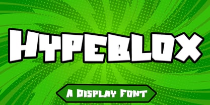 Hypeblox - Display Font is a font with distinctive Display characters perfect for branding projects, logos, media posts, advertisements, product packaging, product designs, labels, photography, watermarks, invitations, stationery, and any project Features : • Character Set A-Z • Numerals & Punctuations (OpenType Standard) • Accents (Multilingual characters) • Ligature Multilingual Support : Afrikaans, Albanian, Asu, Basque, Bemba, Bena, Catalan, Chiga, Cornish, Danish, English, Estonian, Faroese, Filipino, Finnish, French, Friulian, Galician, German, Gusii, Icelandic, Indonesian, Irish, Italian, Kabuverdianu, Kalenjin, Kinyarwanda, Low German, Luo, Luxembourgish, Luyia, Machame, Makhuwa-Meetto, Makonde, Malagasy, Malay, Manx, Morisyen, North Ndebele, Norwegian Bokmål, Norwegian Nynorsk, Nyankole, Oromo, Portuguese, Romansh, Rombo, Rundi, Rwa, Samburu, Sango, Sangu, Scottish Gaelic, Sena, Shambala, Shona, Soga, Somali, Spanish, Swahili, Swedish, Swiss German, Taita, Teso, Vunjo, Zulu There it is! I really hope you enjoy it
 - Alhazed by Hatftype,
$17.00 Alhazed – Halloween Display Font is a display font that is inspired by gothic and horror style because its shape is very unique and is perfect for any project that you will use with this theme. Alhazed with opentype features such stylistic alternates, stylistic sets & ligatures good for logotype, poster, badge, book cover, tshirt design, packaging and any more. Features : 1.Uppercase & Lowercase 2.Multilingual support 3.Number 4.Symbol 5.Punctuation. 6.Extra Dingbat 7.Support in Mac and Windows OS -Support in design application (photoshop, illustrator, and more). There it is. I really hope you enjoy it. Comments & likes are always welcome and accepted. More importantly, don’t hesitate to send a message if you have a problem or question.
 - Amico by Hackberry Font Foundry,
$24.95 This is a new barely modulated, slightly narrow, sans serif font family. It has eight styles: thin, thin italic, regular, italic, bold, bold italic, black, & black italic grouped into two 4-font families: Amico Thin with the Bold; and Amico with the Black. Amico has the standard feature set developed at the end of 2007. It has many OpenType features and 654 character/glyphs: Caps, lower case, small caps, ligatures, discretionary ligatures, swashes, small cap figures, old style figures, numerators, denominators, accent characters, ordinal numbers (1st-infinity): lining and oldstyle), and so on. It is designed for text use in body copy. However, Amico really shines as the choice for heads & subheads when using Amitale or Brinar for the text family.
 - Neugro Typeface by Godbless Studio,
$25.00 Inspired by something experimental and modern but still has a strong and elegant characteristic. Neugro Typeface is a experimental sans serif font well-suited for display use; its orthogonal terminals and short ascenders and descenders make it ideal for block of texts. By mixing different weights, you can have a wide range of design options—short text, isolated words, logos, titles, branding design, posters, etc. The Neugro family comes in 18 weights—from a thin and condensed thin to an expanded and Black. Its character set supports over 200 different languages. Equipped with various additional unique and modern alternative characters, it gives you a very strong composition of identity and personality. This font really deserves to be on your desktop*
 - Calgary Script by Sudtipos,
$99.00 Calgary Script was mostly inspired by a brush script on a Welcome To Calgary sign in, you guessed it, Calgary. Though now, after it's finished, I can easily tell the influence is evident of all the books on American sign painting I have absorbed over the years. The overall effect of the font is similar to something that Fonzied itself, big hair and leather jackets and all, out of the early 1980s, but the feeling really dates back to a few decades earlier. Heady caps and free-flowing lowercase make for a speedy, determined, and instinctively organized buffalo herd of a typeface. This is a packaging font with a true supermarket sign spin, with OpenType features including ligatures, alternates, and ordinals specifically made to follow numbers.
 - Kamerik 205 by Talbot Type,
$19.50 Kamerik 205 is inspired by the classic, geometric sans-serifs such as Futura and Avant Garde, but has shallower ascenders and descenders for a more compact look, and features a traditional double-storey lower case a and g. It's a versatile, modern sans, highly legible as a text font and with a clean, elegant look as a display font at larger sizes. It includes old style non-aligning (lower case) numbers, both proportional and tabular as well as accented characters for Central European languages. The Kamerik 205 family comprises of six weights, and is closely related to Kamerik 105. The most notable differences between the two variations, are the two-storey lower case a and g in Kamerik 205, where they are single-storey in Kamerik 105.
 - Transmogrifier by PintassilgoPrints,
$35.00 Inspired on Cuban posters by the talented and prolific graphic artist Eduardo Muñoz Bachs, Transmogrifier was hand painted with a thin brush, using loose, fast strokes. This font is packed with lots of contextual and stylistic alternates that automatically transmogrifies the letters as you write, when using opentype savvy programs. It's also possible to pick the alternates by hand and set the text the way you like better. The choice is yours, and there are really plenty of alternates to choose from and create original handlettered-looking designs. The font also brings a rough set of pictures based in charcoal sketches from Shniedewend & Lee Company, 1888. These were painted with the same thin brush as the letters, making it a natural complement. So let the transmogrification begin!
 - JWX Western by Janworx,
$19.95 The term Old West conjures up memories of vintage movies and TV shows featuring saloons and dancehall girls. Old wanted posters and cowboys. Rowdy prospectors in the Goldrush, mountains and lots of wide open space. Many of the lettering styles of those days are still in use, reflecting the past, present, and probably the future here. Western style fonts appear in the signage of bars, restaurants, casinos and ski areas. It's a style that speaks of the way it once was in a nostalgic way. This family of three fonts pays tribute to the Old West and its colorful history, with a semi-plain style, a decorated style, and a really lively rendition of our gaudy and raucous history from a century or more ago.
 - Roy Carkton by Luhop Creative,
$9.00 Roy Carkton is a luxurious and thick lettered serif font. This font is PUA encoded which means you can access all of the glyphs and swashes with ease! Add it confidently to your favorite creations and let yourself be amazed by the outcome generated. With its striking contrasts and ultra-fine details, along with bold strokes that look luxurious and voluptuous curves, it creates a beautiful and powerful statement for any typographic composition, Features : 2 weight style uppercase & lowercase numbers and punctuation multilingual PUA encoded alternates & ligatures Roy Carkton luxurious serif really helps you create unlimited variations for your creative needs in creating your project titles: such as fashion, magazines, logos, branding, photography, invitations, wedding invitations, quotes, blog headers, posters, advertisements, postcards, books, websites web, etc.
 - Black Cluster by Hanoded,
$15.00 First things first: I am really not a Star Trek fan. I did come up with this name, which I thought had a good ring to it. When I checked whether the name was already taken, I found out that Black Cluster is a term from Star Trek. Now you want to know what a Black Cluster is, so just check out poster 2 and read all about it. For me, Black Cluster is a handmade ink font, with a lot of jumping glyphs, a lot of diacritics and a handful of ligatures. It may be rough, but you will be pleasantly surprised by what it can do to a design! May the font be with you. Oh, no, that was from Star Wars…
 - Alchimistes by Proportional Lime,
$1.99 Trithemius, a 15th century Abbott, and influential counselor to Emperor Maximilian I, was also an author who wrote both histories and the first printed work on cryptography which gained him much adverse notoriety. He has been long regarded as a mystic and some of his works were therefore banned. However, it may have been his intention to cloak his cryptology essays in mystical writing to keep people from easily grasping the subject matter, which it has been recently demonstrated, at heart was really cryptological methodology. This font is based on a printed version of the Polygraphiae -- a text that included many methods of encryption. The examplar for this font in that text was described as anothor method of Alchemists recording secrets.
 - Joaquin Imperial by Hatftype,
$17.00 Joaquin Imperial – Blackletter Typeface Font is a display font that is inspired by gothic and horror style because its shape is very unique and is perfect for any project that you will use with this theme. Joaquin Imperial with opentype features such stylistic alternates, stylistic sets & ligatures good for logotype, poster, badge, book cover, tshirt design, packaging and any more. Features : 1.Uppercase & Lowercase 2.Multilingual support 3.Number 4.Symbol 5.Punctuation. 6.Extra Dingbat 7.Support in Mac and Windows OS -Support in design application (photoshop, illustrator, and more). There it is. I really hope you enjoy it. Comments & likes are always welcome and accepted. More importantly, don’t hesitate to send a message if you have a problem or question.
 - Speedy Space Goat Oddity by LomoHiber,
$12.00 Speedy Space Goat Oddity is the font with really interesting mood. My purpose was to transfer freedom, immediacy, and a bit of insanity with it. I've painted it with self-made paint and brush in a trippy environment. You can use Speedy Space Goat Oddity almost everywhere (not for body text). It's great for posters, clothes design, package design, music album covers. Also, with the right approach, you can use it as horror font. Speedy Space Goat Oddity Features: Pant texture 2 ligatures for tt and ff 14 contextual alternates for most common double letters Carefully tuned kerning (preview above doesn't show it for some reason) If you have some issues or questions, please let me know: lhfonts@gmail.com Hope you'll enjoy using Speedy Space Goat Oddity!
 - Dignity by Arendxstudio,
$16.00 Dignity contains a unique and neat hand written style that makes it fit to place it for your design project. Dignity is a font with distinctive handwritten characters perfect for branding projects, logos, wedding designs, media posts, advertisements, product packaging, product designs, labels, photography, watermarks, invitations, stationery, and any project who need handwritten dishes. Features : • Character Set A-Z • Numerals & Punctuations (OpenType Standard) • Accents (Multilingual characters) • Ligature There it is! I really hope you enjoy it - comments & likes are always welcome and accepted. More importantly, don't hesitate to send a message if you have a problem or question.Now just read this, go there and make it happen :)
 - Enn'agrammaton by Proportional Lime,
$1.99 Trithemius, a 15th century Abbott, and influential counselor to Emperor Maximilian I, was also an author who wrote both histories and the first printed work on cryptography which gained him much adverse notoriety. He has been long regarded as a mystic and some of his works were therefore banned. However, it may have been his intention to cloak his cryptology essays in mystical writing to keep people from easily grasping the subject matter, which it has been recently demonstrated, at heart was really cryptological methodology. This font is based on a printed version of the Polygraphiae a text that included many methods of encryption.
 - Mrs Ant by Hipopotam Studio,
$20.00 Hand drawn serif typeface designed for one of our books. It has upper and lowercase characters with up to three alternate glyphs. Build in OpenType Contextual Alternates feature will automatically set alternate glyphs depending on frequency of appearance of the same character (even in web font but only in HTML5 browsers). The script doesn’t throw random glyphs. For example in the word “HIPPOPOTAMUS” you will automatically get three different “P” glyphs and two “O” glyphs. It really works great but of course you can always fine tune it by hand. Mrs Ant has an older brother. Mr Anteater was designed for headers for the same book.
 - Core Circus by S-Core,
$20.00 Core Circus is a layered type family consisting of seven 3D effect layers, eight 2D effect layers and one shadow effect layer. Uppercase and lowercase letters are separated by such features that counters are opened or closed. Core Circus provides other closed counter styles such as numbers with opentype feature (Stylistic Alternatives). Also available Core Magic (Slab- Serif version of Core Circus) and Core Circus Rough(Textured version) The shape of Core Circus is simple but the combinations of effect fonts are impressive. Core Circus makes your works charming and special with endless combinations (at least 262,551 kinds). This family is really nice for book titles, headlines, logotypes and any artworks.
 - Brastika by Ekahermawan,
$23.00 Brastika is an elegant serif family with 9 weights from Thin to Black. Brastika also includes a bunch of alternate characters (PUA Encoded) and ligatures to give you a wide range for create an unique typographic design results. Brastika is suitable font for many different projects such as logo, branding, poster, magazines, labels, merchandise, invitation, presentation, advertising, quotes and so much more! FEATURES: OpenType support Playfull to use (with ligatures and alternates options) Multilingual support PUA Encoded If you need support or more information about this item please kindly contact me : ekahermawanputu@gmail.com Thank you so much I really hope you enjoy when using it!
 - M Elle PRC by Monotype HK,
$523.99 The concept of M Elle comes from M Hei and M Yuen, with a sense of contemporary graphic design, aims to accomplish a refreshing, harmonious balance of softness and toughness. The combination of regular crossbars (橫) and stems (豎), rounded hooks (勾) and angles (折), as well as dots (點), ticks (剔) and downstrokes (撇、捺) that are ended sharply, makes it a classy but contemporary, clean and affectionate typeface. The font family consists of 3 essential weights to cater for different needs. Xbold appears elegant and magnificent, Medium weight is practical and affectionate, while the Light style is especially clear, legible and flexible in use.
 - Sunbest Mora by Ekahermawan,
$20.00 Sunbest Mora is a curly designed serif family font that consists of 9 weights from Thin to Black. Sunbest Mora also includes a bunch of alternate characters (PUA Encoded) and ligatures characters to give you a wide range for creating attractive typographic design results for many different projects such as logo, branding, poster, magazines, labels, merchandise, invitation, presentation, advertising, quotes and so much more! FEATURES: OpenType support Playful to use (with ligatures and alternates options) Multilingual support PUA Encoded If you need support or more information about this item, please kindly contact me: ekahermawanputu@gmail.com Thank you so much...I really hope you enjoy when using it!