10,000 search results
(0.061 seconds)
- Ponzu by Mint Type,
$40.00 Ponzu is an elegant stencil-style display sans-serif. Its shape is defined by the sharp endings created by stems that vanish in infinite contrast. It is a hybrid typeface that features beautiful terminals typical for serif fonts. It is perfect for display use in editorial, branding, posters, screen applications etc. Ponzu comes in 9 weights each with complimentary stylish italics. Each style supports multiple languages including Cyrillic script and is packed with OpenType features.
 - Pimpin by Eurotypo,
$48.00 Pimpin, is a speedy cursive typeface that can express a fresh atmosphere of casual style. The Pimpin fonts come in four styles: Regular, Bold, Italic and Bold Italic; Included diacritics for CE languages. They were carefully hand-drawn, with different letter shapes, full of ligatures, and stylistic alternates that will provide great flexibility for your designs. Pimpin may fit perfect for advertising, packaging design, flyers, posters, children books and many other purposes.
 - Mozziano by Mostardesign,
$15.00 Created in 2010 by Olivier Gourvat, Mozziano is an elegant cross between geometric and round shapes. Its post-retro style opposes also fine and thick lines. This font can be used for very short texts however it is particularly effective for headlines in larger point sizes so that its details are emphasized. Mozziano best used in experimental designs. Mozziano contain an extensive character set that includes support for Central and Eastern European languages.
 - Million Design by Graphicxell,
$19.00 This typeface encapsulates a rhythm that is symmetrical and balanced due to a unique mix of different sources of inspiration. Proportions are precisely adjusted with subtle contours and subtle contrasts. These shapes give the font an attractive look without compromising on elegance and minimalism, ensuring that any glyph will work well in any graphic design purpose such as brochures, videos, advertising branding, logos, magazines, layout designs, posters, post templates, games and others
 - Chamfer Serif JNL by Jeff Levine,
$29.00 A set of vintage wood type printing blocks yielded the alphabet which was to become Chamfer Serif JNL. With its heavy vertical serifs and interesting character shapes, the design is unique when compared to the more familiar wood type offerings of the past.
 - Vivala Sans by Johannes Hoffmann,
$15.00 The character of Vivala Sans Round is modern and stylish with elegant squarish shapes. The family includes five weights. A large x-height is ideal for titles and body text. The extended character set supports languages like Western, Central European, and Eastern European.
 - Somatype Skwosh by ArtyType,
$10.00 Somatype Skwosh was born out of a desire to ignore traditional rules for condensed character forms in favour of contrasting vertical and horizontal thicknesses and the interesting shapes produced by re-scaling along only one axis. Somatype Bold was the starting point.
 - Eccentric Sans JNL by Jeff Levine,
$29.00 An instructional page from a vintage lettering book displayed online showed the construction of an Art Deco sans design with varying widths and stylized character shapes. This was the basis for Eccentric Sans JNL, which is available in both regular and oblique versions.
 - Cross Stitch Ornaments by Gerald Gallo,
$20.00 Cross Stitch Ornaments is a collection of classic stitched geometric shapes, plants, birds, and animals. There is an assortment of 47 ornaments located under the character set keys. All ornaments that are asymmetrical have a flopped version located under the shift+character key.
 - Finto by ARToni,
$14.00 Finto is a display typeface inspired by a jet plane, styled to give a feeling of aerodynamic speed. It is carefully handcrafted to preserve detail and smooth shapes. It is suitable for sports, adventures and more. It includes multi-lingual support as well.
 - Eklekt by Yinon Ezra,
$9.00 The Magical look of Eklekt is not made by chance, it is created with the combination of graphic-sharp shapes and a flow curves that looks a bit like it is written by hand. Can be used for logos, headlines and short text.
 - Blancmange by District,
$35.00 Humanist meets handwriting. Blancmange is a fun and informal face with brushy alternates for the flair when you need it. Swash mannerisms blend with structured letter shapes to give a range of personality. Includes all the requisite OpenType goodies in two weights.
 - Meal Ticket JNL by Jeff Levine,
$29.00Meal Ticket JNL follows the same basic letter shapes as Jeff Levine's Flatbush Beanery JNL, but with a much lighter look and feel. This is another perfect typeface for recreating the sign lettering and menus of old-time diners, drive-ins and restaurants. - Sur by Horacio Lorente,
$20.00 Sur is a modern minimalist sans-serif typeface available in two weights (normal and bold), with a good shape for big editorial headlines and fashion publications. It was developed during 2009, trying to find a new way to express ideas in editorial projects.
 - YT Rain Latin by Yangtype,
$9.00The concept of this letter is ‘pleasure’. The shape of the letters with the rain is refreshing. The hardness of the letters, which can tolerate a certain amount of rain, and the intensity of the strong rain create a sense of pleasure. - Magnat by René Bieder,
$29.00 Magnat is a contrasting sans drawing inspiration from designs from the early twenties century and expands them into an elegant and distinctive contemporary design. Playful elements such as the curvy ear on the lowercase g or the long tail on the uppercase Q break the strictness and add character. The combination of closed apertures with the contrasting strokes create an elegant and distinctive overall appearance. The Magnat family is available in 36 weights including matching italics, divided into 3 subfamilies: Poster, Head and Text. Each has been designed for its individual range of text sizes. The Poster and Head styles with their tight spacing and luxurious shapes are made for impactful headlines and short paragraphs, whereas the text weights are either a great addition for small text sizes or, when set in large sizes, perfectly work as a robust standalone font with a lot of character. Each font style is equipped with many opentype features such as alternate characters, different number sets or case sensitive shapes making it a perfect choice for professional type setting in branding, editorial or digital design.
 - CoolKids by SevenType,
$29.99 CoolKids was inspired by the song “Signs of Life” by Arcade Fire. Since the lyrics talk about some cool kids we wondered what a typeface with the name cool kids would look like. We immediately knew it had to be laid back yet bold and to stand out from the crowd. After designing the bold script we decided to include a light, regular and medium weight to offer you more options for your designs. It comes with initial and final alternates, that show up automatically, to make it feel more natural and similar to handwriting. Every character was carefully drawn and connections are real smooth. This casual font-family speaks most Latin languages, both in their basic and alternate forms. CoolKids is great for creating logos, packaging, posters and much more. More important than to create a font is to use it… so now it’s up to you to create something awesome with it. Feel free to share your designs with us via email to hi@seventype.com We would love to see and share them with the world!
 - Harri by Blancoletters,
$39.00 Harri –“stone” in Basque language– is a display font based on the peculiar letter forms used in signs and fascias all over the Basque Country. This idiosyncratic lettering style, very often used as an identity signifier, evolved from ancient inscriptions carved on gravestones which can still be found in the French part of the Basque Country (Behe Nafarroa, Lapurdi and Zuberoa).Harri takes some of its more significant features from those engraved letter forms, but also from the current overemphasized shapes derived from them, while keeping in sight their antecessors: the Romanesque inscriptions and ultimately the Roman Capitals. Gerard Unger once said “the black version of a font is a caricature of the regular”. This may explain how the odd heavy shapes in use in the Basque Country today might have evolved from their engraved roots, which are already an interpretation of Romanesque and Roman letter forms. This evolution is echoed in Harri through its weights, from the clean formal Roman-inspired light to the extreme expressive Basque-style extra bold.
 - Gridlite PE Variable by Rosetta,
$290.00 The two great technical constraints a type designer can tackle are low resolution, which limits detail and dictates proportions between negative and positive shapes, and uniform width, which restricts each letter to a fixed horizontal space. Wrestle with both at once, and each letter becomes a black-and-white chessboard that challenges every design decision. Sometimes battling these constraints gets in the way of a good idea, but other times, tinkering with fewer options can make the job irresistibly easy and lead straight to a grid addiction. Gridlite, an experiment with a modular negative space, is the side effect of such an addiction. It’s simplified, monospaced, and variable: foreground and background alike are ready to be animated, typed, scaled up, scaled down, rounded, or otherwise deformed. Gridlite is primarily a variable font with axes that control the size of the elements, their shape, and the background (one for the rectangular field and one for the compact envelope around the letters). The fonts cover Cyrillic, Greek, and Latin scripts. Small caps are included, for no apparent reason ... and there is a monospaced elephant, too.
 - Sol Pro by Canada Type,
$29.95 Based on the classic Sol design by Marty Goldstein and C.B. Smith, published by VGC in 1973, Sol Pro goes above and beyond the call of revival/retooling to include plenty of optical improvements to the original design, more weights, italics, small caps, biform shapes, alternates, and extended language support. This particular design is one of the more prominent forefathers and strong influencers of the soft, streamlined aesthetic that has been going strong in branding and geometric design for more than 40 years now. It cuts all links to melancholy and classic empire shapes, and introduces smooth contrast modulation that communicates sleek, adaptable youth, confidence, knowledge, and modern hi-tech presence. This is not your grandfather's Eurostile. This is your offspring's global hope, optimism, and total awareness. Sol Pro's extended character set and range of weights and widths makes it quite suitable for applications of all sizes, from small collateral to product branding and massive marketing campaigns. The Sol Pro complete family comes in 20 fonts, each containing over 520 characters. Available in single fonts or value-maximizing packages.
 - Moontok by Ardyanatypes,
$15.00 Hello, Let's play with Moontok! a handmade font with a fun, sweet, also playful type character that gave extra cuteness and perky at once. Like how it named, the cheerful shape bring imaginations to fluffiness, sweetness, cuties, cookies, coffee latte smells, cheesecake, happy kids, even refresh summer trip Moontok has an OpenType feature that will automatically change each character into stunning ligatures, easy! The alternates tail bring cheerful accent to your wondrous display composition, both make more flexible exploring your needs and also including sexy punctuations Even the font shape has a fun impression, the clear bold line still fit to represent something cool and fresh also making it very easy to read and applied in various design styles such as crunchy poster designs, snacks packaging, logos, promotional artworks, storybooks, business cards, website header, and many more design projects. Moontook has its own charm of cheerfulness itself moreover combined with sharp and funny color. It will so easy to remember, catchy and flawless. wanna play more? jump up to try your words Happy summer times!
 - Ulga Grid Rounded by ULGA Type,
$19.00 ULGA Grid Rounded is the smooth, rounded sibling of ULGA Grid and ULGA Grid Solid. The typeface consists of three weights, regular, medium and bold, with corresponding oblique styles. Every character in the extended ULGA Grid family shares the same width. ULGA Grid Rounded features a rounded square design, giving this typeface a soft, yet sturdy appearance. A contradictory mix of stiffness and suppleness, characters slide around like lead-filled snakes trying to find their way through a maze. If this typeface were a snack, it would be a smooth, chocolatey treat - too much of it and you’ll feel dizzy and a bit sick. But, hey, I’m not your dad, do what you want. Learn from your mistakes, that’s what I say. A versatile display typeface that can be used for a wide range of purposes including CD covers, posters, packaging, advertising, name badges for robots, brochures and film titles. Mix and match with ULGA Grid and ULGA Grid Solid, use the alternatives, sneak in an oblique style to spice things up, but most of all this is a fun typeface family. The character set supports Western Europe, Vietnamese, Central/Eastern Europe, Baltic, Turkish and Romanian.
 - Arquitecta Office by Latinotype,
$16.00 We have adapted the version of our Arquitecta font for use in Microsoft Office™. It only has 4 variants: regular, italic, bold and bold italic. Font weights have been named in a way that can be clearly shown up in the font list in Office™ programs for the sake of a good hierarchy (the bold variant is quite bold and does not look the same as the original font). Arquitecta Office update: Improvements of proportions and drawing. The set was extended to the current one of Latinotype.
 - Neo Retro by Set Sail Studios,
$17.00 Disclaimer: An unhealthy amount of energy drinks were consumed while creating this product Bring some loud, bright, and nostalgic fun to your designs with the Neo Retro font pack! Create bold, vibrant, 90s-inspired designs in just a few clicks—giving you more time to hang out at the mall, go to a drive-in, kick-ass at the arcade or go make the perfect mix-tape (you get the idea). Here's a run through the font family; Neo Retro Font • A high energy font with clean edges and sharp ends. An all caps font, but with a larger and smaller variation included as upper and lowercase sets. Neo Retro Alt Font • This is a second version of the Neo Retro Font, with a completely new set of upper & lowercase characters drawn in the same style. If you wanted to avoid letters looking the same each time to recreate a custom-made style, or try a different word shape, simply switch to this font for an additional layout option. Neo Retro Icons Font • A set of 36 fun, hand-drawn icons designed to match with the Neo Retro font. Includes doodles, shapes, zig-zags, underline swashes & more. Simply install as a separate font and type any A-Z or a-j letter to generate an icon. Language Support; English, French, Italian, Spanish, Portuguese, German, Swedish, Norwegian, Danish, Dutch, Finnish, Indonesian, Malay, Hungarian, Polish, Croatian, Turkish, Romanian, Czech, Latvian, Lithuanian, Slovak, Slovenian.
 - Mantika Book by Linotype,
$50.99 Mantika Book was originally conceived and drawn parallel to the first Agilita drawings. *[images: pencil drawings] It took several years before having a chance looking at these designs again. But then, my first impulse was to turn this alphabet into a new sanserif, which was to become Mantika Sans. This was the starting point to conceive a super family consisting of different design styles and corresponding weights. The initial drawings of Mantika Book were refined and an Italic was developed to go with it. The aim was to create a modern serif typeface which is reminiscent of humanistic Renaissance typefaces, yet without following a particular historic model. Its large x-height for one is far away from original Renaissance models. Mantika Book was designed as a companion serif typeface to Mantika Sans that can be set for lengthy texts as in books, hence its name. It shares the same x-height with Mantika Sans but has longer ascenders and descenders, making for better word shapes in long, continuous reading. The approach of an ›old-style‹ looking typeface with large minuscules makes Mantika Book also a choice for magazine text settings where one often needs smaller point sizes to fit in a multiple columns layout. The unique details of Mantika Book are the asymetric bracketed serifs in the upright font and its higher stroke contrast than usual in a Renaissance style. The stems are slightly curved inwards. Also, the Italics have a low degree of inclination, which makes longer passages of text set in Italic rather pleasing to read. Another feature Mantika Book shares with Mantika Sans is that all four weights take up the same line length. It covers all European languages plus Cyrillic and Greek, is equipped with lots of useful scientific symbols [double square brackets, angle brackets, empty set, arrows] and the regular weight has small caps. There is a kind of an old-style feeling to Mantika Book, yet these citations were turned into a contemporary serif typeface with a soft but sturdy character.
 - Linkpen Primary by Linkpen Handwriting Fonts,
$10.00 Linkpen Primary is a font family for teaching handwriting. It is designed to be used by teachers and parents to help children or adult learners practice their handwriting, at home or at school. Linkpen Primary gives you endless possibilities for creating your own educational resources - worksheets, signs, labels, etc. - to appeal to your learners and get them interested and passionate about learning to write. This versatile font family contains 24 styles, each with special features that support learning to write. For ultimate flexibility, styles are available with and without guide lines, and in regular and italic versions. The styles can each be purchased separately or as a complete family value pack. The letter shapes have been designed to be clear, simple and easy to read. There are 12 print styles designed for beginners or younger children, to allow them to practice writing the letter shapes. The print fonts all come in Regular, Guide, Dotted, Dotted Guide, Outline, and Arrow styles, to give learners different ways to build their confidence creating the letter shapes. There are 12 Join fonts, for when your learners are ready to progress onto joined up handwriting. The Join fonts automatically join up as you type on your computer, tablet, or interactive whiteboard, producing beautiful, neat, clear joined up text for your classroom or home resources. The Join fonts come in Regular and Dotted styles, as well as a special Connect style which highlights the join between letters, to help your learners make the transition from printed writing to joined up. The Join fonts are created with OpenType Contextual Alternate rules, which ensure that the joins are always formed correctly, depending on the context of each letter within a word. Compatible with Microsoft Word and Publisher 2010 onwards (desktop version), SMART Notebook 18 onwards, Pages and Keynote for iOS, TextEdit for macOS, LibreOffice 6, Notepad for Windows, and Promethean ActivInspire Version 2.21 onwards.
 - Blackduck by Eurotypo,
$60.00 “Blackduck” font is a typical Gothic, usually named “Blackletter” . This typeface was born with the name of “Textur” and developed from Carolingian cursive. It was used in the middle age as sacred script, became increasingly narrower, his vertical lines were emphasized and his strokes very compacted to save space. Along the time the early German print typefaces derived in others styles that were more readable such as Schwabacher and Fraktur, very popular in Germany and sometimes associated to the identity of the country. The font "Blackduck" was inspired mixing carefully the last two “Blackletters”. We try to joine some characteristics of both to reach good legibility without loosing the strong impact and powerfulness of the shapes. Some minuscules like the “o” “c” “e” “d” are rounded on both sides, while both strokes join in an angle at the top and at the bottom. Some other lower cases are formed by an angular and rounded stroke. This font contains a full set of OpenType features; swashes, stylistics alternates, old style figures (Arabic numeral were carefully shape integrated), ligatures and some extras ornaments were added to help in your design. "Blackduck" includes diacritic signs for Central European languages.
 - Dx Slight by Dirtyline Studio,
$39.00 Dx Slight a new fresh & modern Sans with a Ultra Condensed style. The font it’s look good in posters, it is ideally suited for setting titles. However, the font has gained wide popularity among designers, and now you can find Dx Slight on the covers of magazines, on restaurant signs and on the main pages of websites. Dx Slight Display Typeface is the part of a strong and modern display family. This typeface both impressive at display sizes and easily readable in text size, while the sharp shapes of the triangular sans and the distinctive letter shapes show their strength in logo design and impressive editorial use. Dx Slight comes with elegant style, strength, and contrasts, with features an extended Latin character set of 366 glyphs covering over 88 languages. It has been designed as a variable font to give lots of options and access to unique type looks, however, it also includes nine weights, three axis H-height and Slant to give just as much access to creativity to those without access to variable supporting software. Its distinctive character and many variables make it a versatile, stylish workhorse, great for interfaces and design.
 - Utopian by Sudtipos,
$39.00 UTOPIAN is a color font family based on primary colors and pure geometric shapes, influenced by Bauhaus, DeStijl and Art Deco. Its pure shapes and basic colors are inspired by the beauty of simplicity of modular order and grid, creating a perfect environment where all these elements live in a perfect color harmony. In the other hand, DYSTOPIAN, the black and white family, represents a close sibling in appearance and structure, that carries an opposite meaning, with a darker look and feel. Both typefaces are, somehow, a reflection of the divided views and posible outcomes that the future times ahead yield before us. Package: Utopian/Dystopian comes in file with a pre-defined color palette. You can always change the colors converting the text to outlines. Technical info to use: The package contains a normal TTF/OTF set of fonts in Black and White and a colorfont in SVG-TTF format. To be able to use the color file you need to have installed Adobe Photoshop CC2017 or Adobe Illustrator CC2018. Not all the browsers support color fonts so please be sure to use them as graphics.
 - Sindelar by Willerstorfer,
$95.00 Please note: Sindelar webfonts are exclusively available at willerstorfer.com Sindelar is a capable, contemporary text face addressing today’s news design requirements. Its large x-height, low contrast and robust serifs grant a high legibility in small sizes. The balanced, well chosen proportions make the typeface economic (i.e. space saving) without giving it a too narrow appearance. These characteristics make it the ideal choice for extensive text setting in newspapers and magazines – on paper and on screen. Named after famous Austrian football (soccer) player Matthias Sindelar (1903–1939), one of the best players of his time, the typeface shares two major qualities with its namesake: their technical brilliance and their way of performing aesthetically to the last detail. The football player’s nickname »Der Papierene« (the Paper-man) elegantly refers to the media too. Although optimised for small sizes, Sindelar’s low contrast and robust serifs give the typeface a strong impact and an unmistakable personality in larger sizes. Sindelar’s calligraphic influences can be noticed in the Italics best. The italic letters are inclined by slightly different angles, respecting the letters’ shapes and proportions and resulting in a balanced, yet vivid appearance. Sindelar comes in 18 styles – nine weights in Roman and Italic each. Each font is equipped with a huge character set of about 980 glyphs and various OpenType features.
 - Neo Sans Cyrillic by Monotype,
$103.99The branding agency's client wanted an ultra modern"" typeface that was ""futuristic without being gimmicky or ephemeral,"" according to the design brief. Designer Sebastian Lester took on this intriguing custom font assignment, but soon, a bureaucratic decision cancelled the project. ""I was left with a sketchbook full of ideas and thought it would be a shame not to see what came of them,"" says Lester. He decided to finish the design on his own. Lester's research confirmed that the principal ingredient of an ""ultra modern"" typeface was simplicity of character structure: a carefully drawn, monoline form, open letter shapes and smooth, strong curves. To conceive a typeface that crossed the line from modern to futuristic, Lester decided to amplify these qualities. About a year after Lester's initial conceptual work, two highly functional and versatile typefaces emerged. These are Neo Sans and Neo Tech, designs Lester describes as ""legible without being neutral, nuanced without being fussy, and expressive without being distracting."" Both the Neo Sans and the more-minimalist Neo Tech families are available in six weights, ranging from Light to Ultra. Each has a companion italic, and Neo Tech offers a suite of alternate characters. While engineered to look modern as tomorrow, Neo Sans and Neo Tech display the functional and aesthetic excellence that earns them a place in the list of classic designs from the Monotype typeface library. - Neo Sans Paneuropean by Monotype,
$114.99The branding agency's client wanted an ultra modern"" typeface that was ""futuristic without being gimmicky or ephemeral,"" according to the design brief. Designer Sebastian Lester took on this intriguing custom font assignment, but soon, a bureaucratic decision cancelled the project. ""I was left with a sketchbook full of ideas and thought it would be a shame not to see what came of them,"" says Lester. He decided to finish the design on his own. Lester's research confirmed that the principal ingredient of an ""ultra modern"" typeface was simplicity of character structure: a carefully drawn, monoline form, open letter shapes and smooth, strong curves. To conceive a typeface that crossed the line from modern to futuristic, Lester decided to amplify these qualities. About a year after Lester's initial conceptual work, two highly functional and versatile typefaces emerged. These are Neo Sans and Neo Tech, designs Lester describes as ""legible without being neutral, nuanced without being fussy, and expressive without being distracting."" Both the Neo Sans and the more-minimalist Neo Tech families are available in six weights, ranging from Light to Ultra. Each has a companion italic, and Neo Tech offers a suite of alternate characters. While engineered to look modern as tomorrow, Neo Sans and Neo Tech display the functional and aesthetic excellence that earns them a place in the list of classic designs from the Monotype typeface library. - Prognostic - Personal use only

- Rikale by Sensatype Studio,
$15.00 A Fashion Modern serif font that we created special for elegant branding needs, with extra alternates in unique shape will be ready to add value of your brand. It so nice to leverage designer or product owner that need solutions to make their design look more classy and modern. And specially for Gingka font, We prepared any alternate characters to help you create unlimited variations for your creative needs. Rikale Condensed Fashion Modern Font ready with: Any options to get creative variations (combination of Alternate characters) Preview as a inspirations that you can do with Rikale font Ready with Lowercase and Uppercase characters Wish you enjoy our font. :)
 - Logotype Style by Sensatype Studio,
$15.00 Logotype is Modern Logo Font is a well-balanced modern font with a minimalist, unique, and iconic sans serif, font that you can combine to get any variations and unique shapes easily just in seconds with choose ligatures of them. It is a sans serif font with minimalist style that perfect for branding projects, logo, poster designs, social media posts, advertisements, product packaging, product designs, label, photography, watermark, invitation, stationery, and any projects, it makes with a high level of legibility. What's Included: Character set A-Z Numerals & Punctuation Accented Characters (West Europe) Works on PC & Mac Recommended using Adobe Illustrator or Adobe Photoshop. Wish you enjoy our font. :)
 - Quning by Sensatype Studio,
$15.00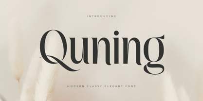 An Elegant serif font that we created special for elegant branding needs, with extra alternates in unique shape will be ready to add value of your brand. It so nice to leverage designer or product owner that need solutions to make their design look more classy and modern. And specially for Quning font, We prepared any alternate characters to help you create unlimited variations for your creative needs. Quning Modern Classy Elegant Serif Font ready with: Any options to get creative variations (combination of Alternate characters) Preview as a inspirations that you can do with Quning font Ready with Lowercase and Uppercase characters Wish you enjoy our font. :)
 - Elegancy Style by Sensatype Studio,
$15.00 Elegancy is Modern Luxury Elegant Font is a well-balanced contemporary font with a fancy, unique, and versatile Luxury serif, font that you can combine to get any variations and unique shapes easily just in seconds with choose alternates of them. It is a serif display font with moderate contrast that perfect for branding projects, logo, wedding designs, social media posts, advertisements, product packaging, product designs, label, photography, watermark, invitation, stationery, and any projects, it makes with a high level of legibility. What's Included: Character set A-Z Numerals & Punctuation Accented Characters (West Europe) Works on PC & Mac Recommended using Adobe Illustrator or Adobe Photoshop. Wish you enjoy our font. :)
 - Royal by Sensatype Studio,
$15.00 Royal is Modern Luxury Unique Serif Font is a well-balanced contemporary font with a fancy, unique, and versatile Luxury serif, font that you can combine to get any variations and unique shapes easily just in seconds with choose alternates of them. It is a serif display font with moderate contrast that perfect for branding projects, logo, wedding designs, social media posts, advertisements, product packaging, product designs, label, photography, watermark, invitation, stationery, and any projects, it makes with a high level of legibility. What's Included: Character set A-Z Numerals & Punctuation Accented Characters (West Europe) Works on PC & Mac Recommended using Adobe Illustrator or Adobe Photoshop. Wish you enjoy our font. :)
 - Tin Roof by Jukebox Collection,
$32.99 Tin Roof is a unique and original Jukebox font based on the 1958 hand lettered movie poster from "Cat on a Hot Tin Roof". The slightly modulated baseline and shaky letters give the font both a silly and sinister aspect. Perfect for any dramatic, spooky or sultry subject, Tin Roof has all the allure of a hot southern night! Jukebox fonts are available in OpenType format and downloadable packages contain both .otf and .ttf versions of the font. They are compatible on both Mac and Windows. All fonts contain basic OpenType features as well as support for Latin-based and most Eastern European languages.
 - Carves by Sensatype Studio,
$15.00 CARVES is a Modern Display Font A new Display Serif that we created special for logo and branding needs, with extra unique shape that will add your brand value. It so nice to leverage designer or product owner that need solutions to make their design look more Unique and modern. And specially for Sugar font, We prepared any alternate characters to help you create unlimited variations for your creative needs specially for logotype or wordmark. CARVES Modern Display font ready with: Any options to get creative variations (combination of Alternates) Preview as a inspirations that you can do with Carves font Ready with All Uppercase characters Wish you enjoy our font :)
