10,000 search results
(0.017 seconds)
- Stat Display Pro by Jure Kožuh,
$45.00 www.Stat-Type.com Complementary Type Family Stat Text Pro Stat Display Pro is an information design sans serif type family legible in circumstances of low visibility. Its large character set with multiple weights is defined by optimal size ratio, distinctive letter shapes, wide aperture and balanced counters. Stat Display Pro remains legible in unfavorable circumstances of distance, size, movement and similar. It contains nearly 700 glyphs, including diacritics, ligatures, small caps, old–style figures, arrows and more. This enables it to achieve wide language support. It consists of four main (Light, Regular, Medium, Bold) and four secondary, negative weights (Light Negative, Regular Negative, Medium Negative, Bold Negative) which are accompanied by their corresponding obliques. Stat Display Pro type family has higher than average x height (72% of cap height) which is accompanied by matching ascender and descender size ratios. With its distinctive letter shape detail it minimizes the possibility of letter shape confusion, while optimizing legibility with wide aperture and balanced counters. Its main intended use is information design, where it, with its characteristics, meets the requirements of wayfinding, infographics, table setting and much, much more. The development of the type family was based on research in legibility to achieve highly legible letter shapes, while not diminishing their visual character. A detailed description of Stat Pro type family is available at Stat-Type.com where a DEMO font can be downloaded.
 - TessieMiscellaneous by Ingrimayne Type,
$13.95 A tessellation is a shape that can be used to completely fill the plane—simple examples are isosceles triangles, squares, and hexagons. Tessellation patterns are eye-catching and visually appealing, which is the reason that they have long been popular in a variety of decorative situations. These Tessie fonts have two family members, a solid style that must have different colors when used and an outline style. They can be used separately or they can be used in layers with the outline style on top of the solid style. For rows to align properly, leading must be the same as point size. To see how patterns can be constructed, see the “Samples” file here. Shapes that tessellate and also resemble real-world objects are often called Escher-like tessellations. Most of the shapes contained in TessieMiscellaneous are Escher-like tessellations. Most or all of these shapes were discovered/created by the font designer during the past twenty years in the process of designing maze books, colorings books, and a book about tessellations. (Earlier tessellation fonts from IngrimayneType, the TessieDingies fonts, lack a black or filled version so cannot do colored patterns. The addition of a solid style that must be colored makes these new fonts a bit more difficult to use but offers far greater possibilities in getting visually interesting results.)
 - taller evolution - Personal use only

- cibreo - Personal use only

- delizioso - Personal use only

- Ulga Grid by ULGA Type,
$19.00 Update November 2022: ULGA Grid now features an oblique variant. It’s also been expanded into a family of different but related designs with the addition of ULGA Grid Solid and ULGA Grid Rounded typeface families. All variants and new designs are monospaced, sharing the same width as the original ULGA Grid font and matching character sets. The character set has also been enlarged and now supports Western Europe, Vietnamese, Central/Eastern Europe, Baltic, Turkish and Romanian. ULGA Grid is a modular, monospaced typeface reminiscent of the old Letraset LCD & Quartz typefaces from the 1970/80s with lots of alternative characters and ornaments to bring a fresh twist to the genre. The idea’s seed germinated while I was going through a phase of binge watching my favourite 1980/90s sci-fi movies (classics such as Terminator, Total Recall and RoboCop). However, perception and reality don’t always align. Thirty years later, when compared to today’s technology, some visual elements look kind of outdated, almost Retro Futuristic. The initial design process started out in Adobe Illustrator when I constructed letters from a few geometric shapes within a square block. Just playing around with different shapes was so engrossing that it wasn’t long before there were enough characters for a basic typeface. The project grew again as I experimented with designs within the shapes and set paragraphs of text in patterns, resulting in over a hundred alternative characters and ornaments, some of which double up as border designs. This typeface may be square but it’s anything but boring. What it lacks in legibility ULGA Grid makes up for in style and the end result is a surprisingly versatile typeface that you'll have fun using for a wide range of display purposes including CD covers, posters, packaging, advertising, brochures and film titles. Ironically, the fixed grid structure frees the characters to create patterns of text not possible with variable widths.
 - HoTom by Linotype,
$29.99Linotype Ho Tom is part of the Take Type Library, which features winners of Linotype’s International Digital Type Design Contest from 1994 to 1997. Designed by Thomas Hoffman, this font’s historical roots are easily traced to the slab serif style. Ho Tom was originally intended as a lettering system for a project in the center of the old East Berlin. This explains the stable, angular characters and the consistent rectangular base forms, which also makes Ho Tom a very legible font, suitable for longer texts. - Charmer JNL by Jeff Levine,
$29.00 Found on the back of some sheet music to promote another song was the hand-lettered title "The Snake Charmer". While not everyone likes snakes, many designers do like the lettering of the Art Deco era, so Charmer JNL is designed from that lettering.
 - Wonder Night by Arterfak Project,
$23.00 Express your imagination with Wonder Night! a fancy fantasy font inspired by magical storybook and horror-fantasy movies. This font created with a very bouncy of letterforms, and carefully kerned into a readable typeface. Wonder Night is an all-caps font that easy to play with. You can combine the uppercase and small caps to get a more playful design. Also completed with alternates and doodles as the decoration to get a more beautiful design. Wonder Night is suitable for children's merchandise, books, logotype, T-shirt, poster, title, quotes, and more! Fonts featured : - Uppercase - Small-caps - Numbers - Punctuation & symbols - Accented characters - Stylistic alternates - Stylistic set 02-03 - Doodles (simply type 'underscore' and 'A-N'; eg: _A, _B, _C etc) Thank you for visiting and supports. Have a nice dream! ramz
 - Chorus by Soneri Type,
$23.00 Chorus is a collective effort to sing in harmony. Similarly, each letter is designed to reflect harmony when used together to form a letter, sentence or paragraph. Letters like B, D, P and R have curved stroke (instead of straight line) while joining vertical stem. Letter K, k, and R have similar disjoint point in middle and unique plus stylish curve at foot. Letter C and G has distinct horizontal cut at top as compared to other letters in typeface e.g. S. Letter like b, h, m, n, and p have consistent stroke joint style with vertical stem. Ink traps in various letters are designed such that they blend with the letter form at certain degree instead, getting emphasised. The family comes in various styles in weight and width.
 - Lovely Scream Queens by Youngtype,
$15.00 Lovely Scream Queens is a hand brush font made with brushes and ink. This typeface is ideal for use in thick watercolor designs or in those needing a hand writing touch such as blog titles, posters, comic books, t-shirts, clothing, book covers, business cards, greeting cards, branding, merchandising and more. Lovely Scream Queens contains a full set of: Uppercase Lowercase alternative n, b, i, w, l, e Punctuation numbers multi-lingual support Lovely Scream Queens Italic works in harmony with Lovely Scream Queens Regular to create exceptional typographic creations. Get inspiration from the preview above. How to access all alternative characters, using Windows Character Map with Photoshop: https://www.youtube.com/watch?v=Go9vacoYmBw How to access all alternative characters using Adobe Illustrator: https://www.youtube.com/watch?v=XzwjMkbB-wQ Thank you!
 - MV Bombay by ManVsType,
$40.00 Bombay is serif type family by ManVsType. It is ideal to use at larger sizes as a display font. The family comes in 5 weights in 2 styles (normal stem height and low stem height). This font is variable in its weight and "connection" heights in the letters a, b, d, h, m, n, p, q, r and u. The typeface has a number of ligature including an R+s ligature that automatically turns into the ₹ (rupee symbol) to solve a major problem in the Indian subcontinent where people don't know how to type it. Bombay is inspired by the colonial version of the city. The city being a melting pot of all kinds of people. Poets, writers, filmmakers enjoyed the city and it quickly became the cultural hub of the entire country.
 - Tin Doghouse - Unknown license

- Tin Birdhouse - Unknown license

- Yolien by Reyrey Blue Std,
$16.00 Introducing, Yolien Font. A retro, cute, and modern inspired by the flowy freeform lettering of the '60s and '70s. This font has a unique shape where every corner is smoother and more rounded. Every curve is designed based on an authentic and natural style. Yolien is perfectly suitable for a layout design for quotes or body copy, best used as a display for headings, logos, branding, magazines, product packaging, invitations: logotypes, and much more.
 - Saskatoon Stencil JNL by Jeff Levine,
$29.00 Inspiration for font design takes on many shapes and forms. It can be vintage source material, visualized concepts or simply suggestions made by others. In an email conversation with Kevin Redekop (the Principal Designer for FabArts Creative Fabricators in Canada) who had purchased a number of Jeff Levine Fonts, a sample sketch of a desired stencil font was provided. This set the wheels into motion for the drawing and production of Saskatoon Stencil JNL.
 - West West by Fenotype,
$25.00 West West is a high-contrast condensed display serif. West West has extra large x-height making it suitable for efficient choice for distinguishable display use such as headlines, packaging, magazines, posters and advertising, among any other. In large sizes, you can also try tighter tracking for maximum impact. With certain of Art Nouveau shapes and massive contrast West West is a great choice anywhere you need a stylish and fashionable touch.
 - Super Love Christmas by Prioritype,
$15.00 Here comes a special Christmas font with a beautiful and unique shape equipped with various alternative characters and of course there are extra bonuses. This font makes it easy for you in various projects that you create. Can be applied to print and digital media such as invitations, clothes, crafts, packaging, and there is still so much to explore. For reference, see preview. Features: -Uppercase -Lowercase -Numeral -Punctuation -Multilingual -Ligature -Alternate -Extra Bonus
 - Moranga by Latinotype,
$29.00 Moranga is a contemporary, serif, retro-style typeface with a strong personality. Its design is a mixture between Café Brasil's flowing, organic shapes and elements from 70's popular fonts such as Cooper and Souvenir. Moranga, in 5 weights and matching italics, is the perfect choice for headlines, display use and high-impact or friendly designs. Moranga contains a set of more than 400 characters and supports over 200 Latin-based languages.
 - Australis Pro Swash by Latinotype,
$29.00 Australis Swash is a new variant that adds to the family of Australis Pro and it brings a touch of whimsy and mannerism to the shape of the cursive letters. Its purpose is purely playful because Australis Swash has some useful Opentype features as standard ligatures, discretionary ligatures and contextual alternates to use them in headlines or as a base for brands and lettering in general. Designed by Francisco Gálvez Pizarro in 2013.
 - The Buchen by Larin Type Co,
$15.00 The Buchen is an excellent combination of smooth shapes and medium weight. It will fit perfectly into any project, both in a modern style and in a vintage style. It can also be classic and more expressive and playful thanks to the alternatives and ligatures that are harmoniously combined in this font and add charm to your project. Making it more versatile to use. This font is easy to use has OpenType features.
 - Diamond Jim JNL by Jeff Levine,
$29.00Diamond Jim JNL was inspired [in part] by an image of a 1970s Letraset® dry transfer typeface made entirely of small stars. By creating his own layout using tiny diamond shapes, Jeff Levine has produced a font that takes on multiple appearances. At 24 point it resembles dot matrix printing; at 48 point the diamonds are clearly visible; and overall, the design has a distinctive 70s retro feel. Limited character set. - Centric by Scholtz Fonts,
$19.00Centric is a rounded and happy font. The circular design that covers the face of this font was inspired by the ripples made when a pebble is thrown into a pond. The outline shapes of the characters were derived from the Font Mafuta. Centric is doubly effective when used in conjunction with Mafuta. It is best used for headings and where you intend to make a strong impact, possibly with an African flair. - Pisak by Cuda Wianki,
$20.00How many times have you been looking for a handwritten yet not childish font without result? We have a nice solution for you-our brand new PISAK! :) Thanks to extra thin condensed letters PISAK is easy readable and ideal for text writing. Its subtle irregularity makes it warm and friendly good for unoficial designs. If you like the shape of the letters but you need a more official and regular version see our Lalalo font. - Collage BB by Posterizer KG,
$24.00 Collage BB font was created for visual imitating of cuted paper Serif letters. The idea was to imitate kid’s clumsiness and irregular shape of letters. Good readability allows using this font for making some long texts. The font contains all the Latin and Cyrillic glyphs. BB - Bajina Bašta (Bašta in English means Garden) is the name of the small town where I spent my carefree childhood. That’s why I was inspired by Peter Pan.
 - Hleba Soli Ziamli Voli by Koval TF,
$39.99 Hleba Soli Ziamli Voli typeface is a graphic discovery on title type that combines traditional poster shapes with Humanist notes from Renaissance. Hleba Soli Ziamli Voli is named after Belarus poem by Yanka Kupala and inherits some original glyph designs from Renaissance printings by Francisk Skoryna. Hleba Soli Ziamli Voli due to wide variety of weights is great for titles and posters. Cyrillic and Latin support makes the type sutable for multilingual communications.
 - Aduana by Fabio Ares,
$- Aduana is the first typographic product of argentine-chilean typographic archeology project called "Valpo. Ciudad de Letras" (Fabio Ares & Karin Thiers, since 2016). Based on the letter located on the front of the Customs building (Valparaíso, Chile). The resultant family can be described as display type and modern renaissance style, with geometric shapes and serif and mild line modulation. The proceeds from the sale of the fonts will be used to finance the project.
 - HD Arnie by HyperDeluxe,
$30.00 HD ARNIE is a unique little typeface. It has a combination of brutalist angles mixed with soft shapes and ink traps to create a truly unique viewing experience. The many alternates give you the flexibility and customisation to treat ARNIE as you wish and create a combination just right for you & your brand. ARNIE has many extras as well as Variable support to make this a must have font of 2022 (and beyond!).
 - Miss Demeanor by Typadelic,
$19.95 Miss Demeanor has a tendency to create her own rules due to her free-spirited nature. She conforms to every day typographic expectations but she wouldn’t like you to think so. She has unusual yet casual and eye catching shapes and makes the best of any situation. I hope you enjoy her pretty style! My inspiration for Miss Demeanor came from a specimen sheet of an american type style from the early 1930’s.
 - French Art Initials JNL by Jeff Levine,
$29.00The source for these hand-drawn initials was an early 20th Century French alphabet book whose pages were displayed online at an image sharing site. This style typifies the Art Nouveau period, and makes a wonderful paragraph starter or "drop cap" for your printed projects. Some users may still want to compose headlines with this font, but be aware there are no punctuation marks, accents or kerning - just the twenty-six initials. - Fladerling by Graphicfresh,
$18.00 This minimalist font inspired by cherry stems is a great choice for impactful logo design and branding. The elegant and simple shapes of each character make it versatile and suitable for any type of logo, whether it's a wordmark or a symbol. The cherry stem inspiration adds a unique touch that sets it apart from other fonts. Use this font to create a lasting impression and memorable branding for your business or project.
 - Cuthick by GuseType,
$12.00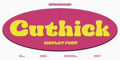 Cuthick is a display font that made based on thick lines, this font has a chubby and cute shape. You can use this font in playful, retro, and vintage style designs. This font can be use for a variety of projects or artwork such as sticker, headline, branding, product label, poster, logotype, magazine, and many more. Feature: - Kerning - Alternative Style and Ligature - Uppercase and Lowercase Letters - Numeral - Punctuation and Symbols - Multilingual Supports
 - AO Hyperion by OwunStudio,
$12.00 Hyperion is high contrast serif font with clean, sharp and elegant lines and shapes. Features a mixed modern-futuristic design, being a typeface whose conception is highly drawn to the idea of modernity. All contain character sets that includes approximately 600+ glyphs, support multilingual languages, numbers, punctuation and many alternative-ligatures. This Hyperion Display can make your project perfect for headlines, editorial design, monograms, branding, logos, poster design, or other typographic compositions.
 - Yukura by CONNECRE,
$10.00 Yukura is a charming and approachable sans-serif font that combines cuteness and friendliness. This font features a plump shape that is perfect for designs aimed at children or with a cute aesthetic, and its bold lettering makes it especially suitable for logos and headlines. With its endearing and approachable qualities, Yukura can effortlessly infuse your designs with an irresistible charm. Don't hesitate to incorporate it into your designs and showcase its adorable personality.
 - The PUNCHER by PAC Font Corner,
$120.00 ThePuncher typeface is made exactly for the book, poster, flyer or any type of titles, and for customers who wants to have bold and eye-catching final product. It can be used as a single letter for a logo or for numbering of anything you want. It is not made for long sentences. ThePuncher typeface purpose is to make big bang from your short and specific messages you want to share with the world.
 - Giane by XdCreative,
$25.00 Giane serif is a serif font family with old style as body text and modern contemporary as display, it's a very harmonious blend, this makes Giane very easy to read and beautiful. Giane Text is created and inspired by old style fonts with a modifications to newer and fresher serif shapes. Giane complet family comes with 16 fonts, 7 different weights, oblique and true italic including display and body text. _Thank you
 - Spirit of 69 by Mysterylab,
$21.00 Here's a lively new take on the swirly psychedelic type we all know and love, Spirit of '69 brings in some subtle dimensions of waviness to the vertical strokes, upslanted horizontal strokes, and alluring paisley shapes formed out of the negative spaces. This is a unicase font, in the grand tradition of the Art Nouveau lettering of the early 20th century, and the melty groovy fonts of the 1960s. Lots of fun and beautiful too!
 - Conamore by Grida,
$19.00 Conamore is a new Humanist Sans family. It consists of 16 styles (8 weights and 8 italics). The structure of the typeface is in a position that is neither too modern nor too classic. It was based on humanist frame and style, but we controlled the shape and removed potential eyesores so it can be easily recognized. These characteristics are suitable for the design requirements, such as editorial design, packaging, branding and display.
 - HU Suryeo KR by Heummdesign,
$25.00 HU SuryeoKR is a new typeface of Heumm's calligraphy that takes the motif from carefully written calligraphy. It follows the calligraphic shape of Korean classics and can be used for titles and body text without distinction. The stroke thickness, strength, and degree of bending were set differently for each style. The thinner it is, the sharper it is, and the thicker it is, the blunt and round it is. HU SuryeoKR includes Korean.
 - Quida Rough by LetterMaker,
$21.00 Quida Rough is a textured display family with three styles; Regular, Italic and Script. The personality of the design comes the rough, worn outlines and concave vertical shapes, which are consistent through all styles. This makes them work together seamlessly. Quida Rough Script is packed with opentype goodness such as swash caps, stylistic alternates, ligatures and ending forms for lowercase letters. All styles have an extended language support for most European languages.


