10,000 search results
(0.027 seconds)
- Skala Display by Hazztype,
$20.00 Skala is a contemporary display, semi condensed, semi sans serif. It has unique diagonal stress, pointy bowls, and terminals, mixing straight and bowed stems. The unique style of Skala makes it look masculine, tough, and strong. Inspired by earlier semi-serif typefaces, Skala mixed and matched serif and sans serif characters that bring attention to any design which makes this display font a great option for logos, labels, signs, headlines, business cards, etc.
 - White Alchemy by Nicky Laatz,
$22.00 White Alchemy is a wildly flamboyant signature script, designed to stand out from the crowd. Inky fountain pen imperfections and an avant-garde attitude make it perfect for a completely natural and unique brand look. A large selection of Opentype ligatures and character alternates add to its natural flow and look. Make sure your Opentype features are active in whichever app you use to type with it, to see this font at it's best.
 - Morthix by Lone Army,
$17.00Introducing our latest font, which features fluid and flowy curves reminiscent of liquid. This font's contemporary style makes it perfect for use in headers and futuristic designs, adding a creative touch that's sure to catch the eye. Its elegant and modern appearance creates a striking impression, making it ideal for designs that need to stand out. With this font, you can create a unique and eye-catching look that's perfect for any project. - Balder Dash NF by Nick's Fonts,
$10.00The distinguishing characteristics of this typeface were suggested by cover artwork for the May 1930 issue of Inland Printer: a combination of caps based on Breda Gotisch, released by H. Berthold AG in 1928, and a lowercase based on Goudy Text. The result is a remarkably elegant and retro-stylish blackletter face. Both versions of the font contain the complete Latin 1252 character set plus support for Central European (Unicode 1250) languages as well. - Archipad Pro by Bejeletter,
$14.00 Archipad Pro is a geometric sans and slab font family, The combination of modern geometric elements make it clean and readable with the form and matching oblique. Archipad Pro Consist of 9 weight sans and 9 weight of slab, makes more free choice in writing with 36 font styles. 9 Weights Sans and Slab (Thin, Extralight, Light, Regular, Medium, Semi Bold, Bold, Extra Bold and Black) Oblique font is available Latin Pro
 - Mylestock by Maulana Creative,
$13.00 Mylestock is a handwritten script font, With fancy slanted and fun characters. It has Opentype features of ligatures, makes it a perfect choice for branding and digital designs. Use this font for logos, social media, websites, blogs, instagram, social media, business cards, branding, and more! Mylestock font support multilingual more than 100+ language. and good pair for your secondary text font with sans or serif. Make a stunning work with Mylestock script font. Cheers, MaulanaCreative
 - MTC Maglita by Martype co,
$59.00 MTC Maglita is a semi-slab serif font that comes with seven styles for display purposes to make it satisfying, also suitable for minimalist, chic, branding, packaging, and logotype design to boost your design exploration. Additional Information Comes with many iconic symbols and arrows (which can be accessed from glyphs in your Adobe software) Multilingual Support supports many different languages 20+ Seven styles to make it more versatile typefaces Thanks & Happy Designing! Umar
 - Moirt by Nathatype,
$29.00 Prepare to make a bold statement with Moirt, an uppercase serif display font that commands attention. Each uppercase letter stands tall and robust, making a commanding presence on any canvas. The spacious layout enhances legibility and gives the font a contemporary, open feel. Delicate lines run parallel to the edges of the letters, adding a unique and captivating visual element. Moirt fits in headlines, logos, branding materials, print media, editorial layouts, and many more.
 - Ownttys by Maulana Creative,
$14.00 Ownttys is a handwritten script font, With fancy slanted and fun characters. It has Opentype features of ligatures, makes it a perfect choice for branding and digital designs. Use this font for logos, social media, websites, blogs, instagram, social media, business cards, branding, and more! Ownttys font support multilingual more than 100+ language. and good pair for your secondary text font with sans or serif. Make a stunning work with Ownttys script font. Cheers, MaulanaCreative
 - Benito by Hipfonts,
$9.00 Benito is a font that exudes elegance and sophistication. With its timeless design, it adds a touch of class to any project. The sleek, professional look of Benito makes it a perfect choice for high-end brands and upscale designs. Additionally, its multilingual support makes it versatile and accessible to a global audience. Whether used in print or digital media, Benito is a font that commands attention and leaves a lasting impression.
 - Amberlayton by Maulana Creative,
$14.00 Amberlayton Signature Font, with monoline stroke, condensed and fun characters. It has Opentype features of ligatures, makes it a perfect choice for branding and digital designs. Use this font for logos, social media, websites, blogs, instagram, social media, business cards, branding, and more! Amberlayton font support multilingual more than 100+ language. and good pair for your secondary text font with sans or serif. Make a stunning work with Amberlayton signature font. Cheers, MaulanaCreative
 - Kinder by 1871 Project,
$15.00 Introducing Kinder, our first serif font featuring both upper and lowercase characters! Featuring unique beautiful curves and a modern feel (look at that K!) Inspired by old records and packaging designs, with an 1871 spin. It has a beautiful range of stylistic alternates with unique characters making it a versatile powerhouse for logos, headlines, posters, shirts, you name it! Pick up Kinder today and make the world more beautiful with your creations!
 - Mailboy by Graptail,
$15.00 A Mailboy Font is a Nostalgic and Chunky typeface with a style that typically features a classic, timeless design that evokes nostalgic feelings. This type of font is often used to make a bold statement or give the text a more artistic or vintage feel. Nostalgia and Chunky fonts are often used in logos, posters, and titles to make them stand out and grab attention. It has 2 font styles, Bold and Oblique with alternates.
 - Bekof by Twinletter,
$15.00 Bhekof is typography with strong characteristics. Explore several other eras of art and combine them into a strong Bhekof characteristic. A great typeface for your next design project. Looking for a typestyle that has strong characteristics? Look no further than Bhekof! This awesome typeface has a vintage look that will make your designs stand out from the rest. With strong characteristics like this, it’s no wonder it makes your design very popular.
 - Cenios by Craft Supply Co,
$15.00 Presenting Cenios: An expanded sans-serif font that ushers in a new era of design. With its generously spaced letterforms and contemporary charm, Cenios injects a fresh modernity into your projects. Embrace the broadened possibilities with Cenios' expansive style, perfect for making bold statements and maximizing visual impact. This typeface is ideal for greeting card, packaging, brand identity, poster, or any purpose to make your design project look eye catching and trendy.
 - Cashwoots by Maulana Creative,
$12.00 Cashwoots is a handwritten script font, With fancy and fun characters. It has Opentype features of ligatures, makes it a perfect choice for branding and digital designs. Use this font for logos, social media, websites, blogs, instagram, social media, business cards, branding, and more! Cashwoots font support multilingual more than 100+ language. and good pair for your secondary text font with sans or serif. Make a stunning work with Cashwoots handwritten script font. Cheers, MaulanaCreative
 - Castle by Linotype,
$29.99This family, which includes faces in light, book, bold, and ultra weights, more stroke contrast than is typical of sans serifs, making it very legible in text. Because of its large x-height, it is recommended for used in point sizes ranging from 12 point upward. Of course, it functions well in display sizes, too. The contrast between the four weights makes this family optimal for use in hierarchical advertising systems, and corporate identity uses. - Baby Dastheg by IRF Lab Studio,
$10.00 Baby Dastheg is a feminine modern handwritten font, carefully handcrafted to become a true favorite. Its casual charm makes it appear wonderfully down-to-earth, readable and, ultimately, incredibly versatile. Baby Dastheg will look outstanding in any context, whether it’s being used on busy backgrounds or as a standalone headline. Equipped with alternative letters for beginning and ending. and also "stylistic alternates" which makes this letter very beautiful and attractive. Thank you
 - Marchens by Ironbird Creative,
$20.00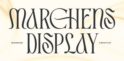 Introducing Marchens, a stylish and modern display serif, making it a versatile and elegant typeface. With a touch of vintage vibes, it will make your presentation looks amazing and sophisticated! You can use this typeface for logo, poster, event, or your social media post. Also support Multi Language and already PUA Encoded! Features: Uppercase & Lowercase Number & Symbol Multi language Ligatures Alternates PUA Encoded Thanks for purchasing and happy creating! Regards, Ironbird Creative
 - Qe Laurenty by Hishand Studio,
$15.00 The newly released Qe Laurenty sans serif font exudes an air of timeless sophistication and elegance. Its clean lines and precise geometry make it a truly classy choice for any design project. Qe Laurenty's refined curves and delicate letterforms add a touch of luxury to any typographic composition. This font's exquisite detailing and balanced proportions make it perfect for creating elegant branding materials. Complete with ligatures alternates regular italic icon kerning multilingual support
 - Patrol Car Stencil JNL by Jeff Levine,
$29.00 Comic books based on popular characters have been around pretty much since the advent of comic books themselves. An edition of the "Car 54 Where Are You?" series published by Dell (and based on the hit TV show created by Nat Hiken) displayed "Car 54" in a bold hand lettered stencil design on the cover. These few characters became the inspiration for Patrol Car Stencil JNL, which is available in both regular and oblique versions.
 - Roadstone by Putracetol,
$24.00 Roadstone is a modern stylish script font that inspired by streetwear and combination hand lettering style. Bold in every character, making this font the perfect fit for your apparel project. Also ideal for logos, badge, label, apparel, club, event, handwritten quotes, product packaging, header, poster, merchandise, social media & greeting cards. Roadstone come with opentype feature like a lot of alternates. Its help you to make beautiful lettering. This font is also support multi language
 - Fan Script by Sudtipos,
$99.00 A friend of mine says that sports are the ultimate popular drug. One of his favorite things to say is, “The sun’s always shining on a game somewhere.” It’s hard to argue with that. But that perspective is now the privilege of a society where technology is so high and mighty that it all but shapes such perspectives. These days I can, if I so choose, subscribe to nothing but sports on over a hundred TV channels and a thousand browser bookmarks. But it wasn't always like that. When I was growing up, long before the super-commercialization of the sport, I and other kids spent more than every spare minute of our time memorizing the names and positions of players, collecting team shirts and paraphernalia, making up game scenarios, and just being our generation’s entirely devoted fans. Argentina is one of the nations most obsessed with sports, especially "fútbol" (or soccer to North Americans). The running American joke was that we're all born with a football. When the national team is playing a game, stores actually close their doors, and Buenos Aires looks like a ghost town. Even on the local level, River Plate, my favorite team where I grew up, didn't normally have to worry about empty seats in its home stadium, even though attendance is charged at a high premium. There are things our senses absorb when we are children, yet we don't notice them until much later on in life. A sport’s collage of aesthetics is one of those things. When I was a kid I loved the teams and players that I loved, but I never really stopped to think what solidified them in my memory and made them instantly recognizable to me. Now, thirty-some years later, and after having had the fortune to experience many cultures other than my own, I can safely deduce that a sport’s aesthetic depends on the local or national culture as much as it depends on the sport itself. And the way all that gets molded in a single team’s identity becomes so intricate it is difficult to see where each part comes from to shape the whole. Although “futbol” is still in my blood as an Argentinean, I'm old enough to afford a little cynicism about how extremely corporate most popular sports are. Of course, nothing can now take away the joy I got from football in my childhood and early teens. But over the past few years I've been trying to perceive the sport itself in a global context, even alongside other popular sports in different areas of the world. Being a type designer, I naturally focus in my comparisons on the alphabets used in designing different sports experiences. And from that I've come to a few conclusions about my own taste in sports aesthetic, some of which surprised me. I think I like the baseball and basketball aesthetic better than football, hockey, volleyball, tennis, golf, cricket, rugby, and other sports. This of course is a biased opinion. I'm a lettering guy, and hand lettering is seen much more in baseball and basketball. But there’s a bit more to it than that. Even though all sports can be reduced to a bare-bones series of purposes and goals to reach, the rules and arrangements of baseball and basketball, in spite of their obvious tempo differences, are more suited for overall artistic motion than other sports. So when an application of swashed handlettering is used as part of a team’s identity in baseball or basketball, it becomes a natural fit. The swashes can almost be visual representation of a basketball curving in the air on its way to the hoop, or a baseball on its way out of the park. This expression is invariably backed by and connected to bold, sleak lettering, representing the driving force and precision (arms, bat) behind the artistic motion. It’s a simple and natural connective analysis to a designer, but the normal naked eye still marvels inexplicably at the beauty of such logos and wordmarks. That analytical simplicity was the divining rod behind Fan Script. My own ambitious brief was to build a readable yet very artistic sports script that can be a perfect fit for baseball or basketball identities, but which can also be implemented for other sports. The result turned out to be quite beautiful to my eyes, and I hope you find it satisfactory in your own work. Sports scripts like this one are rooted in showcard lettering models from the late 19th and early 20th century, like Detroit’s lettering teacher C. Strong’s — the same models that continue to influence book designers and sign painters for more than a century now. So as you can see, American turn-of-the-century calligraphy and its long-term influences still remain a subject of fascination to me. This fascination has been the engine of most of my work, and it shows clearly in Fan Script. Fan Script is a lively heavy brush face suitable for sports identities. It includes a variety of swashes of different shapes, both connective and non-connective, and contains a whole range of letter alternates. Users of this font will find a lot of casual freedom in playing with different combinations - a freedom backed by a solid technological undercurrent, where OpenType features provide immediate and logical solutions to problems common to this kind of script. One final thing bears mentioning: After the font design and production were completed, it was surprisingly delightful for me to notice, in the testing stage, that my background as a packaging designer seems to have left a mark on the way the font works overall. The modern improvements I applied to the letter forms have managed to induce a somewhat retro packaging appearance to the totality of the typeface. So I expect Fan Script will be just as useful in packaging as it would be in sports identity, logotype and merchandizing. Ale Paul
 - MARIAMNE by Type Innovations,
$39.00 MARIAMNE is an original design by Alex Kaczun. It is an elegant, modern and traditional interpretation based on and modeled after his successful "Contax Pro" and "New Age Gothic" typeface series. As such, it has generous proportions with clean, crisp lines—ideally suited for easy reading and long lines of copy. Alex felt that the skeleton for "Contax" was perfectly suited to transform the design into a modern version of 'old-style', somewhat reminiscent of German Black Letter. Numerous modifications where made to the body proportions, stems and shapes. True 'old-style' serifs and unusual 'cross-strokes' where added for a touch of distinction. The 'cross-strokes' where added at exactly visual mid-point on the overall heights. This gives the typeface a romantic, female-like quality to the overall design. Strong, yet delicate. Visually stimulating in appearance and function. The result is a truly unique transitional and modern design. Unlike other typefaces, MARIAMNE incorporates uniform stems throughout the capitals, lower case and figures. This gives the design a uniform appearance in overall color and strength. There is a perfect visual balance between inter-letter spacing, stem weights and proportions. The accents are equally large, bold and command attention. This font includes a large 'Pro' character set, which supports most Central European and many Eastern European languages. As a result, the design is ideally suited for display copy as well as text composition. In the near future, Alex plans to expand the typeface series to include a light and heavy weight, along with true italics.
 - Fino by TypeTogether,
$35.00 Tall, stately, and refined, with a showy contrast between thick and thin, a certain kind of titling Didone has become synonymous with fashion. Ermin Međedović’s latest type system amplifies the most theatrical aspects of this genre while bringing an uncommon flexibility of style and variation to any type palette — particularly those required for editorial design. Fino is a Rational (or Modern) display serif with sharp details. Its fairly Title proportions produce a regular beat of bold stems at frequent intervals. One can add an unexpected twist to this plot line by introducing the alternate ‘C, D, G, O, and Q’ (found in the uppercase); these replace the standard, Title oval shapes with big, full, show-stopping round ones. Other alternate forms, along with a grand ensemble cast of ligatures, lets the director continually flip the script. This stage is set in three acts: Fino, Fino, and Fino Stencil. Each of these offer six weights and italics, and each actor is comfortable speaking any Latin-based language, from standard Hollywood English to the many accents of Eastern Europe. Finally, every style comes in two optical sizes, with Title having the finest hairlines for the biggest parts. This lets you put Fino to work in a variety of productions, from short texts (24pt–48pt settings) to epic titles. The complete Fino family, along with our entire catalogue, has been optimised for today’s varied screen uses. All these talents let Fino perform a range of roles far broader than your typical Bodoni or Didot.
 - Seventies by Lián Types,
$37.00 'Meeeeoooow'! Seventies is another of my 'funkadelic' attempts (1) to fill the existing gap of seventyish looking fonts. In my opinion, that decade has a hidden treasure regarding type that remains unexplored: Only very few fonts rescue its 'groovy' essence, its ‘colourful’ qualities. But, don't have a cow man , and keep on truckin! With Seventies, my new foxy mama , your projects will stand out among the rest. Since there’s not much information available about this kind of lettering I had to get ideas from other styles: Nowadays it’s easy to find all kind of books or guides to understand and practice how different styles of calligraphy and lettering should be done. However, for some reason, 60s and 70s letters seemed to ignore/be free of rules... Was this suggesting the birth of postmodernism? I incorporated some ideas of the copperplate style of calligraphy: The ductus of its forms may be compared to the way letters are made in snell/engrosser’s script. Obviously, this is just the idea behind; the delicacy of thins is replaced here with the graceful imprint of really thick thicks with a brushy look and tons of good vibe . Seventies will work awesome in posters, brands, magazines, book-covers of any kind, due to its modern look adapted to our century. Well, catch you on the flip~side ! STYLES To make you more psyched , Seventies is a layered font! See examples in the posters using Seventies Shade, Seventies Shine and Seventies Printed. NOTES (1) My first one was with Beatle in 2014.
 - Coffee Beans Time by TypoGraphicDesign,
$9.00 The typeface Coffee Beans Time is designed from 2018–2022 for the font foundry Typo Graphic Design by Manuel Viergutz and Annelena Grascht as a graphic design and photography project. The display font based on the original coffee beans and create a dingbat pattern. 3 font-styles (Dingbats, Mix, Coffee Ground) with 304 glyphs (Adobe Latin 2) incl. decorative extras like icons, arrows, dingbats, emojis, symbols, geometric shapes (type the word #LOVE for ♥︎ or #SMILE for ☺ as OpenType-Feature dlig) and stylistic alternates (2 stylistic sets). For use in logos, magazines, posters, advertisement plus as webfont for decorative headlines. The font works best for display size. Have fun with this font & use the DEMO-FONT (with reduced glyph-set) FOR FREE! ■ Font Name: Coffee Beans Time ■ Font Styles: 3 (Dingbats, Mix, Ground) + DEMO (with reduced glyph-set) ■ Font Category: Display for headline size ■ Glyph Set: 304 glyphs (Adobe Latin 2) incl. extras like icons (decorative extras like arrows, dingbats, emojis, symbols) ■ 93 languages: Afrikaans Albanian Asu Basque Bemba Bena Breton Catalan Chiga Cornish Danish Dutch English Estonian Faroese Filipino Finnish French Friulian Galician German Gusii Indonesian Irish Italian Kabuverdianu Kalenjin Kinyarwanda Luo Luxembourgish Luyia Machame Makhuwa-Meetto Makonde Malagasy Manx Morisyen North Ndebele Norwegian Bokmål Norwegian Nynorsk Nyankole Oromo Portuguese Quechua Romansh Rombo Rundi Rwa Samburu Sango Sangu Scottish Gaelic Sena Shambala Shona Soga Somali Spanish Swahili Swedish Swiss German Taita Teso Uzbek (Latin) Volapük Vunjo Welsh Western Frisian Zulu ■ Design Date: 2018–2022 ■ Type Designer: Manuel Viergutz und Annelena Grascht
 - Vernacular Sans by jpFonts,
$19.95 The Vernacular trilogy was designed by Swiss designer Hans-Jürg Hunziker, who had worked for Adrian Frutiger in Paris for many years. Based on the concept of a transitional Linear Antiqua, he has developed a colorful bouquet of typefaces that contain the entire spectrum of typefaces for book design and corporate identity. Thanks to his "Swiss school" and his outstanding skills, he has succeeded in giving the typefaces a particularly noble and sympathetic expression. In addition to the Sans family, there is a Serif family and a Clarendon family, each of which, including the separately drawn italics, is equipped with 12 font weights that are finely tuned to one another. Each of the 3 font styles develops its own character, but thanks to a concept that brings the different font styles closer together, they also work well together and complement each other perfectly. Sans and Clarendon have a vertical axis and similar endings in contrast to the Serif, which has a traditional diagonal axis and horizontal endings. The straight stems and the proportions are used as an element to stress the closeness of the typeface-trilogy. They thus share a comon feature. All fonts contain tabular and proportional figures as well as old style figures. Small caps and small cap figures are also available in all fonts. In addition, some fonts have alternative characters available via style set, such as «g», which can be used to further vary the typeface. Vernacular offers all the options for well-kept typesetting for print and web - for small and large orders.
 - Belda by insigne,
$29.99 Step into the beauty of Belda’s elegant form and discover the richness flowing from both its historic influence and its strong elements. At its heart, Belda's graceful style embodies the classical calligraphy of the Roman capital, best known from such Roman monuments as Trajan's Column. To lessen the possibility for error, the builders of these defining structures brushed their templates onto the marble before taking their first cuts from the expensive stone. These simple strokes now mark a simple but wonderful path full of life and mystery. Beyond a copy of the past, Belda has grown from its roots to offer a brave, new world of potential through its still-simple structure. The new design strongly contrasts thickness and stroke. Its delicate shape, curves and sharp serifs provide a unique style of harmony and beauty. The resulting balance? The lighter weight design remains subtle and elegant, while the combination in its bolder counterparts provides an intense luster and sparkle, pulling the reader’s eye to the font’s captivating features. A quick look beyond its surface of standard forms also reveals Belda has more layers to discover with OpenType small capitals, titling capitals and more. With a wealth of weights and many widths beside, the font is capable of serving as both text and titling. While especially strong as a movie title or poster font, it’s also great for book jackets, advertising, and packaging. So start your journey with Belda. The possibilities to explore on this path are practically endless. Production assistance from Lucas Azevedo and ikern.
 - Alverata PanEuropean by TypeTogether,
$119.00 Gerard Unger’s new typeface Alverata is a twenty-first-century type-face inspired by the shapes of Romanesque capitals in inscriptions of the eleventh and twelfth centuries, without being a close imitation of them. It is additionally based on the early twentieth-century model, but tweaked so as to prevent blandness and monotony. Alverata performs beautifully in both screen and on paper, delivering excellent legibility. Its letters are open and friendly in small sizes and lively and attractive in large sizes. They are robust, and show refinement in their detail. Unger’s Alverata is an extensive type family, with versions for both formal and informal applications, and with Greek and Cyrillic relatives. Alverata consists of three different fonts: Alverata, Alverata Irregular and Alverata Informal, that vary in form and width, but maintain the same spirit. The Irregular version is particularly inspired by the Insular letterforms, the uncials, and their constantly changing positioning. Alverata strikes a balance among Europe’s diversity of languages, combining contemporary typographical practices with features of medieval letterforms, from the time when Europe came into being. Visually, some written languages, such as Czech and Maltese, differ quite strongly from languages like English and German, notably because of their many accented characters. While other typefaces will show this difference, Alverata removes it. As a result, Alverata enables harmonious convergence of languages. For the development of the Greek letterforms, Unger collaborated with Gerry Leonidas (University of Reading) and Irene Vlachou (Athens), and with Tom Grace on the Cyrillic letterforms.
 - Xaver Grotesk by Xaver Design Studio,
$25.00 Xaver Grotesk Variable, a font that emerged in the creative landscape of 2023, stands as a testament to contemporary typographic innovation. This font is not just a mere collection of characters but a meticulously crafted expression of modernity and sophistication. Its genesis was driven by a desire to infuse the typographic realm with a fresh take on the classic grotesque style while embodying a technical allure that whispers of a slightly futuristic essence. At its core, Xaver Grotesk is a testament to the marriage of form and function. The deliberate choice of monospacing adds a unique rhythm and structure to the font, instilling it with a sense of order and balance. The low capital height introduces a distinctive visual characteristic, creating an unconventional yet captivating silhouette that stands out in various design contexts. One of the font's most striking features lies in its letter design. Each character is meticulously sculpted, bearing angular and horizontal traits that not only convey a sense of modernity but also evoke a hint of technological precision. These angular and horizontal elements work in tandem, shaping the font's overall personality and lending it a forward-thinking edge. The fusion of these elements—monospacing, low capital height, and angular/horizontal letter design—creates a harmonious interplay that sets Xaver Grotesk apart. It's not merely a collection of letters; it's an experience, a visual journey that captivates and engages the viewer. Whether used in digital interfaces, printed materials, or other design mediums, this font transcends its utilitarian purpose to become an artistic statement in itself.
 - Mono Spec by Halbfett,
$30.00 Mono-Spec is a monospaced family of sans-serif type. At least in default settings, all characters across the typeface share a common width. That fixed setting is condensed, and the aesthetic style of Mono-Spec’s letterforms is very industrial. A sister family, called Mono-Spec Stencil, is also available. Its design strays away from the mechanical nature of Mono-Spec, and it channels the spirit of resistance and street culture. Mono-Spec ships in two different formats. Depending on your preference, you can install the typeface as a single Variable Font or use the family’s five static OpenType font files instead. Those weights run from Light through Bold. While the static-format fonts offer a good intermediary-step selection, users who install the Variable Font have vastly greater control over their text’s stroke width. The Mono-Spec Variable Font’s weight axis allows users to differentiate between almost 1,000 possible font weights. That enables you to fine-tune your text’s exact appearance on-screen or in print. Whatever format you choose, the Mono-Spec fonts are equipped with several OpenType features. The most striking of these can be activated via a Stylistic Set. That will replace several letters – like “B”, “E”, “F”, “H”, and “I” with double-width alternates. Those alternates take up as much space as two characters placed next to each other otherwise word. The effect of Mono-Spec’s double-width alternates is striking, and their use strikes a strong chord in any display typography applying them.
 - Fino Sans by TypeTogether,
$35.00 Tall, stately, and refined, with a showy contrast between thick and thin, a certain kind of titling Didone has become synonymous with fashion. Ermin Međedović’s latest type system amplifies the most theatrical aspects of this genre while bringing an uncommon flexibility of style and variation to any type palette — particularly those required for editorial design. Fino Sans is a Rational (or Modern) display serif with sharp details. Its fairly Title proportions produce a regular beat of bold stems at frequent intervals. One can add an unexpected twist to this plot line by introducing the alternate ‘C, D, G, O, and Q’ (found in the uppercase); these replace the standard, Title oval shapes with big, full, show-stopping round ones. Other alternate forms, along with a grand ensemble cast of ligatures, lets the director continually flip the script. This stage is set in three acts: Fino Sans, Fino Sans, and Fino Sans Stencil. Each of these offer six weights and italics, and each actor is comfortable speaking any Latin-based language, from standard Hollywood English to the many accents of Eastern Europe. Finally, every style comes in two optical sizes, with Title having the finest hairlines for the biggest parts. This lets you put Fino Sans to work in a variety of productions, from short texts (24pt–48pt settings) to epic titles. The complete Fino Sans family, along with our entire catalogue, has been optimised for today’s varied screen uses. All these talents let Fino Sans perform a range of roles far broader than your typical Bodoni or Didot.
 - Fino Stencil by TypeTogether,
$35.00 Tall, stately, and refined, with a showy contrast between thick and thin, a certain kind of titling Didone has become synonymous with fashion. Ermin Međedović’s latest type system amplifies the most theatrical aspects of this genre while bringing an uncommon flexibility of style and variation to any type palette — particularly those required for editorial design. Fino Stencil is a Rational (or Modern) display serif with sharp details. Its fairly Title proportions produce a regular beat of bold stems at frequent intervals. One can add an unexpected twist to this plot line by introducing the alternate ‘C, D, G, O, and Q’ (found in the uppercase); these replace the standard, Title oval shapes with big, full, show-stopping round ones. Other alternate forms, along with a grand ensemble cast of ligatures, lets the director continually flip the script. This stage is set in three acts: Fino Stencil, Fino Stencil, and Fino Stencil Stencil. Each of these offer six weights and italics, and each actor is comfortable speaking any Latin-based language, from standard Hollywood English to the many accents of Eastern Europe. Finally, every style comes in two optical sizes, with Title having the finest hairlines for the biggest parts. This lets you put Fino Stencil to work in a variety of productions, from short texts (24pt–48pt settings) to epic titles. The complete Fino Stencil family, along with our entire catalogue, has been optimized for today’s varied screen uses. All these talents let Fino Stencil perform a range of roles far broader than your typical Bodoni or Didot.
 - Grafical by Halbfett,
$30.00 Grafical is a contemporary take on 19th-century sans serifs. In this family, the amount of geometry inherent within the letterforms has been amped up. Many shapes have received further streamlining, too. All the geometric forms you see have been optically corrected, ensuring their delivery of better legibility. Grafical ships in two different formats: depending on your preference, you can install the typeface as two Variable Fonts or use the family’s 16 static OpenType font files instead. The static fonts offer eight weights, running from Extralight through Black. Each weight has an upright and an italic font available. While the static-format fonts offer a good intermediary-step selection, users who install the Variable Fonts have vastly greater control over their text’s stroke width. The Grafical Variable and Grafical Variable Italic font’s weight axes allow users to differentiate between almost 1,000 possible font weights. That enables you to fine-tune your text’s exact appearance on-screen or in print. Grafical is the perfect tool for a range of design uses, including text on the web, text in print, and text in motion graphics. Its fonts are typographic workhorses – not just from their legibility perspective but also because of the amount of OpenType features they include. There are ligatures, for instance, as well as proportional and tabular lining and oldstyle figures, fractions, numbers placed inside circles, and even Roman numerals. Users can also substitute alternate versions of the “a”, “g”, “i”, “j”, “y”, “G”, and “Q” into their work.
 - DIN Next by Monotype,
$56.99 DIN has always been the typeface you root for—the one you wanted to use but just couldn’t bring yourself to because it was limited in its range of weights and widths, rendering it less useful than it could be. The century-old design has proven to be timeless, but modern use cases demanded an update, which resulted in DIN Next—a versatile sans serif family that will never go out of style. This classic design turned modern must-have includes seven weights that range from light to black, each of which has a complementary italic and condensed counterpart. The family also included four rounded designs, stretching the original concept’s range and core usability. DIN Next also boasts a suite of small capitals, old style figures, subscript, superscript and several alternate characters. A quintessential 20th-century design, its predecessor DIN was based on geometric shapes and was intended for use on traffic signs and technical documentation. Akira Kobayashi’s update made slight changes to the design, rounding the formerly squared-off corner angles to humanize the family. Rooted in over 100-years of history, it’s safe to say that there will always be a demand for the DIN design, and thanks to DIN Next, now it’s as usable as it is desired. Wondering what will pair with it perfectly? Check out Agmena™, Bembo® Book, Cardamon™, Joanna® Nova, FF Quadraat® and Quitador™. Featured in: Best Fonts for Logos, Best Fonts for Websites, Best Fonts for Tattoos
 - Achates by Karandash,
$29.00 Good, faithful Achates… Named after the trusty Trojan that followed Aeneas throughout his adventures, Achates is a humanist sans workhorse well suitable for broad range of design projects. Its soft, delicate and almost cursive shapes define warm and friendly typeface that is legible and easy on the reader's eye. Following into the footsteps of its namesake, it is humble, informal yet stable and trustworthy. Ideally suited for advertising and packaging, editorial and publishing, logo, branding and creative industries, poster and billboards, small text and signage as well as web and screen design. Achates provides a broad range of advanced typographical features such as language localization, alternates, stylistic alternates, extended ligatures, fractions and case-sensitive forms. It comes with a complete figure range set of old-style, lining and tabular figures. The family has extensive multilingual support, covering more than 70 Latin-based languages and specially designed Cyrillic with Bulgarian and Russian localization. As Achates was a humble hero, a devoted friend and faithful companion to Aeneas on his journey to greatness, so this font can be your trusty sidekick on your creative path. The marvelous Agate is also named after the Trojan hero. It is considered as the stone to call on for support when you need stability and grounding in your life. Along with its supportive energy, the Agate stone has been long admired for its incredible beauty. So… a Trojan hero or a thing of beauty – it is up for you to decide… or just maybe both!
 - Vernacular Serif by jpFonts,
$19.95 The Vernacular trilogy was designed by Swiss designer Hans-Jürg Hunziker, who had worked for Adrian Frutiger in Paris for many years. Based on the concept of a transitional Linear Antiqua, he has developed a colorful bouquet of typefaces that contain the entire spectrum of typefaces for book design and corporate identity. Thanks to his "Swiss school" and his outstanding skills, he has succeeded in giving the typefaces a particularly noble and sympathetic expression. In addition to the Sans family, there is a Serif family and a Clarendon family, each of which, including the separately drawn italics, is equipped with 12 font weights that are finely tuned to one another. Each of the 3 font styles develops its own character, but thanks to a concept that brings the different font styles closer together, they also work well together and complement each other perfectly. Sans and Clarendon have a vertical axis and similar endings in contrast to the Serif, which has a traditional diagonal axis and horizontal endings. The straight stems and the proportions are used as an element to stress the closeness of the typeface-trilogy. They thus share a comon feature. All fonts contain tabular and proportional figures as well as old style figures. Small caps and small cap figures are also available in all fonts. In addition, some fonts have alternative characters available via style set, such as «g», which can be used to further vary the typeface. Vernacular offers all the options for well-kept typesetting for print and web - for small and large orders.
 - Alfie by Monotype,
$29.99 Alfie™ is lively, friendly, inviting and easy on the eyes. What more could you want in a script? How about four flavors of the same design? Alfie Script is a delightful connecting script with a touch of comfortable elegance. Use it for everything from social announcements to headlines and packaging. Alfie Casual is a little more laid-back with letters standing on their own. It works great in short blocks of text copy, subheads and navigational links. Alfie Informal has spirited serifs and its own demeanor, while Alfie Small Caps does a fine job of supporting its other siblings. There’s an immediacy to words and messages set in these lighthearted confections. Jim Ford was practicing drawing with a new brush pen when the inspiration for Alfie came to him. He had filled several pages in a notebook with letters and, at one point, realized that there might be a typeface among them. As it turned out, there were four. The process, however, wasn’t choosing one design and modifying it. The makings of all the designs were on the pages. It was just a matter of culling out the right collection of characters to build the foundations for the four flavors of Alfie. Because they share the same family roots, each design in the Alfie family can be paired and intermixed. Ford admits that there’s a hint of Emil Klumpp’s 1950s Murray Hill typeface (https://www.myfonts.com/fonts/bitstream/murray-hill/) in the Alfie family. Just enough to give the design a 50s vibe. (Some fashions never go out of style.)
 - Vernacular Clarendon by jpFonts,
$19.95 The Vernacular trilogy was designed by Swiss designer Hans-Jürg Hunziker, who had worked for Adrian Frutiger in Paris for many years. Based on the concept of a transitional Linear Antiqua, he has developed a colorful bouquet of typefaces that contain the entire spectrum of typefaces for book design and corporate identity. Thanks to his "Swiss school" and his outstanding skills, he has succeeded in giving the typefaces a particularly noble and sympathetic expression. In addition to the Sans family, there is a Serif family and a Clarendon family, each of which, including the separately drawn italics, is equipped with 12 font weights that are finely tuned to one another. Each of the 3 font styles develops its own character, but thanks to a concept that brings the different font styles closer together, they also work well together and complement each other perfectly. Sans and Clarendon have a vertical axis and similar endings in contrast to the Serif, which has a traditional diagonal axis and horizontal endings. The straight stems and the proportions are used as an element to stress the closeness of the typeface-trilogy. They thus share a comon feature. All fonts contain tabular and proportional figures as well as old style figures. Small caps and small cap figures are also available in all fonts. In addition, some fonts have alternative characters available via style set, such as «g», which can be used to further vary the typeface. Vernacular offers all the options for well-kept typesetting for print and web - for small and large orders.