10,000 search results
(0.571 seconds)
- Crake by Narrow Type,
$35.00 Crake is a contemporary high-contrast serif typeface with a distinctive look. It combines organic details with strong geometry shapes. The typeface comes in 5 weights from Light to Bold. Crake has rounded counters of uppercase letters A, B, E, F, P and R which creates an unique and organic character. With different stylistic sets you can change the feel of your design from more organic to more standard. The typeface also offers many discretionary and standard ligatures. Crake is a display typeface with large x-height which works best for headlines or short to medium-length texts. It’s a perfect typeface for branding, editorial design and much more.
 - Textworthy Serif by Caron twice,
$78.00 Textworthy Serif is a simple serif typeface with a human character. It is based on writing with a classic pen. Serif form we know as the trustworthy type style. Similar shapes we’ve been reading about since the 15th century when letterpress began. And antique can be developed after blackletter type. Textworthy Serif was created because we still believe in serif type for over 500 years. And we still need to use serif types in today’s world for comfortable and rational acceptance of text information. Italic styles are in production. We wanted to offer these 5 styles for those purposes where the number of styles is enough.
 - Bodoni Classic Deco by Wiescher Design,
$39.50 Bodoni Classic Deco is against all rules. Giambattista Bodoni himself would probably hate me for doing it; he was a real purist. The whole idea of the Bodoni typeface is no embellishments and here I go and decorate those nice clear letters. Shame on me! But I find this is a very nice and useful typeface for all kinds of cards and certificates. So I just did it for all of you out there that are not born purists, but want a little embellishment to their lives. And to make things worse, I added a Small Caps cut. I even decorated it. Enjoy! Yours, breaking all the rules, Gert Wiescher
 - Buinton Rough by Melvastype,
$35.00 Buinton Rough is roughed up version of Buinton. There are three versions with increasing distress level. Buinton Rough is a script typeface with noble and vintage looks. It has serifs at the beginnings of the strokes, swash capitals and formal design. Buinton Rough has lots of alternate characters, swashes and ligatures. It has also a bunch of tails with different shapes and widths to give the vintage logotype or sports look to your design. These alternates makes Buinton Rough very versatile. You can design beautiful, elegant and diverse typographic elements with it. It’s well suited for logos, lettering artwork, t-shirt designs, editorial illustrations to name a few.
 - Yagi by Ably Creative,
$25.00 Yagi is a serif typeface that contrasts with old-fashioned proportions creating a more defined texture than your usual sans-serif, and Yagi is elegant enough for fashion, art, and luxury; yet sincere enough for serious business. And at 2 styles, ready for complex typographic demands. When we started this project, we wanted to try drawing modern serifs with accurately verified shapes and detailed elaboration of each character, making your text look great both on paper and on screen. Yagi creates unique and organic characters, with different sets of styles, you can change the feel of your designs from more organic to more standard. Let your designs fly!
 - Lucas Brandis by Proportional Lime,
$9.99 In the early days of printing everything had to be worked out from scratch. This set of lettering is based on section headings used by the Printer Lucas Brandis (no known relation), the first printer to operate in the city of Lübeck around 1473. They remind me of a medieval version of the spray paint graffiti so often seen on the sides of trains. A bit on the crude side, but also and importantly extremely noticeable. So whether you use it for creating old styled printing or some wild modern eye grabbing text item, its robust and sturdy shapes will be certain to grab the eye.
 - Geometry Circle by Vjeko Sumic,
$39.00 Geometry circle is a heading/display type, built with the intent to illustrate and attract the viewer, not to be used for long text. The inspiration comes from the Futurist movement typefaces, especially from Marinetti’s own workshop on new age typography of that time (Italy 1920). The typeface is composed of only capital letters. The letters are of an unique geometric design taking the basic 64 grid system and subtracting the shape of a circle form each glyph in a unique way to form a letter. There is a full complement of typography symbols as well as a support for Central and Eastern European symbols and characters.
 - Reba Samuels by Samuelstype,
$24.00 Reba Samuels is based on the 2007 release Rebecca Samuels. While Rebecca was largely intended for text use Reba aims to be more versatile with an extended weight scope and added cut varieties. While Rebecca’s slab character is developed in the Reba serif, the ’seriffed’ italic of Rebecca is abandoned in favor of a simple italic sans, better matching the serif in plain text. The weight extremes are very useful for headlines while the middles do better in text. The robust and angular shapes of the serif matches the straightforward sans. The extreme contrast between the thin and the black cuts opens up great opportunities in any design project.
 - Plan by Characters Font Foundry,
$17.50 Plan is a corporate typeface made for 'Plan A Ontwerp', a graphic design studio based in Eindhoven, The Netherlands. Based on the rough sketches of the founder of Plan A Ontwerp, Frank Vogt, Characters constructed, mastered and finetuned the complete Plan Family. Plan comes in three versions; Plan A, Plan B and Plan C. All versions can be mixed because they share the same metrics, spacing and kerning. Where Plan A is a strong display type, Plan B has more details and is therefore better suited for longer and smaller texts. Plan C is a decorative stencil version with an own personality and dynamic.
 - Enfluence by Thera Type,
$9.00 Enfluence is a modern typeface perfect for titles and short texts. It could worked in print and digital mediums. It depicts a fresh and modern image but with some winks to older typefaces. About the shape of the letter, it was built with a wide “x” height, short ascendants and descendants, a high contrast, angular serif, and some round terminals. Some letters such as “m, n, h” show a light inclination in the right stem. These characteristics give this typeface great readability with a strong attraction to the eye for its cool forms. Not enough? Also includes a set of ornamental capital letters perfect for the creation of awesome designs.
 - Baltica by ParaType,
$30.00Designed at Polygraphmash type design bureau in 1951-52 by Vera Chiminova, Isay Slutsker, et al. Based on Candida of Ludwig&Mayer, 1936, by Jakob Erbar. This typeface has the characteristics of slab-serif, but serifs are much thinner. The capitals are of generous width, x-height is large. Good legibility in small sizes makes this typeface useful in newspaper and magazine typography, while strong character shapes provide for pleasant display lines. The digital version in 3 weights was designed at Polygraphmash by Alexander Tarbeev in 1988. Small capitals, additional Bold, Extra Bold, and Extra Condensed styles were developed by Manvel Shmavonyan and released by ParaType in 2008. - Picastro by URW Type Foundry,
$39.99 Marit Otto about Picastro: The revolutionary typeface. Picastro is a fusion of Picasso and Castro. Don’t be alarmed by the second name! It is no political statement. Both characters represent different qualities in the typeface. The Picasso influence is the artistic, freestyle and frolic part. The Castro influence is the firm, square, perseverant look with a hint of propaganda to it. To combine two opposite inspirational sources (innovative versus persistent) makes the shape a bit edged. This typeface is very suitable for all kinds of graphic design (flyer, posters, CD covers and artworks) but also casual enough for (non academic) letter and text writing.
 - Carnegie Classic by Wilton Foundry,
$59.00 Carnegie Classic differs from Carnegie 1 & 2 in that the capital letters are larger in height; several connecting strokes and letter shapes have also been refined. Classic also has many more ligatures and is only available in Open Type. Like Carnegie 1 & 2, Classic is a based on my own functional hand lettered calligraphy. Characters are disciplined yet fluid and spontaneous, creating a unique overall texture that is visually very pleasing. Carnegie Classic is ideally suited for wedding and event invitations, certificates, maps, menus, place cards, announcements, memorial documents, titles, testimonials, birth and death certificates, etc. In the gallery is a an image with all the ligatures available in Open Type.
 - Eurostile Unicase by Linotype,
$29.99 Akira Kobayashi modified his Eurostile Next design into a fun unicase version. Ascenders and descenders have been traded in for alternates of letters that all share the same height. The effect is similar to using all caps, although this is quite a bit more quirky. For example, letters like the lowercase a and e are now the same height as their capital versions and the lowercase y has been raised to fit between the baseline and top height. Odd relationships such as these give Eurostile Unicase a fresh and funky feeling. Try using it for headlines and titles, then use Eurostile Next for the body text!
 - Stamped Brass Stencil JNL by Jeff Levine,
$29.00 Up until the advent of modern packing and shipping methods, the common way to mark merchandise or other items to be transported was through the use of a brass stencil. These marking devices were hand stamped (or punched) using metal dies that were struck against sheets of brass to create the letters, numbers and other symbols [unlike the steel rule die cutting method used for manufacturing paper stencils]. One such example of an antique marking stencil had letters and numbers approximately one quarter of an inch in height, and Stamped Brass Stencil JNL recreates the design complete with the unusual variations of character shapes and widths.
 - Nylon and Draylon by Barnbrook Fonts,
$30.00 Nylon is an interpretation of pre-16th century letterforms, in particular those found in mediaeval portraits at the National Gallery, London. The source material contains many unusual and manic shapes—it appears as if these classical forms have, over time, become perverted, almost demonic. Draylon is the more restrained counterpart to Nylon; it is based on letterforms found on 18th century ceramics—some 200 years after the source material of Nylon. Nylon and Draylon have been designed so that they can be mixed together with ease. Both typefaces have been drawn with a kind of crude digital awkwardness—acknowledging the tool of the present moment, the computer, in the design process.
 - LTC Camelot by Lanston Type Co.,
$24.95 Camelot was the first of over 100 typefaces designed by Frederic Goudy. The upper case characters were drawn in 1896 for the Dickinson Type Foundry. Goudy was so encouraged by his check for $10 (double what he asked for the drawings), that he spent the next 50 years designing type. The lower case was added by the Dickinson foundry. This Lanston digital release includes a Text version based on the smaller point sizes of the metal type and a Display version based on the larger sizes. The two appear different in size but share the exact same line weight when at the same point size.
 - Eurostile Candy by Linotype,
$40.99Eurostile Candy is a fun spinoff from Akira Kobayashi's Eurostile Next family. As the name implies, it is based on Eurostile but with many striking new features. Most obviously, the corners and joints have been rounded off to give it a more friendly and softer feel. On top of those changes, the main skeleton of many characters have been modified. Any extra strokes have been removed - such as in the a, s, or t - and joints have been simplified to create even more square shapes - like in the n and r. With these contemporary and futuristic-styled alterations, Eurostile Candy is a cool new design great for many display projects. - Bornholm Tejn Low by Trine Rask,
$25.00 Bornholm Tejn is named after a village »Tejn« on the only rocky island in Denmark »Bornholm« Bornholm Tejn Low is the lowercase variant of Bornholm Tejn, released in 2012, the first face in a series of rough stone cut typefaces, that shares proportions, but differs in any other aspect like different pieces of rock. It is a powerful face, but still very friendly. Good for very big sizes, but can be used for small texts, movie titles, cartoons … Bornholm Tejn Low has a large x-height which supports the heavy and black look of the typeface. It contains tabular and proportional old style and lining figures.
 - Madre Script by Typefolio,
$29.00 Madre Script is a typeface that experiences adopting two building models: the typographic (with repetition of shapes) and the script (with the freedom of writing). The models are presented in a subtle, unobtrusive way and mainly without conflicts. The essence of each personality is present, coexisting harmoniously and enjoying the same stylistic space. After careful evaluation of the connections between characters, intelligent standards have been established for use of the ‘Contextual Alternates - calt’ OpenType feature, that used together with the ‘Ligatures - liga’ feature, offers a gentle and friendly pace. Madre, is therefore, a discreet, near silent ‘scriptypography'. It is the ideal choice for editorial, packaging and branding.
 - NeoGram by The Northern Block,
$29.00 Neogram is a modern neo-grotesque type family inspired by the early roots of Swiss design. The concept was to create a neutral typeface that would demonstrate great clarity while understated in its intended use and application. Stroke contrast is slightly increased, with a more geometric letter shape giving a warmer and more robust personality. Neogram is now available as version 2.0 (2021); the remastered letterforms meet a higher level of technical standards demanded by modern-day users. Details include nine weights with matching italics, three variable widths, 540 characters, five variations of numerals, Opentype features inferiors, superiors, fractions, case-sensitive punctuation, and language support covering Western, South and Central Europe.
 - Lumen Script by Chris Mizen,
$19.99 Lumen Script is a contemporary monoline script display face. Combining the loops and swashes from the fanciest of hand painted scripts, with the consistencies of shape and form from the most regimented of sans, Lumen Script is a fresh and unique take on the ever popular script typeface. To get the most out of Lumen Script, make sure you have Contextual Alternates and Standard Ligatures turned on in your Opentype menu. Lumen Script also has a set of small caps, designed to sit comfortably alongside the standard letters, allowing you to change your tone without changing typeface. Lumen Script is also versed in multiple languages, with many accented characters included.
 - Winnie The Hoop by LetterMaker,
$28.90 Winnie the Hoop is a bold, friendly and round display family inspired by a certain well known teddy bear. The family consists of three styles; Roman, Italic and Script, which are designed to be combined together. You can use any of the three styles as your main style and use the others to create multilayered typography that all share the same aesthetic. The typeface is well suited for branding and packaging design, advertisements, posters and even editorial design as a headline style. The Script is packed with ligatures and has Swash alternates that make it easy to customise your design. All styles include two sets of numerals.
 - Macha by Positype,
$16.00 Macha shares the same DNA as its sibling Anago, but is a completely different species than the former or any of my other sans serifs (Aaux Next, Air, Akagi Pro or Wasabi). It's no-nonsense construction bears many influences from Gill Sans and Frutiger while stubbornly blending my own humanist touch. The focus on developing Macha was just to get to the point with each letterform and discard the rest. Macha takes a little but gives a lot. A fully-loaded character set includes: Small Caps, Proportional Lining and Oldstyle Numerals, Tabular Lining and Oldstyle Numerals, Fractions, Ordinals, Inferiors, Superiors, Stylistic Alternates, Ligatures, Case-sensitive, and more.
 - Matryo by Typogama,
$29.00 Matryo is a narrow, sans serif typeface family of fourteen typefaces, ranging from Thin to Black with accompanying Italics. With a soft, rounded form stroke and open shapes, it aims to remain clear and legible at all point sizes and can be set either in longer passages or for headlines and logos. Conceived as a multilingual family, its large character set covers most latin, cyrillic and greek based languages with a particular attention given to covering the historical forms for added functionality. Through Opentype features, Matryo equally offers a choice of numeral styles and some ligatures or alternative letters to add further choices for end users.
 - SK Glypher by Shriftovik,
$10.00 SK Glypher™ is a super experimental accidental typeface. It is designed under the impression of petroglyphs (ancient writing), which ancient people painted the walls of their caves. The angular and very unusual shape of the typeface allows you to create stunning typeface compositions based on it, which are suitable for both poster design and web design. The SK Glypher supports many languages and language groups: Latin Pro, which supports all 104 Latin languages, Cyrillic Pro, which is suitable for most Slavic languages, as well as the typeface supports Greek. As a nice bonus, the SK Glypher typeface has specially drawn icons and arrows that perfectly diversify the text.
 - Stubby Rough by Tipos Pereira,
$10.00 Stubby Rough is a display type family with 4 styles, inspired by the vernacular landscape. It was made for titles, headlines and also packages, posters and everything that provide space for a rude, fat and widish type. Nonetheless it can be a type for text if you are looking for an informal shape, with eleven styles mixing from a narrowed thin to a sloppy ultrabold. Stubby has a tight spacing looking to fit in squeeze places, trying to simulate some real spirit of the botecos from Brazil, always serving very cold beer in stubby brown bottles. Stubby Rough is a distressed version of the original Stubby.
 - Boldye by Logofonts,
$10.00 Boldye Font Inspired by the Reebok Logo and Sport typeface style. Boldye are strong on the curves and sharp on the edges of some of the letters suitable for logo projects, branding, posters with sports themes. Easily creates your own logo type with fonts. Boldye has an Open Type feature to access a large selection of unique alternative letters and many ligatures to make it easier for you to create. Boldye can be accessed perfectly on design applications such as Adobe Illustrator, Adobe Photoshop, Corel Draw, Affinity Designer but does not rule out the possibility that it can also be accessed using web-based applications such as kittl, canva, artboard studio and others.
 - Aventine by Lunas Type,
$19.00 Introducing, Aventine! A captivating script font that seamlessly blends the allure of handcrafted artistry with a casual and inviting style. This signature font embraces the essence of a natural and cozy ambiance, radiating warmth in every character. Aventine's handmade design showcases the intricate details and delicate imperfections that add a touch of authenticity to your projects. Its flowing curves and graceful strokes evoke a sense of intimacy and personal connection. Whether used in a logo, branding materials, or any creative endeavor, Aventine effortlessly exudes a natural charisma that captures attention and creates a lasting impression. Let Aventine be the embodiment of your unique vision, infusing your designs with an inviting and heartfelt charm.
 - Magic Retro by HansCo,
$15.00 INTRODUCING - Magic Retro casual and playful retro serif typeface. Magic Retro is a bold Casual and playful retro serif typeface with 25+ ligatures and 80+ alternates in lowerscase and uppercase that you can combine to get curves with beautiful ornament bonus. This font is PUA encoded which means you can access all of the glyphs and swashes with ease in photoshop, illustrator and through your character map panel. comes with a full uppercase, lowercase, numbers and punctuation + standard multilingual support. This font is perfect for fashion related branding or editorial design and displays both masculine and feminine qualities. We recommend using Adobe Illustrator or Photoshop. Tutorial how to Install & use Alternate / Special Character : https://hanscostudio.com/tutorial/ Enjoy!
 - VLNL Neue Sardines by VetteLetters,
$35.00 Sardines is a project by Jacques Le Bailly aka Baron von Fonthausen. It first saw the light as a student project for a monospaced font and eventually grew into Vette Letters’ largest font family. We saw its potential and expect it to be a million seller, just like our other typefaces. VLNL Sardines comes in 42 different variations, like rough and clean cuts, regular and condensed widths (condensed is the exactly half of the regular width). Sardines is an eclectic mash of classic curves and mathematical measurements, leaving a very distinct typographic flavor. While most of our type is market-fresh, this one comes out of the can, but it’s delicious nonetheless. And it’s great for adventurous BBQ-ing!
 - Barn Party by Missy Meyer,
$15.00 I'll admit right off the bat here -- I've never been to a party in a barn. I don't even know if they still do barn dances and parties, or if that's something out of the musical Oklahoma! or something. But this font gave me kind of a homey, rustic feel, so the name felt right! Like many of my fonts, this one has been refined with crafters in mind -- smoothed curves and reduced nodes, for easy cutting and printing. It's also packed with over 600 characters total! The usual alphabet, numbers, and punctuation, plus 30 double-letter ligatures, over 300 diacritics, and a full second alphabet coded in as Stylistic Alternates. Enjoy!
 - Laskey by Factory738,
$15.00 Laskey, a new retro serif, is now available! Laskey is a stylish font that is both retro and sophisticated. The serifs bring it back to tradition, while the smooth curves give it a 70s groovy vibe. Laskey is a perfect match for those vintage moodboards and logos. Numbers, punctuation, and multilingual letters are all included, as well as a distinct lower and uppercase. The ligature and italic fonts will come in handy for anything your imagination can think of! Laskey (Regular and Italic) Basic Latin A-Z and a-z Numerals & Punctuation Stylistic Alternates & Ligatures Multilingual Support for ä ö ü Ä Ö Ü ... Free updates and feature additions Thanks for looking, and I hope you enjoy it.
 - Grand Paradiso by Ardian Nuvianto,
$49.00 Grand Paradiso is a luxurious and elegant display font that will add a touch of sophistication to any design. With its bold and dramatic curves, this font is perfect for headlines, titles, and branding projects that require a touch of elegance and class. Inspired by the grandeur of nature and the beauty of mountains, Grand Paradiso is designed to capture the essence of nature and the majesty of the great outdoors. Its unique and artistic letterforms make it ideal for creating logos, posters, and other design projects that require a touch of originality and creativity. Whether you're designing for a luxury brand or creating a beautiful piece of typography, Grand Paradiso is the perfect choice for your next project.
 - Laviossa by Jehoo Creative,
$17.00 Laviossa is an elegant serif font that has a soft and modern character. Small letters have a distinctive accent that represents a flexible wind, their soft curves make for a bold impression and easily blend into your designs. so that your design looks beautiful and stands out Laviossa has an alternative binder that is perfect for a simple and minimalist style. The stunning details and versatility of this font make it an essential addition to any type of design, such as magazines, books, ui ux designs, posters and many more. Laviossa has 5 weights, which is more than 380 glyph at each weight including various opentype features in it. already supports many Latin languages.
 - Taman Siganture by Gilar Studio,
$16.00 Introducing,Taman Signature This Taman Signature script typeface includes many different alternates for each lowercase letter. It's extremely fun to use as each word can be transformed to your liking. Taman Signature Inspired by contemporary fashion and streetwear and combination with Hand Lettering style. I'm made with personality touch every single curve. I hope this can make inspire you from your work. and a very bouncy baseline It has a perfectly paired complimentary marker font. Ideal for logos, handwritten quotes, product packaging, header, poster, merchandise, social media & greeting cards. Features Basic Latin A-Z and a-z Numbers Symbols Stylistic Set Ligature PUA Encode Multilanguage Supportc Check my other fonts here : gilarstudio.com Thanks and happy designing :-)
 - Blackberry by Los Andes,
$25.00 Blackberry is a display typographical family inspired on the design of vintage packaging, old fashion ads and show business marketing campaigns. This font brings back Woodtype characteristics such as angular serifs, and light and diagonal curves, which make it a fresh and current proposal for contemporary design needs. Blackberry has a dynamic system of layers that include 3D extrusions, shadows, outline and inline graphics, as well as a series of dingbats and flags. The system is supported for over 200 Latin-based languages. In total, the 10 Blackberry fonts provide a wide array of combinations and possibilities for high impact graphics, such as labels, packaging, posters, branding, record and movie covers, among others.
 - Selini Display by Eliezer Grawe,
$9.00 Selini Display is a font that incorporates the classic and the modern: “mathematical” curves, classic proportions, thin body, needle-like serifs. It brings the lightness and modernity present in the Didot style, with more classic and wide forms. It is composed of capitals and small capitals, and an extensive set of ligatures, initial and terminal swashes. It came in five widths: condensed, semi condensed, regular, semi expanded and expanded. Selini Display is a thin, elegant and light font ideal, for luxury-related designs, traditional events, fashion magazines and brands and any material that needs a delicate, light and refined touch. Its use is recommended for large sizes and short texts, such as titles, logos, banners and posters.
 - Meilia Beauty by Letterhend,
$17.00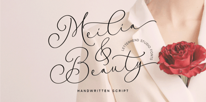 Meilia & Beauty is a gorgeous handwritten script font that embodies the essence of femininity and beauty. Its flowing curves and classy details create a look that is both charm and classy. Perfect for fashion, beauty, and lifestyle brands, this font will add a touch of sophistication and glamour to the other various formal forms such as invitations, labels, logos, magazines, books, greeting / wedding cards, packaging, fashion, make up, stationery, novels, labels or any type of advertising purpose. Features : Uppercase & lowercase Numbers and punctuation Alternates & Ligatures Multilingual PUA encoded We highly recommend using a program that supports OpenType features and Glyphs panels like many of Adobe apps and Corel Draw, so you can see and access all Glyph variations.
 - New Roshelyn Script by Get Studio,
$15.00 Introducing New Roshelyn Font Family, a new carefully crafted and nicely balanced curve on script typefaces with personality. Also with Extrude Version and Swash Tail make it look Retro. You can use it as a logo, badge, insignia, packaging, headline, poster, t-shirt/apparel, greeting card, wedding invitation, etc. The flowing characters are ideal to make an attractive message. Mix and match New Roshelyn Script with a bunch of weights and alternative characters to fit your project. The alternative characters in this font were divided into several OpenType features such as Stylistic Alternates, Stylistic Sets, and Ligature. The OpenType features can be accessed by using the OpenType program such as Adobe Illustrator, Adobe Photoshop, and Adobe InDesign.