10,000 search results
(0.021 seconds)
- SF Hypocrisy by ShyFoundry,
$19.95 SF Hypocrisy is a simplistic san serif with an x-height that goes all the way up and curves in all the right places. This baby works great for all your sexy headlining needs and more...
 - Sf Lang by S6 Foundry,
$15.00 Lang Sans is an elegant contemporary condensed typeface with strong stylistic geometric, authentic contrasts, drawing on the aesthetics and representing the shifting contemporary aesthetics. The distinctive stance gives the right visual consistency for branding and communications. Lang Sans is perfectly suited for headlines, large-format prints, brand identities, social media, advertising, editorial design, posters, magazines, logos, headings, body copy, digital and more.
 - SF Mayyun by Sultan Fonts,
$19.99 Mayyun is An Arabic text typeface for desktop applications. This line is intended for presentation projects, names of various publications and short paragraphs Here you will find a Mayyun in two types of regular and bold fonts. The font includes a matching Latin design and support for Arabic, Persian, Kurdish, and Urdu. Designer: Sultan Maqtari Design date: 2021 Publisher: Sultan Fonts
 - SF Manchit by Sultan Fonts,
$19.99 Manchit is a typeface dedicated to headlines in newspapers, magazines, advertisement banners, book covers and other printing products, and fits headlines on web pages. The Manchit font contains two styles (regular and bold) suitable for large display sizes, especially in the area of advertising, while still functioning well as a text face. The font includes a matching Latin design and support for Arabic, Persian, Kurdish, and Urdu. Designer: Sultan Maqtari Design date: 2020 Publisher: Sultan Fonts
 - SF Rasmi by Sultan Fonts,
$29.99 Rasmi font It is a font for print and the web. Especially for coordinating university and school books, scientific research, exams, government and corporate correspondence, and coordinating financial, judicial, and diplomatic documents. The Rasmi font family includes four weights: thick for headlines, bold for subheadings, medium for body text, and thin for footnotes and explanations. The font supports Arabic, Latin, Persian, Urdu, and Kurdish languages. The graphic designer can use Rasmi variable font to reach wider options in working with the text.
 - SF Pumice by Sultan Fonts,
$10.00 Pumice is a modern sans-serif typeface with characteristic and defined features. This font Name was inspired by the Aden pumice. Its design is composed of diverse 8 styles. Create unique designs by combining any of the upright weights with matching italics. Pumice includes a matching Latin design and support for Arabic, Persian, Kurdish, and Urdu. Pumice was specially designed for branding, advertising, editorial design, Web, and use on Tv and social media. Designers: Sultan Maqtari Publisher: Sultan Fonts
 - Magnesia SF by S6 Foundry,
$24.00 Magnesia Sf is a modern, one-of-a-kind font that will make your designs stand out against the competition. This stylistic semi-block serif comes in 4 styles and has Multi-languages support and the display typeface has what you need for all sorts of projects! Perfectly suited for headlines, large-format prints, brand identities, social media, advertising, editorial design, posters, magazines, logos, headings, digital and more.
 - SF Pastel by Sultan Fonts,
$10.00 About Pastel font family: Pastel font is a simplified Arabic digital Ruqah font, which adopts horizontal formatting characters, The font is available in two styles: Pastel Regular and Pastel Bold. The difference between the two fonts: The Pastel regular font has short ends, The Pastel bold has extended and extended characters. Pastel font for desktop applications Pastel is suitable for large display sizes, especially in the area of advertising, while still functioning well as a text face. The font includes a matching Latin design and support for Arabic, Persian, Kurdish and Urdu. Language families: Arabic, Persian, Urdu, Latin, Kurdish Designer: Sultan Maqtari Design date: 2020
 - SF Limone by Fonts66,
$16.00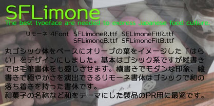 A feminine typeface with Japanese style features. 和風な特長を持った女性的な書体。 丸ゴシック体に毛筆タッチの曲線を組み合わせた、柔らかい印象が女性的でもあり、かつ和風のテイストも感じます。 和の名称や文章、カードなどに柔らかい表現にマッチします。
 - SF Seen by Sultan Fonts,
$9.99 "Seen" is the name of the gods in Kingdom of Hadhramaut 3,000 years ago Kingdom of Hadhramaut - Wikipedia "Seen" Font Family Will Add a Splash Of Historical Musnad writing To Your Designs Coming in 4 Styles: Regular,Medium,Bold and Black, "Seen" Font Family is a serif typeface designed by Sultan Maqtari. Each style of the font is incredible in its own way, with attractive curves, spacing, and ligatures. Ideal for bold headlines, short sentences, unique logos, and general graphics, this typeface will effortlessly add a hint of Musnad writing and a splash of Amazing past to any design. "سين" اسم آلهة في مملكة حضرموت قبل ٣٠٠٠ عام ستضيف مجموعة خطوط "سين" لمسة من كتابات المسند التاريخية إلى تصاميمك. تأتي عائلة الخطوط "سين" بأربعة أنماط: عادي،متوسط،عريض واسود ، وهي عبارة عن خط مزخرف صممه سلطان المقطري. كل نمط من الخط لا يصدق بطريقته الخاصة ، مع منحنيات جذابة ، ومسافات ، ووصلة ربط. مثالي للعناوين العريضة والجمل القصيرة والشعارات الفريدة والرسومات العامة ، سيضيف هذا الخط دون عناء لمسة من كتابة المسند ونفحة من الماضي المذهل إلى أي تصميم.
 - SF Cross by Fonts66,
$16.00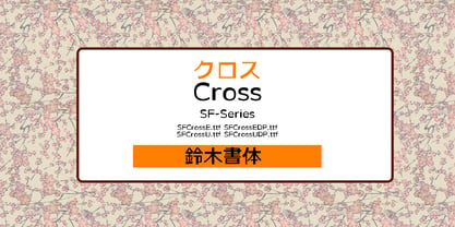 Expressive style for logos and eye catches, titles. 表現力の強い書体。ロゴやアイキャッチ、タイトルに最適。 縦画と横画の太さがほぼ同じのゴシック体の基本を崩して、太さをアトランダムに組み合わせデザインしたのがクロスです。 おやっと思わせるスタイルがアッピール度を高めてアイキャッチを生かしたロゴタイプやヘッドラインなどに適しています。 DPは仮名を大きくし多セットでより強い印象になります。
 - SF Abyan by Sultan Fonts,
$19.00 Abyan is An Arabic typeface for desktop applications & display. Abyan is suitable for large display sizes, especially in the area of advertising, while still functioning well as a text face. The font includes a matching Latin design and support for Arabic, Persian, and Urdu. It also includes proportional and tabular numerals for the supported languages. Abyan typeface comes with many opentype features. Designer: Sultan Maqtari Design date: 2019 Publisher: Sultan Fonts
 - SF Solo by Sultan Fonts,
$19.99 Solo is a renovation of an Arabic font designed by Sultan Maqtari in 2012 Solo is distinguished by its single and unconnected letters, as is the case with other Arabic fonts. Its letters are contemporary and do not dispense with the features of Arabic letters that are clear, legible and simple. But it gives user different creative possibilities, This font can be used in all artistic and creative projects in print and screen.
 - Gatsby SF by Scholtz Fonts,
$19.00Gatsby SF portrays the formal elegance of Art Deco, using the rounded shapes typical of the Art Deco movement. The upper case characters are decorated with a classical Art Deco motif, while lower case characters have been left unadorned for increased readability. Gatsby SF functions well as a display font and creates attention-attracting headers and subheaders. Fully professional, Gatsby SF contains a full character set - Upper and Lower case, all numerals, punctuation, symbols and accented characters. It is suitable for layout work in all major European languages. - SF News by Sultan Fonts,
$19.99 About this font family: News - Dedicated to writing a news text in newspapers, magazines, road boards, book , TV and other printing products, and web pages. The News font contains 3 styles (regular, Medium and bold) The font includes a matching Latin design and support for Arabic, Persian, Kurdish, and Urdu. Language families: Arabic, Persian, Kurdish, Urdu, Latin Designer: Sultan Maqtari Design date: 2021 Publisher: Sultan Fonts
 - SF Ruqah by Sultan Fonts,
$29.99 Ten years ago, I introduced a package of Ruqah fonts, with the most prominent being Ruqah Light, Ruqah Regular, and Ruqah Bold. Today, I am thrilled to announce the renewal of these 3 fonts, with improved design and more beautiful lettering. My goal is to eventually create a computerized Ruqah font that closely mimics handwriting. I encourage creators and designers to give this package of Ruqah fonts a try, as they offer great artistic potential and versatility in various creative projects. من عشر سنوات مضت، قدمت حزمة من خطوط الرقعة، من بينها الخط الرقعة الثقيل والخط الرقعة الخفيف. اليوم، أعيد تجديد هذه ٣ خطوط وجعل حروفها أجمل للمساعدة في الوصول تدريجيا إلى خط الرقعة الرقمي القريب من الكتابة اليدوية. فليجرب المبدعون هذه الحزمة من خطوط الرقعة، لأن هذا الخط قادر على التكيف الفني في مختلف المشاريع الإبداعية.
 - SF Saladin by Sultan Fonts,
$19.99 Saladin font family is designed to be used in broad writing and short sentences. It is an ornate heading font with minimal details. Its domain is stationery, logos, branding, ad design, and posters, and it can be paired with a range of other font styles to create different moods. The font family is available in 4 styles: Saladin, Saladin-bold, Saladin-curl, and Saladin-rolled The Saladin font family supports Arabic, Latin, Persian, and Urdu. Greetings to my brother Saladin
 - SF Handwriting by Sultan Fonts,
$40.00 The SF Handwriting font family is designed for educational and printing purposes. It is a carefully crafted font that supports Arabic, Latin, Persian, and Urdu. The font is characterized by its clarity, ease of reading, and visual appeal. It is also convenient to use in small sizes. The SF Handwriting font family includes three weights: Regular, Bold, and Black. The Dotted style is designed with a straight background for printing and overwriting by children or other users.
 - SF Tobba by Sultan Fonts,
$19.99 Tobba is an Arabic typeface for desktop applications, for websites,designed for Newspapers, magazines and cover titles. Tobba font family is Modern style and contains 3 weights: Regular, bold and black. The font includes support for Arabic, Persian, and Urdu. It also includes proportional and tabular numerals for the supported languages. Sultan typeface comes with many opentype features.
 - SF Liberty by Sultan Fonts,
$9.99 It is a big work that started with Windows in Aden and was redesigned and tuned on an Apple device in Cairo. Liberty is an active contemporary variable font, complete with a flexible range of cases tailored to responsive layouts. The font is clear and legible in small sizes, suitable for printing for large texts, web pages, and other visual uses. Language: Latin default Latin Azerbaijani Latin Catalan Latin Crimean Tatar Latin Kazakh Latin Marshallese Latin Dutch Latin Tatar Latin Turkish
 - SF Animatron by ShyFoundry,
$10.00 SF Animatron is a complete transformation of one of our older designs, SF TransRobotics, which was inspired by those futuristic robots who like to pretend they're cars, trucks, planes, and things like that.
 - SF Change by Sultan Fonts,
$19.00 Change is An Arabic text typeface for desktop applications. Change is freestyle Ruqah and a winner in Horouf Bilingual Typefaces Design Competition. The design is open, calligraphic, and very dynamic. This makes it suitable for large display sizes, especially in the area of advertising, while still functioning well as a text face. The font includes a matching Latin design and support for Arabic, Persian, and Urdu. It also includes proportional and tabular numerals for the supported languages. Change typeface comes with many opentype features.
 - SF Atlantida by Supfonts,
$19.00 Atlantida it is a Calligraphy chick font with exquisite accents. It is perfect for branding, wedding invitations and invitation cards and many more What's inside: Atlantida Script Multilingual support Cricut support
 - SF Tenduex by Fonts66,
$18.00 Historic font that has been used for seal for a long time in Japan. 現代の丸ゴシック体をみると、そのルーツは篆書に有るような気がします。筆で書かれているのも関わらず、エレメントのけ形状はほぼ丸ゴシック体に見えます。 しかし部首などの字体かなり異なり判読しにくい文字も見られます。 そこでユニークな字体を残しつつ、分かりやすき読みやすくしたフォントがテンドゥです。 文字のキャラクターは古いイメージを感じますので歴史的なもの(地名、寺社、旅館)の名称やその説明文などに適しています。 逆に真逆の表現に使っても面白いと思います。
 - VelvetQuilt Display font - Personal use only

- LCD Display Grid - Unknown license

- Komika Display Tight - Unknown license

- Legitimate Crystal Display - Personal use only

- Bomberg Display Serif by iframe,
$32.00 Bomberg Display Serif Font Immerse yourself in the world of art and typography with Bomberg Serif Font by iframe type foundry. Inspired by the legendary David Bomberg's iconic painting, "The Mud Bath." Just as Bomberg's brush strokes conveyed raw emotion and creativity, our font captures that very essence in each meticulously crafted letterform. With Bomberg Serif Font, your designs transcend the ordinary, taking on a unique and expressive character. Like the vivid colors of "The Mud Bath," our font injects vibrancy and depth into your projects. Whether you're a designer seeking to infuse artistic flair or an artist searching for the perfect typographic medium, this font lets you channel the spirit of Bomberg's masterpiece into your work. Unleash your creativity, tell your story, and make your designs a work of art with Bomberg Serif Font. Explore the intersection of artistry and typography today! Design by iframefonts.com
 - Display Art One by Gerald Gallo,
$20.00 Display Art One is a display font inspired by the art nouveau fonts popular at the turn of the 20th century. It is not intended for text use. It was designed specifically for display, headline, logotype, branding, and similar applications. Display Art One has upper and lowercase alphabets, numbers, and punctuation.
 - Display Squares Two by Gerald Gallo,
$20.00 Display Squares Two is a display font not intended for text use. It was designed specifically for display, headline, logotype, branding, and similar applications. Display Squares Two has upper and lowercase alphabets, numbers, and punctuation.
 - Alexio Ace Display by FoxType,
$12.00 Alexio Ace Display is a Unique Modern Elegant Typeface From Alexio Family with Web-fonts. It's a very versatile font that works great in large and small sizes. Alexio Font would perfect for branding, logos, headlines, Captions. or simply as a stylish text overlay to any background image. Strong capitals and a smooth, open lowercase are effective in a variety of applications. It's shown a clean, minimalist, warmth, quirky, yet still purposed to be versatile and easy to read. 04 Weights Included. Free updates and feature additions.
 - Funny Frog Display by Sipanji21,
$15.00 Funny Frog - A Fun Display Font With Cute Characters. It will elevate a wide range of design projects to the highest level, be it branding, headings, Kids Zone, designs, invitations, Snack Package, logotype, wall art illustration, apparel, labels, and much more!
 - ITC Officina Display by ITC,
$29.99When ITC Officina was first released in 1990, as a paired family of serif and sans serif faces in two weights with italics, it was intended as a workhorse typeface for business correspondence. But the typeface proved popular in many more areas than correspondence. Erik Spiekermann, ITC Officina's designer: Once ITC Officina got picked up by the trendsetters to denote 'coolness,' it had lost its innocence. No pretending anymore that it only needed two weights for office correspondence. As a face used in magazines and advertising, it needed proper headline weights and one more weight in between the original Book and Bold."" To add the new weights and small caps, Spiekermann collaborated with Ole Schaefer, director of typography and type design at MetaDesign. The extended ITC Officina family now includes Medium, Extra Bold, and Black weights with matching italics-all in both Sans and Serif -- as well as new small caps fonts for the original Book and Bold weights. - Blink Urgent Display by Tebaltipis Studio,
$15.00 Blink Urgent - Modern Bold Serif Font is a stylish font It has both modern and retro look. Comes with alternatives and ligatures, helps to create stunning logos, quotes, posts, blog posts. branding projects, magazine imagery, wedding invitations, and much more.
 - Ginza Display Inline by Positype,
$22.00Sometimes you get an idea stuck in your head and the only way to get rid of that demon is to put something down on paper. A year later the doodles became a skeleton, and then the skeleton had a body, then the body had a name, then the name got a personality. What was left was a clean set of ten fonts that encompass a very simple skeleton with a lot of visual appeal. During the process, I saw ways to expand the typeface's display capabilities by producing inline styles as well as a down-and-dirty rough set. Each font has a full set of glyphs that include Central European and Small Cap characters. - Quinn Display Typeface by FoxType,
$50.00 Introducing Quinn Display new generation Typeface created for building brand identity. Quinn Typeface created with the vision of to attract the audience to your brand . The finest details of this typeface are methodically and mathematically created. Quinn is created with all the tasks of a corporate font and also for the usage in a variety of projects, including branding, logos, titles, headlines, servers, posters, screens, display, digital ads, and everything else. We are putting a lot of effort on this font as a long-term project.
 - Display Digits One by Gerald Gallo,
$20.00 Display Digits One is a display number font with eight sets of variations of the same digits. The digits 0 through 9, with period and comma in appropriate variations, are prepared as (1) solid, (2) outline, (3) solid with contour outline, (4) outline with 3-D shadow, (5) 3-D shadow only, (6) outline with drop shadow, (7) positive in circle, (8) negative in circle.
 - Ryo Display PlusN by Adobe,
$79.00Ryo is a Japanese kana typeface design composed of hiragana, katakana and some punctuation marks. Available in five weights--medium, semibold, bold, extra bold and heavy, Ryo Display has been specifically designed for use when setting copy in larger sizes, such as in headlines or posters. Supplied in the cross-platform OpenType format, this special kana font can be used to supplement or replace the existing kana designs in existing Japanese fonts that contain full character sets. Creative professionals using the Japanese version of Adobe InDesign may use that program's Composite Font tool to easily combine Ryo Display with other typefaces. - EB Bellissimo Display by Erik Bertell,
$15.95 Bellissimo Display boasts an impressive range of handsome all caps ligatures that would make even Herb Lubalin jealous. Despite its iconic features, Bellissimo works surprisingly well as a text face as well. Small capitals, alternate glyphs and both lower and upper case figures are intrinsic in the design.


