6,902 search results
(0.023 seconds)
- Aloyesia by Eotype,
$16.00 Aloyesia is a condensed serif display font that has beautiful curves. This unique font is perfect for creating beautiful logotypes, stunning magazine designs and more. Aloyesia provides a collection of glyphs with unique shapes. With alternative styles and ligature features, this font is perfect for complementing various projects.
 - TWA Assembly Sans by Work Type,
$30.00 TWA Assembly Sans is not your standard workhorse sans. Although it sports the same geometric shapes, grotesk characteristics, and comes in many weights, its unique qualities and slight diagonal curves give Assembly Sans a friendlier appearance. As the weight increase, the contrast becomes more extreme, adding to its approachability.
 - Mocktaile Typeface by Krismagraph,
$16.00 Mocktaile Typeface is a modern & luxury serif . It's soft curves mixed with high contrast glyphs lend it self to both feminine qualities. Great in layout design for quotes or body copy, and will be unique to the use of the fashion typography, logo design. And also multilingual support.
 - Zembrush by Figuree Studio,
$20.00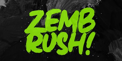 Zembrush is natural and strong hand-drawn brush font that combines attractive curves with a fresh urban edge; delivering a stylish brush font that is guaranteed to add an eye-catching appeal to your logo designs, brand imagery, handwritten quotes, product packaging, merchandise, social media post, or website font.
 - Mindsight by Get Studio,
$23.00 Mindsight Funky Retro Display Font is a vibrant and energetic typeface that captures the essence of vintage aesthetics. With its playful curves and bold strokes, it adds a touch of nostalgia and creativity to any design project, making it perfect for eye-catching headlines, posters, and artistic displays.
 - RM Softsans by Ray Meadows,
$19.00 Strong and distinctive, yet soft and cuddly. This is a rounded sans serif design that features slightly thicker horizontals. Due to the modular nature of this design there may be a slight lack of smoothness to the curves at very large point sizes (around 100 pt and above).
 - Hulpy by Adam B. Ford,
$16.00 Hulpy is a relaxed font that won’t judge you. It was created with a combination of stocky rounded verticals and tapering curves. It could probably be used in comic strips or fun and happy headlines, but it also has enough regularity to be used in unpretentious body copy.
 - RM Smoothsans by Ray Meadows,
$19.00 A family of soft, rounded, yet bold display faces which can successfully be used in conjunction with one another. Due to the modular nature of this design there may be a very slight lack of smoothness to the curves at extremely large point sizes (around 200 pt and above).
 - Ladoni by Diogo Pisoeiro,
$15.00 This typeface is inspired on Bodoni, but this is like his gross sister, because it has angles instead of curves. Is a typeface with personality, strong and robust but at the same time sweet with his italics. This typeface has 5 weights, regular, italic, bold, poster and poster italic.
 - Naure by takoliko,
$9.00 NAURE is a vintage classy serif typeface, with a little roman soul on it. It comes with regular, condensed, and oblique style. It have a curve that give a unique yet elegant feel at the same time. The strong characteristic makes it suitable for attention grabbing design projects
 - Dohrma by The Northern Block,
$12.80 A bold display typeface that blends subtle curves with precision geometry. This crafted detailing creates a wide variety of typesetting options ideal for use on signage, book jackets, packaging, posters and t-shirts. Details include 4 unique styles, a full character set, manually edited kerning and Euro symbol.
 - Holdem by Garisman Studio,
$22.00 Introducing Holdem - Display Block Font Holdem combines attractive curves with a fresh urban edge; delivering a stylish script which is guaranteed to add an eye-catching appeal to your logo designs, brand imagery, quotes, product packaging, merchandise & social media posts. Simple installation Work for PC and MAC Multilingual Support.
 - Rightland by MJB Letters,
$17.00 Rightland is a modern bold script font, which is very strong and clean, has elegant swashes in each curve that can be applied to various design needs such as logos, posters, branding packaging and others. This font supports Multi-Language and OpenType features and it is PUA encoded.
 - P22 Avocet by IHOF,
$29.95 A light chancery script font influenced by both the hand-held pen and the typefounder’s machinery. The curves are reminiscent of the beak of the avocet, a wading bird. This font was originally engraved in metal and copper matrices made for casting into hot metal type for letterpress printing.
 - Vintage Mohai by Nirmana Visual,
$29.00 Vintage Mohai Inspired by art nouveau Design Era. This Serift font is perfect for adding a touch of elegance and sophistication to your designs. With its flowing lines and graceful curves, it is ideal for a diversity of design projects, including logos & branding, social media posts, advertisements & product designs.
 - Hackman by The Northern Block,
$32.00 A geometric sans serif with contemporary lines. Distinctive curves are combined with classical letterforms to produce a clean, linear typeface best suited to identity, mobile and web applications. Details include 9 weights with italics, 500 characters, 5 variations of numerals, stylistic alternatives, manually edited kerning and OpenType features.
 - Bullerby by Maria Brachmańska,
$10.00 Bullerby is a font inspired by children's handwriting. The letters are characterized by charming curves in the lowercase and distinct condensed traits in the upper case. It is very versatile in use: it is ideal for logos, packaging, posters, advertisements, and much more. The font supports 68 languages.
 - Bree by TypeTogether,
$37.50 The Bree font family is a spry sans serif by Veronika Burian and José Scaglione that delivers a spirited look and feel for branding and headline usage. As an upright italic, Bree shows a pleasant mix of rather unobtrusive capitals with more vivid lowercase letters, giving text a lively appearance. Bree is clearly influenced by handwriting. As such, some of its most characteristic features are the single-story ‘a’, the cursive ‘e’, the outstroke curves of ‘v’ and ‘w’, the flourished ‘Q’, and the fluid shapes of ‘g’, ‘y’, and ‘z’. Alternates of these letters are available when a more neutral look is desired. Bree has a touch of cheekiness, a wide stance for each character, and an extra-large x-height. All this adds up to a big personality, so even when set in small text there is no skimming past the words Bree voices. In 2019, the Bree font family got a huge update. A few shapes were updated or added (the ‘k’ and German capital ‘ß’), two entirely new weights were added (Book and Book Italic), and spacing was perfected. More than that, Vietnamese support was added to Bree Latin, and the Bree Greek and Bree Cyrillic scripts were designed from scratch to parallel the Latin’s tone. Additionally, Bree was designed in variable font format for those who want complete control over the font’s appearance while simultaneously saving digital weight in the form of kilobytes and megabytes. Bree is in the perfect position for the next digital revolution. The complete Bree font family, along with our entire catalogue, has been optimised for today’s varied screen uses. Bree has been chosen for such wide-ranging uses as Breast Cancer Awareness Month in the US, the branding for the country of Peru, and numerous layouts including mobile apps, magazines, newspapers, and books. Awards – Tipos Latinos exhibition 2008 – Several best-of-the-year typeface lists of 2008 MyFonts Top 10 Fonts of 2008 Smashing Magazine: 60 Brilliant Typefaces For Corporate Design https://www.smashingmagazine.com/2008/03/60-brilliant-typefaces-for-corporate-design/ Die besten Schriften 2008 http://www.fontwerk.com/619/die-besten-schriften-2008/ – Selected for Typographica’s Best Typefaces of 2008 – Won Bronze for Original Typeface in the 2009 European Design Awards
 - Relica by Artisticandunique,
$12.00 Relica - Serif font family - Multilingual support, 18 Style Relica serif font family has an elegant character with smooth curved turns. If you want to try a modern or classic, elegant look, it can meet all your needs with its timeless structure that is ideal for your projects in capital and small letters. Relica serif font family ensures good overall appearance and easy reading of texts while creating your projects especially in publishing. With its soft curved turns, it is also ideal for branding, logo design, brand identity creation, packaging design. This font comes with uppercase, lowercase, punctuation marks, symbols and numbers, ligatures, and multilingual options. With this font you can create your unique designs. If you have a question, please contact me. Have a good time.
 - Lifeform by Supremat,
$12.00 Lifeform is a modern display font created as a result of my experiments on the forms of letters. While working on the font, I had ambivalent feelings, on the one hand I liked the individual curved lines, on the other hand they seemed very strange, alien and illogical. It was like looking into a microscope and seeing something strange. I wanted to develop and study these forms as something new, because I had never seen anything similar before. The result is a contrasting font that has both curves and sharp, and smooth lines that resemble some kind of organic matter. The font is well suited for large headlines, posters and covers. Its strange design catches the eye and will not leave the viewer indifferent.
 - Zt Qiske by Khaiuns,
$14.00 Qiske is a serif display font with strong characteristics and Qiske is full of modern vibes, with its binders, special alternate glyphs and soft Curves. The high contrast between thick and thin strokes gives Qiske a very stylish look and is ideal for headlines, headers, logos, labels, packaging, postcards, presentations, magazines, invitations, etc. For ligature lovers, Qiske is made to be Soft and intertwined to create a stunning display of its subtle hypnotic curves, making it the perfect choice for impactful editorial layouts and strong feminine creations. FEATURES — 510 Glyphs — Uppercase & lowercase, numbers — Old-style figures — 37 Discretionary Ligatures & Standard ligatures, — 53 Alternates (Uppercase & lowercase) — Symbols, punctuation I hope you have fun using ZT Qiske Thanks for using this font ~ Khaiuns X zelowtype
 - Occam by Veil of Perception,
$20.00 Occam is an informal calligraphic script face. The letter forms were drawn and constructed rather than penned or brushed but reflect a definite flat pen influence. The ascenders and descenders incorporate an abstract implied loop form. Some curves that would normally be round are pointed and some transitions that would normally be sharp and pointed have been made round. A few exit strokes curve back instead of moving up and out for a little different look. This font could be put to good use as a contrasting style combined with sans and serif faces in applications such as newsletters, brochures, invitations and annual reports. It could be used for heads, subheads, pull quotes, drop caps and as a title font for covers.
 - Mantika Sans Paneuropean by Linotype,
$67.99With its well-defined characters that are readily legible even in the small font sizes, Mantika Sans by Jürgen Weltin is ideal for typesetting. The elaborately designed and highly individual set of italics enhances the attractiveness of the font.Jürgen Weltin developed the Mantika™ Sans sans serif font using older designs for an serif font as his inspiration. Nothing more than the merest suggestion of the original serifs has survived. Bevelled line endings and the slight variation in thickness of verticals, in particular, provide Mantika Sans with a very dynamic character that evokes manuscript. Short ascenders and descenders give the font a compact appearance that is also underscored by its condensed proportions. Weltin has achieved his aim of producing a typeface with excellent legibility even in small sizes not just by means of the x-height, which is tall in comparison with the capital letters, but also by using clearly defined and well differentiated designs for critical letters, such as i", "I" and "l". Lower case "i", for example, has a serif while the "l" has a curved base.In addition to uppercase numerals, Mantika Sans also has lowercase or old style numerals that have been designed so that they can be used in both tabular and proportional settings. The uppercase numerals are slightly shorter than the uppercase letters, ensuring that the latter can be sympathetically incorporated within continuous text.The Mantika Sans italics are very unusual. They are inclined at only 4.5° (the usual angle for italics is 10 - 12°) and so appear to be almost upright. In addition, they also have quite distinctive forms. The overall effect calls attention to their curvilinear, manuscript character, enhances contrasts and further emphasizes the terminals. Weltin explains: "Within the variety of forms of the italics there are many contrasting terminal elements that create dynamism. The result is a diversity of interaction between the rounded and angular forms". Mantika Sans Italic thus has all the features of a display typeface, but can also be happily used on its own to set longer text passages. Mantika Sans is available in two weights; Regular and Bold, both of which have corresponding italics sets. Mantika Sans has been designed so that the widths of the four related cuts are identical, meaning that a change of font within a single layout will have no effect on justification. In addition, the members of the Mantika Informal font family, designed by Jürgen Weltin in 2010, also have the same thickness. Other font families having weights with equal thickness can be found in the "Linotype Office Alliance series".The Mantika Sans character sets are paneuropean. There are characters for setting texts in Eastern European languages, Greek and Cyrillic. There is also a range of special symbols, including right-angled brackets, subscript and superscript lower case letters, together with numerals, arrows and many different bullet points.As a vibrant and highly legible text font, Mantika Sans has a broad spectrum of potential applications. Its unusual italics are not just perfect for use in display text. The fact that it has only four cuts means that Mantika Sans is particularly suitable for office use or for the setting of business reports. Its excellent legibility even in the small font sizes also makes it ideal as a text for electronic reading devices; this also applies to Mantika Informal.At the 3rd International Eastern Type Design Competition Granshan 2010, Mantika Sans was awarded in the category Greek text typefaces." - Mantika Sans by Linotype,
$50.99 With its well-defined characters that are readily legible even in the small font sizes, Mantika Sans by Jürgen Weltin is ideal for typesetting. The elaborately designed and highly individual set of italics enhances the attractiveness of the font.Jürgen Weltin developed the Mantika™ Sans sans serif font using older designs for an serif font as his inspiration. Nothing more than the merest suggestion of the original serifs has survived. Bevelled line endings and the slight variation in thickness of verticals, in particular, provide Mantika Sans with a very dynamic character that evokes manuscript. Short ascenders and descenders give the font a compact appearance that is also underscored by its condensed proportions. Weltin has achieved his aim of producing a typeface with excellent legibility even in small sizes not just by means of the x-height, which is tall in comparison with the capital letters, but also by using clearly defined and well differentiated designs for critical letters, such as i", "I" and "l". Lower case "i", for example, has a serif while the "l" has a curved base.In addition to uppercase numerals, Mantika Sans also has lowercase or old style numerals that have been designed so that they can be used in both tabular and proportional settings. The uppercase numerals are slightly shorter than the uppercase letters, ensuring that the latter can be sympathetically incorporated within continuous text.The Mantika Sans italics are very unusual. They are inclined at only 4.5° (the usual angle for italics is 10 - 12°) and so appear to be almost upright. In addition, they also have quite distinctive forms. The overall effect calls attention to their curvilinear, manuscript character, enhances contrasts and further emphasizes the terminals. Weltin explains: "Within the variety of forms of the italics there are many contrasting terminal elements that create dynamism. The result is a diversity of interaction between the rounded and angular forms". Mantika Sans Italic thus has all the features of a display typeface, but can also be happily used on its own to set longer text passages. Mantika Sans is available in two weights; Regular and Bold, both of which have corresponding italics sets. Mantika Sans has been designed so that the widths of the four related cuts are identical, meaning that a change of font within a single layout will have no effect on justification. In addition, the members of the Mantika Informal font family, designed by Jürgen Weltin in 2010, also have the same thickness. Other font families having weights with equal thickness can be found in the "Linotype Office Alliance series".The Mantika Sans character sets are paneuropean. There are characters for setting texts in Eastern European languages, Greek and Cyrillic. There is also a range of special symbols, including right-angled brackets, subscript and superscript lower case letters, together with numerals, arrows and many different bullet points.As a vibrant and highly legible text font, Mantika Sans has a broad spectrum of potential applications. Its unusual italics are not just perfect for use in display text. The fact that it has only four cuts means that Mantika Sans is particularly suitable for office use or for the setting of business reports. Its excellent legibility even in the small font sizes also makes it ideal as a text for electronic reading devices; this also applies to Mantika Informal.At the 3rd International Eastern Type Design Competition Granshan 2010, Mantika Sans was awarded in the category Greek text typefaces."
 - Archequare by Midtype,
$26.00 Archequare is a square font made with geometric shapes by adding a slight curve to the font to make it more varied and specifically designed for text content, long sentences such as mechanical instructions. However, Also useful for display, titling, captions by their sophisticated glyph shapes and their eye-catching geometry
 - Bosch by iframe,
$32.00 Bosch is a serif font, its soft curves and refined details create a sense of elegance. Bosch is known for creating restlessly imaginative works rich in religious symbolism, allegory, and fantastical elements depicted in bustling scenes across expansive compositions. FEATURES 1 weight Upper / lower case, numbers, punctuation Supported Languages: Latin & Greek
 - Vaselina by Mevstory Studio,
$20.00 Vaselina – The chic & modern serif font. Vaselina is a modern and chic typeface, best used as a display for headings, logos, branding, magazines, product packaging and invitations. Vaselina comes with clean lines and smooth curves to give any project an extra touch of class. That's it! Have fun using Vaselina Typeface!
 - Larome by Gholib Tammami,
$17.00 Larome font is a serif font that possesses a truly unique style. This font is combined with lowercase characters that feature graceful curves, resulting in a distinctive and captivating style. Larome font is well-suited for display purposes and for branding products that exude an elegant, unique, and antique ambiance.
 - Eccentric Wood Type JNL by Jeff Levine,
$29.00 An online display of pages from a book on wood type fonts provided an example of a bold, eccentric slab serif design with unusual curves and letter shapes. This font’s eccentricities became the basis for its name, Eccentric Wood Type JNL – which is available in both regular and oblique versions.
 - HU Garaetteok KR by Heummdesign,
$25.00 It is a cute headline font with straight strokes and rounded ends, giving it a rice cake feel. The initial and final consonants 'ㄹ' were designed differently to give a fun sense of rhythm, and the straight strokes and lively curves added personality to the writing. It contains Hangul, Korean.
 - Laviosar by Say Studio,
$12.00 Laviosar is a psychedelic inspired typeface. Unique tripped out lettering makes this font perfect for those groovy band poster, hippy logos and quotes. Laviosar mixes futurist letters with nostalgic curves to create stand out typography. Including lots of alternate letters! uppercase, alternates, numbers, punctuation Multilingual support Have a wonderful Day, Saystudio
 - Headson by Garisman Studio,
$20.00 Introducing Headson Headson combines attractive curves with a fresh urban edge; delivering a stylish script which is guaranteed to add an eye-catching appeal to your logo designs, brand imagery, quotes, product packaging, merchandise & social media posts. - Simple installation - Work for PC and MAC - Multilingual Support Thank You! GRSMN Std. 2012
 - Khatt Algharraf by Mans Greback,
$59.00 Dive into the mesmerizing strokes of Khatt Algharraf, an Arabic typeface that seamlessly blends the age-old beauty of Middle Eastern calligraphy with the dynamism of modern design. With every curve and contour, it tells tales of ancient deserts and bustling souks, yet its sharp, crisp features make it strikingly contemporary.
 - Pracht Antiqua NF by Nick's Fonts,
$10.00Here is a faithful rendering of Pracht Antiqua Schmallfett , designed by Carl Pracht for Nordd. Schriftgießerei in 1942. Its graceful curves and tight fit make it a natural for commanding yet cuddly headlines. Both versions of the font contain the complete Unicode Latin 1252 and Central European 1250 character sets. - WBP Helena by Studio Jasper Nijssen,
$15.00 Helena derived her curves from the old Chinese Tangram puzzle. She sure is playful, though sometimes she bites furiously. No worries! Helena may seem to be a tad crazy, but all in good moderation. Don’t go overboard, use her well and I can assure you … she’ll be worth all your effort.
 - Cornucurlia by Calligraplay,
$13.00 Cornucurlia is a carefully constructed typeface comprising curvaceously connected characters. Designed as a display font, use it for posters, signage, branding and any type-based artwork that needs stylish, standout lettering. Multi-lingual and with a range of symbols, the font includes 368 glyphs that link together with geometric curves.
 - Kodaro by Vultype Co,
$39.00 Kodaro font is an unique and quirky display typeface with unique curves and a dreamy flow. It loops and swoops in a delicate dance that is never boring. Use this dainty serif as a memorable logotype or header and pair it with something contrasting and clean. ( My suggestions: Futura/Lato/Montserrat )
 - RM Signwriter by Ray Meadows,
$19.00 Inspired by the signwriting on traditional old canal boats in the UK, this bold, block serif design has many potential uses. Due to the modular nature of this design there may be a slight lack of smoothness to the curves at very large point sizes (around 100 pt and above).
 - Teroxia Pro by limitype,
$24.00 Teroxia is a typeface that is inspired by the shape and characteristics of the curves and constructions that exist in robots or machines, this typeface is made with a modern touch and a more futuristic and strong form. This typeface is equipped with uppercase, lowercase, numbers, alternate, symbols and multilingual.
 - Catrina by Latinotype,
$26.00 Catrina, designed by Eli Hernández, is an expressive typeface whose curves and straight lines meet each other in harmonious synchrony. Catrina comes in 6 weights, ranging from Thin to Black, plus a Handmade version and includes Dingbats and Catchwords which make it the perfect choice for packaging, branding, titles and advertising.