10,000 search results
(0.041 seconds)
- Graphit by HVD Fonts,
$40.00 Graphit is a typeface designed by Lit Design Studio & curated by HvD Fonts. It combines clear, geometric shapes with edgy yet finely-crafted details. Graphit features uncompromising characters such as G, Q, f, k and 1. It works well both for impactful headlines and for reading sizes. The type family consists of six weights plus matching italics. In early 2018, Livius Dietzel & Tom Hoßfeld started developing the typeface’s essential character and released a free font named after the studio, Lit. Just a few months later, Hannes von Döhren had a look at the typeface and suggested expanding it into a family – then publishing it with HvD Fonts. They drew every single letter from scratch, and also decided to give the font a new name — Graphit. The family features six low-contrast weights, ranging from Black to Thin. Every character has been crafted to give it a distinctive and individual feel. Medium, Regular and Light are optimized for usage in copy text. For smaller font sizes & longer body copy, the alternate character set features a double-story a and a simplified Q, f, r and t for improved legibility. All fonts are manually hinted for optimal performance on digital devices.
 - 2 Prong Tree - Unknown license

- Full Sans by Bülent Yüksel,
$19.00 Full Sans is a geometric sans in the tradition of Futura, Avant Garde and the like. It has a modern streak which is the result of a harmonization of width and height especially in the lowercase letters to support legibility. Full Sans is the younger brother of original Full Neue, Full Slab and Full Tools. Ideally suited for advertising and packaging, editorial and publishing, logo, branding and creative industries, poster and billboards, small text, wayfinding and signage as well as web and screen design. Full Sans provides advanced typographical support for Latin-based languages. An extended character set, supporting Central, Western and Eastern European languages, rounds up the family. The designation “Full Sans LC 50 Book” forms the central point. The first figure of the number describes the stroke thickness: 10 Thin to 90 Bold. Full Sans LC comes 5 weights and italics also Full Sans SC comes 5 weights and italics total 20 types. The family contains a set of 485 characters. Case-Sensitive Forms, Classes and Features, Small Caps from Letter Cases, Fractions, Superior, Inferior, Denominator, Numerator, Old Style Figures just one touch easy In all graphic programs. Full Sans is the perfect font for web use. You can enjoy using it. UPDATE: 08 March 2019 - Fixed extension of glyhps "y" and "g". - "LineGap" error has been fixed. - Fixed bug in "onum", "pnum", "tnum" and "tnum" software in OpenType feature.
 - TT Espina by TypeType,
$19.00 Addition to the collection of TypeType display fonts! TT Espina useful links: Specimen | Graphic presentation | Customization options TT Espina is a display antiqua with expressive serifs. Inspired by the historical shape of the letter O, which took on a diamond shape due to print quality, the designers created a modern typeface with high contrast between horizontals and verticals. TT Espina is yet another proof that antiquas can be stylish and expressive display fonts suitable for modern projects. TT Espina will look harmoniously in headlines of posters or billboards, in gallery and exhibitions design, in large-format printed materials or on websites. The font is easily distinguishable among other antiquas by its high contrast, expressive and large serifs, closed aperture and diamond-shaped circles. TT Espina’s characters are quite narrow, which adds to the materials designed using the font a special aesthetic. It makes you to look closely into each letter, so the headlines set in TT Espina will definitely be read. A full set of different icons is a nice addition for designers who will work with a new typeface. TT Espina consists of 7 typefaces: 6 romans and 1 variable. Each typeface has 648 glyphs. The font family has 21 OpenType features, including changing the shape of some characters (Q, g, j), the possibility to replace characters with high-set diacritics with characters with low-set diacritics, which is convenient for poster design.
 - Michiana Pro by BluHead Studio,
$39.00 Michiana Pro is my new, hand-crafted connecting script! I've been hand lettering cards and envelopes to my wife and family in this type style for years and decided it was time to make a font based on it. I typically start with a single thin stroke for each letter, then build up the weight of the heavy stroke, so there ends up being a lot of charming variations in terms of style and color. The overall finish is rough, yet friendly. Perfect for invitations, place cards, love notes, and with its large x-height, it sets nicely for text. I grew up running around the dunes and beaches along Lake Michigan in northwest Indiana, and I think the shoreline and dune grass has inspired my aesthetic. Michiana Pro takes the name from a small area along the lake between the Indiana and Michigan state lines. There are a lot of nice, modest homes nestled in the duneland forests. Thinking about what it's like back there, it's like having a bowl of steaming hot comfort food. So I hope Michiana Pro feels that way to you too. Michiana Pro features include: + extended character set for Western European language support + 1,205 glyphs + lowercase beginning and ending swashes + contextual initial and final letterforms + alternates for L, R, Z, f, g, p, t and y + 140+ ligatures + superior and inferior figures for unlimited fractions + ordinals (st, nd, rd, th) + 4 ornamental swashes + available in both OTF and TTF formats
 - Titanium Motors by Monotype,
$29.99 There is almost no other font that conveys a sense of speed better than the bold but dynamic letters of Titanium Motors™ by Steve Matteson. Use this headline font to create exciting software titles, logos and user interfaces.
 - Atrament by Suitcase Type Foundry,
$75.00The Atrament font family was originally conceived in 2003 as the corporate display type family for Suitcase Type Foundry. Its original source of inspiration is the front cover of the Devetsil - Revolucni slovn’k almanac (1922), designed by Karel Teige. The lettering on this cover is a condensed sans serif with rounded stroke terminals. Atrament is significantly broader than the model and its characters are better balanced, reflecting the evolution of semi-condensed sans serifs throughout the 1960s. The horizontal strokes of both lower and upper case are less stressed than the vertical stems. Noteworthy are the unusual tiny gaps in the apex and vertex of letters with diagonal strokes, designed to prevent ink from spreading and smudging the letter shapes. This detail is one of the main features of the font's character. The general feel of the italics closely matches the strictly vertical, parallel character of the regular cut. When converting the family to OpenType the alternate character shapes from the Alternator weights were incorporated in the regular cut, which allows the user to switch selected characters from one shape to another within the same font. A number of glyphs and accents were corrected, and all the glyphs missing in the Suitcase Standard character set were added, along with the relevant kerning pairs. The individual weights of Atrament Std thus contain accented upper and lower case, small caps, alternate glyphs for most European languages, nine types of numerals, superscript characters, caps glyph versions, and much more. Its narrow proportions make Atrament the perfect choice whenever economy of space is a must. It is however not very well suited for setting long texts. Ideal for headlines and display use, it is perfect for situations where the text needs to make a great impact in a little space. - Ziro by Wilton Foundry,
$29.00Ziro expresses itself boldly and spontaneously. It consists of two different sets of capitals to help create natural handwriting effect. The letter "I" is treated like a lowercase "I" and the letter "O" has a dot in the center. The lowercase variation does not have a dot in the center for those less adventurous applications. Ziro is loose and raw in larger sizes and therefore has many useful applications that may include restaurant logos, menus, boutiques, packaging, etc. - Spur Wide JNL by Jeff Levine,
$29.00 Spur Wide JNL was modeled from an example of hand lettering from the antique French alphabet book L'Art du Tracé Rationnel de la Lettre. Heavy Roman style letters with spurs (often referred to as Latin) were most popular with sign painters and show card writers in the early part of the 20th century. Spur Wide JNL is available in both regular and oblique versions.
 - TipTop by profonts,
$41.99 TipTop Pro’s origin goes back to around 1900 when the font was released by the German foundry Julius Klinkhardt in Leipzig. Ralph M. Unger redesigned this beautiful art nouveau typeface, extended its character set and digitally remastered it. TipTop Pro fits perfectly into the series of recently released URW++ art nouveau designs (Edda, Gradl, Impression, Joga, Ornella).
 - Dans Le Noël by Latinotype,
$29.00 Dans Le Noël is a Christmas dingbat. Perfect for use as ornament greeting cards, patterns, posters, websites and visual compositions that need Christmas show in a language full of personality, inspired by vintage illustrations. Dans Le Noël is part of the serie Dans, with Dans Le Cuisine and Dans Le Jardin. You can combine them as you like. Enjoy!
 - Falfurrias NF by Nick's Fonts,
$10.00Another in the Whiz-Bang Woodtype series, based on authentic xylographic designs from the late nineteenth century. Named after (surprise!) a small town in Texas. The net effect is a typeface which can add style and warmth to any project. Both versions of this font include the complete Unicode 1252 Latin and Unicode 1250 Central European character sets. - Davina by Nirmalagraphics,
$14.00 I made Davina for display purposes and it can be used for logos with a vintage style, for flyers, brochures, leaflets and more. If you like a logo with a semi-vintage style, thick, unique and clean, it means you have to buy and use Davina! This font also has Multi-Lingual support and more than 15 Ligatures.
 - Martian B by Deltatype,
$49.00 Martian B is a sans-serif based typeface, inspired from industrial signs with semi-modular structure, suitable for using in wide ranged. Available in nine weights from Thin to ExtraBlack. Use well with sign into small print or web which support many languages with extended latin glyphs with standard of Adobe Latin 4 and world ready supported.
 - M Comic 2 PRC by Monotype HK,
$523.99 Stripy strokes with more open to curves, designed for Young Urban, Professionals! PRC series fonts are in Unicode encoding and consists covers GB 2312 character set. It conforms to GB12345 standard. The character glyphs are based on the regular simplified Simplified Chinese writing form and style. It is generally used in China Mainland PRC and Singapore.
 - Gullywasher NF by Nick's Fonts,
$10.00One in the series of fonts called Whiz-Bang Wood Type, intended to be set large and tight. Gullywasher is distinguished by its unusual letterforms and “pineapple” serifs. The font takes its name from a Texas term for a heavy rain. Both versions of this font include the complete Unicode Latin 1252 and Central European 1250 character sets. - Herkules by Nandatype Studio,
$15.00 Herkules is a whimsical script font with a relaxed theme, with a series of hooking hooks for a beautiful style. Whatever the topic, this font will be a great asset to your font library, as it has the potential to enhance any creation. This font is PUA encoded which means you can access all the glyphs and sweeps easily!
 - Pancetta Pro by Mint Type,
$- Pancetta Pro is a squarish sans-serif typeface with semi-closed aperture and pillow-shaped terminals. The shape of a pillow is furthermore used to enliven the boring horizontal stems which are very frequent in Cyrillic script, and get rid of the right angles. Also take a look at Pancetta Pro's serif companion – Pancetta Serif Pro
 - Grand Prairie NF by Nick's Fonts,
$10.00This addition to the Whiz-Bang Woodtype series in based on a 100+ year-old typeface originally named Medallic. Due to the highly ornate nature of this font, it has a limited character set (no math operators or footnote accessories). The Opentype version of this font supports Unicode 1250 (Central European) languages, as well as Unicode 1252 (Latin) languages. - Society Page NF by Nick's Fonts,
$10.00This elegant face with a few semi-script flourishes is based on Morris Fuller Benton’s Announcement Roman, designed for American Type Founders in 1917. It’s perfect for invitations, programs and all kinds of formal ballyhoo. All versions of this font include the Unicode 1250 Central European character set in addition to the standard Unicode 1252 Latin set. - Eckhardt Headline JNL by Jeff Levine,
$29.00 Eckhardt Headline JNL is a bold, condensed sans serif font. This is part of a series of typefaces popular with the sign trade. Named in honor of the late Albert Eckhardt, Jr. - a talented sign writer and a good friend of type designer Jeff Levine - it is available in both regular and "slant" for extra emphasis.
 - MBF Manata by Moonbandit,
$17.00 Manata is a modern futuristic semi-cursive font. This typeface has a unique angle spreading through each glyphs to enhance dynamic and flow. Combined with straight and sharp stem to balance the overall feel and readibility. Perfect usage for large size display, title, poster, logotype and body text. Manata also support multilingual and have several alternate glyphs.
 - Nice One by Mightyfire,
$9.00 Nice One is the font with a modern, clean and semi formal looks. We have three styles on Nice One; light, regular and bold. The characteristic of the font is tall, neat and thin almost like a serif font. Try this font on your book, magazine, or poster and believe me your work will be the nice one! :)
 - Skie by Adam Ladd,
$25.00 Skie is a simple gothic sans serif with normal, condensed, and wide widths. Its distinguishing characteristics are the small x-height with tall ascenders and a minimal amount of contrast, while the apertures are semi-open to help in readability. The simple design keeps the appearance fairly neutral and presents a blend of modern and vintage qualities.
 - Balliniy by Muksal Creatives,
$14.00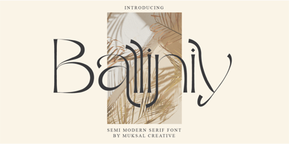 Balliniy semi Modern serif , special glyphs, ornament and multilingual support. It's a very versatile font that works great in large and small sizes. Perfect for editorial projects, Logo design, Clothing Branding, product packaging, magazine headers, or simply as a stylish text overlay to any background image. Balliniy Features : Multilanguange Alternates PUA Encoded Ligatures Files Includes : Balliniy.otf Balliniy.ttf Balliniy.woff Intructions
 - Coyuhqui by Ixipcalli,
$24.00 Coyuhqui is a semi-geometric technical typeface, ideal for posters and flyers. It provides two weights: regular and medium. In addition to three styles: condensed, regular and extended; without leaving out the italic forms of each one. Thus, the Coyuhqui typeface family provides twelve typefaces. If you need a typeface for your project, this is the ideal one.
 - Arnika by Typejockeys,
$50.00 This charming type family comes in four widths: Regular, Semi Condensed, Condensed and Extra Condensed – bringing flexibility and diversity to your drawing table. Crisp details convey confidence without losing fineness. Arnika is your ally for all things classy. Although it is a match made in heaven for beauty products and fashion magazines, we leave its usage to your imagination.
 - Gaia by Outras Fontes,
$21.95 Gaia is the first dingbat series made by Ricardo Esteves Gomes. Each glyph in this font was designed to be used as single forms or as graphic pattens. When repeated several times, they create some interesting optical effects. Their organic shapes gives a nice feeling of nature. I hope this can be useful for your artworks.
 - Reboot by Typelove Fontworks,
$7.00 Born in the lab as a research experiment, Reboot is great for that certain 70’s sci-fi need. It’s filled with the angular curves of the technology of yore, with full diacriticals for Eastern European Cold War era galactic display copy. It’s the first font of a series of research experiments, varying from rectilinear to ovoid.
 - Laguna Madre NF by Nick's Fonts,
$10.00Another addition to the Whiz-Bang Wood Type series is this ultra-condensed font, well suited for very large headlines. Named for the body of water which separates Padre Island from the mainland of Texas. Both versions of this font contain the Unicode 1252 (Latin) and Unicode 1250 (Central European) character sets, with localization for Romanian and Moldovan. - Mixoma by Something and Nothing,
$12.00 Introducing Mixoma, a combination of Serif and Sans strokes gives Mixoma a stylish look. The available stylistic alternates are designed to make your typography look more unique and help bring out your inner Mixologist. Mixoma is available in 9 weights, Thin, Extra Light, Light, Regular, Medium, Semi Bold, Bold, Extra Bold and Black each having an italic version. Enjoy!
 - Meteoric by Nuno Dias,
$24.00 Meteoric is a new playful three-weight typefamily, featuring a soft and rounded sans serif. The semi-stencil style gives it a distinct futuristic look and modern feeling, that is great for logo design, headlines and branding purposes. This monoline typeface, with soft terminals, is a lovely, sweet and perfect typeface for a multitude of typographic applications.
 - Bipolar by VersusTwin,
$39.00 The Bipolar family of fonts is a synthetic blend of digital grid and historical blackletter forms, combining readability and ornamentation into a single modern interpretation. If you feel like you recognize this font style, you may have seen it as the menu font in the popular RockBand series of games. This trendy neo-medieval revival is hot!
 - Chupada by Tipo Pèpel,
$14.00 Chupada is an ultra-condensed font family noted for their exaggerated x-height, which consists of five different weights, accompanied by their italic version. It contains all the central european characters and Cyrillic. Chupada with its bold semi-modular forms make it ideal for use in headlines, posters, titles and anywhere you need for create impact.
 - Margie by Solotype,
$19.95Originally issued as Marggraff Bold Script by the Dresden foundry of A.G. Vorm Brüder Butter. Minor variations were given to a few letters to even the color. - Moonlit Walk JNL by Jeff Levine,
$29.00 Another variant to the ever-popular Art Deco sans lettering with solid centers (no counters) was found in the hand-lettered title on the cover of the 1933 song "There's A Ring around the Moon". This became the basis for the digital typeface Moonlit Walk JNL, available in both regular and oblique versions.
 - MFC Heathcliff Monogram by Monogram Fonts Co.,
$19.00 The source of inspiration for MFC Heathcliff Monogram is a crudely hand drawn vintage monogram transfer depicting a wider format diamond monogram. We revised numerous letters for better clarity and a more vintage industrial vibe. MFC Heathcliff Monogram is capable of traditional two and three letter format monograms, as well as gapped and hugging framing options for each. Numerals 1-9 and 0 on the keyboard for the 2 letter framing options typed before the letters, and use the shift key on the numerals for the 3 letter framing options type before the letters. It's just that easy. Looking for an MC in one of the letter slots? Just type mc on either side of MC in the middle to get it. Otherwise, just type a lowercase, a Capital, and then a lowercase to build your monogram. As one of the most popular shape based formats for monogramming since the beginning, it must be true that diamonds are forever.
 - Vertical by Alias,
$60.00 Alias Vertical is a sans serif typeface with a vertical cut-off point for letter endings. The vertical cut-offs bend round characters (b, c, o, etc) into a squarish, high-shouldered shape, suggesting Roger Excoffon’s Antique Olive. In mid-weights, the typeface mixes Antique Olive with typefaces such as Gill or Johnston, for example the shape of the t, the l borrowing Johnston’s flick. Vertical has the same minimal difference in weight between verticals and horizontals as Gill and Johnston, and the same sharp connection point where curves meet straight lines. Like Antique Olive, Vertical has a narrow connection point here, adding contrast and definition. The overall effect feels austere at lighter weights and strident and graphic at bolder weights, and sharp and incised throughout. In the Bold and Black weights, the squarish and top heavy shape of Antique Olive is most noticeable. For example the wide uppercase, with the B having almost-even width between top and bottom curves, and the almost-overhang of the top curve of the G. But Vertical does not have as extreme an aesthetic or square shape as Antique Olive. As well as its wide design, the upper case is given extra authority by being a slightly heavier weight than the lower case. This is a device borrowed from Gill, and other ‘old’ typefaces, where the upper case is presented as a titling design. Modern sensibilities are more focussed on an even colour between upper and lower case. Vertical was originally intended as a sister typeface to Ano, like AnoAngular or AnoStencil. Vertical developed into a similar but separate design. Ano was designed for use in Another Man — in its modular, circle-base design, and the way there aren’t the amendments usually made in bolder weights to ensure letter clarity. This is for layouts where different weights are used together in different sizes so that the overall letter weight is the same, a feature of the magazine. Where Ano is simple and graphic, Vertical has nuance and texture. It is a pragmatic, utility design. In the balance between graphic and typographic, its focus is the latter.
 - Elyzabeth Pro by moriztype,
$15.00 Elyzabeth Pro is a very elegant and practical sans serif font family and precise in its creation. clean fonts that stand upright elegantly that are soft and familiar and easy to read, Not boring to the reader. This type of font is great to use for very large writing purposes, ranging from notes on daily activities, magazines, newspapers, logos, posters, product compositions, product descriptions to be sold and indications of any product composition that requires writing shadows. Elizabeth Pro contains eight fonts. Broadly speaking, this font has two models, namely Regular and Italic. (Thin, Thin Italic, Regular, Regular Italic, Semi Bold, Semi Bold Italic, Bold and Bold Italic. They all support Latin, Greek, and Cryillic characters. This font will be a great asset to your font library, as it has the potential to enhance your next project creation.
 - BottleKaps by Type Innovations,
$39.00 Alex Kaczun, originally designed BottleKaps for Linotype-Hell, in 1992, as a QuickDraw GX multi-master font series. A few new GX applications, like 'Unicorn', where able to utilize these unique fonts. The GX application allowed the user to adjust weight and proportions, on the fly, including glyph substitution for small capitals, old style figures, swash and alternate endings. The technology was never successfully deployed by Apple, so the individual fonts, 21 styles and variations in all, where sold in the Linotype Font Library as separate Truetype fonts up until 1998. Unfortunately, the fonts collected dust for many years thereafter, but now have been reworked and rejuvenated by Alex in OpenType format for both Mac and PC. 'BottleKaps' is a 'unique', 'playful' and 'decorative' font series. Use it for those bold headlines to stimulate interest and show off your 'unique' individual style.
