1,782 search results
(0.047 seconds)
- Skie by Adam Ladd,
$25.00 Skie is a simple gothic sans serif with normal, condensed, and wide widths. Its distinguishing characteristics are the small x-height with tall ascenders and a minimal amount of contrast, while the apertures are semi-open to help in readability. The simple design keeps the appearance fairly neutral and presents a blend of modern and vintage qualities.
 - Balliniy by Muksal Creatives,
$14.00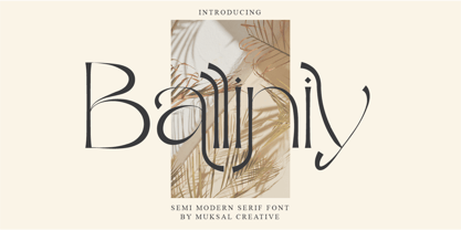 Balliniy semi Modern serif , special glyphs, ornament and multilingual support. It's a very versatile font that works great in large and small sizes. Perfect for editorial projects, Logo design, Clothing Branding, product packaging, magazine headers, or simply as a stylish text overlay to any background image. Balliniy Features : Multilanguange Alternates PUA Encoded Ligatures Files Includes : Balliniy.otf Balliniy.ttf Balliniy.woff Intructions
 - Coyuhqui by Ixipcalli,
$24.00 Coyuhqui is a semi-geometric technical typeface, ideal for posters and flyers. It provides two weights: regular and medium. In addition to three styles: condensed, regular and extended; without leaving out the italic forms of each one. Thus, the Coyuhqui typeface family provides twelve typefaces. If you need a typeface for your project, this is the ideal one.
 - Intrigue JNL by Jeff Levine,
$29.00 The hand-lettered movie titles from one of the William Powell-Myrna Loy "Thin Man" series of films was the basis for Intrigue JNL. Although the lettering style is decidedly from the Art Deco era, it also bears a strong resemblance to the 1980s techno movement; this font being adaptable to any era or design theme.
 - Arnika by Typejockeys,
$50.00 This charming type family comes in four widths: Regular, Semi Condensed, Condensed and Extra Condensed – bringing flexibility and diversity to your drawing table. Crisp details convey confidence without losing fineness. Arnika is your ally for all things classy. Although it is a match made in heaven for beauty products and fashion magazines, we leave its usage to your imagination.
 - Gaia by Outras Fontes,
$21.95 Gaia is the first dingbat series made by Ricardo Esteves Gomes. Each glyph in this font was designed to be used as single forms or as graphic pattens. When repeated several times, they create some interesting optical effects. Their organic shapes gives a nice feeling of nature. I hope this can be useful for your artworks.
 - AT Nezue by Amera Type,
$10.00 Nezue is our first font family consisting of neat and elegant lowercase and uppercase letters, comes with 9 styles (Thin, Extra Light, Light, Regular, Medium, Semi Bold, Bold, Extra Bold, and Black) Formed in a modern style that can help your visual branding look younger, detailed letterforms for optical contrast can make this font even more attractive
 - Retirement JNL by Jeff Levine,
$29.00 The hand lettered film credits for 1937’s “Make Way for Tomorrow” were done in a sans serif design with an ever-so-slight flare and a slightly semi-calligraphic look. Unusual in both style and varying character thicknesses, the lettering has been digitally redrawn as Retirement JNL, which is available in both regular and oblique versions.
 - Reboot by Typelove Fontworks,
$7.00 Born in the lab as a research experiment, Reboot is great for that certain 70’s sci-fi need. It’s filled with the angular curves of the technology of yore, with full diacriticals for Eastern European Cold War era galactic display copy. It’s the first font of a series of research experiments, varying from rectilinear to ovoid.
 - Eckhardt Poster Deco JNL by Jeff Levine,
$29.00Eckhardt Poster Deco JNL is a continuation of a series of sign painter's fonts, and was modeled from a lettering example found within the pages of an old sign design manual. It is named, as always, in honor of the late Albert Eckhardt, Jr., the owner of Allied signs in Miami, Florida and Jeff Levine's good friend. - IngrianaCasual by Ingrimayne Type,
$9.95 IngrianaCasual features a hand-drawn sans-serif family with an italics that has semi-script lower-case letters. The five upright weights are relaxed and informal and the five italics styles are decorative and elegant. The family is very legible and can be be used for many purposes including brochures and advertising, though probably not for book text.
 - Laguna Madre NF by Nick's Fonts,
$10.00Another addition to the Whiz-Bang Wood Type series is this ultra-condensed font, well suited for very large headlines. Named for the body of water which separates Padre Island from the mainland of Texas. Both versions of this font contain the Unicode 1252 (Latin) and Unicode 1250 (Central European) character sets, with localization for Romanian and Moldovan. - Eckhardt Inline JNL by Jeff Levine,
$29.00Jeff Levine's Eckhardt Inline JNL furthers a "mini series" of fonts and lettering styles popularized by sign painters and show card writers. Named in honor of the late Albert Eckhart, Jr. (owner of Allied Signs in Miami, Florida until his passing), this inline sans serif more closely resembles hand lettering than "perfectly designed" display type. Limited character set. - Mixoma by Something and Nothing,
$12.00 Introducing Mixoma, a combination of Serif and Sans strokes gives Mixoma a stylish look. The available stylistic alternates are designed to make your typography look more unique and help bring out your inner Mixologist. Mixoma is available in 9 weights, Thin, Extra Light, Light, Regular, Medium, Semi Bold, Bold, Extra Bold and Black each having an italic version. Enjoy!
 - Meteoric by Nuno Dias,
$24.00 Meteoric is a new playful three-weight typefamily, featuring a soft and rounded sans serif. The semi-stencil style gives it a distinct futuristic look and modern feeling, that is great for logo design, headlines and branding purposes. This monoline typeface, with soft terminals, is a lovely, sweet and perfect typeface for a multitude of typographic applications.
 - Ornata G by Wiescher Design,
$39.50 Ornata G is the seventh of a series of old ornaments that I am trying to save from oblivion. I am completely redesigning the ornaments from scratch. These ornaments have been designed around 1890, I think by someone at the Enschede foundry in Holland. These have a lot of nice swings. Your digitizing type-designing savior, Gert Wiescher
 - Bipolar by VersusTwin,
$39.00 The Bipolar family of fonts is a synthetic blend of digital grid and historical blackletter forms, combining readability and ornamentation into a single modern interpretation. If you feel like you recognize this font style, you may have seen it as the menu font in the popular RockBand series of games. This trendy neo-medieval revival is hot!
 - Chupada by Tipo Pèpel,
$14.00 Chupada is an ultra-condensed font family noted for their exaggerated x-height, which consists of five different weights, accompanied by their italic version. It contains all the central european characters and Cyrillic. Chupada with its bold semi-modular forms make it ideal for use in headlines, posters, titles and anywhere you need for create impact.
 - Elyzabeth Pro by moriztype,
$15.00 Elyzabeth Pro is a very elegant and practical sans serif font family and precise in its creation. clean fonts that stand upright elegantly that are soft and familiar and easy to read, Not boring to the reader. This type of font is great to use for very large writing purposes, ranging from notes on daily activities, magazines, newspapers, logos, posters, product compositions, product descriptions to be sold and indications of any product composition that requires writing shadows. Elizabeth Pro contains eight fonts. Broadly speaking, this font has two models, namely Regular and Italic. (Thin, Thin Italic, Regular, Regular Italic, Semi Bold, Semi Bold Italic, Bold and Bold Italic. They all support Latin, Greek, and Cryillic characters. This font will be a great asset to your font library, as it has the potential to enhance your next project creation.
 - Private Eye JNL by Jeff Levine,
$29.00 From 1958 to 1964, one of ABC-TV’s popular shows was the detective series “77 Sunset Strip”. Based in Los Angeles, the fictional detective agency was located next door to Dino’s Lodge, (partly owned by Dean Martin and actually located at 8532 Sunset). It was originally known as the Alpine Lodge. The adjacent building where Stuart Bailey and Jeff Spencer’s private detective service was located in fact housed a popular modeling agency. The ‘77’ address did not exist outside of the realm of the series. However, a wonderful sign with Art Deco-influenced lettering graced the set (on the wall of the office foyer) saying “Bailey & Spencer Private Investigators Suites 101-102”. A screen capture of this sign served as the working model for Private Eye JNL, which is available in both regular and oblique versions.
 - Hwaiting Serif by Konstantine Studio,
$20.00 Inspired by the emerging Korean culture that grabbing the worldwide actuation in so many realms of the industry. To bridge the vibes and to make it easier to consume, we found the gap to fill with simple things in life that are useful for it, and yes, it's a new day it's a new font. So without any further ado, please welcome Hwaiting Serif. 3/3 series of Korean vibes typefaces. It's a serif font with a thick and thin style of visuals, aiming the luxury and glamorous tone to catch up with high-fashion branding and today's graphic design trends Crafted with deep research about Korean traditional letters, shaped up with the approach of universal Latin letters. This is the last drop of 3 series from the Hwaiting family. Thank you for your engagement with us.
 - BottleKaps by Type Innovations,
$39.00 Alex Kaczun, originally designed BottleKaps for Linotype-Hell, in 1992, as a QuickDraw GX multi-master font series. A few new GX applications, like 'Unicorn', where able to utilize these unique fonts. The GX application allowed the user to adjust weight and proportions, on the fly, including glyph substitution for small capitals, old style figures, swash and alternate endings. The technology was never successfully deployed by Apple, so the individual fonts, 21 styles and variations in all, where sold in the Linotype Font Library as separate Truetype fonts up until 1998. Unfortunately, the fonts collected dust for many years thereafter, but now have been reworked and rejuvenated by Alex in OpenType format for both Mac and PC. 'BottleKaps' is a 'unique', 'playful' and 'decorative' font series. Use it for those bold headlines to stimulate interest and show off your 'unique' individual style.
 - Romana by Bitstream,
$29.99The French interest in the revival of suitably edited Oldstyle romans as an alternative to a world of Modern typefaces started in 1846 when Louis Perrin cut the Lyons capitals. About 1860, as Phemister was cutting the Miller & Richard Old Style in Edinburgh, Theophile Beaudoire turned the idea of the Lyons capitals into a complete Oldstyle typeface, with similar overwhelming success; it was generally known as Elzevir in France and Roemisch, Romanisch, Romaans or Romana in Germany, Holland and Switzerland. In 1892, Gustav Schroeder, at the Central Division of ATF, expanded the series, adding a boldface under the name De Vinne. It was promptly copied, initially in Europe by Ludwig & Mayer, and spread rapidly throughout the US and Europe, becoming the best known member of the series. ATF made popular an ornamental form under the name De Vinne Ornamental. - Bell MT by Monotype,
$39.00 Monotype’s hot metal Bell series from 1931 was based on original types made by the punchcutter Richard Austin for the foundry of John Bell in the 1780s. The different sizes of Monotype’s series were not all based on the same model. As type historian James Mosley wrote on Typophile, “For 18 point and above (the metal type was cut in sizes up to 36 point) Monotype’s model was a larger type [than the model used for the text sizes], the ‘Great Primer’ cut by Austin. This has greater contrast in the capitals and a flat foot to letter a.” The digital Bell closely follows the design of the hot metal 18pt version, and is therefore somewhat lighter in color than the text sizes of Monotype’s original metal face. James Mosley’s Typophile article can be found here.
 - California Street by Letterara,
$14.00 California Street is the perfect handwritten font: Sweet, innocent, light and charming, this one-of-a-kind typeface will add a unique charm to any design project! California Street font was created to look as close to a natural handwritten script as possible by including 64 ligatures. With built in Opentype features, this script comes to life as if you are writing it yourself. You can see it in the picture shown. A wide range of swashes (a-z) and alternates (A-Z, a-z) are included so that you can give your logo or name a custom, hand-calligraphy look. This font is available in 10 fonts in 1 typefaces : Thin, Light, Regular, Semi Bold, Bold, Thin Italic, Light Italic, Italic, Semi Bold Italic, Bold Italic and most importantly, California Street is perfect for you.
 - Compasse by Dharma Type,
$24.99 Compasse is a semi-condensed sans-serif family designed by Ryoichi Tsunekawa and the whole family consists of 12 style: six weights from Thin to ExtraBold and their matching Italics. The range of styles provides flexibility for title, headline and body text. And the large x-heights increases legibility and readability. The basic skeleton of their letterform was not designed over-modularly but moderately semi-modularly (adjusted by designer's experience). Therefore the typical artificiality and unnaturalness which come from module-design does not exist in this family. The sophisticated letterform and its universal, neutral, and standard design make it possible to be used across a wide range of applications in all medias, all purposes. Compasse supports almost all european languages: Western, Central, South Eastern Europeans and afrikaans. And superior figures, inferior figures, denominators, numerators and fraction can be accessed by using OpenType features.
 - ITC Rastko by ITC,
$29.99ITC Rastko began as a series of initial letters for a book of poetry. Serbian designer Olivera Stojadinovic had been working with a small publishing house creating a special series of books under the Masterpieces" brand. Her goal was to draw a new set of initial letters for each book. ITC Rastko, named after the Serbian poet Rastko Petrovic, was a project that required initial letters for the entire alphabet. Once Stojadinovic had drawn the majority of the capital letters, she realized that a companion lowercase would make a distinctive script typeface. Sketches of the letters were drawn quickly with a pointed pen. Stojadinovic then refined these, keeping the spontaneous, hand-drawn quality. Capitals are wide and flourished, while the lowercase letters are more condensed and subdued. It's no surprise that the capitals also make great initial letters." - C-Nation by URW Type Foundry,
$39.99 Marit Otto about C-Nation: The building typeface. Although the 70ties were very liberating and progressive, still girls played mainly with dolls and sweet things and boys with all kinds of challenging stuff. They did all sorts of basic scientific experiments in mini labs and of course built cool things with Meccano building sets. As a girl I was perfectly happy with the toys I had access to. But at the same time I was very curious about all the adventure toys and discoveries my brother did. It also made me wonder why the grown up people thought that our world could be separated so easily by separating our toys in pink and blue sections. At this day of age Meccano is probably hopelessly old fashioned and far to manual. Children of today are fed by fast images and cool animations on screen, they learn, play, communicate and relax in the same space, the digital space. The special feature of Meccano was that even though it was very basic there was the promise you could create anything. It might even contribute to a logical mind. The typeface I designed refers to the Meccano feel. It is a creative typeface. A bit masculine and bold looking perhaps but after the first impression a subtle and refined female touch is revealed. It has links to architecture and associations with metal constructions like ‘The Eiffel Tower’ and (old railway) bridges. I am convinced that we all think of that as very charming man-made objects.
 - Drummer by Harvester Type,
$20.00 Drummer is a large futuristic font family inspired by the Expansion TV series, old science fiction book covers and Honda Prelude and Porsche logos. The family contains a large number of styles and a lot of language support. 54 styles, 6 in width (Ultra Condensed, Condensed, Normal, Expanded, Extra Expanded, Ultra Expanded) and 9 in weight (Thin, Extra Light, Light, Regular, Medium, Semi Bold, Bold, ExtraBold, Black). The font also has a variable version. 573 glyphs, including 40 alternate characters. A lot of work has been done on the font. The fillets on the symbols have been well worked out and tested for a better visual and practical experience. The font combines the monospacing of many characters combined with kerning, which makes it very convenient for many purposes, such as vertical typography. The font is good in all sizes, both small and large, which makes it possible to use it anywhere. Branding, logos, titles, posters, texts, covers, merch, prints, web, titles, banners, games and design in games and much more. In the near future, it is planned to add another axis of variability - the slant. Consequently, the family itself will increase. It is also planned to add a small case (capital). If you want to say something about the font or get a font in other formats, then write to the mail: bunineugene@gmail.com .
 - Pascual Ferry by Comicraft,
$39.00 The slick and sexy letterforms of Ace ACTION COMICS artist, Pascual Ferry, are the latest to join our MASTERS OF COMIC BOOK ART font line. Pascual's work on the SUPERGIRLS storyline in ACTION made us want to lick each page -- but, y'know, not when anyone was looking... we know they're just comic book characters, they're not REAL and we don't fancy them or anything -- Uhhh... so we were delighted when Pascual invited us to create this stylin' sans souciant family of fonts for him. All we asked for in return was this smokin' alternate cover for the next issue of HIP FLASK... Hey, don't lick your monitor, you might get an electric shock...
 - Timeout by DearType,
$35.00 Timeout is a fresh, casual script paired with a bold, impactful sans and lots of goodies. It is modern, stylish and it comes in two variations for easy use: - Timeout - long ascenders, descenders and caps - for more impact. - Timeout B - short ascenders, descenders and caps - for easy stacking. The combo between the script and the headline-style sans works perfectly for various applications such as logos, posters, fashion photos, ads, postcards, branding, T-shirts, web images, product packaging and basically for anything you need to look sexy, interesting and informal. The script has some sweet ligatures, stylistic alternates and swashes that will make your designs stand out and capture attention, especially paired with some of the goodies.
 - Mina Chic by Resistenza,
$49.00 Mina Chic is fresh, elegant and sexy. She was raised by the french riviera sun, loves watching Nouvelle Vague films and adores french pop divas from the 60´s. She wants to be a star! Mina Chicis a new version of one of our most popular scripts,Mina. We added some expansion on the strokes reminding of a pointed nib pen writing and kept the long connections and smooth swashes to preserve the elegance and simplicity of that classic style. This typeface contains 515 glyphs, swashes, ligatures, alternates, final forms and initial forms and offers a wide range of flexibility with its many Opentype features! Mina Chic Extra has an extra thicker strokes who gives more weight to Mina.
 - Blooms by DearType,
$29.00 Say hello to Blooms - an edgy, brush script with lots of attitude! All handmade and then vectorized, Blooms is the perfect mix between sexy and serious. The script is made in two variations - one rough and one smooth for a more sleek look. The Blooms family comes with some great additions to support the script - a thick headline font for the ultimate impact and a narrow tagline font for more hand-style expression. Urban, modern and full of personality, Blooms is perfect for various occasions. Wedding invitations, T-shirts or cards, Instagram photos or interactive designs, it covers it all. Throw some ligatures and stylistic alternates on top of that and you have yourself a multipurpose family.
 - Rettyllda by Twinletter,
$14.00 Rettyllda is a script-typeface that seems like it was handmade. This typeface has an exquisite, simple, lovely blend and harmony between letters, making it ideal for your particular project. Yes, as you can see, the ligature that gives this Rettyllda font its beauty and sensuality may assure beauty and sexiness in your creative project works. Not only that, but this font has a genuine handwritten feel to it, which has been developed to create a portion and composition that matches your demands. As a result, this typeface is appropriate for craft projects, children’s writing, adventure posters, food banner titles, wedding invitations, product packaging logos, quotations, social networking page covers, and furniture banners, headlines, book covers, and much more.
 - Parsnip NF by Nick's Fonts,
$10.00Will Ransom designed the exemplar for this series for Barnhart Brothers & Spindler in the early 1900s. The typeface was originally named "Parsons", after the advertising director of a Chicago department store (evidently a very BIG customer of BB&S). Both versions of this font contain the Unicode 1252 (Latin) and Unicode 1250 (Central European) character sets, with localization for Romanian and Moldovan. - Signs Of Yesterday JNL by Jeff Levine,
$29.00Signs of Yesterday JNL brings another twenty-six vintage signs inspired by a series of decals once made by the Duro Decal Company (now Duro Art Industries) of Chicago. This font complements the original twenty-six designs found in Too Much Information JNL. There are two blank sign panels on the parenthesis keys for use in creating custom retro signage. - Vince by Sign Studio,
$15.00 Vince was created to be a display font. Each side of the character is carefully crafted so that this font has a premium quality. The curve that has an extrema point will be kept geometric and smooth. Ligatures and Stylistic Alternate work well to provide design variations. Versatile for building branding, invitations, logotypes, magazine headings and posters. Supporting font in preview : Hexi
 - Sis Boom Bah NF by Nick's Fonts,
$10.00An old favorite from the venerable Letragraphica series, named Yankee Shadow and designed by Tony Geddes, provides the pattern for this sporty font. For this version, the outlines have been beefed up, and the shadow has been moved in an easterly direction. Both versions of this font include the complete Latin 1252 and CE 1250 character sets, with localization for Romanian and Moldovan. - Aligarh Arabic by NamelaType,
$29.00 Aligarh Arabic is new version of Aligarh with the addition of Arabic glyphs, for Arabic, Urdu, and Farsi Basic form for arabic font is refers to the arabic kufi style, semi-slab serif font formed with a smooth rounded bracket whose edges end with unique shapes, an exploration of combining unique styles in a typefaces to harmony with Latin version.
 - PF Cosmonut Pro by Parachute,
$69.00 Spaced out and a bit nutty. This typeface revisits the futuristic atmosphere of the 50s and 60s cartoons and is complemented with an amazing, wacky and super cool series of 50 pictograms, designed by the master designer Dimitris Foussekis. This is a very popular informal typeface which was expanded recently into a ‘Pro’ version that includes Latin, Greek and Cyrillic.