2,808 search results
(0.018 seconds)
- Culpepper by Galapagos,
$39.00I've always admired the work of Rudolph Koch. Culpepper is what I think Neuland would have looked like if it had been developed with lowercase, small caps and a range of weights. I started work on this series in the late 80’s and, like so many of my ideas, it was shelved when life drew me in another direction. Culpepper is the name of one of the islands in the Galapagos chain. - Wolfie Font Family by Oui Studio,
$17.00 Hello friends! The 'Wolfie' font family is coming; a dynamic and new vintage feel. It's perfect for branding, logo, packaging, header, title, etc. Wolfie is great if you pair it with an 80s illustration, it will make the design even more dope. Wolfie are available in 3 Widths (Condensed - Ultra Condensed - Normal) with matches 5 weights (Light - Semi Light - Regular - SemiBold - Bold) total 30 fonts and support for 75+ language. Happy creating :)
 - Los Muertos by Just My Type,
$25.00 Happy Halloween (and All Souls Day and Day of the Dead)! I’ve seen other fonts made up of bones of various kinds, but none with this variety. Henry Gray’s Anatomy of the Human Body (the book, not Grey’s Anatomy, the TV series) was heavily scoured to find more unusual bones shaped like letters. You’ll find Los Muertos both fun and appropriate for the up-coming holidays. (Uppercase is Solid, lowercase is Outline).
 - Ornata B by Wiescher Design,
$39.50 Ornata B is the second of a series of old ornaments that I am trying to save from oblivion. I am not just scanning these, I am completely redesigning the ornaments from scratch, thereby eliminating imperfections. These ornaments have been first designed by the Elzevier printer family from the Netherlands. The designs date back til the 17th century and I think they just had to be saved. Your digitizing type-designing savior, Gert Wiescher
 - Servat by Maulana Creative,
$14.00 Servat is a retro semi slab serif font. With medium stroke, fun character with a bit of ligatures and alternates. To give you an extra creative work. Servat font support multilingual more than 100+ language. This font is good for logo design, Social media, Movie Titles, Books Titles, a short text even a long text letter and good for your secondary text font with sans or script. Make a stunning work with Servat font.
 - Mithella by Lafontype,
$19.00 Mithella is a sans serif family with a pleasant touch. Some letters, especially linear ones, look normative like other rounded sans serifs, but the difference can be seen clearly in curved letters so that it gives a pleasant impression for each series of words. Mithella comes with eight weights ranging from thin to black to complement your design needs be it branding, blogging, logos, advertising, games, cooking, packaging, editorial and publishing, web and screen design.
 - Graviola by Harbor Type,
$30.00🏆 Selected for Tipos Latinos 7 with a Certificate of Excellence. With semi-rounded terminals, Graviola is soft and friendly. The family consists of 16 fonts, from Thin to Black and matching italics. While the intermediate ones are suited for body text, the extreme weights look specially beautiful at display sizes. Each font contains 530+ glyphs, supporting more than 90 languages. Stylistic sets provide alternates in two groupings (a, v, w, y and G, g, &). - Patrol Car Stencil JNL by Jeff Levine,
$29.00 Comic books based on popular characters have been around pretty much since the advent of comic books themselves. An edition of the "Car 54 Where Are You?" series published by Dell (and based on the hit TV show created by Nat Hiken) displayed "Car 54" in a bold hand lettered stencil design on the cover. These few characters became the inspiration for Patrol Car Stencil JNL, which is available in both regular and oblique versions.
 - Raleigh by ParaType,
$30.00 Raleigh was produced in 1977 by Robert Norton based on Carl Dair’s Cartier typeface which was designed for the 1967 Montreal World's Fair. It was renamed after Dair’s death. Adrian Williams added three weights for a display series, and Robert Norton developed the text versions. A contemporary old style serif with calligraphic features. For use both in text and display typography. Cyrillic version was developed at ParaType in 2001 by Vladimir Yefimov.
 - Eckhardt Signwriter JNL by Jeff Levine,
$29.00Eckhardt Signwriter JNL is based on a casual display lettering face popular with many sign painters and show card writers of yesteryear, best suited for large print projects. Jeff Levine has named this font (along with others in a series) after the late Albert Eckhardt, Jr. (1929-2005) who had owned Allied Signs in Miami, Florida from 1959 until his passing. Al was a talented lettering artist and a good friend to Jeff. - Flagtail Display by Pekotype,
$23.00 Flagtail Display combines the familiar feeling of classic typeface with the modernish touch to suit the nowadays trend. With its semi-bold and sharp type of shape, it can easily catch and engage the reader's attention in an instant. The excellent readability of Flagtail Display will put any of the messages being delivered to be the limelight. This typeface suits for you who aim to catch attention through headlines, rebrand your products, and beyond.
 - Hand Stamp Gothic Rough by TypoGraphicDesign,
$25.00 “Hand Stamp Gothic Rough” is based on real vintage rubber stamp letters from Germany. A classic american gothic face mixed with a modern condensed sans serif type. Rough & dirty with a authentic hand stamped look for a warm analogue vintage charm. It started analogous with only a few rubber stamps and finally it was digital 776 glyphs. With 4 × A–Z, 4 × 0–9, 4 × a–z and many other alternative glyphs like @. Plus modern OpenType Features like contextual alternates (automatic generated loop for letter variation). The different variations from the dynamic pressure by hand intended to show the hand-made nature and creates a liveliness in the display font. The font has 80 decorative extras in the form of symbols & dingbats like arrows, hearts, smileys, stars, further numbers, lines & shapes. A range of figure set options like oldstyle figures, lining figures, superiors & inferiors. Additionally standard ligatures, decorative ligatures (type the word “show” for ☛ and “love” for ❤ … ), Versal Eszett (German Capital Sharp S) and many emojis & symbols. Example of use It’s your turn … for example everywhere where it makes sense. The hand stamped font would look good at headlines. Advertising (big headlines), Corporate Design (type for logos & branding), Editorial Design (magazine or fanzine headlines), Product Design (typographical packaging) or Webdesign (headline webfont for your website), flyer, poster, music covers or web banner … How To Use – awesome magic OpenType-Features in your layout application: ■ In Adobe Photoshop and Adobe InDesign, font feature controls are within the Character panel sub-menu → OpenType → Discretionary Ligatures … Checked features are applied/on. Unchecked features are off. ■ In Adobe Illustrator, font feature controls are within the OpenType panel. Icons at the bottom of the panel are button controls. Darker ‘pressed’ buttons are applied/on. ■ Additionally in Adobe InDesign and Adobe Illustrator, alternate glyphs can manually be inserted into a text frame by using the Glyph panel. The panel can be opened by selecting Window from the menu bar → Type → Glyphs. Or use sign-overview of your operating system. For a overview of OpenType-Feature compatibility for common applications, follow the myfonts-help http://www.myfonts.com/help/#looks-different ■ It may process a little bit slowly in some applications, because the font has a lot of lovely rough details (anchor points). Technical Specifications ■ Font Name Hand Stamp Gothic Rough ■ Font Weights Regular & Dirty (Bold) ■ Font Category Display for headline size ■ Font Format.otf (OpenType Font for Mac + Win) ■ Glyph Set 776 glyphs ■ Language Support Basic Latin/English letters, Central Europe, West European diacritics, Turkish, Baltic, Romanian, OpenType Features, Dingbats & Symbols ■ Specials Alternative letters, stylistic sets, automatic contextual alternates via OpenType Feature (4× different versions of A–Z & 0–9 + a–z), Euro, kerning pairs, standard & decorative ligatures, Versal Eszett (German Capital Sharp S), 80 extras like Dingbats & Symbols, arrows, hearts, emojis/smileys, stars, further numbers, lines & shapes. ■ Design Date 2016 ■ Type Designer Manuel Viergutz ■ License Desktop license, Web license, App license, eBook license, Server license
 - Gilam by Fontfabric,
$39.00 Gilam is a sans serif font with semi-condensed proportions. The typeface was based on the famous DIN but combines its popular neo-grotesque look with characteristics, such as the pointed edges in the “W” and “M” as well as the outward cut terminals, which gives a distinctive look to the modern geometric typeface. The complete set of 9 weights plus italics gives to designers the absolute freedom to create anything. Perfect layouts with blocks of text, headlines, motion graphics, logos, apps, and websites are just part of the intended usage of this versatile typeface. Features: • 765 glyphs in 18 styles; • Extended Latin, Cyrillic and Greek; • Geometric forms and low contrast; • Prominent x-height which makes it legible in a text; • Perfect for headlines and logos; • Suitable for web, print, motion graphics etc. • Semi-condensed proportion; • Advanced typographical support and OpenType features including case-sensitive forms, fractions, superscript and subscript characters, and stylistic alternates; • Complete set of figures - old style and lining figures, which come with proportional and tabular variation; Gilam means “joy of people” so that you can enjoy it!
 - Organica Pro by Sudtipos,
$39.00 Just as most buildings are based on a structure of vertical columns, horizontal floors, square angles and the occasional arch, most Latin typefaces are designed within a largely uniform, static, alphabetic structure that provides a framework for playing with the style of the terminals —serif, sans-serif, slab-serif, flared, Tuscan— without significantly modifying the deep anatomy of the letters. Orgánica Pro, by contrast, proposes a different structure: curvilinear, subtle and sophisticated, beyond the typical «sticks and balls» model. Organic anatomy, in one word; deliberately dynamic and asymmetrical. Over this radically distinct structure, terminals play a characteristic, expressive role that challenges easy classifications: Is this a serif or a sans font? A semi-serif? A semi-sans? For text or display? Modern or ultra-modern? Joke or serious? All answers are valid. Anyway, its six stylistic variants allow for multiple, diverse uses in text setting, headings and logotypes. In spite of —or perhaps thanks to— its innovative, uncommon structure, Orgánica’s personality is sweet to the eyes, wittily elegant and surprisingly legible.
 - Lust Pro by Positype,
$50.00 Confident and versatile, Lust Pro™ is an exercise in indulgence—an attempt to create something over the top and vastly useful. If Lust Pro seems both new and familiar, that’s because it is. The series unapologetically channels Herb Lubalin, but produced with a deliberate, contemporary twist. There is an intentional slyness infused in the letterforms—the extreme thick and thin lines flow effortlessly without becoming gratuitous. It’s always just enough, not too much. What makes the type series so appealing? The curves. When asked to describe the letterforms, most people unwittingly allude to the human form, using adjectives usually reserved for describing physical traits… creating all-too-familiar comparisons. Summerour has grown to accept this as unavoidable and reasonable given his acknowledgement of its influences and has provided nuances within the letterforms to accentuate that. Intended to be set large, the typeface boasts 3 widths and 5 weights and matching italics for both the Regular and Didone variants (that’s 60 fonts in total), making it perfect for editorial use and a highly flexible solution for any display need.
 - Gutenberg A by Alter Littera,
$- This is a free abridged edition of the full-featured Gutenberg B and Gutenberg C fonts. Although (as the name suggests) it was originally conceived as the first release in the B42-type series, it actually represents the colophon to this series. In addition to having a narrower scope, the font differs from its full-featured predecesors in both letter and word spacing, as well as in glyph design, using exclusively straight lines for every glyph and providing a significantly rough appearance at medium to large point sizes. The font includes the usual standard characters for typesetting modern texts, as well as a few special characters, alternates and ligatures that can be used for typesetting nearly as in Johann Gutenberg’s 42-line Bible and later incunabula. Please note that the use of this free font is subject to the same terms and conditions as those for Alter Littera’s pay fonts. Specimen, detailed character map, OpenType features, and font samples available at Alter Littera’s The Oldtype “Gutenberg A” Font Page.
 - Glyphic Neue by Typeco,
$29.00Glyphic Neue was inspired by the Op Art style of lettering in the United States that ran rampant in many photo type houses in the 1960's and 1970's. The Glyphic Series from the Franklin Photolettering group was an influence and spring board for this family of fonts, hence it's name. But Glyphic Neue departs from its unicase Franklin influence in several ways. Firstly the designer created both upper and lower case forms. The lowercase has been designed with barley protruding ascenders and descenders and with an x-height equivalent to the cap height, so that upper and lower can be exchanged indiscriminately for a quirky effect. Some of the letters take a cue from the original Glyphic series but many have been redesigned entirely to fit the designers vision. The italic forms differ enough from the upright version making it almost an entirely different display alphabet. Glyphic Neue is a versatile family of 6 fonts -- 3 widths, each with an accompanying italic that look equally at home when used on a party flier or a sports team visual identity. - Lust Pro Didone by Positype,
$50.00 Confident and versatile, Lust Pro™ is an exercise in indulgence—an attempt to create something over the top and vastly useful. If Lust Pro seems both new and familiar, that’s because it is. The series unapologetically channels Herb Lubalin, but produced with a deliberate, contemporary twist. There is an intentional slyness infused in the letterforms—the extreme thick and thin lines flow effortlessly without becoming gratuitous. It’s always just enough, not too much. What makes the type series so appealing? The curves. When asked to describe the letterforms, most people unwittingly allude to the human form, using adjectives usually reserved for describing physical traits… creating all-too-familiar comparisons. Summerour has grown to accept this as unavoidable and reasonable given his acknowledgement of its influences and has provided nuances within the letterforms to accentuate that. Intended to be set large, the typeface boasts 3 widths and 5 weights and matching italics for both the Regular and Didone variants (that’s 60 fonts in total), making it perfect for editorial use and a highly flexible solution for any display need.
 - Absalon by Michael Nordstrom Kjaer,
$39.00 Absalon has square letter shapes. It has some characteristics semi-sharp and semi-rounded corners and it has a relatively tall x-height for legible text. To create the perfect typesetting the spaces between individual letter forms has been precisely adjusted. The Absalon font family is perfect for the web as well as for print, for display as well as longer text, for motion graphics, on the side of a van, t-shirts, logotypes and so on. The font family consist of 5 weights or 10 styles and it has 410 glyphs. A total of more than 4000 glyphs. The styles are: Light, Light Italic, Regular, Italic, Medium, Medium Italic, Bold, Bold Italic, Extra Bold & Extra Bold Italic. It has OpenType features such as automatic fractions, subscript, superscript, numerators, denomerators, ordinals and the “f” ligature set. Absalon has extended language support (most Latin-based scripts are supported). The name of the font family is Absalon and it is a reference to a Danish bishop in the middle ages. He was a key figure in the founding of Copenhagen, the Capital of Denmark.
 - Superfont by CozyFonts,
$20.00 Superfont type family, created by Tom Nikosey, California Typographic Designer/Illustrator is based on his design and illustration for the title art for the 1984 movie Supergirl. 'I've always felt someday I would design a complete font with variations, including Euro Glyphs and dingbats and numbers based on that logo and letters'. Cozyfonts Foundry is the manifestation of a career-long desire to create fonts in 2011 with his release of Aladdin Bold font family. Superfont is the 22nd font family release. Superfont has a 1960s superhero feel and movement. The entire font family is italic by style. There's a hint of Retro-Moderne in it's overall look. The 1960s ushered in the supersonic era in travel and technology with the jetset look in fashion, product design, fabric design, and type design. Superfont is Cozyfont's take on that era with the innocent future-forward attitude in it's glyph's personality.
 - Rabsy by D&K Project,
$15.00 Rabsy is a unique cartoon font with a doodles concept. The included dingbat doodles pattern makes it easy for you to make unique patterns, and make fun display tittle. A mixed-case font (Rabsy and Rabsy Pattern) with lots of combination possibilities, makes for great fun! It is good for logotype, stickers, fun kids signs, and other lettering projects. This fun is perfect combination uppercase and lowercase. Rabsy File Downloaded: - UPPERCASE and lowercase - Lots of doodles Rabsy Pattern 1-9, A-Z and a-z (more fun with lots of combination possibilities) - Punctuation and numeral - Extended Latin characters for language support. Please let me know in the comments what you think or if you have any issues or queries, If you have any questions about licensing, need help with a typeface, or would like to request a new feature, drop me a message. Thank you, D&K Project
 - Niedermann Grotesk by steve mehallo,
$19.14 With the printing of the Futurist poem “Zang Tumb Tuuum” in 1914, modern art had taken a typographic twist: “words in freedom” (parole in libertà) were now a major part of the art world. The avant garde followed suit. Niedermann Grotesk is based on the everyday type that appeared in early modernist collages, journals and manifestos. It is a peculiar style of lettering—which was originally inspired by the Sachplakat (object poster) work of Lucian Bernhard—and adapted for hot metal in 1908 by Heinz Hoffmann. 100 years ago, the style became a workhorse of the German printing industry. Niedermann Grotesk is an updated variant, referencing the original poster art, each letter carefully drawn with an old brush. Bumpy, bold and blunt—with a suite of alternate characters and a few dingbats—Niedermann Grotesk is perfect for advertising, packaging, poetry, art, protests and retro homage.
 - NO culture no SOUL by TypoGraphicDesign,
$9.00 The typeface No Culture No Soul is designed from 2021–2022 for the font foundry Typo Graphic Design by Luise Herke × Manuel Viergutz as a project for support the culture. Special THX to Michael Rütten of soulpatrol.de The display font with 254 glyphs incl. numbers, punctation, marks & symbols is inspired in the past and present. Extras like OpenType-features and 7 sylistic sets. For use in logos, magazines, posters, advertisement plus as webfont for decorative headlines. The font works best for display size. Have fun with this font & use the DEMO-FONT (with reduced glyph-set) FOR FREE! Font Specifications ■ Font Name: No Culture No Soul ■ Font Styles: 1 (Rough) + DEMO (with reduced glyph-set) ■ Font Category: Display for headline size ■ Glyph Set: 254 glyphs incl. extras like icons (decorative extras like dingbats, emojis, symbols) ■ Design Date: 2021–2022 ■ Type Designer: Luise Herke, Manuel Viergutz, THX to Michael Rütten (Soulpatrol)
 - Double Nines JNL by Jeff Levine,
$29.00 Double Nines JNL is a dingbat font containing fifty-five glyphs for the tiles found in the second level of domino games. Sets of dominoes can be of either double six, double nine or double twelve. In this font, the double blank tile is located on the zero keystroke, while the one/blank and 1/1 tiles are on the 1 and 2 keystrokes. The rest of the tiles (in numerical order through 9/9) are located on the A-Z and a-z keystrokes respectively. To use any or all of the images contained in Double Nines JNL in any manufactured products or services, please refer to the software license agreement provided when purchasing this font. A separate royalty license must be secured from Jeffrey N. Levine for such purposes. The images are NOT licensed for use in proprietary logos or service marks.
 - Mix Sonic by Mix Fonts,
$13.00 MIX SONIC is a font pair inspired by the night sky. You get a round, bouncy and plump decorative san serif in MIX SONIC MOON and an all-uppercase and moon and stars dingbat hybrid in MIX SONIC STAR. The shapes of these glyphs capture the various phases of the moon, and how it lights up eerily lights up the night sky at each phase. MIX SONIC MOON and MIX SONIC STAR are great additions to your font collection. Make it a go-to font for all your projects of the mystic, astrology, magic, zodiac, elemental, witchcraft or divine variety. Use together, or separately, both font sets are sure to delight! MIX SONIC MOON comes with the following glyphs: ABCDEFGHIJKLMNOPQRSTUVWXYZ abcdefghijklmnopqrstuvwxyz 0123456789 !@#$%^&*()`~♥♥✿•· ÷×+−±≈=≠≥≤[]<>:;’”,.\|/?{}“”‘’-–—_… ©®™‹›«»°¹²³ªº¡¿₱¢€£¥½¼¾¶§№† ÁÀÂÄÃÅĂĀĄÆĆĈČÇÐĐÉÈÊËĖĒĘĜĤIÍÌÎÏĪĮĴŁŃÑŇÓÒÔÖÕŌŐ ØŒŔŘŚŜŠŞȘŤȚÚÙÛÜŮŰŬŪŲẂẀŴÝŶŸŹẐŽŻÞẞ áàâäãåăāąæćĉčçðđéèêëėēęĝĥıíìîïīįĵłńñňóòôöõōő øœŕřśŝšşșťțúùûüůűŭūųẃẁŵýŷÿźẑžżþß MIX SONIC STAR comes with the following glyphs: ABCDEFGHIJKLMNOPQRSTUVWXYZ abcdefghijklmnopqrstu-vwxyz 0123456789 !@#$%^&*()`~+= []<>:;’”,.\|/?{}“”‘’-_‹›₱¢€£¥ Fellow witches, enjoy!
 - Plakato Pro by Underware,
$50.00 Plakato, a stencil love affair Plakato is a family of display fonts, consisting of various eye-catching styles, each of them very bold. Plakato is an identity toolkit, a heavyweight building block in case you need a strong personality, a small stencil font family to cut out your best ideas and grab all the attention. But just as with many other creations, its outcome is as divers as its multiple origins. Plakato comes in 16 eye-catching styles. The default stencil style comes in Regular & Italic. They both have 2 variations: one version, named Plakato Stencil, automatically creates borders around the text, putting any text into a graphic stencil in this way. Another version, the extruded three-dimensional version, guarantees even more attention for your message. Next to this there is also the Inline version, which is an optical play with a lot of lines. Plakato Inline has a supportive background layer, a separate font in case you want to add a background in a different colour. Then there is Plakato Paper, a manually teared version of Plakato offering a more physical look. This small family of eye-catching display fonts also contains a Neon font, an independent design in Plakato style, which can actually be used for making neon signs due to its construction. Plakato Neon comes with its own Dingbat font for that extra flush-flush. Plakato has also been redrawn on a C64, and with all its accompanying limitations been ported back and turned into a font: Plakato Game. Also this font comes with its own Dingbat font, full of emoji’s and icons for oldskool pleasure. Last but not least there is Plakato Build, constructed out of blocks. As if that wasn’t enough, there are various dynamic versions in the Plakato Play package, which offer a whole new range of possibilities for typographic expression, with new animation and interaction opportunities.
 - Decorata by Positype,
$29.00 How many times have you seen lettering on a book cover, poster, or card and wanted to make something similar? Decorata’s eight intertwining weights finally make that possible in an intelligent way. The first major collaboration of its kind, Decorata pairs the talents of supreme lettering artist Martina Flor and masterful type designer Neil Summerour. Lettering was traditionally understood as using words in an artistic way, while type design created written language for easy reading, the one overlapping the other in several ways. For this unique project, Martina created several versions of the alphabet and its decorative layers in her eye-catching style. Neil then took those designs and created an enormous eight-style font family that respects the designer’s need for control and capitalizes on the artist’s expressiveness. Each style can work separately but, on top of the foundational styles, try placing the Lace, then Filigree in contrasting colors. Use any OpenType-capable program to turn headlines from blasé to wowza, make posters with some pow, and design your own cards with that just-right level of detail. Whatever idea you can imagine with the Decorata family, it promises to be a playful and precise wordsmith where the words themselves are the art. Decorata’s glyphs are bifurcated, have medium contrast to showcase their intricate interactions, and include Shadow, Regular, Outline, Filigree, Lace, Fancy, Intricate, and Dingbat styles — eight in all. The Regular style sets the word or phrase to begin the design, Shadow ensures it lifts off the background, and Outline attempts to restrain its ornate flair. Think of those as the foundation and use the rest of the styles for flamboyance. The Intricate and Filigree styles vary only in the thickness of the glyphs, with Filigree being thinner. Lace removes the external curls around each letter but keeps the internal negative space from those decorative lines. The Fancy style is a solid lettershape that includes its attendant elements, and the Dingbats are exactly as expected: borders, manicules, patterns, frames, and many stylized items to bring designs to life.
 - CAL Bodoni Terracina by California Type Foundry,
$47.00 Bodoni Terracina is a legible, fun-formal script face, with lots of curls. Sometimes script faces are hard to read. Sometimes being formal means that there’s no personality and there’s no fun. Enter Terracina: one of the masterpieces of font design. Some of the most personable italics ever carved. Includes powerful new features for: • Dates • Pricings • Addresses Not is only Terracina formal but fun, it’s also fun to use! In a program like Adobe Indesign or Illustrator, just highlight a word and see lots of fun options. Bodoni himself etched these symbols, and his fun-loving personality shines through. As a semi-script, it can go together with many script fonts, but it is more readable. When you need something equal parts elegant and whimsical, Terracina strikes a perfect balance to let the fun shine through, such as for holiday designs or fairytales. Terracina is a subheads font, but Bodoni also used it for paragraphs. So Terracina works well doing subhead paragraphs, especially when contrasting with the mood of the first font. And because of the swash variety, it works well for setting German and other European languages. CAL Bodoni Terracina is a member of our Origins Series. Origin Fonts are designed to be true to the original designer's intentions and fonts. Our Bodoni origin fonts ARE Bodoni fonts, not imitations or interpretations. They were drawn by Bodoni, our team just expanded it for modern use. For Terracina, Bodoni's original weight is the "Quasi-Lite" option, all other weights have been meticulously matched by the CAL Origins Team.
 - Dinghy by Atlantic Fonts,
$32.00 Dinghy is a shore thing. Like three fonts in one, Dinghy sports a friendly, bold lower-case, a salty, strong upper-case, and in all-caps with discretionary ligatures turned on, Dinghy is tightly interlocking. Turn some ligatures on, others off, to craft the look you want - whatever floats your boat. Dinghybats contains 26 original Amy Dietrich seaside illustrations from curious ocean animals to dune grasses to, well, dinghies.... So enjoy making waves with Dinghy family!
 - Tattoo - Unknown license

- Avain - Personal use only

- Chiripa by Huy!Fonts,
$25.00 Chiripa is a casual, handcrafted, display font that gets a semi-random effect rotating between three different sets of characters (with Contextual Alternates on). Chiripa means luck in Spanish, but if you do not trust in your Chiripa you can turn Contextual Alternates off and change the glyphs switching between sets in the OpenType menu of your application or in the Glyphs list. Chiripa is perfect for children's books, fresh advertising, food packaging and any use in large sizes.
 - Village by Font Bureau,
$40.00 David Berlow undertook the revival of Frederic W. Goudy’s Village family in the early ’90s as the first real step in the successful redesign of Esquire magazine. Goudy originally cut Village No. 2 in 1932 to bring early ideas up to date, adding the italic a year or two later for his own satisfaction. Font Bureau expanded Village, the model for Goudy’s mature style, into a ten-part series designed for Esquire’s use in text and display; FB 1994
 - MC Rilego by Maulana Creative,
$17.00 Rilego is a semi monospaced with serif font. Regular stroke, fun character with a bit of ligatures and alternates. To give you an extra creative work. Rilego font support multilingual more than 100+ language. This font is good for logo design, Social media, Movie Titles, Books Titles, a short text even a long text letter and good for your secondary text font with script or serif. Make a stunning work with Rilego font. Cheers, Maulana Creative
 - Noahs Ark by Vincenzo Crisafulli,
$29.00 Noah’s Ark was designed to combine it with the bestiary animal series I designed. A simple font, well harmonized with the highly synthesized designs of animals and insects. So, it seemed natural to use them for posters. Noah's Ark is a stylized font with a constant stroke, which stands between writing and the typeface. Its design is inspired by the fonts used in the 1940s. It is made up of linked letters, excluding numbers and other signs.
 - Sirkle by Invasi Studio,
$19.00 Sirkle is a semi-serif typeface for display, constructed with sharp and curvy characters. All Letters are handcrafted and made to fit each other perfectly without exception, with a modern and edgy style that gives them a unique look. Sirkle comes with ligatures, alternates, and supports 60+ Latin-based languages. The Sirkle is ideal for logotype, signage, posters, packaging, and much more! Features: Uppercase & Lowercase Numerals & Punctuation Alternates and Ligatures Multilanguage Supports 60+ Latin based languages
 - Benton Sans Std by Font Bureau,
$40.00 In 1903, faced with the welter of sanserif typefaces offered by ATF, Morris Fuller Benton designed News Gothic, which became a 20th-century standard. In 1995 Tobias Frere-Jones studied drawings in the Smithsonian and started a redesign. Cyrus Highsmith reviewed News Gothic, and with the Font Bureau studio expanded it into Benton Sans, a far-reaching new series, with matched weights and widths, offering performance well beyond the limits of the original; FB 1995-2012
 - Sueno by Mix Fonts,
$13.00 Looking for a font that's chic, stylish, and oh-so-slightly handwritten? Look no further than MIX SUENO! This monoline semi-script was crafted with care using an iPad Pro and Apple Pencil, and is the perfect addition to any design project. Whether you're creating invitations, social media graphics, or just sprucing up your website, MIX SUENO will bring a touch of sophistication and personality to your work. So don't hesitate - give MIX SUENO a try today!
 - MC Blitez by Maulana Creative,
$19.00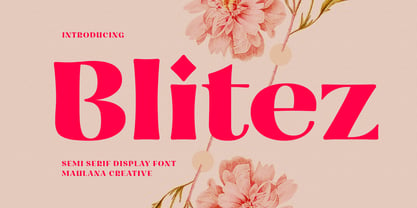 Blitez is a modern semi serif display font. Bold stroke, fun character with a bit of ligatures and alternates. To give you an extra creative work. Blitez font support multilingual more than 100+ language. This font is good for logo design, Social media, Movie Titles, Books Titles, a short text even a long text letter and good for your secondary text font with script or serif. Make a stunning work with Blitez font. Cheers, Maulana Creative
 - Palio by Eurotypo,
$34.00 Palio is a family of fonts derived from the classic Didone, its capitals are slightly condensed and the lower case definitively abandon the reminiscent of the baroque endings strokes, which are still endure in many typefaces. It is an elegant font especially the slant version that actually is a truly italic. This version very readable and is enriched with a series of alternative variables and swashes that make it more expressive for certain projects that need some flowering.

