10,000 search results
(0.815 seconds)
- Eyeballs by Bitstream,
$29.99Eyeballs was designed at Bitstream by designer David Robbins. Its beginnings can be found in Bitstream’s Old Dreadful No. 7, where Mr. Robbins first conceived the capital I. He was later asked by Bitstream to develop the entire character set. The result is a humorous meld of cartoon and typography. A word of caution: Watch how you use it! - Handmade Font by Ingrimayne Type,
$14.95 In Handmade Font the letters are made of hands or handprints, something children sometimes do when they are set free with paint. It is caps only but the letters on the lower-case keys differ from those on the upper-case keys. It comes with a large assortment of accented letters to support most European languages.
 - Type Warmers JNL by Jeff Levine,
$29.00 The name Type Warmers JNL traces its lineage to small catalog booklets issued by Indianapolis' Cobb Shinn for his line of letterpress cuts; of which a few can be found included within this typeface. Presumably type could "warm up to" these stock illustrations and work hand-in-hand to deliver the message, hence the "Type Warmers" sobriquet. Originally known for illustrating many attractive and comical postcards of the early 1900s, Shinn moved into the field of purchasing stock art and redistributing them as electrotypes or "cuts", the predecessor to today's digital clip art. A number of the cartoons he sold can be found in the Shinn Kickers JNL font.
 - MFC Monarchy Initials by Monogram Fonts Co.,
$19.95 The inspiration source for Monarchy Initials is the 1934 Book of American Types by American Type Founders. In that specimen book, they had created a sophisticated two color initial design they called "Stationers Initials" which was only available in metal type at 24, 36, and 48 points. This wonderfully detailed initial style is now digitally recreated and revived for modern use. Monarchy Initials is only capable of initial or single letter monograms due to its unique design. The two color aspect of the original design has been preserved and made accessible within all programs. The Capital character slots contain the background color glyphs, and the lowercase slots hold the outline art for the letters. You can choose a color, type a capital letter, then switch to black and type a lowercase letter for the two color effect, or just tpe a lowercase letter on its own. It's that easy! Download and view the Monarchy Initials Guidebook if you would like to learn a little more.
 - Isidora by Latinotype,
$26.00 Designed by Enrique Hernández V. Isidora is a modern geometric design based on the classic typefaces of the early 20th Century with a contemporary and functional touch. In spite of its strong and rational structure, the font also looks friendly and expressive, thanks to its rounded terminals. In addition, its diagonal terminal cuts give it a softer and more rounded appearance. Isidora consists of two 7-weight subfamilies: one (more classic) Regular and one Alternative (more contemporary and for display use). Both subfamilies come in italic version, giving a total of 28 fonts. Isidora is the perfect font for headlines, logotypes, branding, packaging, publishing and web use. The family contains a set of 438 characters—supporting 207 different languages—and also includes an alternative character set, which allows for more versatility when composing text.
 - Louisa by Julia Hanft,
$30.00 Louisa is a monospaced font-family designed and optimized specifically for small font sizes. But even as headline font it looks good. It has a very good distinguishability of letter forms and legibility even in longer text paragraphs. The character of Louisa is a combination of strong elements and warm, friendly forms. The font family is not only designed for coding and tabular layout, but can be used in different fields of communication design. Therefore it provides two stylistic sets with different letter forms: one with the look of serious modern typewriter font, the second with more soft letter forms and elements of a real italic. Additionally it consists oldstyle numbers (and of course tabular numbers) and a set arrows. The font is available in four styles: regular, italic, bold and bold italic.
 - Churchward 69 by BluHead Studio,
$25.00 Churchward 69 is a ten weight typeface family originally designed during the late 1960’s by the late type designer Joseph Churchward. From the extremely condensed Regular weight to the outlandishly heavy Ultra Black, this square sans serif makes an audacious statement. Even the Italics are extreme at their 17 degree angle! Churchward 69 includes 5 weights, Regular, Bold, Extra Bold, Black, and the gorgeous Ultra Black, and their italics. Joseph sure knew how to draw heavy weights! All members of the Churchward 69 family have OpenType features, including proportional and tabular figures, unlimited fractions, superior and inferior figures, and ordinals. Each font also has an extensive character set to support many western European languages.
 - ITC Modern No. 216 by ITC,
$40.99 Modern typefaces refer to designs that bear similarities to Bodoni and other Didone faces, which were first created during the late 1700s. Ed Benguiat developed ITC Modern No. 216 in 1982 for the International Typeface Corporation (ITC). Showing a high degree of contrast between thick and thin strokes, as well as a large x-height, this revival is more suited to advertising display purposes than the setting of long running text, or books. Many traits in Benguiat's design are worth further notice. The thick stems of the roman weights have a very stately, solid presence. Their thin serifs have been finely grafted on, a masterful solution to the challenge of bracketing presented by Modernist designs. The italic weights have a very flowing, script-like feel to them, and the letters take the form of true italics, not obliques. The ITC Modern No. 216 family contains the following font styles: Light, Light Italic, Medium, Medium Italic, Bold, Bold Italic, Heavy, and Heavy Italic.
 - Linotype Belle by Linotype,
$29.99Linotype Belle is a casual script face. Created in 1999 by the Swiss designer Isabelle Stutz, the letters in this design have a light, informal nature, and appear as if they were written out quickly, using a writing instrument similar to a ballpoint pen. Linotype Belle has two fonts to offer: Linotype Belle Plain and Linotype Belle Bonus. Linotype Belle Bonus contains more extravagant, swash-like capitals than Linotype Belle Plain's characters; when used together, these two fonts can create a varied, lively impression. Linotype Belle was a prizewinner in Linotype's Third International Type Design Contest. Additionally, the design is part of the innovative Take Type Library, and can be purchased as part of the Take Type 3.1 CD collection. The typeface works excellently when used to set magazine or newsletter headlines, and as text for greeting cards." - Fruitypops by Set Sail Studios,
$16.00 Introducing Fruitypops! A friendly, versatile script font ready for any project. Hand drawn with a real marker pen on paper, Fruitypops is bold and standout yet maintains large counter spaces with its large loops and carefully crafted letterforms. With 56 ligatures, a full set of unconnected lowercase alternates, and a bold version included, it’s designed to be a go-to script font for any design brief in need of a personal touch. The Fruitypops family includes; 1. Fruitypops Regular • A handwritten script font containing upper & lowercase characters, numerals and a large range of punctuation. 2. Fruitypops Bold • A bold version of Fruitypops with thicker letterforms, great for use at smaller sizes. Lowercase Alternates • A full set of a-z lowercase alternates are included with unconnected strokes. These can be accessed by turning on ‘Stylistic Alternates’, via a Glyphs panel, or pasted via Font Book/Windows Character Map. 56 Ligatures • 56 ligatures are included for lowercase letters (see image). These are uniquely designed double and triple letter combinations designed to create realistic handwriting and fix tricky character pairings. These can be accessed by turning on ‘Standard Ligatures’, via a Glyphs panel, or pasted via Font Book/Windows Character Map. Language Support • English, French, Italian, Spanish, Portuguese, German, Swedish, Norwegian, Danish, Dutch, Finnish, Indonesian, Malay, Hungarian, Polish, Croatian, Turkish, Romanian, Czech, Latvian, Lithuanian, Slovak, Slovenian.
 - Ciubby by Krafted,
$10.00 Looking for a fun display font that makes your design bold and original? A great 3D font can be a real head-turner, leaving standard fonts in the dust. Introducing Ciubby - A Chubby Display Font. From T-shirts to headlines, Ciubby is perfect for any type of project. It works equally well for web and print, allowing you to use it across your brand. Let’s get creative! What you’ll get: Multilingual & Ligature Support Full sets of Punctuation and Numerals Compatible with: Adobe Suite Microsoft Office KeyNote Pages Software Requirements: The fonts that you’ll receive in the pack are widely supported by most software. In order to get the full functionality of the selection of standard ligatures (custom created letters) in the script font, any software that can read OpenType fonts will work. We hope you enjoy this font and that it makes your branding sparkle! Feel free to reach out to us if you’d like more information or if you have any concerns.
 - Nomina by Tokotype,
$40.00 Nomina is a family of sans serif fonts for use from large to small sizes. The weights of the family itself contain 16 styles plus italic, ranging from ExtraLight to Black. The font family takes was inspired by classic Grotesk typefaces such as Venus and Akziden Grotesk. Unlike any other modern Grotesk typefaces, the details of the contrast in this font family are quite subtle and yet still harmonize while standing in between another character, the open apertures help them to increase the quirkiness accompanied by the sharp terminals on each rounded glyphs. The Nomina family is well equipped with lots of selective alternates and OpenType features, and the main usage of this font is universal, this means this can use it any design style as long as the look and feel keep match with its characteristics.
 - Scotch Modern by Shinntype,
$79.00 Sporting pot-hook serifs and a tiny aperture, the Scotch Modern was an evolution of the Didone and Scotch Roman classifications, becoming the default type genre of the 19th century. Recontextualizing the 10-point type of a scientific report published in 1873, Nick Shinn has produced sleekly refined, micro-detailed vector drawings by eye, without the assistance of scans, of this magnificent classic. A beautiful genre of type, so popular in books, magazines and advertisements during the Victorian era and much of the 20th century, the Scotch Modern was derided by advocates of both the Arts & Crafts movement and 20th century modernists, and was never been properly adapted to hot metal, phototype, or digital media -- until now. Now the full range of typographic expression is possible in this style. The OpenType fonts support Western and CE encodings, Cyrillic (with Bulgarian alternates) and Polytonic Greek. There are many special features, including small caps, unicase, italic swash capitals, ten sets of figures per font, and both slashed and nut (vertical) fractions. Together with Figgins Sans, comprises The ModernSuite of matched fonts.
 - Darwin Pro by Los Andes,
$26.00 Darwin Pro, the sequel to Darwin, is ready to leave port and start new adventures. The font was redrawn, the language support was extended and a new set of figures was added. Darwin Pro comes in 7 weights plus italics and includes alternative characters available as an OpenType feature as well as oldstyle figures, numerators and denominators.
 - Tracker by Device,
$39.00 Tracker is a geometric twin-line font reminiscent of space-age disco designs of the 60s and 70s, but entirely reexamined, rationalised, redesigned and updated for contemporary use. Best seen in shorter, punchier settings and at larger sizes. The font includes connecting ligatures that can be toggled an and off in the Opentype palette to further customise your text.
 - Ramen Sans by Nina Belikova,
$20.00 Ramen Sans is a friendly grotesque type family with the warmth of serif types and a little bit of the edginess of geometric sans! Designed with body text in mind, it offers 5 weights (and their italics), small caps, tabular figures, fractions, numerators, denominators, and supports the Adobe Latin 3 character set (most western and central European languages).
 - Dark Garden - 100% free

- Rustico Farmero by Kaligra.co,
$19.00 Rustico Farmero is a Textured ultra condensed Type Family that includes 3 styles: Regular, Rounded & Vintage versions. This family is an All-Caps family with each version contains a textured (Aged) and alternates. With 3 styles and iconic alternates, this font can give a diverse set of aesthetics. With light giving a much more simple modern vintage look, fashionable feel and the bold giving a more rugged vibe for Simple strong and mature design look.
 - FF Reminga by FontFont,
$51.99 French type designer Xavier Dupré created this serif FontFont in 2001. The family has 6 weights, ranging from Regular to Bold (including italics) and is ideally suited for advertising and packaging, book text as well as festive occasions. FF Reminga provides advanced typographical support with features such as ligatures, small capitals, alternate characters, case-sensitive forms, fractions, and super- and subscript characters. It comes with a complete range of figure set options – oldstyle and lining figures, each in tabular and proportional widths. This FontFont is a member of the FF Reminga super family, which also includes FF Reminga Titling.
 - Due Giorni by Eurotypo,
$80.00 “Due Giorni”, two days in italian language, express a measurement of time, it can be little or a lot, depending on who or what it is used for. “Due Giorni” is a script font very expressive, fresh, agile and dynamic, hand-drawn with connected forms on slanted angle of 23º This font contain 542 glyphs with plenty OpenType features: Standard and discretionary ligatures, stylistic alternates, swashes, Old style figures, small caps, case sensitives and ornaments. It come also, with three kind of capitals: Roman Capitals, Small Caps (different proportions) and Swashes. Roman Capitals are inspired on the beautiful inscription found in the Augustorium’s house in Ercolano, Naples.those letters have been carefully drawn and sculpted. Swashed Cursive Capitals are similar to 18th century penmanship. “Due Giorni” is a versatile font that may give you the chance to create original logos and headlines, specially by many stylistic sets, ligatures and alternates that can be combined with them.
 - Katoria Sans by Dora Typefoundry,
$15.00 Introducing Katoria is a luxury font duo with elegant combinations. You can use it as an addition or main. In this font, all letters are Uppercase, you will find various ligatures and alternatives that will help you create a unique design for your project, try changing the ligatures and alternatives and you will see how many options you can choose which are perfect for logos, magazines, social media, and more. This font is easy to use and has OpenType features. This type of family has become the work of true love, making it as easy and fun as possible. I really hope you enjoy it!
 - PF DIN Serif by Parachute,
$36.00 DIN Serif: Specimen Manual PDF The DIN Type System: A Comparison Table This is the first ever release of a true serif companion for the popular DIN typeface. DIN Serif originated in a custom project for a watchmaking journal which required a modern serif to work in unison and match the inherent simplicity of DIN. As a result, a solid, confident and well-balanced typeface was developed which is simple and neutral enough when set at small sizes, but sturdy and powerful when set at heavier weights and bigger sizes. It utilizes the skeleton of the original DIN and retains its basic proportions such as x-height, caps height and descenders, whereas ascenders were slightly increased. DIN Serif makes no attempt to impress with ephemeral nifty details on individual letters, but instead it concentrates on a few modern, functional and everlasting novelties which express an overall distinct quality on the page and set it apart from most classic romans. This is a low contrast typeface with vertical axis and squarish form which brings out a balance between simplicity and legibility. Its narrow proportions offer economy of space which is critical for newspaper body text and headlines. At small sizes the text has an even texture, it is comfortable and highly readable. The serifs are narrow at heavy weights and when tight typesetting is applied at large sizes, the heavier weights become ideal for headlines. DIN Serif was inspired by late 19th century Egyptian and earlier transitional roman faces. Bracketed serifs were placed on the upper part of the letterforms (this is where we mostly concentrate our attention when we read) whereas small clean square serifs were placed on and under the baseline to simplify the letterforms. In order to reduce visual tension at the joins and make reading smooth and comfortable, a slight hint of bracketed serif was added at the joins in the form of a subtle angular tapered serif, which softens the harsh angularity. These angular tapered serifs tend to disappear at smaller sizes (or smooth out the joins) but stand out at bigger sizes exuding a strong, modern and energetic personality. What started out as a custom 2 weight family, it has developed into a full scale superfamily with 10 styles from Regular to ExtraBlack along with their italics. Additional features were added such as small caps, alternate letters and numbers as well as numerous symbols for branding, signage and publishing. All weights were meticulously hinted for excellent display performance on the web. Finally, DIN Serif supports more that 100 languages such as those based on the Latin, Greek and Cyrillic alphabet.
 - TT Ricks by TypeType,
$19.00 Attention! Important information! There is no Cyrillic support in TT Ricks! TT Ricks useful links: Specimen | Graphic presentation | Customization options About TT Ricks: We are glad to present you the new font TT Ricks, which continues the line of trendy and yet affordable TypeType Starter Kit fonts. TT Ricks is a flamboyant elzevir-type serif, for which the words “cute” or “calm” are not a fitting definition. TT Ricks can be classified as a display title typeface that works especially well at large and medium sizes in packaging design, book graphics and posters. The typeface is inspired by the pre-digital font “De Vinne”, which was designed in 1892 by the designer Gustav F. Schroeder. We liked certain aspects of the historical prototype, but at the same time, when creating TT Ricks, we did not want to limit ourselves—on the contrary, we were eager to discover a completely new spirit and bring bright details to the font. The TT Ricks typeface stands out for its strong contrast, noticeable sharp serifs, narrow letterforms with a pronounced displacement of flows in the arches. The typeface has very dense spacing, and in the bold style, the text set begins to resemble Gothic by its richness and tension. Important visual features of TT Ricks are the dashing shapes of ascenders and descenders, the thin and sharp stroke endings, and the “elzevier legs” of the letters R K k. In the lowercase round characters c e s, you can notice the pronounced slope of the oval, which contrasts with the general set of the font. These "slanted" signs and ascenders and descenders of the letters f and y are designed to cut the monotony of a set and to entertain the reader's eyes. The TT Ricks typeface consists of three weights (Regular, Medium, Bold) and one variable font. Each style consists of 553 glyphs and contains 18 OpenType features. The most interesting features are stylistic alternates for the letters R K k with alternative short leg shapes, two sets of figures for working with upper and lower case characters, and a set of original icons that further reveal the spirit of the family. Please note! If you need OTF versions of the fonts, just email us at commercial@typetype.org Attention! Important information! There is no Cyrillic support in TT Ricks! TT Ricks OpenType features: aalt, ccmp, locl, numr, ordn, tnum, onum, lnum, pnum, case, liga, calt, ss01, ss02, ss03, ss04, ss05, ss06 TT Ricks language support: Acehnese, Afar, Albanian+, Aleut (lat), Alsatian, Aragonese, Arumanian+, Asu, Aymara, Azerbaijani +, Banjar, Basque +, Belarusian (lat), Bemba, Bena, Betawi, Bislama+, Boholano+, Bosnian (lat), Breton +, Catalan+, Cebuano+, Chamorro+, Chichewa, Chiga, Colognian+, Cornish, Corsican +, Cree, Croatian, Czech+, Danish, Dutch+, Embu, English+, Esperanto, Estonian+, Faroese+, Fijian, Filipino+, Finnish, French, Frisian, Friulian+, Gaelic, Gagauz (lat), Galician+, Ganda, German+, Gikuyu, Guarani, Gusii, Haitian Creole, Hawaiian, Hiri Motu, Hungarian+, Icelandic+, Ilocano, Indonesian+, Innu-aimun, Interlingua, Irish,
 - Bodrum Sans by Bülent Yüksel,
$19.00 You can download usiful link: Bodrum Sans PDF Type Specimen Bodrum Sans is a sans serif type family. Designed by Bülent Yüksel in 2018/19. The font, influenced by style serifs, popular in the 1920s and 30s, is based on optically corrected geometric forms for better readability. Bodrum Sans is not purely geometric; it has vertical strokes that are thicker than the horizontals, an “o” that is not a perfect circle, and shortened ascenders. These nuances aid in legibility and give Bodrum Sans a harmonious and sensible appearance for both texts and headlines. Bodrum Sans provides advanced typographical support for Latin-based languages. An extended character set, supporting Central, Western and Eastern European languages, rounds up the family. The designation “Bodrum Sans 14 Regular” forms the central point. "Bodrum Sans" is available in 10 weights (Hair, Thin, Extra-Light, Light, Regular, Meduim, Bold, Extra-Bold, Heavy and Black) and 10 matching italics. The family contains a set of 650+ characters. Case-Sensitive Forms, Classes and Features, Small Caps from Letter Cases, Fractions, Superior, Inferior, Denominator, Numerator, Old Style Figures just one touch easy in all graphic programs. Bodrum Sans is the perfect font for web use.
 - Bodrum Slab by Bülent Yüksel,
$19.00 “Bodrum Slab” is a slab serif type family. Designed by Bülent Yüksel in 20018/19. The font, influenced by style serifs, popular in the 1920s and 30s, is based on optically corrected geometric forms for better readability. “Bodrum Slab” is not purely geometric; it has vertical strokes that are thicker than the horizontals, an “o” that is not a perfect circle, and shortened ascenders. These nuances aid in legibility and give “Bodrum Slab” a harmonious and sensible appearance for both texts and headlines. Bodrum Slab provides advanced typographical support for Latin-based languages. An extended character set, supporting Central, Western and Eastern European languages, rounds up the family. The designation “Bodrum Slab 14 Regular” forms the central point. “Bodrum Slab” is available in 10 weights (Hair, Thin, Extra-Light, Light, Regular, Meduim, Bold, Extra-Bold, Heavy and Black) and 10 matching italics. The family contains a set of 650+ characters. Case-Sensitive Forms, Classes and Features, Small Caps from Letter Cases, Fractions, Superior, Inferior, Denominator, Numerator, Old Style Figures just one touch easy In all graphic programs. Bodrum Slab is the perfect font for web use.
 - Skyward by Carmel Type Co.,
$19.00 Robust, towering, and geometrically refined, Skyward is a surefire classic cocktail of equal parts utility and elegance. This typeface carries a set of over 300 glyphs across 8 distinct faces. With Deco-era sensibilities and a touch of modern refinement + an all new alternative set of characters, Skyward is exceedingly effective in a diverse spectrum of situations. Skyward is the perfect selection for modern, chic, luxury products and packaging as well as bold ad campaigns, window signage, magazine headlines or the classic branding project. Skyward works best as display text. 12 styles Sans-Serif, Serif, and Rounded styles Select Stylistic alternates Upper & lowercase Numerals & punctuation 330+ glyphs per style Supports 75+ Latin based languages OTF files Designed by Jason Carne
 - Hey Sucka by Stationjack,
$18.00 Hey Sucka is a hand drawn, bold and playful cartoon like font. Upper and lowecase, numbers, punctuation and special characters including advanced latin, basic cryllic and advanced cryllic character sets. This font would be ideal to use on product packaging, magazines, posters, t-shirts.
 - Glamour Brains by Haksen,
$21.00 Glamour Brains is a contrast serif display style with unique anatomy every letter. Provide variant ligatures make the design letter looks incredible. Honestly it works perfectly for headlines, logos, posters, packaging and much more. Font Features : Character set A-Z in uppercase and lowercase Ligatures in Uppercase Numerals & Punctuation Accented Characters Multiple Languages Supported Recommended to use in Adobe Illustrator or Adobe Photoshop with opentype feature. Ligatures feature is default setting in Adobe Illustrator or Adobe Photoshop in Uppercase character. So when you want not to use the ligatures. Open glyphs panel : In Adobe Photoshop choose tool Window Character and then please click fi symbol In Adobe Illustrator choose tool Window Type Open Type and then please click fi symbol If you have questions, just send me a message and I’m glad to help. Have a great day, Haksen
 - Home Alone by Absonstype,
$19.00 Home Alone is the horror display typeface with high contrast all caps style looks and feel nice balanced. Honestly it works perfectly for headlines, logos, posters, packaging, T-shirts and much more, related Halloween. Font Features : Character set A-Z in All Caps Style Ligatures Numerals & Punctuation Accented Characters Multiple Languages Supported Recommended to use in Adobe Illustrator or Adobe Photoshop with opentype feature. Ligatures feature is default setting in Adobe Illustrator or Adobe Photoshop in Uppercase character. So when you want not to use the ligatures. Open glyphs panel : In Adobe Photoshop choose tool Window Character and then please click fi symbol In Adobe Illustrator choose tool Window Type Open Type and then please click fi symbol If you have questions, just send me a message and I’m glad to help. Have a great day, Absonstype
 - Pyke by The Northern Block,
$39.95 Pyke is a versatile serif typeface inspired by the Didone style of Giambattista Bodoni. After a detailed legibility study, Sofie Beier produced the typeface in three optical sizes; Micro, Text, and Display. The work goes beyond historic revival creating the complexities and subtleties of this classic style fit for users in the modern era. Details include six weights with true italics, specific sizes; Micro for small point sizes of 8 or less, Text for 9–14 points, and Display for larger print sizes, over 530 characters per style with 14 opentype features, and language support for Western, South, and Central Europe. Check out Karlo which is a great pair for Pyke.
 - Enfluence by Thera Type,
$9.00 Enfluence is a modern typeface perfect for titles and short texts. It could worked in print and digital mediums. It depicts a fresh and modern image but with some winks to older typefaces. About the shape of the letter, it was built with a wide “x” height, short ascendants and descendants, a high contrast, angular serif, and some round terminals. Some letters such as “m, n, h” show a light inclination in the right stem. These characteristics give this typeface great readability with a strong attraction to the eye for its cool forms. Not enough? Also includes a set of ornamental capital letters perfect for the creation of awesome designs.
 - Merlo Neue Round by Typoforge Studio,
$29.00 Merlo Neue Round is the younger brother of Merlo Round and cousin of Merlo Neue. This new family received a refreshed, rounded style and a new shape of many glyphs. New Merlo consist of a wide range of instances' seven new weights with italics, from Hairline to Bold allows to use the family in a complex way, depending on the users' needs. The font has a glyph set for latin and cyrylic script, small caps and old-style figures. Merlo Neue Round would be a great choice for display use as well as for the longer texts. This family is inspired by a "You And Me Monthly" published by National Magazines Publisher RSW "Prasa" from May 1960 till December 1973 in Poland.
 - Lovera by Din Studio,
$29.00 Lovera is elegant serif font. Made for any professional project branding. It is the best for branding, printing, wedding and quotes. Every letter has a unique and beautiful touch. Includes: Lovera (OTF) Features: Beautiful Ligatures Many Swashes Stylistic Sets PUA Encoded Multilingual Support Numerals and Punctuation Thank you for downloading premium fonts from Din Studio
 - Screenfont_8_Sans by fontkingz,
$19.00The Screenfont_8 font-family is specially designed for use with Flash and other Screendesign applications so that it doesn't blur or fill. In contrast to most other pixelfonts Screenfont_8 also works well in Flash dynamic and input text fields. Screenfont_8 fonts include a full character set and also contain outlines for any print application. - Marrline by Din Studio,
$29.00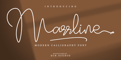 Marrline is a modern calligraphy font. It brings a beautiful and attractive typeface. Made for any professional project branding. It is the best for logos, branding, wedding and quotes. Includes: Marrline (OTF) Features: Stylistic Set Beautiful Ligatures Swashes Multilingual Support PUA Encoded Numerals and Punctuation Thank you for downloading premium fonts from Din Studio
 - Blastine by Din Studio,
$29.00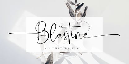 Blastine is a beautiful signature font. It brings a modern and attractive typeface. Made for any professional project branding. It is the best for logos, branding, wedding and quotes. Includes: Blastine (OTF) Features: Stylistic Set Many Swashes Beautiful Ligatures Multilingual Support PUA Encoded Numerals and Punctuation Thank you for downloading premium fonts from Din Studio
 - Carade by Din Studio,
$29.00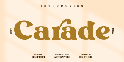 Carade is a elegant serif font. Made for any professional project branding. It is the best for logos, branding and quotes. Every letter has a unique and beautiful touch. Includes: Carade (OTF) Features: Beautiful Alternates Stylistic Set Swashes Multilingual Support PUA Encoded Numerals and Punctuation Thank you for downloading premium fonts from Din Studio
 - Aiytha by Din Studio,
$29.00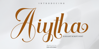 Aiytha is a modern calligraphy font. It brings a beautiful and attractive typeface. Made for any professional project branding. It is the best for logos, branding, wedding and quotes. Includes: Aiytha (OTF) Features: Stylistic Set Beautiful Ligatures Swashes Multilingual Support PUA Encoded Numerals and Punctuation Thank you for downloading premium fonts from Din Studio
 - Anyva by Din Studio,
$29.00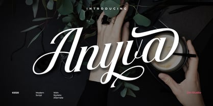 Anyva is a modern calligraphy font. It brings a beautiful and attractive typeface. Made for any professional project branding. It is the best for logos, branding, wedding and quotes. Includes: Anyva (OTF) Features: Stylistic Set Standard Ligatures Swashes Multilingual Support PUA Encoded Numerals and Punctuation Thank you for downloading premium fonts from Din Studio
 - Atteron by Din Studio,
$29.00 Atteron is a elegant serif font. Made for any professional project branding. It is the best for logos, branding and quotes. Every letter has a unique and beautiful touch. Includes: Atteron (OTF) Features: Beautiful Alternates Stylistic Set Swashes Multilingual Support PUA Encoded Numerals and Punctuation Thank you for downloading premium fonts from Din Studio
