10,000 search results
(0.195 seconds)
- Thenie Dawson by Grezline Studio,
$15.00 Thenie Dawson is a stylish serif font with classy and timeless charm. This font was designed to enhance the beauty of your projects. Very suitable for headlines, titles, advertising, vintage mood board, branding, logotypes, packaging, editorial design, blog/websites, social media quotes, wedding branding, vintage designs and much more. Add this font to your collection and let its beauty tell your story. Feature : Alternates and Ligatures Multilingual Language Works on PC & Mac Simple installations Accessible in the Adobe Illustrator, Adobe Photoshop, Adobe InDesign, even works on Microsoft Word. We highly recommend using a program that supports OpenType features and Glyphs panels like many of Adobe apps and Corel Draw, so you can see and access all Glyph variations. Thank You! Grezline Studio – Akhmad Reza Fauzi
 - Judicious by Create Big Supply,
$15.00 Judicious is perfect for making a bold statement and grabbing attention with its strong and commanding style. With its uppercase and lowercase letterforms, Judicious offers versatility and creativity for your design projects. Whether you're creating impactful headlines, striking logos, or eye-catching posters, this font will ensure your message is delivered with confidence. Featuring a comprehensive character set, Judicious includes numbers, punctuation marks, and supports multiple languages, making it suitable for various design applications. Additionally, the font is PUA encoded, allowing easy access to all glyphs and swashes, expanding your design possibilities. Let Judicious be the foundation of your next design project. Whether you're working on branding, advertising, packaging, or any other creative endeavor, this bold display font will command attention and leave a lasting impression.
 - MEXURY by Product Type,
$15.00 Welcome to Mexury, a font that transports you to the future with an alluring modern and futuristic twist. Are you looking for the perfect solution for modern, futuristic, sci-fi, and future-themed projects? Mexury is the right choice. Mexury is a font designed to create a unique and sophisticated atmosphere. Each letter has a unique design, exuding a dazzling future and presenting an elegant look. With Mexury, your project will be in the spotlight and create an unforgettable impression. The main benefit of Mexury is its ability to deliver stunning styles. Each letter carries great visual uniqueness, giving your project a modern, stylish, and futuristic look. Inspired designs will steal the show and capture your audience’s imagination. Apart from that, Mexury also supports multilingualism, allowing you to display text in multiple languages without any restrictions. This flexibility ensures that you can easily reach a global audience and convey your message with consistent clarity across cultural contexts. Take your projects to the next level with Mexury. Let this font be the catalyst for the creation of eye-catching visuals and set the scene for a future full of innovation. Explore Mexury’s limitless potential and let your creativity flourish. With this font, you’re ready to enter the futuristic and stunning world of design. Choose Mexury and let this font be the perfect choice for your vibrant, modern, futuristic, sci-fi, and future projects.
 - Standing Room Only NF by Nick's Fonts,
$10.00Here's an Art Deco classic with a bit of an edge. This typeface is based on a somewhat less refined but more energetic version of Broadway, designed by Morris Fuller Benton for ATF in 1928, originally named Broadway Poster. Both versions of this font contain the complete Unicode 1252 (Latin) and Unicode 1250 (Central European) character sets, with localization for Romanian and Moldovan. - McKenna Handletter NF by Nick's Fonts,
$10.00Here’s a warm, casual text font based on an early twentieth century work by lettering artist Elizabeth Colwell, released by American Type Founders in 1923. For this update, all four fonts have been completely redrawn, and many new characters have been added. Both versions of this font contain the complete Latin A Extended character set, as well as extended ligatures and fractions. - Flawless Flygirl PB by Pink Broccoli,
$16.00 Flawless Flygirl is a quirky sans-serif font inspired by the titling sequence from the 1964 film, "The World of Henry Orient". Fun and full of personality, it is one of those lettering styles that was a joy to flesh out and make into a typeface filled with double letter ligature alternates to keep the typesetting weird and wonderful. With a pseudo unicase character set, and offbeat letter weighting, Flawless Flygirl is fun to typeset, with ligature combinations that are pleasant surprises. You’ll find this Flawless Flygirl is ready to dance to the beat of your designs.
 - Dazzle by Device,
$29.00 Op-art never looked so good. Taking a cue from the popularity in the 1970s of deco Prismas and their related contemporary interpretations, this geometric font updates the trend. Overlap text in different colours or black and white for eye-teasing moiré combinations. An image above illustrates the use of Dazzle Underprint, a uniform-width version of the font that is placed under Dazzle and used to create two-colour effects simply and easily. Dazzle Underprint is not intended for solo use, only as an underprint — please see Dazzle Unicase for a range of undecorated weights.
 - Fatum by ParaType,
$25.00 Fatum™ is a new original ultrablack slab serif typeface that was initiated by the impression of the TDC 2011 exhibition. Redundant stem thickness and closed character shapes make a feeling that counterspaces are the narrow slits cut in massive character bodies. Fatum can be used in large sizes in placards, playbills, in the headings of magazines, newspapers and Web-pages, as initials in book setting, for typographic illustrations and compositions. Ultrablack weight also gives a possibility to insert pictures, ornaments or other decorations into the contours of letters. This typeface was designed by Sveta Morozova and released by ParaType in 2013.
 - You Blockhead by Comicraft,
$29.00 Why you little Numbskull! Nitwit! Visigoth! Dimwitted Jackass! Interplanetary Goat! Highwayman! Sea-gherkin! Jellyfish! KnowNothing! Filibuster! Cachinnating cockatoo! Artichoke! Two-timing Troglodyte! Bald-headed budgerigar! Odd-toed Ungulate! Autocrat! Carpetseller! Duck-billed platypus! Dunderheaded coconut! Ectoplasm! Steamroller! Iconoclast! Kleptomaniac! Raggle taggle ruminant! Orangutang! Rapscallion! Ten thousand thundering typhoons! Whippersnapper! Billions of billious barbecued blue blistering barnacles -- you-you... YOU BLOCKHEAD! With its sturdy stance and over 100 friendly interlocking letter pairs, this font was made famous in the logo and branding for the video game CLASH OF CLANS, and infamous in the logo and branding for the Image comic THE BEEF.
 - Kaithryn by Din Studio,
$29.00 Kaithryn is a modern calligraphy font. It brings a beautiful and attractive typeface. Made for any professional project branding. It is the best for logos, branding, wedding and quotes. Includes: Kaithryn (OTF) Features: Stylistic Set Beautiful Ligatures Multilingual Support PUA Encoded Numerals and Punctuation Thank you for downloading premium fonts from Din Studio
 - Westlake by Din Studio,
$29.00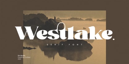 Westlake is a serif font. Made for any professional project branding. It is the best for logos, branding and quotes. Every letter has a unique and beautiful touch. Includes: Westlake (OTF) Features: Standard Ligatures Swashes Stylistic Sets PUA Encoded Multilingual Support Numerals and Punctuation Thank you for downloading premium fonts from Din Studio
 - Anzilam by Din Studio,
$29.00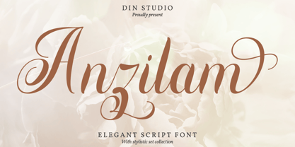 Anzilam is a modern calligraphy font. It brings a beautiful and attractive typeface. Made for any professional project branding. It is the best for logos, branding, wedding and quotes. Includes: Anzilam (OTF) Features: Stylistic Set Beautiful Ligatures Multilingual Support PUA Encoded Numerals and Punctuation Thank you for downloading premium fonts from Din Studio
 - Jafrine by Din Studio,
$29.00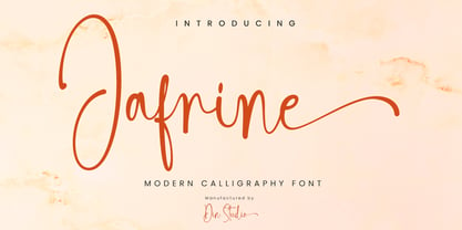 Jafrine is a modern calligraphy font. It brings a beautiful and attractive typeface. Made for any professional project branding. It is the best for logos, branding, wedding and quotes. Includes: Jafrine (OTF) Features: Stylistic Set Beautiful Ligatures Multilingual Support PUA Encoded Numerals and Punctuation Thank you for downloading premium fonts from Din Studio
 - Hellomind by Din Studio,
$29.00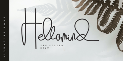 Hellomind is a beautiful signature font. It brings a modern and attractive typeface. Made for any professional project branding. It is the best for logos, branding, wedding and quotes. Includes: Hellomind (OTF) Features: Stylistic Set Beautiful Ligatures Multilingual Support PUA Encoded Numerals and Punctuation Thank you for downloading premium fonts from Din Studio
 - Anglez by Hurufatfont,
$29.00 Anglez was designed by Turkish calligraphy artist Mustafa Eren. It was inspired by the "British Script" style. "Anglez" is designed to meet modern and current needs. It offers user-specific solutions with rich ligatures, swashes, alternative characters, content alternatives, end forms and style sets. Ideal for special day designs, labels and invitation designs.
 - Malina by Katatrad,
$19.00 Malina is a sans-serif monoline typeface with some humanist touches creating a clear and legible typeface. The Idea is to make hairline display font that elegant and perfect for use at large sizes, with a set of alternative characters such as K, Q and R for your design in any layout.
 - Vintage Melody by Din Studio,
$29.00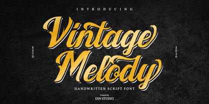 Vintage Melody is a elegant handwritten font. It brings a beautiful and attractive typeface. Made for any professional project branding. It is the best for logos, branding, wedding and quotes. Features: Stylistic Set Standard Ligatures Swashes Multilingual Support PUA Encoded Numerals and Punctuation Thank you for downloading premium fonts from Din Studio
 - Megiday by Ditatype,
$16.00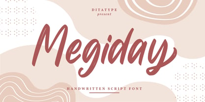 Megiday is a elegant handwritten font. Made for any professional project branding. It is the best for logos, branding and quotes. Every letter has a unique and beautiful touch. Includes: Megiday (OTF) Features: Beautiful Ligatures Stylistic Set Multilingual Support PUA Encoded Numerals and Punctuation Thank you for downloading premium fonts from Dita Type
 - Maristand by Ditatype,
$29.00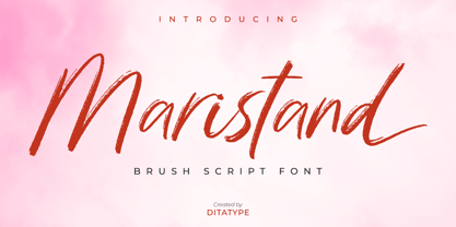 Maristand is a beautiful brush font. It brings a elegant and attractive typeface. Made for any professional project branding. It is the best for logos, branding, wedding and quotes. Includes: Maristand (OTF) Features: Stylistic Set Beautiful Ligatures Multilingual Support PUA Encoded Numerals and Punctuation Thank you for downloading premium fonts from Dita Type
 - Watterline by Din Studio,
$29.00 Watterline is a elegant signature font. It brings a modern and attractive typeface. Made for any professional project branding. It is the best for logos, branding, wedding and quotes. Includes: Watterline (OTF) Features: Stylistic Set Beautiful Ligatures Multilingual Support PUA Encoded Numerals and Punctuation Thank you for downloading premium fonts from Din Studio
 - Biotic by TypeUnion,
$25.00 Biotic is a dual-personality 18 style typeface which features two distinct design approaches that can be initiated with the flick of a switch. The natural design approach uses conventional forms for a geometric sans but when you switch to the engineered approach some key glyphs become squared to create an edgy approach in an instant. The characters that change are f, i, j, k, l, t and y, along with all punctuation and accents which switch to the square approach. Biotic covers extended latin and basic Cyrillic languages and includes many opentype features such as stylistic sets & alternates, two sets of arrows, circled & old-style numbers, along with case sensitive punctuation and much more.
 - MardiKrewe PB by Pink Broccoli,
$14.00 Wild and carefree, the MardiKrewe Family is filled with spunk and personality. MardiKrewe started as a digitization of a film typeface called MardiGras by Lettergraphics. From there, this lively typeface was fleshed out to a full character set and expanded to a family of 5 widths: Extra Narrow, Narrow, Regular, Wide, and Extra Wide to fit a variety of funktastic needs.
 - Salzburger Plakat NF by Nick's Fonts,
$10.00A poster by Otto Baumberger for an Austrian winter sports festival in 1907 inspired this charming confluence of medieval and Art Nouveau influences. As such, its appeal is timeless, and well suited for storybook romances of all stripes. Both versions of the font include complete Latin 1252, Central European 1250 and Turkish 1524 character sets, with localization for Moldovan, Romanian and Turkish. - Menina Graciosa Ornaments by Intellecta Design,
$17.90 Meninas are the new comprehensive collection of innovative craft alphabets and ornaments researched in rare cross-stitch booklets from 1850 to 1930. This alphabet and ornaments series was entirely designed by hand, without use of auto-tracing, by Iza W, from Intellecta Design. Keep your eyes wide-open, because we will launch more amazing alphabets in this collection. “Menina” means “Girl” in Portuguese. Menina Graciosa is a Graceful Girl. See too her sister fonts: Menina Formosa , Menina Carinhosa , Menina Poderosa Ornaments , Menina Espinhosa .
 - Menina Poderosa Ornaments by Intellecta Design,
$27.00 Meninas are the new comprehensive collection of innovative craft alphabets and ornaments researched in rare cross-stitch booklets from 1850 to 1930. This alphabet and ornaments series was entirely designed by hand, without use of auto-tracing, by Iza W, from Intellecta Design. Keep your eyes wide-open, because we will launch more amazing alphabets in this collection. “Menina” means “Girl” in Portuguese. Menina Poderosa is a Powerful Girl. See too her sister fonts: Menina Formosa , Menina Carinhosa , Menina Espinhosa , Menina Graciosa Ornaments .
 - Cotillion Pro by Canada Type,
$39.95 Cotillion is an original design Jim Rimmer finished just before the turn of the century. Alongside its evidence of Jim's nostalgia at the deco type designs he was exposed to as a child, it distinctly shows a type designer who has become very comfortable with that rarest of design abilities: Bringing efficient typographic solutions to what is essentially a calligraphic endeavour. This design has all the elements of what made a traditional deco typeface display unmistakable elegance and luxury: The expressively low x-height, the precisely calculated upwards comfort and reserved grace of the vertical metrics, the subtle fusion of calligraphic ornamentation and clean minimalist type technique, and the unique indentity of the original lowercase flow. Cotillion was refined and remastered in 2012 to include a weath of aesthetic and functionality improvements. This Cotillion Pro set includes small caps, true italics, ligatures, seven types of figures, automatic fractions, extended Latin language support, stylistic alternates that include lowercase serif angle options, and plenty of extra OpenType features like caps-to-small-caps substitution, case-sensitive positioning, ordinals, and extended class-based kerning. At over 780 characters, each of the Cotillion Pro fonts is the equivalent of three fonts in one.
 - Dupont Gothic by Hexagon Foundry,
$19.00 Dupont Gothic is a sleek and contemporary sans-serif font that embodies elegance, clarity, and modernity. With its clean lines, balanced proportions, and distinctive character, Dupont Gothic is a versatile typeface that can be used in many ways. The simplicity of Dupont Gothic lends itself to a wide range of applications. Whether used for headlines, body text, or branding, this font possesses a quality to effortlessly adapt to different design contexts. The font comes in 10 weights with matching oblique characters, 2 widths, and 2 style sets that ensure the endless combinations and possibilities.
 - Stencil Playthings JNL by Jeff Levine,
$29.00 A circa-1951 toy set called “Kusan Kavalcade of Letters” was comprised of molded plastic letters and numbers a child could play with, trace and arrange to learn their alphabet and numerals. Typographically, the design was all over the place – from sans serif characters to those with some spurred serifs and even some stenciled characters because of the nature of manufacture. As odd as this combination seems, it was novel enough to be turned into a digital typeface called Stencil Playthings JNL, which is available in both regular and oblique versions.
 - Tiza by Sudtipos,
$39.00 Tiza is a rough take on informal faces and handwriting, brought on by the recent demand for scripts and brush lettering. Its flow leaves traces simulating runny pen ink, which makes it very suitable for handwriting-like paragraphs as well as casual greeting card and invitation setting. The bold weight, Tiza Negra, fits very nicely on book covers as well as large signs. Tiza is the proverbial reminder that typefaces can sometimes be more human than they are normally perceived. Designed by lettering great Angel Koziupa, and digitized and completed for Sudtipos by Alejandro Paul.
 - PF Lindemann Sans by Parachute,
$49.00 Lindemann Sans is an immediately-inviting typeface with a pleasing distinct visual voice grounded by geometry and golden proportions. This modern geometric san serif typeface serves the interpretive needs of modern design through its legibility. This legibility is achieved through proportional balance of each letter based on the golden ratio, open counters, high x-height and wider individual shapes. In addition, a high level of legibility is arrived through distinctive glyphs like a, e, @, and f, which are engaging and add to Lindemann Sans visual voice. Being a modern, spirited, tech-savvy typeface, Lindemann Sans has many of the features demanded by today's designers. These features include 800 characters within each font, many ligatures, full numbers sets, small caps, alternative characters and other niceties found in opentype fonts. Due to Lindemann Sans high legibility, geometric sans tradition, and a large feature set list, it is a very versatile typeface and can be used in replacement of the more commonly used sans. Specifically, Lindemann Sans can be used by technology corporations, architectural firms in their supporting materials, in magazines as headers and key-points, as the typeface for professional keynotes, for the package design industry as a whole, in automotive concept projects, and for cosmetic branding for high class hair products. With its inviting nature it may also be used for liberal arts promotional materials. In addition, this typeface can be used by green industries because of its nature derived proportions. Each style and weight of Lindemann Sans adheres to the same geometric and golden proportions, however, each weight is innately noteworthy. For example, there is a charm that is found in the ultralight weight's elegant geometry and lights impressive use as oversized headlines. It shines with true clarity of vision with the book weight and the versatility of the medium. One cannot overlook the power and pacing of the bold and extra bold weights with its clear counters and restrained letter forms. Within Lindemann Sans family each weight has a distinctive role to play but stays true to its purpose.
 - Open TECH Neue by TypoGraphicDesign,
$9.00 The typeface Open TECH Neue is designed from 2018—2021 for the font foundry Typo Graphic Design by Manuel Viergutz. 6 font-styles (Sans Serif, Invert, Outline, Slab Serif, Stretch, Box Puzzle) + 1 icon-style with 1097 glyphs (Adobe Latin 3) incl. 400+ decorative extras like icons, arrows, dingbats, emojis, symbols, geometric shapes, catchwords, decorative ligatures (type the word #LOVE for ♥︎ or #SMILE for ☺ as OpenType-Feature dlig) and stylistic alternates (6 stylistic sets). For use in logos, magazines, posters, advertisement plus as webfont for decorative headlines. The font works best for display size. Have fun with this font & use the DEMO-FONT (with reduced glyph-set) FOR FREE! ■ Font Name: Open TECH Neue ■ Font Styles: 6 (Sans Serif, Invert, Outline, Slab Serif, Stretch, Box Puzzle) + Icons + DEMO (with reduced glyph-set) ■ Font Category: Display for headline size ■ Glyph Set: 1097 glyphs (Adobe Latin 3) incl. 400+ icons (decorative extras like arrows, catch words, dingbats, emojis, symbols) ■ Design Date: 2018—2021
 - Lust Pro by Positype,
$50.00 Confident and versatile, Lust Pro™ is an exercise in indulgence—an attempt to create something over the top and vastly useful. If Lust Pro seems both new and familiar, that’s because it is. The series unapologetically channels Herb Lubalin, but produced with a deliberate, contemporary twist. There is an intentional slyness infused in the letterforms—the extreme thick and thin lines flow effortlessly without becoming gratuitous. It’s always just enough, not too much. What makes the type series so appealing? The curves. When asked to describe the letterforms, most people unwittingly allude to the human form, using adjectives usually reserved for describing physical traits… creating all-too-familiar comparisons. Summerour has grown to accept this as unavoidable and reasonable given his acknowledgement of its influences and has provided nuances within the letterforms to accentuate that. Intended to be set large, the typeface boasts 3 widths and 5 weights and matching italics for both the Regular and Didone variants (that’s 60 fonts in total), making it perfect for editorial use and a highly flexible solution for any display need.
 - Lust Pro Didone by Positype,
$50.00 Confident and versatile, Lust Pro™ is an exercise in indulgence—an attempt to create something over the top and vastly useful. If Lust Pro seems both new and familiar, that’s because it is. The series unapologetically channels Herb Lubalin, but produced with a deliberate, contemporary twist. There is an intentional slyness infused in the letterforms—the extreme thick and thin lines flow effortlessly without becoming gratuitous. It’s always just enough, not too much. What makes the type series so appealing? The curves. When asked to describe the letterforms, most people unwittingly allude to the human form, using adjectives usually reserved for describing physical traits… creating all-too-familiar comparisons. Summerour has grown to accept this as unavoidable and reasonable given his acknowledgement of its influences and has provided nuances within the letterforms to accentuate that. Intended to be set large, the typeface boasts 3 widths and 5 weights and matching italics for both the Regular and Didone variants (that’s 60 fonts in total), making it perfect for editorial use and a highly flexible solution for any display need.
 - Porcelain by Up Up Creative,
$16.00 Introducing Porcelain, a hand-lettered condensed sans serif font with subtle dip-pen texture and some fun OpenType features. Porcelain is perfect for invitations, branding, and editorial design and can be dressed up or down depending on your needs. Porcelain comes with more than 430 glyphs and includes OpenType features like stylistic sets, multilingual support (including multiple currency symbols), and discretionary ligatures. The OpenType features can be very easily accessed by using OpenType-savvy programs such as Adobe Illustrator and Adobe InDesign. (To access these awesome features in Microsoft Word, you'll need to get comfortable with the advanced tab of Word's font menu. If you need help with this, ask me!)
 - Gaudeamus by Znakomesto,
$35.00 Gaudeamus is a Cyrillic face of medieval Gothic textura inspired of incunabulum artworks. Recommended for a historical and cultural context, but it goes well beyond. Suitable for music, books, fashion, catering, packaging and more. Works for long paragraphs and short sentences. Features: — 7 Stylistic sets; two of which are text preformats to the commons of the Middle Ages and Early Modern historical periods. — Sets of Ordinal and Superscript characters for French, Portuguese, Spanish typesetting. — Localized letterforms for Bulgarian and Serbian. — Localized diacritics for Polish and Romanian. — Support typesetting in Russian pre-reform orthography. — Support typesetting in Middle English orthography. — Case sensitive characters for greater consistency with uppercase letters. — Set of Roman Numerals. — Standard and Discretional ligatures. — 530 glyphs; 40 languages support.
 - Pockota by Nasir Udin,
$25.00 Pockota is a retro, soft display serif typeface with 12 fonts. Ranging from light to black with its matching italics, Pockota offers many possibilities to be applied in many graphic or editorial projects. Lighter weights are suitable for body text, and the heavier weights are perfect for striking headlines. Thanks to the OpenType features built in, many stylistic sets and swashes are fun to play with. And with the extended latin character set, so that Pockota supports 200+ latin-based languages. Pockota is a classic and timeless typeface, perfectly suitable for display purpose such as branding, editorial, headlines, and packaging.
 - Midsole SC by Grype,
$16.00 Geometric/Technical style logotypes have been developed for car chrome labels since the early 1980’s, but automobile companies don't monopolize the style by any means. Shoe companies have a foothold in the geometric sans serif styles as well, and range from straightforward to full of techno styled play. Nonetheless, these logotypes all lack an expansive family which shows off all the logotypes are and what they "could" be and do. And that's where we come in. The Midsole SC Family finds its origin of inspiration in the CONVERSE shoe company logo, or an older version of their logo, and from there we expanded it into a 40 font family of weights, widths, and obliques. Midsole pays homage to the styling of the earlier logotype, including unicase variations to match the original look, while further evolving beyond the brand inspiration to yield a family that pulls on modern and historical styles. It adopts a sturdy yet approachable and recognizable style with its uniform stroke forms and curves, and goes on to include smallcaps, numerals, and a comprehensive range of weights, creating a straightforward, uncompromising collection of typefaces that lend a solid foundation and a broad range of expression for designers. Here’s what’s included with the Midsole SC Family bundle: 489 glyphs per style - including Capitals, SmallCaps, Numerals, Punctuation and an extensive character set that covers multilingual support of latin based languages. (see the 10th graphic for a preview of the characters included) Stylistic Alternates - alternate characters and unicase variants for a less standardized text look. 4 weights in the family: Light, Regular, Medium & Bold. 4 obliques in the family, one for each weight: Light, Regular, Medium & Bold. Here’s why the Midsole SC Family is for you: - You’re in need of stylish sans font family with a range of weights and obliques. - You’re love that older CONVERSE letter styling, and want to design anything within that genre. - You’re looking for an alternative to Eurostile & Handel Gothic. - You’re looking for a clean techno typeface for your rave poster designs. - You just like to collect quality fonts to add to your design arsenal.
 - Midsole by Grype,
$16.00 Geometric/Technical style logotypes have been developed for car chrome labels since the early 1980’s, but automobile companies don't monopolize the style by any means. Shoe companies have a foothold in the geometric sans serif styles as well, and range from straightforward to full of techno styled play. Nonetheless, these logotypes all lack an expansive family which shows off all the logotypes are and what they "could" be and do. And that's where we come in. The Midsole Family finds its origin of inspiration in the CONVERSE shoe company logo, or an older version fo their logo, and from there expanded it into a 40 font family of weights, widths, and obliques. Midsole pays homage to the styling of the earlier logotype, including unicase variations to match the original look, while further evolving beyond the brand inspiration to yield a family that pulls on modern and historical styles. It adopts a sturdy yet approachable and recognizable style with its uniform stroke forms and curves, and goes on to include a lowercase, numerals, and a comprehensive range of weights, creating a straightforward, uncompromising collection of typefaces that lend a solid foundation and a broad range of expression for designers. Here’s what’s included with the Midsole Family bundle: 489 glyphs per style - including Capitals, Lowercase, Numerals, Punctuation and an extensive character set that covers multilingual support of latin based languages. (see the 10th graphic for a preview of the characters included) Stylistic Alternates - alternate characters and unicase variants for a less standardized text look. 4 weights in the family: Light, Regular, Medium & Bold. 4 obliques in the family, one for each weight: Light, Regular, Medium & Bold. Here’s why the Midsole Family is for you: - You’re in need of stylish sans font family with a range of weights and obliques. - You’re love that older CONVERSE letter styling, and want to design anything within that genre. - You’re looking for an alternative to Eurostile & Handel Gothic. - You’re looking for a clean techno typeface for your rave poster designs. - You just like to collect quality fonts to add to your design arsenal.
 - Astrid Grotesk by Eclectotype,
$40.00 Astrid Grotesk is a normalized version of Schizotype Grotesk. Normalized; not neutralized. Where many neo-grotesks appear cold with their harsh neutrality, Astrid has a warmth, eminating from its (for want of a better word) clunkiness. With the latest update, it becomes a true workhorse, with a range of widths and italics for the normal widths. Astrid Grotesk, while being clearly a neo-grotesk in appearance, has a personality all of its own. Standout characters include the f and t, and the default binocular g, unusual in neo-grotesks. And the right angled terminals on c, e and s. Stylistic sets offer up alternate forms of a, g, y, I, @, dutch IJ, german eszett and l. A full complement of numerals is included: proportional and tabular, lining and oldstyle, plus fractions, subscript and superscript. Note also that the tabular figures are duplexed across weights - very useful when highlighting specific entries in tables. The tabular figures feature also substitutes in fixed width (across all weights) comma and period, so your decimals line up perfectly always. Lastly, case sensitive forms of certain glyphs are included for all-cap settings. This typeface will be useful for corporate identities and branding work. It’s spaced more for text settings in the normal width, and gets more display-optimized as the width decreases, but with careful tracking, all styles can sing at display sizes. Bored of those other Swiss style typefaces? Astrid Grotesk could be the face you need to breathe new life into your designs. Coupled with Schizotype Grotesk, its more eccentric cousin, you've got an unorthodox branding system ready to use straight out of the box.
 - Regulator Nova by Device,
$39.00 A high lower-case x-height geometric sans with open counters, Regulator Nova is extremely legible at text sizes and in extended settings while the range of weights also make it suitable for headlines. The stoke terminals are all cut at close to 90 degrees, lending a sharp precision to the characters. Alternate versions of the g, j, r, w, K, R, W, # and ampersand are available in both upright and italic, and can be toggled on and off in the Opentype panel or the Glyphs palette. Clean, elegant and legible, Regulator Nova has a classical proportions based on a circumscribed circle and square, and shares structural similarities to early sans serifs such as Rudolf Koch’s Kabel, while adopting more British forms for the M and R. Regulator Nova is an extension and reworking of Regulator, now with extra weights, reweighed italics, Opentype-savvy alternates and a full European character set.