10,000 search results
(0.079 seconds)
- Led by Graviton,
$8.00 Led font family has been designed for Graviton Font Foundry by Pablo Balcells in 2012. It is dotted display typeface. Led consists of 2 styles.
 - Hyperloopa2104 by Andrew Tomson,
$10.00 Hello, friends! I recently bought myself an old game console, the SEGA Mega Drive 2. For a long time I couldn't understand why, when I was a kid, it seemed incredible to play it. Nowadays there are a lot of games with stunning graphics and realism, but still there is something warm and light in old games. Maybe it's just a memory of a carefree childhood. After playing it, I decided to create this font so that everyone could do something in the style of old games that an army of designers and programmers hadn't worked on yet. Good luck and love to you!
 - Barosa by NREY,
$19.00 Hi, friends! Introducing new typeface - Barosa. It is a new display font with 2 styles and cool characters. Typeface designed as monolite, all descending and ascending elements has same size as most characters. Barosa has multilingual support includes cyrillic. Many ligatures make your typography most variable. Barosa Typeface was inspired by ethnic slavonic style which combining classic typography with awesome features bring classic touch on this culture. It works well with normal size text and for large displays or short words. You may combine uppercase and smallcase in the text body, as alternates symbols. The Barosa typeface is suitable for : product packaging, labeling, logo, classic shop, ethnic shop, titles, etc
 - Marujo by PintassilgoPrints,
$15.00 Marujo is a highly decorative typeface inspired by painted pieces of Arthur Bispo do Rosário, a striking Brazilian artist who lived for 50 years in a psychiatric institution. Besides its spirited Regular and Light cuts, Marujo family brings nifty eye-catching variations adorned with dots and stripes. It also brings complementary fonts to spice things up even more: there are 2 shadow options and yet a picture font packed with doodles, mostly on nautical subjects (which are strongly present on Bispo do Rosário, a former seaman apprentice.) Bispo do Rosário's works employs a multitude of materials and are often very intricate. Words are everywhere, painted or embroidered at most. He produced a vast amount of works, and is now - posthumously - widely recognized in Brazilian art scene. The psychiatric institution in which he lived is now a museum dedicated exclusively to his work. Marujo draws inspiration not only from Bispo's works, but also from this man's potency, a persistent man who produced amazing art locked in such a tough environment for a life-long. Marujo fonts are positively adventurous and will safely navigate through a sea of feelings, reaching free spirits everywhere. To navigate is precise...
 - Caswallon by Scriptorium,
$18.00The original Caswallon font was based on samples of 17th century text script, featuring a decorative upper case character set with clean, basic lower case letters plus some bonus decorative ornaments to add flair to any design. The popularity of the original script style has lead us to develop a full family of associated fonts, including the recently released Caswallon Ornament set, plus the brand new Caswallon Archaic Text font and Caswallon Alternate script style. - Centennial Script by Canada Type,
$24.95 Centennial Script was designed and cut by Hermann Ihlenburg in 1876 (the centennial of American independence, hence the typeface's name) for the MacKellar, Smiths & Jordan foundry in Philadelphia. Ihlenburg was then only 33 years old, and these beautiful forms put him on his way to become the most prolific and innovative deco, ornamental and script typeface designer and punch cutter of the nineteenth century. In trying to be a true homage to the history of the new world, Centennial Script transcends its then-contemporary deco fashion to embrace script elements historically similar to lettering found on maps or political documents of the 18th century. Letters like the p and s extend themselves high and mighty to accentuate words and lines of text in a fancy hand-drawn manner. The dots on the i and j are those of a careful scribe who acknowledges the importance of the document being lettered. The lowercase letters connect with two slight angular motions of the hand, also very carefully and elegantly. Even the ligatures and ending swashes Ihlenburg made for this face were reminiscent of a mapmaker's patient hand, though Ihlenburg's elegant touch in them cannot be mistaken. Although Centennial Script was one of the few Ihlenburg faces to make it to film type technology, the transition was neither credited nor faultless. The film type version was a bit sloppy in the way the connectors were made, so the lowercase needed a lot of manual work to typeset properly. To alleviate such waste of time for the user of this digital version, the connectors were redrawn according to the original metal ones made by Ihlenburg himself, and tested thoroughly in print to ensure the quality of the typeface's flowing cursive nature. This wasn't an easy task, and very time-consuming, since the changing angles on both ends of the connection made it impossible to escape from having to build every lowercase letter with both left and right connectors that would fit with the rest of the letters. This is one typeface that couldn't be revived in any other manner than the way it was originally made, regardless of more than 130 years of technological advances since the face was designed. Centennial Script comes in all popular font formats, and supports most Latin-based languages. Also included is an Alts fonts that contains alternates, ligatures, snap-on swash endings, some ornaments, as well as a complete set of the lowercase without left side connectors, for a more natural combination when following a majuscule, or just in case the user finds it fit to set the copy in a non-connecting script instead of the face's original connected flow. Centennial Script Pro, the OpenType version, combines the main font with the Alts font in a feature-packed single font. Use the ligature feature to set wordmarks like Mr, Ms, Mrs, Dr, and &Co, the stylistic alternates feature to replace some letters with their alternative forms, the contextual alternates feature for better uppercase-lowercase sequences, and the titling feature to set your text in a disconnected script. Centennial Script is the only script we currently know of that can be set connected or disconnected simultaneously, either using the titling feature in the OpenType Pro version, or manually in the other formats.
 - Kufica by Artegra,
$29.00 Kufica is a geometric sans serif display family based on the kufic style, a 7th century calligraphic form of the Arabic script originates from Kufa, Iraq. It’s quite amazing that a historic Arabic calligraphic style can be implemented into a modern (even futuristic!) typeface that serves so well in modern advertising, branding, packaging, posters and so on. Kufica family comes in 2 weights with italics, each of the fonts has solid language support with over 430 glyphs.
 - Grold Rounded by Typesketchbook,
$55.00 Grold Rounded is an altered modified from the form of the original “Grold” typeface. Designed to be more friendly, the font family has rounded terminals that harmonizes with rounded corners. With all of these features, “Grold Rounded” is a prominent, eye-catching and unique typeface. It comes with 9 weights with 2 Hight options in order to suit for a multifunctional usage, especially for cooperative work, such as website, magazine, editorial, publishing, as well as packaging.s
 - Kelpt Sans by Typesketchbook,
$55.00 Kelpt Sans is an altered modified from the form of the original Kelpt typeface. Designed to be more Corporate, the font family has flat terminals that harmonizes with sharp corners. With all of these features, “Kelpt Sans” is a prominent, eye-catching and unique typeface. It comes with 9 weights with 2 Hight options in order to suit for a multifunctional usage, especially for cooperative work, such as website, magazine, editorial, publishing, as well as packaging.
 - Titular by Latinotype,
$26.00 Titular is a condensed Sans Serif typeface that works well with headings, subheadings, newspapers, magazines as well as with logotypes, brands and posters. This typeface revives the spirit of old Woodtypes, but adding a contemporary flavour and Latin American seasoning. The family comes with 2 subfamilies: one regular and one alternative. Just like many of our faces, every subfamily includes 7 weights plus italics. Titular is a Latinotype’s typeface designed by Bruno Jara, and produced and supervised by Latinotype Team. Latinotype Team comprises: Luciano Vergara, Daniel Hernández, Bruno Jara, César Araya and Rodrigo Fuenzalida.
 - Chanide Script by Letterhend,
$19.00 Please welcome our newest script typeface: Chanide. As you can see at the previews, this typeface has unique swashes that allows you to create beautiful lettering in a snap! It has many stylistic set alternates that you can choose from. This font is works well for various formal forms such as invitations, labels, logos, magazines, books, greeting / wedding cards, packaging, fashion, make up, stationery, novels, labels or any type of advertising purpose. Features: Uppercase & Lowercase Numbers and Punctuation Multi-lingual Support Ligatures Alternates Swashes PUA encoded We highly recommend using a program that supports OpenType features and Glyphs panels like many of Adobe apps and Corel Draw, so you can see and access all Glyph variations. Email us to letterhend@gmail.com if you need something! Happy Designing!
 - Bon Mot NF by Nick's Fonts,
$10.00What’s the good word? This elegant, stylish typeface, based on an early twentieth-century Barnhart Brothers & Spindler release, named simply "Engravers Upright Script". Based on French ronde letterforms, this version is bolder—which makes it suitable for text settings, even at smaller sizes—and has more pronounced stroke contrast—which makes it suitable for headlines. Versatile, handsome and charming, this typeface is an invaluable addition to any type repertoire. Both versions of the font contain the complete Unicode 1252 (Latin) and Unicode 1250 (Central European) character sets, with localization for Romanian and Moldovan. - Latitude Sans by Stiggy & Sands,
$24.00 An Uber-Black Sans Serif with a Warm Personality Latitude Sans began as a digitization of a film typeface from LetterGraphics known simply as "Free". The original specimen included standard Capitals and Lowercase, Numerals and minimal Punctuation, a bare bones character set. We've fleshed out the Latitude Sans typeface to include a full standard character set, an extended international set, and more so it can be a strong heavyweight sans typestyle. See the last graphic for a comprehensive character map preview. Opentype features include: - Full set of Inferiors and Superiors for limitless fractions. - Tabular, Proportional and Oldstyle figure sets. - Ligatures for a collection of "f" paired sets: fi, fl, ft, ffi, ffl, etc. Approx. 652 Character Glyph Set: Latitude Sans comes with a glyphset that includes standard & punctuation, international language support, and additional features.
 - spanky's bungalow - Unknown license

- Folkard - Unknown license

- Frenkel MF by Masterfont,
$59.00 A practical font family with 2 weights for all your needs: headlines, body text, signage etc. High legibility at small sizes.
 - Compatil Fact by Linotype,
$50.99Compatil is the first comprehensive type system which enables all typographical elements to be used to full effect in order to reproduce the message conveyed by text information. Four different type styles with a total of 16 weights including italics have been merged into a unique typographical network. There are now no limits to the font user's creativity. The system is a product of technical innovation and constitutes a new design approach which meets the highest aesthetic standards. For almost two years, a team of experts from Linotype has been working with initiator Professor Olaf Leu under the direction of Silja Bilz, Erik Faulhaber and Reinhard Haus to create the Compatil type system. Despite the Internet and TV, it is essential today to be able to absorb information quickly by being able to read it with ease. A fact that is becoming increasingly important both on-screen and on paper. It is the role of the font to increase legibility and to ensure typographically perfect results for text design work. The new Compatil type system meets all these needs. The Compatil is a part of the Platinum Collection. The following four different styles are available: Compatil Exquisit, Compatil Fact, Compatil Letter and Compatil Text. Compatil is available in various font formats: 16 separate OT Pro fonts including the small caps and Adobe Central European character set for OpenType-supporting applications like Adobe InDesign, or as 32 separate OpenType Com fonts for office communication, with the following special features: 1. Optimized display capabilities for computer screens eXcellent Screen Fonts (XSF-quality). 2. An extended, international character set, which supports 48 different languages for Microsoft Office applications like MS Word or as 64 PostScript fonts, which can be used in non-OpenType-supporting applications like Quark XPress. - Compatil Fact Paneuropean by Linotype,
$103.99Compatil is the first comprehensive type system which enables all typographical elements to be used to full effect in order to reproduce the message conveyed by text information. Four different type styles with a total of 16 weights including italics have been merged into a unique typographical network. There are now no limits to the font user's creativity. The system is a product of technical innovation and constitutes a new design approach which meets the highest aesthetic standards. For almost two years, a team of experts from Linotype has been working with initiator Professor Olaf Leu under the direction of Silja Bilz, Erik Faulhaber and Reinhard Haus to create the Compatil type system. Despite the Internet and TV, it is essential today to be able to absorb information quickly by being able to read it with ease. A fact that is becoming increasingly important both on-screen and on paper. It is the role of the font to increase legibility and to ensure typographically perfect results for text design work. The new Compatil type system meets all these needs. The Compatil is a part of the Platinum Collection. The following four different styles are available: Compatil Exquisit, Compatil Fact, Compatil Letter and Compatil Text. Compatil is available in various font formats: 16 separate OT Pro fonts including the small caps and Adobe Central European character set for OpenType-supporting applications like Adobe InDesign, or as 32 separate OpenType Com fonts for office communication, with the following special features: 1. Optimized display capabilities for computer screens eXcellent Screen Fonts (XSF-quality). 2. An extended, international character set, which supports 48 different languages for Microsoft Office applications like MS Word or as 64 PostScript fonts, which can be used in non-OpenType-supporting applications like Quark XPress. - Compatil Letter by Linotype,
$50.99Compatil is the first comprehensive type system which enables all typographical elements to be used to full effect in order to reproduce the message conveyed by text information. Four different type styles with a total of 16 weights including italics have been merged into a unique typographical network. There are now no limits to the font user's creativity. The system is a product of technical innovation and constitutes a new design approach which meets the highest aesthetic standards. For almost two years, a team of experts from Linotype has been working with initiator Professor Olaf Leu under the direction of Silja Bilz, Erik Faulhaber and Reinhard Haus to create the Compatil type system. Despite the Internet and TV, it is essential today to be able to absorb information quickly by being able to read it with ease. A fact that is becoming increasingly important both on-screen and on paper. It is the role of the font to increase legibility and to ensure typographically perfect results for text design work. The new Compatil type system meets all these needs. The Compatil is a part of the Platinum Collection. The following four different styles are available: Compatil Exquisit, Compatil Fact, Compatil Letter and Compatil Text. Compatil is available in various font formats: 16 separate OT Pro fonts including the small caps and Adobe Central European character set for OpenType-supporting applications like Adobe InDesign, or as 32 separate OpenType Com fonts for office communication, with the following special features: 1. Optimized display capabilities for computer screens eXcellent Screen Fonts (XSF-quality). 2. An extended, international character set, which supports 48 different languages for Microsoft Office applications like MS Word or as 64 PostScript fonts, which can be used in non-OpenType-supporting applications like Quark XPress. - Compatil Text by Linotype,
$50.99Compatil is the first comprehensive type system which enables all typographical elements to be used to full effect in order to reproduce the message conveyed by text information. Four different type styles with a total of 16 weights including italics have been merged into a unique typographical network. There are now no limits to the font user's creativity. The system is a product of technical innovation and constitutes a new design approach which meets the highest aesthetic standards. For almost two years, a team of experts from Linotype has been working with initiator Professor Olaf Leu under the direction of Silja Bilz, Erik Faulhaber and Reinhard Haus to create the Compatil type system. Despite the Internet and TV, it is essential today to be able to absorb information quickly by being able to read it with ease. A fact that is becoming increasingly important both on-screen and on paper. It is the role of the font to increase legibility and to ensure typographically perfect results for text design work. The new Compatil type system meets all these needs. The Compatil is a part of the Platinum Collection. The following four different styles are available: Compatil Exquisit, Compatil Fact, Compatil Letter and Compatil Text. Compatil is available in various font formats: 16 separate OT Pro fonts including the small caps and Adobe Central European character set for OpenType-supporting applications like Adobe InDesign, or as 32 separate OpenType Com fonts for office communication, with the following special features: 1. Optimized display capabilities for computer screens eXcellent Screen Fonts (XSF-quality). 2. An extended, international character set, which supports 48 different languages for Microsoft Office applications like MS Word or as 64 PostScript fonts, which can be used in non-OpenType-supporting applications like Quark XPress. - TA Bankslab by Tural Alisoy,
$33.00 The building of the Northern Bank of St. Petersburg's Baku branch was built in 1903-1905. It was the first Art Nouveau-style building in Baku, Azerbaijan. Later the bank was transformed into the Russian-Asian Bank. After the oil boom in Baku in the 19th century, branches of many banks and new banks were opened in the city. The branch of the Northern Bank of St. Petersburg was among the first banks that was opened in Baku. N.Bayev was the architect of the building for the branch of the Northern Bank of St. Petersburg located at Gorchakovskaya 3 in 1903-1905. The building currently houses the Central Branch of the International Bank of Azerbaijan. My purpose in writing this is not to copy and paste the information from Wikipedia. What attracted me to the building was the word "Банкъ" (Bank) written in Cyrillic letters, which was also used in Azerbaijan during the Soviet era. The exact date of the writing is not known. Every time I pass by this building, I always thought of creating a font of this writing someday. I had taken a photo of the building and saved it on my phone. I did a lot of research on the font and asked a lot of people. However, some did not provide information at all and some said they did not have any information. I was interested in the history of this font but I do not know if this font really existed or it was created by the architect out of nowhere. If there was such a history of this font, I wanted to recreate this font and make it available. If not, I had to create it from scratch in the same way, using only existing letters on the building. Finally, I made up my mind and decided to develop the font with all letters I have got. It was difficult to create a font based on the word, Банкъ. Because in the appearance of the letters, the midline of the letters on A, H, K was very distinct, both in the form of inclination and in more precise degrees. The serif part of the letters, the height of the upper and lower sides, differed from each other. I don't know whether it was done this way when the building was constructed or it happened over time. I prepared and kept the initial version of the font. I took a break for a while. I started digging on the story of the font again. Meanwhile, I was researching and got inspired by similar fonts. Unfortunately, my research on the font's history did not yield any results. I decided to continue finishing up the font. After developing the demo, I created the font by keeping certain parts of these differences in the letters. In addition, I had to consider the development of letters in the Cyrillic, as well as the Latin alphabet, over the past period. Thus, I began to look at the appearance of slab-serif or serif fonts of that time. In general, as I gain more experience in developing fonts, I try to focus on the precision of the design for each font. In recent years, I specifically paid attention to this matter. YouTube channel and articles by Alexandra K.'s of ParaType, as well as, information and samples from TypeType and Fontfabric studios on the Cyrillic alphabet were quite useful. I gathered data regarding the Latin alphabet from various credible sources. I do not know if I could accomplish what I aimed at but I know one thing that I could develop the font. Maybe someday I'll have to revise this font. For now, I share it with you. I created the font in 10 styles. 7 weight from Thin to Extra Black, an Outline, Shadow, and Art Nouveau. The Art Nouveau style was inspired by the texture in the background used for the text on the building. The texture I applied to capital letters adds beauty to the font. If you like the font feel free to use it or simply let me know if your current alphabet doesn't support this font.
 - TA Bankslab Art Nouveau by Tural Alisoy,
$40.00 TA Bankslab graphic presentation at Behance The building of the Northern Bank of St. Petersburg's Baku branch was built in 1903-1905. It was the first Art Nouveau-style building in Baku, Azerbaijan. Later the bank was transformed into the Russian-Asian Bank. After the oil boom in Baku in the 19th century, branches of many banks and new banks were opened in the city. The branch of the Northern Bank of St. Petersburg was among the first banks that was opened in Baku. N.Bayev was the architect of the building for the branch of the Northern Bank of St. Petersburg located at Gorchakovskaya 3 in 1903-1905. The building currently houses the Central Branch of the International Bank of Azerbaijan. My purpose in writing this is not to copy and paste the information from Wikipedia. What attracted me to the building was the word "Банкъ" (Bank) written in Cyrillic letters, which was also used in Azerbaijan during the Soviet era. The exact date of the writing is not known. Every time I pass by this building, I always thought of creating a font of this writing someday. I had taken a photo of the building and saved it on my phone. I did a lot of research on the font and asked a lot of people. However, some did not provide information at all and some said they did not have any information. I was interested in the history of this font but I do not know if this font really existed or it was created by the architect out of nowhere. If there was such a history of this font, I wanted to recreate this font and make it available. If not, I had to create it from scratch in the same way, using only existing letters on the building. Finally, I made up my mind and decided to develop the font with all letters I have got. It was difficult to create a font based on the word, Банкъ. Because in the appearance of the letters, the midline of the letters on A, H, K was very distinct, both in the form of inclination and in more precise degrees. The serif part of the letters, the height of the upper and lower sides, differed from each other. I don't know whether it was done this way when the building was constructed or it happened over time. I prepared and kept the initial version of the font. I took a break for a while. I started digging on the story of the font again. Meanwhile, I was researching and got inspired by similar fonts. Unfortunately, my research on the font's history did not yield any results. I decided to continue finishing up the font. After developing the demo, I created the font by keeping certain parts of these differences in the letters. In addition, I had to consider the development of letters in the Cyrillic, as well as the Latin alphabet, over the past period. Thus, I began to look at the appearance of slab-serif or serif fonts of that time. In general, as I gain more experience in developing fonts, I try to focus on the precision of the design for each font. In recent years, I specifically paid attention to this matter. YouTube channel and articles by Alexandra K.'s of ParaType, as well as, information and samples from TypeType and Fontfabric studios on the Cyrillic alphabet were quite useful. I gathered data regarding the Latin alphabet from various credible sources. I do not know if I could accomplish what I aimed at but I know one thing that I could develop the font. Maybe someday I'll have to revise this font. For now, I share it with you. I created the font in 10 styles. 7 weight from Thin to Extra Black, an Outline, Shadow, and Art Nouveau. The Art Nouveau style was inspired by the texture in the background used for the text on the building. The texture I applied to capital letters adds beauty to the font. If you like the font feel free to use it or simply let me know if your current alphabet doesn't support this font.
 - Chonky by Typesenses,
$39.00 Chonky is a bold script font based on English calligraphy but with touches of the vitality that the commercial lettering of 1950s had, and it is mostly inspired in the work of the master Doyald Young and his lessons. Its rounded terminals, friendly look and heavy weight make Chonky a perfect option for advertising, packaging and visual identities. In the Regular font, the ascenders, descenders and capitals are the shorter they could be; while in Poster, they are larger, in order to achieve more graceful forms. Both options include stylistic sets and ligatures to embellish the words. Use professional software that widely support Open Type features. Otherwise, you may not have access to some glyphs. Keep the Standard Ligatures and Contextual Alternates features always active. For further information about features and alternates, see the User Guide Chonky has extensive Western, Central and Eastern European language support. Enjoy!
 - Really Big Shoe NF by Nick's Fonts,
$10.00This quaint headline typeface is based on an offering from the Cleveland Type Foundry, originally named Oxford. The centered small caps treatment makes for unusual and alluring headlines. All versions of this font include the Unicode 1250 Central European character set in addition to the standard Unicode 1252 Latin set. - Wintermint by Pink Broccoli,
$16.00 A funtastic and playful typestyle, Wintermint started as a digitization of a film typeface called Lori by LetterGraphics. This font is filled with bounce and liveliness taken from its original limited character set and fleshed out to a fully functional typeface. Flare serifs along with the occasional weird and wonderful curl gives this typeface a festive holiday vibe, but it could easily blend into a psychedelic design space, or just an all out wacky groove. Give it a spin, and see where Wintermint takes you.
 - Margareta by Letterara,
$12.00 Margareta is a modern calligraphic font with handwriting with mono-line model. It's perfect for branding, logos, wedding invitations, diaries, cups, mugs, greeting cards and more. What’s included: 1. Style in this font include: Regular & Italic 2. 103 Ligatures 3. Works both on Mac & PC 4. Simple installations 5. Accessible in the Adobe Illustrator, Adobe Photoshop, Adobe InDesign, CorelDraw, even work on Microsoft Word. 6. Support multilingual; ä ö ü Ä Ö Ü ß ¿ ¡ 7. To access the alternate glyphs, you need a program that supports OpenType features such as Adobe Illustrator CS, Adobe Photoshop CC, Adobe Indesign and CorelDraw. More information about how to access alternate glyphs, check out this link (http://goo.gl/ZT7PqK)
 - Darling Emily NF by Nick's Fonts,
$10.00The typeface Weiner Grotesk, designed by Rudolf Geyer for the H. Berthold AG foundry of Berlin in 1912, provides the pattern for this classic Jugendstil font. The design is very versatile: used as all caps, you can create elegant, compact headlines; and, as upper and lower, you can create subheads with decidedly dramatic contrast. Either way, this one is a "Weiner". All versions of this font include the Unicode 1250 Central European character set in addition to the standard Unicode 1252 Latin set. - MC Haltto by Maulana Creative,
$17.00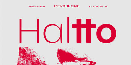 Haltto is a geometric based sans serif font. 2 weights stroke, fun character with a bit of ligatures and alternates. To give you an extra creative work. Haltto font support multilingual more than 100+ language. This font is good for logo design, Social media, Movie Titles, Books Titles, a short text even a long text letter and good for your secondary text font with script or serif. Make a stunning work with Haltto font. Cheers, Maulana Creative
 - Hermitage by Larin Type Co,
$15.00 Hermitage is a modern, elegant serif font that includes six typefaces regular, outline, oblique, outline oblique, rough and rough oblique. This font has a light weight and looks amazing in logos, branding, arranging wedding invitations, business cards, packaging, cosmetics, also works perfectly with text, it is very readable and recognizable, book cover, magazine headers, or simply as a stylish text overlay to any background image. This font includes alternates for Uppercase and Lowercase, with them you can make your project more elegant and unique and the slanted style will add dynamics to your design. Use a rough style on the craft paper, it will look great on it and create an atmosphere of handwriting. This font is easy to use has OpenType features.
 - Mr Orange by Hipopotam Studio,
$28.00 Mr Orange is a typeface based on our handwritten letters which we used in some of our books H.O.U.S.E, D.E.S.I.G.N and Who Eats Whom. It has up to three alternate glyphs for each character, even for every diacritic letter. We do use our fonts in our books so we know that switching alternate glyphs can be a pain in the ass. Thats why we’ve created a very cool Contextual Alternates feature. It automatically sets alternate glyphs depending on frequency of appearance of the same character. The script doesn’t throw random glyphs. It’s checks if lets say letter “A” appears more then once in a sequence of characters. For example in the word “ANAKONDA”, the third “A” and the second “N” would be changed to glyphs from first stylistic set, the second “A” would also be changed but to glyph from second stylistic set. We’ve designed different rules for basic characters and different for diacritics and punctation. It really works great but of course you can always fine tune it by hand. This option has one obvious advantage for web fonts. Browsers that support OpenType calt feature will be able to display alternate characters. And since you can’t put by hand alternate glyphs on your website this is the only way to use them.
 - Cloister Open Face LT by Linotype,
$29.99Cloister Open Face was designed in 1929 by Morris Fuller Benton as one weight of the Cloister Old Style family. Cloister itself appeared from 1897 with American Type Founders, and later for the typesetting machines of the Linotype, Intertype and Monotype companies. At that time, it was the truest modern industrial revival of the Jensonian Roman. Benton stayed close to the style of his model in both design and spacing. Cloister Open Face has an old-world elegance, and it works well for titling in books and magazines. In 1458, Charles VII sent the Frenchman Nicolas Jenson to learn the craft of movable type in Mainz, the city where Gutenberg was working. Jenson was supposed to return to France with his newly learned skills, but instead he traveled to Italy, as did other itinerant printers of the time. From 1468 on, he was in Venice, where he flourished as a punchcutter, printer and publisher. He was probably the first non-German printer of movable type, and he produced about 150 editions. Though his punches have vanished, his books have not, and those produced from about 1470 until his death in 1480 have served as a source of inspiration for type designers over centuries. His Roman type is often called the first true Roman." Notable in almost all Jensonian Romans is the angled crossbar on the lowercase e, which is known as the "Venetian Oldstyle e."" - Together Whenever by Invasi Studio,
$17.00 The Together Whenever a sweet hand-lettered Font Duo. A casual handwriting marker style all-caps font and a matching Script make up this combo. It can be easily matched to an incredibly wide variety of projects, so try incorporating it into your creative ideas and see how it elevates them! This font is suitable for headlines, flyers, greeting cards, product packaging, book covers, printed quotes, logotype, and album covers, among other applications.
 - Winter Miracle by Larin Type Co,
$12.00 Inspired by winter and Christmas, this modern calligraphy font duo is right for any of your projects. These fonts are in perfect harmony with each other and complement each other. With them you can create a beautiful composition. You can also use them individually. There are alternatives in the script that will help make your project more attractive, in a sans font you will see bold and thin letters that diversify your design.
 - Sis Boom Bah NF by Nick's Fonts,
$10.00An old favorite from the venerable Letragraphica series, named Yankee Shadow and designed by Tony Geddes, provides the pattern for this sporty font. For this version, the outlines have been beefed up, and the shadow has been moved in an easterly direction. Both versions of this font include the complete Latin 1252 and CE 1250 character sets, with localization for Romanian and Moldovan. - Montauk by profonts,
$51.99 Montauk Pro is named after a small village in Suffolk County, New York on the South Shore of Long Island. It is the easternmost area in Long Island, and thus the easternmost area in New York State. It is home to Montauk Point State Park, site of the Montauk Point Lighthouse. It is named after the Montauk Indians. Montauk Pro is a casual, jaunty and quite beautiful handwriting script. It comes with six styles as light, light italic, regular, regular italic, bold and bold italic, each style with about 1.000 characters covering the complete Latin glyph set for West and East including Baltic and Turkish, including a large selection of ligatures, character combinations and alternates to make this beautiful script design a perfect font for OTF-savvy applications like e.g. InDesign or Quark Xpress 7.
 - Crispbake by Hanoded,
$15.00 A crispbake is a kind of cracker or rusk you eat for breakfast. At least, in Holland we do. They are called 'beschuit', they are round and they come in a pack of 13 (which is a baker's dozen). It turns out that this odd number of crispbakes in a pack comes from the fact that the ovens they were baked in held 13 crispbakes in a row and it was easier to pack them like that. So, should this question pop up during a game of trivial pursuit, you now know the answer! Crispbake font is a crunchy brush font. Completely handmade using a brush and Chinese ink. This fresh all caps font comes with a set of alternate glyphs and extensive language support, including Vietnamese and Greek.
 - Churchward Typestyle by BluHead Studio,
$25.00 Churchward Typestyle is a clean sans serif font, originally designed as a photo font by Joseph Churchward back in 2002. Under exclusive license, BluHead Studio has digitized this typeface by using his original drawings. We added any missing glyphs, being careful to maintain the aesthetic that makes this a classic Churchward design. Joseph intended this to be a six weight family, so we digitized the Light and Ultra Bold weights and interpolated the middle four. We enhanced the functionality of the family by creating a complimentary set of small caps, as well as creating a 10 degree oblique of each weight, being careful to correct the slanted curve forms of the letters. Churchward Typestyle is now an extensive 12 weight family, ranging in weights from Light to Ultra Bold, making it extremely useful in a broad range of design applications, from text and print, to display, posters and billboards. It’s sanserif design is clean and open, with a few of those characteristic Churchward goodies. Joseph loved his ink traps, so look for many of those! They especially become more apparent in the heavier weights. All of the Churchward Typestyle fonts support the major Western European languages, and have OpenType features for ligatures, smallcaps, tabular figures, superiors, inferiors, fractions, and ordinals.
 - Eleganto Sans by Ardyanatypes,
$10.00 A Fashionable Modern Sans Serif with special alternative letters and multilingual support for elegant, upscale, chic, and classy branding designs Look at that curve shape as a sexy hip and legs walk out! This character set makes your designs more brave, eccentric, and fascinating Comes out with 6 weight as your wish for any needs. y es tan perfecto! Superfit with your design moods as beauty care, boutique, fashion sale promotion, villas, restaurants, and much more where your design style goes by Of course, the ligatures will make it all double perfects, be ready! this is the time to have all that ELEGANTO style nos vemos, mi amor A guide to accessing all alternatives can be read at: http://adobe.ly/1m1fn4Y Features: A – Z Character Set a – z Characters set Numerals & Punctuations (OpenType Standard) Multilingual Thank you and have a nice day
 - Bible Script by ITC,
$29.00Bible Script font is the work of designer Richard Bradley. A textured edge, swash alternate characters and additional flourishes enhance this traditional, calligraphic font. Word settings look as though they were written by hand. Bible Script font is perfect for certificates, diplomas, citations, greeting cards, or anything that should have a personal, elegant touch. - Spaza by Scholtz Fonts,
$15.00In parts of Africa, in the poorer, rural and peri-urban areas there are many small shops or convenience stores which are called "Spaza" shops. The owners of these shops often don't have access to commercial signwriting and write their signs themselves. The font "Spaza" is based on these hand-lettered signs. This lettering has a refreshing simplicity and spontaneity, yet retains great legibility. In the font "Spaza", there are three styles: - Spaza Regular - with normal upper and lower case; - Spaza Small Caps - in which the lower case is a true "small caps" and not a shrunken version of the upper case (generated by the operating system); - Spaza Double Caps - in which the lower case characters have been replaced by an alternate set of capital letters. The font thus contains two sets of differing upper case characters. You can use characters from both these sets to give a true feeling of randomness because if the same character occurs twice in a word, different versions of the character can be used. Spaza can be used with great effect in a great variety of applications such as advertisements, flyers, posters and in magazine pages. Spaza contains a full character set and has been carefully spaced and kerned.

