10,000 search results
(0.038 seconds)
- Heimat Mono by Atlas Font Foundry,
$50.00 Heimat Mono is the monospaced typeface family within the Heimat Collection, also containing Heimat Didone, Heimat Display, Heimat Sans and Heimat Stencil. Heimat Mono is a legible typeface family designed for contemporary typography, especially for use in headlines and on posters, but also for reading purposes. It combines an idiosyncratic appearance with the feeling of a grid-based letter construction of the late 20s. Since the design might be too extreme for some applications, Heimat Mono’s character set provides two alphabets, the regular one plus an alternate design that comes across as less suspenseful. Heimat Mono [684 glyphs] comes in six weights and contains an extra set of alternate glyphs, many ligatures, lining [proportionally spaced and monospaced], hanging [proportionally spaced and monospaced], positive and negative circled for upper and lower case, superior and inferior, fractions, extensive language support and many more OpenType features.
 - Realtime by Juri Zaech,
$30.00 Information displays have an aesthetic of their own. Functional design where transmission of information is key — and best in real time. The Realtime typeface is not meant to recreate the appearance of those applications, instead it takes inspiration from them. The result is a technical yet friendly design with details that serve function and visual impact alike. As a monospaced typeface it lends itself to tabular designs, sturdy columns and tidy layouts. Nevertheless Realtime comes with a feature for setting continuous text — a proportional design employable through OpenType — it further comes in five weights, from light to black, and with a character set that covers over 200 latin languages. Please see the Realtime Type Specimen PDF in the gallery. A soft version of Realtime is available separately: Realtime Rounded. Its soft edges apply warmth to the otherwise rather technical appearance. Thanks for visiting!
 - Tessie Letters by Ingrimayne Type,
$8.00 A tessellation is a shape that can be used to completely fill the plane—simple examples are isosceles triangles, squares, and hexagons. Tessellation patterns are eye-catching and visually appealing, which is the reason that they have long been popular in a variety of decorative situations, such as quilting. The TessieLetters fonts contain letter shapes that can be used to construct tessellation patterns. Each family has two styles, an outline style and a filled or black style. The black style can be used to construct colored patterns. To see how patterns can be constructed, see the files here for TessieLettersACE, TessieLettersFQ, TessieLettersGJKMN, TessieLettersLL, TessieLettersTT, TessieLettersOSZ, and TessieLettersSingles. Many or these patterns were discovered/created by the font designer during the past twenty years in the process of designing maze books, coloring books, and a book about tessellations. The TessieLetters are picture or dingbat fonts. For fonts of tessellating letter shapes that can be used for text, see the Tescellations family.
 - Distillery by Sudtipos,
$39.00 The Distillery Set is a collection of 5 fonts: Display, Strong, Script, Caps, and Icons. The fonts' influences are in lettering from different eras and styles. They reflect forms from the Arts & Crafts movement, the Roman majuscules, artistic printing, traditional tattoo lettering, sing painting and showcards from the early XX century and some typography trends started from 1970s America and being used today like chalkboard art or handmade labels in packaging. This is collection of fonts that strongly hints of the spontaneous ways of pencil on paper, the dynamic rebellion and simultaneous imperfection and elegance of DIY. This set contains a wide range of characters, including alternates, ligatures, variations on ascenders and descenders, initials and terminals, icons and ornaments, providing endless application possibilities. The different fonts can be used individually, but of course it is their combination in use that creates the magic. The Distillery Set was designed by young talent Carolina Marando. Alejandro Paul produced and expanded the digital work.
 - Hadron by Veil of Perception,
$20.00 Hadron is a fusion of gothic black letter and foundational letter forms. It has a heavy flat pen influence but is combined with more modern letter forms for increased legibility over that offered by black letter fonts. Unlike most black letter fonts, Hadron can be set all caps using the first level of caps. A basic design kernel based on the caps “O” and “H” was created first. These letter forms consist of an interplay between curves and straight lines with abrupt transitions and also possess some of the geometric crispness of a modern sans serif. The rest of the Hadron font was developed around this “O” and “H” kernel. This font could be used for any application requiring a formal black letter or foundational lettering look. Hadron could also be used for invitations, brochures and posters. The first level of caps and lower case is basic enough to set a large body of text. It could also be set all caps at that level.
 - Endless Sunrise by Wing's Art Studio,
$10.00 A hand-made retro script font duo inspired by 80s action movies! This hand-made, retro styled script font was born from a childhood watching countless 80s action movies. Stories of inspirational heroism and competition, all set against impossibly beautiful Summer sunsets. And no self-respecting 80s movie would be without the coolest title design, setting the stage with a seemingly spontaneous glide of the designer’s brush. Endless Sunrise aims to capture this spirit through it’s loose, hand-drawn design and complimentary sans-serif. It comes with a complete set of alternatives and underlines for true customisation, meaning you’ll never have to repeat an E or an I; the tale-tell signs that give away other script fonts. It also features uppercase and lowercase characters, along with numerals, punctuation and language support. An awesome font that will work equally well across film, sports, music, merch and more! Find more from The Video Store Collection at Wingsart Studio
 - JulesLove - Unknown license

- Armature Neue Sans by fontBoy,
$15.00 Armature Neue Sans is an extension of the original Armature Neue family released in 2010. Like Armature Neue, Armature Neue Sans consists of six weights with accompanying italics. Armature is one result of my interest in typefaces that are constructed, rather than drawn. Although it is basically a monoline design, there are subtle details throughout that compensate for a monoline’s evenness. As with all fontBoy fonts, there are dingbats hidden away in the dark recesses of the keyboard. When I first started designing this face in 1992, I called it Dino - I thought I would name all my fonts after famous pets, so the dingbats for Armature are dinosaurs. To access the alternate characters (closed counter B and R, and others) use Stylistic Set 1 or the glyphs palette in your OpenType-enabled application. Designed by Bob Aufuldish with editing and production by Psy/Ops.
 - Chonky by Typesenses,
$39.00 Chonky is a bold script font based on English calligraphy but with touches of the vitality that the commercial lettering of 1950s had, and it is mostly inspired in the work of the master Doyald Young and his lessons. Its rounded terminals, friendly look and heavy weight make Chonky a perfect option for advertising, packaging and visual identities. In the Regular font, the ascenders, descenders and capitals are the shorter they could be; while in Poster, they are larger, in order to achieve more graceful forms. Both options include stylistic sets and ligatures to embellish the words. Use professional software that widely support Open Type features. Otherwise, you may not have access to some glyphs. Keep the Standard Ligatures and Contextual Alternates features always active. For further information about features and alternates, see the User Guide Chonky has extensive Western, Central and Eastern European language support. Enjoy!
 - Groovy of love by Black Studio,
$15.00 Introducing Groovy of Love, Thanks for checking out Groovy of Love! A very fun yet elegant script font with lots of energy, it lets you create beautiful handcrafted typography in an instant. With extra curves & twists, Groovy of Love is guaranteed to make your text stand out - perfect for logos, printed quotes, invitations, cards, product packaging, headers, weddings and anything else you can imagine. What's really awesome is that Groovy of Love comes with a full set of lowercase alternatives, which allow you to create more authentic custom-feel text. This type has become the work of true love, making it as easy and fun as possible. I can't wait to see what you do with Groovy of Love! Feel free to use the #Black Studio tag and the #Groovy of Love font to show what you've been up to, I really hope you enjoy it! Thank you!
 - Yasemin by Bülent Yüksel,
$24.00 My wife name is Yasemin. After building this typeface, I wanted to honor with my wife’s name. I think I fully reflects the character I created in my mind. I created ornaments and connected glyphs. Yasemin is an OpenType font that contains 1045 glyphs. Ligatures, alternates, starting, endings, a wide range of latin languages and a set of ornaments. And words specially designed to use in advertising slogan, stationery for weddings, birthdays, etc. TIPS: Try using Yasemin at a 20º angle so that the slanted strokes, ornament become perfectly vertical. Having the decorative ligatures feature (dlig) activated is a good option to see letters dance. TECHNICAL: It is absolutely recommended to use this font with the standard ligatures feature (liga) activated. It makes letters ligate perfectly and also improves the space between words. UPDATES: - 3 December 2015 Opentype Feature (fractions) update. - 20 March 2019 Opentype Feature (fractions) update. Some bug fixes.
 - Chypre by insigne,
$- 21st century innovation demands a 21st century style. It’s the age of virtual assistants. It’s machine learning and AI. It’s blockchain and cryptocurrencies. Shape the feel of these modern concepts with the mechanically-inspired forms of Chypre. Chypre’s subtle technological feel is perfect for our culture’s evolving electronic media applications. At its source, the carefully adjusted character designs and the balanced weight contrast convey to the modern reader an understanding of cutting edge concepts through a pleasing human feel. Unlike many other tech-driven fonts out there, this next-gen cyborg is a great option for text settings as well as headlines. The new face is composed of six styles, including numerous alternates which dramatically alter the appearance. There are also extra letter shapes, numerous figure options, and extensive language support. Designed to fit where you need a high-tech feel, Chypre is a modern font for a modern age.
 - Archie by Canada Type,
$39.95 Archie is a wide attention-grabber based on a simple geometric alphabet drawn in the early 1930s by Dutch calligrapher and lettering artist Martin Meijer. This digital family expands considerably on the original letters, adding biform shapes, small caps, italics across the board, and support for many Latin-based languages. Archie's eye-catching forms are meant for clear, seamless and strong message delivery. In its upright styles, strong vertical strokes emphasize the sense of confidence and importance, and in its italics, that emphasis is further affirmed by a natural sense of urgency. This kind of alphabet is perfect for display typography aiming at the glance-and-go crowd. When used properly and placed prominently, no eye can escape it. The basic Archie family is comprised of six basic fonts, while the Pro set combines all three uprights in one font and all three italics in another.
 - Little Japan by Okaycat,
$19.50Okaycat proudly presents Little Japan, our new dingbats font full of traditional Japanese icons. See the sights of Japan - beautiful Mount Fuji, geisha, sushi, sumo, shiriken, geta and so much more. - Gans Fulgor by Intellecta Design,
$12.00See also other font families inspired by Gans' original typefaces: Gans Tipo Adorno , Gans Lath Modern , Gans Titular Adornada , Gans Ibarra , Gans Antigua , Gans Antigua Manuscrito and Gans Radio Lumina . - Folfo by OrakArik,
$9.00 Folfo is a modern font with a casual handwritten and funny feel. It is suitable for use for your products, book covers, branding for your company, and also for setting text.
 - More Office Stamps JNL by Jeff Levine,
$29.00More Office Stamps JNL is the companion font to Office Stamps JNL, and collects another twenty-six designs based on vintage 'stock' rubber stamps used in hundreds of offices for decades. - Sheppaloe by Khurasan,
$8.00 Sheppaloe is a fresh handwritten font with an elegant and vintage feeling. Sheppaloe includes a full set capital and lowercase letters, as well as multi-lingual support, currency figures, numerals, & punctuation.
 - Tygodnik by GRIN3 (Nowak),
$16.00Tygodnik is a font inspired by the logo of the Polish magazine Tygodnik Powszechny. Language support includes Western, Central and Eastern European character sets, as well as Baltic and Turkish languages. - Garamond Antiqua Pro by RMU,
$50.00 A font classic as a RMU redesign - a small yet mighty family with a West and Central European character set plus Cyrillic. All three styles include small caps and oldstyle figures.
 - Karim by Linotype,
$187.99Karim is a traditional-style Arabic text face, designed in response to a demand for a traditional text face adapted to setting Quranic commentaries. Within the constraints of the standard character set and typesetting program, Karim’s design aims to recall the style and fluency of manuscript Naskh without, however, reproducing the idiosyncrasies of any particular calligrapher. The line weight chosen is heavier than usual for a traditional light face in order to benefit the reproduction of small size Tafsir text. A tall kaf, deep descenders and slightly inclined alifs and lams all help to suggest the cursiveness of manuscript. The type-style that emerges is characterized by restraint and clarity; qualities suited to Karim’s original purpose, and ones that recommend it for wider use. Karim ships includes Latin glyphs from Janson Text Roman, allowing the single font to set text in both most Western European and Arabic languages. Karim’s code pages incorporate Basic Latin and the Arabic character set, which supports Arabic, Persian, and Urdu. The font includes tabular and proportional Arabic, Persian, and Urdu numerals, as well as a set of tabular European (Latin) numerals. - Bulaa by Biroakakarati,
$9.00 A good font for your comics! The font is entirely hand-drawn letter by letter. It's completed of Basic and advanced Latin characters set. Randomly there are letters with different weight for a dynamic and original look. Especially for comics, cartoons and posters.
 - Lovely Dream by Yumna Type,
$16.00 Lovely Dream is a beautiful script font with a natural and unique design will make your project more beautiful. The font is suitable for your branding project, printing, logos dan wedding. Features: Multilingual Support PUA encoded Set Stylistics Many Swashes Beautiful Ligatures
 - Starland by Sulthan Studio,
$10.00 Starland is a cute handwritten font. Perfect for stellar quotes, handwritten notes, sweet greeting cards, and of course stand-out branding. Font includes a full set of gorgeous uppercase and lowercase letters, numbers, a large selection of punctuation marks and multilingual support.
 - Jeyran by Michael Browers,
$25.00Jeyran is a handwriting font co-developed by Elnara Browers and Michael Browers. Based on Elnara Browers' handwriting, Jeyran is her first font design. Elnara's fluency in multiple languages facilitated the development of an extended character set that includes both Latin and Cyrillic. - Tattoo Master by Vozzy,
$10.00 Introducing a vintage look label font named "Tattoo Master". This family includes five styles - Regular, Texture, Shadow, Full and Aged. You can see samples on the posters. This font will be great on any retro design on poster, t-shirt, label, logo etc.
 - Holy Roller by GRIN3 (Nowak),
$19.00Holy Roller is a fun, hand-drawn font inspired by typewriter fonts. It can be used for invitations, greeting cards, posters, advertising, weddings, books, menus etc. Language support includes Western, Central and Eastern European character sets, as well as Baltic and Turkish languages. - Chalky by Alan Meeks,
$45.00 Originally designed as a supermarket point-of-sale font, Chalky is a chalk on blackboard style of lettering. More condensed than most fonts of this style, chalky can be used in relatively long settings without losing legibility. Great for headlines and subtext.
 - Oksana Text Swash Cyrillic by AndrijType,
$25.00 These Oksana Text Swash Cyrillic fonts have swashed initials and ampersand for Oksana Text italics in six weights from Thin to Black. They support basic Latin and European Cyrillic. For all-in-one fonts please look at that OpenType version of Oksana Text.
 - Modern Times by Tural Alisoy,
$20.00 Modern Times font has been updated. To use the new version, go here. Modern Times font. 996 glyph, 100+ Languages Set. Multilingual support: Latin basic, Latin Extended, Cyrillic, Greek, Georgian, Central Europe, Turkish, Baltic, Romanian, Euro, West European diacritics Please test your alphabet
 - PreCursive by Graffiti Fonts,
$9.99 This set of two fonts is intended for use by kindergarden & 1st grade teachers or anyone else teaching young children how to write. 2 Fonts are included, PreCursive Lined has the upper, lower & dotted mid line & the the Regular has only the letters.
 - Bubble Honey by Create Big Supply,
$15.00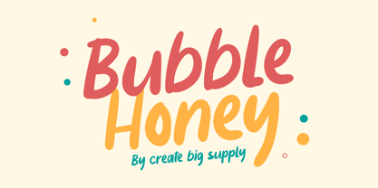 Bubble Honey Font is a cute and fun display font. This will add a cheerful, happy touch to your design. Features: Uppercase & lowercase Numbers and punctuation Multilingual PUA Encoding Full Character Set !"#$%&()*+,-./0123456789:;?@ABCDEFGHIJKLMNOPQRSTUVWXYZ[\]^_`abcdefghijklmnopqrstuvwxyz{}~ ¡¢£¤¥§¨©ª«®°±²³´¸¹º»¿ÀÂÃÄÅÆÇÈÉÊËÌÍÎÏÑÒÓÔÕÖ×ØÙÛÜÝßàáâãäåæçèéêëìíîïñòóôõö÷øùúûüýÿıŒœŠšŸžˆˇ˚˜–—‘’“”†•‹›€−
 - Votrag Texture by Putracetol,
$20.00 Introducing Votrag - 10 Modern Font Collection, a versatile typeface set that encompasses a spectrum of design possibilities. With five distinct weights - thin, light, regular, semibold, and bold - each accompanied by both clean and textured versions, Votrag offers a total of ten unique fonts.
 - Krom Mono by ATK Studio,
$15.00 Krom Mono is a modular monospaced font built with pixel shapes. Designed for headlines, posters, and small size body text. This family consist of 9 weights from thin to black plus variable font with a character set that covers over 90 languages.
 - Bubbly Kids by Create Big Supply,
$15.00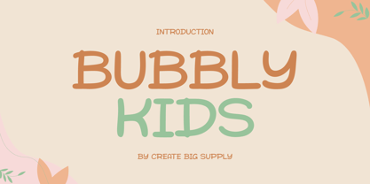 Bubbly Kids Font is a cute and fun display font. This will add a cheerful, happy touch to your design. Features: Uppercase & lowercase Numbers and punctuation Multilingual PUA Encoding Full Character Set !"#$%&()*+,-./0123456789:;?@ABCDEFGHIJKLMNOPQRSTUVWXYZ[\]^_abcdefghijklmnopqrstuvwxyz{|}~ ¡¢£¤¥§©ª«®°±²³¹º»¿ÀÂÃÄÅÆÇÈÉÊËÌÍÎÏÑÒÓÔÕÖ×ØÙÛÜÝÞßàáâãäåæçèéêëìíîïñòóôõö÷øùúûüýþÿıŒœŠšŸž–—‘’“”†‹›€−…·•/‚„
 - Foppish Birdie by Natalie Thomson,
$15.00 Foppish Birdie is a font family with character of birds that was inspired by the font Guakala by RodrigoTypo. Foppish Birdie - dynamic, cheerful, a special typeface for children's short titles and brands, containing the Cyrillic set. Take each letter and make game!
 - Millettre by ParaType,
$30.00 A calligraphic script font Millettre is the last member of the trilogy of types designed by Lyudmila Mikhailova. First two fonts Milanette and Milafleur were released earlier. The font is based on author's lettering artworks which she did for many years for companies who produced greeting cards. The characters of the font have rough contours simulating lettering by a pointed pen on a rough paper. The character set covers standard Western, Central European and Cyrillic code pages. The default version of the font is presented by disconnected script, but connected variant is also included and organized as an alternative stylistic set. The font also contains some initial, finial and alternative forms of letters. Recommended for use in advertising and display typography. Released by ParaType in 2011.
 - Palmer Lake by Jen Wagner Co.,
$13.00 Features: Palmer Lake Print: Uppercase letters, numbers, & extended punctuation Palmer Lake Script: Lowercase letters, numbers, & extended punctuation Non-English support for the international designer Same stroke thickness with each font, so you don't need to make any time-consuming adjustments to get it looking right! Palmer Lake Print (uppercase font) letters are the same height as the Script lowercase letters, so making quotes is super easy! This is such a fun new duo, perfect for creating quotes, logos, or just adding a hand-written touch to any project! While other fonts usually take some size adjusting to look just right, Palmer Lake duo has the same stroke thickness for both fonts, so you can set each font to the same size and you're done! Plus, the uppercase letters of the Print font are the same height as the lowercase letters of the Script font (see the samples), so lining them up with one another is a breeze! Each font also has alternates for each letter, so when you type uppercase or lowercase for each font, the letters will change slightly. For example, tying in all caps with the Script font will connect each letter, whereas typing all lowercase will disconnect each letter. Test it out for yourself in the box above!
 - 112 Hours by Device,
$9.00 Rian Hughes’ 15th collection of fonts, “112 Hours”, is entirely dedicated to numbers. Culled from a myriad of sources – clock faces, tickets, watches house numbers – it is an eclectic and wide-ranging set. Each font contains only numerals and related punctuation – no letters. A new book has been designed by Hughes to show the collection, and includes sample settings, complete character sets, source material and an introduction. This is available print-to-order on Blurb in paperback and hardback: http://www.blurb.com/b/5539073-112-hours-hardback http://www.blurb.com/b/5539045-112-hours-paperback From the introduction: The idea for this, the fifteenth Device Fonts collection, began when I came across an online auction site dedicated to antique clocks. I was mesmerized by the inventive and bizarre numerals on their faces. Shorn of the need to extend the internal logic of a typeface through the entire alphabet, the designers of these treasures were free to explore interesting forms and shapes that would otherwise be denied them. Given this horological starting point, I decided to produce 12 fonts, each featuring just the numbers from 1 to 12 and, where appropriate, a small set of supporting characters — in most cases, the international currency symbols, a colon, full stop, hyphen, slash and the number sign. 10, 11 and 12 I opted to place in the capital A, B and C slots. Each font is shown in its entirety here. I soon passed 12, so the next logical finish line was 24. Like a typographic Jack Bauer, I soon passed that too -— the more I researched, the more I came across interesting and unique examples that insisted on digitization, or that inspired me to explore some new design direction. The sources broadened to include tickets, numbering machines, ecclesiastical brass plates and more. Though not derived from clock faces, I opted to keep the 1-12 conceit for consistency, which allowed me to design what are effectively numerical ligatures. I finally concluded one hundred fonts over my original estimate at 112. Even though it’s not strictly divisible by 12, the number has a certain symmetry, I reasoned, and was as good a place as any to round off the project. An overview reveals a broad range that nonetheless fall into several loose categories. There are fairly faithful revivals, only diverging from their source material to even out inconsistencies and regularize weighting or shape to make them more functional in a modern context; designs taken directly from the source material, preserving all the inky grit and character of the original; designs that are loosely based on a couple of numbers from the source material but diverge dramatically for reasons of improved aesthetics or mere whim; and entirely new designs with no historical precedent. As projects like this evolve (and, to be frank, get out of hand), they can take you in directions and to places you didn’t envisage when you first set out. Along the way, I corresponded with experts in railway livery, and now know about the history of cab side and smokebox plates; I travelled to the Musée de l’imprimerie in Nantes, France, to examine their numbering machines; I photographed house numbers in Paris, Florence, Venice, Amsterdam and here in the UK; I delved into my collection of tickets, passes and printed ephemera; I visited the Science Museum in London, the Royal Signals Museum in Dorset, and the Museum of London to source early adding machines, war-time telegraphs and post-war ration books. I photographed watches at Worthing Museum, weighing scales large enough to stand on in a Brick Lane pub, and digital station clocks at Baker Street tube station. I went to the London Under-ground archive at Acton Depot, where you can see all manner of vintage enamel signs and woodblock type; I photographed grocer’s stalls in East End street markets; I dug out old clocks I recalled from childhood at my parents’ place, examined old manual typewriters and cash tills, and crouched down with a torch to look at my electricity meter. I found out that Jane Fonda kicked a policeman, and unusually for someone with a lifelong aversion to sport, picked up some horse-racing jargon. I share some of that research here. In many cases I have not been slavish about staying close to the source material if I didn’t think it warranted it, so a close comparison will reveal differences. These changes could be made for aesthetic reasons, functional reasons (the originals didn’t need to be set in any combination, for example), or just reasons of personal taste. Where reference for the additional characters were not available — which was always the case with fonts derived from clock faces — I have endeavored to design them in a sympathetic style. I may even extend some of these to the full alphabet in the future. If I do, these number-only fonts could be considered as experimental design exercises: forays into form to probe interesting new graphic possibilities.
 - Balister by Rotterlab Studio,
$15.00 Introducing Special creative products for you, our products will give you an extraordinary experience that will not be forgotten. Balister A popular and professional Handwritten font. Modern and elegant, this typeface is made of beautiful creative strokes. Balister This font is perfect for your creative ideas, both formal and informal. It has a modern style with a touch of creative ideas that is very suitable to be applied anywhere that requires creative ideas such as invitation cards, letterheads, website logos, social media, banners, advertisements, brochures, packaging products, leather products, and any product that requires writing. By using this font, all of your products will look luxurious, elegant, and attractive, please try and see the results. This font includes a complete set of beautiful upper and lowercase letters, numbers, a wide variety of punctuation marks, and ligatures. All lowercase letters include a start and end, providing a realistic style. everything you get. Encoded PUA Character – Can be accessed completely without additional design software., Please note that Stylistic Alternates will require professional design software such as Adobe Illustrator, Photoshop, InDesign or Inkscape. Thank you...
