10,000 search results
(0.022 seconds)
- Prumo Slab by DSType,
$40.00 Prumo is a new type system, based on a unique skeleton that flows, like a pendulum, from high contrast to low contrast. It’s a sort of typographic journey, from the 18th century typefaces to the 19th century slab serif typefaces, gathering information from the Scotch Roman fonts on its journey. Prumo is a type family with classic proportions that takes advantage of the recent type production technology while looking carefully at the most important historical references.
 - ITC Stylus by ITC,
$29.99ITC Stylus is the work of American designer Dennis Pasternak, who based its forms on those of freehand architectural lettering from historical and contemporary sources. Pasternak points out that while the typeface emulates hand lettering, no pencil drawings or scanned art were used in its creation. The letters bounce slightly across the baseline, giving the typeface the look of true handwriting. ITC Stylus emanates warmth when used for extended text and a fresh quality in display sizes. - Kufica by Artegra,
$29.00 Kufica is a geometric sans serif display family based on the kufic style, a 7th century calligraphic form of the Arabic script originates from Kufa, Iraq. It’s quite amazing that a historic Arabic calligraphic style can be implemented into a modern (even futuristic!) typeface that serves so well in modern advertising, branding, packaging, posters and so on. Kufica family comes in 2 weights with italics, each of the fonts has solid language support with over 430 glyphs.
 - Deutschmeister by RMU,
$25.00 This crisp and constructed Ludwig Wagner, Leipzig, blackletter font in textura style had been originally designed by Berthold Wolpe. Freshly redrawn and redesigned, it adds now to the treasure trove of historic typefaces. This font contains a bunch of useful ligatures, and it is recommended to activate Discretionary Ligatures too. By typing 'N', 'o' and period plus activating Ordinals you get an oldstyle numbersign. As usual in my blackletter fonts, the # key is occupied by the 'round' s.
 - MC Calpita by Maulana Creative,
$13.00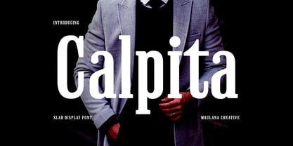 Calpita is a classic inspired by historical 50s serif font. Bold stroke, fun character with a bit of ligatures and alternates. To give you an extra creative work. Calpita font support multilingual more than 100+ language. This font is good for logo design, Social media, Movie Titles, Books Titles, a short text even a long text letter and good for your secondary text font with script or serif. Make a stunning work with Calpita font. Cheers, Maulana Creative
 - Prumo Poster by DSType,
$40.00 Prumo is a new type system, based on a unique skeleton that flows, like a pendulum, from high contrast to low contrast fonts, is a sort of typographic journey, from the eighteen century typefaces to the nineteen century slab serif typefaces, gathering information from the scotch roman fonts on it's journey. Prumo is a type family with classic proportions, that takes advantage of the recent type production technology while looking carefully at the most important historical references.
 - Aberfoyle by Mysterylab,
$19.00 Aberfoyle is an elegant and ornate modern condensed serif. It’s a great choice for unique branding and banners of anything from gourmet food packaging, to high-end accessories and cosmetics, to winter holiday headline vibes. With its old-world flair, it features a wealth of eye-catching details and a whimsical variety in its approach to letter width and shape. Aberfoyle straddles two worlds, referencing historical embellishment traditions, but squarely looking forward into the future of typographic design.
 - Prumo Banner by DSType,
$40.00 Prumo is a new type system, based on a unique skeleton that flows, like a pendulum, from high contrast to low contrast. It’s a sort of typographic journey, from the 18th century typefaces to the 19th century slab serif typefaces, gathering information from the Scotch Roman fonts on its journey. Prumo is a type family with classic proportions that takes advantage of the recent type production technology while looking carefully at the most important historical references.
 - Cruz Quaste by Mans Greback,
$59.00 Cruz Quaste is a calligraphic medieval type, drawn by Måns Grebäck between 2018-2020. While traditional in character it is yet original, and could be described as a reinvented Gothic style. Its blackletter style it works great in historical contexts, or to give projects a tough feeling. Cruz Quaste contains OpenType features such as alternates and ligatures. The font is multilingual and supports all Latin-based European languages. It contains numbers, punctuation and all symbols you'll ever need.
 - MC Fringes by Maulana Creative,
$13.00 Fringes is a classic historical early sans serif font. Regular stroke, fun character with a bit of ligatures and alternates. To give you an extra creative work. Fringes font support multilingual more than 100+ language. This font is good for logo design, Social media, Movie Titles, Books Titles, a short text even a long text letter and good for your secondary text font with script or serif. Make a stunning work with Fringes font. Cheers, Maulana Creative
 - Prumo Text by DSType,
$40.00 Prumo is a new type system, based on a unique skeleton that flows, like a pendulum, from high contrast to low contrast. It’s a sort of typographic journey, from the 18th century typefaces to the 19th century slab serif typefaces, gathering information from the Scotch Roman fonts on its journey. Prumo is a type family with classic proportions that takes advantage of the recent type production technology while looking carefully at the most important historical references.
 - 26 Flowers by Celebrity Fontz,
$24.99 26 Flowers is a digital revival and restoration of a beautiful collection of 26 individually unique ornamental letters from historical texts. Each of the 26 letters of the alphabet are contained in a square frame with a different flower in the background and an antique letter in the top right corner; hence, the name 26 Flowers. This highly ornamented typeface is perfect for leading off paragraphs or in any text dealing with the subject of flowers.
 - Upside by Little Fonts,
$15.00 Upside is an all caps font. The design of the font is tied to historic golden ages gone by, but with a modern flair giving it a contemporary edge. It is a tall and condensed geometric sans serif, with four unique styles and appearances. Upside is a distinctive display font, perfect for headlines and headings across a range of formats such as graphic design posters, editorial pieces, or anything that needs that extra eye-catching touch.
 - Prumo Deck by DSType,
$40.00 Prumo is a new type system, based on a unique skeleton that flows, like a pendulum, from high contrast to low contrast. It's a sort of typographic journey, from the 18th century typefaces to the 19th century slab serif typefaces, gathering information from the Scotch Roman fonts on its journey. Prumo is a type family with classic proportions that takes advantage of the recent type production technology while looking carefully at the most important historical references.
 - Prumo Display by DSType,
$40.00 Prumo is a new type system, based on a unique skeleton that flows, like a pendulum, from high contrast to low contrast. It’s a sort of typographic journey, from the 18th century typefaces to the 19th century slab serif typefaces, gathering information from the Scotch Roman fonts on its journey. Prumo is a type family with classic proportions that takes advantage of the recent type production technology while looking carefully at the most important historical references.
 - Alter Gotisch by Alter Littera,
$25.00 This is Alter Littera’s first original design. The font has been created by attempting not to reproduce any historical typeface in particular, but only to re-create the overall forms and style of classic black-letters from different time periods and places. Two specific sources must be acknowledeged nonetheless: (1) the “Black” type from William Caslon’s A Specimen of Printing Types (1785), and (2) the “Caslon Gotisch” type by D. Stempel A.G. (1926). In addition to the usual standard characters for typesetting in modern Western languages, the font includes a comprehensive set of special characters, alternates and ligatures, plus Opentype features, that can be used for typesetting as in antique writings and printings. The glyphs are clean, smooth and definitely readable, so the font will be suitable not only for large titles and headings, but also for full text pages. Specimen, detailed character map, OpenType features, and font samples available at Alter Littera’s The Oldtype “Alter Gotisch” Font Page.
 - Geographica Script by Three Islands Press,
$39.00 Time-tested elegance is what you’ll get with Geographica Script, a handwritten typeface steeped in 18th century sophistication. Source materials include the maps of Emanuel Bowen (circa 1694–1767), Geographer to King George II, as well as English and American trade cards from the middle 1700s, including the work of artist and printmaker William Hogarth (1697–1764). A kindred font to our Geographica serif family, Geographica Script is a painstaking replication of the elegant roundhand cursive seen in engravings of the period. Geographica Script has more than 1,100 glyphs, including scores of standard and contextual ligatures, three full uppercase alphabets, historical forms, decorative flourishes, and full Latin support. It’s also got fifty evocative ornaments inspired by map and trade card illustrations, e.g., lion rampant, unicorn rampant, crowns, anchors, sailing ships, whale, dolphin, sun, moon, and many others. Note: To prevent Microsoft Word from cutting off Geographica Script’s extra-long descenders, set line spacing (Format —> Paragraph —> Spacing) to 1.5 lines.
 - Sandwich by Suitcase Type Foundry,
$85.00The all-caps display face Sandwich was inspired by historic, hand lettered sans serif alphabets with slightly sloping terminals, as found in showcard lettering and on billboards. Besides a number of alternate glyphs located in the lowercase area of the font, the typeface features about forty 'ligatures'. These are not ligatures in the traditional sense of the word, but short two- or three-letter combinations — mostly prepositions, conjunctions, articles and so on — in different languages, which are positioned vertically, not horizontally. Since the number of such pre-fabricated ligatures in a font is limited and cannot possibly cover all the desired combinations, a special algorithm programmed into the OpenType font permits the user to compose any two- or three-letter words, provided no accented characters are used. This is why Sandwich includes five versions of each letter. Using the full possibilities offered by the OpenType format, the automatic vertical aligning of glyphs is based on a combination of optional ligatures, style sets, and modified kerning. - Psych Handlettering by Mysterylab,
$14.00 Here's a font system distilled from the lettering styles of a thousand vintage psychedelic rock albums and posters from the swingin' sixties. All of the grooviness, but perhaps twice the legibility of some of the more "far out" examples from the genre. This family features an extensive character set and multilingual glyphs, so you can say "Trippy, Man." in many languages. The three versions allow you to harmonize letter bodies and highlight strokes with the color palette of your project Once loaded on your system, the three versions of the font show in your menu as the following three "weights": Psych Handlettering Bold, Psych Handlettering Incised, and Psych Handlettering Highlight. The 3-alphabet collection works together seamlessly to allow you to assign one color to the body of the letter, and a second color to the inset highlight lines. Just copy your text block, paste in place, reassign the font to the "highlight" version, choose a complimentary color, and off you go.
 - Ghitta Bodoni Cancellaresca by Spurnej Type Foundry,
$39.00 Giambattista Bodoni was an Italian engraver, printer, and publisher who was one of the best typographers of the 18th century and became known worldwide for his iconic serif typeface. In the posthumous edition of Bodoni’s “Manual of Typography” published in 1818 by his widow Margherita “Ghitta” Dall’Aglio may also be found, among the other treasures, the Cancellaresca (Chancery). Ghitta is a redesign of this typeface in its finest form. With strong stroke contrast in 4 optical grades, 850 glyphs with wide range of language support, accented ligatures, oldstyle figures, 8 stylistic sets, and unique way of letter connection, Ghitta Bodoni Cancellaresca follows and builds on the best of Bodoni’s historical prototype and shifts further to a contemporary script typeface full of grace, neatness, and beauty. *** This font is powered by OpenType feature “Ligatures”, so it is necessary to have this function turned on. If you need support or more information, please kindly contact me: spurnej@email.cz
 - Frigga by Sudtipos,
$49.00 Frigga is a typeface that settles its roots in the Baroque Dutch tradition of text typefaces and northern european type forms. Carefully crafted for an optimum balance between its solid historic structure and a refreshing repertoire of organic forms, where blossoms its contemporary spirit and natural beauty. In the page, spread on long text settings a feeling of comfort and closeness, while in headlines and display use, it reveals itself more exuberant and plentiful of details. Is beautiful, timeless, lush, elegant and smooth like nordic mead. Fully equipped to realize your wildest editorial dreams, Frigga came in 20 styles, with more than a 1000 glyphs per style, alternates, ornaments and borders, old style and tabular figures, small caps and plenty of OpenType features to fulfill any type of editorial need. Named after the nordic goddess Frigga (also called Frejya), taking as a reference the romantic mythos of its cultural representation, the solemn presence and her warm, gentle embrace.
 - Woodford Bourne by Monotype,
$20.99 Woodford Bourne is a brand new 19th century grotesque typeface. The design is a tribute to the historic stone cast type in the building façades of the former Woodford, Bourne & Co. in Cork City, Ireland. For many years I had admired the type’s simplicity and strength, so I decided to faithfully reproduce those letters and expand them to a fully working font with 500 glyphs per case. A key feature of Woodford Bourne is the ability to change the feel of your typography with just one click. Switch from contemporary to vintage style by selecting “Stylistic Set 1” – this gives Woodford Bourne a unique versatility which I am sure you will enjoy playing with in your designs. It is a solid, reliable “workhorse” font family that reproduces well at all sizes… it’s also great for branding and identities. These font files (v2) were redrawn and updated in April 2021 (v1 created 2015).
 - Babetta by Viktor Nübel Type Design,
$- Babetta is a display typeface that comes with some decorative typographical features. Alongside a set of arrows and flower icons, it also includes an alternative ›E‹, some special diacritic marks, a wavy ›S‹ and a series of ligatures. It features 5 weights, a special ›Neon‹ version and supports a wide range of Latin languages. This typographical tool box provides a large and playful variety of options for headlines and logotypes. Babetta supports Latin and Cyrillic languages. The initial inspiration for Babetta was an illuminated vintage shop sign—that of a famous bookstore in Berlin called Karl-Marx-Buchhandlung that dates back to the days of East Germany. During the course of the design process, this slightly shabby historical original was kissed by an Italian Art Deco beauty and has blossomed into a new typeface with its own special charm. The aim was not to preserve the original lettering, but to use it as a starting point for typographical exploration.
 - Ongunkan Carpathian Basin Rovas by Runic World Tamgacı,
$60.00 Carpathian Basin Rovas The Carpathian Basin Rovas script, or Kárpát-medencei rovás in Hungarian, was used in the Carpathian Basin between about the 7th and 11th centuries. Most of the inscriptions are in Hungarian, but some were in Onogur, As-Alan, Slavic or Eurasian Avar. Carpathian Basin Rovas is thought to be a descendent of the Proto-Rovas script, which was used to the east of the Aral Sea between about the 1st century AD and 567, when the tribes who were using it, the Avars and Ogurs, started to move into the Carpathian Basin. That process took until about 670 AD, after which the Proto-Rovas script became the Carpathian Basin Rovas and the Khazarian Rovas scripts. The Proto-Rovas script was perhaps a descendent of the Aramaic script. Since 2009 efforts have been made to revive the use of this alphabet. Some letters were added to it to represent sounds in modern Hungarian that weren't used historically.
 - Taskeksem - Unknown license

- Trapezoidal by Ingrimayne Type,
$9.00 The letters of Trapezoidal are like sheep: they do not like being alone but want to be part of a flock. Many of the individual letters of Trapezoidal look strange and unshapely in isolation because they are designed to fit into a pattern with other letters. That pattern is formed by alternating asymmetric trapezoids, with trapezoids that are wide at the top alternating with trapezoids that are wide at the bottom. The magic of the OpenType feature of contextual alternatives (calt) automatically alternates them. The fonts in the family are largely monospaced and have very tight letter spacing. (If for some reason one wants to use only one set of the letters, the letters will overlap unless one widens character spacing.) (If D and O are too similar, use the alternative versions of D.) The family has five weights and each weight has an italics formed by flipping the trapezoidal pattern over a vertical line. Like other alternating-character typeface families from IngrimayneType, this distinctive and visually-arresting family can be used for titles or advertising. (For another but very different typeface based on alternating trapezoids, see PoultrySign.)
 - Wu by Gajana Aslanjan,
$34.99 Wu is a font that flows through the page like waves in the sea. The font is based on the shape of an Ancistrus fish swimming through water. The shapes of the letters flow into each other and move out again in perfect harmony. Purchase this font and come see it swim.
 - Circus Sideshow by Vozzy,
$15.00 Introducing vintage label font named Circus Sideshow. All available characters you can see at the screenshots. This font has six styles: Regular, Shadow, Rough, Rough Texture and two effect styles Texture FX and Shadow FX. This font will look good on any vintage styled designs like a poster, T-shirt, label, logo, etc.
 - Regina by Laura Worthington,
$25.00 Regina is a broad, welcoming, and highly legible script. Its languorous letterforms are a reminder of an era when people took the time and care to share beautifully penned thoughts by hand. Regina shines when used in display or text settings on letters, invitations, and menus. See what’s included! http://bit.ly/2bOqfVW
 - Ready Kid by Flying Fuzzball,
$22.00 Ready Kid is a versatile, funky display typeface that is inspired by freehand signpainting with a dose of childhood nostalgia. It's perfect for children's birthday party invitations, punk band marketing, or packaging for art supplies. There are six sets of stylistic alternatives, 340+ ligatures, and 1200+ glyphs that cover over 200 languages.
 - FarHat-Quintas - Unknown license

- FarHat-Acordes - Unknown license

- FarHat-Acordes b y # - Unknown license

- Shrub by Chank,
$59.00 The new OpenType font Shrub feels like a printed, textural typestyle, influenced by the great slab-serif fonts of the 20th century and organic, messy effects of old Xerox copiers. You might call this one a “multi-messter font” because it not only comes grainy and coarse, but also features a special stylistic alphabet set to add extra schmutz as you see fit. Users of Adobe’s Creative Suite applications can access this feature as either “Stylistic Set #1” in InDesign or “Stylistic Alternates” in Illustrator. The extra blotches can be turned on or off as you see fit. Put a little organic texture mixed with old-school legibility to make you flyers and other designs look like they were really printed! Shrub speaks with a compelling, grounded personality in a voice that’s easy to read.
 - Perfectly Nineties by Jen Wagner Co.,
$17.00 Introducing Perfectly Nineties – a brand new serif with all the nostalgic vibes! I've started seeing classic, tightly spaced serifs of the 80s & 90s making a comeback, and wanted to create the perfect one for you too! Perfectly Nineties is a beautifully nostalgic upper and lowercase typeface that looks incredible in both large and small settings as a display and body text. It's gorgeous used on its own, or paired as you see above with Aguafina Script (free from Google Fonts: https://fonts.google.com/specimen/Aguafina+Script ) One thing to note about Perfectly Nineties is the letter spacing. It was intentionally spaced for clean reading if you wanted to use it for body type, so I recommend setting the spacing a little tighter for display use (around -20 should do!).
 - Mayence by Isaco Type,
$39.00 Mayence is the French name of Mainz, German city where Johannes Gutenberg was born. It's a manuscript font inspired in the author's calligraphy, with an angular structure, marked by a certain impulsiveness. Besides being a continuous-line font, Mayence explores some deviations and imperfections in the calligraphy practice, as accumulations of paint and anomalies in the thickness variation, characteristics which gives it more naturality. Its main difference is the set of over 430 ligatures (Premium version), based on the research and selection of important character sequences, rather frequent in several languages. For this, a study was done about the diphthongs, triphthongs and di-tri-tetra-pentagraphs more common in languages such as English, Spanish, French, German, Italian, Portuguese, Dutch, Hungarian, Croatian, among others. Ligatures with up to 2 characters are enabled by default and with more than 2 characters are enabled by the Discretionary Ligatures option. Mayence also contains several ligatures based on common words in English and Spanish, exclusive ligatures with numbers and another standard, discretionary, historic and Unicode ligatures. It has 9 different ampersands (&), which can be chosen by the user according to the application context. When you enable the Titling Alternates (in OpenType-savvy programs), these 9 ampersand styles are converted to their forms of seal, with different purposes of use. To enrich your graphic applications, Mayence brings the Ornaments Version, for construction of impressive lines, borders, textures and the geometric shapes that you want, according to your creativity! To see the features available in each version, open or download the User Guide pdf, in the Gallery section. All text fonts are available in OpenType PS format and have extended character set to support CE, Baltic, Turkish, as well as Western European languages and additional Celtic characters.
 - Shaky Kane by Comicraft,
$39.00 He sees you! He can see everything YOU do! He wears X-Ray Spex! He glows in the dark! Top Pop Cult Comic Artist Shaky Kane pushes at the limits of taste, dragging a scalpel down the veil of your illusions to make you see the world as it really is, as HE sees it. You've wondered at his work in the pages of ELEPHANTMEN! THE BULLETPROOF COFFIN! CAP'N DINOSAUR! THAT'S BECAUSE YOU'RE A ROBOT! MONSTER TRUCK and DEADLINE! You've worn the HATEFUL DEAD t-shirt and drawn blood with the SHAKY KANE FAN CLUB pins. Now Shaky Kane isn't just a disaffected punk rock way of looking at the world, it's a font too. A little Shaky, a little Stirred, best served with a purple eyeball spiked on a cocktail stick.
 - Thinpaw by upirTYPO,
$4.00 Thinpaw is a serif handwritten font perfect for usage in a really big sizes (50 pt+). The stem width is about 0.5 mm (0.019") in 100 pt size. The font comes with central european character set and a set of various glyphs and icons (see preview images). Opentype features: - Standard ligatures - fi, fl, ff - Discretionary Ligatures - ft, fb, fh, fk, fj - Contextual Alternates - a, e, f, g - Stylistic set 01: A Stylistic set 01 changes every dot into the heart shape symbol. It turns every writing into a nice looking love letter! Thinpaw is perfect for wedding proposals, wedding invitations, happy birthday cards or anything personal. For usage on the computer screen, the stem width is about 1 pixel for 50 pt size, and 2 pixel for 100 pt size.
 - XRoomingHouse by Ingrimayne Type,
$9.95 XRoomingHouse is a typeface of pictures that I did many years ago. Most of the pictures are border elements, and within a set they can be combined to make borders or frames. There is no real style consistency in the font—it is an eclectic collection of elements. (Minor corrections and additions were made in 2018 to improve sets that can form frames. For a more ambitious attempt at a font that can form frames, see Framealot). As for the name, boarders stay in a rooming house.
 - Speeday by deFharo,
$24.00 Speeday is a Display and Sans Serif typeface family, slanted at 23 ° with a rounded finish, with 3 styles, Regular, Bold and Small Caps that include 9 sets of numbers, 3 sets of uppercase and alternate letters, as well as advanced Open functions Type. Thick typography with a contemporary appearance that brings great dynamism to the texts written with it, its use in graphic, editorial and advertising design guarantees originality, difference and maximum readability, the kerning has been carefully configured in all versions. See specimen in PDF


