10,000 search results
(0.033 seconds)
- Old Dreadful No. 7 by Bitstream,
$29.99Old Dreadful No. 7 is truly a unique typeface design. Bitstream’s designers and other employees all contributed individual letterforms to the character set. This typeface is definitely not recommended for long blocks of texts! David Robbins expanded his contribution of the capital I into a complete typeface, Eyeballs. - Misyela by Stripes Studio,
$20.00 Introducing Misyela, made with modern handwriting! You can use it for your work because there are a lot of features in it to contain a complete set of letters lower and uppercase letters, assorted punctuation, numbers, and multilingual support. This font also contains several ligatures and alternate characters.
 - Pretty Smile by Sronstudio,
$15.00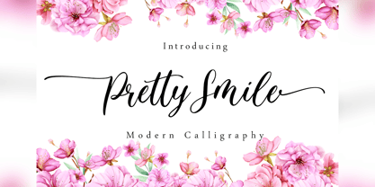 Pretty Smile is a beautiful calligraphy font perfect for crafting, branding, invitation, stationery, wedding designs, social media posts, advertisements, product packaging, product designs, label, photography, watermark, special events or anything. Pretty Smile comes with full set of uppercase and lowercase letters, swash alternates, ligatures,multilingual symbols, numerals and punctuation.
 - Feel Love by Fikryal,
$15.00 Feel Love is a natural script font perfect for crafting, branding, invitation, stationery, wedding designs, social media posts, advertisements, product packaging, product designs, label, photography, watermark, special events, or anything. Feel Love comes with full set of uppercase and lowercase letters, swash alternates, ligatures,multilingual symbols, numerals and punctuation.
 - Obsession by Autographis,
$39.50Obsession has taken me completely in its spell. I could go on forever creating new forms for this script. But I have other fonts to do, so this is as far as my obsession goes for the moment. There are six different cuts and all letters can be mixed. - Atrament by profonts,
$41.99 Another beautiful script design by German type designer Ralph M. Unger. Atramant is casual and easy, ideal for any setting in larger sizes. Still, due to its excellent legibility, it can also be used for short text blocks in smaller sizes. Atrament was originally designed for the URW++ FontForum.
 - Pearl White by Fikryal,
$15.00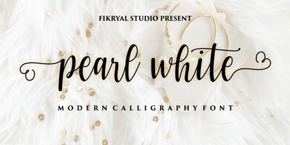 Pearl White is a beautiful calligraphy font perfect for crafting, branding, invitation, stationery, wedding designs, social media posts, advertisements, product packaging, product designs, label, photography, watermark, special events or anything. Pearl White comes with full set of uppercase and lowercase letters, swash alternates, ligatures,multilingual symbols, numerals and punctuation.
 - Aaah Speed - Unknown license

- StageDive - Unknown license

- Kröwn by Vasava Fonts,
$30.00 Kröwn is a ruthless display font family. It is presented in three styles that can be used stacked to create beveling and dimensional effects. Kröwn’s most distinctive feature is the absence of counter shapes, or at least its minimum impact. All counter shapes width is the same as the separation between characters, this creates a blocky, strong and hardcore rhythm. Use it with precaution to build strong titling, powerful logotypes or short letterings. With Kröwn, the less is more, the bigger the better. Its visual style draws inspiration from sword and sorcery fantasy genre and historical periods as the middle age.
 - Breakfast Noodles by Hanoded,
$15.00 I used to be a tour guide and spent a lot of time in Asia. One thing that I really liked, was having noodles, ANY kind of noodles, for breakfast! Breakfast Noodles is a very uncomplicated headline font: I made it while seriously renovating our ‘new’ home (a fixer upper farm), which means that this particular font was made over a period of almost 3 months… It wasn’t exactly a letter at a time, but close. I will try and make the next font in, say, under two months… Hopefully! In the meantime, enjoy this one!
 - Sanseki by Hanoded,
$20.00 The term Sanseki (Japanese for Three [Brush] Traces) is used to describe three famous Heian period calligraphers: Yaseki, Gonseki and Saseki. Not that I would ever dream of comparing my messy brush-work with theirs, but the name stuck and I kind of liked it. I used Chinese ink and a high quality brush (which I got in a sale actually) to create this font. All glyphs were hand painted in one go! Sanseki is a very detailed brush font. Upper and lower case letters mingle and there’s even an alternate for every lower case glyph. Comes with an abundance of diacritics.
 - Prinzess Gravur by RMU,
$35.00 In 1905 Berthold released an engraved blackletter font called Prinzess Kupferstichschrift. Based on an old printed remnant, I revived this beautiful open-face fraktur and enriched it with several OpenType features. As usual in my blackletter fonts, the round ‘s’ lies on the number sign key, and a traditional number sign can be accessed via the Discretionary Ligature feature and typing 'N-r-period'. In this font you have also the possibility to turn I, V, X, L, C, D, and M into Roman numerals by activating the Stylistic Alternates feature. And last but not least, various useful ligatures polish up this font.
 - French Plug by HiH,
$8.00 Frank H. Atkinson was a popular Art Nouveau sign painter in Chicago, Illinois. He designed signs for the Cadillac Motor Car Co., Chicago Academy of Fine Arts and the department store Marshall Field. Oddly enough, he even designed signs for other sign painters. In 1908 he published a book, Sign Painting, which sold well. French Plug, a bold, rounded, all-cap design in an American Art Nouveau style from that book. It has a relaxed, easy-going informality that is useful for ads and flyers. It also would have fit very nicely with many French posters of the period.
 - Goudy Stout CT by CastleType,
$49.00 This face was recommended to me by Mark Solsburg, president of FontHaus. At first I was a bit reluctant to revive it, if for no other reason than Frederic Goudy’s admission that he created this design “in a moment of typographic weakness.” However, I put the sample that Mark sent me up on my bulletin board, and over a period of time, it grew on me. It finally got to the point that I had to recreate the face, and from the response that I’ve gotten, I’m glad I did! Uppercase only with numerals and punctuation.
 - Bandleader JNL by Jeff Levine,
$29.00 How does one arrive at a font name? With the thousands of digital typefaces available, it's not an easy process. Bandleader JNL was modeled from the hand-lettered title on a piece of sheet music called "Largo", which means "slow tempo". Since the names "Largo" and "Tempo" were already taken, what other musical theme would fit? The lettering is in an Art Deco style, and Big Band was all the rage of the Art Deco period; therefore "Bandleader". Sometimes the road to naming a font takes on many twists and turns but the end result is always gratifying.
 - FF Providence by FontFont,
$72.99 American type designer Guy Jeffrey Nelson created this script FontFont in 1994. The family contains 4 weights: Regular, Italic, Bold, and Bold Italic and is ideally suited for advertising and packaging, festive occasions, poster and billboards as well as web and screen design. FF Providence provides advanced typographical support with features such as ligatures, small capitals, alternate characters, case-sensitive forms, and stylistic alternates. It comes with proportional oldstyle figures. As well as Latin-based languages, the typeface family also supports the Greek writing system. This FontFont is a member of the FF Providence super family, which also includes FF Providence Sans.
 - Rosina by Hashtag Type,
$28.49 Rosina is a geometric typeface with a distinctive charm. With a captivating fusion of dashing 1920s style and 21st Century sensibility, geometric forms have been taken and optically adjusted to create a sturdy typeface. Tall ascenders and descenders attempt to simulate architectural features of the Art Deco period, striving for a look of the future, nevertheless form always follows function. Rosina explores typographic boundaries and lends itself well to branding, posters and other display uses. Full details include 6 weights from Thin to UltraBold and include a range of OpenType features such as case sensitive punctuation.
 - Rogliano by TipoType,
$25.00 Rogliano is an affable Slab Serif. On one hand it responds to the classic tenet of strong and direct alphabets of the Industrial Revolution period. While nourishing the text of a warm environment, it takes the freedom to flirt with lettering and lithographic posters of the Victorian era: due to its multiple stylistic alternatives, borders and decorative ornaments. This wide range of voices makes Rogliano a versatile typeface that can move from the mechanical to humanistic with absolute ease, and perform efficiently from branding to editorial design. Rogliano offers 14 weights with support for more than 200 latin languages.
 - Helenium by Greater Albion Typefounders,
$14.95 Informal does not have to mean aggressively modern or casual. Helenium is inspired by some hand drawn capitals that I found added to a 19th century map. It's a great font for informal titles and headings that still keep an air or regularity and ever so slightly period elegance. It manages to be formal and casual all at once, as well as classical and modern. Helenium's range of different weights and drop shadow effects make it useful for hierarchical titles and headings. Helenium miniscule adds greater flexibility by extending the family with a fun range of rounded lower case forms.
 - Jeeves by Red Rooster Collection,
$79.00 The inspiration for Jeeves came from Leslie Carbarga's wonderful book LETTERHEADS, One Hundred Years of Great Design, 1850-1950. It was based on a secondary type usage for the letterhead for Sutherland in New York. The rest of the letterhead had features that were more typical of the Art Deco period, but this script added a touch of timeless elegance. And since at the time I was reading every scrap of P.G. Wodehouse I could get my hands on, the name Jeeves seemed like a perfect fit. The font is loaded with a plethora of extra glyphs, ligature characters and OpenType features.
 - Newsletter by Die Typonauten,
$19.00 Monospaced but no mono space. Created from 2002 to 2007 this font family is influenced by fonts like OCR-B, DIN and the work of Erik Spiekermann. Newsletter is not a real monospaced font but has the ease of recognition these fonts have - even though these fonts are often criticized for their aesthetic qualities. Newsletter has a computer-related impression but is more legible and aesthetic than real monospaced fonts are. Since 2006 Newsletter is the corporate font of the design agency "die Typonauten". It is eminently suitable for correspondence use. After a testing period and fine tuning it is now published.
 - Buxom by ITC,
$29.00Robert Trogman originally designed Buxom for Fotostar in 1975 with lettering from Herman Spinadel. Trogman’s design is an old-fashioned headline face, whose style feels at home in a number a different periods: the Wild West, the 1960s–70s, and once again today! Buxom is an all caps typeface with a three-dimensional effect: each character looks like it sits atop a trapezoidal shape, whose right side is always shaded. An inline around each letterform enhances this shadowy image. Buxom is best used in large display sizes as a single word, or single line of text. - NorB Pen Cased by NorFonts,
$28.00 This is the Cased version of my NorB Pen fonts are being inspired from Arial Round font, I use this font regularly in my jazz lead-sheets. It's a handwritten text font emulating marker permanent pen. You can use this font with any word processing program for text and display use, print and web projects, apps and comic books, graphic identities, branding, editorial, advertising, scrapbooking, cards and invitations and any casual lettering purpose… or even just for fun! Pen cased font8 weights, each with their matching italics and in a Light, Normal, Bold and Heavy version.
 - Bowen Script by Ashton,
$9.00 The font was inspired by the persistent demands of editors for scripts which actually looked like real handwriting, a lot of historical fiction projects and a love of maps. While making a map for a prequel to Treasure Island I decided to make a font from the lettering of some Caribbean maps of the period. The glyphs are all hand drawn vector outlines which although very legible and consistent in style carry the variation and irregularity you expect from handwriting. This font has been featured on maps for books by authors such as Peter V. Brett, Mark Lawrence and Michael Crichton.
 - Positronic Toaster by Brian Crick,
$25.00 Positronic Toaster is a modern interpretation of the French upright scripts of the nineteenth century. It started off as an attempt to make a stylized script that didn't feel like it belonged on a 1950s chrome appliance. Later on, however, the design grew to embrace the qualities of that style of lettering. The result is something playful and elegant, that is not tied to any particular time period. The distinctive angular loops on the ascenders will join together in words like 'bulb' or 'wallflower' using OpenType contextual alternates. It is suitable for cards, wedding invitations, or any project requiring a fashionable, upscale look.
 - Zentenar Fraktur by RMU,
$25.00 The name of this blackletter font was chosen due to the centennial of the Bauer Foundry, Frankfurt am Mai, in 1937. Ernst Schneidler probably created then the most beautiful of all fraktur fonts. They are the fruit of countless calligraphic drawings and of many years of professional experiences. Zentenar Fraktur became in its time the workhorse among German blackletter fonts. To access all ligatures in both styles, it is recommended to activate Standard and Discretionary Ligatures. The round s can be reached by typing the # key, and the combination N-o-period plus the OT feature Ordinals gives you the Numero sign.
 - Egyptian Hieroglyphics – Dendera by Deniart Systems,
$25.00 Cast your stars like the ancient Pharaohs. Commonly known as the Zodiac of Dendera, this series is based on the symbols found on the roof of the temple at Dendera. It is believed that the Egyptians likely borrowed the signs of the zodiac from the Greeks, possibly in the Ptolemaic period. Containing 52 unique characters, the series includes the 12 zodiac signs, the 30 phases of the moon in its equatorial position, the Gods of the four winds, and the Gods of the five planets of Venus, Mercury, Mars, Saturn and Jupiter. NOTE: this font comes with an interpretation guide in pdf format.
 - Mocombo JNL by Jeff Levine,
$29.00Mocombo JNL is a slightly modified version of one of the numerous alphabets created by the late Alf R. Becker for Signs of the Times Magazine during the period of the 1930s through the 1950s. Tod Swormstedt of ST Media—who is also the curator of the American Sign Museum in Cincinnati, Ohio—supplied Jeff Levine a wealth of source material from which this font is derived. The angular style of this typeface was originally referred to as “German Poster Lettering” by Becker, but it can represent many styles from 1940s night clubs to African safaris and just about anything in-between. - RF Marshall by Magpie Paper Works,
$18.00 RF Marshall was inspired by an 1883 tombstone, tucked away in a pioneer cemetery. The 4-sided marker is sparsely adorned with homespun carvings of a handprint, two tulip poplar leaves, and these words: "RF Marshall died 1883 Aged 72 years." The font faithfully reproduces the stone's hand-carved lettering and artwork, as well as artwork from other 18th and 19th century American headstones. It was drawn with calligraphy nibs dipped in walnut ink and delights in a range of end uses including period films, rustic decor, Halloween decorations, historical logos and branding, and on the pages of children's books.
 - Trippy Hippie JNL by Jeff Levine,
$29.00 Don’t let the name “Trippy Hippie JNL” fool you. Although the type design fits well with the 1960s-70s hippie movement and the “love generation”, the design is actually straight out of a page from a vintage German lettering textbook entitled “50 Alphabete fur Technikur und Fachschulen” (loosely translated to “50 Alphabets for Technicians and Specialized Schools”). The novelty, free form shapes and stroke weights of this hand lettered alphabet fits well in creating 1920s period pieces or for designing a retro-inspired rock and roll concert poster. Trippy Hippie JNL is available in both regular and oblique versions.
 - SK Greenland by Salih Kizilkaya,
$9.99 SK Greenland is a humanist sans serif font family with geometric and organic forms. Synthesizing Greenland's thousands of years of organic history and modern period, this font combines the organic nature of Greenland with the geometric structure of its urban areas. This font family, which contains 14 fonts and 9856 glyphs in total, contains all the typographic elements you will need in your designs. You can use this font family, which includes many unique ligatures, without any problems, from headlines to long text. Greenland offers full support for the Latin alphabet while also supporting many other alphabets.
 - Roadway by K-Type,
$20.00 Roadway is based on U.S. highway lettering observed on New York street signs. Two weights of capitals would often be used on the same sign, condensed for the main name, and a half-size regular superscript for ‘road’ or ’street’. Roadway is a Small Caps font. The upper case consists of condensed capitals, the lower case consists of regular width small caps, sized at 50% and superscript. A small superscript comma and period, aligned with the lowercase, are at keystrokes < and > respectively. A small hyphen lining with the superscript lowercase is at the en dash position (Mac: option hyphen, Windows: alt-0150).
 - Club Type by Club Type,
$37.00 Perhaps the greatest tragedy in all English history began in 1642 when, for five years, families and friends were divided by violent struggle. Respect for the monarchy was as great then as it is today; but it was squandered by Charles I and Civil War ensued. Out of Cromwell's eventual victory came a period of absolute rule just as arbitrary. In communicating the affairs of Court, Mercurius Aulicus can claim to be England's first regular newspaper, printed at Oxford and reprinted in London almost throughout the entire war. This typeface family echoes the calligraphic scripts of newspaper cartoons of the time.
 - Unger Fraktur by RMU,
$25.00 In the wake of the Enlightenment and the French Revolution there was a desire for a clear classical blackletter font without frills. That is why in 1793 the famous printer and editor Johann Friedrich Unger and his partner Johann Christian Gubitz accomplished their own fraktur. Now you will be able to use both regular and bold styles of this highly readable blackletter font. It is recommended to activate both OT features Standard and Discretionary Ligatures to access all ligatures in both these fonts. Typing N-o-period and activating the ordinal feature gives you the numero sign.
 - Portello by Greater Albion Typefounders,
$14.50 Portello is a display family in the tradition of Tuscan advertising and display faces. It's a family of three 'all capital' faces. A perpendicular regular form is offered, along with an italic form (a true italic - with purpose designed glyphs-NOT merely an oblique) and a basic form for small text - which dispenses with the family's characteristic outlined look. It offers the spirit of the Victorian era with ready and distinctive legibility. It's ideal for poster work, especially at large sizes, and for signage with a period flair. Why not give your work the flair of colorful 19th century commercial design today?
 - Letterpress by FaceType,
$18.00 Meet the Letterpress! Jakob Erbar’s Phosphor was released by the Ludwig & Mayer Foundry before 1923. The origins of Aurora date back to 1912 (Johannes Wagner Foundry). Permanent Headline was designed by Karlgeorg Hoefer, also known simply as Headline. It was fun making a mix out of the three classics – with Letterpress Bastard you will quickly get astounding results. To complete the family we added a font containing random symbols we also found in the metal type boxes. Please note that we provided loads of ligatures for double-letters to make your design look as authentic as possible.
 - Gothic Tuscan One by HiH,
$12.00 Gothic Tuscan One is a all-cap condensed gothic with round terminals and decorative “tuscan” center spurs. It was first shown by William H. Page of Norwich, Connecticut among his wood type specimen pages of 1859. Gothic Tuscan One exemplifies the strength of decorative wood types: large, simple type forms that provide the visual boldness sought by advertisers of the Victorian period. While our marketing has gotten so very sophisticated, there is always a place for simple, visually strong typeface. Although about 14 miles inland, Norwich lies at the head of the Thames River. The river is both wide and deep, and therefore was not bridged in the early 20th century. From the 17th century until then, if you wanted to get from Groton on the west bank to the whaling port of New London on the east bank by land, you had to had to go by way of Norwich. Because of its size, the Thames is navigable all the way from Norwich to New London. Docks were built in Norwich around 1685 and the city became Connecticut’s 2nd largest port by 1800. With the construction of the Norwich & Worcester Railroad in 1835, Page could easily ship his wood type north by rail or south by coastal schooner. Included with our font, Gothic Tuscan One, are two 19th century printer’s ornaments of sailing ships similar to those that sailed up the Thames to Norwich. There is also a more contemporary glyph of a whale, looking quite pleased that the only whaling ship left in Connecticut is the Charles W. Morgan, permanently moored at Mystic Seaport. Reference: Moon’s Handbooks, Connecticut 2nd Edition (Emeryville CA 2004). Gothic Tuscan One ML represents a major extension of the original release, with the following changes: 1. Added glyphs for the 1250 Central Europe, the 1252 Turkish and the 1257 Baltic Code Pages. Added glyphs to complete standard 1252 Western Europe Code Page. Special glyphs relocated and assigned Unicode codepoints, some in Private Use area. Total of 332 glyphs. 2. Added OpenType GSUB layout features: pnum, ornm and dlig. 3. Added 330 kerning pairs. 4. Revised vertical metrics for improved cross-platform line spacing. 5. Redesigned mathamatical operators 6. Included of both tabular (std) & proportional numbers (optional). 7. Refined various glyph outlines. Please note that some older applications may only be able to access the Western Europe character set (approximately 221 glyphs). The zip package includes two versions of the font at no extra charge. There is an OTF version which is in Open PS (Post Script Type 1) format and a TTF version which is in Open TT (True Type)format. Use whichever works best for your applications.
 - Custer by Font Bureau,
$40.00 In 2009, a book from 1897 in the library of the University of Wisconsin caught David Berlow’s attention. It was set in a clear text face—a predecessor of Bookman—cast by the Western Type Foundry who called it Custer. Upon noting how well the typeface worked in sizes of 6 and 7 points, Berlow developed it into a member of the Reading Edge series specifically designed for small text on screen. Custer RE was a broad and approachable typeface drawn large on the body with a tall x-height to maximize its apparent size when set very small. This was the beginning of the newly expanded series; in 2020, Berlow added new optical sizes and weights, growing the original design’s versatility up to headline sizes.
 - Sandokan by Matyas Machat,
$30.00 Sandokan is a brush script font with a character and morphology that nears Oriental calligraphy, Art Nouveau typefaces, psychedelic “flower power” fonts from the Sixties and Tuscan poster fonts from the 19th century. Its main features are the high contrast between thick and thin strokes and the extreme slanted angle in the typewriter imprints, creating inverse shadowing. The letter set is further accentuated by exotic decorative details and the often unusual connectors between small letters. The typeface supports all languages using the universal Latin character set. Sandokan is a slightly sweetened cultural cocktail. As such it looks best on everything that needs to come across as exotic and rather solid but unmistakeably eccentric - such as labels and packaging on exotic delicacies or circus posters.

