10,000 search results
(0.033 seconds)
- Venarotta by Aftertime Studio,
$20.00 Venarotta is a minimal and neat sans serif font. It can easily be matched to an incredibly large set of projects, so add it to your creative ideas and notice how it makes them stand out! Thank you.
 - Ando Round by JCFonts,
$30.00 This is the rounded version of Ando, an elegant geometric typeface with smooth curves, designed for headlines. Six styles are available, with the same OpenType features as the original: stylistic alternates, case sensitive forms, tabular figures, and more!
 - Costa Dorada by Letterhead Studio-YG,
$15.00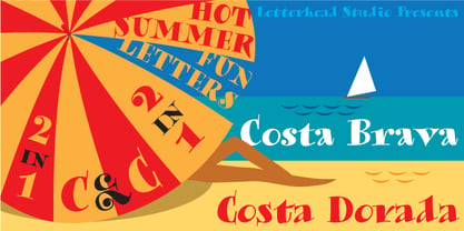 Costa Brava and Costa Dorada are devoted unforgettable days on beaches of tender Mediterranean sea in Catalonia. Enjoy! Both fonts were originally created in the summer 2003. The OpenType version, with extended Latin characters, was released in 2009.
 - Doge's Venezia by Greater Albion Typefounders,
$15.00 Doge’s Venezia is one of a set of four typefaces, the others being Doge’s Delight, Doge’s Darker and Doge’s Banner. Together they make up a splendid family of Victorian inspired Tuscan faces, allowing for an integrated design approach.
 - Objet by Pascal Tarris,
$10.00 Inspired by the clarity of signage fonts, Objet Sans is a modern geometric typeface with a friendly rounded touch. It containts many OpenType features and an extensive character set that make it suitable for a variety of uses.
 - Silverstone by Arendxstudio,
$12.00 Introducing Silverstone, Luxury script font, using hand made style with brush. Beautiful for wedding card design, logotype, website header, fashion design and any more. Features : • Character Set A-Z • Numerals & Punctuations (OpenType Standard) • Accents (Multilingual characters) • Swash • Ligature
 - Doge's Darker by Greater Albion Typefounders,
$15.00 Doge’s Darker is one of a set of four typefaces, the others being Doge’s Delight, Doge’s Banner and Doge’s Venezia. Together they make up a splendid family of Victorian inspired Tuscan faces, allowing for an integrated design approach.
 - PIXymbols Signet Umbra by Page Studio Graphics,
$29.00A monogram font of classic capitals with a thin shadow embossed look, to create elegant stationery. Includes six border styles for monograms, each accessed by a single keystroke, as well as decorative rule characters to generate business letterheads. - Andarillo by Franklin Veiga,
$10.00 Andarillo is a display typeface inspired by vintage travel posters and magazines. The complete glyph set contains uppercase, small caps, numerals, punctuation, ligatures and multilingual support. Andarillo is perfect for logotypes, magazines, titles, posters, advertising and branding communication.
 - Huntington JNL by Jeff Levine,
$29.00From the backlots of Hollywood to a computer near you! Quiet on the set... Huntington JNL is a bold sans serif font inspired by titles preceeding the opening of the film classic "Casablanca". Art Deco meets Film Noir... - Digital Stitch by 2D Typo,
$28.00 Digital Stitch is the embroidery of digital era. This font is a blend of pixel stylization of traditional cross-stitch embroidery and stylization of printed circuit boards. There is a big collection of ornaments in the symbols set.
 - Somewhat by PintassilgoPrints,
$24.90 Somewhat retro, somewhat amusing, somewhat handsome, totally handy! This hand-drawn family counts 4 fonts plus a whimsical set of ornaments. Suitable for both display and text sizes, it will bring an extra charming feel to your creations.
 - Doge's Delight by Greater Albion Typefounders,
$15.00 Doge’s Delight is one of a set of four typefaces, the others being Doge’s Darker, Doge’s Banner and Doge’s Venezia. Together they make up a splendid family of Victorian inspired Tuscan faces, allowing for an integrated design approach.
 - DB Flornaments by Illustration Ink,
$3.00Flornaments are decorative font ornaments, with a hint of floral styling. Each Doodlebat corresponds to a letter or number on the keyboard. This downloadable set of dingbat doodles will add a fanciful, formal flair to your scrapbook journaling. - Totem by Cuda Wianki,
$20.00 TOTEM is simple and geometric, strong and modern. Previously it was designed for our logo and next we made the rest of the alphabet, including multi-language coverage and numbers. Totem has a nice set of ornaments too.
 - Casualties Pro by The Type Fetish,
$45.00 Casualties Pro is an OpenType font that contains four variations of every character in its extended character set. OpenType-savvy applications will be able to rotate through the variations to give a more random look to the text.
 - Cheesegum by PizzaDude.dk,
$20.00 Cheesegum is super legible even at very small sizes. If you use Cheesegum at larger sizes, you can see the delightful crucnhy edges! Kinda like roasted cheese! The crunchier, the lovelier! :) Just go ahead and eat some Cheesegum!!!
 - Gungsuh by Microsoft Corporation,
$129.00Gungsuh™ features a mincho (serif) stroke style with proportional Latin characters. This Gungsuh font file is 6.9 MB in size. Gungsuh is a trademark of the Microsoft Corporation. Gungsuh Character Set: Latin 1, Korean code page 949 - Loftype by Gleb Guralnyk,
$15.00 Hello! Presenting a design set named "Loftype". It includes a font files with various OpenType features - lots of ligatures and alternate characters with swashes (you can access them trough "OpenType" tab, or manually insert them from "Glyphs" tab).
 - Veltro by profonts,
$41.99 Veltro was originally designed in 1931 for Nebiolo in Torino. The typeface has been redesigned, digitized, completed and expanded as OpenType Pro in the profonts studio. Both styles cover the complete character set for Western and Eastern Europe.
 - Autobahn Pro by AVP,
$40.00 Autobahn is a robust masculine sans of near monoline thickness and angular characteristics. Available in four weights (with italics), it has a healthy compliment of OpenType Features and the character set covers most Roman-based letterforms and Cyrillic.
 - Memory Square by Beware of the moose,
$16.99Mono Square is a monospaced font, each glyph has the same width. It is based on 25 rectangles so the are some glyphs that needs some effort to read.The font set contains most punctuation marks for normal use. - Solastion by GlyphStyle,
$18.00 Solastion is a signature style font that looks both bold and sheer. An elegant looking font and lots of unique characters like natural hand strokes. – Font feature Uppercase, Lowercase, Numerals & Punctuations, Stylistic Alt, Stylistic Set, Swash Ligature, Multilanguage
 - Sereno by Robert Corseanschi,
$19.99 This font family includes six very unique font styles & weights. The font styles are applicable for any type of graphic design - web, print, motion graphics, etc. and perfect for t-shirts and other items like posters and logos.
 - Great Dunker by Arendxstudio,
$13.00 Great Dunker Graffiti Font is a free style font that has the characteristics of street art that shows freedom and is filled with unique characters Features : • Character Set A-Z • Numerals & Punctuations (OpenType Standard) • Accents (Multilingual characters) Outline
 - Velvet Script by Typadelic,
$19.00A pretty handwriting typeface. Smooth and feminine. You'll find an alternate "r" and "s" (Option 9 and Option 10 on the keyboard) which have a beginning stroke to achieve a finished look. Try it and see for yourself. - Oksana Text Std by AndrijType,
$25.00Oksana Text is the demure version of Oksana, with shorted serifs, higher contrast, more slender proportions. In six weights from Thin to Black and with the real italic, this typeface is suitable for longer text with rich typography. - Run Child by Figuree Studio,
$18.00 Say hello to Run Child font. Made with love and joy. Comic look, so it will make your design more beautiful, cute, fun and colorful. Features: Character Set Numerals and Punctuation (OpenType Standard) Accents (Multilingual characters) PUA Encode
 - Grundee by Ingrimayne Type,
$9.00 Grundee is a grungy serifed face. It is sloppy and irregular but still quite legible. It was one of several efforts to draw a serifed typeface by pen; see also SarahfSlob, which contains a complete family of styles.
 - Oksana Text Alt by AndrijType,
$25.00Oksana Text is the demure version of Oksana, with shorted serifs, higher contrast, more slender proportions. In six weights from Thin to Black and with the real italic, this typeface is suitable for longer text with rich typography. - Circula by Paragraph,
$16.50 Circula is a simplified geometric display typeface based on circles. It contains capitals and small capitals only (no lower case), basic symbols, superior and inferior numbers and common fractions. It supports Eastern European, Baltic and Turkish character sets.
 - Godhong by Tama Putra,
$17.00 Godhong is a typeface inspired from gothic and rebel style. The Godhong typeface includes a full set of uppercase and lowercase letters as well as multi-lingual and currency support, numerals, punctuations, alternates, ligatures and some extra glyphs.
 - Alipe Script by TeGeType,
$29.00 Alipe Script is a new script typefaces family. Alipe Script family has light, medium and bold fonts, all with ligatures, alternates and a set of ornaments. It can be used for text as well as for titling applications.
 - Bank Gothic by Bitstream,
$29.99 A set of square capitals developing from the interest in geometric forms stimulated by the Bauhaus, Bank Gothic was designed by Morris Fuller Benton for ATF in 1930, the same year that Georg Trump designed City for Berthold.
 - Milano by ITC,
$29.99Milano is definitely in the upper echelon of display typography with its superb, engraved chromium style, italic lowercase and extravagant initials. The lowercase is designed to be closely set. From the talented hand of British designer David Quay. - Crozzoe by Tama Putra,
$17.00 Crozzoe is a decorative blackletter typeface inspired by victorian style. The Crozzoe typeface includes a full set of uppercase and lowercase letters as well as multi-lingual and currency support, numerals, punctuations, alternates, ligatures and some extra glyphs.
 - Spargo by Greater Albion Typefounders,
$8.50 Spargo is inspired by 20s and 30s American typefaces, often seen on share certificates and other securities. Spargo is offered in six all capitals display typefaces. Bring a touch of inter-war America to your next design project!
 - Doge's Banner by Greater Albion Typefounders,
$15.00 Doge’s Banner is one of a set of four typefaces, the others being Doge’s Delight, Doge’s Darker and Doge’s Venezia. Together they make up a splendid family of Victorian inspired Tuscan faces, allowing for an integrated design approach.
 - Signage JNL by Jeff Levine,
$29.00 Signage JNL shows the heavy influence of the perennial favorite Futura Black with a couple of minor changes here and there. The design was inspired by a set of British brass stencils for sale in an online auction.
 - Areplos by Storm Type Foundry,
$53.00To design a text typeface "at the top with, at the bottom without" serifs was an idea which crossed my mind at the end of the sixties. I started from the fact that what one reads in the Latin alphabet is mainly the upper half of the letters, where good distinguishableness of the individual signs, and therefore, also good legibility, is aided by serifs. The first tests of the design, by which I checked up whether the basic principle could be used also for the then current technology of setting - for double-sign matrices -, were carried out in 1970. During the first half of the seventies I created first the basic design, then also the slanted Roman and the medium types. These drawings were not very successful. My greatest concern during this initial phase was the upper case A. I had to design it in such a way that the basic principle should be adhered to and the new alphabet, at the same time, should not look too complicated. The necessary prerequisite for a design of a new alphabet for double-sign matrices, i.e. to draw each letter of all the three fonts to the same width, did not agree with this typeface. What came to the greatest harm were the two styles used for emphasis: the italics even more than the medium type. That is why I fundamentally remodelled the basic design in 1980. In the course of this work I tried to forget about the previous technological limitations and to respect only the requirements then placed on typefaces intended for photosetting. As a matter of fact, this was not very difficult; this typeface was from the very beginning conceived in such a way as to have a large x-height of lower-case letters and upper serifs that could be joined without any problems in condensed setting. I gave much more thought to the proportional relations of the individual letters, the continuity of their outer and inner silhouettes, than to the requirements of their production. The greatest number of problems arose in the colour balancing of the individual signs, as it was necessary to achieve that the upper half of each letter should have a visual counterbalance in its lower, simpler half. Specifically, this meant to find the correct shape and degree of thickening of the lower parts of the letters. These had to counterbalance the upper parts of the letters emphasized by serifs, yet they should not look too romantic or decorative, for otherwise the typeface might lose its sober character. Also the shape, length and thickness of the upper serifs had to be resolved differently than in the previous design. In the seventies and at the beginning of the eighties a typeface conceived in this way, let alone one intended for setting of common texts in magazines and books, was to all intents and purposes an experiment with an uncertain end. At this time, before typographic postmodernism, it was not the custom to abandon in such typefaces the clear-cut formal categories, let alone to attempt to combine the serif and sans serif principles in a single design. I had already designed the basic, starting, alphabets of lower case and upper case letters with the intention to derive further styles from them, differing in colour and proportions. These fonts were not to serve merely for emphasis in the context of the basic design, but were to function, especially the bold versions, also as independent display alphabets. At this stage of my work it was, for a change, the upper case L that presented the greatest problem. Its lower left part had to counterbalance the symmetrical two-sided serif in the upper half of the letter. The ITC Company submitted this design to text tests, which, in their view, were successful. The director of this company Aaron Burns then invited me to add further styles, in order to create an entire, extensive typeface family. At that time, without the possibility to use a computer and given my other considerable workload, this was a task I could not manage. I tried to come back to this, by then already very large project, several times, but every time some other, at the moment very urgent, work diverted me from it. At the beginning of the nineties several alphabets appeared which were based on the same principle. It seemed to me that to continue working on my semi-finished designs was pointless. They were, therefore, abandoned until the spring of 2005, when František Štorm digitalized the basic design. František gave the typeface the working title Areplos and this name stuck. Then he made me add small capitals and the entire bold type, inducing me at the same time to consider what to do with the italics in order that they might be at least a little italic in character, and not merely slanted Roman alphabets, as was my original intention. In the course of the subsequent summer holidays, when the weather was bad, we met in his little cottage in South Bohemia, between two ponds, and resuscitated this more than twenty-five-years-old typeface. It was like this: We were drinking good tea, František worked on the computer, added accents and some remaining signs, inclined and interpolated, while I was looking over his shoulder. There is hardly any typeface that originated in a more harmonious setting. Solpera, summer 2005 I first encountered this typeface at the exhibition of Contemporary Czech Type Design in 1982. It was there, in the Portheim Summer Palace in Prague, that I, at the age of sixteen, decided to become a typographer. Having no knowledge about the technologies, the rules of construction of an alphabet or about cultural connections, I perceived Jan Solpera's typeface as the acme of excellence. Now, many years after, replete with experience of revitalization of typefaces of both living and deceased Czech type designers, I am able to compare their differing approaches. Jan Solpera put up a fight against the digital technology and exerted creative pressure to counteract my rather loose approach. Jan prepared dozens of fresh pencil drawings on thin sketching paper in which he elaborated in detail all the style-creating elements of the alphabet. I can say with full responsibility that I have never worked on anything as meticulous as the design of the Areplos typeface. I did not invent this name; it is the name of Jan Solpera's miniature publishing house, in which he issued for example an enchanting series of memoirs of a certain shopkeeper of Jindrichuv Hradec. The idea that the publishing house and the typeface might have the same name crossed my mind instinctively as a symbol of the original designation of Areplos - to serve for text setting. What you can see here originated in Trebon and in a cottage outside the village of Domanín - I even wanted to rename my firm to The Trebon Type Foundry. When mists enfold the pond and gloom pervades one's soul, the so-called typographic weather sets in - the time to sit, peer at the monitor and click the mouse, as also our students who were present would attest. Areplos is reminiscent of the essential inspirational period of a whole generation of Czech type designers - of the seventies and eighties, which were, however, at the same time the incubation period of my generation. I believe that this typeface will be received favourably, for it represents the better aspect of the eighties. Today, at the time when the infection by ITC typefaces has not been quite cured yet, it does absolutely no harm to remind ourselves of the high quality and timeless typefaces designed then in this country.In technical terms, this family consists of two times four OpenType designs, with five types of figures, ligatures and small capitals as well as an extensive assortment of both eastern and western diacritics. I can see as a basic text typeface of smaller periodicals and informative job-prints, a typeface usable for posters and programmes of various events, but also for corporate identity. Štorm, summer 2005