10,000 search results
(0.032 seconds)
- Sutro Initials by Parkinson,
$20.00 A two-font chromatic (or layered) set. The Primary font, which is the old Sutro Inlined Initials. Salvaged from the wreckage of my Type1 font library, the inlined initials have been in the shop for some repairs and detailing. I just added the fill font to support the inlined version. Each font works on it’s own but they work very well together. Caps only. Open Type.
 - Heberling Casual NF by Nick's Fonts,
$10.00This delightfully playful font is based on a single-stroke pen font from the 1922 tome Heberling’s Basic Lettering, and elements of composition, color harmony, gilding, embossing-processes, etc. by Walter A. Heberling. Swoopy, loopy, but never poopy, this font delivers on the fun. This font contains the complete Latin language character set (Unicode 1252) plus support for Central European (Unicode 1250) languages as well. - Rosalina by Supfonts,
$15.00 Hello, friends. Here's my new experiment. This font breaks the boundaries even more. Rosalina combines all these qualities: simple and clear, looks at ease. It is perfect for signatures or design, wedding invites and cards, where you do not need a strict style :) Test it out below to see how it could look for your next project! Check out my blog: https://www.instagram.com/zloillev pinterest.com/dmitriychirkov7 Enjoy
 - Sign Template JNL by Jeff Levine,
$29.00 Sign Template JNL is based on one of the many plastic lettering guides manufactured by the now-defunct Wright-Regan Instrument Company (also known as WRICO). Aside from their engineering and drafting templates and tools, WRICO had a line of "Sign-Maker" sets which featured various styles of lettering, special ink pens and metal alignment guides to assure clean, crisp lettering with little effort.
 - PIXymbolsFabricCare by Page Studio Graphics,
$39.00 Standard fabric (or textile) care symbols used for creating clothing labels. This font has temperature setting symbols for washing, drying and ironing. It also includes bleach and dry cleaning symbols. This font uses a method that allows combinations of the washing, drying and dry cleaning symbols to create more symbols. Therefore, this font actually has a total of 73 unique fabric care symbols that can be created.
 - Raligur by Hishand Studio,
$15.00 Raligur is a harmonious blend of timeless aesthetics and modern versatility, making it a perfect choice for designers seeking a balance between tradition and innovation. Featuring exquisite details and a sense of timeless appeal, Raligur, the newly unveiled serif font, sets the stage for elegant typography that leaves a lasting impression on any audience. Complete with ligatures alternates regular italic icon kerning multilingual support
 - Catchfire by Alan Smithee Studio,
$10.00 Warm and human, yet reliable and precise. Catchfire blends humanist proportions and geometric features. The result is a sans serif typeface with strong personality traits, but that can fulfil everyday needs. It is very legible due to its open counters. It boasts a large character-set, OpenType features, circled numbers, wide range of weights, cursive italics : everything needed to become your new companion for years to come!
 - Saint Onki by Atom,
$10.00 Saint Onki is a natural brush font with 4 styles that will give a casual impression to your design. With stylistic sets and original handmade quality, your design will stand out more. You will get Saint Onki Regular Saint Onki Italic Saint Onki All Caps Saint Onki All Caps Bold Saint Onki Swash Hope you like it with this font. Have a great day and happy buying.
 - Twang by ITC,
$29.00Twang is the work of British designer Timothy Donaldson, who says its appeal lies in its ugliness. Its irregular, craggy features give it an aggressive, eye-catching edge. The font comes wiht an extra set of small caps which add more zest to this cutting edge style. Twang is ideal for retail promotions and fashion-related publications as well as large poster and signage applications. - Ayumi Pro by Positype,
$9.00 Ayumi is one of those precocious sans. At first glance, I wanted it to look simple...basic characters, moderate modulation, common structure...but at closer inspection, it is filled with all kinds of fun and expressive details. The italics are...well, fun. They're curvy and expressive and truly compliments the face. The new Pro version includes a tightened character set, Central European glyphs, and remastered kerning.
 - Body Pretty by Create Big Supply,
$15.00 Body Pretty is a Monoline Bold Script. Perfect for all your design needs such as branding designs, logos, and more. This font is PUA encoded which means you can access all the amazing glyphs and ligatures easily Features: Uppercase & lowercase Numbers and punctuation Multilingual Ligatures Alternates PUA Encoding Full Character Set !"#$%&'()*+,-./0123456789:;?@ABCDEFGHIJKLMNOPQRSTUVWXYZ[\]^_`abcdefghijklmnopqrstuvwxyz{|}~¡¢£¤¥§¨©ª«®¯°±²³´¹º»¿ÀÁÂÃÄÅÆÇÈÉÊËÌÍÎÏÑÒÓÔÕÖ×ØÙÚÛÜÝÞßàáâãäåæçèéêëìíîïñòóôõö÷øùúûüýþÿ•†‹›?–ˆ?˜€“‘ŸœŒš?”’?žŠ
 - CG Clarendon by Monotype,
$29.99The first Clarendon was introduced in 1845 by R. Besley & Co, The Fan Street Foundry, as a general purpose bold for use in conjunction with other faces in works such as dictionaries. In some respects, Clarendon can be regarded as a refined version of the Egyptian style and as such can be used for text settings, although headline and display work is more usual. - Velveteen Round NF by Nick's Fonts,
$10.00This fresh face takes a number of design cues from Tomás Vellvé Mengual's eponymous design for Barcelona's Neufville Type Foundry in 1971. This version softens many of the lines of the original, and warms the design up overall with rounded terminals. Available in three weights, this font contains the complete Latin language character set (Unicode 1252) plus support for Central European (Unicode 1250) languages as well. - Vriegbe Script by Tebaltipis Studio,
$15.00 Introducing new latest from TebTipsudio, Vriegbe Script is a typeface with personality. You can use it as a logo, badge, insignia, packaging, headline, poster, etc The alternative characters in this font were divided into several OpenType features such as Stylistic Alternates, Stylistic Sets, and Ligature. The OpenType features can be accessed by using OpenType program such as Adobe Illustrator, Adobe Photoshop, and Adobe InDesign. Thank you!
 - HS Decomage by Hemphill Studio,
$19.00 HS Decomage was created by a desire for a more modern approach and as an homage to the Art Deco period. HS Decomage has a large set of ligatures to make optimum spacing easier to accomplish and stylistic alternatives give design choices. HS Decomage works great for headlines but also handles descriptive text quite well. Multi-lingual characters, numbers and punctuation are included in HS Decomage.
 - San Louis by Inumocca,
$25.00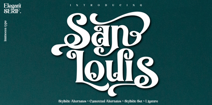 San Louis is an Elegant Serif typeface , Modern , Classy and Glamour Worlds. Awesome Stylictic Set, Beautiful Ligature and unique contecttual alternates, stylistic alternates. Really playful typeface to covering your Project, like Lettering, Website Interface, Magazine, Branding, Poster, wedding invitations, Quotes Lettering, Logos, and more your project design. - Unique glyphs - Multilingual Characters - UPPERCASE - Lowercase - Numeric - Symbol - Punctuation Character - Ligature - Contextual Alternates - Stylistic Alternates - SS01, SS02, SS03, SS04
 - The Stacy by BlackLotus,
$15.00 The Stacy is a retro script inspired font. This font has a variety of unique alternates and also has 2 styles, namely regular standard and italic. The Stacy is perfect for a wide variety of projects, and can be easily combined with a wide variety of colors. The Stacy has a bold character and soft nuances that will make a striking impression on everyone who sees it.
 - Display Digits Three by Gerald Gallo,
$20.00 Display Digits Three is a display number font with eight sets of variations of the same digits. The digits 0 through 9, with period and comma in appropriate variations, are prepared as (1) solid, (2) outline, (3) solid with contour outline, (4) outline with 3-D shadow, (5) 3-D shadow only, (6) outline with drop shadow, (7) positive in circle, (8) negative in circle.
 - Linoma by FlehaType,
$21.99 Linoma is a handmade font duo consisting of a sans and a stencil version. Its rough and textured appearance derives from the linocutting technique. Use Linoma Stencil as headline or display font and Linoma Sans when you need text settings in smaller sizes. Linoma is suitable for packaging, books, magazines, products and branding projects. It supports most of Central European and Easter European languages.
 - Yukas by Alex Camacho Studio,
$25.00 Yukas is a funky and sexy typeface where the proportions are based on the optical balance between black strokes and white shapes. Ideal to enjoy on a large scale. It takes its references from the psychedelic movement, old-school western movie posters, and mid-19th century American wood type with those big, heavy capital letters. Includes several Open Type alternatives to customize your design however you want.
 - Fast Lane by Supfonts,
$14.00 Fast Lane Script it is a Lettering chick font with exquisite accents. It is perfect for branding, wedding invitations and invitation cards and much more. It includes a full set of gorgeous uppercase and lowercase letters, numbers, a large selection of punctuation marks & ligatures. Includes: Latin languages support Uppercase and lowercase Numbers and punctuation Ligatures Check out my blog: https://www.instagram.com/di.zigner https://pinterest.com/dmitriychirkov7 Enjoy
 - Ovallique by Vanderfont,
$24.00 Ovallique shares roots with its looser cousin Beachbuoy. But don't mistake Ovallique's casual parentage for hand me down genes. Ovallique is the well-tailored relation, with limousine and driver at the ready. Dom Casual meets Dom Perignon for supper at the revolving restaurant. OK, so the wallpaper is slightly faded. Ovallique's x-height makes it legible even after apéritifs. It's kitschy slumming for the streamlined set!
 - Avenia by Supfonts,
$15.00 Avenia it is a modern calligraphic font with exquisite accents. It is perfect for branding, wedding invitations and invitation cards and many more Font includes a full set of gorgeous uppercase and lowercase letters, numbers, a large selection of punctuation marks and ligatures. Includes: Regular Script Latin languages support Uppercase and lowercase Numbers and punctuation Ligatures Swashes Check out my blog: https://www.instagram.com/di.zigner pinterest.com/dmitriychirkov7 Enjoy
 - Nord Express NF by Nick's Fonts,
$10.00Power, speed and modern creature comforts characterized rail travel in the 1930s. To reflect those characteristics, legendary French poster artist A. M. Cassandre employed strong graphic elements and a chiaroscuro letter treatment to the 1939 poster lettering that inspired this font. Both versions of this font contain the Unicode 1252 Latin and Unicode 1250 Central European character sets, with localization for Romanian and Moldovan. - Master Photograph by Subectype,
$17.00 Master Photograph is a Monoline Signature Font, font with a touch of handwriting style. This font is perfect for creating signature logos and watermarks for photography studio or wedding invitation. Master Photograph includes full set of beautiful hand lettered uppercase and lowercase letters, numerals, a large range of punctuation and many beautiful ligatures. You will get: Regular and Italic Version 100+ Ligatures Thank You, Subectype
 - Fastest by Letterara,
$16.00 Fastest is a unique and modern sans serif font, specially designed for headlines, big text, branding, logotypes, marketing graphics, banners, posters, signage, and display usage. It can easily be matched to an incredibly large set of projects, so add it to your creative ideas and notice how it makes them stand out! This font is PUA encoded which means you can access all of the amazing glyphs.
 - Octavia VV by STARSsoft,
$10.90 The "Octavia VV" font family includes Regular, Italic, Bold, and Bold Italic fonts. Sans serif font type. The whole font family includes a large set of additional characters and letters with diacritics. Standard and Latin Extended support such languages - English, Danish, Spanish, German, Norwegian, Polish, Portuguese, French, Swedish. Standard and extended Cyrillic are supported by languages - Russian, Belarusian, Bulgarian, Macedonian, Serbian, Ukrainian, Kazakh, Kyrgyz.
 - Laguna Vintage by Aiyari,
$25.00 Introducing Laguna Font Collection. Inspired from American motor inn signs and vintage restaurant signs in 50s-70s. Laguna comes with open type features such stylistic alternates, stylistic sets, contextual alternates & ligatures. Also available in variable font format. Laguna Font Collection is best uses for headings, Logo type, quotes, apparel design, invitations, flyer, poster, greeting cards, product packaging, book cover, printed quotes, cover album, movie, etc
 - Rassetta NF by Nick's Fonts,
$10.00The pattern for this graceful, subtly modulated Art Deco typeface was designed by Willard T. Sniffin for American Type Founders in the 1930s. True to the original design, the Swash Caps version features Sniffin's twelve decorative variants. The Postscript and Truetype versions contain a complete Latin language character set (Unicode 1252); in addition, the Opentype version supports Unicode 1250 (Central European) languages as well. - Tact Slab by Pesic,
$35.00 Tact Slab is geometrically slab serif font, black and condensed looks glyphs, with an alternative glyph set to improve its use in different graphic contexts. Tact Slab is compatible with the sans serif font Tact. It is suitable for use in the fields of science, art, architecture, urban planning, techniques, electronics, advertising, futuristic themes, sport, film, computers, phones, video games, magazines... Contains all Latin and Cyrillic glyphs.
 - Dark Angel by Alphabet Soup,
$60.00 Selected as one of “Our Favorite Typefaces of 2013” by Typographica.org, Dark Angel is the first completely new take in decades on the traditional “blackletter” font style. It began its journey towards the light years ago when this style was born as a sketch for a new logo for the California Angels baseball team (renamed shortly thereafter the Anaheim Angels). The Angels logo never happened, but that sketch has risen from the dead and become the basis for this brand new font design—and was also the source for the name. It’s kind of blackletter in feel, but as a display font it’s so much more. It is far more legible than most “Old English” or “Gothic Script” styles, and incorporates many features never before seen in them, such as swashes, tails and a plethora of ligatures. Dark Angel can be purchased in its regular solid form, or as Dark Angel Underlight—a handtooled font. If these two fonts are purchased together, the Family package will contain a third font—Dark Angel Highlight. With this font layered over the basic font, you can achieve two–color typesetting when the highlight and the base font are assigned two different colors. Dark Angel has enough language support to make the builders of Babel envious—its 1,163 glyphs can be used to set copy in 59 different languages. From A to Z: Afrikaans, Albanian, Basque, Bemba, Bosnian, Catalan, Cornish, Croatian, Czech, Danish, Dutch, English, Esperanto, Estonian, Faroese, Filipino, Finnish, French, Galician, Ganda, German, Hungarian, Icelandic, Indonesian, Irish, Italian, Kalaallisut, Kamba, Kikuyu, Kinyarwanda, Lithuanian, Luo, Malagasy, Malay, Maltese, Manx, Morisyen, North Ndebele, Norwegian Bokmål, Norwegian Nynorsk, Nyankole, Oromo, Polish, Portuguese, Romansh, Sango, Shona, Slovak, Slovenian, Somali, Spanish, Swahili, Swedish, Swiss German, Turkish, Welsh, and last (but not least) Zulu. PLEASE NOTE: Dark Angel is a cross-platform font which depends to some extent on certain advanced OpenType features, therefore it can be used to its full potential only with programs that support those features. ADDITIONALLY: When setting Dark Angel one should ALWAYS select the “Standard Ligatures" and “Contextual Alternates” buttons in your OpenType palette. Please see the “Read–Me–First!” file in the Gallery section.
 - Coco Gothic Pro by Zetafonts,
$39.00 Inspired by a biography of Coco Chanel and trying to capture the quintessential mood of classical fashion elegance, Cosimo Lorenzo Pancini designed Coco Gothic looking for the effect that the first geometric sans typefaces (like Futura, Kabel or the italian eponyms like Semplicità) had when printed on paper. The crisp modernist shapes acquired in printing charme and warmth through a slight rounding of the corners that is translated digitally in the design of Coco Gothic. This signature touch is enhanced by the inclusion of light humanist touches to the proportions of the letters, resulting in the unique mix that makes Coco Gothic one of our best sellers, with a look that is both contemporary and vintage. After six years from the original project (that has spawned in the meanwhile successful families like Cocogoose and Coco Sharp), we went back to the design to completely redraw and expand the original family, creating with a Pro version that has better on-screen readability, a wider weight range, variable type versions and more language coverage (with Coco Gothic Arabic adding a new script to the latin, greek and Cyrillic of the original). Coco Gothic Pro comes in three subfamilies, each with seven weights with matching italics and featuring an extended character set with open type support for small caps, ligatures, alternates, European languages, Greek and Cyrillic alphabets. The original, body-text optimised Coco Gothic and Coco Gothic Alternate subfamilies have been kept for compatibility with the previous version, while a new Coco Gothic Display subfamily has been developed with a complete redesign aimed at display usage, featuring tighter spacing and optimised letterforms. A distinguishing feature of Coco Gothic Pro is the inclusion of ten alternate historical sets that allow you to use the typeface as a true “typographic time machine”, selecting period letterforms that range from art deco and nouveau, to modernism and to eighties’ minimalism. Equipped with such an array of historical variants, Coco Gothic Pro becomes an encyclopedia of styles from the last century, ready to transform itself and adapt to the mood of your text.
 - FS Aldrin by Fontsmith,
$80.00 Elegant and round Having harboured a desire for a rounded font within the Fontsmith library for some time, Phil Garnham recognised that FS Emeric offered the perfect skeleton around which to design it. Most new rounded fonts rely on scripts or other in-app automation to form their characters. For all their warmth and approachability, they too often conjure images of jelly sweets and sausages. Not so FS Aldrin, where every curve and transition has been crafted by hand, giving a distinctive look and elegant feel. Design highlights FS Aldrin enjoys wide-open ‘lunar’ counters and soft, tube-like terminals. These improve legibility, especially on backlit signage and screens. The open proportions and circular strokes are juxtaposed against a more serious technical aspect that exists within each counter shape. The lighter weights feel precise and efficient, perfect for notes on blueprints or technical drawings. The heavy weights are equally crafted but more playful by their rotund nature, and are perfect for strong headlines or packaging projects. UI icons A suite of 268 icons complement the typeface beautifully and extend the design language in all directions. They cover a range of commonly used applications and themes ranging from ecommerce to weather, and also serve as a solid starting point for a bespoke brand icon set or UI. In addition, born of FS Aldrin’s astronomical theme and playful nature is a special collection of space-themed icons, including rockets, shuttles and lunar modules (hint: if you type the word BUZZ with ligatures enabled, an astronaut appears). Earth to Buzz Buzz Aldrin was the pilot of Apollo 11’s lunar module, the one that put man on The Moon for the very first time. Early on in the project’s life, FS Aldrin emerged as the ideal hook on which to hang the font’s space helmet (hardly surprising given Phil’s fascination with space travel and astronomy). An approach was made to Buzz’s management to see if he would sanction the association. Not only was the great man himself happy to see his name on a typeface, he also asked to use it in his upcoming keynote talks, book launches and online projects.
 - Varius by Linotype,
$29.99The shapes of the f-holes on a violin reminded German designer André Maaßen of an italic letter "f". Maaßen used these captivating contours as the theme for his type family, Varius. The name "Varius" is an homage to the manufacturer of the violin that inspired Maaßen's project, Antonio Stradivarius, the most famous manufacturer of violins in music history. Varius has three separate styles. Varius 1 and its italic are the base style of the family, and are typefaces in the baroque serif manner. Varius 2 and its italic are slab serif egyptiennes, slightly heavier than Varius 1's more classical forms. Varius 3 and its italic are semi serif faces; their characters are serifed, but some of the serifs have been cut off. The family is rounded out with two pi faces: an ornaments font (which can be used in conjunction with the text fonts, or on its own to create beautiful borders or individual decorative elements), and a font of musical symbols and notations. Each of the six text fonts has dozens of supplemental ligatures included in their character sets. When these fonts are used in an OpenType-supporting application, such as Adobe InDesign, these ligatures automatically appear in text when the "Discretionary Ligatures" feature is activated. Additionally, the character sets include added alternate glyphs, such as a swash "m" or "n" to finish off a line of text. These can be inserted manually in applications that include glyph palettes (e.g., Adobe InDesign or Illustrator CS). All of the Varius family's letterforms appear slightly narrow, and traces of the wide-nibbed pen can be seen within their forms. Additionally, the shape of a violin's f-hole is a reminiscent element within all of the family's curves. Varius is particularly suited for use many applications, such as body text, newspaper text, display text, headlines, posters, books, screen design, and corporate identity. Use in sizes ranging from body copy text to display and poster format allow the different facets of the typeface to effectively present themselves. The effects can be as versatile as the possibilities! Due to its special character, the typeface could be used in the design of a logo, or within an appropriate corporate design context, to particularly stress individuality. - Blue Goblet Serif by insigne,
$6.99 Blue Goblet is a series of fonts and ornaments by Cory Godbey and Jeremy Dooley. This best selling series has now been extended to include a new member, Blue Goblet Serif. Blue Goblet Serif comes with a variety of weights and also an outline version. Blue Goblet is hand-lettered by the artist, Cory Godbey, and is organic, spontaneous and exuberant. Characters bounce and dance above and below the baseline and x-height, making this a whimsical and fun script. Not only is Blue Goblet Serif a excellent choice, it also is a member of a wide family of different fonts. You can use it side by side with the original Blue Goblet, and there are a wide range of ornaments available, totaling over 350 illustrations! These illustrations include frames, florals and other text ornaments that can be inserted into your text and resized at will. This makes the Blue Goblet series a great pick when you want a type system that works very well together for a very unique and consistent look. The Blue Goblet series continues to grow and be expanded, making it a valuable investment. Blue Goblet Serif also includes auto replacing ligatures that make it appear that the script was drawn by the artists own hand, just for you! Blue Goblet Serif also includes a wide variety of alternates that can be accessed in any OpenType enabled application. Blue Goblet includes over 150 OpenType glyphs, and is loaded with features including an even more unique alternate alphabet. Included are swash alternates, style sets, old style figures and small caps. Please see the informative PDF brochure to see these features in action. OpenType enabled applications such as the Adobe suite or Quark can take full advantage of the automatic replacing ligatures and alternates. This family also includes the glyphs to support a wide range of languages. Blue Goblet Serif is great choice for display and short blocks of display text, children's books, packaging, or other unique applications. Fill in the counter spaces with color for a unique look, or alternate the different weights. Use Blue Goblet whenever you want to inject a sense of fun and whimsy to your designs. Give the Blue Goblet series a try today!
 - Sugar Pie by Sudtipos,
$79.00 When Candy Script was officially released and in the hands of a few designers, I was in the middle of a three-week trip in North America. After returning to Buenos Aires, I found a few reactions to the font in my inbox. Alongside the congratulatory notes, flattering samples of the face in use, and the inevitable three or four “How do I use it?” emails, one interesting note asked me to consider an italic counterpart. I had experimented with a few different angles during the initial brainstorming of the concept but never really thought of Candy Script as an upright italic character set. A few trials confirmed to me that an italic Candy Script would be a bad idea. However, some of these trials showed conceptual promise of their own, so I decided to pursue them and see where they would go. Initially, it seemed a few changes to the Candy Script forms would work well at angles ranging from 18 to 24 degrees, but as the typeface evolved, I realized all the forms had to be modified considerably for a typeface of this style to work as both a digital font and a true emulation of real hand-lettering. Those were the pre-birth contractions of the idea for this font. I called it Sugar Pie because it has a sweet taste similar to Candy Script, mostly due to its round-to-sharp terminal concept. This in turn echoes the concept of the clean brush scripts found in the different film type processes of late 1960s and early 1970s. While Candy Script’s main visual appeal counts on the loops, swashes, and stroke extensions working within a concept of casual form variation, Sugar Pie is artistically a straightforward packaging typeface. Its many ligatures and alternates are just as visually effective as Candy Script’s but in a subtler and less pronounced fashion. The alternates and ligatures in Sugar Pie offer many nice variations on the main character set. Use them to achieve the right degree of softness you desire for your design. Take a look of the How to use PDF file in our gallery section for inspiration.
 - Sigmund Freud Typeface by Harald Geisler,
$29.00 “For those who regret what keyboards and touch screens have done to their penmanship, typographer Harald Geisler has an answer: Sigmund Freud.” — The Wall Street Journal Sigmund Freud was a neurologist who lived from 1856 to 1939. His research and studies led to the foundation of ‘Psychoanalysis’. When I first saw Freud’s century old letters, I was fascinated by the beauty of these historic manuscripts. It made me smile to imagine a person writing his or her shrink a letter set in Freud’s handwriting. I started to plan creating a font based on his manuscripts. I contacted the Sigmund Freud Museum Vienna and Freud Museum London. To start the creation I selected eight handwritten documents from the archive in Vienna – This selection of specimen was my orientation during the design process. The Samples were created between 1883 to 1938 and are of various character such as handwritten scientific papers, personal letters, notes and a telegram. A successful Kickstarter Campaign "The Sigmund Freud Typeface - A Letter to your Shrink" with over 1400 Backers enabled me to visit the archive in Vienna and study the original manuscripts of Sigmund Freud. After a year of preparation and design work, I finished four alphabets based on Freud’s handwriting. What are the different Versions PRO, Kurrent, #1, #2, #3 and #4 about? “This project gives people the convenience afforded by the computer while maintaining the romantic nostalgia, beauty, and character of letter writing with real handwriting.” — Daniel Vahab, The Huffington Post When you write with your hand, every letter looks a little different. When you write a text on your computer every letter looks exactly the same. In order to make type look like handwriting, I chose four different variations of each letter from Freud’s manuscripts, drew and stored them in the font. The font is then programmed to exchange letters while you are typing. This makes the rendered result on your screen or print look like unique handwriting. PRO While you are typing… the PRO Version actively combines all four alphabets and exchanges them automatically. Through this mechanism never the same two o’s will stand next to each other. With every touch a unique look is generated. This works in certain applications i.e. Word 2010(or newer), Pages, TextEdit, Editor(Pre-installed on Windows 7 or newer), InDesign, Illustrator… →Here you can see an animation of what this effect looks like in action. (Please Note: some applications like LibreOffice, OpenOffice do currently not support this feature. Date: December 2013) #1 #2 #3 and #4 The Sigmund Freud Typeface #1, #2, #3 and #4 each hold one individual lowercase alphabet based on Freud’s handwriting. Kurrent Most of Freud’s correspondence was written in German. Until the 1950′s a different handwriting was taught throughout German speaking countries (Switzerland, Austria, Germany). This style is called Kurrent. The name Kurrent and Cursive derive from the Latin word currere - to run, hurry - both styles were designed to write fast. As you can see in the samples above, Freud practiced both Kurrent and when writing english Cursive (Latin script or Joined-up). Kurrent has three significantly different letters (s,h,e). Use Kurrent to render the authentic look of an historic Sigmund Freud letter in German. Bundle On the Top of this page you can get all six fonts of the Sigmund Freud Typeface Family in a bundle. International Typeface All styles of the Sigmund Freud Typeface feature a wide range of accented letters so you can write to all your friends in Sweden (Bjørn) France (Chloé & Zoë), Ireland (Dáirine), Poland (Łucja), Germany (Jörg) and almost everywhere around the globe (Find a complete list in the tech specs). Usage recommendations I hope that this design will be valuable to you and most of all that you have fun with this typeface! 1. Point Size — To reproduce the size of Sigmund Freud’s handwriting adjust the type size between 18-24 point in your word processor. If you are using an imaging software like Photoshop set the resolution to 300dpi and adjust the point size between 18-24. 2. Line Spacing — Narrow the line hight until swashes of capital letters touch the baseline above. This also happens when you write a letter and gives the document a unique handwritten look. 3. Right Aligned — Freud had the habit to write towards the right edge of the page and start loosely on the left. Set your text alignment to ‘right’ to incorporate this dramatic expression also to your documents. What do other People say about the Sigmund Freud Typeface? “Wouldn’t you love to write a letter to your shrink using the Sigmund Freud typeface?” — Dorothy Tan, Design TAXI ''“JUST DON’T WRITE A LETTER TO YOUR MOTHER WITH IT… …until the reader looks a bit closer, and they see 70+ years of modern science weighing in on turn-of-the-century pop psychology."'' — Mark Willson, Fast Company “Doctor, what does it mean if you dream of creating a font of Freud’s handwriting?” — Ayun Halliday, Open Culture “…geekily romantic, at once artistic and scientific” — Edie Jarolim, Freud’s Butcher “…sympathisch” — Jürgen Siebert, Fontblog !WOW! Thank you for reading the complete font description! You are awesome! If you still have a question please contact me through MyFonts or my website haraldgeisler.com. Credits This project was made possible by the help of 1481 Backers on Kickstarter and the kind support of the Sigmund Freud Museum Vienna and the Freud Museum London. Thank you. All of Freud’s Manuscripts shown are © Sigmund Freud Museum Vienna. Poster Image: IN17 - Sigmund Freud, Germany 1932. © Freud Museum London. Flag Image: IN19 - Sigmund Freud 1930’s. © Freud Museum London.
 - Dekapot by Chank,
$49.00A grunge-oriented secret code font, Dekapot Deluxxe has mysterious underlines and accent marks that pop up at seemingly random locations as you type. But these morse-code-like dots and dashes are not random at all, they're simply attached to the preceding letter to make things seem more cryptic than they really are. Get it? Originally released as a Chankstore freefont back in the '90s, Dekapot (translated from the Dutch as "the broken font") has a newly bulked-up character set to add functionality and professionalism to its all caps display nature. These are fresh new versions of this font, made to replace prior versions formerly known as Dekapot Masss and Dekapot Deluxxe. Poke around a bit and you'll find new glyphs for Central Europe and a new Cyrillic character set in there, too. OpenType users get DEKAPOT-PRO with lots of language support. Special Mac PostScript and Windows TrueType is available for the individual Regular or Cyrillic version. - Bustani by Monotype,
$103.99 The Bustani™ typeface is a typographic interpretation of Naskh, a principal calligraphic style of Arabic script. Designed by Patrick Giasson and Kamal Mansour, Bustani is the first OpenType® font to offer full classical Naskh contextual shaping, while supporting all the numerous languages that use the Arabic writing system without the need for auxiliary plugins (an OpenType compliant application is required). Through the use of OpenType® stylistic sets, Bustani features intelligence to choose the appropriate letterforms for faithful interpretation of Naskh calligraphy. Bustani supports Arabic, Farsi, and Urdu – in addition to many other languages. While primarily intended for setting literary text, the Bustani typeface can also be used in a broader variety of projects that require classic, graceful shapes. “The face shines in environments where the text is given breathing space,” says Giasson. “This includes poetry, literature and artistic publications – perhaps even adding a bit of flair to parking tickets,” he quipped.
 - Salma Alianda Script by FadeLine Studio,
$23.00 Introduce Salma Alianda Script! This is a modern font script. This font comes with a thin and italic style, made very slowly to get a neat result so it will create a very elegant impression on this font. Available 653 glyphs in it, so you can get used it freely and follow the current trend. With a style like this, this font will be suitable in use for logo's, branding projects, homeware designs, product packaging, mugs, quotes, posters, shopping bags, logo's, t-shirts, book covers, name card, invitation cards, greeting cards, and all your other lovely projects. You can use this font for your job very easily. Because there are many features in it. Contains the complete set of lower and uppercase letters, punctuation, numbers, web fonts, and multilingual support. This font also includes several ligatures and alternative style Stylistic Set For those of you who have software that is capable of working OpenType (Corel Draw / Photoshop / Illustrator / InDesign).