10,000 search results
(0.093 seconds)
- Wrong by Monotype,
$15.99 Wrong is all about the improv. Made with tape segments this font has a real DIY feel to it. It’s bold, solid and square-jawed. Its modular appearance gives it a constructed strength and it's available with two sets of caps and stacks of attitude as standard.
 - Palatine by Larin Type Co,
$14.00 Palatine - this bold display typeface is a stylish and original, multipurpose font in a modern style with many alternatives, ligatures and swash that are very attractive, with their help you can make your project unique. And also use the main set to highlight exactly what you need.
 - Gorgone by Letterhend,
$14.00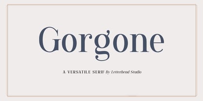 Gorgone, a versatile serif that brings the luxury feel. Gorgone is suitable for headlines, logotypes, apparel, invitations, branding, packaging, advertising and more. This typeface is comes in uppercase, lowercase, punctuations, symbols & numerals, stylistic set alternate, ligatures, and also multi-lingual support and is already PUA encoded.
 - Zephyr by IHOF,
$24.95 Zephyr is a sinuous Roman font available in both Regular and Openface (inline) versions. This classically inspired font set conjures up a gentle, relaxing breeze from the West and Southwest. Subtle and not-so-subtle variations offer a refreshingly modern take on these age-old letterforms.
 - Signage by Fontador,
$36.00 Signage is not made up of grid-based dots. They are optical corrected and there is always the same distance between the dots, with the aim to create more harmonic letterforms. The dots also vary gradually in size to reflect the thickening and thinning of strokes, giving the letterforms a sophisticated overall look. Signage comes up with 3 weights and 3 italics and is perfectly suited for logos, brands, magazines and special for signage systems and mobile devices. The language support includes Western, Central and Eastern European character sets, as well as Baltic and Turkish languages.
 - Hoban by District,
$40.00 The light and the bold. The thick and the thin. Laverne and the Shirley. Peanut Butter and the Jelly. Hoban is about contrast. Hoban wants to be noticed, but only after a second glance. A friend of a friend to the didones, it has smaller, tapering serifs, slightly calligraphic traits, and spindly little terminals that go where they please. It’s a headline face. Period. Set it big and bold. Or light and airy. But preferably next to something with flair. Cuff links, canapés, or corvettes–it’s up to you. Distinct ligatures, ornaments, and swashy alternates provide plenty of character to tailor your style.
 - Aviano Royale by insigne,
$34.99 Aviano returns to lend its classic line to its newest variation, Aviano Royale--named so because of the rich flow the calligraphic capitals give the established font. The extended lowercase characters give an air of formality to the face as well and bestow on the family a deeper sense of wealth and power. This recent development of a timeless font, part of insigne’s annual tradition of adding to the Aviano family, was elected the clear winner in a poll of insigne design’s social media followers. And is it any wonder why? The long-handed elegance of Royale features graceful script capitals as well as widely tracked and smaller titling capitals, all which make Royale ideal in high-end applications and branding where titling with a taste of gentility is required. Royale’s suite boasts a number of OpenType alternates, most importantly of which are the alternate forms for the capitals. Whereas the default forms of the face are regal, it’s flourishes must be activated through the swash set. For a look more restrained, activate the stylistic alternates. It’s like having three different fonts in one! Additionally, there are baseline lowercase forms. The lowercase forms are 20% smaller in height than Aviano’s lowercase forms, so the families are not interchangeable. However, they can still be used well together. The script capitals could also be used separately as drop capitals and nicely complement any of the other 12 Aviano families. It’s time to look beyond common. For the look of refinement you desire, design with Aviano Royale.
 - Poligon by Halbfett,
$30.00 Poligon is a large family of geometric sans serif fonts. It is inspired by classic typefaces from the geometric-sans genre, like Futura and Avant Garde Gothic, whose shapes were constructed from circles and straight lines. Every character has been crafted to give it a distinct and individual feel. The family is an excellent choice for both corporate design and editorial design projects because of its range of weights, as well as its legibility in text. The typeface family ships in two different formats. Depending on your preference, you can install the typeface as two Variable Fonts or use the family’s eight static OpenType font files instead. Those weights run from Thin to Black. While the static-format fonts offer a good intermediary-step selection, users who install the Variable Fonts have vastly greater control over the stroke width in their upright and italic texts. The weight axes in Poligon’s Variable Fonts allow users to differentiate between almost 1,000 possible font weights. That enables you to fine-tune your text’s exact appearance on-screen or in print. But even the static fonts satisfy the need for flexibility, creating harmonious variations of texture and emphasis. Despite their rigid geometry, the fonts have a playful air to them. That playfulness and uniqueness can be dialed up by applying stylistic alternates via the fonts’ four Stylistic Sets. The first of these replaces “G”, “M”, and “&” with alternate, more outgoing shapes. Stylistic Set 2 has an alternate “ß”; Stylistic Set 3 has a “Q” with a longer tail and another “G”. Stylistic Set 3 has alternates for “A”, “K“, “Q”, “R”, “S”, “Y”, and “Z”.
 - TPG Tolle One by Tolstrup Pryds Graphics,
$15.00 TolleOne - a display font family of five weights, named after my wife, whose nickname is Tolle. The “One” indicates that she is number one, of course, but also that this is the first set of fonts I have published.
 - Dutch Mediaeval Book by Canada Type,
$29.95This is the elaborately expanded version of what is arguably the most classic and popular of all historic Dutch faces: Sjoerd Hendrik de Roos's Hollandse Mediaeval from 1912. Over the decades, many pressmen and typography connoisseurs have gushed loving prose about this typeface. An extended family of two weights, corresponding italics, small caps, four condensed fonts, four book fonts, a set of initials and some very Dutch ornaments, Dutch Mediaeval is a versatile workhorse that flows comfortably and artistically, with the elegance of the main weights nicely complemented by the sturdiness of the bolds. Very few text faces are this clean and inviting while being crafty as well. The Dutch Mediaeval family comes with quite a few OpenType features and extended Latin language support. - Dutch Mediaeval by Canada Type,
$29.95This is the elaborately expanded version of what is arguably the most classic and popular of all historic Dutch faces: Sjoerd Hendrik de Roos's Hollandse Mediaeval from 1912. Over the decades, many pressmen and typography connoisseurs have gushed loving prose about this typeface. An extended family of two weights, corresponding italics, small caps, four condensed fonts, four book fonts, a set of initials and some very Dutch ornaments, Dutch Mediaeval is a versatile workhorse that flows comfortably and artistically, with the elegance of the main weights nicely complemented by the sturdiness of the bolds. Very few text faces are this clean and inviting while being crafty as well. The Dutch Mediaeval family comes with quite a few OpenType features and extended Latin language support. - Eckmann by Linotype,
$29.99The font Eckmann is named after its designer, Otto Eckmann, and appeared with the Klingspor font foundry in 1900. The influence of the Jugendstil is clear to see in the flowing floral contours of the letters. This font was made for larger point sizes, like on posters, and while relatively legible, it is not meant for smaller print. The font was often used in book titles and advertisements of the 19th century and today Eckmann is often used to suggest a feeling of nostalgia and is often found on the Jugendstil facades in Germany, Austria and Switzerland. - Rock It by Fenotype,
$29.95 Rock it! is a type family that let's you create instant graphic design for any ROCK, PUNK, HARDCORE, HORROR and so on -gig, poster, logo, and whatever you need. Just type your texts and combine all the tree versions for authentic look! Rock It! includes three ultra condensed sans fonts with different eroded textures and partially different letter shapes. Different versions of Rock It! are set as "Light," "Regular," and "Bold", where Light and Regular have eroded holes in them whereas Bold has "dirty print stains" all over the characters.
 - Inklination by Emtype Foundry,
$69.00 Inklination is a new grotesque that goes against the 'genre rules' and has a low x-height. It breathes quite better than larger x-height typefaces, with the sensation of air and more whitespace. This, combined with long ascenders and descenders, makes it look luxurious, elegant and refined. The family has two sets of italics, a regular one with 10º of inclination, and a more brutalist one with 20º. A monospaced version of five weights complete this versatile family. For more info visit emtype website.
 - Monroe by Latinotype,
$39.00 Monroe was designed in 2010, but in 2013 the font’s designer stopped selling it. Eight years after its initial release, Monroe returns in a new and upgraded version—with improved drawing and spacing—which includes more weights as well as alternate glyphs. Each font style has 819 glyphs and the whole set contains 394 characters which support 207 Latin-based languages. Monroe also includes 5 stylistic sets that offer a wide range of signs, swashes and discretionary ligatures, all specially made to add aesthetic value to your designs. The family comes in 5 weights: Thin, Ultra Light, Light, Regular and Bold. Monroe was designed by Daniel Hernández with the collaboration of Alfonso García.
 - Ricksta by Twinletter,
$17.00 Ricksta is a charming gothic serif font, with a unique sharp touch. If you are looking for an eye-catching and truly powerful look in your various visual branding design projects, then Ricksta is the answer. This font has been created with detail and precision to meet the needs of your branding projects. With families that include regular, shadow, slant, and distort, you have a variety of options to create a look that matches your brand identity. Ricksta also features alternate ligatures and characters, giving you the ability to create truly unique and captivating letter designs. Ricksta also supports multiple languages. That way, you can reach a global audience without limitations. This is your chance to make your brand stand out with a strong character. So, prepare yourself to turn your branding projects into stunning works of typographic art. Get Ricksta now and see how this unique gothic serif look will add a special appeal to your brand and your projects.
 - Asgaard by Vozzy,
$10.00 Introducing a vintage label font named Asgaard. This strong typeface is perfect for lettering on vintage style posters, t-shirts, greeting cards, logos, and more. All capital letters (including multilingual) have alternates. You can see all available characters and styles in the previews.
 - Renaissance Initial by Kaer,
$19.00 This is a new classic Renaissance Initial font. Renaissance Initial font is perfect for premium design labels, medieval print, antique posters, etc. The fonts are presented in usual and color versions. Only uppercase letters from A to Z and numbers set (36 characters)
 - Agarsky by AndrijType,
$45.00 This fat and vivid typeface with broken lines has a great ability for uppercase setting. It was named after the Agara name our small river Berda had when ancient Greeks sailed it. Includes Western, Central European, Baltic Latin and European Cyrillic characters.
 - Agarsky Basic by AndrijType,
$30.00This fat and vivid typeface with broken lines has a great ability for uppercase setting. It was named after the Agara name our small river Berda had when ancient Greeks sailed it. Includes Western, Central European, Baltic Latin and European Cyrillic characters. - Diaper Money by Fonthead Design,
$19.00On October 15, 2006 we became proud parents of three babies. To commemorate (and help pay for diapers) I decided to release this baby-themed dingbat set. All proceeds for the next few years goes to pay for lots and lots of diapers. - Pani Sans by Alessio Laiso Type,
$19.99 Pani Sans is a contemporary type family in 18 styles designed by Alessio Laiso. It takes inspiration from Italian rationalist and art deco typefaces, bringing them into the present with the mix of its reliable geometric structure and distinctive warm personality. The italics add to the unique character of the family by featuring distinguishing calligraphic touches. Pani Sans is fully equipped for intense professional use for both print and digital applications. It supports 219 languages, covering 100% of the Latin Plus character set, and it ships with powerful OpenType features including beautiful small caps, ligatures, stylistic alternates, fractions, tabular figures, old-style figures, and more. The variable fonts included in the family package allow you to pick the perfect weight, for unlimited design freedom.
 - Burford Rustic by Kimmy Design,
$10.00 Burford Rustic is the weathered and textured alternative to the Burford Family. It works the same way as Burford as a layer-based font family, but with some style variations and new layering options. It includes 20 font files, starting with four texture variations from Black, Bold, Light to Ultralight. It also includes and Outline and two Inline Weights. Additionally it offers three line weights (light, medium and bold) for top layering options. There are two extruded fonts and two drop shadow fonts, all either in a solo version and set with Burford Rustic Black for users not using Opentype programs. For users that have Opentype programs, such as Adobe Illustrator, Photoshop, InDesign, Microsoft Publisher and Quark, each font also comes with a set of Stylistic Alternatives for letters A C E F G H P Q R. There are two versions of each letter, and by using contextual alternatives, no two letters next to each other will be the same. Burford Rustic Basic package is created for users who don’t have access to programs with Opentype capabilities and are unable to use the layering effect. Burford Rustic can still be a powerful tool as each font can also be used on it’s own. It includes every font file not needed for the layering effect. The Burford Rustic Ornaments uses all basic keyboard characters - around 100 total elements per set. They are designed to go specifically with Burford Rustic and use the same textured edge. The set includes: banners, borders, corners, arrows, line breaks, catchwords, anchors and many more!
 - Aleesya Rose by Brenners Template,
$19.00 Aleesya Rose is a Stylish Font Family to bring a touch of elegance to any design. The clear contrast blends into all styles - even thin styles - and the strong individuality by weight delights the designer's imagination. 14 styles including 7 weights and italics are essential for designers to complete more detailed and sophisticated typography. This style has 426 glyphs each, check the glyph window in your app. The upright standing of the vertical stems stably supports the center of gravity of the entire font. And the thin strokes used as finishing touches will convey an elegant personality to the layout. The ligatures are designed to appeal to the reader with their beautiful tenderness, and they are: Ba, Be, Ha, He, LO, Le, Lo, Re, Ro, ck, de, do, ee, ff, fi, oo, rr, th. In particular, we recommend that you choose this font family to achieve the following purposes: Editorial design, Personal branding, Branding business, logo design, portfolio, and any special design.
 - Olarwe by Ardyanatypes,
$15.00 A modern and elegant look of a sans serif tagline. This font comes with nine levels of thickness, from light to black, according to your needs. It pairs well with san serif and modern script as pictured or stands alone as a representative header and brand for an elegant look. Olarwe is equipped with a professional modern character font that can present an elegant and attractive identity for your company for business use, such as business cards, name tags, and uniforms as brand elevation. This modern Olarwe typeface is suitable for embossing as letter nameplates or even sprinkling them in your office with elegant-looking cutting stickers. This elegant Olarwe-type shape also looks excellent for book covers or magazine articles. You can see all the available characters in the screenshot above, and you can try the modern & elegant Olarwe now for any design issues. Olarwe is also multilingual, making it easy to work with for any country and language use. It also comes with Ligatures and alternative stylistics to make your designs more attractive.
 - Sweet Gothic by Sweet,
$39.00 Sweet Gothic is a 2009 addition to the Sweet Collection of engraved lettering styles from the 20th Century. Sweet Gothic Light is closely based on lettering from an engravers pattern from the early 1900s that was used for tracing letterforms with the engraving machine (pantograph) to make steel engraving plates. The design is related to many similar engravers gothics developed in the early 1900s, but as each engraving house created by hand their own patterns for popular styles of the time, there is variation among the models. Sweet Gothic offers contrast in stroke weight and its unique personality. The bolder weights are new designs, based on the characteristics of the Light. A serif variant (Sweet Gothic Serif) has also been developed to expand the usefulness of the family, offering an alternative to Copperplate Gothic. As such, most of the fonts are new designs, yet may seem familiar and ubiquitous given their model. The fonts offer two sizes of figures and monetary symbols: one set is intended for use with upper- and lowercase settings; the second set is the same height as the small caps.
 - Sweet Gothic Serif by Sweet,
$39.00Sweet Gothic Serif is a 2009 addition to the Sweet Collection of engraved lettering styles from the 20th Century. It is a serif variant of Sweet Gothic. Sweet Gothic Light (without serifs) is closely based on lettering from an engravers pattern from the early 1900s that was used for tracing letterforms with the engraving machine (pantograph) to make steel engraving plates. The design is related to many similar engravers gothics developed in the early 1900s, but as each engraving house created by hand their own patterns for popular styles of the time, there is variation among the models. Sweet Gothic offers contrast in stroke weight and its unique personality. The bolder weights are new designs, based on the characteristics of the Light. Sweet Gothic Serif has been developed to expand the usefulness of the Sweet Gothics, offering an alternative to Copperplate Gothic. As such, most of the fonts are new designs, yet may seem familiar and ubiquitous given their model. The fonts offer two sizes of figures and monetary symbols: one set is intended for use with upper- and lowercase settings; the second set is the same height as the small caps. - Bali Script by Eclectotype,
$40.00 Inspired by the Indonesian island’s laid back feel and easy going culture, Bali Script is a tribute to the hand-lettered signage on beach bars, surf shacks and cafes. The swell of the stroke endings and the bolder-than-your-average gooey look convey a cool, contemporary take on baseball scripts. Overlay Bali Script Highlight for a cartoonish, glossy finish. Perfect for logos. This font is jam-packed with OpenType features that make smooth flowing text a doddle. Contextual alternates and ligatures are best left on by default. The alternates especially work a subtle magic that helps letters connect with an even rhythm, and automatically substitutes letters with the best fit alternatives based on their context, such as at the end of words, or adjacent to certain other letters. There are four stylistic sets (or all grouped together in the stylistic alternates feature for those without easy access to them) which do the following: SS01 - changes the r to a script form SS02 - makes certain caps more ‘scripty’ SS03 - capital I (and accented versions of it) get serifs SS04 - underline function. typing two or more underscores extends on underline beneath the previous word. Also included for your pleasure - oldstyle figures, automatic fractions, superior and inferior numbers, ordinals, some discretionary ligatures, swash alternates and extended language support.
 - Kegilka by Tony Type Studio,
$17.00 Seeing the characters in rhythm makes the Kegilka font very charismatic, the intersection of curves is so smooth and beautiful that it makes your project look neat and special. Kegilka comes with Alternative and Ligature fonts that add an elegant value to make your project look more charming. kegilka also provides international languages. Kegilka is suitable for use on product brands, covers for print and digital media.
 - Bailamore by 38-lineart,
$19.00 Bailamore is a retro boldscript font. We're pouring the lettering styles into fonts. As much as possible we make this font well integrated with spacing and balance of space. We made 159 ligatures. Activate the ligature mode and you are like being a lettering artist, plus 85 alternates to enrich the feel of lettering. This font consists of 3 fonts, namely regular, outline and shadow. Regular stands alone, while outline and shadow are complementary if you want a 3D extrude impression. Please see the video torial here: https://youtu.be/H71JEgEOows Please try and enjoy the retro bold Bailamore script
 - Delicious Pro by Yes Please,
$45.00 Delicious Pro from Yes Please is a bold, contemporary take on the classic Americana script. Inspired by the vibrant history of early 20th Century American packaging vernaculars, Delicious Pro delivers unique flavor packed with gestural personality perfect for headlines, packaging and more! Delicious Pro features conventional ligatures, a standard set of accents and symbols, and a full set of extended custom styling ligatures to provide a versatile end-user experience. Delicious Pro has played hard for Nike Women's Training, Nike Sportswear, IFC and more. Delicious Pro is designed by Lee Schulz.
 - Steel Grrrder Script by ULGA Type,
$9.00 Steel Grrrder is an industrial-style joining script with a stencil effect, available in six weights ranging from Light to Black. Great for all kinds of display purposes including posters, film titles, book covers, magazines, advertising, signage, packaging, logos and tanks, this is a script with a sharp personality and a steely presence. However, if you’re searching for a “nice” script - sorry, bud - you’re looking in the wrong place. Steel Grrrder Script doesn’t entice the reader with voluptuous curves, flowing swashes or frisky letterforms, instead its sharp chiselled features compel the reader to pay attention. Characters muscle their way along like robotic bulldogs in steel-toe cap boots. Steel Grrrder Script is a veritable slab fest, best categorised as a constructivist joining script. Forged from carbon steel and wrapped in a layer of Graphene, this is a robust display typeface family able to withstand even the most demanding typographical situations. The Steel Grrrrder extended family also includes a six-weight sans-serif with corresponding italics and two display fonts, Groove & Nutjob - all designed to work with each other.
 - Moon Slayer by Letterhend,
$19.00 Moon Slayer is a display brush script font with fun and pop feel. The strokes make this font outstanding and looks great for title. This type of font perfectly made to be applied especially in logo, headline, signage and the other various formal forms such as invitations, labels, logos, magazines, books, greeting / wedding cards, packaging, fashion, make up, stationery, novels, labels or any type of advertising purpose. Features : numbers and punctuation multilingual alternates / swashes and ligatures PUA encoded We highly recommend using a program that supports OpenType features and Glyphs panels like many of Adobe apps and Corel Draw, so you can see and access all Glyph variations.
 - Vendetta by Emigre,
$69.00 The famous roman type cut in Venice by Nicolas Jenson, and used in 1470 for his printing of the tract, De Evangelica Praeparatione, Eusebius, has usually been declared the seminal and definitive representative of a class of types known as Venetian Old Style. The Jenson type is thought to have been the primary model for types that immediately followed. Subsequent 15th-century Venetian Old Style types, cut by other punchcutters in Venice and elsewhere in Italy, are also worthy of study, but have been largely neglected by 20th-century type designers. There were many versions of Venetian Old Style types produced in the final quarter of the quattrocento. The exact number is unknown, but numerous printed examples survive, though the actual types, matrices, and punches are long gone. All these types are not, however, conspicuously Jensonian in character. Each shows a liberal amount of individuality, inconsistency, and eccentricity. My fascination with these historical types began in the 1970s and eventually led to the production of my first text typeface, Iowan Old Style (Bitstream, 1991). Sometime in the early 1990s, I started doodling letters for another Venetian typeface. The letters were pieced together from sections of circles and squares. The n, a standard lowercase control character in a text typeface, came first. Its most unusual feature was its head serif, a bisected quadrant of a circle. My aim was to see if its sharp beak would work with blunt, rectangular, foot serifs. Next, I wanted to see if I could construct a set of capital letters by following a similar design system. Rectangular serifs, or what we today call "slab serifs," were common in early roman printing types, particularly text types cut in Italy before 1500. Slab serifs are evident on both lowercase and uppercase characters in roman types of the Incunabula period, but they are seen mainly at the feet of the lowercase letters. The head serifs on lowercase letters of early roman types were usually angled. They were not arched, like mine. Oddly, there seems to be no actual historical precedent for my approach. Another characteristic of my arched serif is that the side opposite the arch is flat, not concave. Arched, concave serifs were used extensively in early italic types, a genre which first appeared more than a quarter century after roman types. Their forms followed humanistic cursive writing, common in Italy since before movable type was used there. Initially, italic characters were all lowercase, set with upright capitals (a practice I much admire and would like to see revived). Sloped italic capitals were not introduced until the middle of the sixteenth century, and they have very little to do with the evolution of humanist scripts. In contrast to the cursive writing on which italic types were based, formal book hands used by humanist scholars to transcribe classical texts served as a source of inspiration for the lowercase letters of the first roman types cut in Italy. While book hands were not as informal as cursive scripts, they still had features which could be said to be more calligraphic than geometric in detail. Over time, though, the copied vestiges of calligraphy virtually disappeared from roman fonts, and type became more rational. This profound change in the way type developed was also due in part to popular interest in the classical inscriptions of Roman antiquity. Imperial Roman letters, or majuscules, became models for the capital letters in nearly all early roman printing types. So it was, that the first letters in my typeface arose from pondering how shapes of lowercase letters and capital letters relate to one another in terms of classical ideals and geometric proportions, two pinnacles in a range of artistic notions which emerged during the Italian Renaissance. Indeed, such ideas are interesting to explore, but in the field of type design they often lead to dead ends. It is generally acknowledged, for instance, that pure geometry, as a strict approach to type design, has limitations. No roman alphabet, based solely on the circle and square, has ever been ideal for continuous reading. This much, I knew from the start. In the course of developing my typeface for text, innumerable compromises were made. Even though the finished letterforms retain a measure of geometric structure, they were modified again and again to improve their performance en masse. Each modification caused further deviation from my original scheme, and gave every font a slightly different direction. In the lower case letters especially, I made countless variations, and diverged significantly from my original plan. For example, not all the arcs remained radial, and they were designed to vary from font to font. Such variety added to the individuality of each style. The counters of many letters are described by intersecting arcs or angled facets, and the bowls are not round. In the capitals, angular bracketing was used practically everywhere stems and serifs meet, accentuating the terseness of the characters. As a result of all my tinkering, the entire family took on a kind of rich, familiar, coarseness - akin to roman types of the late 1400s. In his book, Printing Types D. B. Updike wrote: "Almost all Italian roman fonts in the last half of the fifteenth century had an air of "security" and generous ease extremely agreeable to the eye. Indeed, there is nothing better than fine Italian roman type in the whole history of typography." It does seem a shame that only in the 20th century have revivals of these beautiful types found acceptance in the English language. For four centuries (circa 1500 - circa 1900) Venetian Old Style faces were definitely not in favor in any living language. Recently, though, reinterpretations of early Italian printing types have been returning with a vengeance. The name Vendetta, which as an Italian sound I like, struck me as being a word that could be taken to signifiy a comeback of types designed in the Venetian style. In closing, I should add that a large measure of Vendetta's overall character comes from a synthesis of ideas, old and new. Hallmarks of roman type design from the Incunabula period are blended with contemporary concerns for the optimal display of letterforms on computer screens. Vendetta is thus not a historical revival. It is instead an indirect but personal digital homage to the roman types of punchcutters whose work was influenced by the example Jenson set in 1470. John Downer.
 - Stay Bright by Ivan Rosenberg,
$12.00 Stay Bright is a modern font duo consisting of a signature style script and elegant serif font. Both fonts includes multilingual support for Western and Central Europe. Is ideal for weddings invitations, baby showers, blog website, instagram, branding, invitations, business cards, and many more. This font also include complete set of alternates and stylistic ends for lowercase characters. Stay Bright Script : It contains one set of opentype stylistic lowercase alternates and one set of opentype stylistic ends. Script version contains 55 LIGATURES. Stay Bright Font Duo contains following characters: AÁĂÂÄÀĀĄÅÃÆBCĆČÇDÐĎĐEÉĚÊËĖÈĒĘFGĢHIÍÎÏÌĪĮJKĶLĹĽĻŁMNŃŇŅŊÑOÓÔÖÒŐŌØÕŒPÞ QRŔŘŖSŚŠŞTŦŤŢUÚÛÜÙŰŪŲŮVWẂŴẄẀXYÝŶŸỲZŹŽŻ aáăâäàāąåãæbcćčçdðďđeéěêëėèēęfgģhiíîïìīįjkķlĺľļłmnńňņŋñoóôöòőōøõœpþqrŕřŗsśšş ßtŧťţuúûüùűūųůvwẃŵẅẁxyýŷÿỳzźžż
 - Defense by Reserves,
$49.00 Defense is an unyielding rectangular slab-serif stencil face designed with consistently balanced letterforms and a refined finish. It’s extremely angular geometric form commands attention in display settings, yet is also legible in short text blocks. The stencil mark width varies accordingly with each weight, helping to further define each style. Numerous alternate character sets allow room for customization, while the expanded ligatures push letter combinations to the limit. Stylistically, Defense’s almost crude, sharp-cornered construction is balanced by it’s sophisticated finish and attention to detail, often unrealized in similar faces of this genre. The upright weights are complimented by pairings of true italics, completely rebuilt, slightly narrower in width with modified letterforms, increasing their contrast and flow. Features include: Precision kerning Standard Ligatures set including 'f' ligatures (fi, fl, ff, fh, fj, ffl, ffi, ffj) Discretionary Ligatures set including (ft, rt, ae, oe, st, ft, ct, oc, oo, ry, AE, OE, AL, TH, HE, AK, AN, TT, HD, AM, AP, AR, NF, NE, NH, NL, NB, FL, ND, FE, AB, OB, OD, OF, OG, OH, OK, OL, OM, ON, OO, OP, OQ, OR, OU, AH, UE, UF, UB, UD, UH, UK, UL, UM, UN, UP, UR, UU, MP, XY, YX, KY, WY, VY, AF, FF, FI) Alternate characters (O, o, S, s, a, h circumflex, @, ®, ™, ¶, $, &, _, and various ligature alternates) Case forms (shifts various punctuation marks up to a position that works better with all-capital sequences) Capital Spacing (globally adjusts inter-glyph spacing for all-capital text) Slashed zero Full set of numerators/denominators Automatic fraction feature (supports any fraction combination) Extended language support (Latin-1 and Latin Extended-A) *Requires an application with OpenType and/or Unicode support.
 - Nafiri by HandletterYean,
$17.00 Every customer loves to see something unique, beautiful, exciting, and elegant, right? Don't be confused to find an interesting font that attracts their attention, we have a special font named Nafiri. Nafiri is a beautiful and attractive font that represents the excitement of Christmas and Winter holiday. Titling, swashes, alternates, & underline of this font makes your design unique and stand out. Nafiri was designed to have a simple look without losing its elegance and uniqueness. This font shows that you have a modern spirit on high-quality products and services. Features of this font give an artistic touch to your work. It is also applicable to any use like business logo, branding, wedding invitation, and anything you want. Check out our font collection for more great and artistic fonts. Pick your most favorite font and use it as you like to reach your goals. What’s included: 1. Nafiri font file 2. This font completed with: standard glyph, stylistic alternate, titling, swash, stylistic set 01-08 3. Works both on Mac & PC 4. Simple installation 5. Accessible in the Adobe Illustrator, Adobe Photoshop, Adobe InDesign, and CorelDraw 6. Support multilingual; ä ö ü Ä Ö Ü ß ¿ ¡ To access the alternate glyphs, you need a program that supports openType features such as Adobe Illustrator CS, Adobe Photoshop CC, Adobe Indesign and CorelDraw. More information about how to access alternate glyphs, check out this link ( goo.gl/ZT7PqK )
 - Fenomen Sans by Signature Type Foundry,
$38.00 Geometrical drawing of Fenomen Sans typeface goes back to the roots of the Bauhaus aesthetics and the entire architectural and design avant-garde of the 20th century. It is still a symbol of functional rationality, clean aesthetics in relation to shape, and of progressive thinking. Its popularity is timeless and permanent. The set contains eight basic alphabets of a square pattern, eight semicondensed, eight condensed and eight extremely condensed alphabets, all in Latin and Cyrillic alphabets. Every font of the family has four types of numerals, small caps and variant letters. The typesetting can fluently use all fonts simultaneously. The typeface originated between the years 2011–2014 and was subjected to a series of tests for the fluent legibility of narrow fonts even in extreme conditions. Narrow fonts provide this set with the maximum use also for newspaper typesetting. The typeface has an elegant, delicate design in thin fonts and sufficient legibility in bold. Mutual contrast produces creative tension. Font name acronyms described: SCN = SemiCondensed CN = Condensed XCN = ExtraCondensed
 - Excelsis by Solotype,
$19.95This font began life as a metal type called Duerer, from the Boston Type Foundry about 1890. A wood type maker copied it, and that's where we got it (in Guadalajara, Mexico, already! Some people travel to see the sights; we travel to collect type.) - ITC Cali by ITC,
$29.99 There are a few professions in which being left-handed confers an advantage-think of the great southpaw pitchers in major league baseball, like Sandy Koufax. Now, think of all the great left-handed calligraphers. Not so easy, right? Here's a hint: Luis Siquot. Far from being an advantage, Siquot's lefty orientation proved a hurdle to overcome. When I was young, I had serious problems writing," he recalls. "If there was a lot of text, I almost always soiled the paper with wet ink as my hand followed the pen." Then, a friend told Siquot about a special store in London that catered to left-handed people. It was there that he found an Osmiroid pen specially designed for left-handed calligraphers. ITC Cali is based on Siquot's use of this pen. "Electronic scans of my calligraphy were the foundation of the design," he says. "I was careful to leave in some imperfections to avoid an excessively mechanical look, and added the little notches in the strokes to imitate the texture of writing on a rough cotton paper." ITC Cali works equally well in text and display sizes, but it is a calligraphic script, Siquot warns, "and shouldn't be set in all capitals." That said, ITC Cali is a remarkably versatile design, well-suited to a variety of communication projects."