10,000 search results
(0.142 seconds)
- FS Ostro by Fontsmith,
$80.00 Cosmopolitan Elegance Named after a southerly wind that blows over the Mediterranean Sea, FS Ostro breathes warmth into letterforms with their roots in colder, stark Modern typefaces. FS Ostro is a typeface imbued with balanced and sophisticated elegance. It’s discerning and sensitive, self-assured but understated. One for the well-travelled reader. Thoughtful contrast FS Ostro draws inspiration from a wide range of sources, such as 19th century British Scotch Roman designs, Italian modern style typefaces and highly contrasted display Spanish examples. Its text version offers a consistent rhythm and robust texture that is easy on the eye. This elegant, cosmopolitan typeface is characterised by its thoughtfully modulated contrasts between thick and thin, sharp angles, and sophisticated curves. Exaggerated touches in display “What is more restrained and sober in text, becomes purposefully prominent and more detailed in display,” says Fontsmith designer Alessia Mazzarella. These exaggerated details for the display version can be seen in the letter terminals, such as those in the ‘a’ and ‘g’ and the tail of the ‘Q’, as well as in the set of numerals, fractions, arrows, borders and ornaments, which can be used to build decorative framing elements. Fluid italics The less rigid and curvaceous italics of modern style typefaces were the inspiration for FS Ostro’s own subtle, flowing italic styles. The letterforms are confident and fluid, creating an overall sense of refinement and modernity.
 - FS Ostro Variable by Fontsmith,
$119.99Cosmopolitan Elegance Named after a southerly wind that blows over the Mediterranean Sea, FS Ostro breathes warmth into letterforms with their roots in colder, stark Modern typefaces. FS Ostro is a typeface imbued with balanced and sophisticated elegance. It’s discerning and sensitive, self-assured but understated. One for the well-travelled reader. Thoughtful contrast FS Ostro draws inspiration from a wide range of sources, such as 19th century British Scotch Roman designs, Italian modern style typefaces and highly contrasted display Spanish examples. Its text version offers a consistent rhythm and robust texture that is easy on the eye. This elegant, cosmopolitan typeface is characterised by its thoughtfully modulated contrasts between thick and thin, sharp angles, and sophisticated curves. Exaggerated touches in display “What is more restrained and sober in text, becomes purposefully prominent and more detailed in display,” says Fontsmith designer Alessia Mazzarella. These exaggerated details for the display version can be seen in the letter terminals, such as those in the ‘a’ and ‘g’ and the tail of the ‘Q’, as well as in the set of numerals, fractions, arrows, borders and ornaments, which can be used to build decorative framing elements. Fluid italics The less rigid and curvaceous italics of modern style typefaces were the inspiration for FS Ostro’s own subtle, flowing italic styles. The letterforms are confident and fluid, creating an overall sense of refinement and modernity. - Bill Corporate Medium by OGJ Type Design,
$35.00 Bill Corporate is a geometric typeface with generous capitals. A modern classic, based on Max Bill’s lettering work, its straightforward and uncompromising construction can be both edgy and sublime. With minimalist letterforms, pointy apexes instead of flat ones, and archetypal proportions, this font family doesn’t follow any trends but strives to achieve a timeless formal vocabulary. The skeleton of its letters is based heavily on the famous primary shapes of the Bauhaus: square, circle, and triangle. This makes for quite wide uppercase and much narrower lowercase letters. The contrast between uppercase and lowercase benefits inexperienced users, who will be able to get appealing results quickly. At the same time, it’s a powerful tool for seasoned designers, who can employ either case selectively to set the desired typographic course. Bill Corporate Medium’s 16 styles (including a set of eight lighter-than-light fonts from “Two” to “ExtraLight”) are an excellent choice for editorial design, branding, headlines, and even short to mid-length copy in a wide range of applications and industries. The uppercase letters in particular—with their varied widths and lavish dimensions—are suitable for cosmopolitan and stylish logotypes and wordmarks. Whenever a timeless, staid, and classy look is demanded, choose Bill Corporate.
 - Poetica by Adobe,
$29.00Poetica font was designed by Robert Slimbach in 1992 with particularly generous characters. The typeface family consists of 21 weights to allow for an unusual variety of design possibilities within one typeface family. Numerous swash letters, ornaments and ligatures remind one of the early Renaissance and its unforgettable masters, for example, Giambattista Palatino, who later gave his name to Hermann Zapf's creation. Slimbach used the Lettera Cancellaresca as a model for his typeface, the cultivated humanistic italic which later served as a point of departure for the development of italics of the Renaissance and thereafter. Lettera Cancellaresca is very legible, extremely harmonic and impressively beautiful. The early forms display two different compositional tendencies, namely the static of the simple vertical capitals and the italic dynamic of the slanted lower case alphabet, as shown in the weight Chancery 4. The capitals later conform to the slant of the lower case, as shown in the weights Chancery 1-3. Poetica font should be set according to the included suggestion in order to see the full benefit of its grace and beauty. - Mrs Eaves XL Serif by Emigre,
$59.00 Originally designed in 1996, Mrs Eaves was Zuzana Licko’s first attempt at the design of a traditional typeface. It was styled after Baskerville, the famous transitional serif typeface designed in 1757 by John Baskerville in Birmingham, England. Mrs Eaves was named after Baskerville’s live in housekeeper, Sarah Eaves, whom he later married. One of Baskerville’s intents was to develop typefaces that pushed the contrast between thick and thin strokes, partially to show off the new printing and paper making techniques of his time. As a result his types were often criticized for being too perfect, stark, and difficult to read. Licko noticed that subsequent interpretations and revivals of Baskerville had continued along the same path of perfection, using as a model the qualities of the lead type itself, not the printed specimens. Upon studying books printed by Baskerville at the Bancroft Library in Berkeley, Licko decided to base her design on the printed samples which were heavier and had more character due to the imprint of lead type into paper and the resulting ink spread. She reduced the contrast while retaining the overall openness and lightness of Baskerville by giving the lower case characters a wider proportion. She then reduced the x-height relative to the cap height to avoid increasing the set width. There is something unique about Mrs Eaves and it’s difficult to define. Its individual characters are at times awkward looking—the W being narrow, the L uncommonly wide, the flare of the strokes leading into the serifs unusually pronounced. Taken individually, at first sight some of the characters don’t seem to fit together. The spacing is generally too loose for large bodies of text, it sort of rambles along. Yet when used in the right circumstance it imparts a very particular feel that sets it clearly apart from many likeminded types. It has an undefined quality that resonates with people. This paradox (imperfect yet pleasing) is perhaps best illustrated by design critic and historian Robin Kinross who has pointed out the limitation of the “loose” spacing that Licko employed, among other things, yet simultaneously designated the Mrs Eaves type specimen with an honorable mention in the 1999 American Center for Design competition. Proof, perhaps, that type is best judged in the context of its usage. Even with all its shortcomings, Mrs Eaves has outsold all Emigre fonts by twofold. On MyFonts, one of the largest on-line type sellers, Mrs Eaves has been among the 20 best selling types for years, listed among such classics as Helvetica, Univers, Bodoni and Franklin Gothic. Due to its commercial and popular success it has come to define the Emigre type foundry. While Licko initially set out to design a traditional text face, we never specified how Mrs Eaves could be best used. Typefaces will find their own way. But if there’s one particular common usage that stands out, it must be literary—Mrs Eaves loves to adorn book covers and relishes short blurbs on the flaps and backs of dust covers. Trips to bookstores are always a treat for us as we find our Mrs Eaves staring out at us from dozens of book covers in the most elegant compositions, each time surprising us with her many talents. And Mrs Eaves feels just as comfortable in a wide variety of other locales such as CD covers (Radiohead’s Hail to the Thief being our favorite), restaurant menus, logos, and poetry books, where it gives elegant presence to short texts. One area where Mrs Eaves seems less comfortable is in the setting of long texts, particularly in environments such as the interiors of books, magazines, and newspapers. It seems to handle long texts well only if there is ample space. A good example is the book /CD/DVD release The Band: A Musical History published by Capitol Records. Here, Mrs Eaves was given appropriate set width and generous line spacing. In such cases its wide proportions provide a luxurious feel which invites reading. Economy of space was not one of the goals behind the original Mrs Eaves design. With the introduction of Mrs Eaves XL, Licko addresses this issue. Since Mrs Eaves is one of our most popular typefaces, it’s not surprising that over the years we've received many suggestions for additions to the family. The predominant top three wishes are: greater space economy; the addition of a bold italic style; and the desire to pair it with a sans design. The XL series answers these requests with a comprehensive set of new fonts including a narrow, and a companion series of Mrs Eaves Sans styles to be released soon. The main distinguishing features of Mrs Eaves XL are its larger x-height with shorter ascenders and descenders and overall tighter spacing. These additional fonts expand the Mrs Eaves family for a larger variety of uses, specifically those requiring space economy. The larger x-height also allows a smaller point size to be used while maintaining readability. Mrs Eaves XL also has a narrow counterpart to the regular, with a set width of about 92 percent which fulfills even more compact uses. At first, this may not seem particularly narrow, but the goal was to provide an alternative to the regular that would work well as a compact text face while maintaining the full characteristics of the regular, rather than an extreme narrow which would be more suitable for headline use. Four years in the making, we're excited to finally let Mrs Eaves XL find its way into the world and see where and how it will pop up next.
 - Herkimer Bunrab NF by Nick's Fonts,
$10.00Eh, what's up, Doc? This cuddly little oddball of a typeface was originally released under the rather unlikely name of Hercules by the Amsterdam Typefoundry in 1926. This face includes OpenType Stylistic Alternates for b, h, h, k and l, which feature very tall ascenders with a "bunny ear" vibe. Both versions include the complete Latin 1252, Central European 1250 and Turkish 1254 character sets, as well as localization for Moldovan and Romanian. - Franklin Gothic Raw by Wiescher Design,
$19.50 When drawing a new font, there is a time when the final form is found – almost – but the curves are not slick and clean yet, that's what I call the "raw" form. Raw – no sweeteners added! In this family I tried to redefine this moment in type development for the eternally beautiful "Franklin Gothic". I call the design "Franklin Gothic Raw", not to be confounded with "rough". The family can be used like any good normal typeface, you hardly see any difference to a conventionally cut "Franklin Gothic" in small sizes. The charm of the design becomes obvious the bigger it becomes, then it enhances your design with its imperfections in the outline. "Franklin Gothic Raw" is therefore an extremely versatile family. I created the cuts, that I considered necessary for the seasoned designer who knows what he's doing. Enjoy!
 - AnoStencil by Alias,
$60.00 Stencil typefaces are popular because they are striking and decorative, and their associations - whether Utility, Travel, Vernacular, etc - are evocative. Anostencil is developed from, but not exactly like, our Ano typeface. Ano’s geometric skeleton, tweaked a bit, allows for a level of abstraction while retaining legibility. Some of Ano’s characters, such as the a, e, f and r, have been amended to make clearer, more graphic shapes when the stencil design has been applied. Different application of the stencil gaps in the letters make functional but decorative and expressive linear forms. This is particularly evident in Anostencil’s extended character set which features codified, semi abstract shapes. So the stencil design in Anostencil has been applied in not necessarily the most logical or immediate way, but in a way that makes each letter a striking and graphic shape.
 - Woodhaven Initials JNL by Jeff Levine,
$29.00 Woodhaven Initials JNL were designed using an outline cast shadow wood type set against a rectangle with horizontal "engraving" lines to add background texture to the initials. An ampersand is on the corresponding keystroke, and a blank rectangle is on the period key.
 - Hacky Sack NF by Nick's Fonts,
$10.00Ross George in his numerous Speedball chapbooks called the pattern for this typeface Stunt Roman. A studious observer may discern that many of the wackier letterforms were tamed to produce the popular font University Roman; however, this version remains unapoligetically true to the original. All versions of this font include the Unicode 1250 Central European character set in addition to the standard Unicode 1252 Latin set. - Balbek by Valentino Vergan,
$16.00 Introducing “Balbek” – A modern “condensed” sans serif ligature typeface. Designed by graphic designer Martin Katibi. The balbek font is an eye catching heavy and condensed sans serif type face. The inspiration for this font were other condensed sans serif such as Gabo Drive and Impact. The Balbek font is great for use on headlines, advertisements, product packaging, newspapers and posters. Balbek fully supports multilingual characters, it also come with a full set of alternative uppercase letters, ligature and small cap. All these features will make your next project standout. The font comes in eight styles, which are Regular, Cut, Outline and Soft. Each of these font styles comes with an oblique version. If you are looking for something modern and eye catching for you next project, Balbek is the font for you. WHAT YOU GET: Balbek Regular.otf Balbek Oblique.otf Balbek Cut.otf Balbek Cut Oblique.otf Balbek Outline.otf Balbek Outline Oblique.otf Balbek Soft.otf Balbek Soft Oblique.otf BALBEK INCLUDES A FULL SET OF: Uppercase and lowercase letters. Numbers. Punctuation. Ligatures. Alternates. Small Caps. Multilingual symbols. Here is a short list of some of the unique ligatures: AB AD Æ AF AH AK AL AM AN AP EH EK EM ET FT HE LH LK LM MB MD ME MM MP NE NN Œ TE TH TT TU THE Th ZH ZK ZM æ ? fj ? ? ft ? œ tt ty We hope you enjoy using the Balbek Font.
 - Publica Play by FaceType,
$- Publica Play is Publica Sans’ and Publica Slab’s playful sister. It comes with loads of subtle open type features, tabular options, rare currencies signs and symbols and arrows – ‘Publica Play’ has everything you need for playful design tasks. Take a close look at our gallery (especially ‘OpenType Features 1–7’) to discover the versatility of Publica Play. Alternates and Stylistic Sets Give your typography a certain spin with the variety of alternate letters provided. Explore the Stylistic Sets provided. Currency You need to set prices in exotic countries? No problem: Publica Play gives you loads of rare currency symbols. Case Sensitive Forms Sometimes you write in all caps and there are some symbols (e.g. brackets) that need some extra treatment to make it look perfect – that’s what case sensitive forms are for. Figures Publica Play provides 6 sets of figures, like lining, tabular, oldstyle, numerators ... Discretionary Ligatures Ligatures can make your logo or headline look spicy. So there are plenty of them.
 - Praha Nouveau by Matt Frost,
$30.00 I found this type specimen on the statue of Jan Hus in Prague’s Old Town Square. The statue was designed in 1903 by Ladislav Saloun, and its writing is the cutest Nouveau font I've ever seen. Filling in the blanks, I realized the need for a standard lower case because the caps are so wild. The result is a very type-able and dynamic Nouveau. I encourage you to mix up your upper and lower cases for curious results. Use the lower case for running type. Go to http://facebook.com/frostfoundry to share this and see more!
 - Camijo by Kavoon,
$15.00 Camijo is a contemporary serif typeface with characteristic and defined features. This font was inspired by the idea of mixing different types of terminals in order to give the font a singular appearance. Its design is composed of diverse styles such as Didone and contemporary faces. Camijo comes with a set of 352 characters. This font was specially designed for branding, advertising, editorial design, and use on Tv and social media.
 - FF Dirty Three by FontFont,
$41.99 British type designer Neville Brody created this display FontFont in 1994. The font is ideally suited for music and nightlife and poster and billboards. FF Dirty Three provides advanced typographical support with features such as ligatures. It comes with proportional lining figures. This FontFont is a member of the FF Dirty super family, which also includes FF Dirty Four, FF Dirty One, FF Dirty Seven, and FF Dirty Six.
 - Graduate by Fontforecast,
$54.00 Graduate Script is a contemporary calligraphic script. With over 825 glyphs Graduate Script can be dressed up or down, to enliven its style. You can add curls to beginning and end of any lowercase letter, or even in between them. Alternates for both upper and lowercase, as well as ligatures for double letters are included too. OpenType features such as five numeral styles, fractions and both standard and discretionary ligatures, make Graduate Script a well equipped font. Graduate Ornaments has over 300 glyphs and expands the design possibilities of Graduate Script even further. It offers additional ornaments and curls to add to lowercase letters, frames, automated borders that can be accessed by the keyboard and a lot more fun glyphs to work with. On top of that there are catchwords in different styles. Not finding the catchword you’re looking for? Just create your own! A full set of capitals, including roman accented caps, currency, numerals and punctuation is part of Graduate Ornaments. Designed to fit the same frames that are being used for the different catchword-styles, so you can easily integrate custom text with the existing catchwords. A detailed user guide is available in the gallery section.
 - Amitale by Hackberry Font Foundry,
$24.95 Amitale (A-mi-tah'-lay) is the union of Amitale Book and Amitale Wide into a new 8-font book family in my continuing objective of designing a better font family for readability in booklets. My goal here is for a full range of styles from light, regular, bold, and black without the plugged counters and clunky feel of most bold fonts. In my use, personally. I do not use Amitale Book Bold. I use Wide for the bold and Wide-Bold for the black style. In many ways, Amitale is Brinar with bracketed serifs. Many people find Brinar to be an exceptionally readable and beautiful humanist sans. This new serif font family has many of the same characteristics. This is also the debut of my new OpenType features set for 2009. There are more and more ligatures for your fun and enjoyment: bb gg ff fi fl ffi ffl ffy fj ft tt ty Wh Th and more. Like all of my fonts, there are: caps, lowercase, small caps, proportional lining figures, proportional oldstyle figures, & small cap figures, plus numerators, denominators, superiors, inferiors, and a complete set of ordinals 1st through infinity.
 - Slightly Hollow - Unknown license

- Monte Carlo Script NF by Nick's Fonts,
$10.00This elegant monoline script is based on a typeface called "Médicis" from a Deberny and Peignot catalog, circa 1920. Graceful but robust, it is equally suited for invitations, announcements and headlines. Both versions of this font contain the Unicode 1252 (Latin) and Unicode 1250 (Central European) character sets, with localization for Romanian and Moldovan. - Malik by Zetafonts,
$39.00 Taking its name from the arabic word for "king", Malik is a flared sans serif typeface family designed in 2020 by Andrea Tartarelli. The designer wanted to find a way to bridge the classical letterforms of Roman Old Style typefaces with the readability of contemporary sans typefaces. This was achieved by using the so-called flared serif that emerges gradually from the stem of the letter, ending in a sharp angle. It's something that also reminds of the peculiar shapes of the Simoncini Method, invented by italian type designer Francesco Simoncini to get a sharper definition of letterforms. To this blend of classical elegance and modernist expertise, Malik adds the calligraphic influence of modern masters like Frederic Goudy or Ed Benguiat, visible in signature details like the reverse contrast uppercase B, or the calligraphic lowercase k. Malik also means "owner", and this font surely wants to rule the page. It manages to be extremely readable when used in body text size, but looks surprising and expressive in display use. The inclusion of the Malik Heavy Display weight, with its black texture balanced by deep inktraps, allows for striking logo design. The weight range of the family is extremely wide, including a Book alternative to the Regular weight for fine-tuning readability, a range of light display weights and a solid choice of bold weights for branding, all coming with matching true italics. The 16 cuts of Malik have been equipped with all the features you need to solve your editorial and design challenges, including a wide language coverage (thanks to over one thousand latin and cyrillic characters) and a complete set of open type features (including small capitals, positional numbers, case sensitive forms). Alternate characters and stylistic sets allow you to fine-tune your editorial and branding design by choosing variant letter shapes. Malik is the typeface for everyone who wants to design like a king...or like he doesn't care who the king is!
 - Roihu by Melvastype,
$32.00 Roihu is a sans serif type family with 16 fonts: eight upright and eight italic weights. Each weight offers more than 1,100 glyphs. Roihu includes some groovy stylistic alternates and swashes that make your titles, packaging, logos, etc. pop out. Roihu also includes small caps, old style and lining figures, and ligatures to make sure your text and designs won't be boring. Download the PDF specimen from the Roihu gallery to see more-specific OpenType instructions and a full glyph set. Opentype features: - small caps - stylistic alternates - swashes - proportional lining figures - proportional old style figures - tabular lining figures - tabular old-style figures - standard ligatures - discretionary ligatures - case-sensitive punctuation - fractions - ordinals - superscript - subscripts - arrows
 - Donatello LP by LetterPerfect,
$39.00 Donatello is a classically proportioned design with subtly tapered strokes, inspired by the lettering on the fifteenth century cantoria by Luca della Robbia in the Museum of the Duomo, in Florence. The design, consisting of caps and small caps, also includes Donatello Alternates -- a compatible set of wider characters. It was designed by Paul Shaw and Garrett Boge in 1997. Donatello is part of the LetterPerfect Florentine Set.
 - MultiType Pixel by Cyanotype,
$- MultiType Pixel, an all caps typeface focused in display purposes. 27 styles to be mixed with retro gaming and computing vibes in a fresh way. This is the first release of an upcoming multiverse of mixable fonts. The whole family of typefaces has been designed to work at big sizes and display purposes such as branding, headlines, thumbnails, posters and animations. You can swap between the three additional alternate sets through all the styles to add diversity to your composition, even in Cyrillic. This version features small caps in a independent font file. MultiType Pixel is inspired by bitmap fonts, fonts from video games, arcades and variable fonts. Have fun mixing all the styles in your projects.
 - Classike by Emtype Foundry,
$69.00 Classike is a high contrast squarish display typeface. Inspired by the Art Déco period from a modern perspective. Refined and elegant yet with a mechanical vibe, it is ideal for pairing with any functional font, it works especially well with Geogrotesque, from which it inherited its proportions and soul. Classike adds an exclusive touch and helps enrich your graphic voice. A Variable Font version is included with the family or as a separate style. Read some thoughts about the design process at the Emtype's blog. For more details see the PDF.
 - Tooting Sans by HamburgerFonts,
$39.95 Tooting Sans is a well-crafted, contemporary humanist sans. Designed for the needs of editorial, advertising and signage, Tooting Sans is not only suitable for setting large amounts of text at small sizes, it also has a presence and robustness for powerful headlines. Tooting Sans has slightly condensed letters with clean lines, open forms and predominantly straight terminals, although some vertical strokes have angled terminals for variation. This helps to keep the flow of the copy alive whilst being economical with space and legible in both text and headline usage. Released as an OpenType font, Tooting Sans expands upon the standard sans serif character set to include Greek and Cyrillic glyphs, small caps, oldstyle figures, proportional figures, ligatures and improved support for Latin-based languages.
 - Gold Fever by FontMesa,
$25.00Gold Fever is a revival of the old classic Caxtonian font originaly designed in the mid to late 1800s. Along with the original engraved shadow version new styles have been created making this decorative font set more complete. The new styles include a solid black, open faced, condensed and fill versions. - Mr Robot by Hipopotam Studio,
$16.00 Mr Robot is a typeface designed for our next book for children. We wanted to have a colorful, dimensional and edgy looking letters for headlines. There are three ways to use Mr Robot. You can align three text frames with same text but with different colors and font styles (Regular, Shadow 1 or Shadow 3 and Shadow 2) or with ALLinONE font style but select a different OpenType Stylistic Sets (set 1 is like Shadow 1, set 2 like Shadow 2 and set 3 like Shadow 3). This works great but we don’t like to have unnecessary text frames in our layouts so we added a very cool Contextual Alternates OpenType feature. You just need Mr Robot ALLinONE style and only one text frame. First make sure that Contextual Alternates is off. Type every character three times (RRROOOBBBOOOTTT), select colors for each letter (first letter of every three is a side shadow, second is bottom shadow and third is a front of the dimensional letter). When everything is set just turn Contextual Alternates back on. Styles and alignment will be set automatically. Check out the Users Manual for a visual explanation. For web fonts it is better (at least for now) to use the first method (with font styles) as the OpenType features are not supported in older browsers.
 - Carllosta by Letterhend,
$17.00 Introducing, Carllosta, a Victorian style font. Carllosta is a layered typeface which is inspired by vintage lettering sign and art. While this font has a victorian touch, it still looks bold and solid. Very suitable for for headline, logotype, apparel, invitation, branding, packaging, advertising etc. This typeface contains with beautiful decorative ornaments that ready to use to create a vintage lettering in sec. It also comes in uppercase, lowercase, punctuations, symbols & numerals, stylistic set alternate, ligatures, etc also support multilingual and already PUA encoded.
 - Module by Sébastien Truchet,
$40.00 Sébastien Truchet designed a modular typographic system during his last year in the School of Fine Arts of Besançon. The system is made of a unique grid and 6 modules which are the components to build several typefaces. The most radical is the "2-2". The last one is the "10-12".This is the "2-3". The goal is to use a grid made of 2 modules in width and three in height. This version is the most pertinent minimalist typeface which keeps plasticity and legibility. There is a character set of capitals tied to the origin of the project
 - Gamesome by Mevstory Studio,
$20.00 Gamesome is SPORTY, FUTURISTIC, and SHARP font. It will make your design looks sporty and also futuristic design. Gamesome Really fit for retro, futuristic, automotive, and gaming themed designs. Just look how it performs on the preview that I have provided, you will see its capabilities. But it will also work well with other themes. I can’t wait to see what you guys will come up with with using this font!
 - Adelphi PE by Rosetta,
$70.00 Adelphi is a geometric sans, redefined for the northern side of the English Channel. Typographic modernism was a late arrival in Britain — due partly to the Second World War and to the strong local type tradition. This delay provided for fruitful divergence, thus modernism was not adored in quite the same way as it had been in Germany and central Europe. It was instead rethought and repurposed against the backdrop of the bleak British weather and postwar social reform – a continental fashion statement reshaped into a more humanist variant. Likewise, when crafting Adelphi, Nick Job reimagined the constraints that defined the geometric sans as a genre. Whereas other typefaces seem overly bound by the rules, Adelphi feels relaxed and approachable. Elementary square and circular shapes are merely implied. A keen observer may notice that the uncomplicated letterforms occasionally reveal a subtle naïveté associated with early Grotesques. Brunel’s bridges and Harry Beck’s tube map spring to mind alongside the Bauhaus and Futura. But Adelphi is by no means nostalgic! It is a contemporary, comprehensive, and durable system with a pragmatic set of features. These include a wide array of weights, ‘uniwidth italics’, and variable extenders that go from tall and flat in Adelphi Text to short and sharp in Adelphi Display, with default Adelphi standing midway between these two extremes. You can set the extenders to your preference in the all-inclusive variable font or use one of the three static fonts that come packed together, priced as a single font. The pan-European support for Latin, Cyrillic and Greek scripts already makes for a vast character set, but Adelphi takes things a step further by including alternate glyphs to satisfy the DIN1450 legibility norm, a range of ordinals that can be used to create specialist compositions in all three scripts and two kinds of fractions and arrows. Play with the alternates or use it as-is. Either way, this understated beauty will carry you through.
 - Buddy by Hackberry Font Foundry,
$24.95 Buddy is the new companion sans for Contenu, the book font family designed for my book on font design design. Originally, I called it Compagnon, but that seemed to pompous. Then I called it Aide, but that was too formal and dry. It's a loose, free, easy to read sans, so when my wife suggested Buddy, it clicked. This is the 4-font Buddy family of Regular, Italic, Bold, & Bold Italic. I made a new, more limited feature set for these fonts due to their designed usage, but there are still small caps, small cap figures, oldstyle figures, numerators, and denominators. The bold is closer to a black, and the italics are only slightly slanted obliques. If you need a strong black in caps, use the small caps of the bold.
 - Glembo by Differentialtype,
$10.00 Glembo is a bold sans display font. This font has six styles that you can combine. Whatever the topic, this font will be a great asset to your font library, as it has the potential to enhance any creation.
 - Tangelo by Laura Worthington,
$25.00 Tangelo is a fun, casual display script that could be more accurately termed a unicase – it borrows characters liberally from the lower case, but scales them up to cap-size. Tangelo is ideal for kid-friendly products like candy packaging, game boards or apps, and clothing labels. It includes 115 alternates and swash characters for a convincingly hand-lettered look. See what’s included! http://bit.ly/2lW33tt These fonts have been specially coded for access of all the swashes, alternates and ornaments without the need for professional design software! Info and instructions here: http://lauraworthingtontype.com/faqs/
 - Pronk Family by wearecolt,
$9.00 Pronk - move forward by leaps and bounds This family includes Clean, Rough and Outline - You're welcome! This is an all caps, tall, bold and round sans serif display font designed for retro-modern designs. This font is perfect for your next logo design or magazine titles. Taking inspiration from many tall fonts and American number plates I created a display font that would be my 'go-to' for a neat tall, bold font. I also wanted something which would take a good amount of treatment like stamp effects and grunge. Pronk works brilliantly as a pegboard font and for neon lettering. Pronk pairs perfectly with Stroom and Gill Sans. I really hope you enjoy this font, please don't hesitate to drop me a message if you have any questions. Features: - Uppercase letters - Numerals
 - Holy Mordigan by BlackLotus,
$10.00 Holy Mordigan is a modern script font that is inspired by luxury. Holy Mordigan font makes every design created has an elegant aura. so it has its own value for everyone who sees it. Holy Mordigan also has a variety of alternate options that can be used. What's included in this font pack : -- LARGE GLYPH SETS : There are 409 total glyphs in this font pack. Holy Mordigan comes with a large range of glyphs including punctuation, numerals, international language support, ligatures & additional extra glyphs for stylistic sets. It includes 182 Glyphs of Stylistic Sets to make your text looks natural and beautiful. -- NO SPECIAL SOFTWARE REQUIRED -- INTERNATIONAL LANGUAGE SUPPORT : This font supports English, French, Italian, Spanish, Portuguese, German, Swedish, Norweigen, Danish, Dutch, Finnish, Indonesian, Malay.
 - Slam Bang Theater NF by Nick's Fonts,
$10.00This ultrabold headline font is basically patterned after the font Nubian Black, designed by Willard T. Sniffin for American Type Founders in the 1920s, but includes an unusual inline treatment of the caps. Named for the local television show on KFJZ-TV (later KTVT) in Fort Worth, Texas, that introduced a whole new generation of kids to the Three Stooges, and hosted by the erstwhile Icky Twerp. Both versions of this font contain the Unicode 1252 (Latin) and Unicode 1250 (Central European) character sets, with localization for Romanian and Moldovan. - Odisseia by Plau,
$20.00 Odisseia: Monospaced Typeface Made on Earth by Plau. Plau presents Odisseia, a monospace type family in 8 styles designed with simplicity of shapes and a humanist touch. We’ve ventured into monospace territory, where all letters must occupy the same amount of space. This style is usually associated with typewriters and computer terminal fonts. Like all monospaced fonts, every letter align vertically in a multi-line setting. The rhythm created is peculiar, since large letters such as m and w occupy the same space as narrow ones like i. Because we have 4 different weights: light, regular, bold and black the design of some characters have to be adapted to fit the same width and achieve a constant light/dark value throughout. These features make Odisseia suitable for a specific yet considerable range of uses, from computer coding to systemized communication such as brand identities. This style has been used from high-end brand identity to cutting edge digital applications. Odisseia sets a little shorter in comparison with other monospaced fonts, and bears a large x-height.
 - Ganiser by Letterhend,
$17.00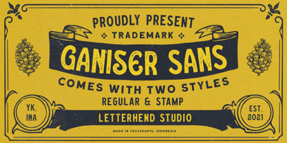 Ganiser Sans is a vintage display typeface with the touch of nostalgic feel. This typeface has unique looks and strong character. This font perfectly made to be applied especially in logo, and the other various formal forms such as invitations, labels, magazines, books, greeting / wedding cards, packaging, fashion, make up, stationery, novels, labels or any type of advertising purpose. Features : Uppercase & lowercase (alternates) Numbers and punctuation Stylistic alternates multilingual PUA encoded We highly recommend using a program that supports OpenType features and Glyphs panels like many of Adobe apps and Corel Draw, so you can see and access all Glyph variations.
 - Rikkia by Matt Chansky,
$21.00 Rikkia is synonymous with glamour and innovation and has an immediate high-end look that is both timeless and universally appealing. The font family is distinguished by modern ovals and subtle architectural angles. Stylish and versatile, Rikkia comes in wide and standard widths – from hair to bold. The font also has an alt character set for key glyphs like "a" and "R." You'll find a professional set of ligatures, multilingual options, fractions, and a the estimated symbol. Cosmetics, AI, engineering, healthcare, sports, editorial – and all points in between, Rikkia has you covered for a variety of layout needs. Clean, distinctive, memorable, and easily readable — an ideal choice for both print and screens.
