10,000 search results
(0.136 seconds)
- Lingua by JOEBOB graphics,
$30.00 Lingua is the unlikely offspring of our CAPUT font. Wondering what the undercast characters of this font would look like, I started writing. I was pleased with the first results and this encouraged me to pursue the process. The final font still has some slight resemblance to its predecessor, but stands completely on its own. This bold, sturdy typeface is very suitable for headers, posters and other designs where large sizes are needed. It comes with both a western and a cyrillic character set.
 - Kingstown NF by Nick's Fonts,
$10.00A simple, elegant semiscript…enough said. All versions of this font include the Unicode 1250 Central European character set in addition to the standard Unicode 1252 Latin set. - Itacolomi by Eller Type,
$35.00 Itacolomi is a font family conceived for editorial purposes. Based on historical models, it is well placed in the present time, turning classic proportions into contemporary letter shapes. It is robust and clean in small sizes, keeping the consistency in both print and digital environments. Itacolomi is a result of an extensive investigation into Scottish style types produced in Brazil around 1820. A possible connection between Brazil and Scotland. In short, it preserves the qualities of the famous 19th-century Scotch Roman types while adding a personal approach with unique features from the early Brazilian models. It has six weights, romans plus respective italics, which makes twelve fonts with an extensive character set that supports over two hundred languages and includes small caps, ligatures, old-style and tabular numerals.
 - ITC Stepp by ITC,
$29.99When Hal Taylor saw the 1930 logo for the Stetson Shoe Company of Weymouth, Massachusetts, he didn't run out and buy a pair of loafers. Instead, he seized on this striking example of an Art Deco logotype as the basis for a new typeface design. “I was impressed with the delicate and sophisticated letter forms,” Taylor recalls, “particularly the enlarged cap S -- in any other case it would have seemed unbalanced, but in the context of this logo, it worked perfectly.” All the letters in the original all-caps Stetson Shoe logo were rendered with condensed proportions except the O, which was a perfect circle. While the prominent O added visual interest to the logo, Taylor knew that such a character would limit his typeface to display applications. For versatility's sake, he drew his O for ITC Stepp with the same proportions as the rest of the alphabet. Taylor also gave the logotype's inverted S a more traditional design, but kept the original as an alternate character in the OpenType font. Taylor's toughest challenge during the design process was creating a lowercase. “A good type design tells you what it wants to be,” he says, “and after a little while the Stepp caps began to tell me what the lowercase should look like.” Taylor's lowercase is slightly more conventional than the caps. The jaunty g" and almost upside-down "s" add subtle charm, while the capital letters provide the broader gestures of Stepp's personality. Together, they create a versatile and distinctive typeface design. One of Hal Taylor's first jobs was as a photo-lettering typographer in Philadelphia, setting headlines and creating custom lettering. This was followed by a stint doing finished lettering for John Langdon, whose ambigrams appear in Dan Brown's best-selling novel, Angels & Demons. Today, Taylor works as a graphic designer in the publishing industry, but he still finds time to create an occasional hand-lettered book jacket, and draw handsome typeface designs. ITC Stepp is available in four weights, ranging from Light to Ultra Bold. All four weights have companion italics, and the lightest three weights also offer a suite of small caps." - Matthews Modern Stencil NF by Nick's Fonts,
$10.00Bold geometric shapes, softened with graceful finishes, characterize this jazz-age offering first proposed by lettering artist Eric Matthews. Best used as upper- and lowercase. Both versions of this font contain the Unicode 1252 Latin and Unicode 1250 Central European character sets, with localization for Romanian and Moldovan. - Departura by Nasir Udin,
$20.00 Departura is a sans-serif family inspired by art deco travel posters in early 20th century, fused with modern & geometric touch. It comes in 18 styles, 9 weights and its matching italics. With those style variatons, Departura offers many possibilities to be applied in many graphic or editorial projects.The modernized retro-look makes this family great to presents any contents related to travel, history & culture in the present/modern way. Also thanks to the extended latin character set so that Departura supports 200+ latin-based languages plus Cyrillic (including the Bulgarian and Serbian characters). P.s.: The Bold Italic & ExtraLight styles are free to download, so you can use them for any projects free of charge.
 - Deluge by Letterhend,
$19.00 Introducing, Deluge- Handwritten Script Typeface. The natural hand writing feel make this font makes it stands out. This font perfectly made to be applied especially in logo, and the other various formal forms such as invitations, labels, logos, magazines, books, greeting / wedding cards, packaging, fashion, make up, stationery, novels, labels or any type of advertising purpose. Features : uppercase & lowercase numbers and punctuation multilingual ligatures alternates PUA encoded We highly recommend using a program that supports OpenType features and Glyphs panels like many of Adobe apps and Corel Draw, so you can see and access all Glyph variations. How to access opentype feature : letterhend.com/tutorials/using-opentype-feature-in-any-software/ Email us to letterhend@gmail.com if you need something! Happy Designing!
 - AS Noqta by Sallam Type,
$25.00 AS Noqta Font is a modern Arabic typeface designed by Ahmed Salllam. The design is inspired by the circle style contemporary tastes with wide open counters and short ascenders and descenders that minimize the hight. And has a high - contrast between the vertical and the horizontal to line up in harmony with Latin. and ligatures set. This makes it suitable for branding, editorial, packaging and advertising. AS Noqta Font consists of 7-weight versions from thin to Heavy.
 - York Village by Letterhend,
$19.00 York Village is a stylish retro font with swashes. The stylistic alternates and ligatures make this font event more unique and stands from the crowd, with 70s vibe. This font perfectly made to be applied especially in logo, and the other various formal forms such as invitations, labels, logos, magazines, books, greeting / wedding cards, packaging, fashion, make up, stationery, novels, labels or any type of advertising purpose. Features : uppercase & lowercase numbers and punctuation multilingual alternates, swashes & ligatures PUA encoded We highly recommend using a program that supports OpenType features and Glyphs panels like many of Adobe apps and Corel Draw, so you can see and access all Glyph variations.
 - Bright Gesture by Letterhend,
$19.00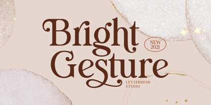 Introducing, Bright Gesture - A Modern serif font with swashes. The stylistic alternates and ligatures make this font event more unique and stands from the crowd. This font perfectly made to be applied especially in logo, and the other various formal forms such as invitations, labels, logos, magazines, books, greeting / wedding cards, packaging, fashion, make up, stationery, novels, labels or any type of advertising purpose. Features : uppercase & lowercase numbers and punctuation multilingual alternates, swashes & ligatures PUA encoded We highly recommend using a program that supports OpenType features and Glyphs panels like many of Adobe apps and Corel Draw, so you can see and access all Glyph variations.
 - Ground Castle by Letterhend,
$19.00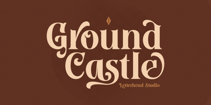 Introducing, Ground Castle - A Modern high contrast serif font with swashes. The stylistic alternates and ligatures make this font event more unique and stands from the crowd. This font perfectly made to be applied especially in logo, and the other various formal forms such as invitations, labels, logos, magazines, books, greeting / wedding cards, packaging, fashion, make up, stationery, novels, labels or any type of advertising purpose. Features : uppercase & lowercase numbers and punctuation multilingual alternates, swashes & ligatures PUA encoded We highly recommend using a program that supports OpenType features and Glyphs panels like many of Adobe apps and Corel Draw, so you can see and access all Glyph variations.
 - Candleton by Letterhend,
$19.00 Introducing, Candleton - A classic sans serif with swashes. The stylistic alternates and ligatures make this font event more unique and stands from the crowd. This font perfectly made to be applied especially in logo, and the other various formal forms such as invitations, labels, logos, magazines, books, greeting / wedding cards, packaging, fashion, make up, stationery, novels, labels or any type of advertising purpose. Features : uppercase & lowercase numbers and punctuation multilingual alternates, swashes & ligatures PUA encoded We highly recommend using a program that supports OpenType features and Glyphs panels like many of Adobe apps and Corel Draw, so you can see and access all Glyph variations.
 - Vindale by Letterhend,
$19.00 Introducing, The Vindale - a vintage script with reverse contrast and a touch of nostalgic look. The unusual reverse contrast make this typeface one of a kind. This type of font perfectly made to be applied especially in logo, and the other various formal forms such as invitations, labels, logos, magazines, books, greeting / wedding cards, packaging, fashion, make up, stationery, novels, labels or any type of advertising purpose. Features : uppercase & lowercase numbers and punctuation multilingual alternates and ligatures PUA encoded We highly recommend using a program that supports OpenType features and Glyphs panels like many of Adobe apps and Corel Draw, so you can see and access all Glyph variations.
 - Sensual Initials JNL by Jeff Levine,
$29.00Sensual Initials JNL is a revamped and cleaned-up version of an old freeware font by Jeff Levine. Redrawn, and now utilizing the typeface French Art Initials JNL - Barricada by Sudtipos,
$49.00 Barricada is a loud-voiced typeface with small counters that gives an interesting strong weight. Moreover, it has a solid structure providing strength. Its curved serifs and swashes give a touch of softness and make the letters a little playful. This is the right option to set a fresh and solid text.
 - Templit JNL by Jeff Levine,
$29.00Templit JNL is one of a number of fonts modeled from actual lettering stencils by Jeff Levine. This one takes its style from a set of individual letters and numbers used for marking and identifying objects. Some of the letters and numbers have solid shapes rather than traditional stencil breaks in the characters. - Mighty Ditey NF by Nick's Fonts,
$10.00A delightfully different typeface named Aphrodite, designed by Richard Nebiolo for Photolettering in the 1970s, provided the pattern for this svelte beauty. Graceful and elegant, it's the perfect choice for tasteful yet commanding headlines. The PC Postscript, Truetype and Opentype versions contain the complete Latin language character set (Unicode 1252) plus support for Central European (Unicode 1250) languages as well. - Silk Script by Canada Type,
$29.95Silk Script is a revival and elaborate expansion of a 1956 Helmut Matheis script called Primadonna, which strangely remained a metal face and never made the leap into the film age. Silk Script has the unmistakable high contrast and elegance of formal scripts, yet both its majuscules and minuscules show much more complex and visually appealing art than traditional copperplate or Spencerian calligraphy. When set properly, it adds just the needed extra touch of artistic flair to designs that are not visually satisfying with the usual high-contrast elegant scripts. Silk Script comes in two styles, with the Alt font containing form variations on almost every letter, allowing for flexibility and precision in choice typesetting. Plenty of more alternates are available throughout the character sets of both fonts. Both styles also boast expanded character sets that include support for Central and Eastern European languages, as well as Baltic, Celtic, Esperanto, Maltese and Turkish. Silk Script Pro unifies both styles in one font, for 550 characters of sheer elegance and handy OpenType features including stylistic alternates, discretionary ligatures and class-based kerning. - Royalana by Kufic Studio,
$15.00 Royalana is a modern royal font with a minimalist factor. A complete font set containing all the important glyphs. Royalana has been inspired by the very minimalist and compact designs in trend to deliver a new look and yet keeping the professional outlook of any design or print. Royalana font set includes; Royalana Light, Royalana Light Italic, Royalana Regular, Royalana Italic, Royalana Bold, Royalana Bold Italic, Royalana Extra Bold & Royalana Extra Bold Italic. Kufic Studio is a platform that provides professional and high-quality designs & fonts to fill the gap that has been missing in the market.
 - Salty by Fenotype,
$40.00 Salty - not fat just big boned. Salty is a hearty brush family that’s great for any kind of display use from packaging to poster & logos to headlines. Salty has bold and clear basic letterforms and lots of alternates for more customised look. Salty family consists of Script, Caps and Extras and two weights of each. Salty script is equipped with plenty of OpenType features: Keep Automatic Ligatures on to keep the flow and click Swash, Stylistic or Titling Alternates for extra goodies or manually select from even more alternates from Glyph Palette. Salty Caps is a vivid set of casual caps that play well with the script but can also be used on their own. Salty Extras is a set of ornaments and swashes designed to support the script. Some of the Extras are designed so that they can be used to customise the letters - to create your own Alternates.
 - Pluto by HVD Fonts,
$40.00 Pluto - and its straight companion Pluto Sans - was designed by Hannes von Döhren. The whole family consists of 16 Pluto Uprights, 16 Pluto Italics, 16 Pluto Sans Uprights and 16 Pluto Sans Italics; 64 fonts in all. Type designer Hannes von Döhren has created Pluto, a sweet type family consisting of 16 Uprights and 16 Italics; 32 fonts in all. The fonts are informal and friendly at first sight and lend themselves to display settings, however the straight and upright architecture of Pluto also makes it perfect for longer copy. Because of its large x-height, it even performs nicely in very small sizes. This contemporary type family is ideal for use in retail, cosmetics, food and hospitality applications and advertising. Pluto is equipped for complex, professional typography. The OpenType fonts have an extended character set to support Central and Eastern European as well as Western European languages. Each font includes alternate letters, fractions, lining-, tabular numbers, scientific superior/inferior figures and a set of arrows.
 - Nautica Line by Resistenza,
$39.00 Nautica Line is a new version of Nautica font. This fonts family contains 10 fonts, made by different weight of lines. The Features of this fonts are: Contextual Alternates, Standart ligatures, Stylistic Alternates and Stylistic sets.
 - Evoque Text by Monotype,
$40.00 Evoque Text is a humanist serif type family specifically designed for a comfortable reading experience. This has been achieved by optically adjusting the regular weights from my original Evoque family (released November 2021). You will notice a significantly reduced x-height and longer ascenders and descenders, complemented by adjustments to weight and spacing. This makes Evoque Text a perfect choice for any long passages of text. All OpenType features have been retained from Evoque. A plethora of swash alternates and discretionary ligatures enhance Evoque Text, giving you the opportunity to embellish your typography. Simply activate Stylistic Sets to start adding these flourishes to your text. Other useful features include Small Caps at the click of a button, and Old Style Figures are an option to the default proportional figure style. There are 14 fonts altogether over 7 weights in roman and italic, you can also avail of two variable fonts which allow you to fine tune the weight to your exact liking. Evoque Text has an extensive character set (900+ glyphs) that covers every Latin European language. Key features: 7 weights in both roman and italic 80 Alternates 26 Ligatures Small Caps Variable fonts included with full family Full European character set (Latin only) 900+ glyphs per font.
 - Klatter by Scholtz Fonts,
$19.00Klatter is a font that is "in your face". It can't be ignored, and draws attention to itself no matter how noisy the environment. It is available in three styles: - Klatter Regular is a clean, spunky, non-grunge font that uses a combination of straight lines and sharp angles to make a strong, no-nonsense statement; - Klatter SmallCaps, in which the lower case is a true "small caps" and not a shrunken version of the upper case (generated by the operating system); - Klatter Grunge is based on Klatter Regular but is "dirty" and messy, giving the impression of printing problems and wet ink being smudged. Unlike many other grunge fonts, Klatter Grunge is a font that is full of character. Both styles have a full character set with upper and lower case, numerals and mathematical symbols, as well as a full set of accented and special characters. The font has been carefully letter-spaced and kerned and the vertical spacing has been appropriately set. Klatter Grunge and Regular are appropriately purchased together since they complement one another when used in the same graphic design job. - 1509 Leyden by GLC,
$49.00 This script font was inspired by the type used in Leyden by Jan Seversz to print Breviores elegantioresque epistolae [...], author Francesco Filfelo, circa 1509. The original font contains all lower case characters, except w, eth, thorn, lslash, oslash and so... and almost upper case. In addition, one set of small lombardic initials were also nearly complete. It take place instead of the Bold style (in only one package)offering a real and rare complete historical printing set... The original small "a" hight was 2,8 mm !, the upper case hight no more than nearly 5 mm, the initials hight almost 15 mm, covering nearly two lines. This font includes "long s", naturally, as typically medieval and also a few ligatures, but not any variants. We have entirely recreated some characters, upper, lower and initials, to fill gaps. It is used as variously as web-site titles, posters and fliers design, publishing texts looking like ancient ones, or greeting cards, all various sorts of presentations, menus, certificates, as a very decorative, elegant and unusual font, besides its historical scrupulous reality... This font supports enlargement as well as small size.
 - Lehmann Egyptian by ParaType,
$30.00 Lehmann Egyptian is a font of three styles, based on the pre-revolutionary hand set fonts by Berthold and Lehmann type foundries in St. Petersburg. Designed mainly for display typography, the font works well in small texts too. There's also a quite useful bonus — a stylistic set of historical forms. Lehmann Egyptian was designed by Albert Kapitonov in cooperation with Dmitry Kirsanov and released by ParaType in 2018.
 - Akceler by Adtypo,
$45.00 Many sport publications missed typefaces designed especially for sport communication conditions. We usually see only mechanically slanted or other synthetically destroyed standard typefaces. I want to fill in this space and create a system of fonts, that will be used primarily in sport. It is usable for many prints - logotypes, magazines, catalogues, posters etc. Elasticity of glyphs reflected an adrenalinous shapes of latest bikeframes, skies or sportcars. Maximum open arches guaranteed good readability in very small sizes and prevented interchanges of glyphs „o, c, e“ per poor reading conditions. Softness of lowercase is at uppercase balanced in bottom arches, that are subtly kicked-up. Numerals are an important component of sport communication, so this font offers expressive design, different from numerals of book typefaces. Every font has 9 kinds of numerals. Character case contains over 1000 glyphs, sport icons and othes signs creating the sport feeling. The font name, Akceler, represents acceleration, which is characteristic attribute of this typeface. It’s suitable for display and text usage, too. To see more please visit the PDF specimen. ■24 styles (2 alternatives, 3 grades of dynamics, 4 weights) ■over 1 000 glyphs per font ■9 kinds of numerals ■icons of sport equipment ■8 stylistic sets ■8 kinds of arrows ■23 OT features ■support of latin languages
 - Marian Churchland by Comicraft,
$39.00 Tall, thin and elegant, Marian Churchland’s fonts are very much like her.. and now available from those awfully nice chaps at Comicraft to allow you to pretend that you are too! Marian Churchland was born in Canada in 1982, and was raised on a strict diet of fine literature and epic fantasy video games. She has a BA in Interdisciplinary Studies (English Literature and Visual Arts) from the University of British Columbia, and has been doing professional illustration work, including book covers and magazine articles, since she was 17. Last year, she became the first woman to solo-illustrate a CONAN story, and this year she’s illustrating three issues of ELEPHANTMEN for Image Comics. See the families related to Marian Churchland: Marian Churchland Journal.
 - Whisky by Corradine Fonts,
$24.95 Whisky is a blackletter font family with a casual touch that makes it look friendly and current. The stroke varies its thickness and angle endings making it form very dynamic bodies of text. The family includes seven weights, each with a fill and a inline version that allow you to develope more colorful applications overlaping them as layers. Also by using Open Type features you can access to an extended set of characters wich contains swashes and alternative endings to make more playful compositions.
 - P22 DeStijl by P22 Type Foundry,
$24.95The Dutch De Stijl movement (1917-1931) sought to create an art which took abstraction to its logical extreme, as exhibited in the paintings of Piet Mondrian. Inspired by the movement's philosophy of pure form, P22's De Stijl set features three rigid, balanced, and angular fonts and a set of geometric extras. - Felipe by Sudtipos,
$49.00 As a follow-up to his popular Chocolate font, Angel Koziupa softens his brush again to produce Felipe, a font made in the memory of his brother. As packaging-friendly and versatile as any Koziupa font, Felipe contains fresh perspectives on old characters. Some of the majuscules and figures show characteristics normally reserved for minuscules. The overall color of the font is somewhat bittersweet, which adds to its ability to capture the attention in display settings. Felipe is ideal for packaging, signs, culinary-related designs, and posters.
 - Headlines Core Edition by TypeThis!Studio,
$45.00Headlines font family was designed for optimised headline settings. The condensed letters are designed for clear and straight headlines and also allow longer words and headlines to find the space they need for a well-composed headline. Typeface Features 265 Characters 8 Styles, including Italics Western European Language Support Numbers Symbols Punctuation www.typethis.studio Thank you for checking out Headlines Font Family. If you have any questions, please send an email to hello@typethis.studio - Abril by TypeTogether,
$39.00 Conceived specifically for intensive editorial use, whether it is in newspapers, magazines or digital media, Abril is a font family of two worlds. The titling weights, based on a contemporary revamp of classic Didone styles, display both neutrality and strong presence on the page, attracting the reader’s attention with measured tension in its curves, good color and high contrast. It also features typographic niceties such as ornaments, borders, special dingbats and alternate letters and numbers that propose a broad palette of tools to the designer. The text weights are more closely inspired by both, 19th century slab serifs and scotch roman types. They maintain consistency with the headline styles, and at first glance may appear to have the same shapes only with lower contrast. However, in reality the letter forms of Abril Text were engineered from scratch to achieve a color, texture and overall width that allow using the font comfortably in the most challenging environments for continuous reading, such as newspapers. This also makes it a great font family for pocketbooks and magazines. Abril competes, in terms of economy of space, head to head with some newspaper classics such as Utopia or Nimrod, but featuring a more contemporary look and feel; and unlike them, includes a full set of small caps with numbers and punctuation. The four main text weights of Abril Text were also manually hinted which grants the possibility of a smooth transition from printed media to web platform. Abril consists of 8 text styles and 12 display styles, all of them containing the standard TypeTogether character set that supports over 50 languages including those from Central and Northern Europe.
 - Sweet Tooth by Almazova Dolzhenko,
$15.00 I am happy to introduce my new handwritten script font Sweet Tooth. This font is bouncy and cheerful. It will look perfect for branding, package and menu design. Hand-drawn script font Sweet Tooth contains 2 sets of uppercase and 3 sets of lowercase letters and a big set of ligatures helping to imitate handwriting. Multilingual support is included. No special software is required to use Sweet Tooth font, it is PUA encoded. For designers who do have OpenType capable software: you can access alternates by turning on 'Ligatures' buttons on in Photoshop's Character panel or via any software with a glyphs panel, e.g. Adobe Illustrator, Photoshop CC, Inkscape. Features: 2 sets of Uppercase 3 sets of Lowercase Numerals & Punctuation Ligatures Multilingual support I hope you love it and if you have any question, feel free to contact me! Thanks! Lena (instagram @almaz_dolzhe)
 - Parallone by Kulturrrno,
$- The great sans-serif for heading:) This is the big update of my font Parallone created in 2018. I needed the compact but not monospaced font with oversized caps. And here it is) Extended latin set Friendly glyphs design Stylistic alternates + ligatures 6 weights + italics
 - Guillermo by Homelessfonts,
$49.00 Homelessfonts is an initiative by the Arrels foundation to support, raise awareness and bring some dignity to the life of homeless people in Barcelona Spain. Each of the fonts was carefully digitized from the handwriting of different homeless people who agreed to participate in this initiative. Please Note: these fonts include only the latin alphabet; no accented characters, no numbers or punctuation. MyFonts is pleased to donate all revenue from the sales of Homelessfonts to the Arrels foundation in support of their mission to provide the homeless people in Barcelona with a path to independence with accommodations, food, social and health care. Guillermo was born in Argentina. And after crossing four continents and travelling in more than twenty countries, he still has his accent. His luck ran out on the streets of Barcelona. But despite his circumstances, he hasn’t lost a bit of his wit or articulacy. “The worst thing about the street is something that touches your heart, your brain. Not being able to have sex, not having any privacy until it leaves you empty.” On the street he follows his passion for art and writing as best he can, using old cardboard when he can’t find paper and listening to the music that comes to him. His way of thinking and expressing himself leaves people wide-eyed and open-mouthed, but even so he admits he’s a solitary man. “Solitude is an individual word. A solitary type like me can’t bring the word solitude to the whole world.”
 - Fishmonger by Suitcase Type Foundry,
$39.00Fishmonger originated from a commission of two fonts for the corporate identity of a fishmonger shop. When sketching the elementary principles for the lettering, the idea for a modern, extensive font family with a large number of styles was born. The first step consisted of defining the range of widths and weights. Then the master design Medium Regular was completed. The next step was adjusting the Extra Condensed Thin, the Extra Condensed Bold, The Extra Extended Thin and the Extra Extended Bold weights, as they are the vertices of an imaginary square map of the face. This meant that, in order to achieve a harmonious result, the x and y axis needed to be defined. From top to bottom, from the widest to the most condensed cut, the proportions are linear. However, from light to black, the line curves gently, allowing lesser difference between the light cuts, and a dramatic one between the heavier cuts. To ensure the original parameters were respected each position on the vertex was checked against the Medium Regular. After sorting out the ideal set-up, the remaining characters of each of the weights were drawn, and the remaining cuts were interpolated according to the principles above. Fishmonger is a functional, clean design, free of any buoyant, ornamental shapes, almost minimalist. Maybe this is what lends the type family its unique appearance. - Sunday Evening by Typodermic,
$11.95 Welcome to Sunday Evening, a stunning display typeface that is guaranteed to elevate your designs to new heights. This typeface is not your typical typeface; it has a unique character that is sure to catch the eye of anyone who sees it. With its squarish letterforms and high-tech superelliptical style, Sunday Evening is perfect for anyone who wants to add a touch of sophistication to their designs. The reverse contrast of this soft sans-serif typeface gives it a one-of-a-kind look, while the high waistlines and curving ends are reminiscent of the Art Nouveau era. However, the elegant technical letterforms and sensual lines make this font anything but old-fashioned. It’s a perfect blend of vintage and modern design that will make your message stand out from the rest. But what truly sets Sunday Evening apart are the adorable heart symbols that have been included. Simply type [heart1], [heart2], and so on to add these sweet symbols to your designs. These little touches are what make Sunday Evening so special and unique. In summary, Sunday Evening is a display typeface that combines vintage and modern design elements to create a stunning and unforgettable font. With its unique character and squarish letterforms, this font is sure to add a touch of sophistication and elegance to any project. So why not give it a try and see how it can transform your message with exquisite accuracy and a truly unique personality? Most Latin-based European, and some Cyrillic-based writing systems are supported, including the following languages. A Afaan Oromo, Afar, Afrikaans, Albanian, Alsatian, Aromanian, Aymara, Bashkir (Latin), Basque, Belarusian (Latin), Bemba, Bikol, Bosnian, Breton, Bulgarian, Cape Verdean, Creole, Catalan, Cebuano, Chamorro, Chavacano, Chichewa, Crimean Tatar (Latin), Croatian, Czech, Danish, Dawan, Dholuo, Dutch, English, Estonian, Faroese, Fijian, Filipino, Finnish, French, Frisian, Friulian, Gagauz (Latin), Galician, Ganda, Genoese, German, Greenlandic, Guadeloupean Creole, Haitian Creole, Hawaiian, Hiligaynon, Hungarian, Icelandic, Ilocano, Indonesian, Irish, Italian, Jamaican, Kaqchikel, Karakalpak (Latin), Kashubian, Kikongo, Kinyarwanda, Kirundi, Komi-Permyak, Kurdish (Latin), Latvian, Lithuanian, Lombard, Low Saxon, Luxembourgish, Maasai, Macedonian, Makhuwa, Malay, Maltese, Māori, Moldovan, Montenegrin, Ndebele, Neapolitan, Norwegian, Novial, Occitan, Ossetian, Ossetian (Latin), Papiamento, Piedmontese, Polish, Portuguese, Quechua, Rarotongan, Romanian, Romansh, Russian, Sami, Sango, Saramaccan, Sardinian, Scottish Gaelic, Serbian, Serbian (Latin), Shona, Sicilian, Silesian, Slovak, Slovenian, Somali, Sorbian, Sotho, Spanish, Swahili, Swazi, Swedish, Tagalog, Tahitian, Tetum, Tongan, Tshiluba, Tsonga, Tswana, Tumbuka, Turkish, Turkmen (Latin), Tuvaluan, Uzbek (Latin), Venetian, Vepsian, Võro, Walloon, Waray-Waray, Wayuu, Welsh, Wolof, Xhosa, Yapese, Zapotec Zulu and Zuni.
 - Broken Glade by Letterhend,
$17.00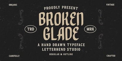 Broken Glade is a classic hand drawn with vintage looks!. This unique font has 2 styles : regular and outline. This font perfectly made to be applied especially in logo, and the other various formal forms such as invitations, labels, logos, magazines, books, greeting / wedding cards, packaging, fashion, make up, stationery, novels, labels or any type of advertising purpose. Features : Uppercase & lowercase Numbers and punctuation Multilingual PUA encoded We highly recommend using a program that supports OpenType features and Glyphs panels like many of Adobe apps and Corel Draw, so you can see and access all Glyph variations.
 - Midgeto by Letterhend,
$17.00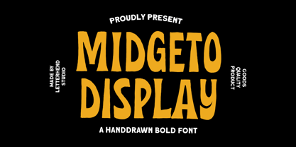 Introducing, Midgeto Display - A hand drawn display font. This font has unique shape, very suitable for casual and playful theme design. This font also perfectly made to be applied especially in logo, and the other various formal forms such as invitations, labels, logos, magazines, books, greeting / wedding cards, packaging, fashion, make up, stationery, novels, labels or any type of advertising purpose. Features : numbers and punctuation multilingual PUA encoded We highly recommend using a program that supports OpenType features and Glyphs panels like many of Adobe apps and Corel Draw, so you can see and access all Glyph variations.