10,000 search results
(0.113 seconds)
- Wintermint by Pink Broccoli,
$16.00 A funtastic and playful typestyle, Wintermint started as a digitization of a film typeface called Lori by LetterGraphics. This font is filled with bounce and liveliness taken from its original limited character set and fleshed out to a fully functional typeface. Flare serifs along with the occasional weird and wonderful curl gives this typeface a festive holiday vibe, but it could easily blend into a psychedelic design space, or just an all out wacky groove. Give it a spin, and see where Wintermint takes you.
 - Ollie by Eclectotype,
$40.00 Meet Ollie, a casual signage script whose friendly, bouncy exterior belies a heart of sophisticated OpenType programming. This font is designed to make the most of OpenType savvy applications, and as such is recommended for professional design use. Or to put it another way: Make sure that contextual alternates and ligatures are always turned on! Ollie includes about 900 glyphs, many of which are automagical substitutions to keep the text flowing smoothly, and to pseudo-randomly pick different glyphs to avoid repetition. With contextual alternates turned on (as they should be by default), most lowercase letters will alternate between at least two different forms. The powerful OpenType programming makes the font itself ‘look back’ (up to eight characters) on previously used letters; typing “banana” will give you three different a’s and two different n’s (the last a is a special ‘end form’ character). The calt feature controls many other ‘special effects’ which all add together to give a smooth-flowing, hand-lettered look. These effects include start and end forms (and indeed, ‘loner’ forms) of many letters, which are automatically substituted in at beginnings or ends of words, or when the previous or next letter doesn't connect. Another special feature tests to see if there is room for the crossbar of t (or tt ligature) to extend further over the previous or next letter, or both, as is often the case. The last main effect of the calt feature is to substitute certain letters typed before any ‘e’ character, to make for a more natural connection (see the pe combination in ‘Eclectotype’ in the first poster). Ligatures should be on by default, for a much nicer looking tt combination, and a few others besides. The swash feature should be used sparingly (one glyph at a time, really) to apply a more extravagant look to g,j and y in the lower case, and quite a few of the upper case too. Oldstyle figures are included, as well as the lining defaults. Now to delve into the stylistic alternates... These are all included in the salt feature, or for uses of applications that support them, separated into stylistic sets thus: ss01 - (with swash feature on) L and G swashes get even swashier. ss02 - standard s changes to a connected script s form. ss03 - r takes on a script form. ss04 - z also gets a scriptier look. [the previous three sets also change any versions of s, r or z with diacritics] ss05 - a useful underline function. When enabled, typing two or more underscores will extend a cool underline under the previous letters. More underscores = longer underline. ss06 - the Polish script lslash changes to its more standard form. ss07 - E, S and B change to a more top-heavy alternate form. ss08 - An alternate form for A characters. ss09 - Alterative rounder forms of M and N. ss10 - An alternate ampersand. That about wraps up the features. Now all that’s left is for you to license the font and get experimenting!
 - Kade by Re-Type,
$45.00 Kade is a display/semi display sans family of fonts based on vernacular lettering photographed over the last ten years in and around the harbors of Amsterdam and Rotterdam. Hence the name Kade that translates into English as ‘quay’, also the name of its designer. Kade grew slowly from many different ideas and elements. The letters reflects the industrial method in which they are cut for the side of ships from large steel plates. Frequently subtleties of curves are compromised due to the cutting tools and the fact engineers are in control. Kade’s italics have an experimental character and were produced in an unorthodox manner by rotating 8 degrees, rather than slanting the roman characters, a method sometimes employed in shipyards. Kade constructed character is ideal for contemporary editorial works, architecture magazines, museums communication and posters. The six distinct styles are published in OpenType format, featuring small caps and four sets of numbers (proportional old style, tabular old style, proportional lining and tabular lining), as well as matching currency symbols and a complete set of fractions.
 - Peanotes by Mvmet,
$15.00 Peanotes is a fun cartoon display font inspired by 80s and 90s cartoon movies. Peanotes font comes in 2 versions, regular and filler version. You can use it for anything ranging from t-shirts, book designs, and greeting cards to stickers and posters, or anything that needs a casual touch. Fall in love with its incredibly versatile style, and use it to create lovely designs!
 - Warna by IKIIKOWRK,
$19.00 Proudly present Warna - Bohemian Font, created by ikiiko. With a design that is both fun and retro-inspired, Warna perfectly embodies that character. The font in question moves to the beat of your imagination. Each figure has a distinctive, hand-crafted quality, as though they were lovingly and enthusiastically created on a worn-out journal from the 1960s. "Warna" is more than simply a typeface; it's a lively storyteller who tells old tales with a contemporary twist. Its vibrant and youthful appeal makes it ideal for branding with a bohemian or retro aesthetic. The letters serve as your artistic friends, encouraging you to express your ideas with bold strokes that evoke the liberation of a joyful party. This font is very suitable for making a bohomian stuff, vintage boho brand, poster, magazine layout, fashion design, quotes, or simply as a stylish text overlay to any background image. What's Included? Uppercase & Lowercase Numbers & Punctuation Multilingual Support Works on PC & Mac
 - Juan Carlos by Homelessfonts,
$49.00 Homelessfonts is an initiative by the Arrels foundation to support, raise awareness and bring some dignity to the life of homeless people in Barcelona Spain. Each of the fonts was carefully digitized from the handwriting of different homeless people who agreed to participate in this initiative. A biography/story of each homeless person captures their story, to help raise awareness and bring some dignity to the life of homeless people. Monotype is pleased to donate all revenue from the sales of Homelessfonts to the Arrels foundation in support of their mission to provide the homeless people in Barcelona with a path to independence with accommodations, food, social and health care. Juan Carlos was born in Barcelona, Spain 46 years ago. Since the age of 17 – and during eleven years – he worked double shifts of eight hours every day in a factory. Excessive work and family problems debilitated his health and he lost his job. He then faced a dilemma: to spend unemployment benefits to pay for rent or for food. For a few years, he worked helping in the kitchens of different restaurants while he lived on a pension, until he was definitively left without work and ended up living in the street for 10 years. “In the street I tried to find rest in the ATMs of banks. I preferred to be alone, and if I ran into conflictive people, I looked for somewhere else” he explains. Living in the street he was the victim of an aggression. Since then, with the help of Arrels he moved into a pension. Today, Juan Carlos is a volunteer in the shower service of Arrels, the same showers he used during years. He also collaborates with the maintenance team, helps prepare hygienic and cleaning material, and participates in activities such as the theatre group and the football team.
 - Ermis Pro by Wannatype,
$62.00 Ermis Pro – handwritten, multilingual, natural Ermis Pro is a cross between a perfectly finished, comprehensive, classically cut old face type and handwriting. It combines the slightly irregular contours you see in very small letter sizes caused by the flow of ink on paper with the elegant look and feel of a serif font. This makes Ermis Pro the perfect choice for stylish printed materials with a personal touch, doubtlessly winning fans in the worlds of fiction and fantasy alike. Ermis Pro is robust and easy to read in both display and body copy. With its comprehensive character set, it is suitable for a wide range of typographical uses. Besides the standard Latin, the character set includes the Greek and Cyrillic alphabets as well as extended Latin with pan-African letters and the complete International Phonetic Alphabet (IPA). Ermis Pro also comes with numerous OpenType features such as discretionary ligatures, small capitals and nine number variants. The typeface features upright and italic fonts in three weights: Light, Regular and Bold.
 - Bluebell by Fenotype,
$35.00 Bluebell is a modern script type family in the style of copperplate calligraphy. It comes with six weights from extra light to extra bold, all of them maintaining the distinct high contrast. Rich with Open Type features, Bluebell includes Swash & Stylistic alternates, automatic ligatures, old style figures and small caps that work as stand-alone font as well. Each font also comes with a set of ornaments that are found in the glyph palette. Bluebell makes for an elegant, iconic display letter for packaging, books, posters and the like.
 - Wild Soul by Pixel Colours,
$24.00 Wild Soul is a handwriting font duo designed for projects with a hand drawn, organic vibe. Imperfect with a subtle texture, great for artsy designs! This artistic font is perfect for product packaging, movie posters, art posters, quotes, logo design, etc. Includes a dingbats font full of extra doodles for decorating texts or creating beautiful quotes for social media posts. This font pair is a must have if you love handwritten fonts! Includes: Wild Soul Regular: a script hand drawn font with imperfect lines and texture Wild Soul Extras: a dingbats font full of hand drawn doodles
 - P22 Franklin Caslon by P22 Type Foundry,
$24.95 This font set was created in collaboration with the Philadelphia Museum of Art to coincide with the Benjamin Franklin Tercentenary. This font set includes faithfully reproduced letterforms digitized directly from images of impressions made by Benjamin Franklin and his printing office circa 1750. The printing conditions of the time involved handmade paper with textured surfaces and handmade inks which were hand-applied for each impression. By digitizing the printed type in its real-life state, an authentic look of Franklin's actual work is achieved and, ultimately, has a timeless appeal.
 - Gasted by Twinletter,
$12.00 Introduce Gasted font, designed by combining heroism in written artwork, modern fonts for digital and robotic needs, of course, this very elegant and powerful san serif font family, will make your project unique and attractive in its presentation. what are you waiting for, start making your project spectacular This font is perfect for games, sporting events, branding, banners, posters, movie titles, book titles, quotes, clothing, logotypes, and more. of course, your various design projects will be perfect and extraordinary if you use this font because this font is equipped with a complimentary font family, both for titles and subtitles and sentence text. start using our fonts for your amazing projects.
 - Litza by Marianna Orsho,
$35.00 Litza is a layered, condensed, all-caps cross stitch display type family. It is made up of 10 layers that show different stages of stitching and can be stacked, moved around, and coloured separately in order to create interesting effects. The ten layers come in 3 weights; Light, Medium, and Bold. The 3 weights can also be mixed with one another to create a vast range of combinations when stacking the layers. Litza has multilingual support and includes glyphs for a wide range of Latin and Cyrillic languages. The family also contains a set of ornamental borders and over 80 decorative symbols in the shape of various animals and objects. Combining the various Litza layers allows you to create eye-popping, intricate, experimental typographic compositions that are rich in detail - with ease. The condensed, geometrics sans-serif letterforms and playful nature of the Litza layering system give a contemporary feel - while at the same time retaining a nostalgic and tactile quality due to its reference to traditional needlework techniques and patterns. Ideal for use at larger point sizes where the unique, stylish effects can be best expressed - Litza will add a touch of intrigue and work best in headings and emphasised text for poster design, editorial design, packaging design, and motion design.
 - Realtime Rounded by Juri Zaech,
$30.00 Information displays have an aesthetic of their own. Functional design where transmission of information is key — and best in real time. The Realtime Rounded typeface is not meant to recreate the appearance of those applications, instead it takes inspiration from them. The result is a technical yet friendly design with details that serve function and visual impact alike. Its soft edges apply warmth to the otherwise rather technical appearance. As a monospaced typeface it lends itself to tabular designs, sturdy columns and tidy layouts. Nevertheless Realtime comes with a feature for setting continuous text — a proportional design employable through OpenType — it further comes in five weights, from light to black, and with a character set that covers over 200 latin languages. Please see the Realtime Rounded Type Specimen PDF in the gallery. Realtime Rounded is the soft companion to the standard Realtime Typeface which is available separately. Thanks for visiting!
 - Lucifer Sans by Daniel Brokstad,
$29.00 Lucifer Sans is a modern sans serif font rooted in Scandinavian geometry and minimalism, mixed with a healthy dose of black metal and irreverent attitude. Harsh vertical cuts and angles throughout the font creates a very strict and hard look, that can either be amplified or loosened up through its stylistic sets. Lucifer Sans family contains 162 font, 9 different weights and width, plus italics. In addition there are 3 different stylistic sets. This creates substantially diverse set of characters for contrasting against another and makes it a versatile font for different formats. Style 01 takes on an almost hand drawn style, while Style 02 enhances the geometric aspects of the font further. Style 03 uses only the rounded letter 01 without the hand drawn variations.
 - All Round Gothic by Dharma Type,
$24.99 Originally designed in 2012 by Ryoichi Tsunekawa, All Round Gothic is a font family inspired by classic sans serif fonts such as Avant Garde Gothic and Futura. All Round Gothic is a structured geometric sans, but also creates a sweet and cute atmosphere by removing unnecessary stems. With their bowls shaped by not-perfectly-geometric circles, All Round Gothic makes an organic impression in some degree. As a result, All Round Gothic became a new font family that covers between 1920s Bauhaus and contemporary design trends comprehensively and one of the most suitable family for any purpose such as text, headline, logo, poster, and animations thanks to clean and legible but soft and friendly letterforms. All Round Gothic includes 5 weights and obliques corresponding to each weight. Why don't you try this family if you got a little bored with classic sans serifs. This font is used in Minions movie.
 - Straight Flush Block by Inumocca,
$18.00 Straight Flush font family inspiration from Old school traditional tattoo font, simple and Strong Charachters. come with some simple Alternates for covering your Project, like Branding, Movie Title, Headline Letter, Bookcover or Book Content, Magazine cover, Poster, Quotes Lettering, Logos, and more your project design. - Unique glyphs - Multilingual Characters - UPPERCASE - Lowercase - Numeric - Symbol - Punctuation Character - Alternates inumocca type Studio
 - Black Sun by Inumocca,
$19.00 BlackSun – A futuristic, eyecatching font with simple, strong characters. Inspired by modern technology, synthwave, Sci-fi movie posters, science and generally space. A really great font for many projects, like lettering, website interface, magazines, branding, posters, wedding invitations, quotes lettering, logos, and more. - Unique glyphs - Multilingual support - UPPERCASE - Lowercase - Numeric - Symbol - Punctuation - PUA encoded - Stylistic alternates
 - Japanese Brush - Unknown license

- Eulalie NF by Nick's Fonts,
$10.00Here’s another happy camper based on the work of master penman Walter Heberling. Its quirky character and offset baseline make for interesting and enticing heads and subheads. All versions of this font include the Unicode 1250 Central European character set in addition to the standard Unicode 1252 Latin set. - Black wagon by LetterStock,
$22.00 Black Wagon This pair was inspired by poster design that i saw on street, It was crafted by hand specially to add natural handmade feeling in its brand identity than i make it clean with pentool. If you need a decorative serif font style, Black Wagon font is great choice for you to make your design looks better and unique. Opentype features Black Wagon font has 204 character set included Black Wagon Font is very good looking in logo, movie poster design, youtube thumbnail, labels, product packaging, invitations, advertising and others. This decorative serif fonts works with folowing languages: Afrikaans, Albanian, Asu, Basque, Bemba, Bena, Chiga, Cornish, Danish, English, Estonian, Filipino, Finnish, French, Friulian, Galician, German, Gusii, Indonesian, Irish, Italian, Kabuverdianu, Kalenjin, Kinyarwanda, Low German, Luo, Luxembourgish, Luyia, Machame, Makhuwa-Meetto, Makonde, Malagasy, Malay, Manx, Morisyen, North Ndebele, Norwegian Bokmål, Norwegian Nynorsk, Nyankole, Oromo, Portuguese, Romansh, Rombo, Rundi, Rwa, Samburu, Sango, Sangu, Scottish Gaelic, Sena, Shambala, Shona, Soga, Somali, Spanish, Swahili, Swedish, Swiss German, Taita, Teso, Vunjo, Zulu Thank you for using this font. LS
 - Shorelly by LetterStock,
$23.00 Shorelly This pair was inspired by beutiful lettering design that i saw on some coffee shop, It was crafted by hand specially to add natural handmade feeling in its brand identity than i make it clean with pentool. If you need a serif decorative font style, Shorelly font is grat choice for you to make your design authentic and unique. Opentype features Shorelly font has 201 character set included Shorelly Font is very good looking in logo, movie poster design, youtube tumbnail, labels, product packaging, invitations, advertising and others. This serif decorative fonts works with folowing languages: Afrikaans, Albanian, Asu, Basque, Bemba, Bena, Chiga, Cornish, Danish, English, Estonian, Filipino, Finnish, French, Friulian, Galician, German, Gusii, Indonesian, Irish, Italian, Kabuverdianu, Kalenjin, Kinyarwanda, Low German, Luo, Luxembourgish, Luyia, Machame, Makhuwa-Meetto, Makonde, Malagasy, Malay, Manx, Morisyen, North Ndebele, Norwegian Bokmål, Norwegian Nynorsk, Nyankole, Oromo, Portuguese, Romansh, Rombo, Rundi, Rwa, Samburu, Sango, Sangu, Scottish Gaelic, Sena, Shambala, Shona, Soga, Somali, Spanish, Swahili, Swedish, Swiss German, Taita, Teso, Vunjo, Zulu Thank you for using this font. LS
 - Karlburns by LetterStock,
$20.00 Karlburns This pair was inspired by unique t-shirt design that i saw on some store, It was crafted by hand specially to add natural handmade feeling in its brand identity than i make it clean with pentool. If you need a decorative serif font style, Karlburns font is great choice for you to make your design authentic and unique. Opentype features Karlburns font has 201 character set included Karlburns Font is very good looking in logo, movie poster design, youtube tumbnail, labels, product packaging, invitations, advertising and others. This decorative serif fonts works with folowing languages: Afrikaans, Albanian, Asu, Basque, Bemba, Bena, Chiga, Cornish, Danish, English, Estonian, Filipino, Finnish, French, Friulian, Galician, German, Gusii, Indonesian, Irish, Italian, Kabuverdianu, Kalenjin, Kinyarwanda, Low German, Luo, Luxembourgish, Luyia, Machame, Makhuwa-Meetto, Makonde, Malagasy, Malay, Manx, Morisyen, North Ndebele, Norwegian Bokmål, Norwegian Nynorsk, Nyankole, Oromo, Portuguese, Romansh, Rombo, Rundi, Rwa, Samburu, Sango, Sangu, Scottish Gaelic, Sena, Shambala, Shona, Soga, Somali, Spanish, Swahili, Swedish, Swiss German, Taita, Teso, Vunjo, Zulu Thank you for using this font. LS
 - Kernel by JCFonts,
$19.00 Kernel is a square geometric type family in six weights with matching obliques and small caps. The design mixes slightly rounded terminals and shoulders with square counterforms, giving the shapes a strong masculine and futuristic look, great for applications like innovation, technology, sports and of course, sci-fi ! The fonts, delivered in Opentype format, include diacritics for most European languages and come with a variety of Opentype features : two stylistic sets, tabular figures, case-sensitive forms, fractions and more.
 - Haarlem Nights NF by Nick's Fonts,
$10.00A 1920 Dutch poster for Public Placement Services by Johan Dijsktra provided the inspiration for this crisp geometric typeface. Instead of the normal underscore (_), this font features a set of parallel lines flush to the tops of the caps and small caps, which offers some intriguing design possibilities. Both versions of this font include the complete Unicode 1252 Latin and Unicode 1250 Central European character sets. - Selfie by Lián Types,
$37.00 ATTENTION CUSTOMERS :) There's a new Selfie available, have a look here; Selfie Neue is better done and more complete in every aspect. However, you can stay here if you still prefer the classic version. -But first, let me take a Selfie!- said that girl of the song and almost all of you at least once this year. While some terms and actions get trendy, some font styles do it too. It wouldn't be crazy to combine these worlds, in fact it happens often. Selfie is a connected sans serif based in vintage signage scripts seen in Galerías of Buenos Aires. These places are, in general, very small shopping centres which pedestrians sometimes use as shortcuts to get to other parts of the city. Their dark corridors take you back in time, and all of a sudden you are surrounded by cassettes, piercings, and old fashioned cloth. For some reason, all these shops use monolined geometric scripts. Surely, neon strings are easier to manipulate when letterforms have simple shapes. My very first aim with Selfie was to make a font that would serve as a company to those self-shot pictures that have become so popular nowadays. However, the font turned into something more interesting: I realised it had enough potential to stand-alone. Selfie proves that geometry itself can be really attractive. In this font, elegance is not achieved with the already-known contrast between thicks and thins of calligraphy, but with the purity of form. Its curves were based in perfectly shaped circles which made the font easy to be used at different angles (some posters show it at a 24.7º angle) without having problems/deformities. In addition to its nice performance when used over photographs, the font can be a good option for packaging and wedding invitations. TIPS Adding some lights/shadows between letters will for sure catch the eye of the viewer: Words will look as if they were made with tape/strings; so trendy nowadays. Try using Selfie at a 24.7º angle so that the slanted strokes become perfectly vertical. Having the decorative ligatures feature (dlig) activated is a good option to see letters dance. TECHNICAL It is absolutely recommended to use this font with the standard ligatures feature (liga) activated. It makes letters ligate perfectly and also improves the space between words.
 - Graphit by HVD Fonts,
$40.00 Graphit is a typeface designed by Lit Design Studio & curated by HvD Fonts. It combines clear, geometric shapes with edgy yet finely-crafted details. Graphit features uncompromising characters such as G, Q, f, k and 1. It works well both for impactful headlines and for reading sizes. The type family consists of six weights plus matching italics. In early 2018, Livius Dietzel & Tom Hoßfeld started developing the typeface’s essential character and released a free font named after the studio, Lit. Just a few months later, Hannes von Döhren had a look at the typeface and suggested expanding it into a family – then publishing it with HvD Fonts. They drew every single letter from scratch, and also decided to give the font a new name — Graphit. The family features six low-contrast weights, ranging from Black to Thin. Every character has been crafted to give it a distinctive and individual feel. Medium, Regular and Light are optimized for usage in copy text. For smaller font sizes & longer body copy, the alternate character set features a double-story a and a simplified Q, f, r and t for improved legibility. All fonts are manually hinted for optimal performance on digital devices.
 - GraySun by Inumocca,
$20.00 GraySun Futuristic Font simple, strong Character and eyecatching. Inspiration by Modern Technology, Synthwave, Sci-fi Movie Poster, science and Space Theme. Really great font to covering your Project, like Lettering, Website Interface, Magazine, Branding, Poster, wedding invitations, Quotes Lettering, Logos, and more your project design. - Unique glyphs - Multilingual Characters - UPPERCASE - Lowercase - Numeric - Symbol - Punctuation Character - PUA encoded - Stylistic Alternates inumoccatype
 - Ghost Grim by Mvmet,
$15.00 Ghost Grim is a cool font inspired by vintage slasher horror movies and horror comics. It will be perfect for your horror and Halloween themed needs! You can use it for anything ranging from merchandise like t-shirts and clothing, for your scary book designs, Halloween party needs, greeting cards, stickers, posters, banners, or anything that needs a horror touch.
 - Bloody Nightmare by Mvmet,
$18.00 Bloody Nightmare is a fantastic ink drips font inspired by vintage horror movies, comics, and Metal music. It will be perfect for your horror and Halloween themed needs! You can use it for anything ranging from merchandise like t-shirts and clothing, for your scary book designs, Halloween party needs, greeting cards, stickers, posters, banners, or anything that needs a horror touch.
 - Ancient Astronaut by Comicraft,
$19.00 Are you in search of Ancient Astronauts? Extraterrestrial beings who came from the 12th planet to influence human cultures, technologies and religions? They're here! They visited our Earth prehistorically and they didn't just make contact with humans -- they gave birth to our entire race! Some believe they are a secret group of reptiloids who still control humanity! Their agents live amongst us disguised as George W. Bush, Queen Elizabeth II, Kris Kristofferson and Lady Gaga. It's true, we read it in Weekly World News. These ancient aliens established divine status over primitive men and compelled them to build Stonehenge, Pumapunku, the Moai of Easter Island, the Great Pyramid of Giza, and the ancient Baghdad electric batteries. After all, if you're stuck on Earth, you may as well have some big heads to look at and a source of power to jump start your flying saucer. And a font. Features: Three fonts (Regular, Bold & Alien) with alternate characters.
 - Portlin by Designova,
$20.00 Portlin is a modern display typeface perfect for headlines, big text, branding, logotypes & graphic design purposes such as posters, flyers and advertisements. This font can be an excellent choice for creating outstanding logos, promotional content, and marketing presentations that can bring uniqueness and freshness at its level best. The font is very flexible in terms of your creativity, you can adjust the letterspacing to design unique textual presentations, especially for creating amazing logotypes and branding designs. Please see the examples shown above to get an idea of the capability of this typeface. Portlin comes with extended language support including Western European, Central European, and South-Eastern European character sets (a total of 231 glyphs).
 - Hug Shack by Yumna Type,
$12.00 A beautiful and easy-to-style font duo to elevate your design. Hug Shack expresses a feeling of joy and cute overall. Through the script font, Hug Shack brings your design to delve deep into the world of cuteness, while the display font creates modern look. You can mix and match this harmonious font duo to make gorgeous result in your design. This font become more special with awesome clipart as bonus. Features: Stylistic Sets Ligatures Multilingual Supports Numerals and Punctuation It can be used for branding, logos, social media quotes, stickers, posters, vintage designs, wall art, merchandise, social media, and many more. Get more inspiration by seeing the preview. Thank you for purchasing our premium fonts! Happy Designing!
 - El Mariachi by IKIIKOWRK,
$17.00 Introducing El Mariachi - Libre Type, created by ikiiko. El Mariachi is a unique typeface inspired by a Mexican vibe. A simple, bold sans serif typeface combined with attractive ligatures gives this font a strong character. This font is perfect to create layout for vintage design, mexican brand product, movie poster, food packaging, fashion product, and another fun project to a have unique or vintage look. What's included? Uppercase & Lowercase Number & Punctuation Ligature Multilingual Support Get also a good offer & FREEBIE at our site : www.ikiiko.com Enjoy our font and if you have any questions, you can contact us by email : ikiikowrk@gmail.com
 - Candy Paint by Crumphand,
$20.00 Introducing, Candy Paint fonts. Candy Paint have a unique shape, rounded and fun. Comes with 4 style Regular, Outline and Extrude, then can mix and match with Stylistic Set. What's Included Inside The Fonts ? Uppercase Lowercase Symbols Numerals Stylistic Set 1 Stylistic Set 2 Stylistic Set 3 Stylistic Set 4 European Multilingual Thank you, Regards!
 - Corsica by AVP,
$19.00 Corsica is an all-purpose geometric sans-serif typeface of visually uniform stroke thickness. The design seeks to be reminiscent of classic 20th Century grotesques with a crisp modern appearance and opentype features that are now expected. Coverage includes most Roman languages, Greek and basic Cyrillic. Each font contains a standard set of features including fractions, small capitals etc. The family contains six weights, two widths and three lowercase size options, together with an italic variant for each. The are three standard 4-font families for each size variant and a further three corresponding families for Condensed versions. The versatility provided by this extensive family has many useful applications. In particular, the choice of small, medium and large lowercase letter sizes (SX, MX, LX) allows designers to select an appropriate style for suitable impact and legibility in different situations such as headlines, captions, signage, web menus etc. Although each of the three size options will work equally well in most situations, the middle size (Corsica MX) would generally be the preferred choice for lengthy texts.
 - Pinsmalle by Letterhend,
$19.00 Pinsmalle script is a retro bold script with a touch of vintage look and feel. The swashes makes this font looks great for retro lettering which you can create in a sec! This type of font perfectly made to be applied especially in logo, headline, signage and the other various formal forms such as invitations, labels, logos, magazines, books, greeting / wedding cards, packaging, fashion, make up, stationery, novels, labels or any type of advertising purpose. Features : uppercase & lowercase numbers and punctuation multilingual alternates / swashes and ligatures PUA encoded We highly recommend using a program that supports OpenType features and Glyphs panels like many of Adobe apps and Corel Draw, so you can see and access all Glyph variations. How to access opentype feature : letterhend.com/tutorials/using-opentype-feature-in-any-software/
 - Bloom Monday by Letterhend,
$19.00 Bloom Monday is a retro bold script with a touch of vintage look and feel. The swashes makes this font looks great for retro lettering which you can create in a sec! This type of font perfectly made to be applied especially in logo, headline, signage and the other various formal forms such as invitations, labels, logos, magazines, books, greeting / wedding cards, packaging, fashion, make up, stationery, novels, labels or any type of advertising purpose. Features : uppercase & lowercase numbers and punctuation multilingual alternates / swashes and ligatures PUA encoded We highly recommend using a program that supports OpenType features and Glyphs panels like many of Adobe apps and Corel Draw, so you can see and access all Glyph variations. How to access opentype feature : letterhend.com/tutorials/using-opentype-feature-in-any-software/
 - Al Boldest Enough by Aluyeah Studio,
$119.00 Boldest Enough, modern and mystical bold display typeface. Inspired by the mystical vibe from animation horror movie for kids. It gives you fear, curiosity, and amazement at the same time. Coming with 160+ stunning and super easy to use alternates. Very suitable for magazine, headline, website, ads, product package and all type of design project you have. Features: OpenType support Multilingual support (15 languages) PUA Encoded Super Easy to Use alternates - It's OpenType support but you can easily call alternates character using special combination like A.2 R.3 h.5 etc so you don't need special software. To get results like the preview just type B.4ol.9d.2es.2t.2 E.4n.5ough.7
 - La Beauties by MJB Letters,
$19.00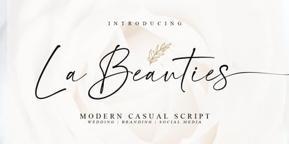 La Beauties is an original, casual and modern handwritten font that comes with a distinctive chic character that adds unique value to the font, perfect for branding, wedding invites cards, and more. La Beauties includes a full set of uppercase and lowercase letters, numeral, punctuations, and ligatures. The lowercase letters completed with beautiful beginning and ending swashes Included in this set: Works on PC & Mac Simple installations Accessible in Adobe Illustrator, Adobe Photoshop, Adobe InDesign, even work on Microsoft Word. PUA Encoded Characters – Fully accessible without additional design software
 - Trapezoidal by Ingrimayne Type,
$9.00 The letters of Trapezoidal are like sheep: they do not like being alone but want to be part of a flock. Many of the individual letters of Trapezoidal look strange and unshapely in isolation because they are designed to fit into a pattern with other letters. That pattern is formed by alternating asymmetric trapezoids, with trapezoids that are wide at the top alternating with trapezoids that are wide at the bottom. The magic of the OpenType feature of contextual alternatives (calt) automatically alternates them. The fonts in the family are largely monospaced and have very tight letter spacing. (If for some reason one wants to use only one set of the letters, the letters will overlap unless one widens character spacing.) (If D and O are too similar, use the alternative versions of D.) The family has five weights and each weight has an italics formed by flipping the trapezoidal pattern over a vertical line. Like other alternating-character typeface families from IngrimayneType, this distinctive and visually-arresting family can be used for titles or advertising. (For another but very different typeface based on alternating trapezoids, see PoultrySign.)
